Component Library Upgrade Log
v3.31.0
Release Date: 2026/06/22
Data Table filters unauthorized fields
- The Data Table component now automatically filters fields that the current user has no permission to access, improving data security.
Form Container filters unauthorized fields
- The Form Container component now automatically filters fields that the current user has no permission to access, preventing unauthorized data access.
Carousel Container unifies Web and Mini Program autoplay configuration
- Unified the autoplay configuration for Web and Mini Program, improving cross-platform consistency.
Phone Input supports configuring numeric keyboard
- The Phone Input component now supports configuring the numeric keyboard option. On mobile devices, the numeric keyboard will automatically appear when users enter phone numbers, improving input experience.
v3.30.0
Release Date: 2025/12/22
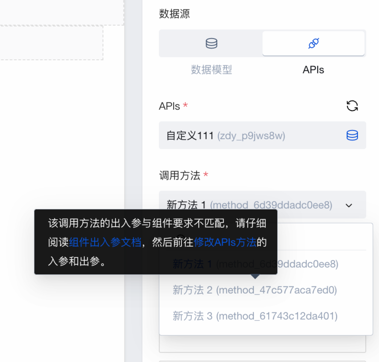
Map Location supports using Tencent Maps APIs V2 created in Open Services
- When using V2 protocol APIs, non-super administrator roles need to be authorized with the relevant policies before use. Please refer to APIs 2.0 User Role Permission Configuration Guide to complete the configuration in the cloud backend.
- When using V2 protocol on Mini Program, you need to configure request domains additionally. See Map Location Component Documentation
More Charts supports bar chart, line chart, and pie chart on Mini Program
- After upgrading to component version 3.30.0, newly dragged More Charts components support Mini Program.
Due to Mini Program package size limitations, the official preset package only includes three common chart types: bar chart, line chart, and pie chart.
v3.29.0
Release Date: 2025/12/03
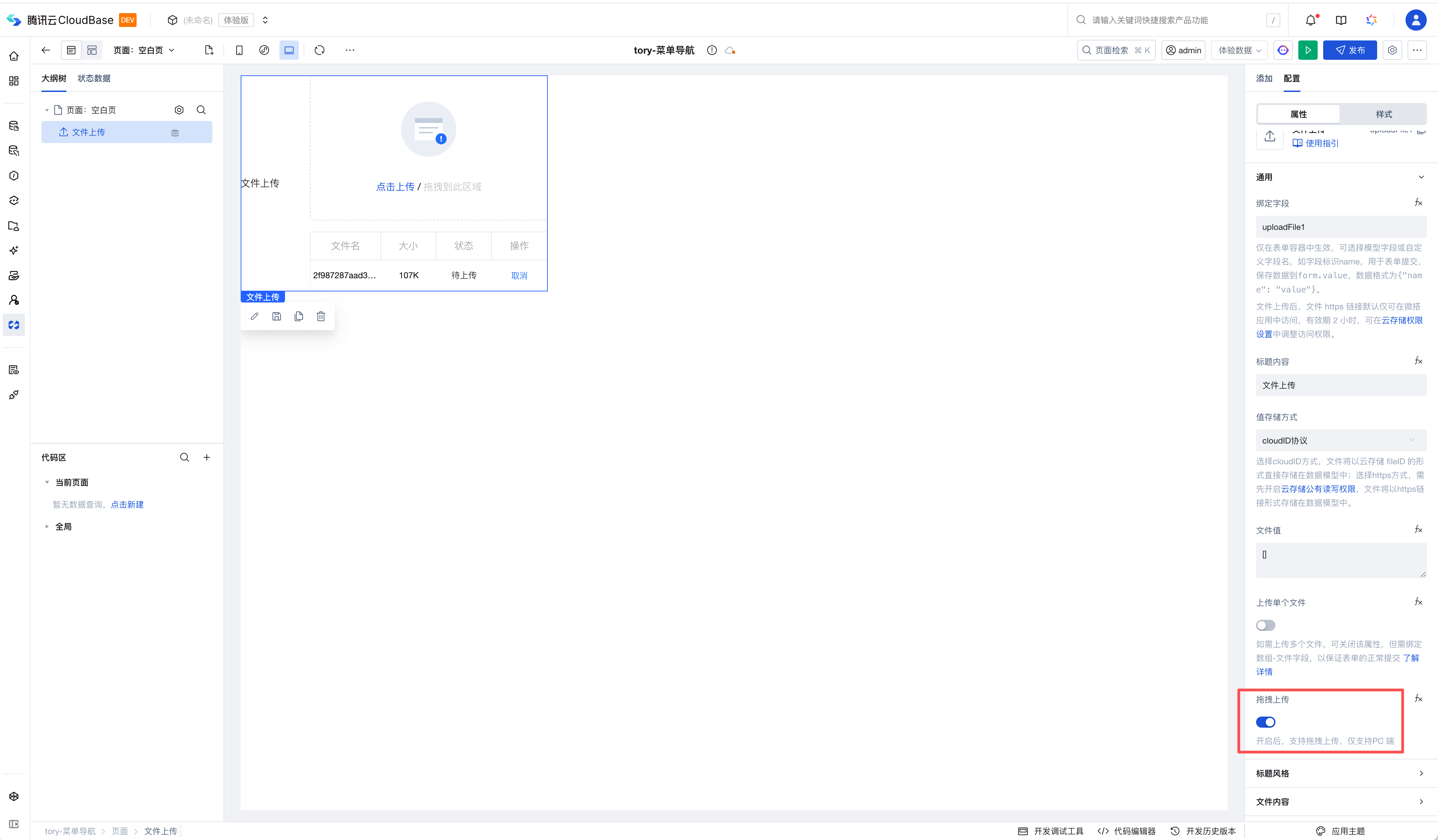
File Upload supports drag-and-drop upload on PC
- Supports uploading files via drag-and-drop, improving the file upload experience.
v3.28.0
Release Date: 2025/11/19
Scroll Container supports scrolling to a specified position
Combined with the scroll container, you can scroll to a specified position using the scroll-to-element ID property. Examples are as follows:
- Method 1: Implement via the scroll-to-element ID property
- Create a
selectorvariable to store the element ID for scrolling to a specified position - Add a button component to the scroll container, set the button text to
Scroll to specified position, and set the button click event to variable assignment, assigning theselectorvariable with the component'sidproperty value
- Create a
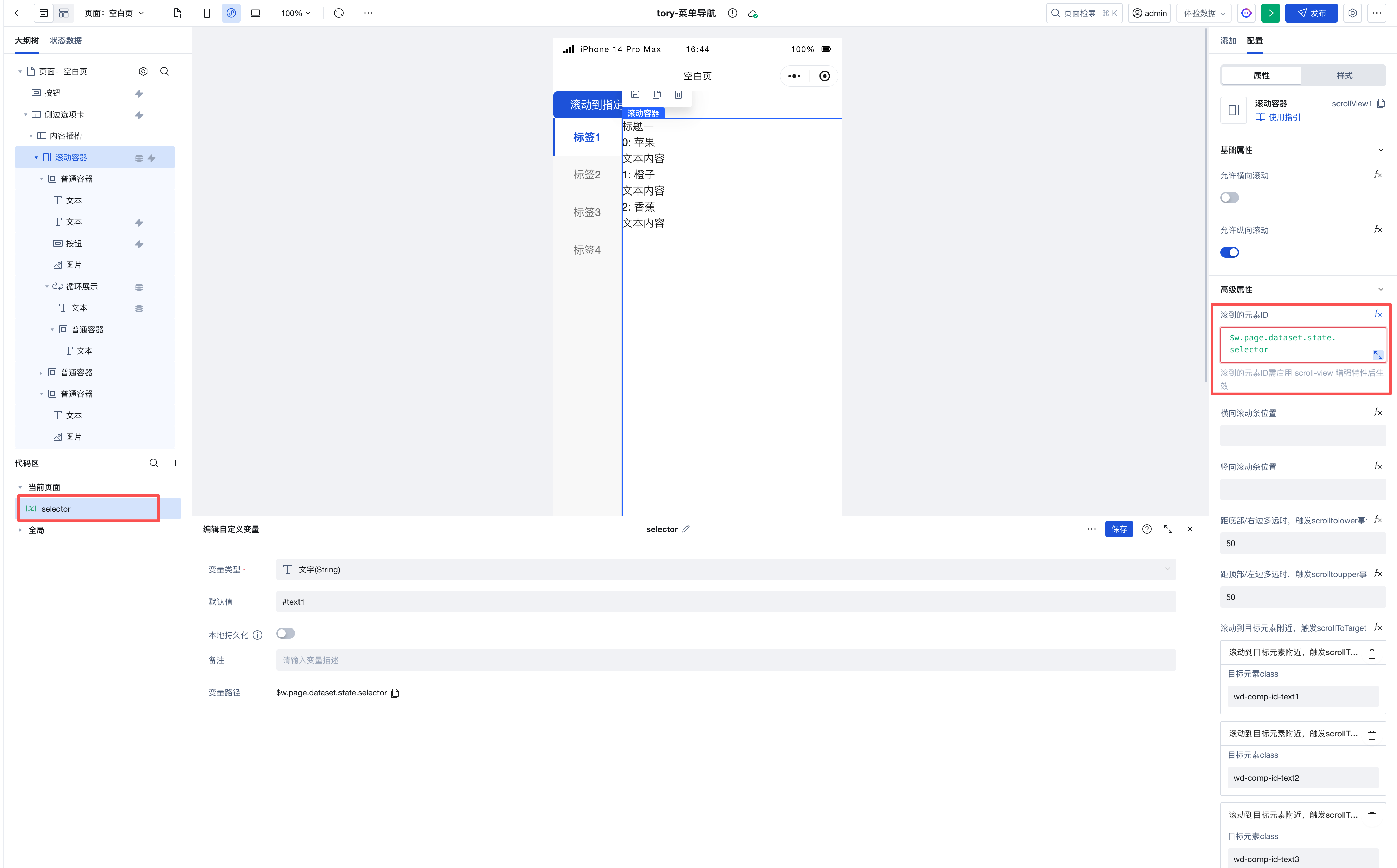
-
Method 2: Implement by triggering the scroll-to-element method
For example, when switching tabs, scroll to a specified position. In the tab switch event, trigger the
scrollIntoElementmethod to scroll to a specified position by passing in the componentidorclassto scroll to.

Map Location supports opening WeChat built-in map on Mini Program
- Only supported on Mini Program. When enabled, you can tap the map to open the WeChat built-in map to view the location or start navigation.
v3.27.0
Release Date: 2025/10/23
Bar Chart/Line Chart supports configuring additional color palettes through expressions.
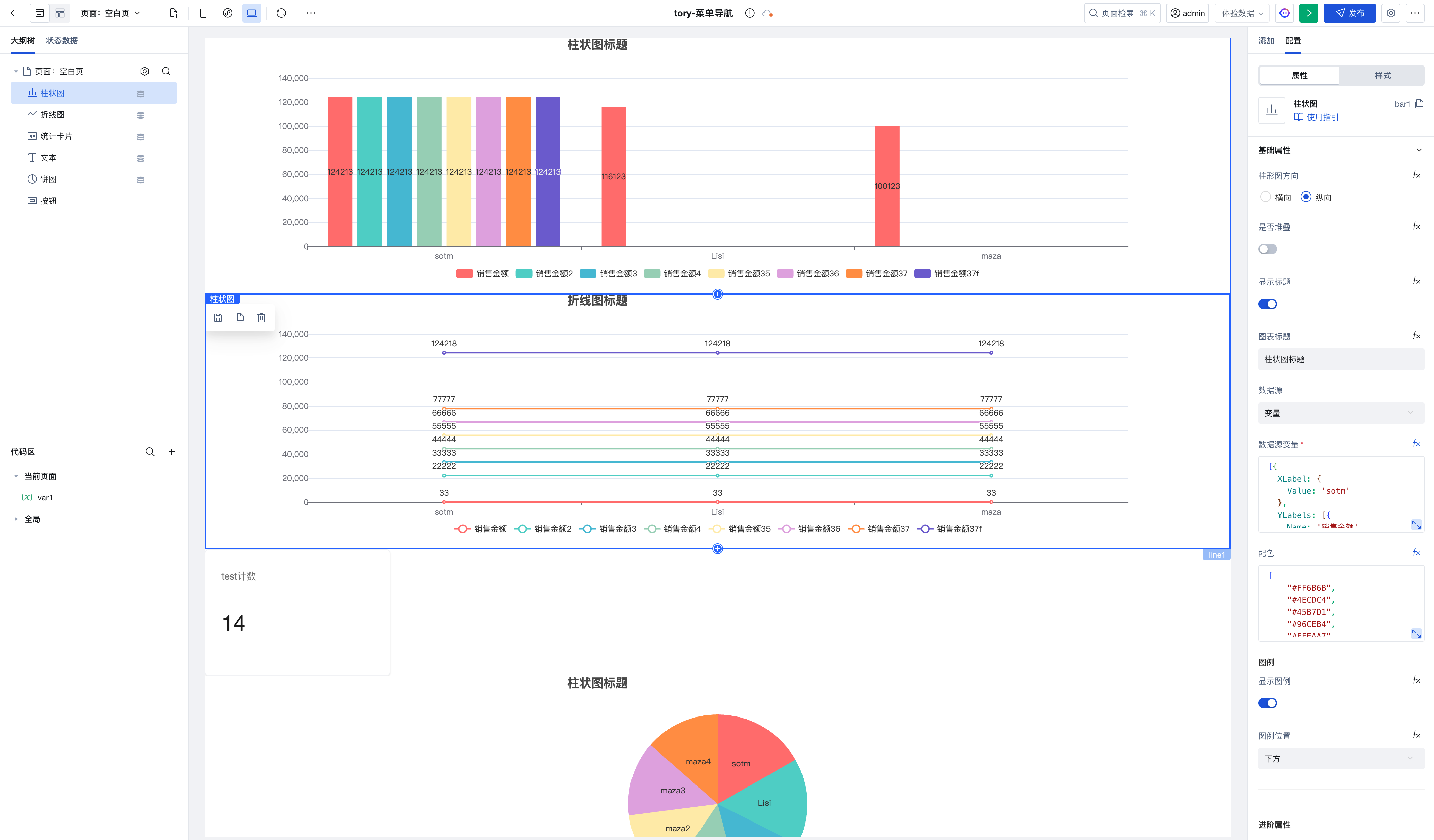
Stat Card supports accessing statistical values via Widget API.
$w.statisticsCard1.value; // statistical value
$w.statisticsCard1.calculatedValue; // unit-converted statistical value
v3.26.0
Release Date: 2025/10/09
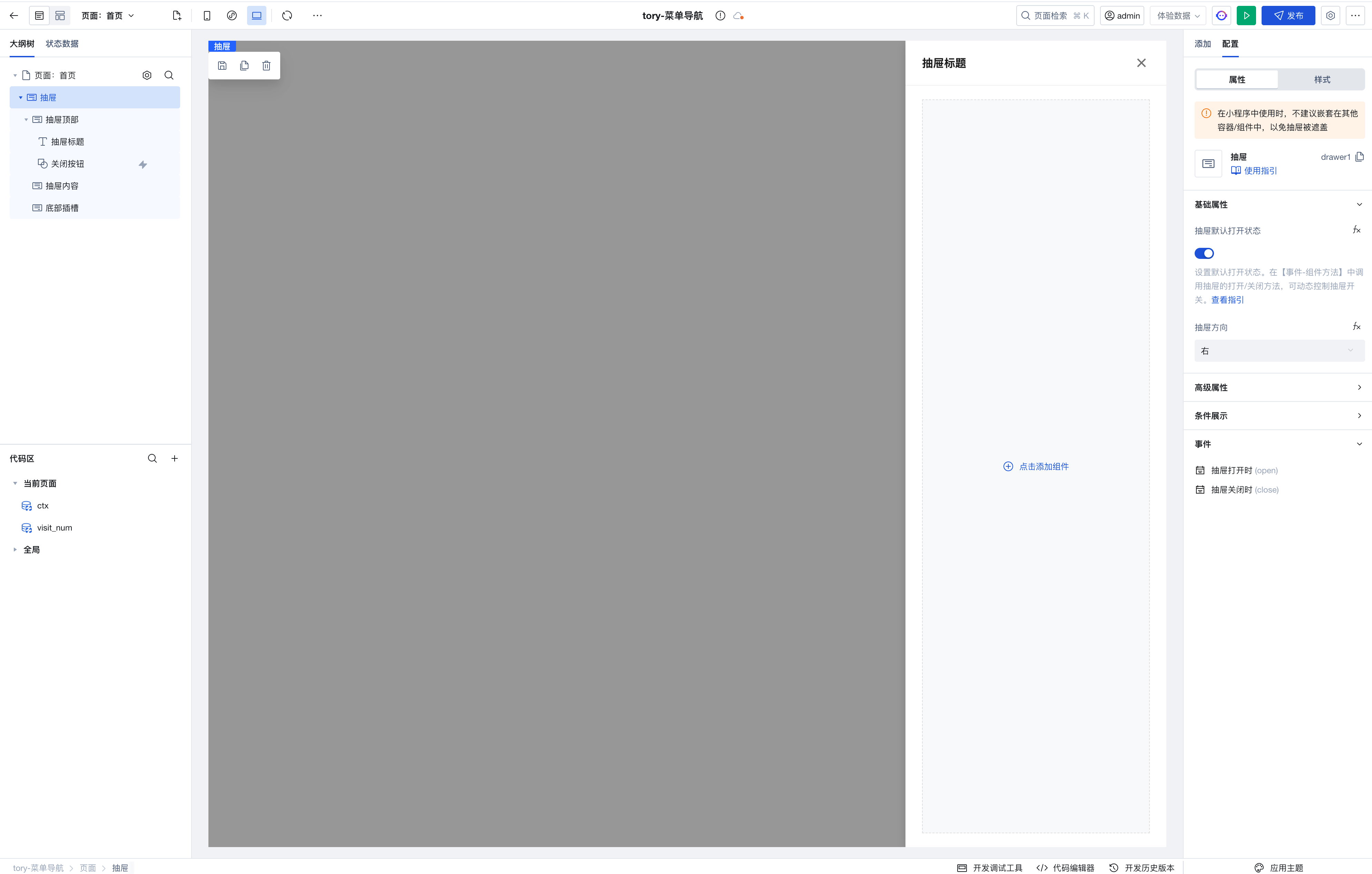
Drawer Component added
- Used to implement a side drawer display effect, commonly applied in scenarios such as navigation menus, detail panels, and filters. Supports sliding out from all four directions of the page.
v3.25.0
Release Date: 2025/09/17
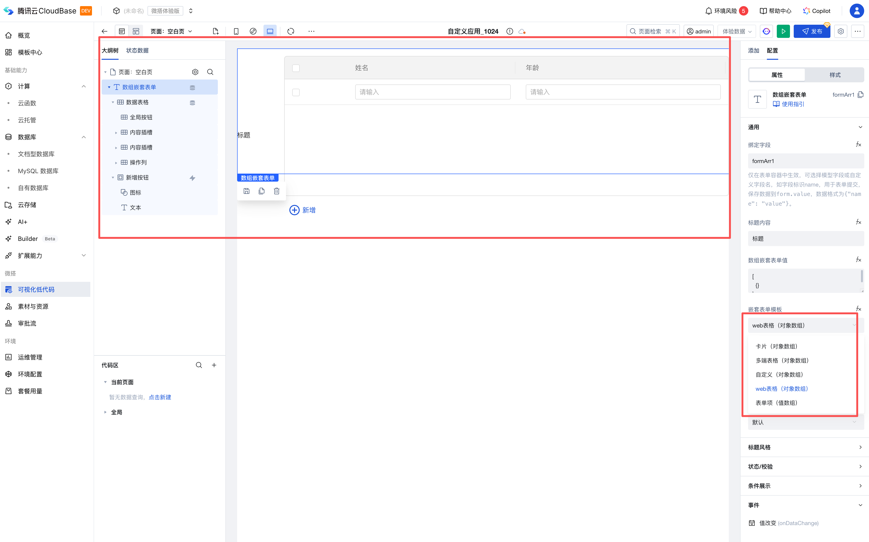
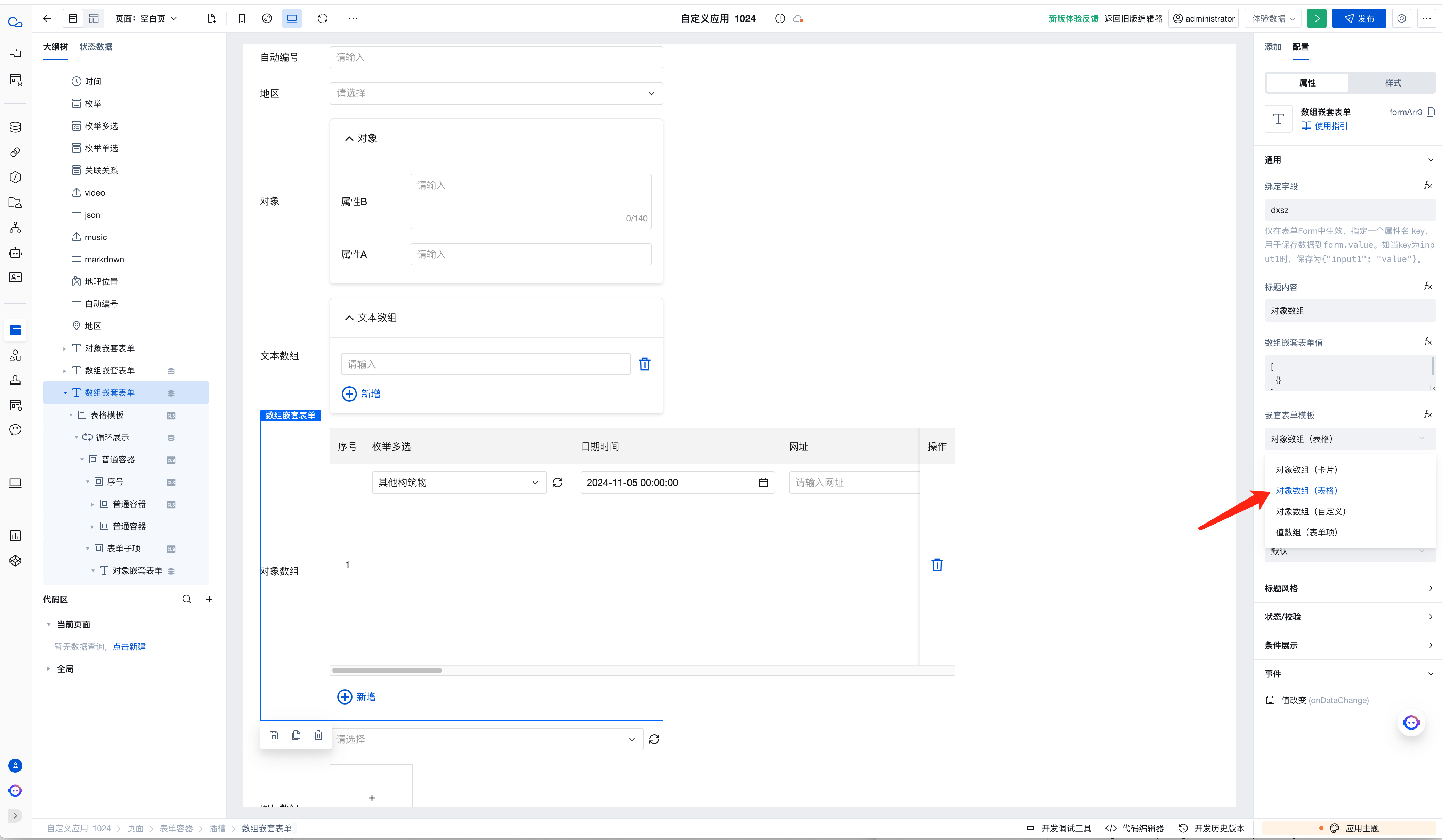
Array Nesting: web Table Template Added
-
Feature positioning: Added a new web table template. Its functional design is richer and more convenient compared to multi-end table templates, aiming to better adapt to complex form nesting and data interaction scenarios in web environments.
-
Switching rules: When switching to a web table template, it will reinitialize and generate a basic sample template. This operation will not retain the child form items inside the original nested array component.
-
Compatibility note: The web table template is only supported on the web end and cannot be used in Mini Programs. To cover Mini Program scenarios, please select the universal multi-end templates.
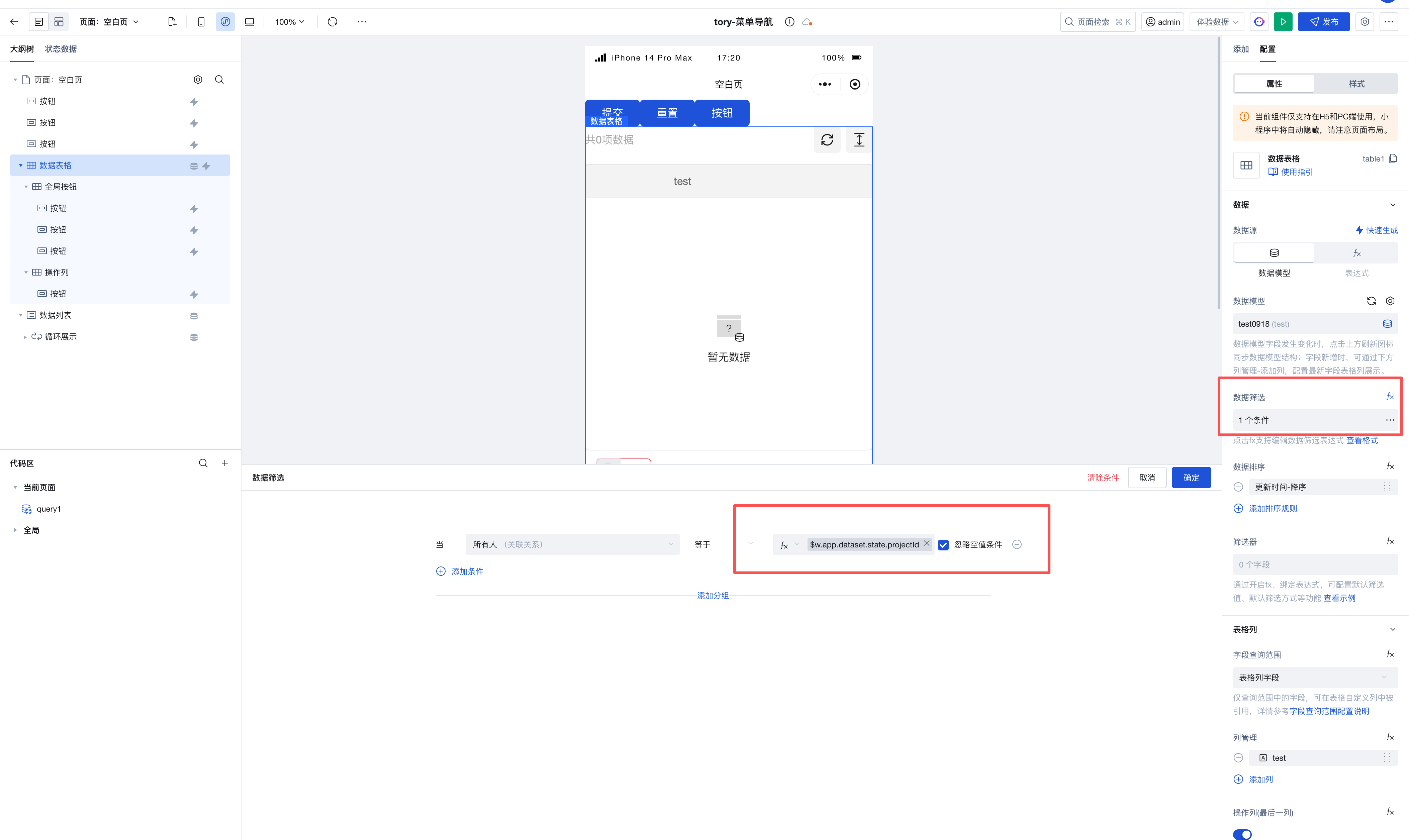
Array Table/Data List: Data Filtering Supports Ignoring Empty Value Conditions
v3.24.0
Release Date: 2025/08/27
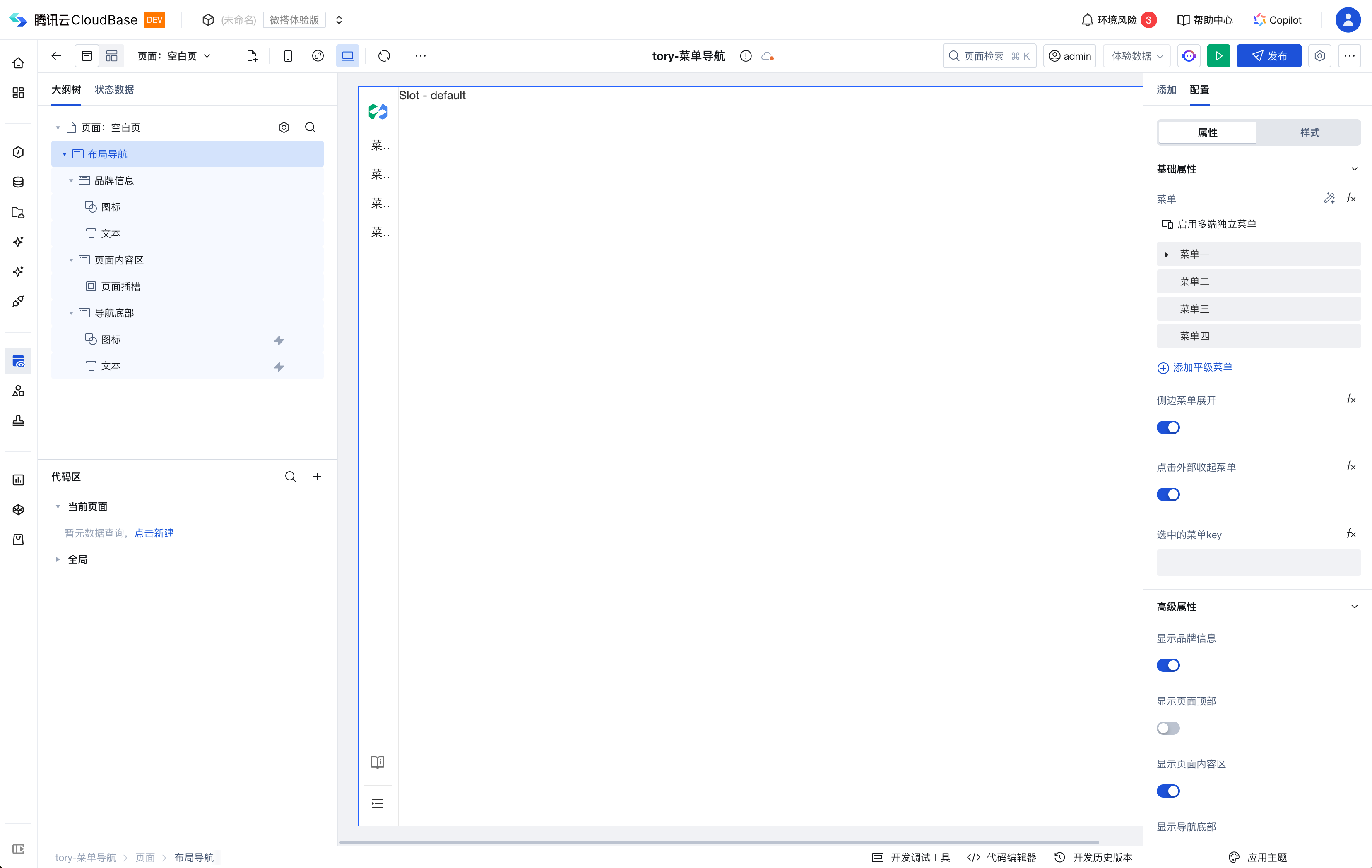
Layout Navigation: Left Navigation and Factory-style Navigation Support Left-side Menu Collapse
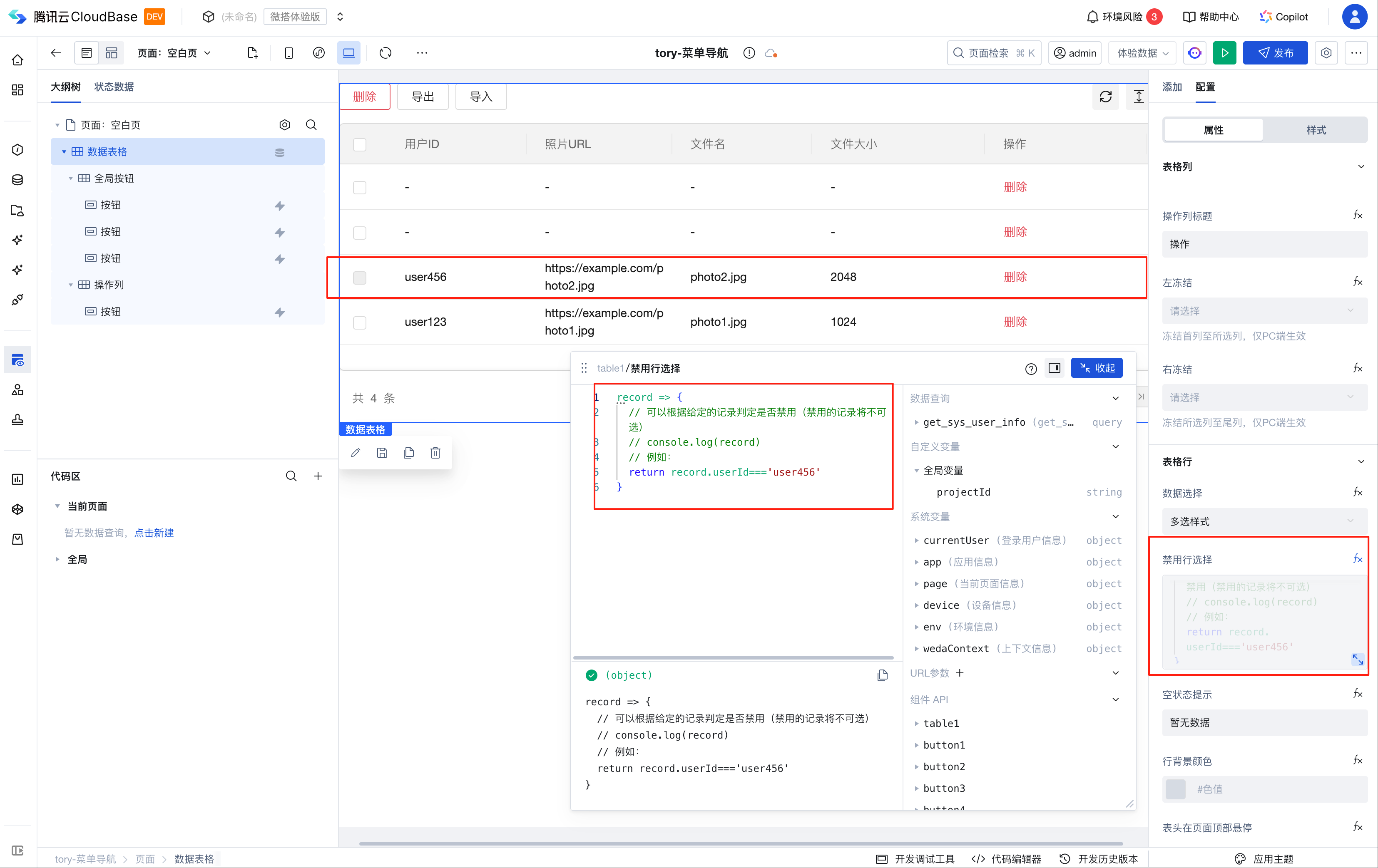
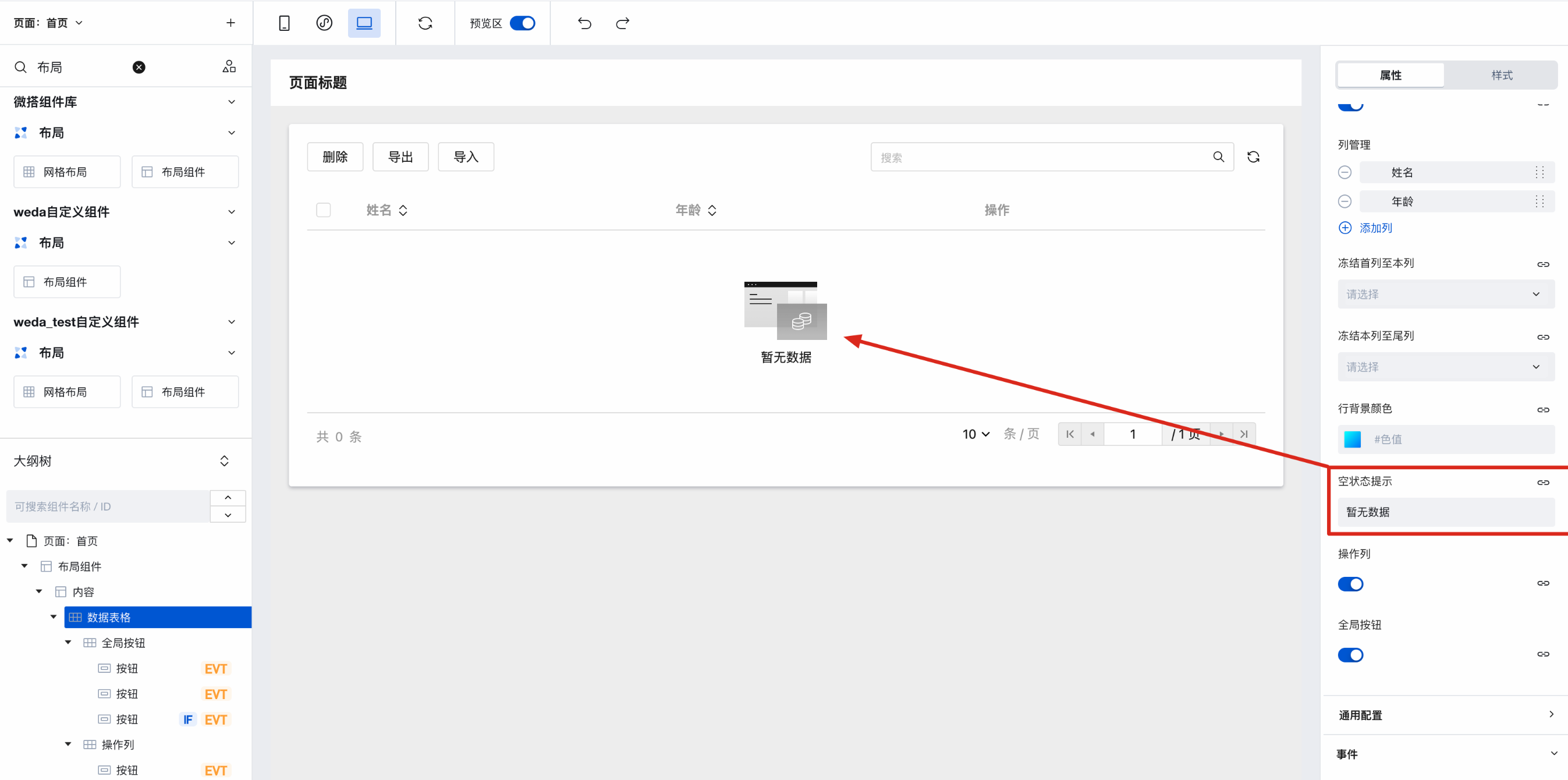
Data Table: Supports Conditionally Disabling Row Selection
v3.23.0
Release Date: 2025/08/15
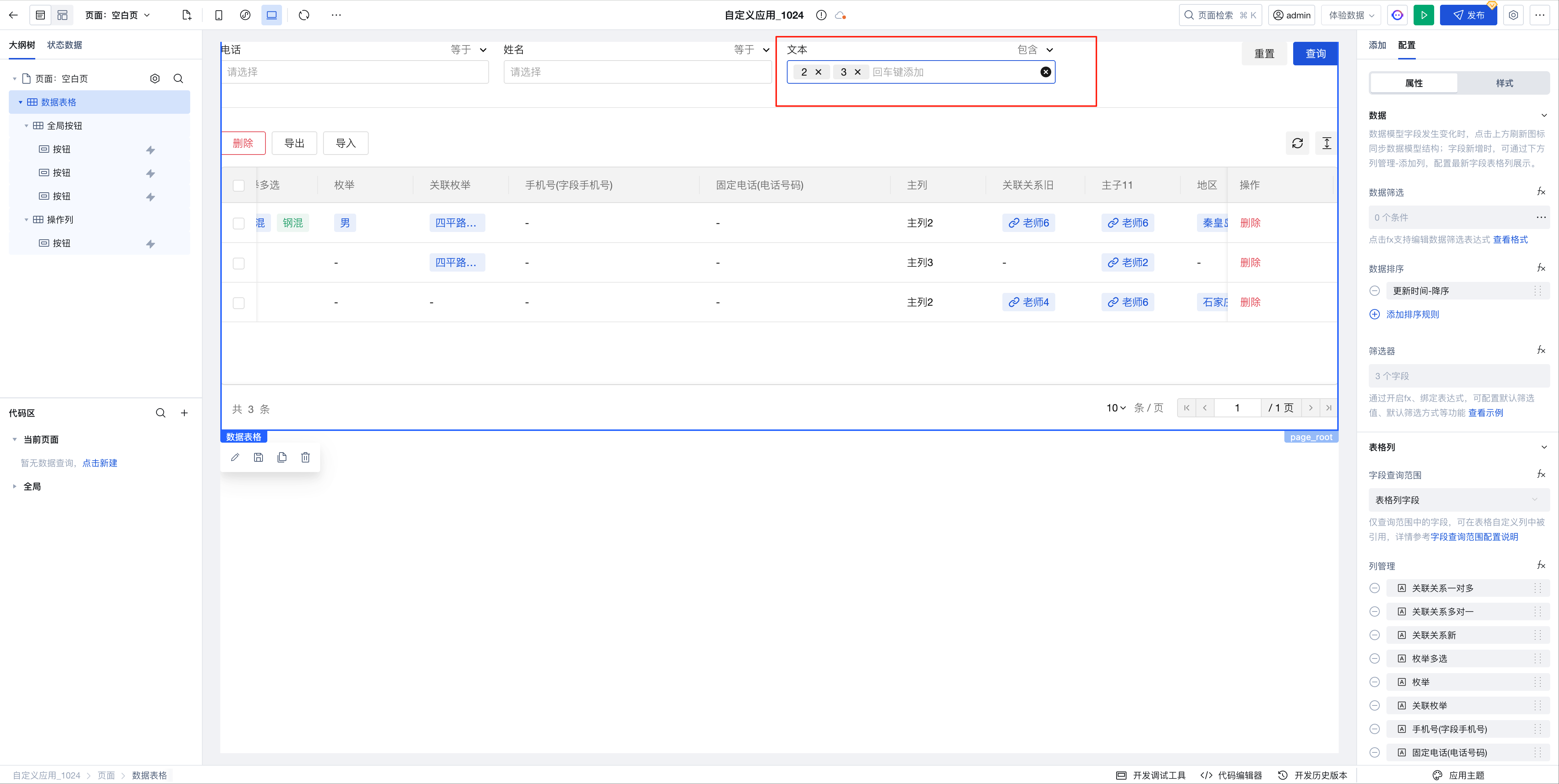
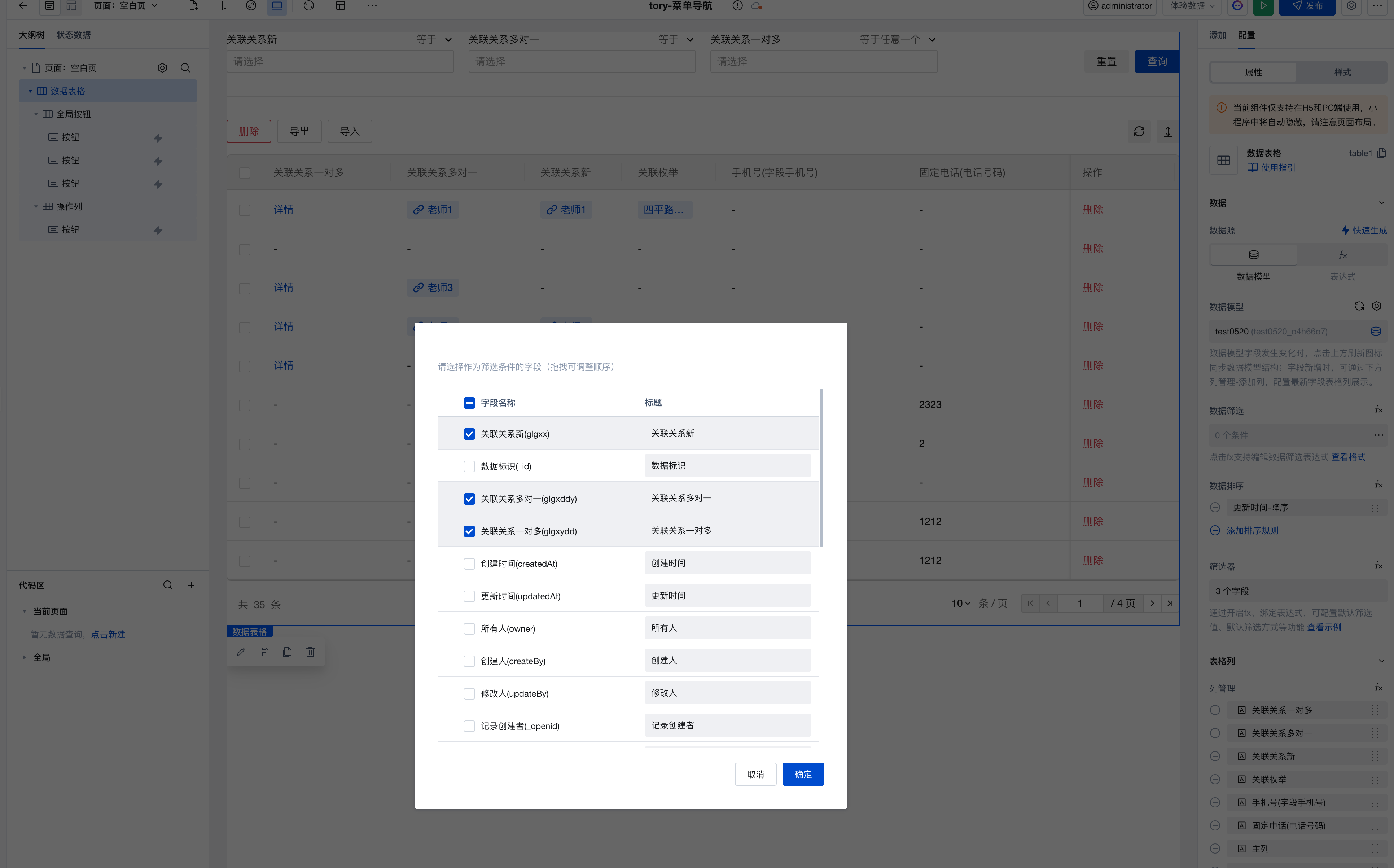
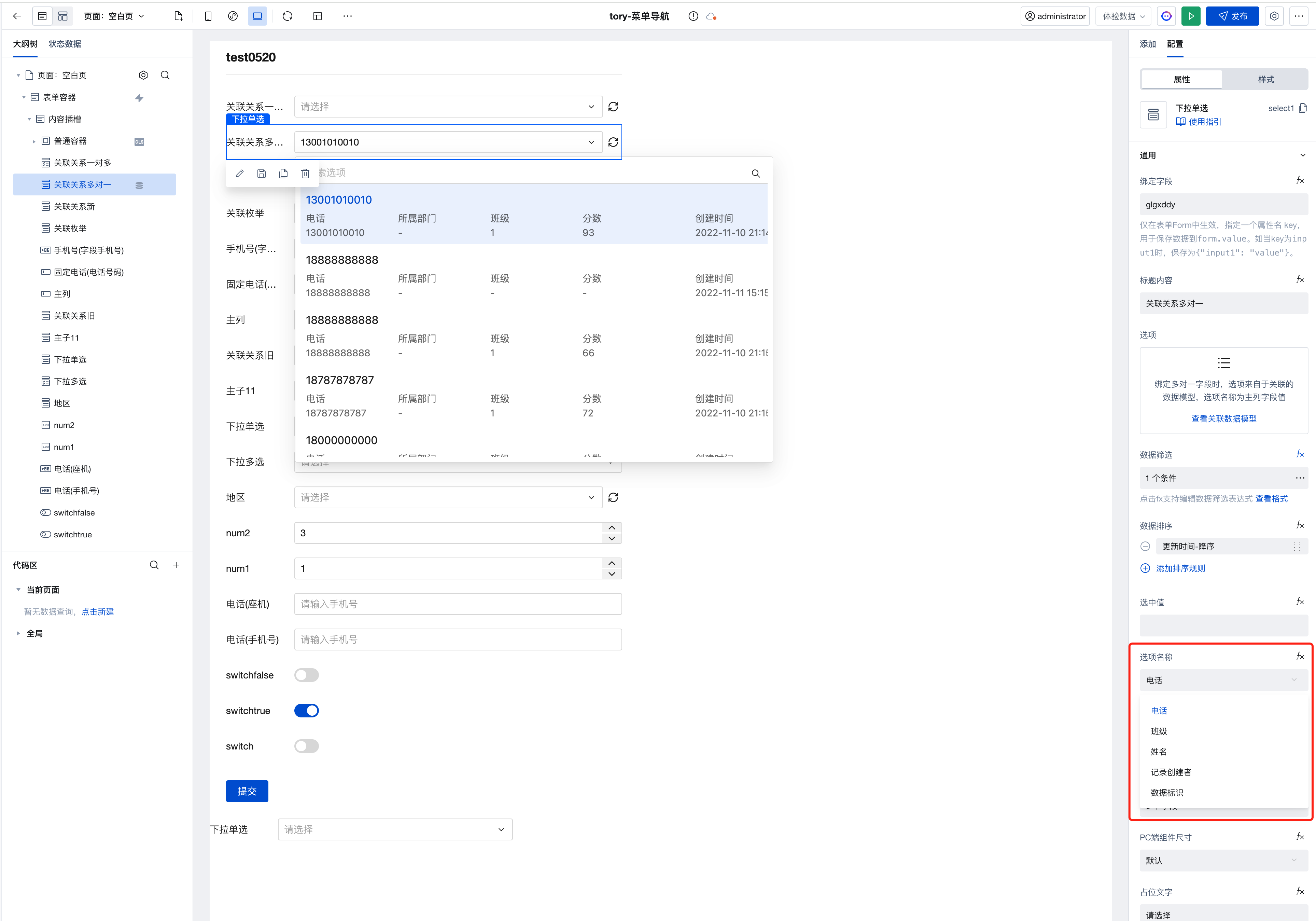
Data Table: Table Filter Supports Visual Configuration of Relationship Fields
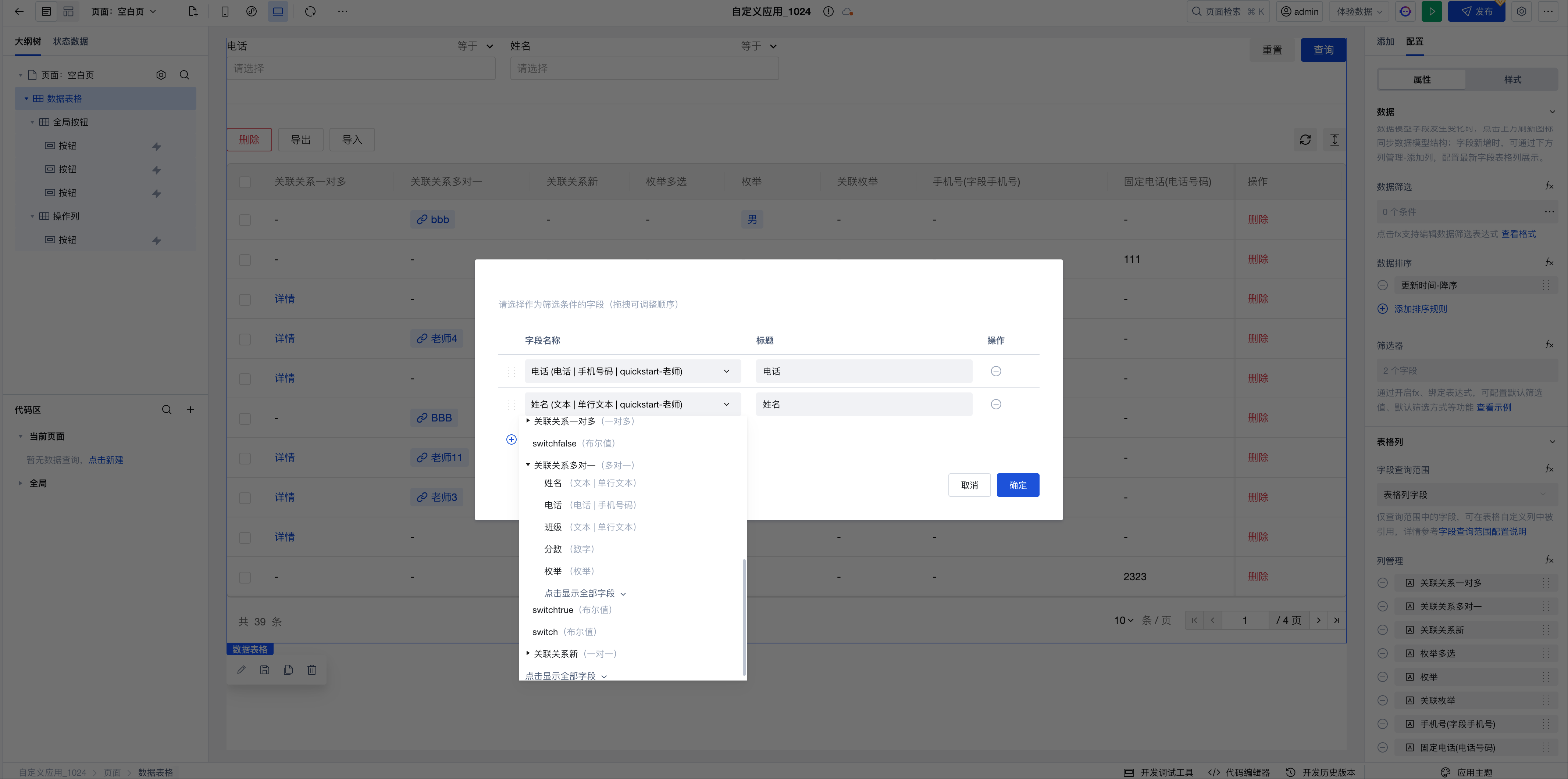
Data Table: Table Filter Supports Tag Input
-
Supports quick data filtering through tag input for array and string field types, improving query efficiency for complex datasets.
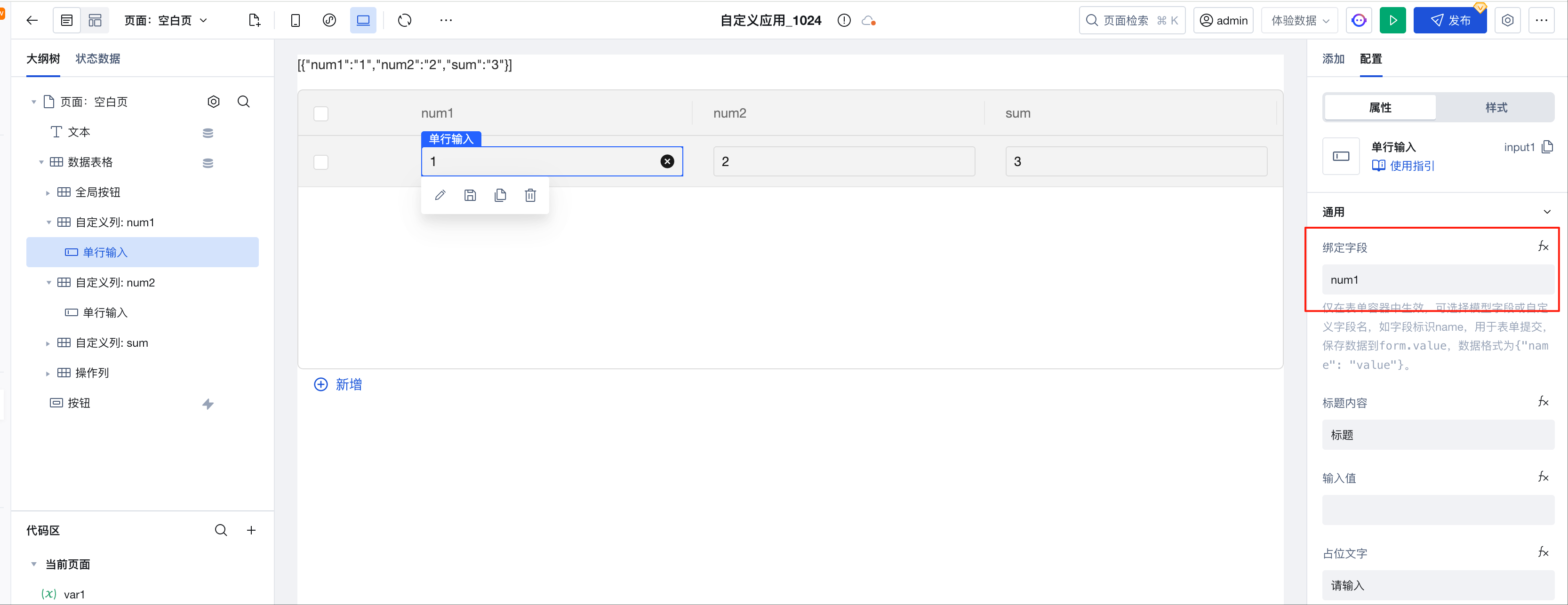
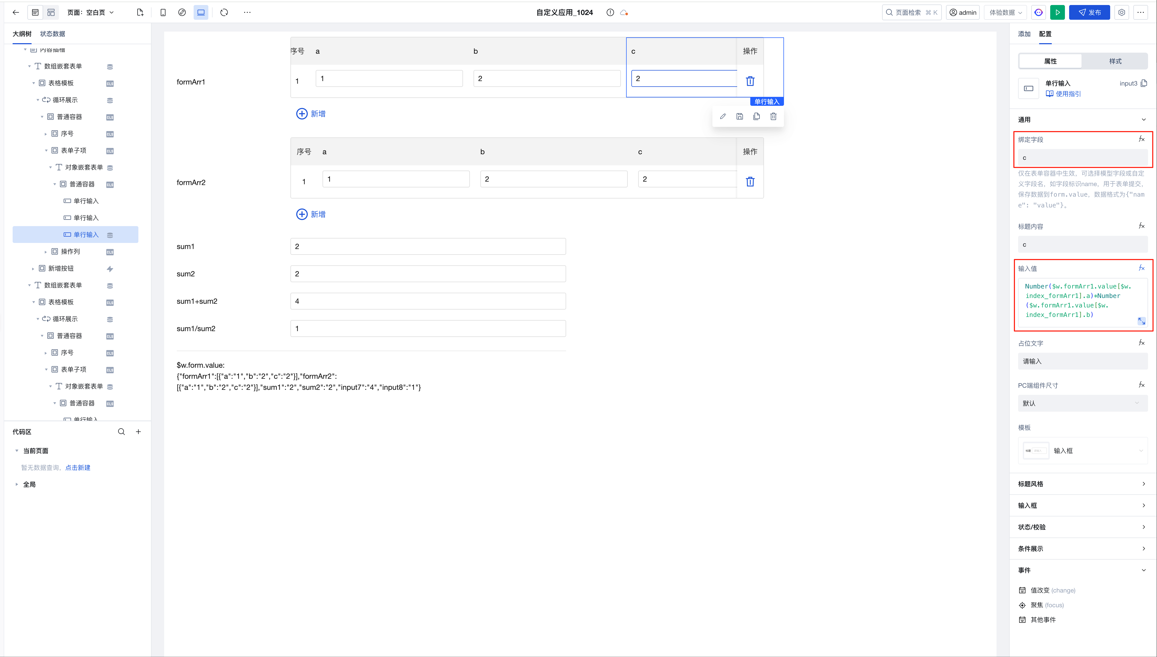
Data Table: Supports Form Value Management Capabilities
-
In data model binding scenarios, table values can be managed through custom slots combined with form components.
- After adding a table column, select the model, enable the custom slot, add an input box, update the corresponding name attribute, and the input box will automatically retrieve the model field value
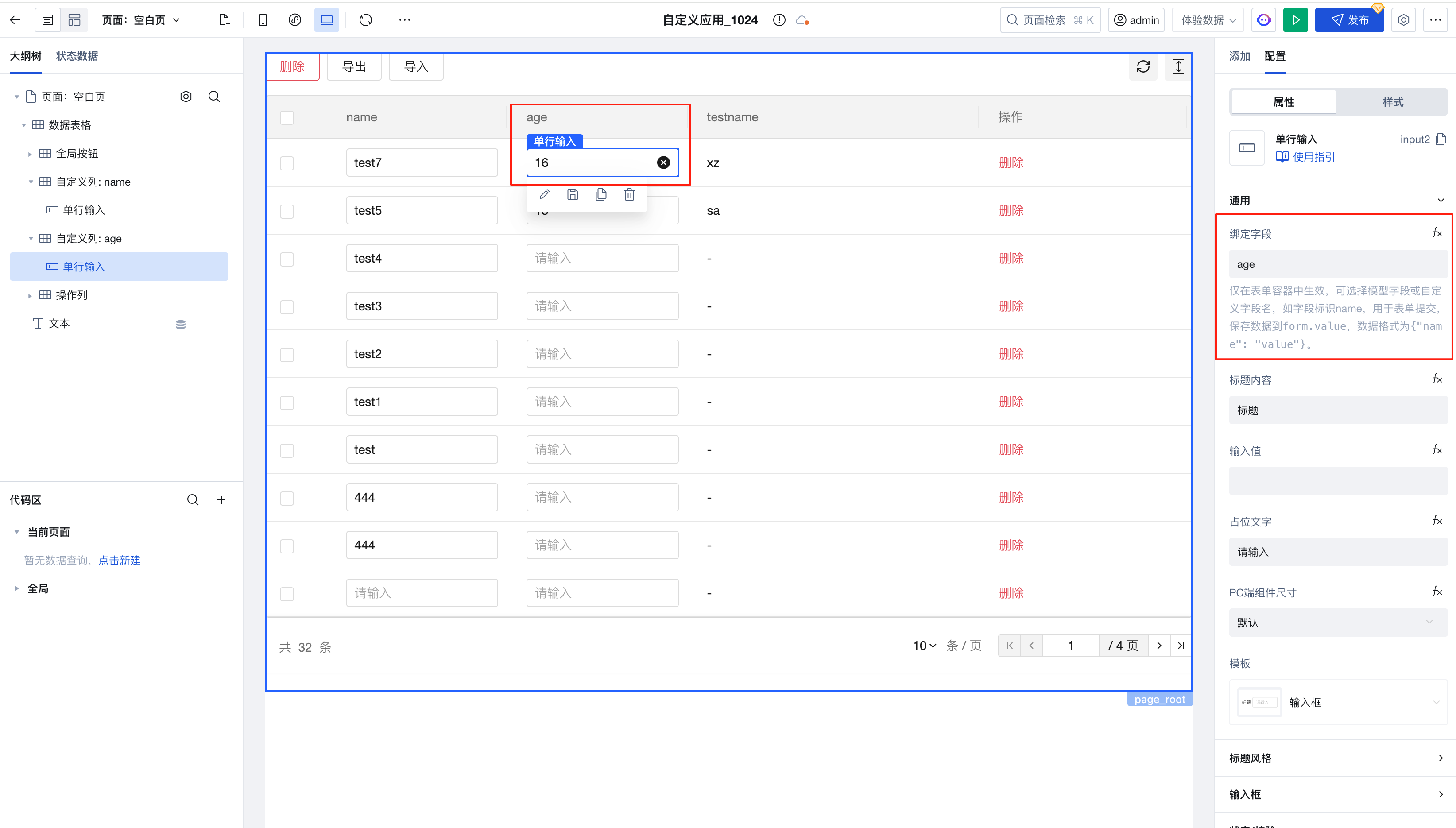
- By using $w.table1.value, you can obtain real-time table data
- Within custom slots, use $w.table1.cell_xxx.rowValue to obtain real-time table row data, which can be used in computational scenarios
-
In binding expression scenarios, table values can also be managed through custom slots combined with form components.
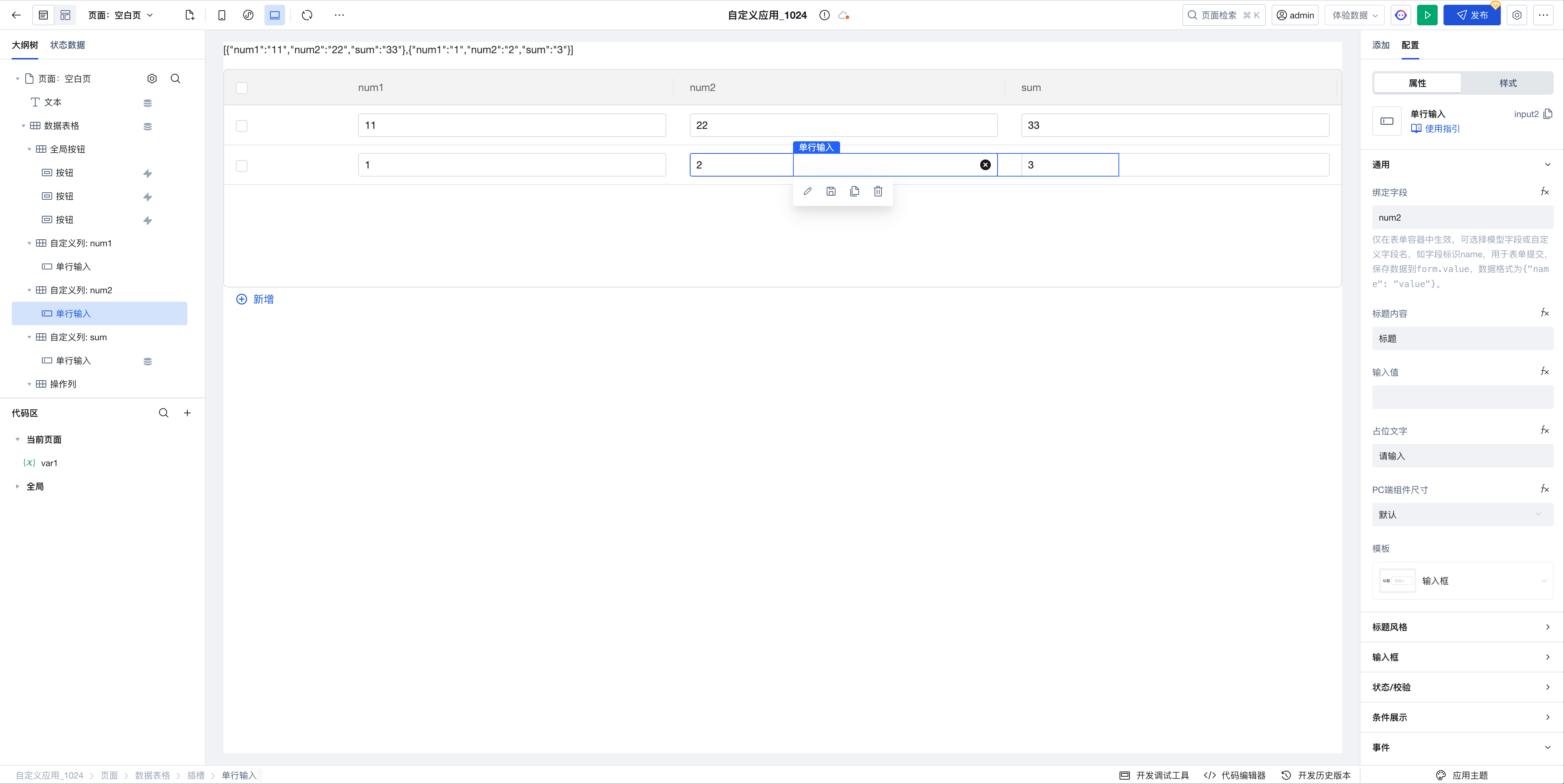
-
After adding a table column, enable the custom slot, add an input box, and update the corresponding name attribute
-
Obtain real-time table data through the value attribute of the data table component
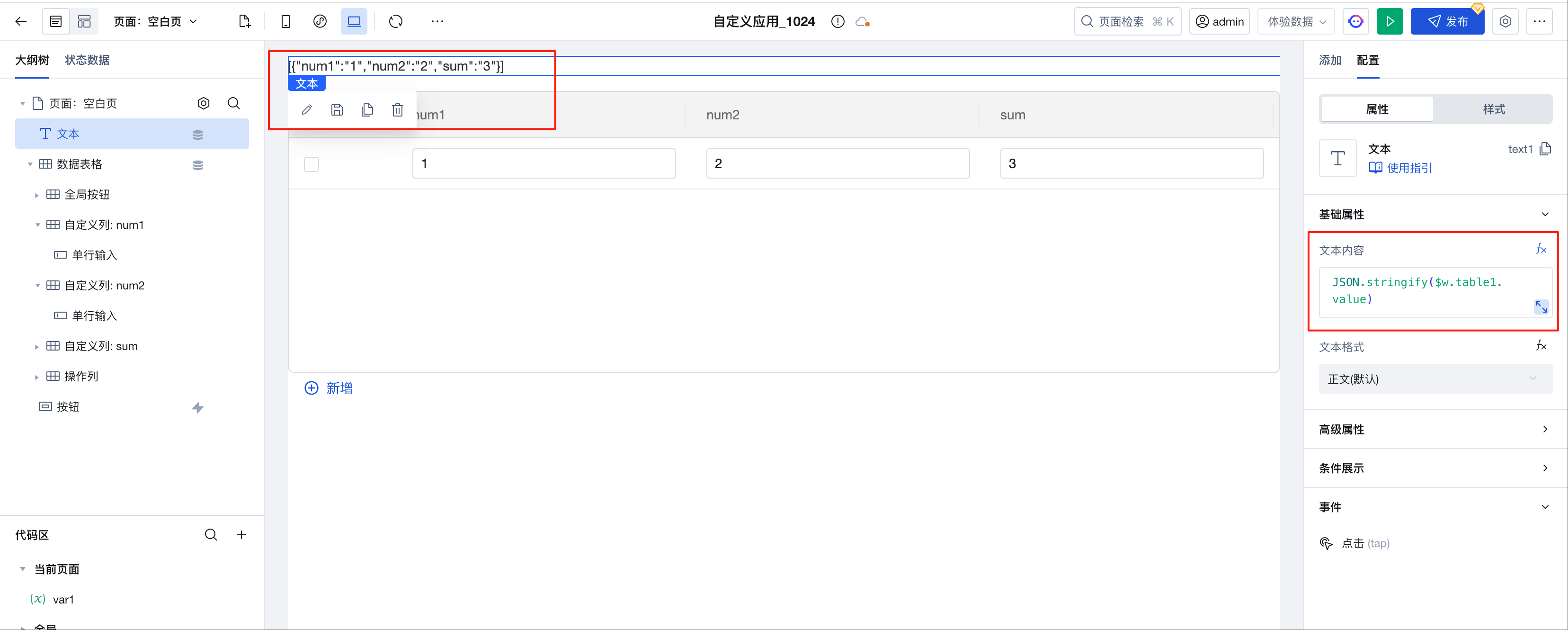 JSON.stringify($w.table1.value);
 -
Within custom slots, use $w.table1.cell_xxx.rowValue to obtain real-time table row data, which can be used in computational scenarios
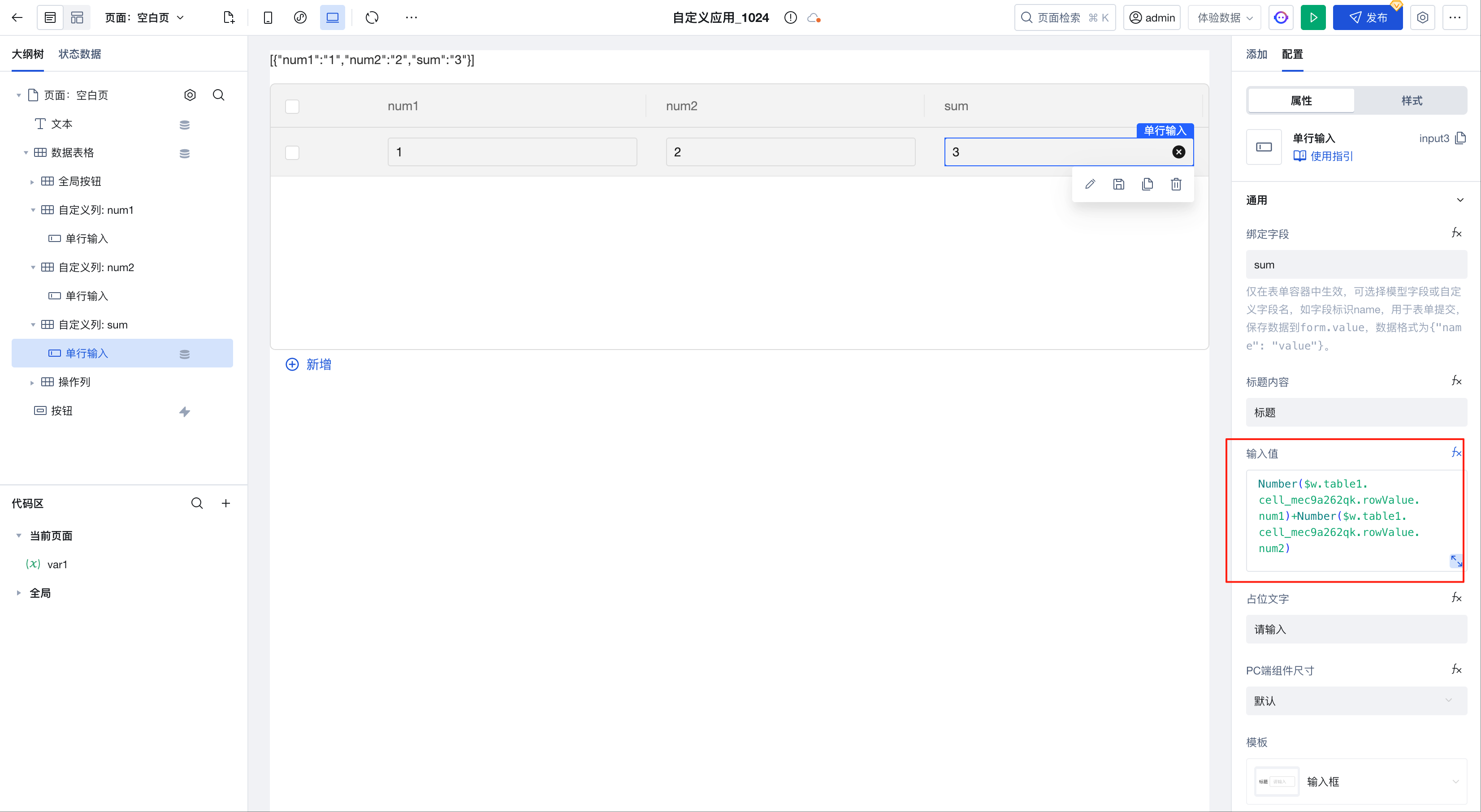 Number($w.table1.cell_mec9a262qk.rowValue.num1) +Number($w.table1.cell_mec9a262qk.rowValue.num2);
-
v3.22.0
Release Date: 2025/07/16
Data Table: Custom formats added for date/datetime/time/boolean types.
Image Upload: Fix custom path for image uploads
v3.21.0
Release Date: 2025/07/02
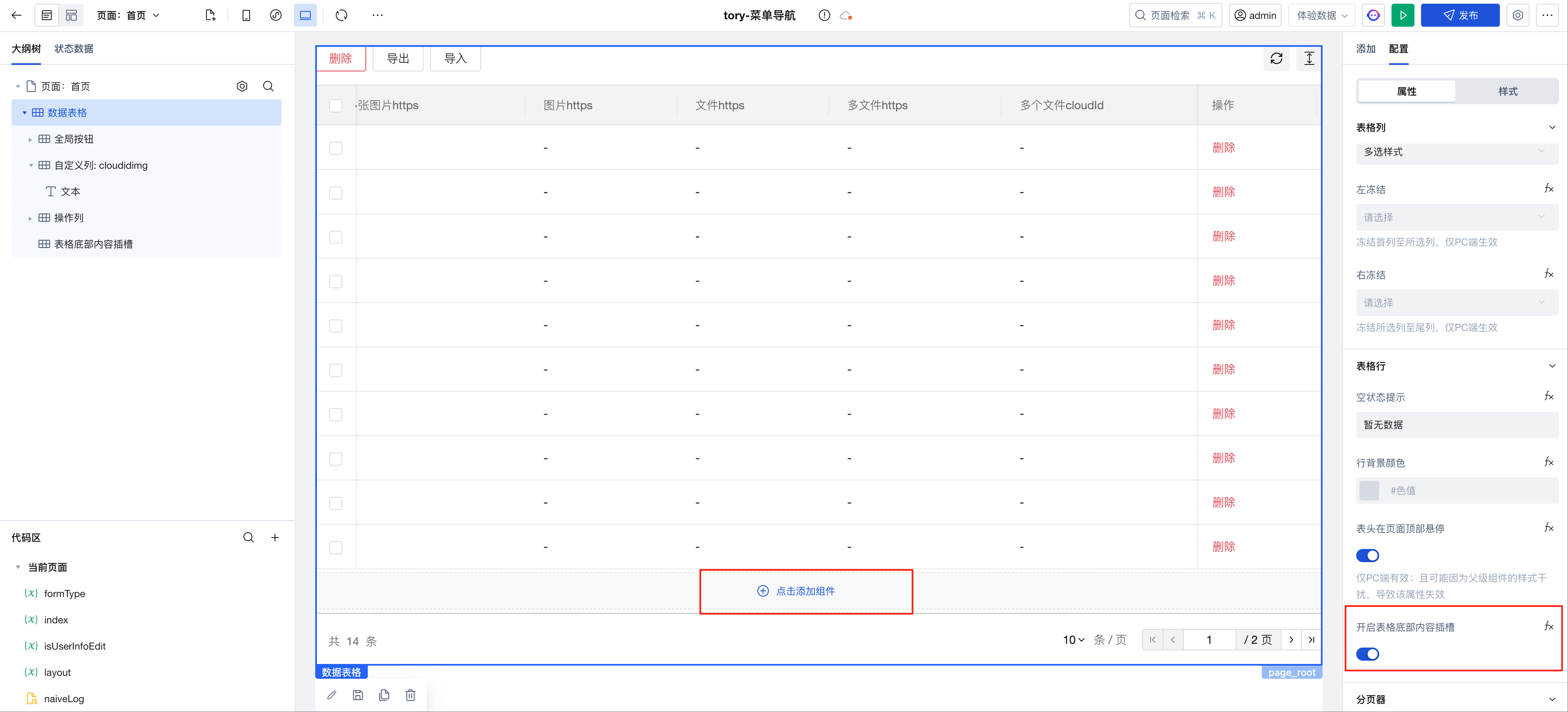
Data Table: Supports Bottom Slot
Carousel Container: Web-side support for disabling loop switching
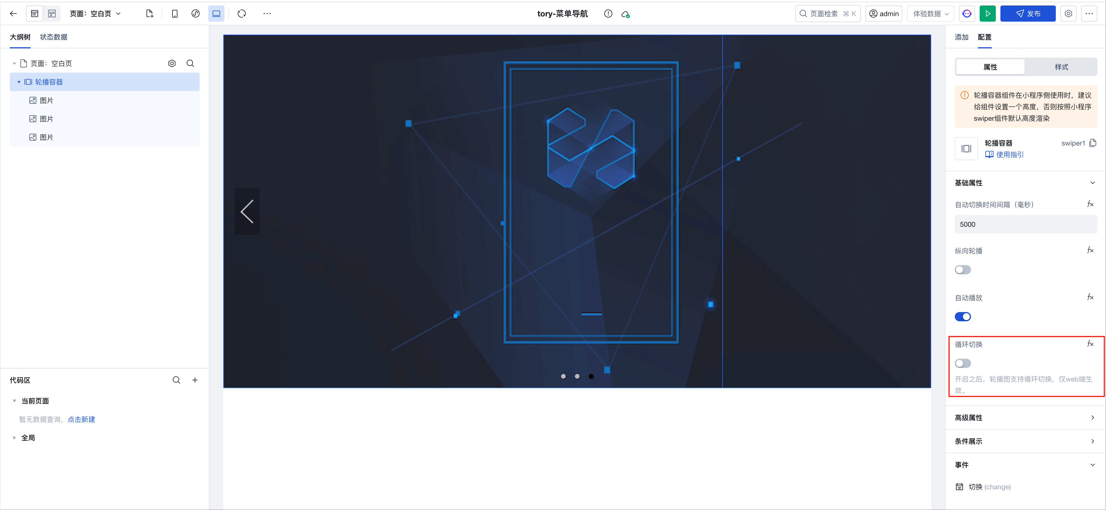
- Web-side support for disabling. After disabling, swiping right to the last page will not allow further right swiping. If loop switching is disabled while auto-play is enabled, playback will stop after reaching the last image.
- Due to limitations on the Mini Program side, loop switching is not supported, but seamless sliding is supported. Disabling seamless sliding on the Mini Program side prevents further right swiping after reaching the last page. If seamless sliding is disabled while auto-play is enabled, playback will loop back to the first image after reaching the last one.
v3.20.0
Release Date: 2025/06/11
Form Container: Optimize Form Value Management
- Optimize nested array component performance
- Optimize value calculation scenarios. For details, refer to Form Value Calculation Scenario Configuration
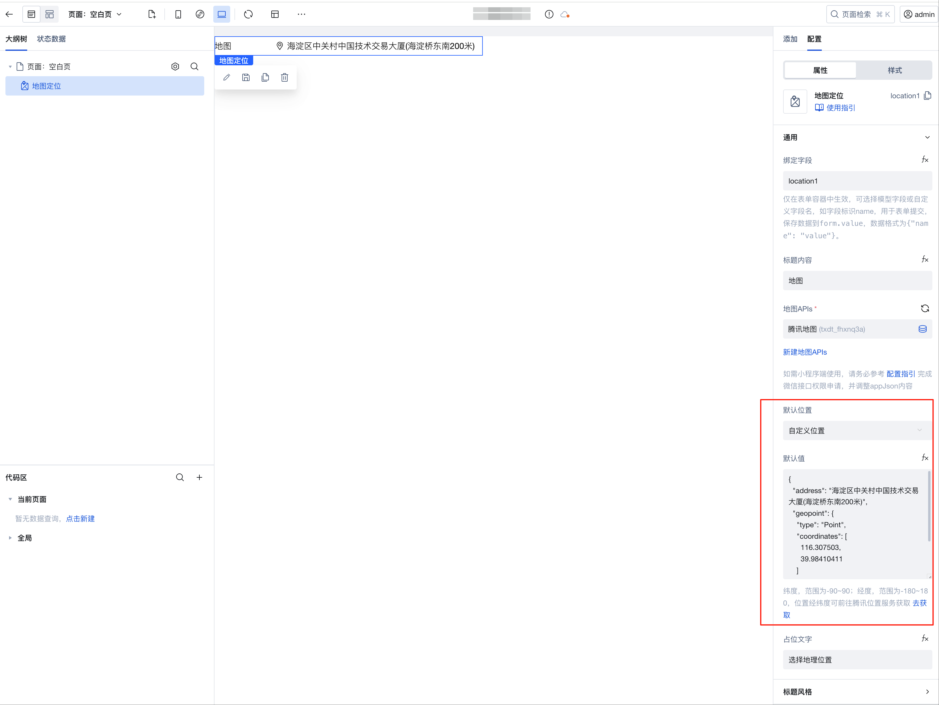
Map Location: Supports Setting Default Location
Calendar Component: Supports Configuring Earliest/Latest Dates
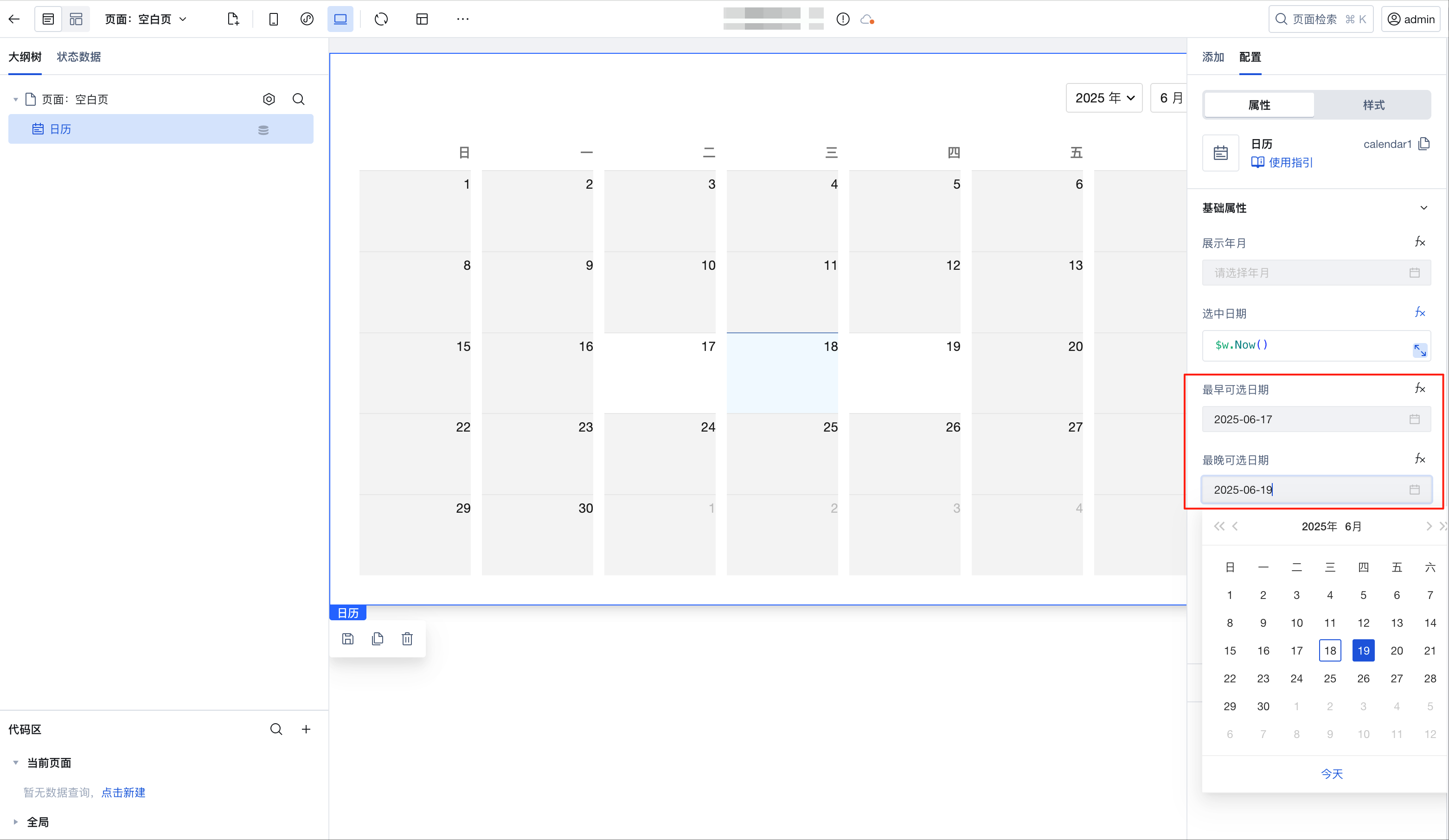
Image Upload/File Upload/Rich Text Editor: Added new value storage method, supports storing in https format
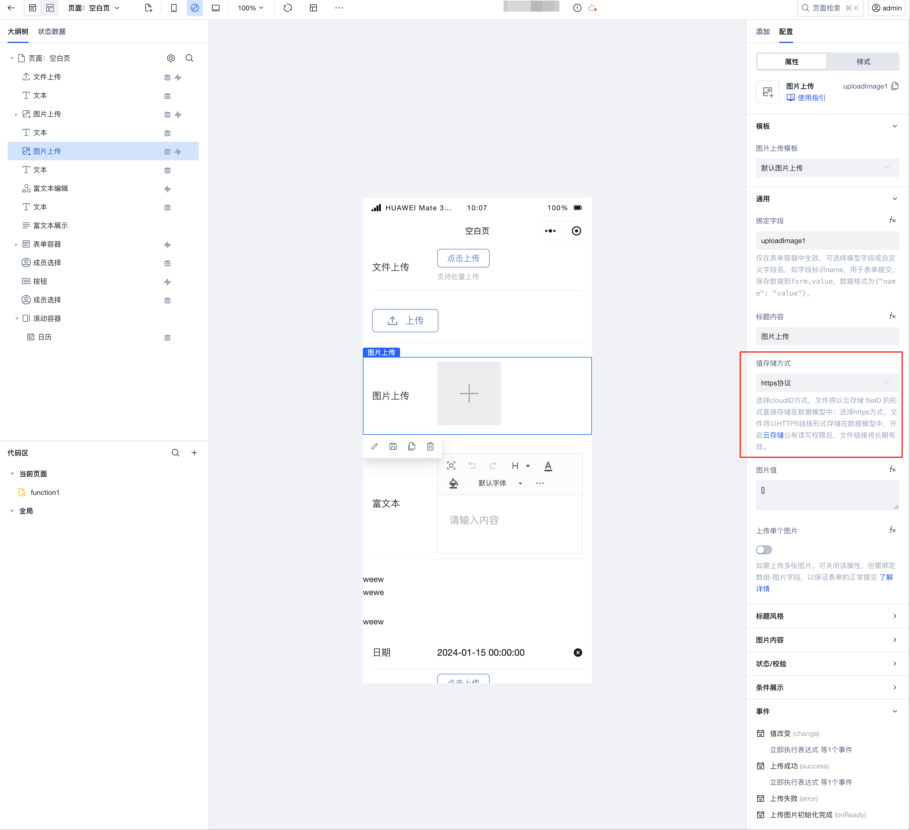
- Select the cloudID method, files will be stored directly as cloud storage fileID in the data model. Default storage is cloudID.
- Select the https method, files will be stored as HTTPS links in the data model. After enabling public read-write permissions for cloud storage, the file links will be permanently valid.
- After selecting the https storage method, the output parameters of the value change event and upload success event will also be updated to the https format, unifying the output parameter format of upload success events across multiple platforms.
v3.19.0
Release Date: 2025/06/04
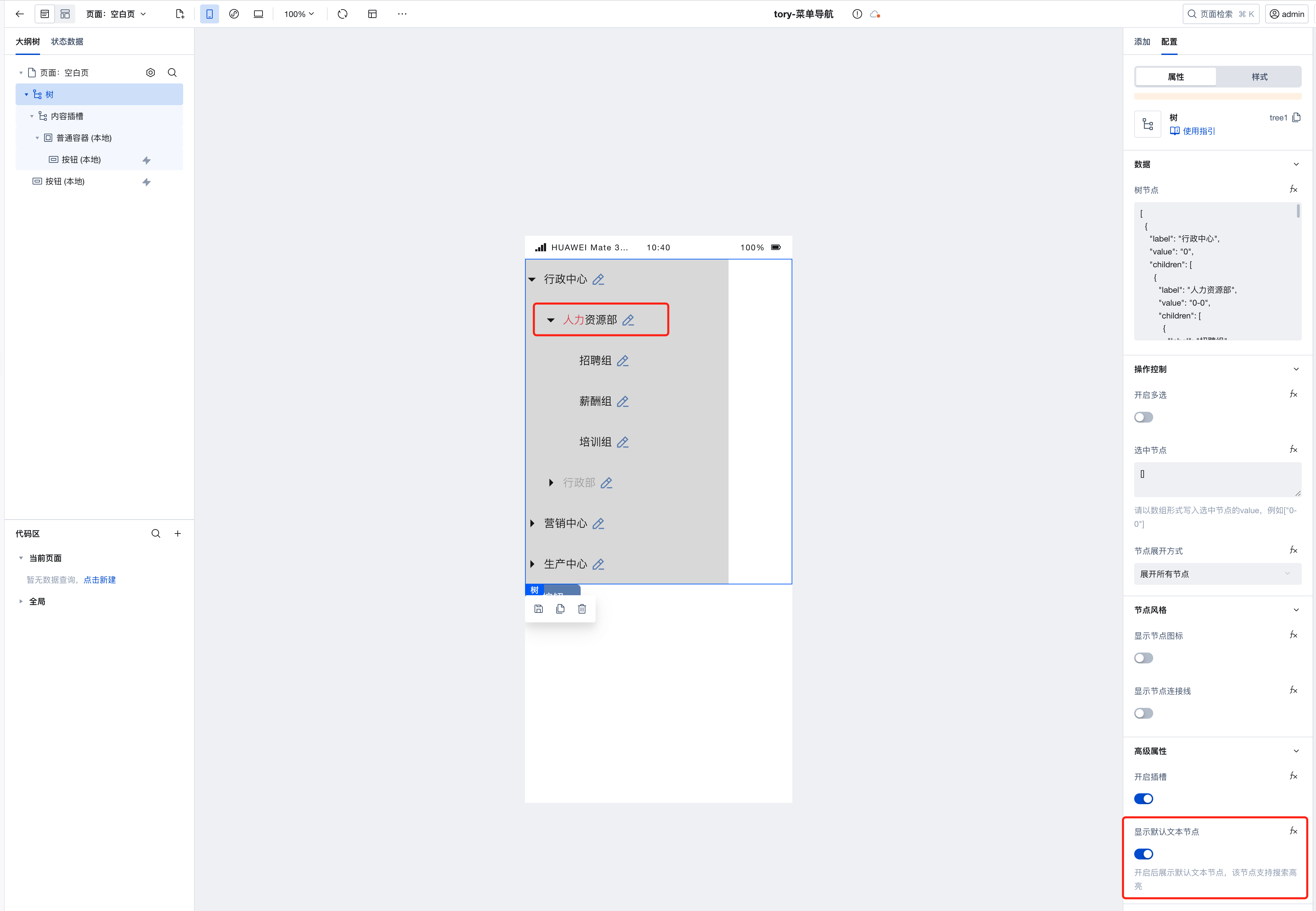
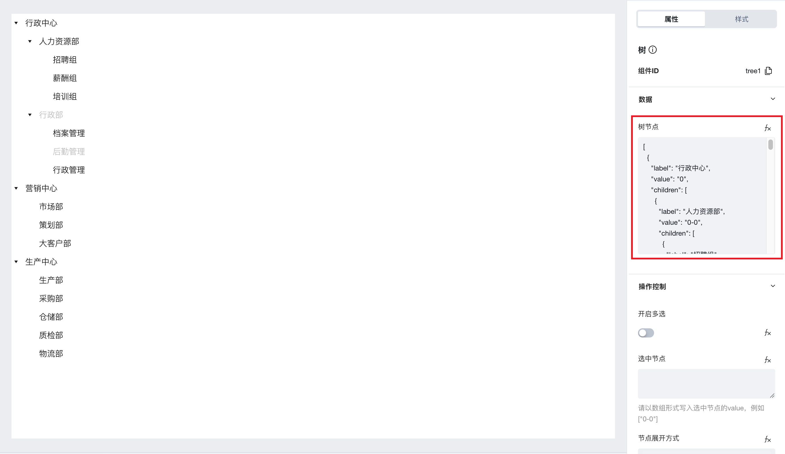
Tree Component Supports Scoped Slots
-
After the component is upgraded to 3.19.0, the tree component supports scoped slots. By selecting advanced properties and enabling the slot, the outline tree will add a content slot, allowing you to add custom content to the slot node.
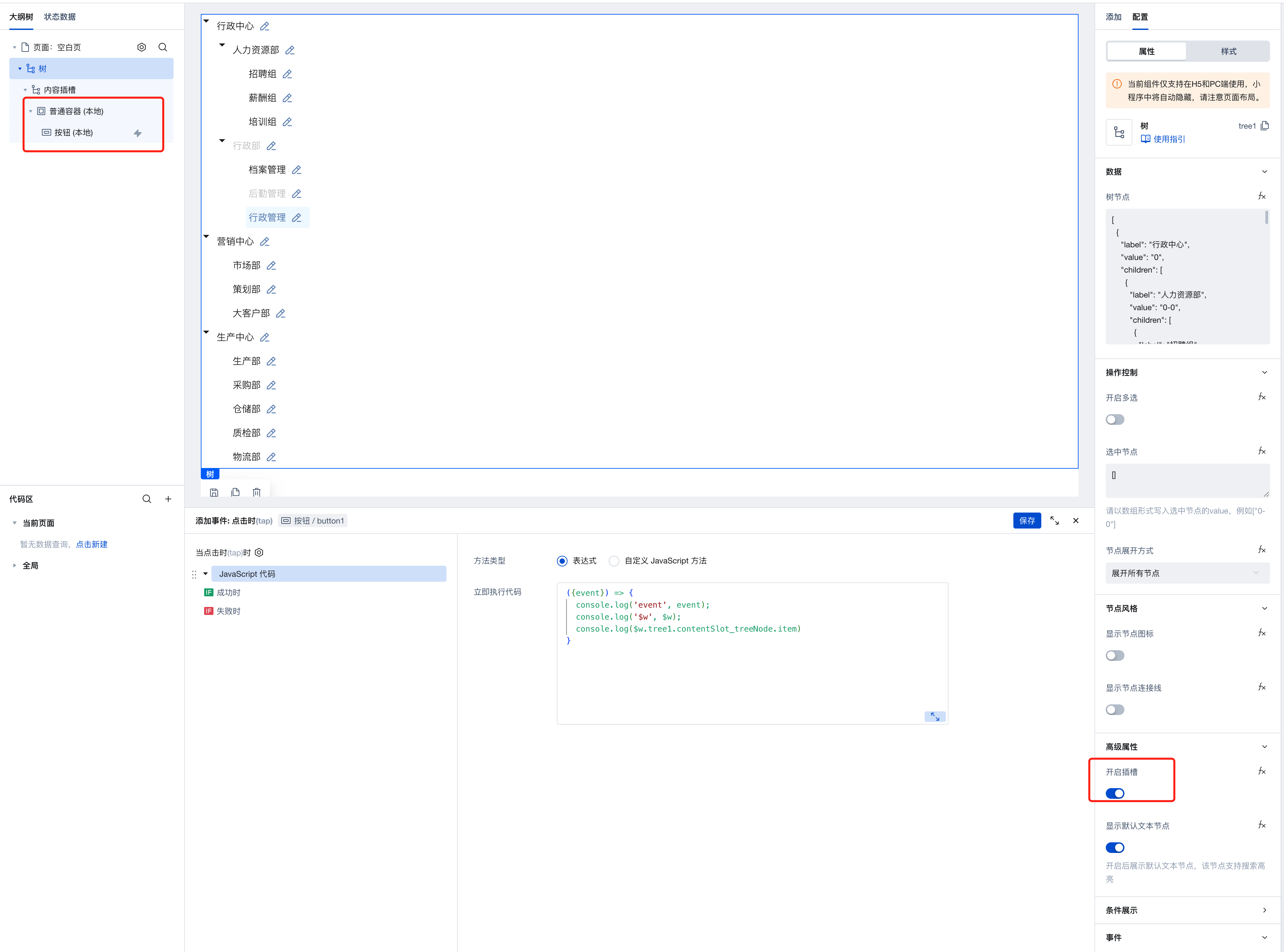
-
You can use the expression
$w.tree1.contentSlot_treeNode.itemto obtain detailed information of the tree node.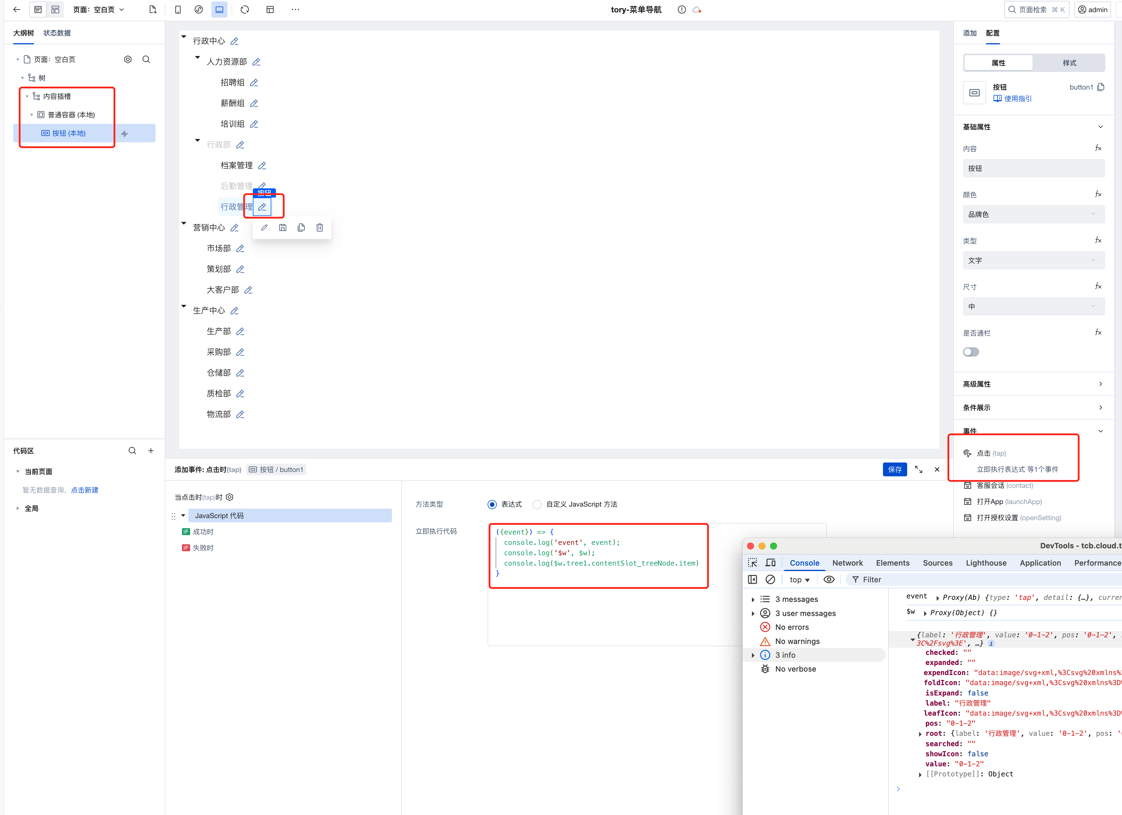
-
You can customize tree node styles via style APIs. For more style APIs, refer to the tree component documentation.
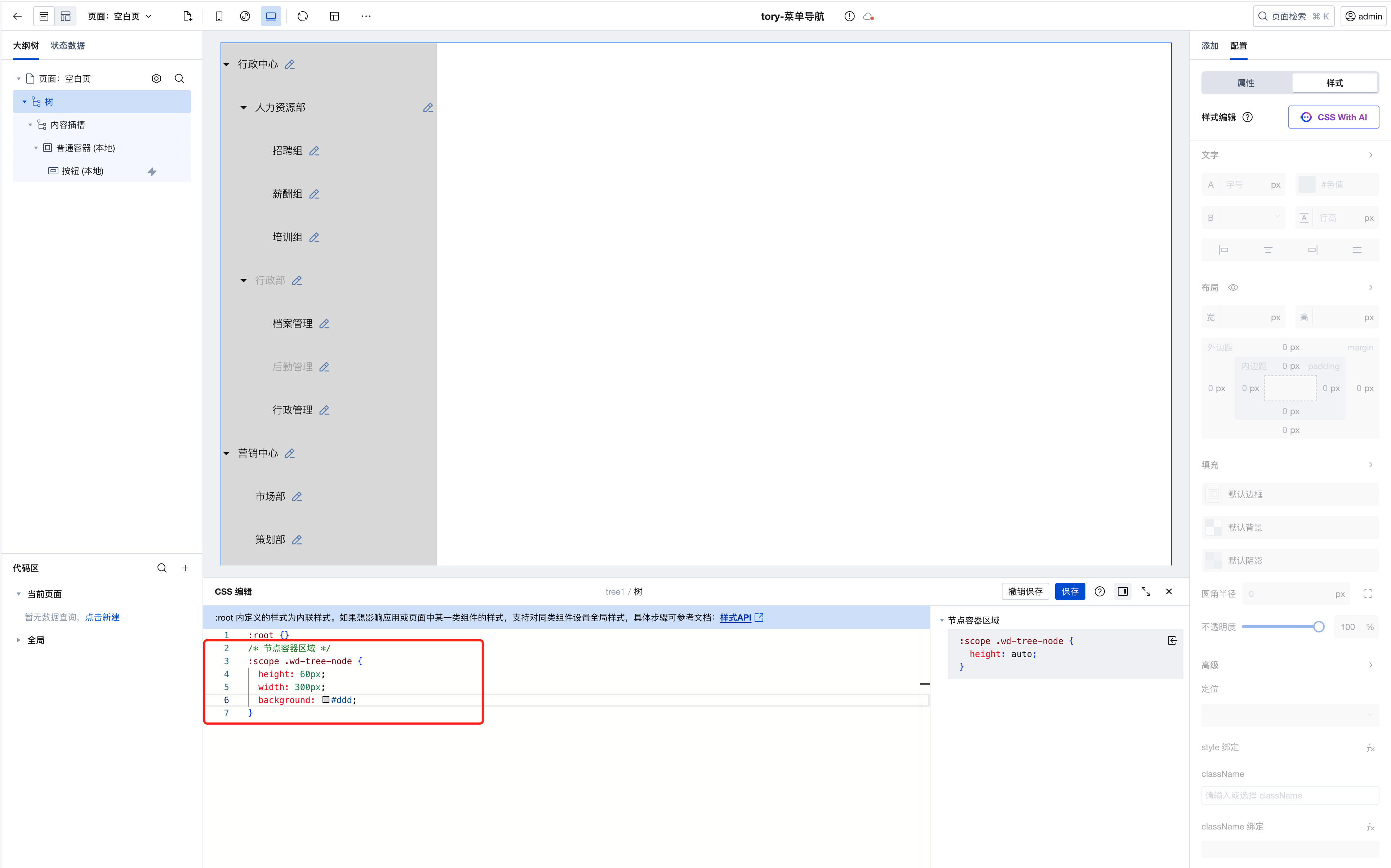
-
Default text nodes support search highlighting. You can disable this feature and customize the display via text nodes.
Nine-grid Lottery Component Supports Configuring Lottery Duration
Data Table: Supports Row Selection Event
v3.18.0
Release Date: 2025/04/18
Data Table: Table Filter Supports Configuration of Relationship Filtering
- After upgrading to component version 3.18.0, the mobile-end filter received style enhancements to improve the query experience on mobile devices. For users requiring custom styling, the filter appearance can be adjusted via the form component's style APIs.
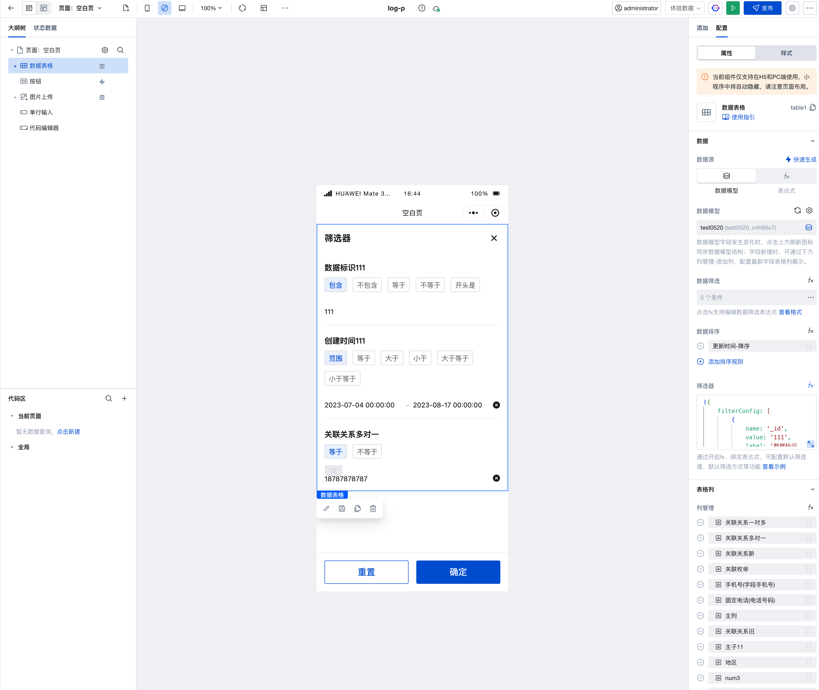
- Through custom configuration, you can set the relationFieldName field to specify the option names displayed in the relationship filter. Currently, only string-type fields are supported as option names. For details, refer to Custom Filter Configuration
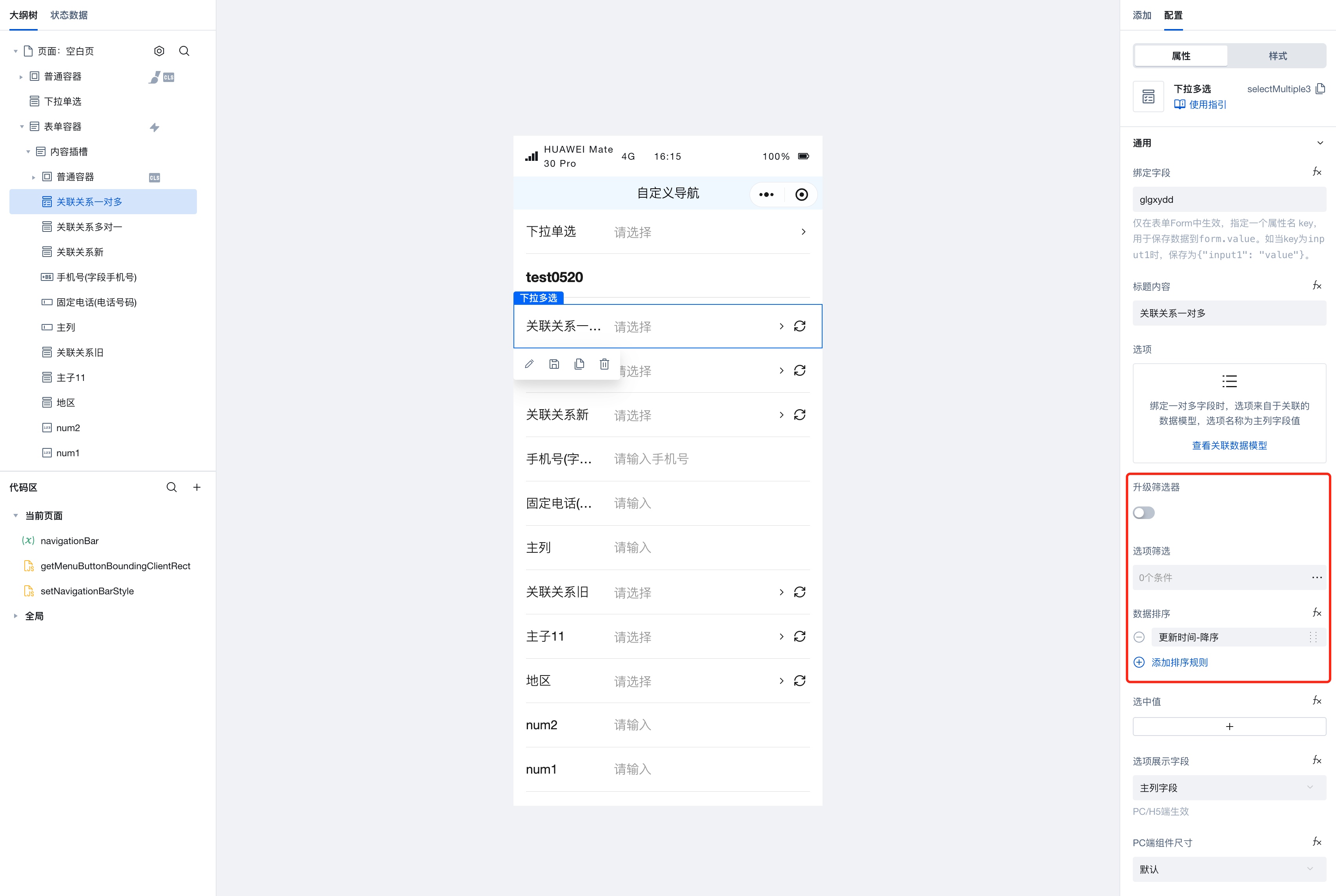
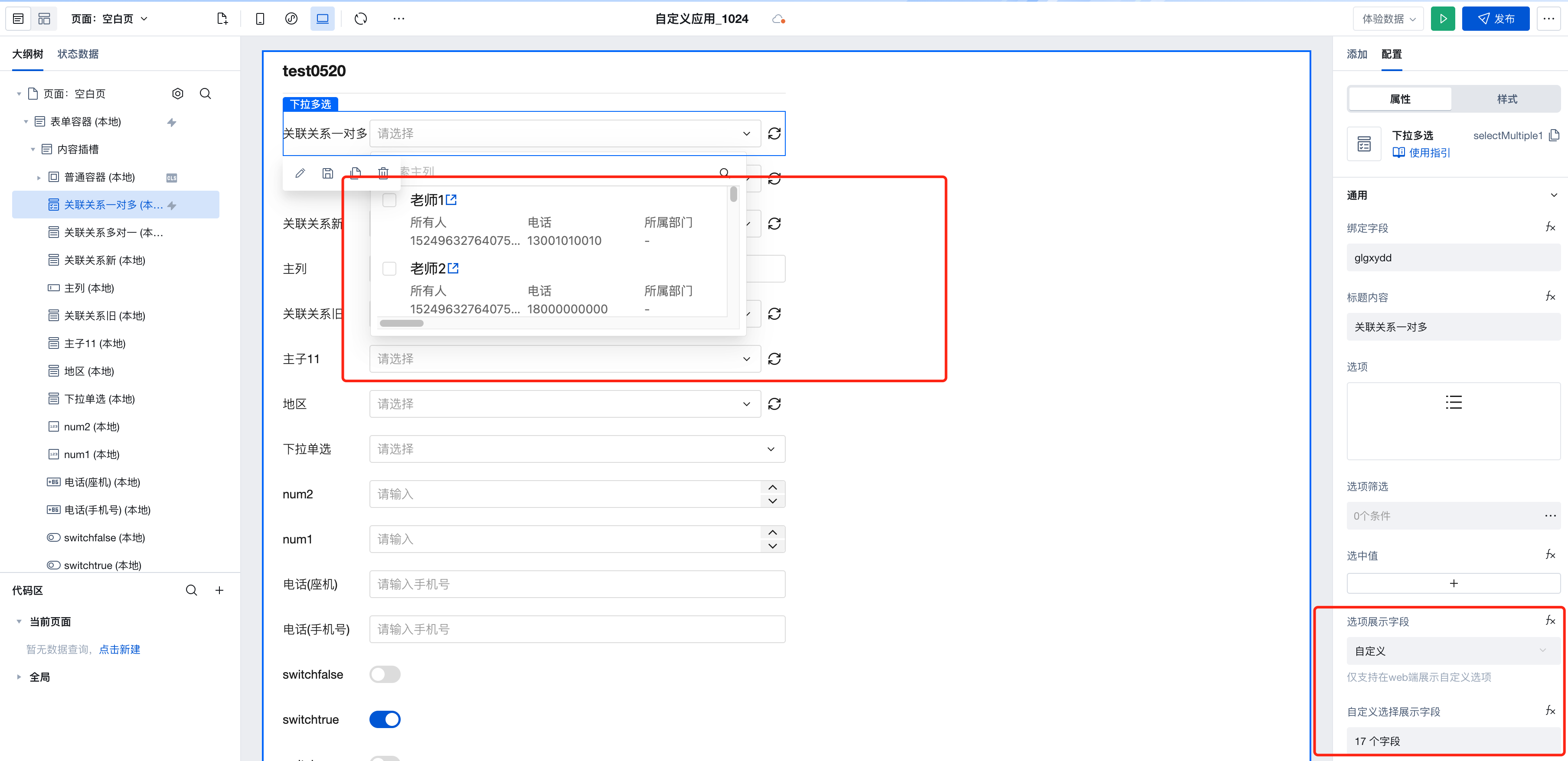
Dropdown (Single/Multi-select): Automatically Mapped Relationship Fields in Form Scenarios Support Configuring Option Names
- Currently, only string-type fields are supported as option names
v3.17.0
Release Date: 2025/03/26
Image Upload: Support for custom upload templates
- After the component is upgraded to version 3.17, image upload supports custom upload templates. The default image upload template on the web end also supports the following methods, while the default image upload template on the Mini Program end is not currently supported.
-
- Added the onReady event for image upload initialization completion
-
- Added the image upload method: upload
-
- Added the single image deletion method: delete
-
- Custom image upload path can be specified in the format pathA/pathB, stored in weda-uploader/appName/customUploadPath, with customUploadPath defaulting to empty.
-
- Added the setConfig method for updating image upload configurations, which can be configured via the property panel or updated through the method. For details, see Configuration Parameter Guide
- Added the setConfig method for updating image upload configurations, which can be configured via the property panel or updated through the method. For details, see Configuration Parameter Guide
-
Mini Program Ads: Support for Rewarded Video Ad Types
v3.16.0
Release Date: 2025/03/19
Dropdown Single/Multi Select: Added support for remote search, support for disabling search, added focus and blur events (web end)
v3.15.0
Release Date: 2025/02/17
Dropdown Single/Multi Select: Added support for sorting, enhanced filter, and added case-insensitive search
- After upgrading to component version 3.15, the Dropdown Single/Multi Select components with bound associations in forms now support data sorting, feature an enhanced filter, and offer case-insensitive search.
-
- Queries are sorted in descending order by update time by default.
-
- After clicking to upgrade the filter, if filtering rules were previously configured, they need to be reconfigured.
-
- Searches are case-insensitive by default.
-
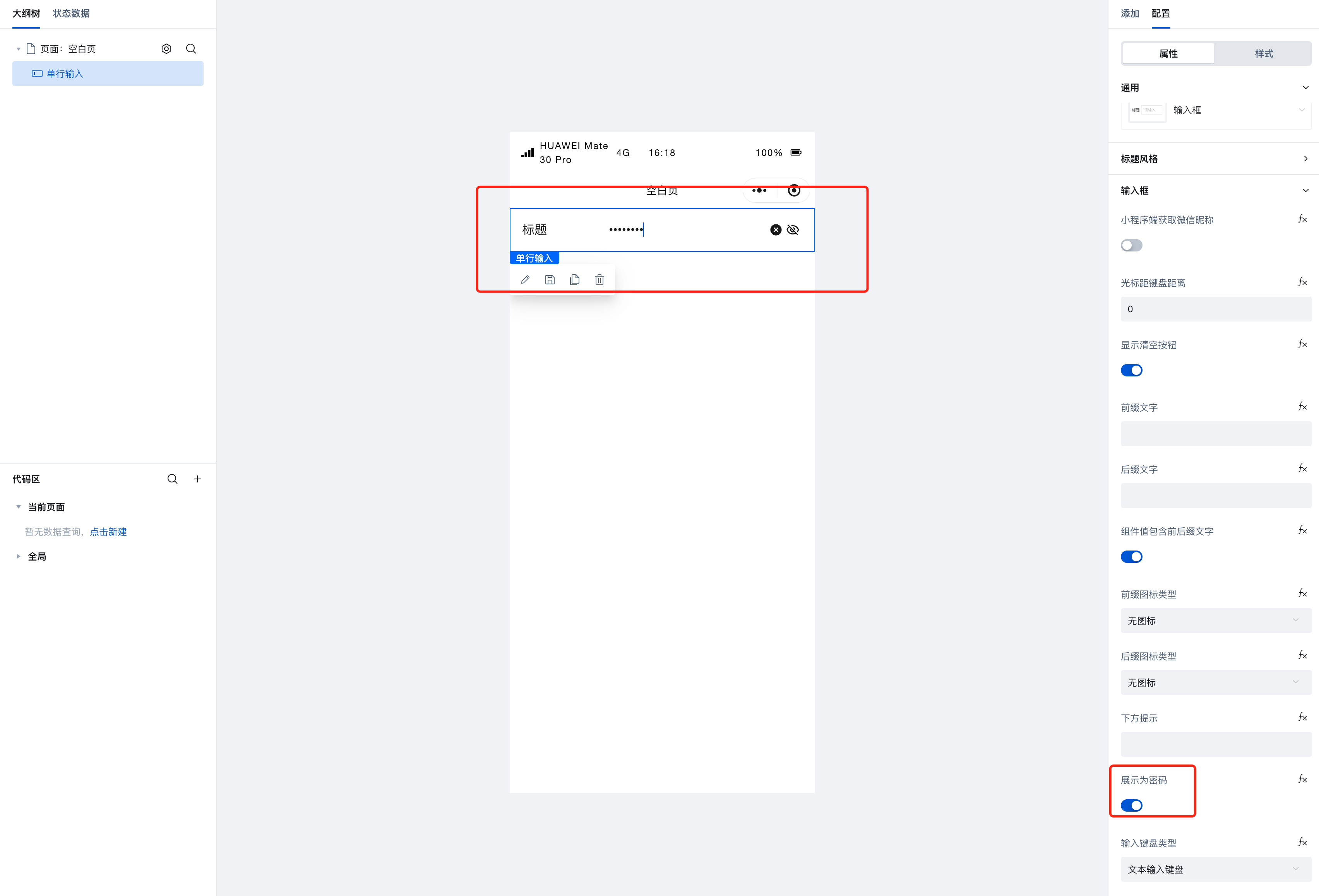
Input Box: When password is enabled, it supports controlling the display of password in plaintext.
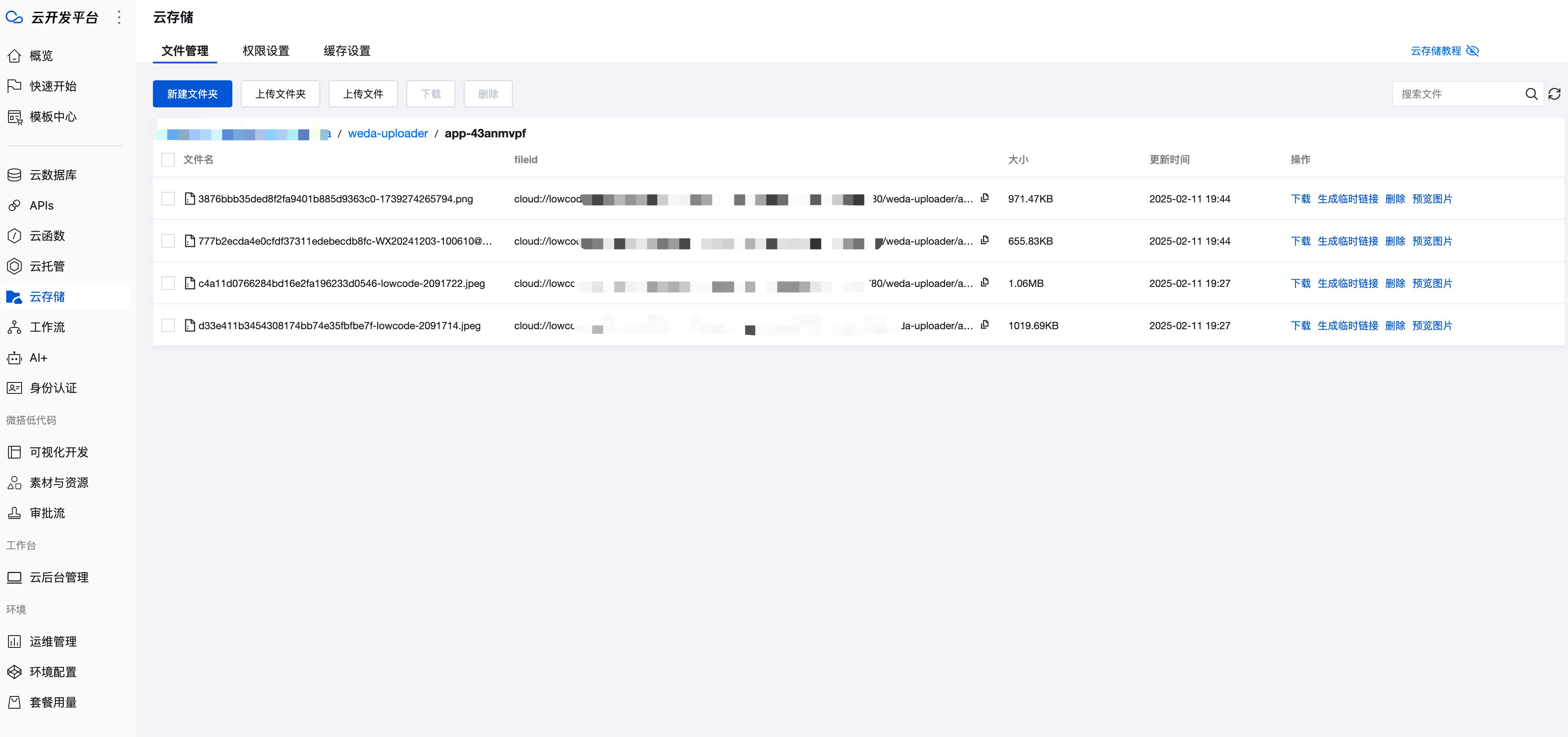
Image/File/Rich Text Upload: Default address adds an application name level
- The default storage path for images/files is
{{bucket}}/weda-uploader/{{appName}} - The default storage path for rich text is
{{bucket}}/weda-richtext-upload/{{appName}}
Data List: Added a standardized style use case.
v3.14.0
Release Date: 2025/01/22
WeChat Store products: Added customContent, logoPosition, and openPage attributes in the Mini Program.
Carousel: Added layoutType, transformType, and easingFunction attributes in the Mini Program.
v3.13.0
Release Date: 2024/12/17
WeChat Store Homepage: Added the WeChat Store homepage component
WeChat Store products: Added the WeChat Store product component
v3.12.0
Release Date: 2024/12/02
AI JSX Code Block: AI-Generated Low-Code Components
- For complex business scenarios, AI can automatically generate corresponding component code with logic based on user requirements, helping developers quickly implement business features. For details, refer to AI-generated low-code components.
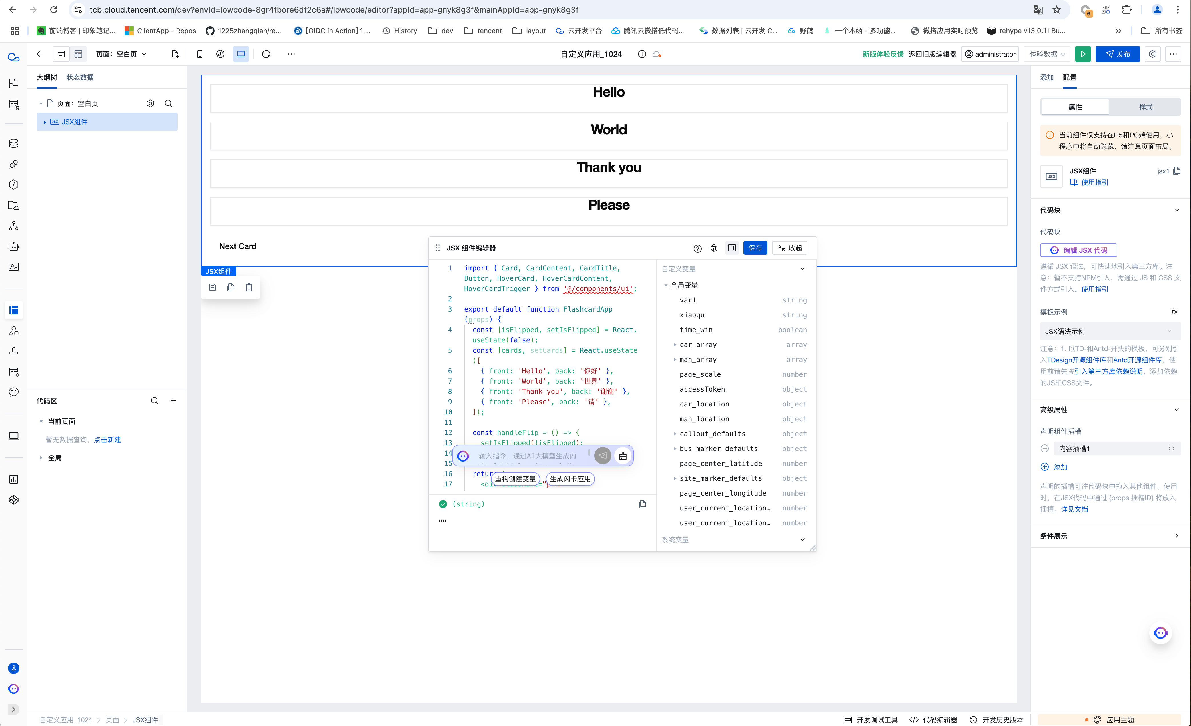
Image Upload: The image upload component supports rotatable preview and switching preview for multiple images.
Image: The image component supports rotatable preview
Table: The image fields in the table component support rotatable preview and switching preview for multiple images.
Array Nesting/Object Nesting: The array nesting/object nesting component supports multiple UI modes
-
After upgrading to version 3.12, when the array nesting component selects the object array template, it supports switching among three UI modes: card, table, and custom, while retaining the child form items inside the nested object component.
Layout Navigation: When the side expansion property is disabled, maintain the current expanded/collapsed state of the side menu
Table: Added a method to clear options.
webview: The webview component supports passing through the allow and sandbox attributes.
v3.11.0
Release Date: 2024/10/25
Dropdown Multi/Single Select: Optimized display of associated fields and enum fields on the web side
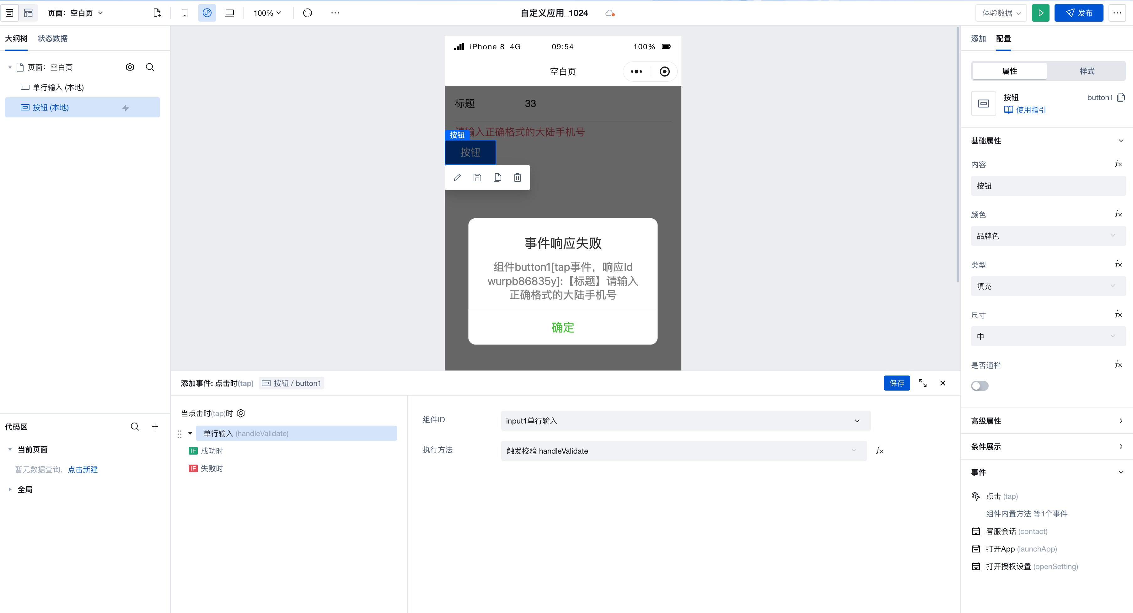
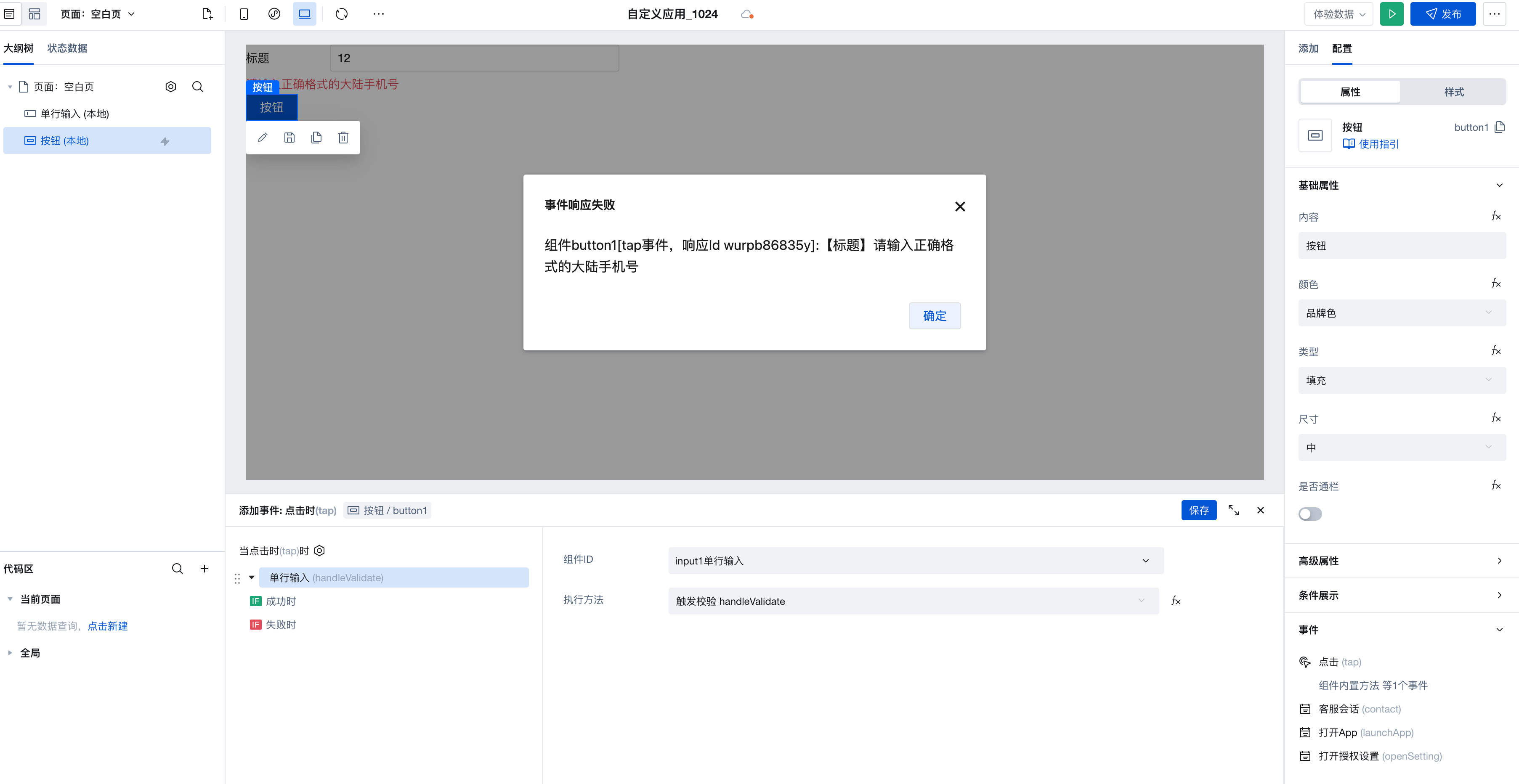
Form Item Validation: Optimized the triggering mechanism for internal validation methods in form-related components
- After upgrading to version 3.11, when form item validation fails, it follows the failure logic branch. If no failure event is configured for validation failure, a pop-up notification will display the validation failure by default. Custom logic can be achieved by configuring events.
Single-line Input/Phone Input: Updated mobile number validation rules
- Single-line input
- The mobile number validation rule has been updated to the Mainland China mobile number validation rule. Regex: /^1[3-9]\d9$/
- The landline phone validation rule has been updated to the standard phone number validation rule. Regex: /(^(0\d3-)?|^(\d3)?|^(400|800)-?)(\d8)(-\d4)?$/
- Added a universal phone number validation rule supporting domestic and international mobile numbers and landline phones. Regex: /^(+\d4[\s-]?)?((?\d4)?[\s-]?)?(\d4[\s-]?)?(\d4)?\d9(\s?(x|ext)\s?\d6)?$/
- The telephone input validation rule has been updated to the Mainland China mobile number validation rule
Progress bar: Supports displaying progress value
Menu Navigation: The menu navigation component has been deprecated. It is recommended to use the Layout Navigation component instead.
v3.10.0
Release Date: 2024/09/23
Multi-line Input: Added confirm event
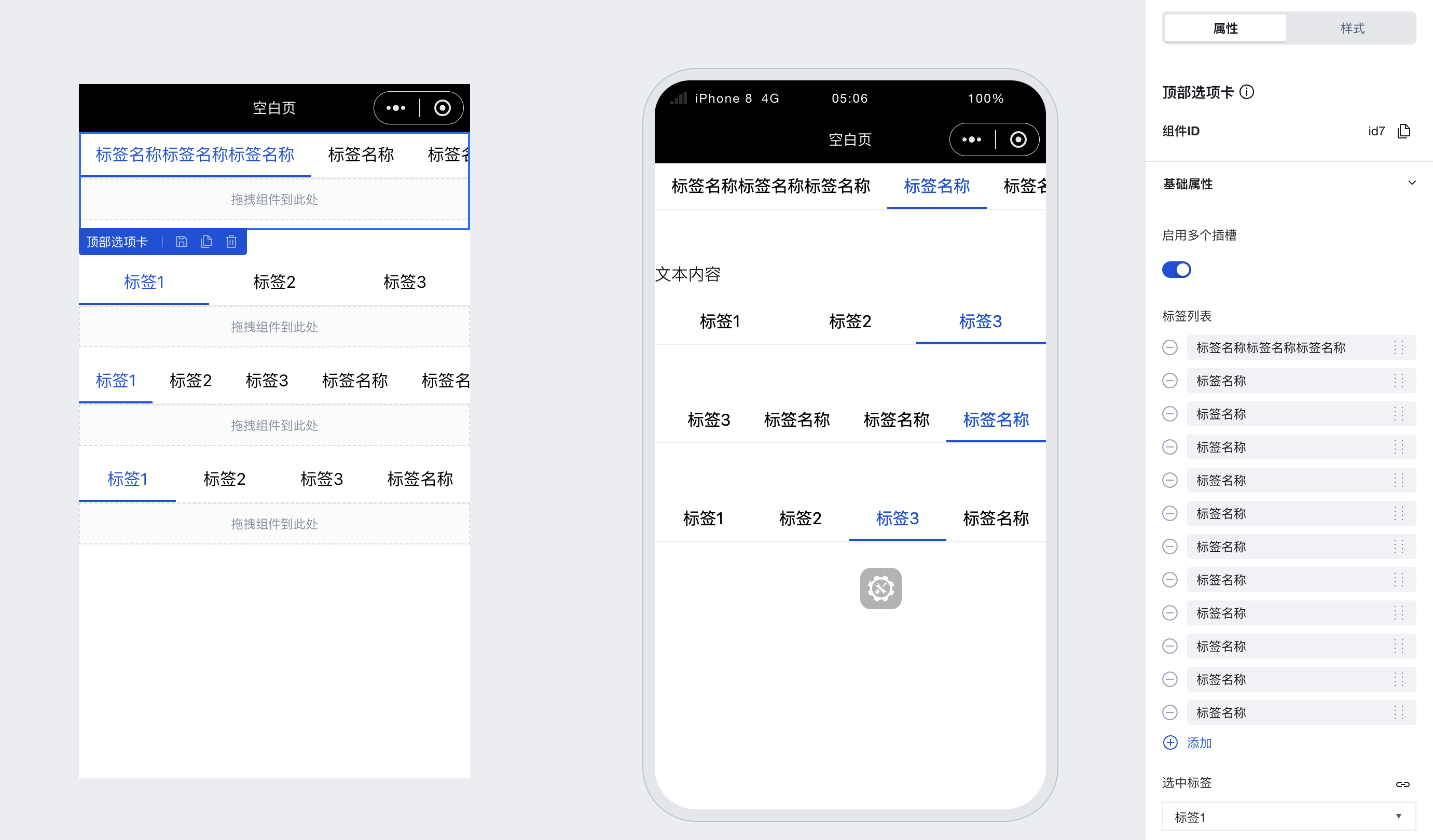
Top Tabs: Support for Dynamic Slots
Side Tabs: Support for Dynamic Slots
Dropdown Multi-select/Dropdown Single-select/Table: Optimized display of associated fields and enum fields on the web side
Image Upload: Optimized display of the upload process on the web side
File Upload: Support for customizing the upload button text
Standardizing exception messages for components
v3.9.0
Release Date: 2024/08/02
Layout Navigation: Added I-shaped Layout Template
markdown Display: Added the markdown display component
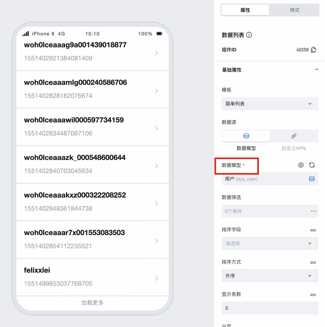
Data List: Supported Data Sources v2 Protocol
Data Details: Supported Data Sources v2 Protocol
v3.8.0
Release Date: 2024/07/18
Single-line Input and Other Input Components: Added front and rear icon click events
Single-line Input Component: Filter out empty rules when using custom validation
Dropdown Single Select/Dropdown Multi Select Component: Added filter condition attribute
Code Editor Component: Added JSON / Markdown Format
Rich Text Component: Optimized Styles
v3.7.0
Release Date: 2024/05/29
Cascading Select Component: Added
- Multi-level selector, commonly used in region selection, model configuration selection, and more.
Code Editor Component: Added
- A code editor wrapped based on React CodeMirror. A form component for assisting code input and display.
web-view: Added component method to support sending messages
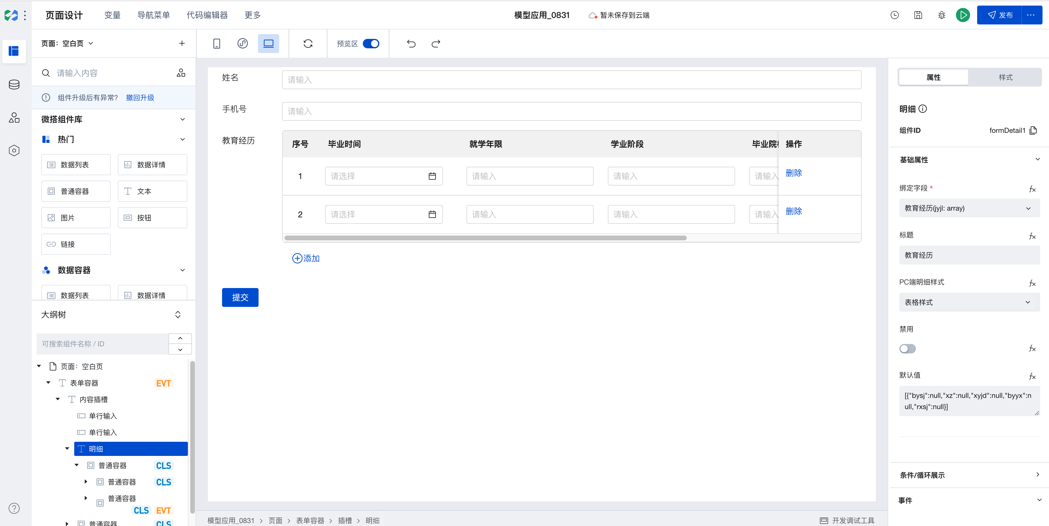
Array Nested Form Component: Added
- Provides a form feature for scenarios where array elements are objects.
Object Nested Form Component: Added
- Provides a form feature for multi-level object nesting scenarios.
v3.6.0
Release Date: 2024/05/06
Data Table
- Data Table: Added data source binding guidance, supporting quick generation of data queries and table configuration to achieve display, addition, update, and other requirements for table data.
Version Number Explanation
- Skip versions 3.4 and 3.5, synchronize the version number of npm package
@cloudbase/weda-ui
V3.3.0
Release Date: 2024/03/27
Rating Component: Added
- Intuitive rating input component
Progress Bar Component: Added
Advanced Link Component: Added
- Supports clicking on hyperlinks to navigate on the web end. Supports launching Mini Programs on the mobile end.
- Supports navigating to Mini Program pages on the Mini Program end.
Optimization of the Multi-line Input Component
- Added auto-adapting height capability
Redraw component icons, update component arrangement styles to improve the efficiency of browsing and selecting components.
Expanding the Component Icon Library
V3.2.0
Release Date: 2024/02/21
Table Component Adds Reset Filter Feature
- The Table Component now provides a "Reset Filter" option to allow users to quickly clear filter criteria when needed.
Text Component Supports Inheriting Parent-Level Color
- Optimized the color setting feature of the Text Component, which can now inherit the parent-level color, making it easier for users to apply unified style settings.
Image Component: Preview Feature Fix
- Fixed the issue where the preview could not be closed when clicking on the preview image in the image component on some mobile phones.
Map Location: Unified Method Parameter Passing
- The setValue method of the Map Location Component now has more unified parameter passing, making it easier for users to use.
Data List Added "Load Button Name" Property
- The Data List component has now added a property to set the name of the load button, providing more flexible customization options.
Image Upload Adds PC-Side Preview Support
- The Image Upload component now supports the preview feature on PC-side as well, delivering a more user-friendly experience.
Dropdown Single Select/Dropdown Multi-Select/Single Select/Multi-Select/Tag Select Component: Enhanced Feature
- These components now support disabling individual options, providing richer option settings.
- Added item api to allow users to obtain selected items.
Member Selection Component: Optimized Parameter Passing
- Optimized the handling of passing null for the condition in the Member Selection component when no filter conditions are present, enhancing the component's robustness.
Optimize form component performance
- Optimized the performance of form components, reducing rendering frequency and improving operational efficiency.
Optimize component features in subcontracting scenarios
V3.1.0
Release Date: 2024/01/10
Grid Layout component adds common layouts, improving layout efficiency.
- The Grid Layout component now offers more preset layout options, helping users design page layouts more efficiently.
Layout Navigation Component: Added Expand/Collapse Control
- Users can more flexibly control the display state of navigation items through expand/collapse features, enabling a richer interactive navigation experience.
Button and Form Event Linkage Mechanism
- Developers can now quickly configure form submission actions on submit buttons, simplifying the form processing flow and improving development efficiency.
Form Container Data Source Supports Binding to Query
- The Form Container component now supports obtaining data from MySQL databases, enabling forms to dynamically display and process content from the database.
Audio Playback Component: Added
- The newly added Audio Playback component provides two common templates, enabling users to quickly create audio playback interfaces.
- You can access the Audio Playback component official documentation to learn how to use this component.
Video Playback Component: Layout Mode Optimized
- The Video Playback component now supports layout mode control, allowing users to choose to hide the play button in the center of the video for a cleaner viewing experience.
Grid Layout Component: Underlying Implementation Optimized
- The optimized Grid Layout component is more stable when handling complex layouts, effectively preventing unnecessary scrollbars from appearing on the page.
JSX Component: Underlying Implementation Optimized
- The underlying implementation of the JSX component has been optimized, reducing unnecessary rendering and improving application performance and response speed.
Date Range Picker Component: Added
- The newly added "Date Range Picker" component simplifies the building process and reduces the difficulty of creating complex date selection interfaces.
- For developers needing to implement date range selection functionality, refer to the official documentation of the Date Range Picker component.
V3.0.0
Release Date: 2023/12/14
WeDa Component Library 'Theme Switching' feature enables one-click configuration of application color, text, and other design styles.
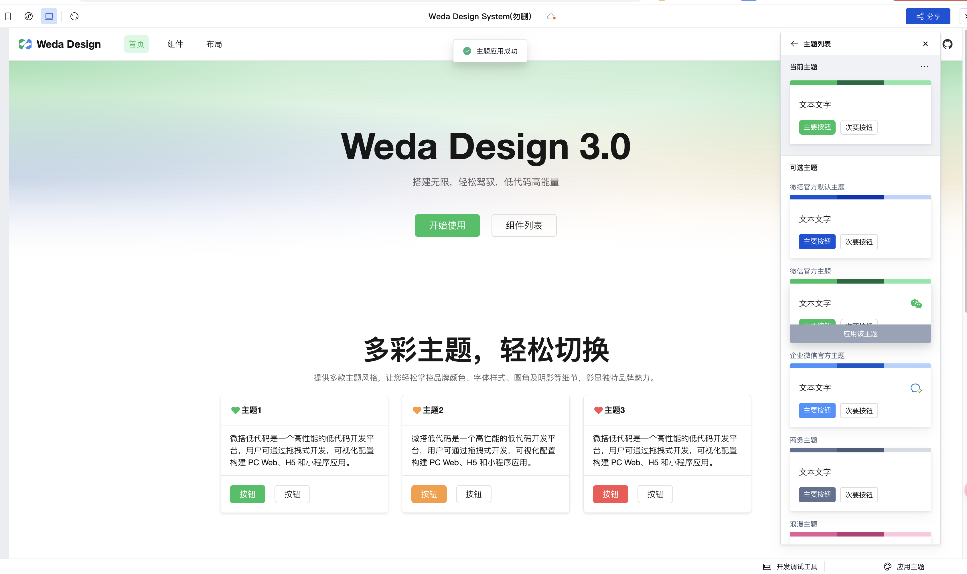
Version 3.0.0 officially launches the Theme Switching feature, allowing quick theme changes in the editor via the Apply Theme feature to adapt to brand characteristics, efficiently adjusting unified design styles including application colors, text, rounded corners, and shadows.
Form and table components provide CSS examples for the style API, enabling precise control of internal component styles.
Standardized components expose a standard Style API, solving the problem of users being unable to customize the internal structure styles of components via the low-code editor.
This version adds numerous sample code examples in the style panel->CSS editor for form/table components, facilitating user query and reference.
Resolves the issue of not knowing how to write code when overriding styles for specific components individually.
The component library adds a global click feedback effect to enhance user experience.
All components bound with tap events, such as icons and containers, feature a global feedback effect that triggers visual responses during mouse hover and click interactions.
Single-line Input component supports controlling input keyboard types and adds input value transformation configuration
Resolves the issue on mobile devices where specific keyboards (e.g., numeric keypad) are invoked for inputting phone numbers, ID numbers, verification codes, etc., but without converting the input values to numeric format.
Form Container: Optimize the querySuccess event to reduce unnecessary triggers
Map Location component optimizes real-time current location update logic
Icon component supports displaying images from cloud storage in custom icon mode
Generic Container component supports data properties and APIs
When developing blocks, you can use the Generic Container to declare configuration information, and then reference context variables via the property API inside the container.
When reusing blocks, only the configuration information on the container needs to be updated, resulting in a more flexible and efficient process.
File Upload component: File download feature compatible with older WeCom client versions
Due to older WeCom client versions not supporting opening blob or dataurl type files, the new version adopts the method of directly opening file links to ensure basic usability, which is compatible with most browsers.
After the change, due to the browser's default policy, clicking to download image-type files will open them in a new page.
Other types of files such as pdf, XLSX, doc, etc., can generally be downloaded normally during testing.
Rich Text Component: Compatible with older browser versions
Form-related components: Decoupled validation behavior from configuration field names
Form validation is no longer related to whether field names are configured. Even if no field names are configured or duplicate field names exist, validation can be triggered normally.
Input components display a clear button by default
Facilitates user operations and eliminates the need for additional configuration.
Optimize component implementation with global mask layer for compatibility with more scenarios
Compatible with scenarios such as cloud backend operations
Tab Bar component optimized and standardized, supporting style APIs and property APIs.
File and Image Upload components support pre-upload function configuration, enhancing flexibility.�
Addresses the need for users to store resources on other servers in certain scenarios.
Added Tab Bar Navigation Layout and Navigation Bar Layout templates, addressing mobile layout issues.
Added Mini Program "Ads" component for displaying WeChat ads in Mini Programs.
V2.36.0
Release Date: 2023/10/30
Added canvas component
Data Table component supports hover effects for headers and pagination
Data Table component supports configuring field query scope
Data Table component supports triggering queries by pressing the Enter key in the filter input box
Video Player component supports relevant APIs and events, enabling flexible control
Graphic Card component has been removed. It is recommended to use the card template of the Data List component instead.
The Data List component has modified overflow-related configurations and supports internal sticky effect settings.
Map Component optimized styles for three platforms
Data Table component supports customizing column field formatting
Form Container component triggers the validation method and initiates the failure process upon validation failure; added trigger events for validation success and failure.
Card component has added a collapsible panel feature template
Menu Navigation, Link, Grid Navigation and other components support jumping to pages in sub-packages
Image Upload component supports restricting to only taking photos / selecting from gallery
File Upload component on Mini Program supports choosing sources such as album and camera
Optimized the default location logic of the Map Location component
Optimize the binding expression logic of the Data List component
Optimize the error message for the "Get Phone Number" component
V2.35.0
Release Date: 2023/10/11
Added application layout capability to enable unified layout and reuse across pages.
Added left navigation layout, top navigation layout, factory-style layout, and other common layouts.
Added Tag and Tag Select components
Image Upload component supports pre-upload image compression
Optimized the Menu Navigation component and standardized component styles.
Optimize the data loading performance of the Form Container component
Optimized the styles of the Nine-grid Lottery component across different screen sizes
Optimize the display styles of the File Upload component across multiple platforms
Optimize the styles of the Image Upload component in read-only/disabled states
Optimize the default width of Image Upload / Rich Text Editor on PC side
Optimize dropdown single-select / dropdown multi-select, change 'Clear' to 'Cancel' on mobile devices.
Optimize the code size of components in mini-programs
V2.34.0
Release Date: 2023/09/11
Added JSX Code Block component for quick integration of third-party components
This is a versatile source code component that enables quick integration of external components, such as third-party open-source libraries like TDesign and Antd. It can be configured to implement various components including watermarks, step bars, cascading selectors, ratings, slider inputs, and more.
For details, refer to the JSX Code Block component documentation
Calendar component optimized and standardized, supporting style APIs and property APIs.
Form Container component supports multi-column layout per row
Data List component added loading status property control
Data List component template design upgraded and optimized, added product list template
Data List component added pagination change event for mini-program
Layout components style optimized with support for mini-program
Single-line Input component and Multi-line Input component compatible with Chinese input methods
Rich Text Display Component: Optimized Image Loading Experience for Mini-Programs
Global component optimization: Disabling unused style configurations
V2.33.0
Release Date: 2023/08/24
Comprehensive form components standardization and optimization
- Optimized property classification and naming
- Standardize style structure
- Supports configuration of title width, alignment, and tooltip text
- Expose properties/methods API
- Supports quick value retrieval and assignment operations
- Removed horizontal full-width property
- Component width can be directly configured via the style-width property
- Supports toggling between edit/disabled/read-only states
- Added prefix/suffix text/icon configuration for some components
Support for Search Style Templates in Single-line Input Component
Standardized upgrade and user experience optimization for Top Tab Bar and Side Tab Bar components, supporting property APIs and style APIs.
Dropdown List Component supports search event
File Upload component: Added file value property to facilitate configuration of default file resources; supports custom file format restrictions.
Time Selection: supports selecting the "Hour:Minute:Second" time mode
Data Table component supports displaying image fields and others in new relationships
V2.32.0
Release Date: 2023/08/02
Form Container Component: Optimized Title Style and Layout Style
Added echart object to Widget API in More Chart Components
You can obtain the echarts object via the chart Widget API $w.chart1.echarts, which supports configuring more advanced chart effects, such as gradient fills, etc. This is equivalent to directly importing echarts in the project, allowing you to directly call its internal methods to perform corresponding operations, for example, echarts.color, echarts.graphic, etc. For specific details, see the official Echarts documentation.
For details, refer to the More Chart Components documentation
Performance optimization for form components
When the user input value changes, you can obtain the real-time value via Widget API such as $w.input1.value in the change event callback
Data List component template optimization
- Optimize text types in templates by filtering rich text types
- Optimize line types and colors in templates
Data Details Component: Supports Displaying Rich Text Content
- When template content contains rich text components, use rich text display components to render them
Rich Text Display Component: Optimization
- Optimize the default template for rich text
- Optimize the presentation of images in rich text by adjusting the maximum image width
Detail Component: Default Value Optimization
After the default value property of the detail component is bound to a variable, the detail data updates in real time.
Carousel Container Component and WeChat Official Account Follow Component Property Configuration Optimization
Component declarations and documentation improvements, partial deprecated components have been removed
Optimization of Read-only/Disabled States for Components such as Multi-select, Multi-line Input, and Detail Component
Optimization of Input Component: Displaying Prefix and Suffix Text in Read-Only Mode
Optimize Form Container Loading Performance
Optimization of Data Table Filter Panel Display on iOS
Optimization of Image Component Loading Effects on the Web
Data Table supports displaying image fields and other types in related models
V2.31.0
Release Date: 2023/07/13
Data List Component supports expressions for data sources.
New feature: The Data List adds binding expression data, and original API paths are optimized to expressions. Note: The array must include the _id field by default. When the input expression changes, it triggers automatic generation of list fields. Therefore, it is recommended to input the expression first before adjusting the style.
Data Detail Component supports expressions for data sources.
New feature: Data Detail adds binding expression data, and original API paths are optimized to expressions. Note: When the input expression changes, it triggers automatic generation of detail fields. Therefore, it is recommended to input the expression first before adjusting the style.
Card Component Supports Mini Program Side
For details, refer to the Component Documentation
Data Container Components: Data source APIs are discontinued, expressions are recommended.
V2.30.0
Release Date: 2023/06/08
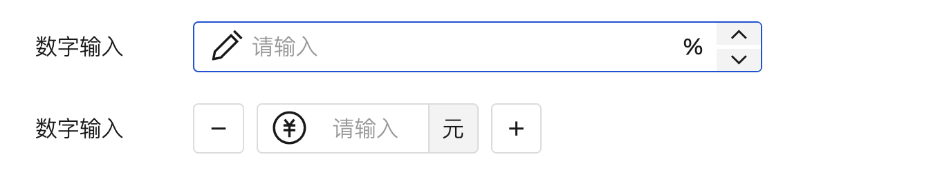
Number Input Component has been added
For details, refer to the Component Documentation
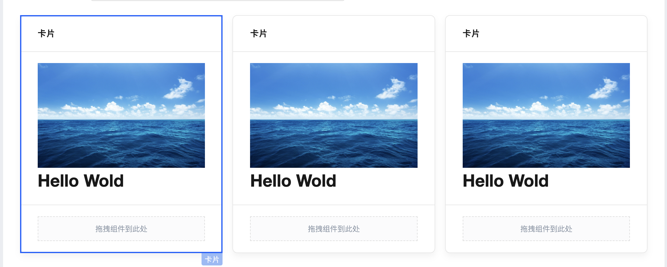
Card Component has been added
For details, refer to the Component Documentation
Layout Component has been added
For details, refer to the Component Documentation
Date Time Picker optimized and standardized, with added style APIs and property APIs.
For details, refer to the Component Documentation
Data Table Component supports expressions for data sources, with property API optimization
Grid Layout component standardized and configuration optimized, with added style APIs and property APIs.
Data Table Component and Form Component support many-to-many and one-to-many relationships.
Loop Display Component default template and configuration items optimized
Data Container Components API request performance optimization
Form Components View Mode Style Optimization
V2.29.0
Release Date: 2023/05/30
Modal Component standardized and experience optimized, supporting property APIs and style APIs.
For details, refer to the Component Documentation
Form Container Component standardized and experience optimized, supporting property APIs and style APIs.
For details, refer to the Component Documentation
Data Container Components Error Message Optimization
Runtime Reactivity Tracking Optimization
Dynamic scaling windows no longer switch between PC and mobile, but only display responsive styling.
V2.28.0
Release Date: 2023/05/18
Added More Charts Component
Added More Charts Component, enabling batch quick integration of all Echarts charts such as area charts, funnel charts, scatter plots, etc., with customizable chart color schemes.
For details, refer to the More Chart Components documentation
Runtime Size and Loading Performance Optimization
Optimize the size of components and runtime, reduce the volume of application artifacts, and enhance application access performance.
V2.27.0
Release Date: 2023/05/12
Added Tree Component
It supports displaying multi-level data content in a tree structure, such as organizational structures, material information, customer classifications, etc.
For details, refer to the Tree Component Documentation
Added "Official Account Follow" Component
The Official Account Follow component can be configured within Mini Programs, enabling users to quickly follow Official Accounts.
For details, refer to the Official Account Follow Component Documentation
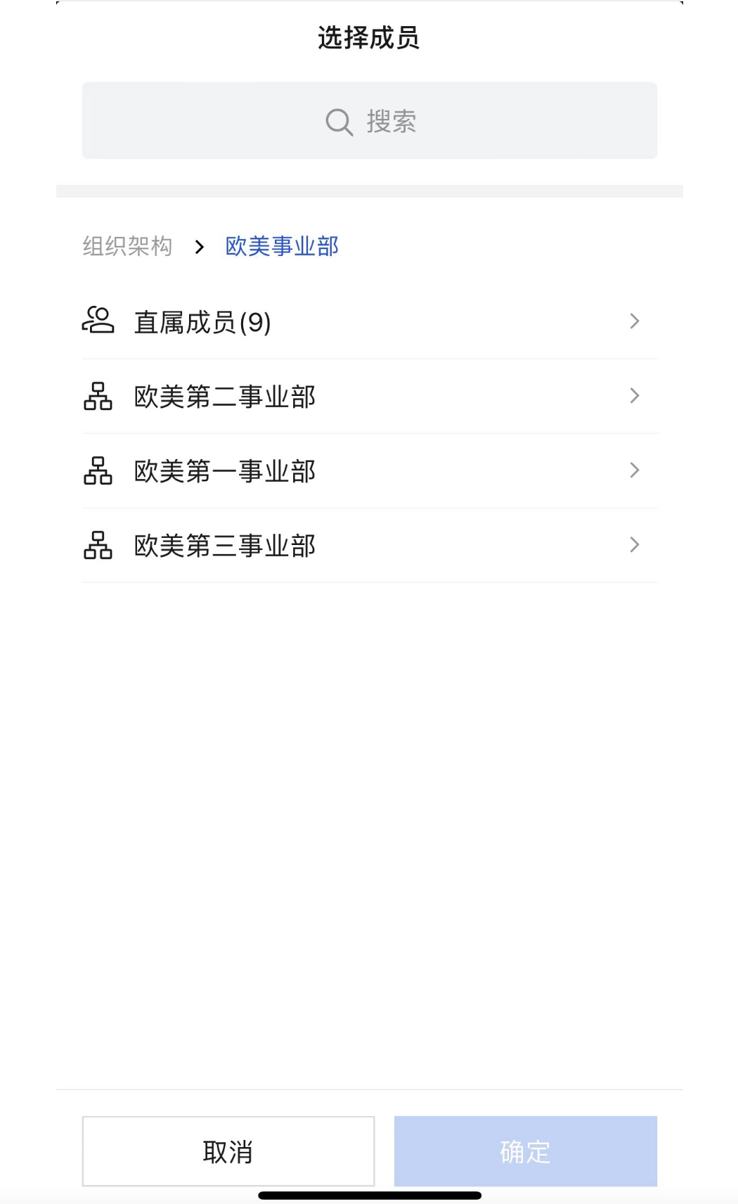
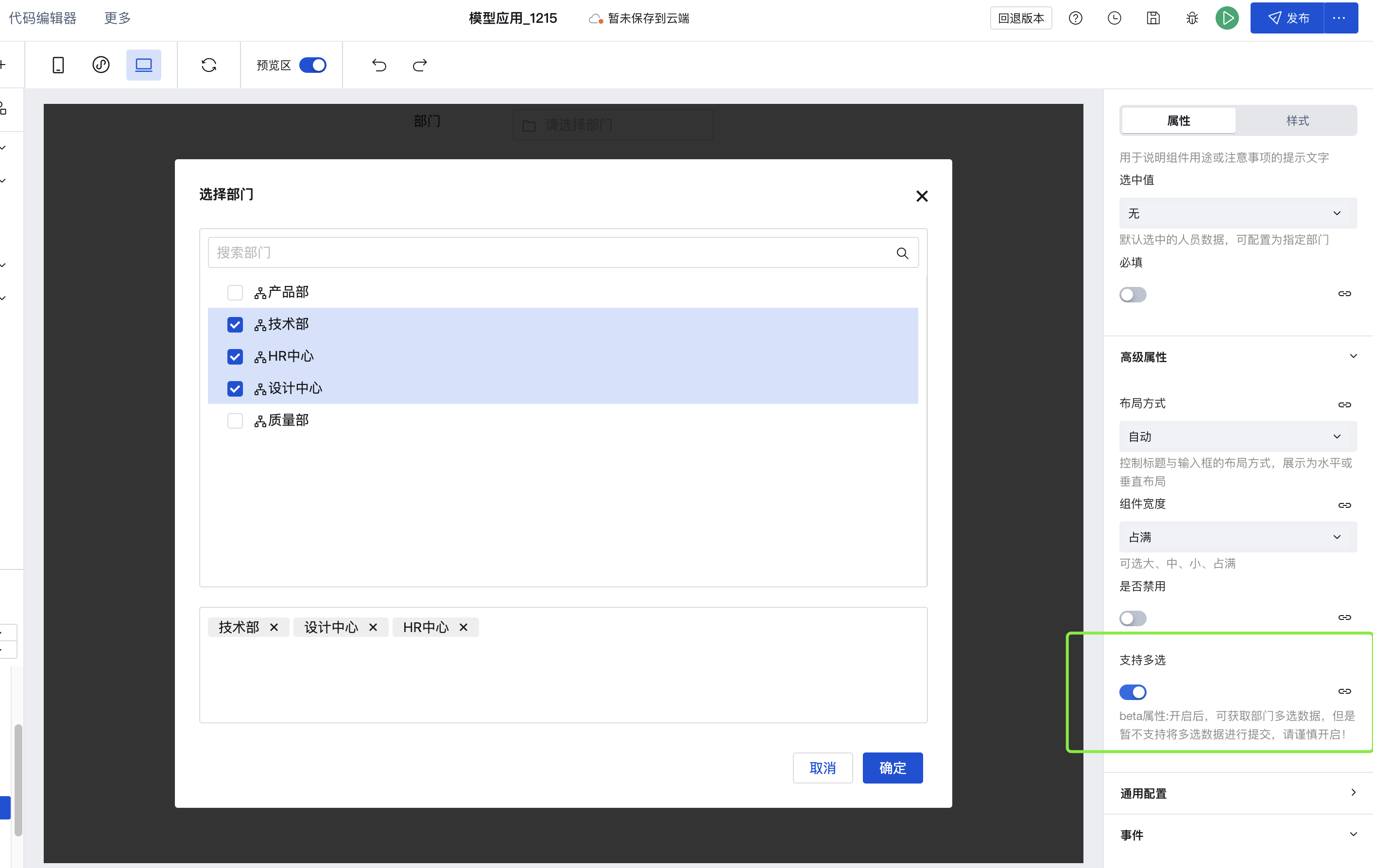
Member/Department Select Component: Supports displaying and selecting department and member data for interconnected enterprises
Data List and Data Detail Components support obtaining query component data via $w.componentId.property
For details, refer to
V2.26.2
Release Date: 2023/04/20
Form Components Standardization Upgrade
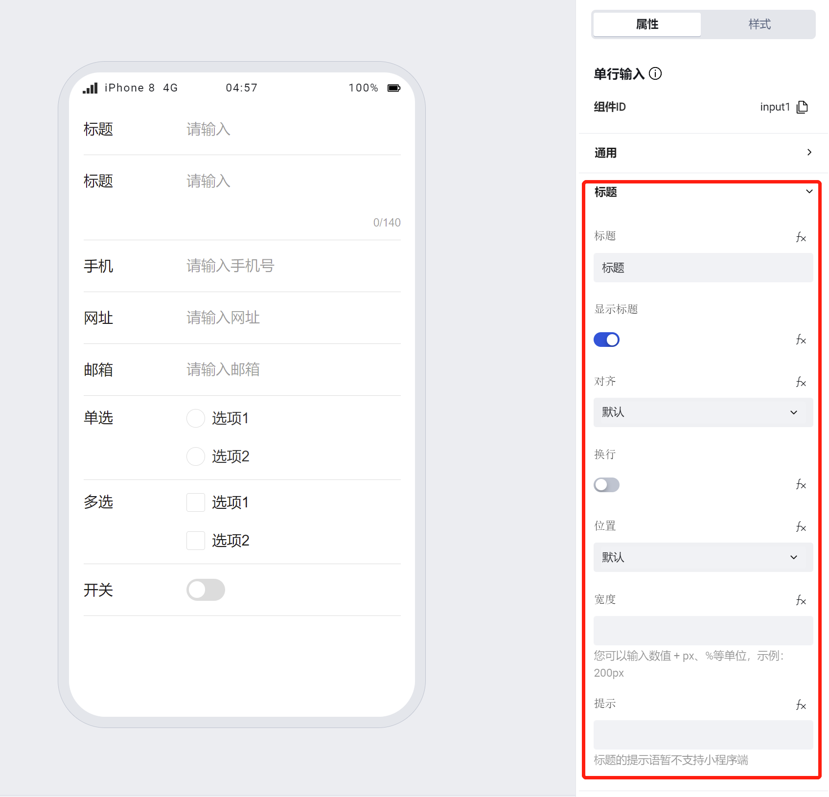
Standardized upgrades have been implemented for single-line input, multi-line input, URL input, phone number input, email input, toggle, radio, and checkbox components.
The common newly added capabilities for the above components include:
- Component size and whether to span horizontally can be configured (effective on PC but not on mobile)
- Supports personalized configuration for titles, including content, alignment, line wrapping (when enabled, titles exceeding one line wrap to display; when disabled, titles exceeding one line show with ellipsis), position, width, and tooltip text
- Provides component Widget API to read and write values of form input components, set read-only or disabled states, etc.
- Provides component external style API to address the issue where users cannot customize internal structure styles of components via the low-code editor
Note:
- If a component is within a form container, its size, title alignment, position, line wrapping, and width will default to the property configuration of the form container
Single-line Input Component: Standardization Upgrade
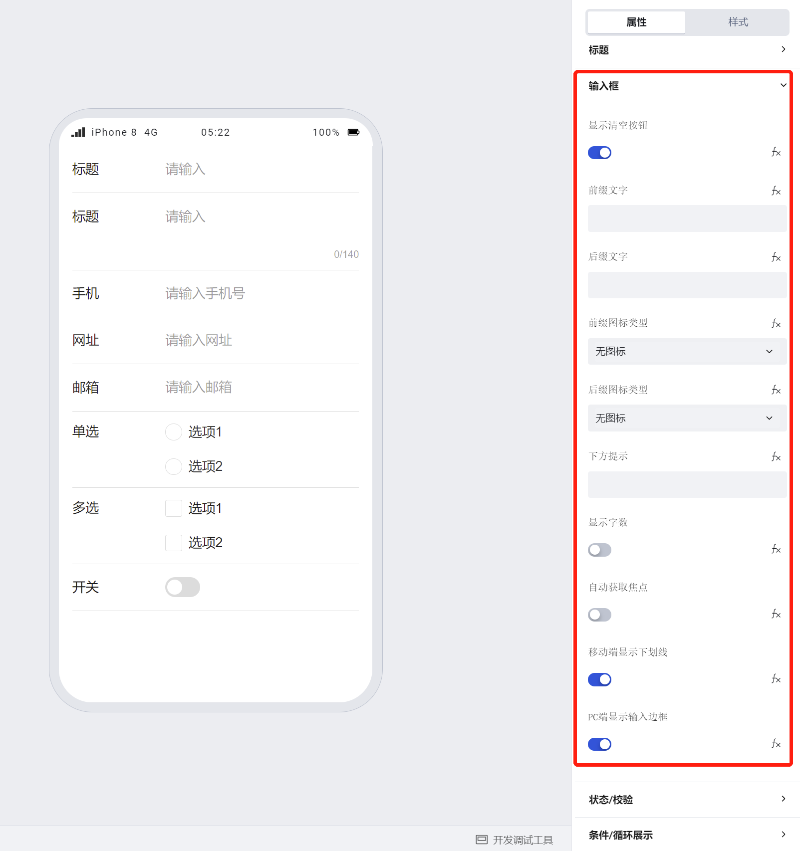
- Supports personalized configuration for input boxes, including whether to display a clear button, prefix and suffix text, prefix and suffix icons, hint below, whether to display as password, input keyboard type, whether to display character count, whether to automatically obtain focus, whether to display underline on mobile / whether to display input box on PC.
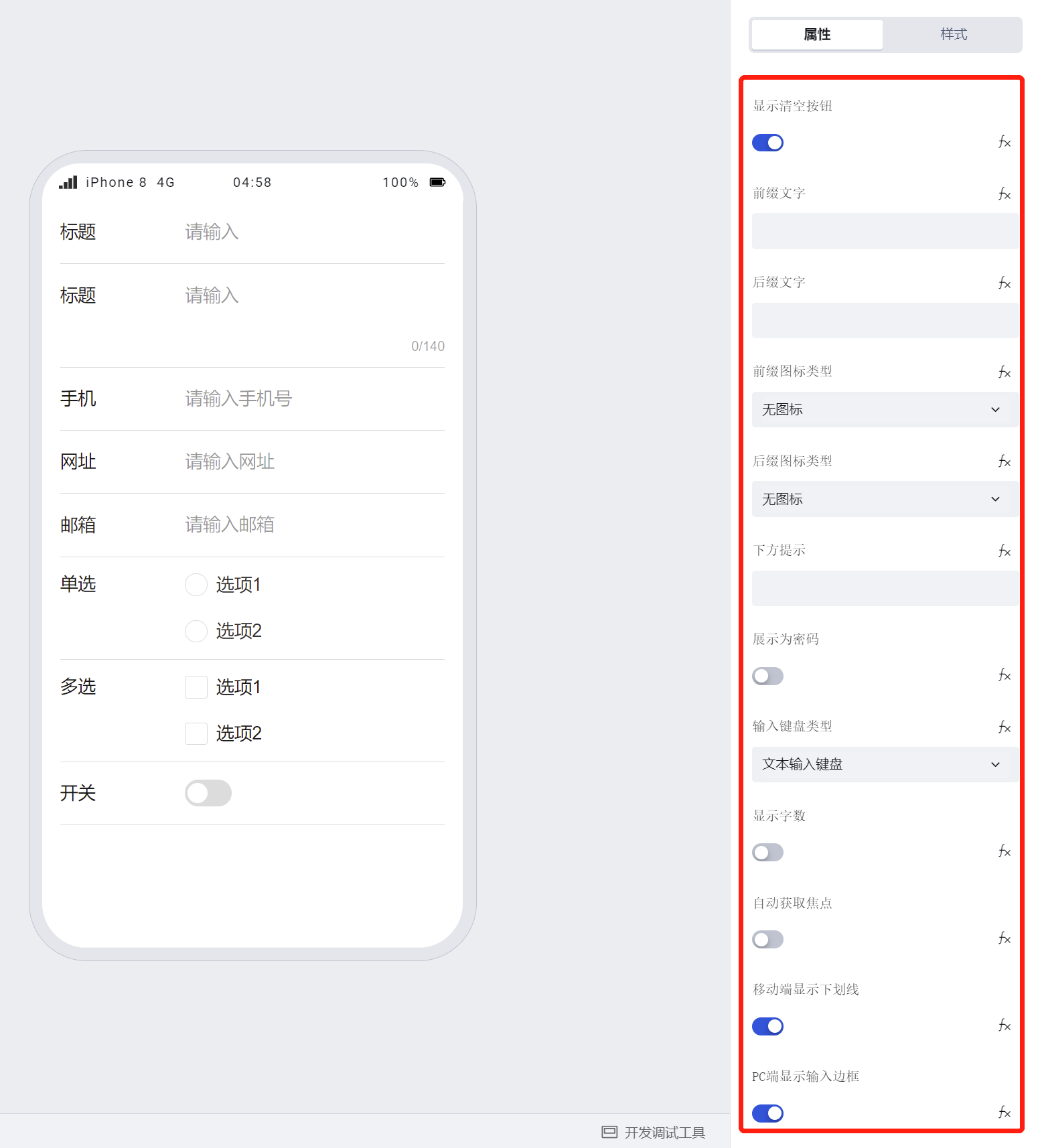
Note:
- Prefix and suffix text in forms will be submitted to the data model along with the input content.
- Size configuration applies only to the PC side;
Multi-line Input Component: Standardization Upgrade
- Supports personalized configuration for input boxes, including hint below, whether to display character count, whether to automatically obtain focus, whether to display underline on mobile / whether to display input box on PC.
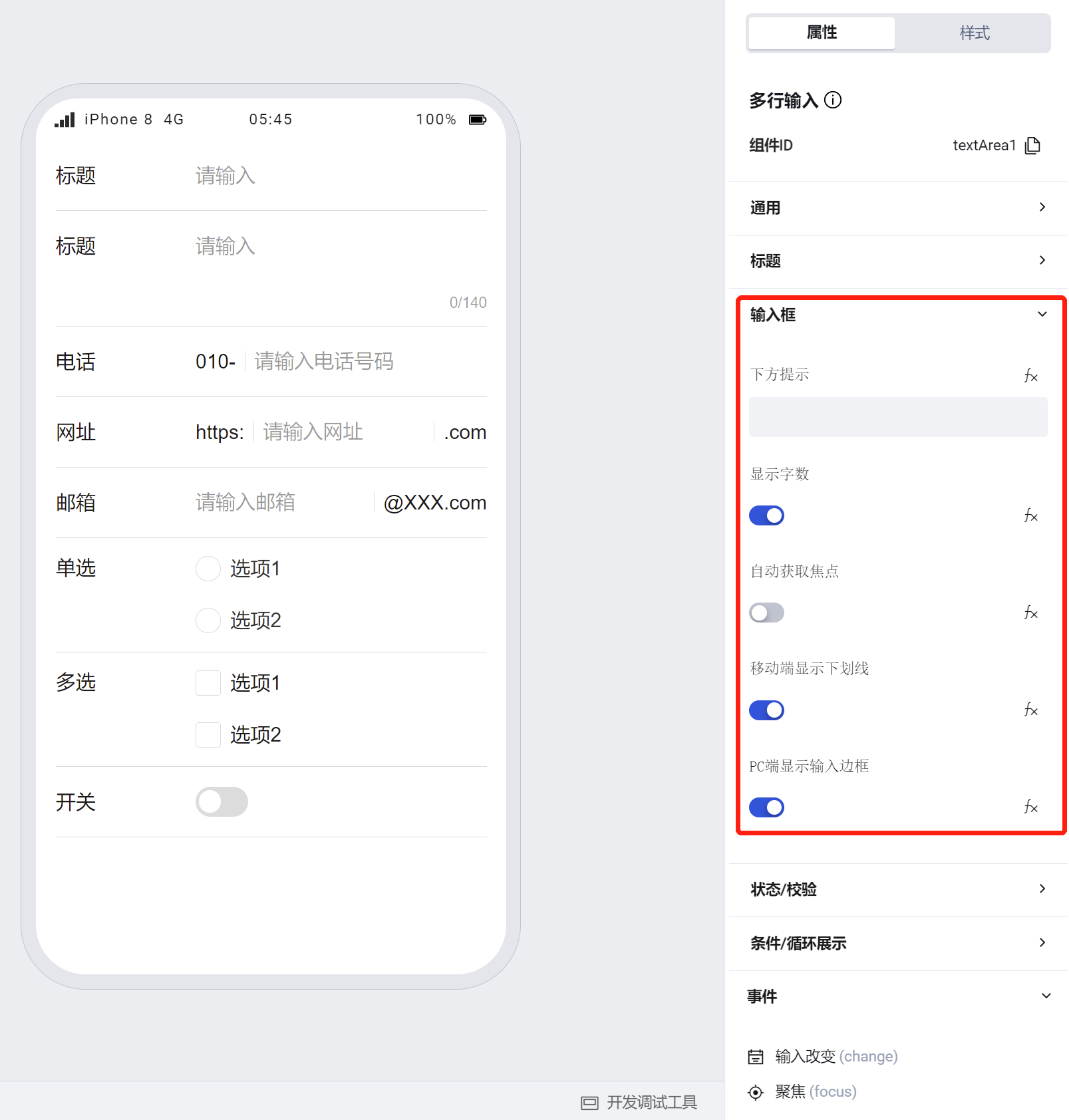
Note:
- Unlike the single-line input component, the multi-line input component does not include configuration for prefix/suffix text or prefix/suffix icons.
- The multi-line input component displays the character count of the input content by default.
- The multi-line input component has a default height of two lines. During runtime, its height automatically increases based on the input content. When the input exceeds ten lines, content can be viewed via scrollbars;
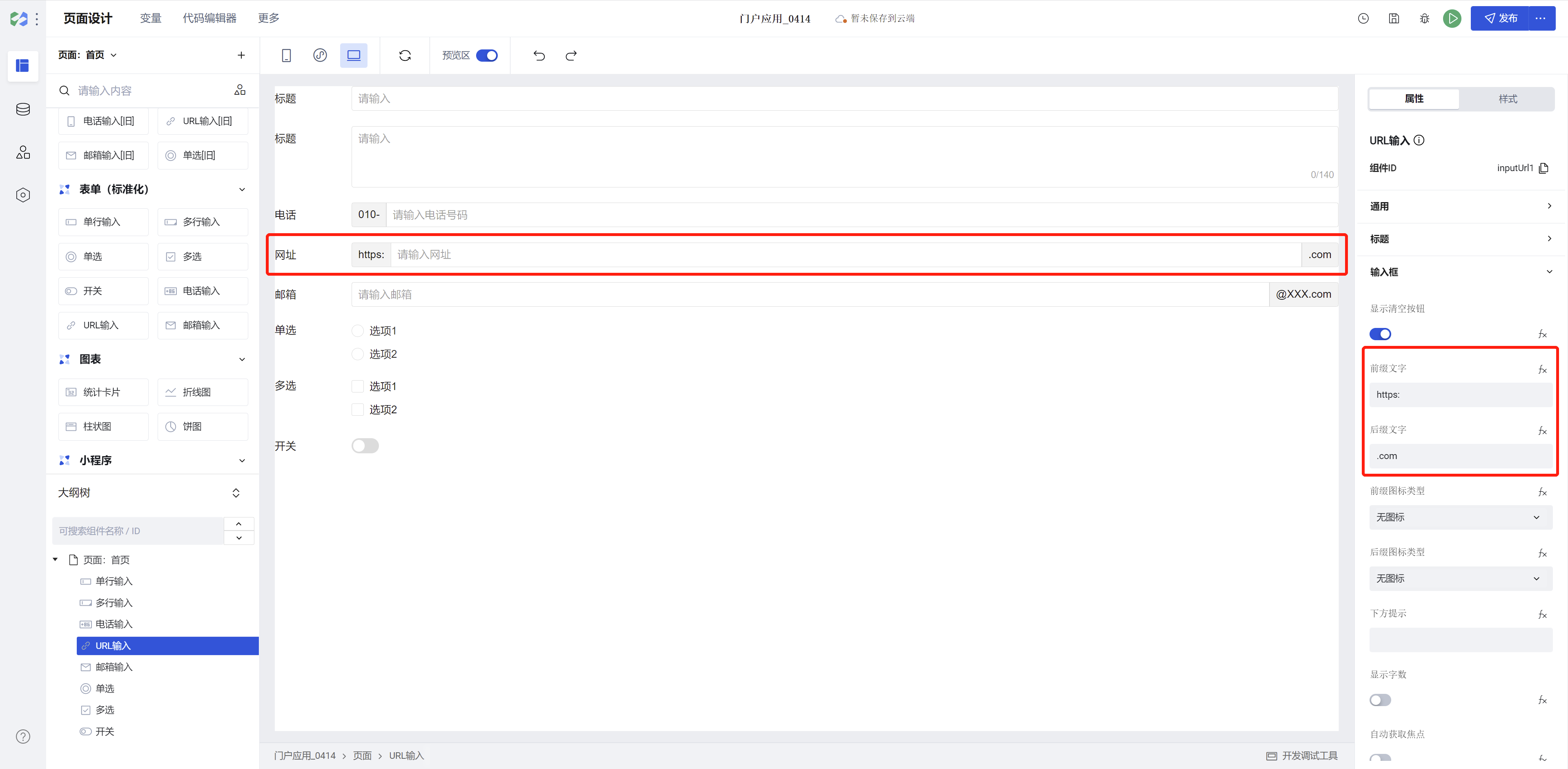
URL Input Component: Standardization Upgrade
- Supports personalized configuration for input boxes, including whether to display a clear button, prefix/suffix text, prefix/suffix icons, hint below, whether to display character count, whether to automatically obtain focus, whether to display underline on mobile / whether to display input box on PC.
Note:
- Prefix and suffix text in forms will be submitted to the data model along with the input content.
- URL input can be quickly configured with prefix/suffix text to achieve the following styles:
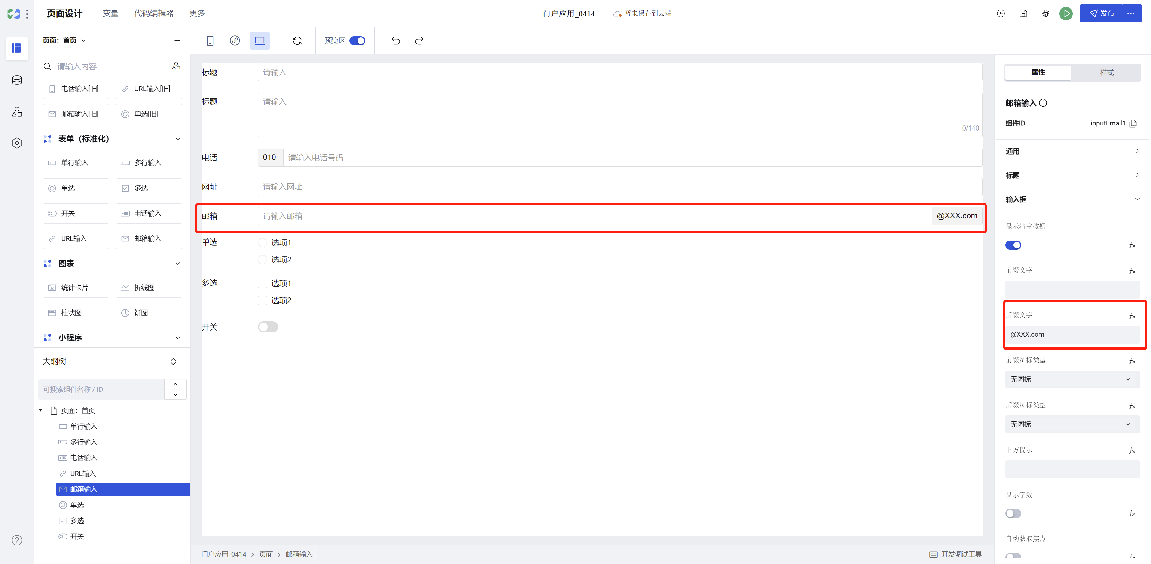
Email Input Component: Standardization Upgrade
- Supports personalized configuration for input boxes, including whether to display a clear button, prefix/suffix text, prefix/suffix icons, hint below, whether to display character count, whether to automatically obtain focus, whether to display underline on mobile / whether to display input box on PC.
Note:
- Prefix and suffix text in forms will be submitted to the data model along with the input content.
- Email input can be quickly configured with suffix text to achieve the following styles:
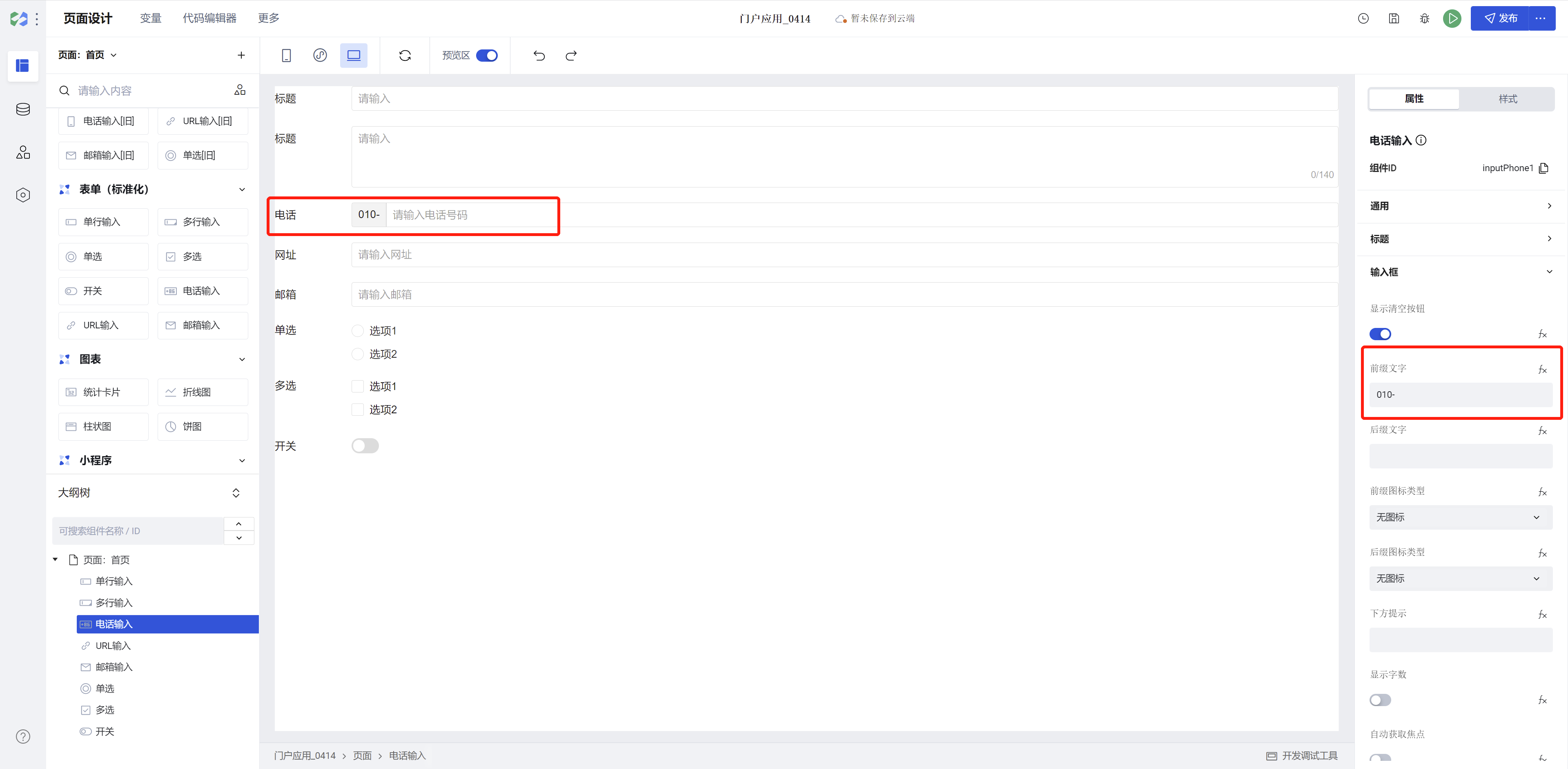
"Phone Input" Component: Standardization Upgrade
- Supports personalized configuration for input boxes, including whether to display a clear button, prefix/suffix text, prefix/suffix icons, hint below, whether to display character count, whether to automatically obtain focus, whether to display underline on mobile / whether to display input box on PC.
Note:
- Prefix and suffix text in forms will be submitted to the data model along with the input content.
- The phone number input field (numeric-only, maximum 11 digits) supports hyphen input (for landline number compatibility). The following styles can be quickly configured using prefix text:
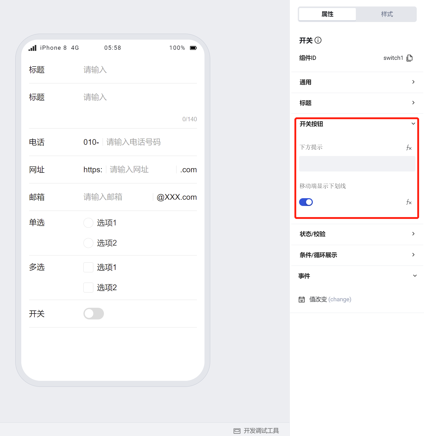
"Switch" Component: Standardization Upgrade
- Supports personalized configuration for switch buttons, including hint below, whether to display underline on mobile.
"Radio" Component: Standardization Upgrade
- Supports personalized configuration for options, including hint below, layout direction, whether to display underline on mobile.
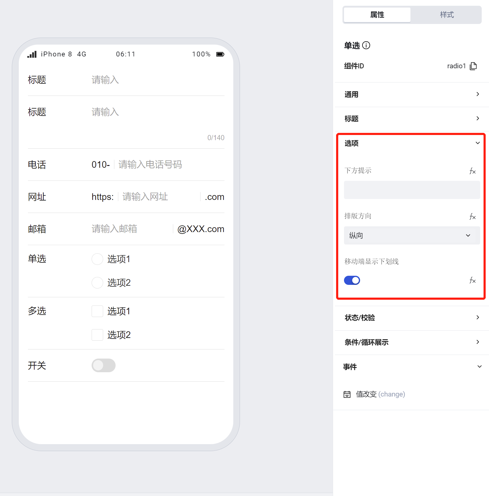
Note:
- The radio component supports both horizontal and vertical layout directions for options, with vertical as the default. When horizontal is selected, options will automatically wrap based on their length.
"Multi-select" Component: Standardization Upgrade
- Supports personalized configuration for options, including hint below, layout direction, whether to display underline on mobile.
Note:
- The multi-select component supports both horizontal and vertical layout directions for options, with vertical as the default. When horizontal is chosen, options will wrap automatically based on their length.
- The multi-select component supports configuring multiple default selected values.
"Table" Component: Supports resizing columns by dragging at runtime
"Rich Text Editor" Component: Feature Upgrade and Optimization
Rich Text Component: Comprehensive Feature Upgrade and Optimization
- Added capabilities such as format painter, table insertion, and text superscript/subscript
- Supports pasting content directly from word into the rich text editor, accurately preserving basic formatting styles
- Optimized color configuration, font configuration, heading numbering, alignment settings, and other items, enabling more convenient editing of rich text content and configuration of content styles.
Added "Dropdown Multi-select" Component to Forms
"Menu Navigation" Component Supports Use in Model Applications
"Member Selection"/"Department Selection" Component Supports Use in Custom Applications
Added View node to the root node of the Mini Program "page"
Add a view node to the root node of the Mini Program page to ensure that the standardized style api and css variables can take effect on the Mini Program side.
Note:
- Added a view node to wrap the page content, with the id of the View node set to
wd-page-root; styles can be set for#wd-page-rootif needed. - If a percentage height is set for the Page in the application, nodes directly relative to this percentage-height element may have their relative height invalidated by the added View node (wd-page-root); corresponding styles need to be set for
#wd-page-root.
V2.24.0
Release Date: 2023/4/7
"Detail" Component
Provides a table detail style for the PC end, with a more aesthetically pleasing detail layout, and supports free switching between table/tile styles.
"Data Table" Component
Add a default pagination property for the PC end to control the initially opened page when the table loads.
V2.23.0
Release Date: 2023/3/30
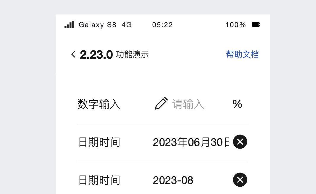
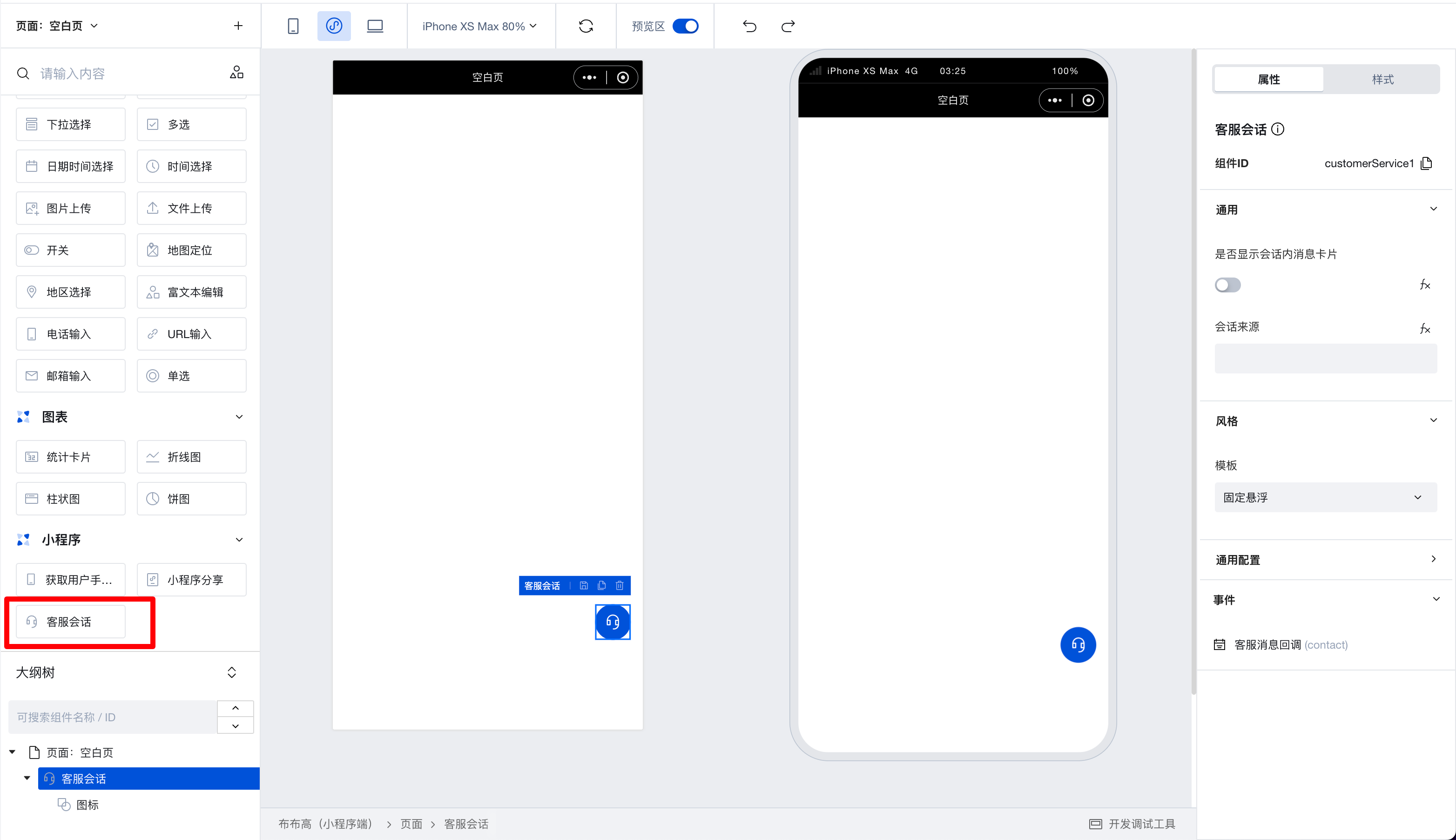
Customer Service Chat Component has been added
Supports enabling customer service chat, quickly implementing a two-way communication mechanism between customer service and users within 3 minutes.
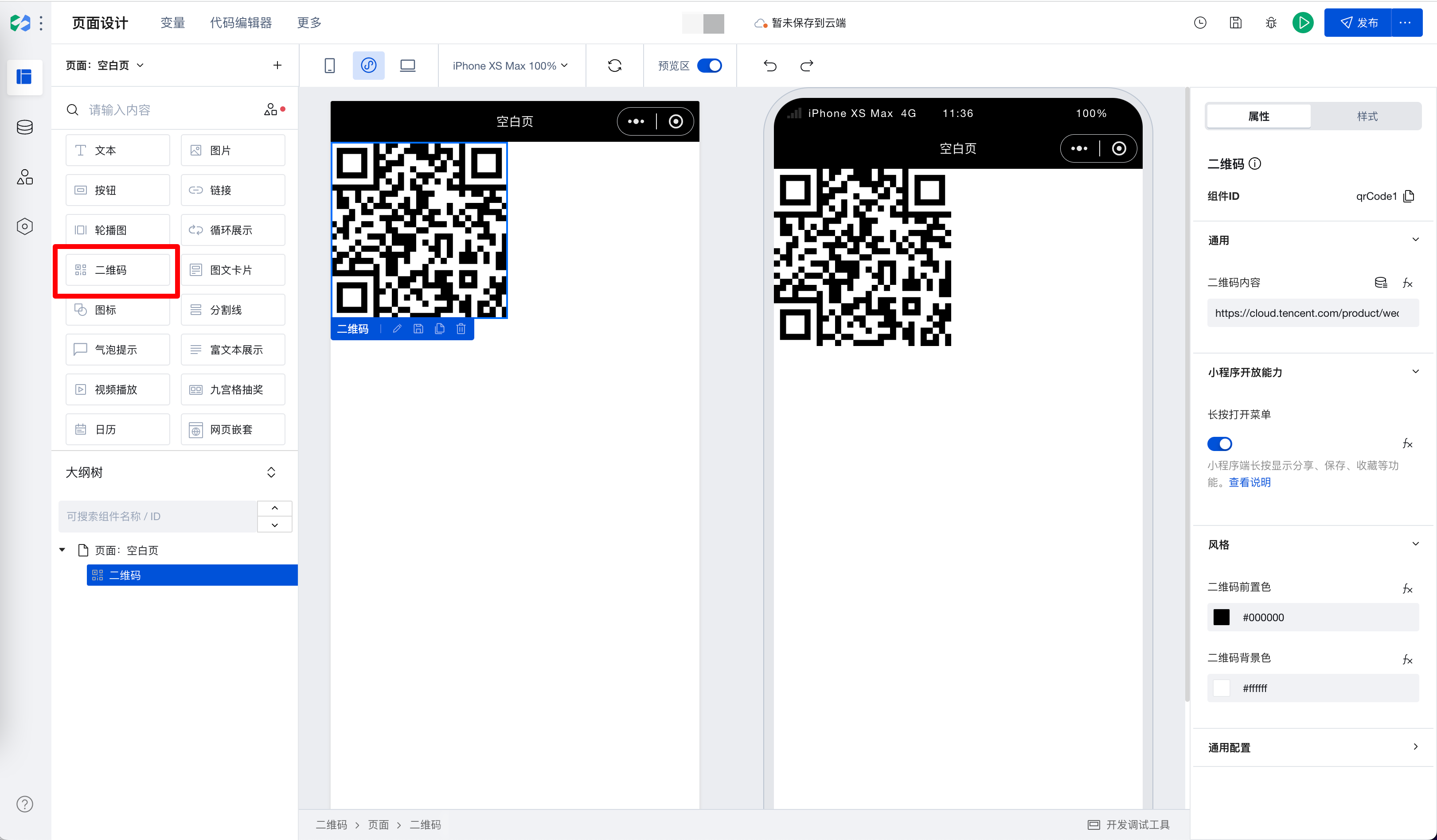
QR Code Component has been added
Can generate QR codes based on links, text, etc.
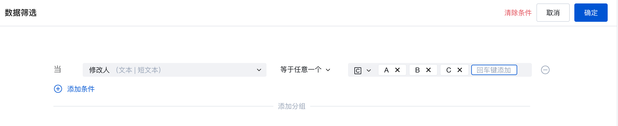
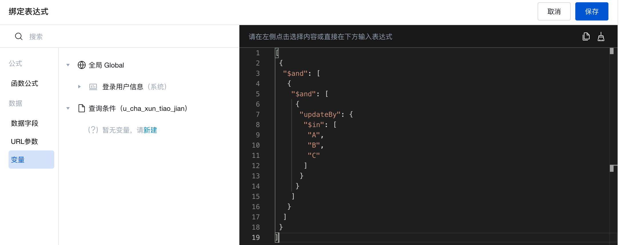
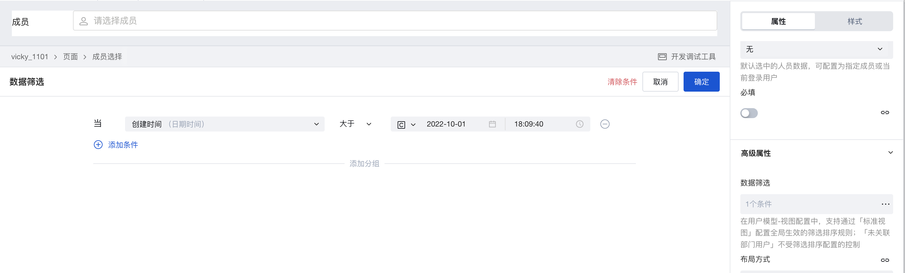
Enhanced Data Filter Conditions
Supports $in queries and supports directly writing expressions to achieve arbitrary query conditions. This covers three components: Data List, Data Detail, and Data Table.
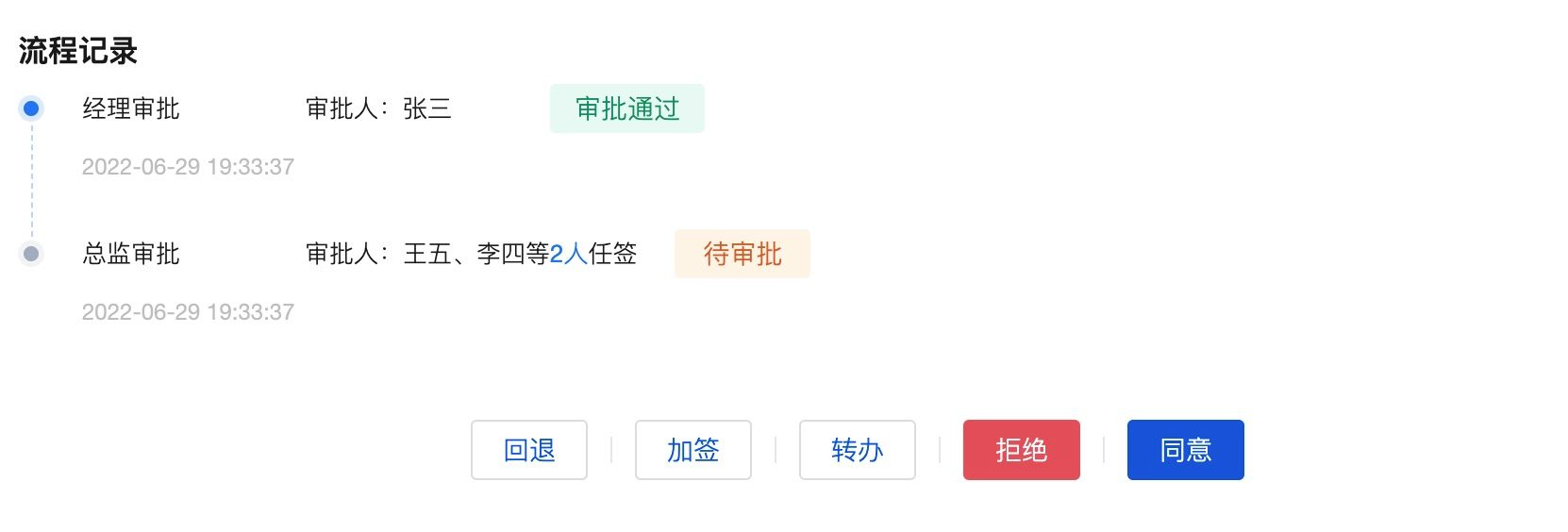
Approval Operation Component Supports Parallel Gateway Nodes
V2.22.5
Release Date: 2023/03/16
Underlying Support for Widget API in All Form Components
V2.21.3
Release Date: 2023/3/07
Standardization, Upgrade, and Optimization of the Data Table Component
The new Table has the following changes:
- This upgrade provides brand-new table styles for PC end/mobile end.
- Enhanced capabilities for filters and table column configuration
- Added table row click event
- Standardize component property names and classification
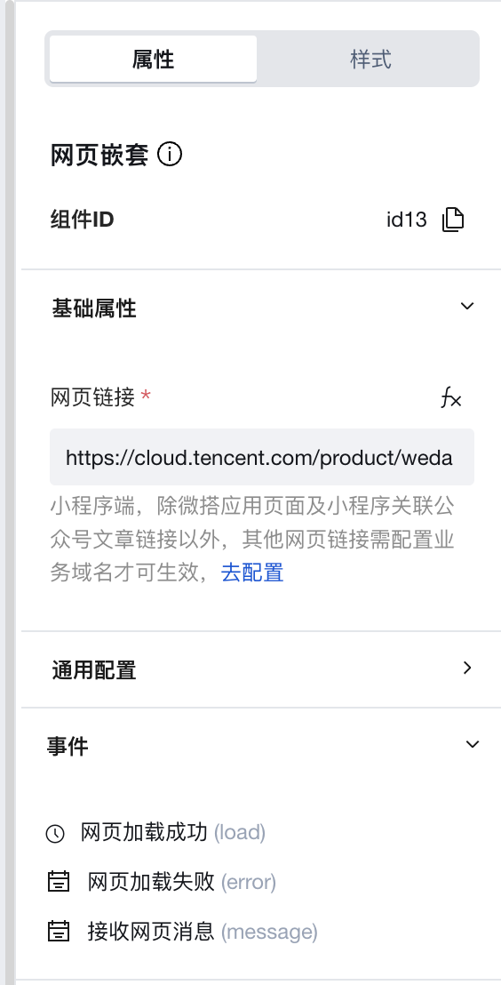
Web Page Nesting Component: Supports embedding web page links within applications, compatible with Mini Program, PC, and H5 platforms
V2.20.0
Release Date: 2023/2/23
Image Upload Component
Added WeChat Open Capabilities attribute configuration, supporting direct upload of WeChat avatars on the Mini Program end. Added attribute configuration for image display shapes, where images can be displayed as circles, rectangles, or rounded rectangles.

"Single-line Input" Component: Added WeChat Open Capabilities attribute configuration, supporting direct filling of WeChat nicknames on the Mini Program end.
Data Container Components
Supports API optimization, adding input/output parameter type validation and usage guidelines. Including form, table, data list, data detail, statistic card, bar chart, etc.
Data List, Data Table, Form Container, Chart, and other components, when bound to API methods, support displaying query parameters in separate lines, enhancing the convenience of parameter configuration binding.
Process Operation Component
PC-side Operation Button Style and Layout Optimization:
Mobile-side Button Operation Style and Layout Optimization:
The Personnel Selection Component fully adopts the WeDa Member Selection Component UI.
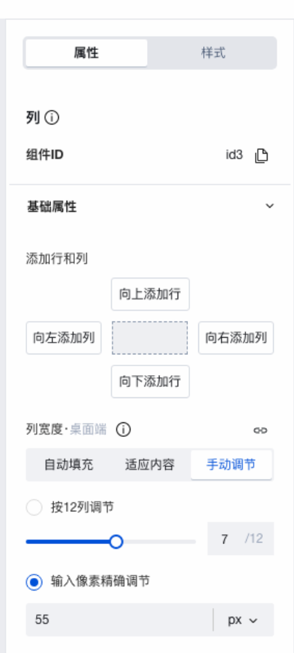
Grid Layout Component: Column width supports px-level precision adjustment, and single rows support independent column spacing settings.
V2.19.0
Release Date: 2023/2/2
Mobile-side Interaction Optimization for the "Member Selection" Component
V2.18.0
Release Date: 2023/1/16
Data Container Automatic Binding
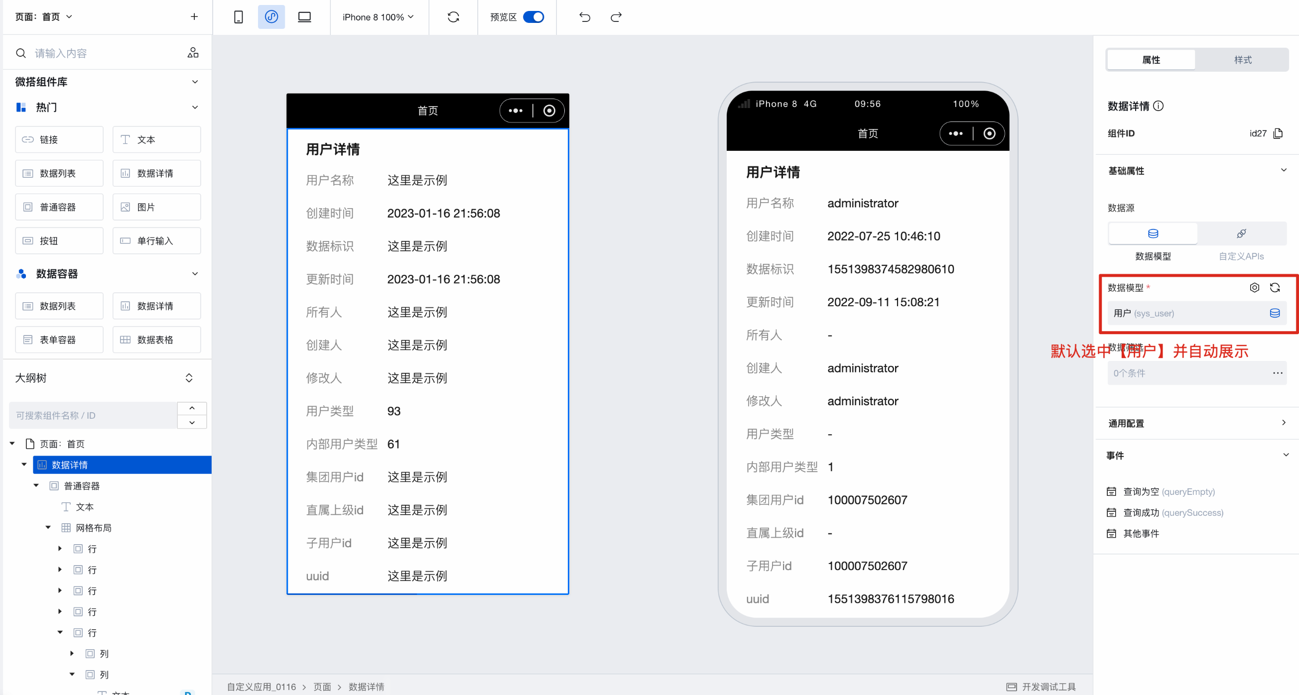
The data container is a component used for querying data, and this update simplifies the usage path. When adding a new data container, it displays data from the [User] table by default, and you can switch to any model data. This update also supports automatic binding of data fields, achieving what-you-see-is-what-you-get (WYSIWYG).
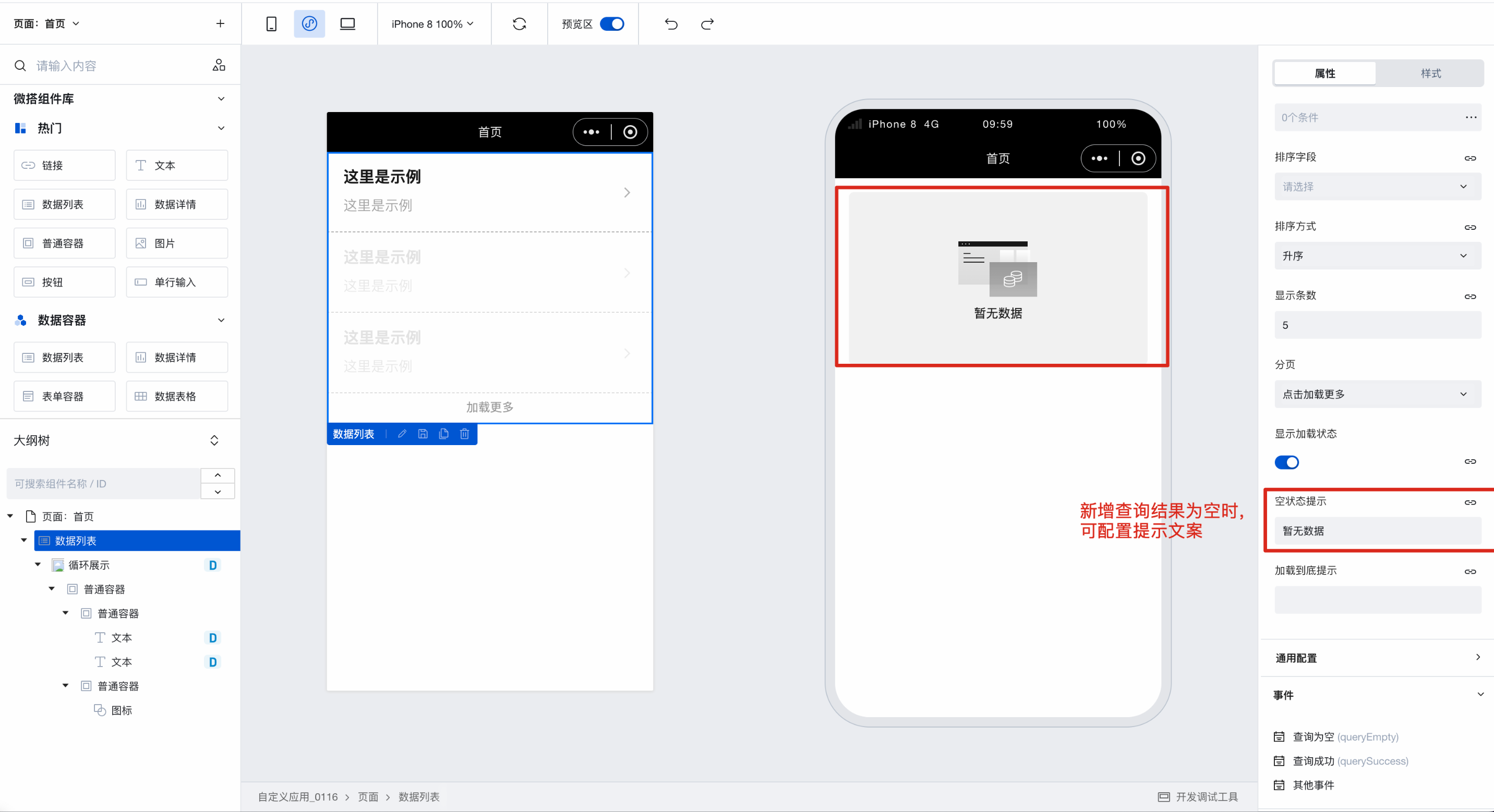
Data Container Empty State Optimization
Data List and Data Table components, when the query result is empty, have been uniformly optimized for the empty state prompt style, and the prompt text can be custom configured.
Optimization of Required Field Prompts for Data Display Components
Data List, Data Detail, Form, Table, Icon, and other components now display required field markers when selecting models and APIs, as shown below.
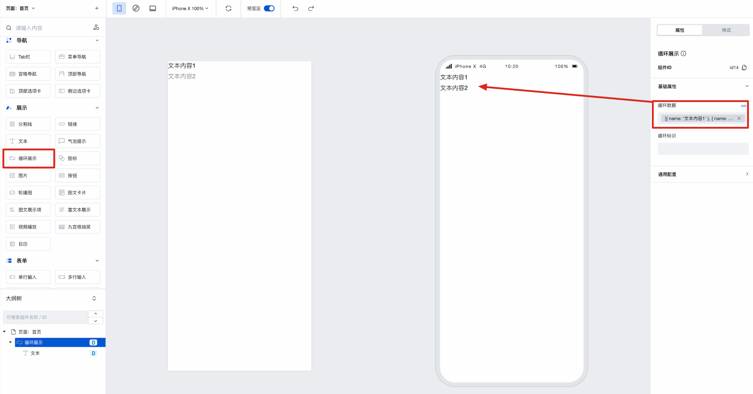
New Loop Display Component
This update introduces a Loop Display component, primarily used to display array-type data. Simply replace the data in the Loop Display component with the array you need to display to implement the $for loop.
V2.17.0
Release Date: 2022/12/28
This upgrade introduces standardized enhancements and optimizations for certain components. Components that have been standardized are now marked with in the Component List. Standardized components unify implementations across PC, H5, and Mini Program platforms while openly supporting a series of standard APIs, including style APIs and custom CSS variables. For individual component upgrade methods and precautions, refer to the Upgrade Migration Guide
Standardized component visual styles and features, enhanced visual aesthetics and user experience
Components expose a series of standardized APIs, maintaining consistency across components with continuous maintenance
Component Library Specifications and exposed CSS variables support user style customization
System-level Theme Customization
Refer to Global CSS Variable definitions. Modify corresponding CSS variable values to adjust global styles.
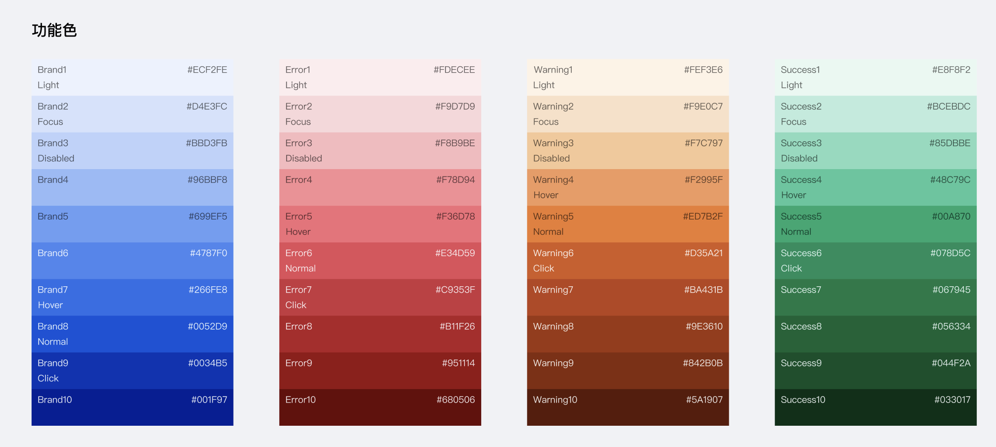
Component-level Theme Style Customization
For example, to uniformly modify button styles, you can adjust the CSS variables exposed by buttons across the page.
.wd-btn {
  --wd-btn-border-radius: 0.3rem;
  --wd-btn-color-brand: var(--wd-color-success);
  --wd-btn-color-brand-hover: var(--wd-color-success-hover);
  --wd-btn-color-brand-active: var(--wd-color-success-active);
  --wd-btn-color-brand-focus: var(--wd-color-success-focus);
  --wd-btn-color-brand-disabled: var(--wd-color-success-disabled);
}
(To ensure style modifications take effect, it is recommended to add an id selector before custom styles to increase CSS specificity.)
Components expose external style APIs to address the issue where users cannot customize internal structure styles of components via the low-code editor
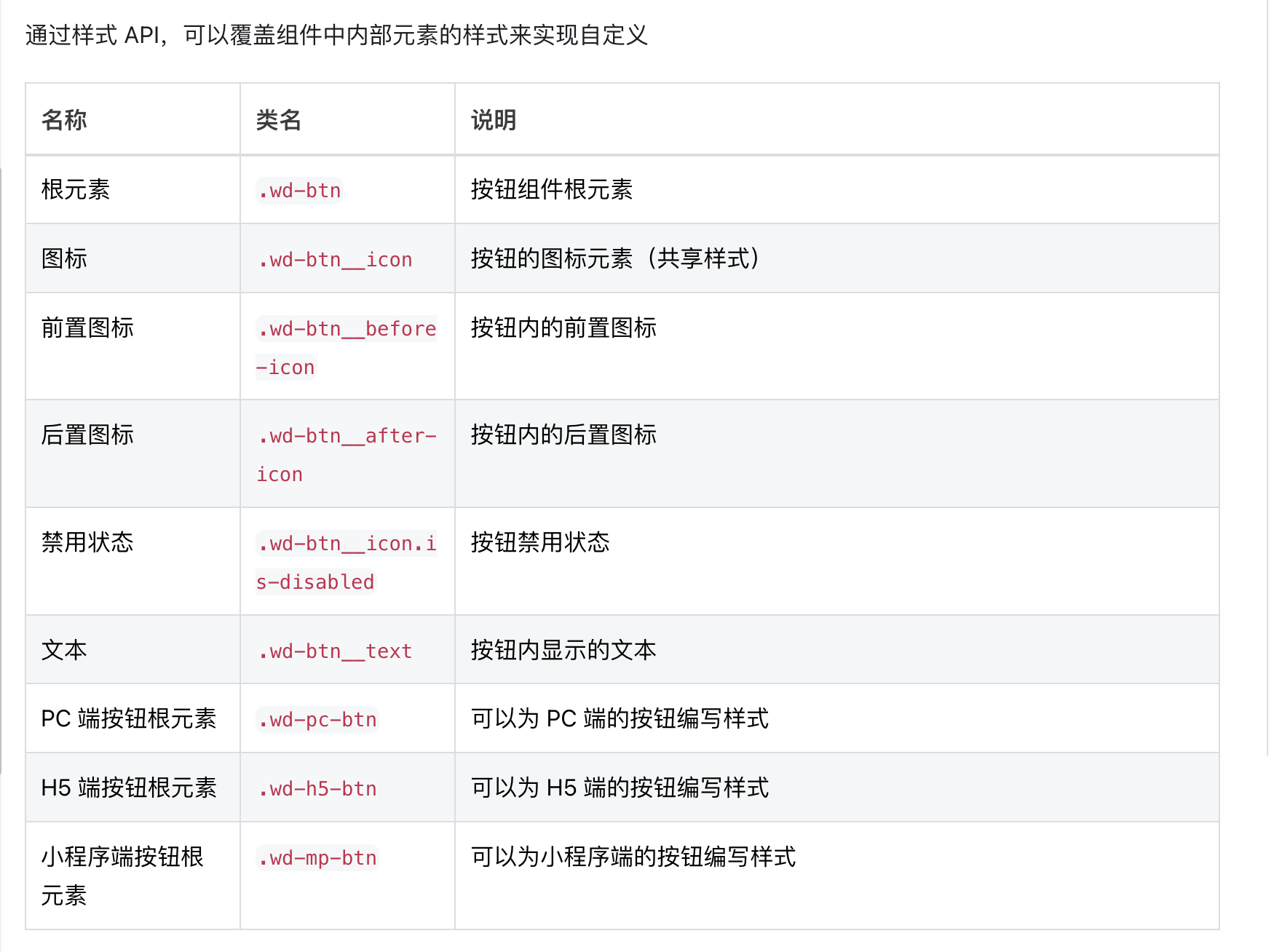
.wd-btn {
  border-color: cyan;
  background-color: black;
  border-width: 2px;
  border-radius: 6px;
}

.wd-btn:hover {
  background-color: #0c0096;
}

.wd-btn.is-disabled {
  background-color: #888;
}

.wd-btn__text {
  color: cyan;
}
(To ensure style modifications take effect, it is recommended to add an id selector before custom styles to increase CSS specificity.)
Standardization, Upgrade, and Optimization of the Button Component
The new Button has the following changes:
- The default button size has been adjusted, and full-width button configuration has been added (after upgrade, the default size of existing buttons will change)
- Removed default padding from buttons; they no longer center by default on pages, and single buttons no longer occupy a full row by default on mobile devices (after upgrade, layout changes should be noted and adjusted as needed)
- Enriched the default button colors. After upgrade, please note the changes in default button colors and adjust as needed.
- The disabled state style of buttons has been optimized
- Buttons now support configuration capability for icons within buttons
- Enriched the default button types, providing options for filled, outlined, text, and link styles
Standardization, Upgrade, and Optimization of the Text Component
The new Text has the following changes:
After upgrade:
- Text component supports configuration of text overflow ellipsis
- Optimized the font, font size, and style for text initialization
- Added large, medium, and small sizes as options for body text format
Standardization, Upgrade and Optimization of the Image Component
View the Image component documentation
Standardization, Upgrade and Optimization of the Icon Component
The new Icon has the following changes:
- The color configuration in the icon property panel has been removed. Icon colors can now be configured via the font color setting in the Style panel (colors from original icon configurations will be retained).
- Icon size configuration has been changed from manual numerical input to a dropdown selection of predefined sizes (existing icon size settings will be preserved)
Standardization, Upgrade and Optimization of the Link Component
View the Link component documentation
Standardization, Upgrade and Optimization of the Divider Component
The new Divider has the following changes:
- Added support for selecting two divider line types: solid and dashed
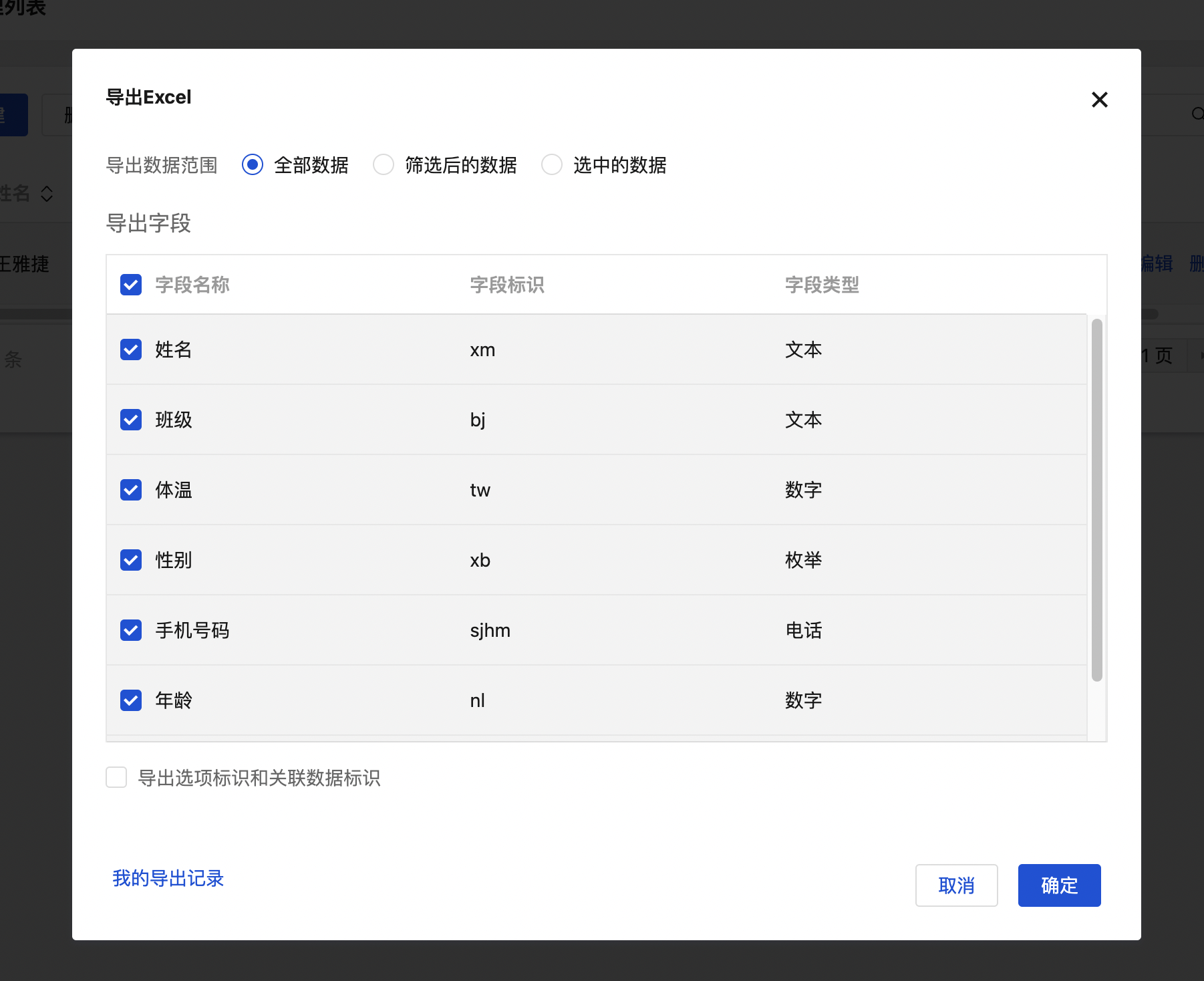
Data Table component: Optimization of the data export feature, supporting exporting all data to the cloud
Data Table new component method added: Data Export (Optional export mode) exportOptionalMode
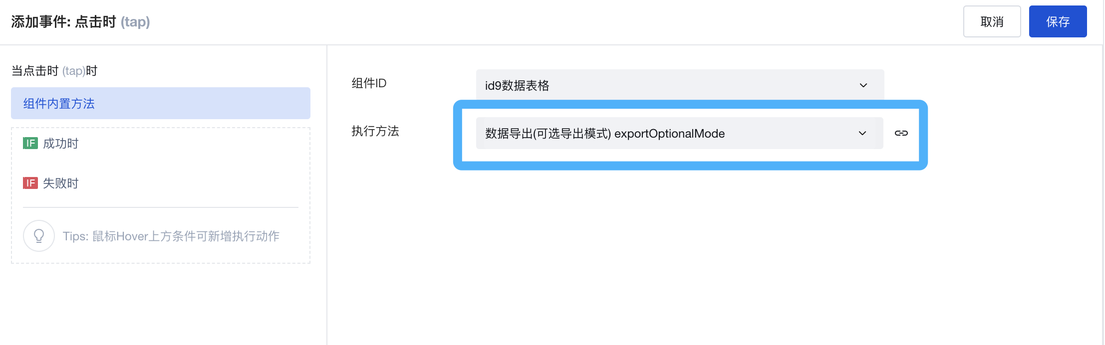
Support exporting all data or filtered data from the cloud, and support selecting fields to export
Menu Navigation component: Added navigation slot
Fix styling issues for the Top Tabs component on mobile devices when text is lengthy
When tabs have excessive content, they scroll horizontally on mobile devices.
V2.16.0
Release Date: 2022/12/22
Member Selection component: Added a data filtering property to support filtering member data; supports adjusting member ordering via the standard view of the user model
V2.15.0
Release Date: 2022/12/15
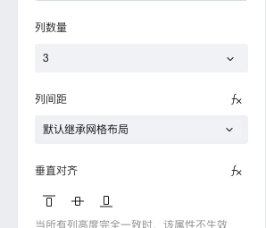
Grid Layout Component: Supports flexible addition of rows and columns, controlling single-column width, greatly enhancing the configuration experience for multi-column layouts.
The new version of the Grid Layout component (Grid) is more powerful, enabling quick layout and control of the positions of multiple components within a container.
It divides the page into grid cells, allowing them to be freely combined to quickly achieve various layouts.
➡️ Click to view the Grid Layout Component Documentation
Overall Style unified optimization: Components display more content on large-screen mobile devices.
All components no longer use the Mini Program rpx unit or the web-side rem unit. On large screens, they do not scale but prioritize displaying more content.
"Department Select" Component: Added "Support Multi-Selection" attribute to support selecting multiple departments within the organization.
When selecting departments, after enabling "Support Multi-Selection", users can select multiple departments at once.
➡️ Click to view the Department Select Component Documentation
Data Table component: When table columns are bound to associated model fields, it supports dynamically showing or hiding columns based on column permission configurations.
➡️ Click to view Data Table Component Documentation
Fixed several issues
- Date Time Picker component: Fixed the issue with initial value display on the Mini Program side.
- Dropdown Select component: Fixed the issue with initial value display on the h5 side.
V2.14.0
Release Date: 2022/12/9
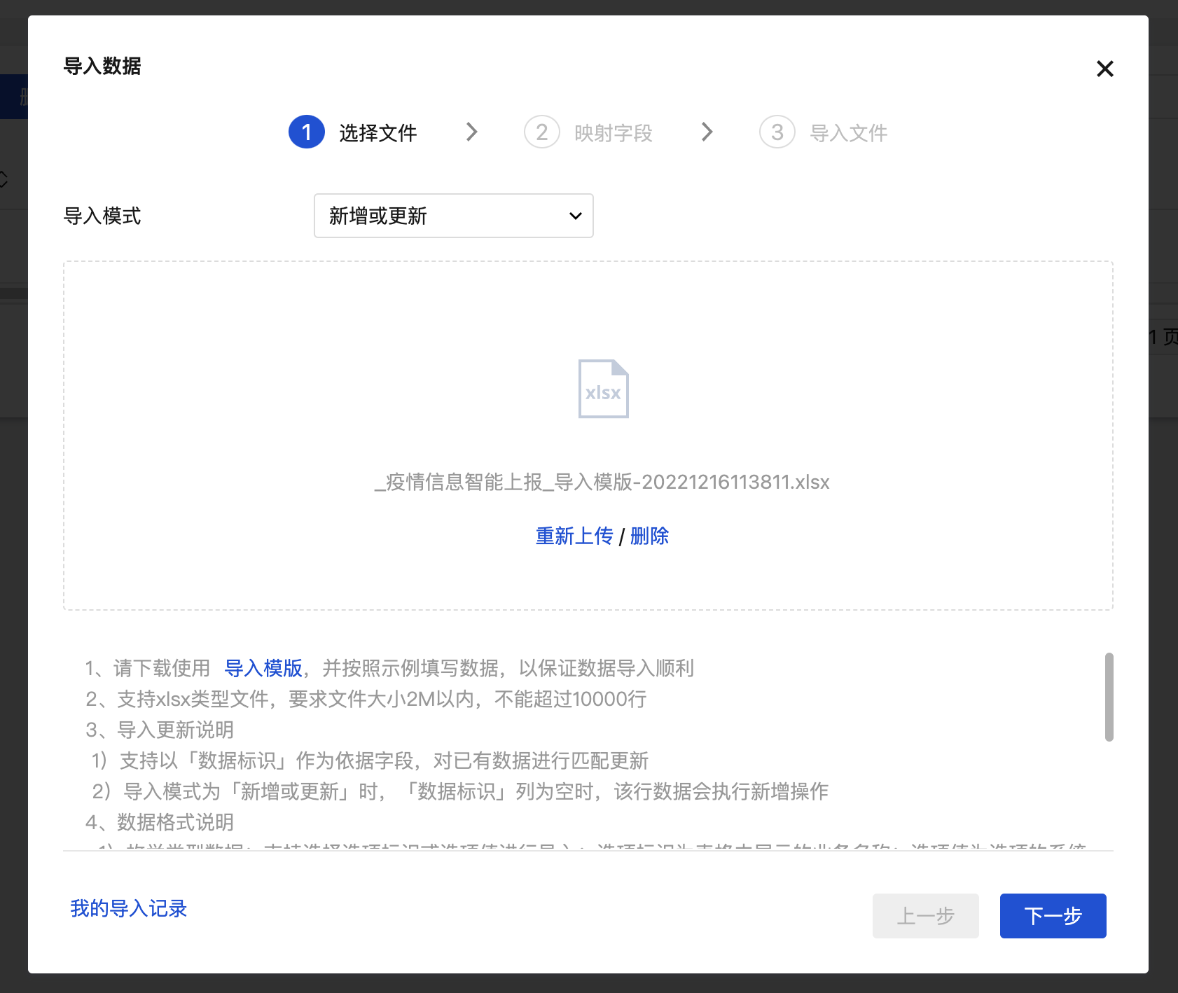
Data Table component: Supports importing and updating existing data; single import capacity expanded to 10,000 records; relationship fields support importing primary column field values; enumeration fields support importing option identifiers
➡️ Click to view Data Table Component Documentation
Check mechanism: Optimized the inspection prompt text for Mini Programs' enterprise entity requirements when using the "Obtain User Phone Number" component or enabling the login feature
V2.13.0
Release Date: 2022/11/29
Data List/Data Detail Components: Added component methods "Refresh and Delete Single Item", enabling quick refreshing and deleting of list or detail data.
V2.12.0
Release Date: 2022/11/22
New Bubble Tooltip Component: Displays text, images, and other content in a bubble form on mouse hover.
Data List, Detail, Table, and Chart components: Data filtering properties support configuration of multiple conditions with OR relationship
###Approval Component: Added custom events and optimized the personnel selection experience for adding signers / reassigning tasks / CC'ing
Global optimization of sorting, grouping, and naming for official components
V2.11.0
Release Date: 2022/11/12
Table Component: The action column and top action buttons have been changed to slots
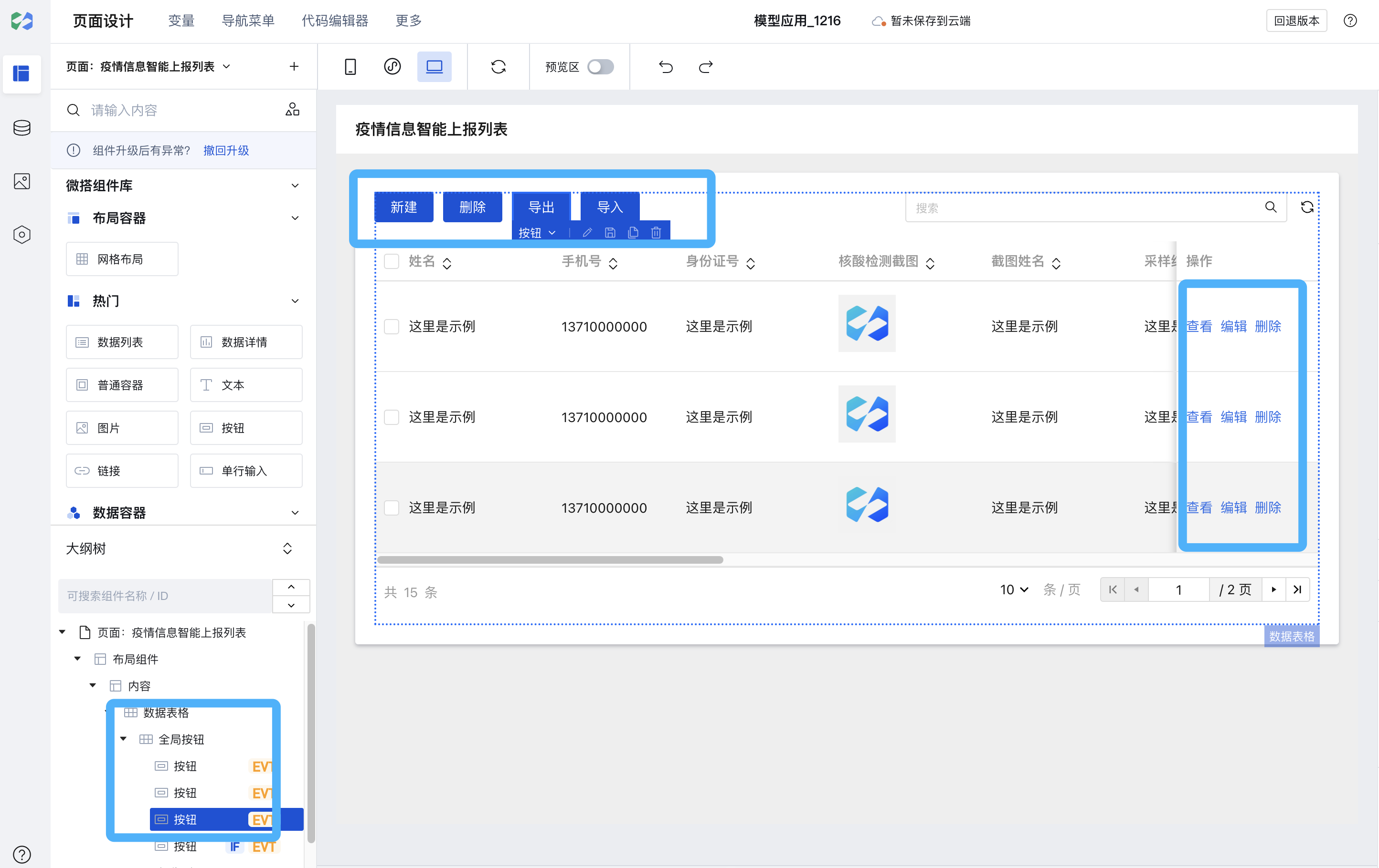
➡️ Click to view Data Table Component Documentation