JSX code
This is a versatile source code component that enables quick integration of external components, such as third-party open-source libraries like TDesign and Antd. It can be configured to implement various components including watermarks, step bars, cascading selectors, ratings, slider inputs, and more.
Applicable Scenarios
When the components in the official library fall short of requirements, you can use this component to achieve:
-
This component is developed in source code, requiring you to learn and master React JSX syntax. It is recommended for frontend developers.
-
Before use, check whether the third-party library supports CDN file inclusion. If CDN is not supported, it cannot be used.
Note: Only supports component libraries introduced via CDN files and does not currently support NPM package inclusion. For NPM package inclusion, use the Local Custom Component Library.
Basic Features
1. Template
This component provides several sets of commonly used chart templates, such as TD watermarks, syntax examples, step bars, etc.
2. Code Syntax
2.1 Using Platform Variables and Methods
Primarily obtain the platform's variables and methods through props.$w. For more methods, you can refer to the platform API documentation.
Example: Obtain current logged-in user information
$w.auth.currentUser.name;
Example: Calling platform methods
$w.utils.setClipboardData({
  data: 'Copy content to clipboard'
});
Example: Retrieving and assigning values for page variables
$w.page.dataset.state.xxx; // Variable value retrieval, where xxx is the variable name
$w.page.dataset.state.xxx = 123; // Variable assignment, where xxx is the variable name
2.2 Slot Declaration and Usage
Slots serve as placeholders where platform components can be dragged and dropped. For example, drag a data table component inside a watermark container.
Usage path:
- Declare slots: In advanced properties, add slots, define the name and slot ID.
- Insert slots into specified positions via
{props.slotID}in JSX code
2.3 Style Configuration
-
Obtain the styles configured from the right-side properties [Style] panel via
props.style, then apply them to the component you want to control. -
Define a style variable within the function to control styles in the code.
-
Use page or globally defined className for batch style control of components.
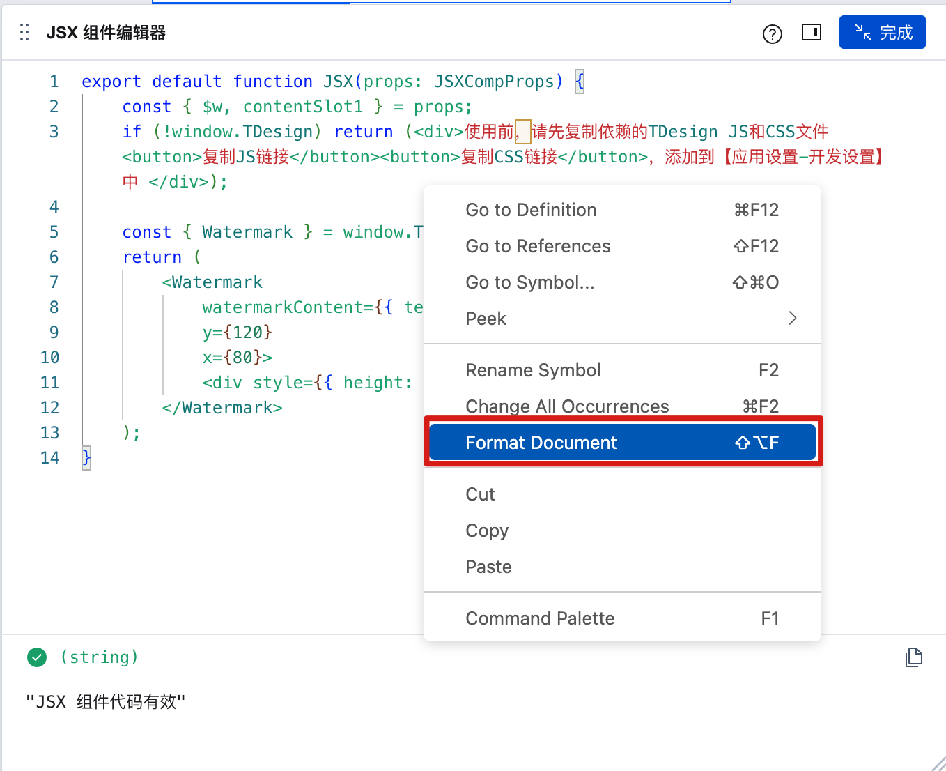
2.4 Format Code
Format code via right-click or keyboard shortcuts, as follows:
3. How to Integrate Third-Party Component Libraries
3.1 Steps to Integrate Third-Party Libraries
The following takes TDesign and Antd as examples to demonstrate how to quickly integrate third-party component libraries:
-
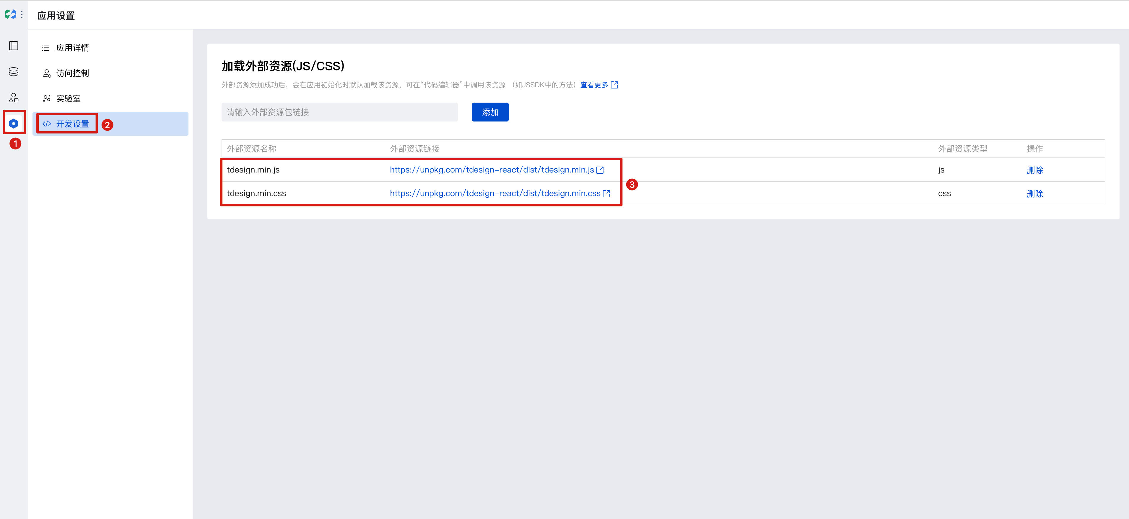
First, import the dependency files by adding the JS and CSS to [Application Settings - Development Settings].
-
Then, follow the third-party library's instructions to obtain global variables and write component code.
Note 1: Only supports component libraries introduced via CDN files and does not currently support NPM package inclusion. For NPM package inclusion, use the Local Custom Component Library.
Note 2: After CDN import, the import syntax is not supported. Follow the third-party platform's instructions to use global variables such as
window.TDesign.Buttonto access components. For details, refer to the CDN import usage instructions on the third-party official website.
3.2 Example: Integrating the Antd Component Library
- First, import dependencies by copying the browser import links for the Antd component library (note the file import order: dayjs must be placed before antd), as follows:
https://cdnjs.cloudflare.com/ajax/libs/antd/5.8.5/reset.min.css
https://cdnjs.cloudflare.com/ajax/libs/dayjs/1.11.9/dayjs.min.js
https://cdnjs.cloudflare.com/ajax/libs/antd/5.8.5/antd.min.js
The links are obtained from the official documentation. For reference, see Antd Browser Introduction
-
In WeDa's [Application Settings - Development Settings - Load External Resources], add the JS and CSS files of third-party libraries.
-
Then, access the component library via the global
antd, as demonstrated below with the TDesign Watermark component example:
export default function JSX(props: JSXCompProps) {
  const { $w, contentSlot1, style } = props;
  const { Watermark } = antd;
  return (
    <Watermark content={$w.auth.currentUser.name} style={style}>
      <div style={{ minHeight: 300 }}>{contentSlot1}</div>
    </Watermark>
  );
}
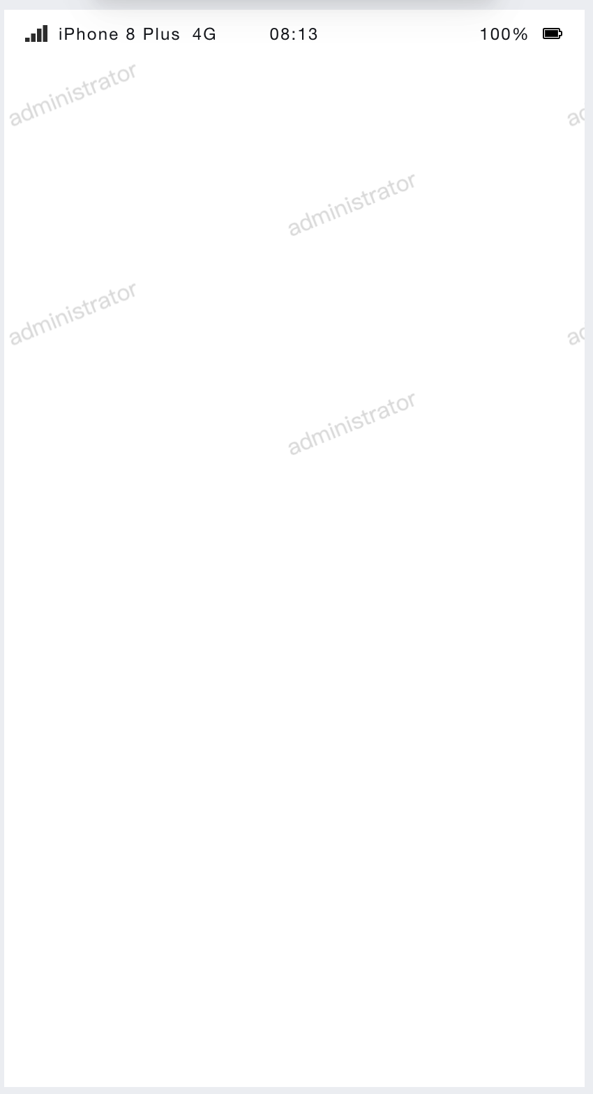
Effect Preview:
3.3 Example: Integrating the TDesign Component Library
- First, import dependencies by copying the browser import links for the TDesign component library, as follows:
https://unpkg.com/tdesign-react@1.2.4/dist/tdesign.min.js
https://unpkg.com/tdesign-react@1.2.4/dist/tdesign.min.css
The links are obtained from the official documentation. For reference, see TDesign Browser Installation
- In WeDa's [Application Settings - Development Settings], add the JS and CSS files of third-party libraries.
- Then, access the component library via the global
window.Tdesign, as demonstrated below with the TDesign Watermark component example:
export default function JSX(props: JSXCompProps) {
  const { $w, contentSlot1, style } = props;
  const { Watermark } = window.TDesign;
  return (
    <Watermark
      watermarkContent={{ text: $w.auth.currentUser.name }}
      style={style}
    >
      <div style={{ minHeight: 300 }}>{contentSlot1}</div>
    </Watermark>
  );
}
You can preview the effect in the editor.
Frequently Asked Questions
What is the relationship between JSX components and local custom components?
The local custom component library is an approach to developing custom components locally.
| Type | JSX Component | Local Custom Component |
|---|---|---|
| Applicable Scenarios | Lightweight Code Scenario | Complex Code Scenario |
| Development Approach | WeDa Editor | Local Editor Vscode |
| Supports NPM Installation | Not Supported | Supported |
| Syntax Support | Only React | React,Vue,WXML |
| Supports Mini Program | Not Supported | Supported |
| Component Configuration Area Customization | Not Supported | Supported |
Local Custom Component Library Development Documentation
Property Description
External properties received by the component
Property Name | Property Identifier | Type | Description |
|---|
| code block | jsxCode | string | |
| Claim component slot | slotList | array | Example: [] |
| Template example | template | string | Template example Example: "example" |