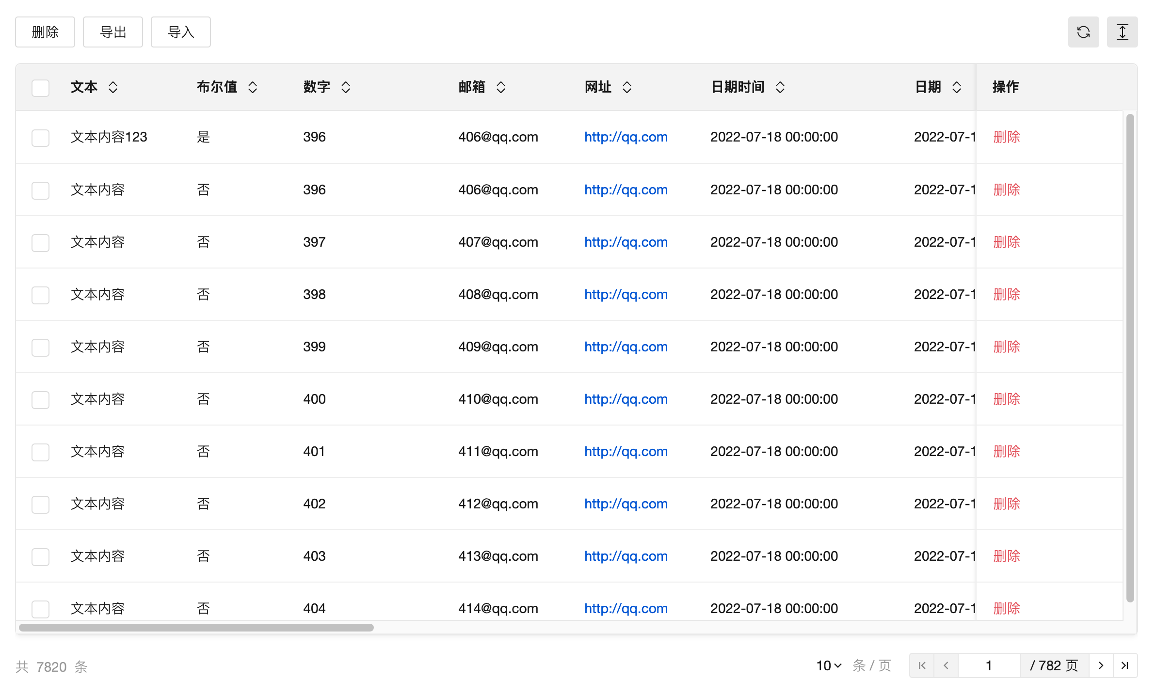
Data Table
WdTable
Practice Guide
Applicable Scenarios
It displays multiple rows of data in a table format and supports sorting, searching, pagination, and customization of displayed content and operations for the data.
Basic Capabilities Description
The model page auto-generates table components
When creating a model application or model page, this component is automatically generated on the management table page of the data. It establishes associations with the data's addition/update/view pages to implement corresponding page navigation logic.
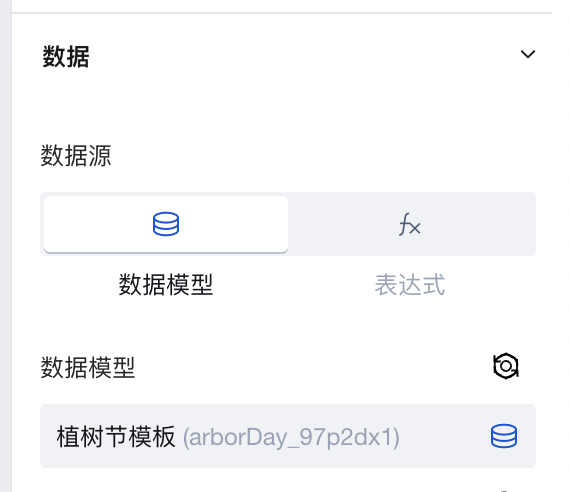
Configure Table Data
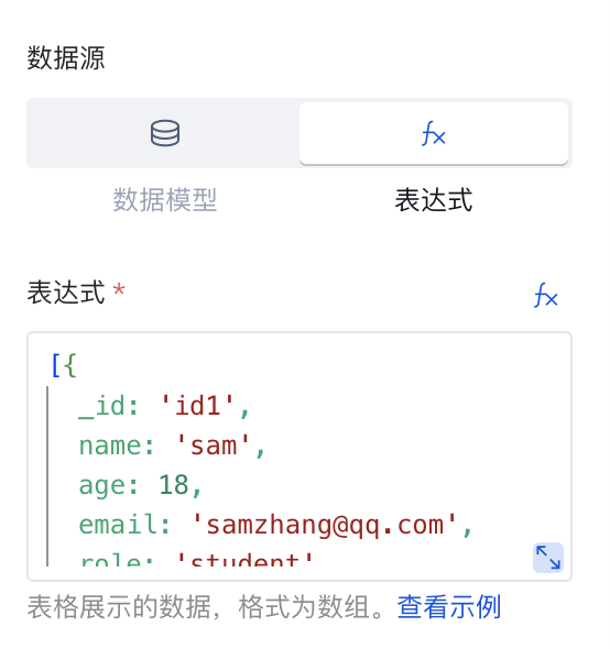
Table data can be selected from a data table or bound to an expression.
1. Quick Select Data Table
As shown below, directly select the data table and configure the query parameters. The table's internal requests are equipped with features such as pagination, sorting, and filtering. Additionally, clicking the upper-right corner allows you to navigate to the management backend of this data table to view the data.
2. Binding Expression
Expressions can be static data or variables. You can use Query to connect to built-in data tables, external APIs, etc., and then select a query in the expression for binding.
For specific implementation, refer to the data list binding query for dynamic pagination
3. Binding APIs (Discontinued in the latest version)
Note : Starting from version v2.30.0, the support for APIs calls in the data table has been discontinued. Please use expressions to select Query to query APIs.
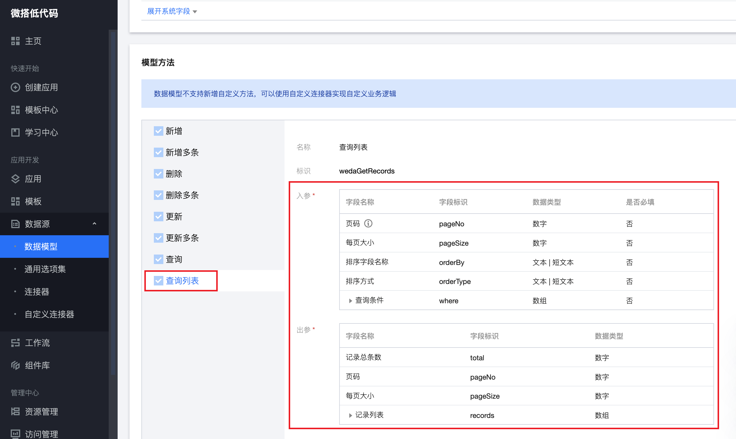
Parameter Requirements for Calling APIs
-
When "Data Source Type" is set to APIs, you can bind an APIs method to query data and display it in the table. The method must include the following input and output parameters and meet the relevant requirements.
-
Method parameters:
- pageNo: Page number
- pageSize: Page size
- orderBy: Field name for sorting. Can pass values from the fields in the output parameter records (optional; if this parameter is absent, sorting control will be unavailable).
- orderType: Sorting method. Pass asc for ascending order; pass desc for descending order (optional; if this parameter is absent, sorting control will be unavailable).
-
Output parameters:
- total: Total number of records
- records: Multiple data items in object array format, with each element within the object representing a table column field. Note: Objects in the array must contain the data unique identifier field _id (text type) for features such as pagination to function properly.
-
Field identifiers must exactly match the identifiers mentioned above and must be top-level parameters; they must not be nested within any object parameters. You can refer to the parameter format of the "query list method" in any data model.
-
-
For the input and output parameter format of APIs connector methods, you can refer to the predefined "query list" method parameters in any data model.
Configure Sorting for Table Columns
By default, table columns are sorted according to the field order in the bound data model. You can drag to adjust the column order in the "Column Management" property.
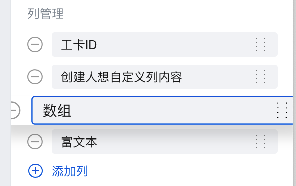
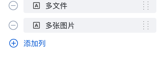
Add Table Column
System fields, including "Data Identifier, Created Time, Updated Time, Owner, Creator, Modifier, Department", are not displayed in table columns by default. You can click the "Add Column" button in the "Column Management" property to add system fields or previously deleted fields.
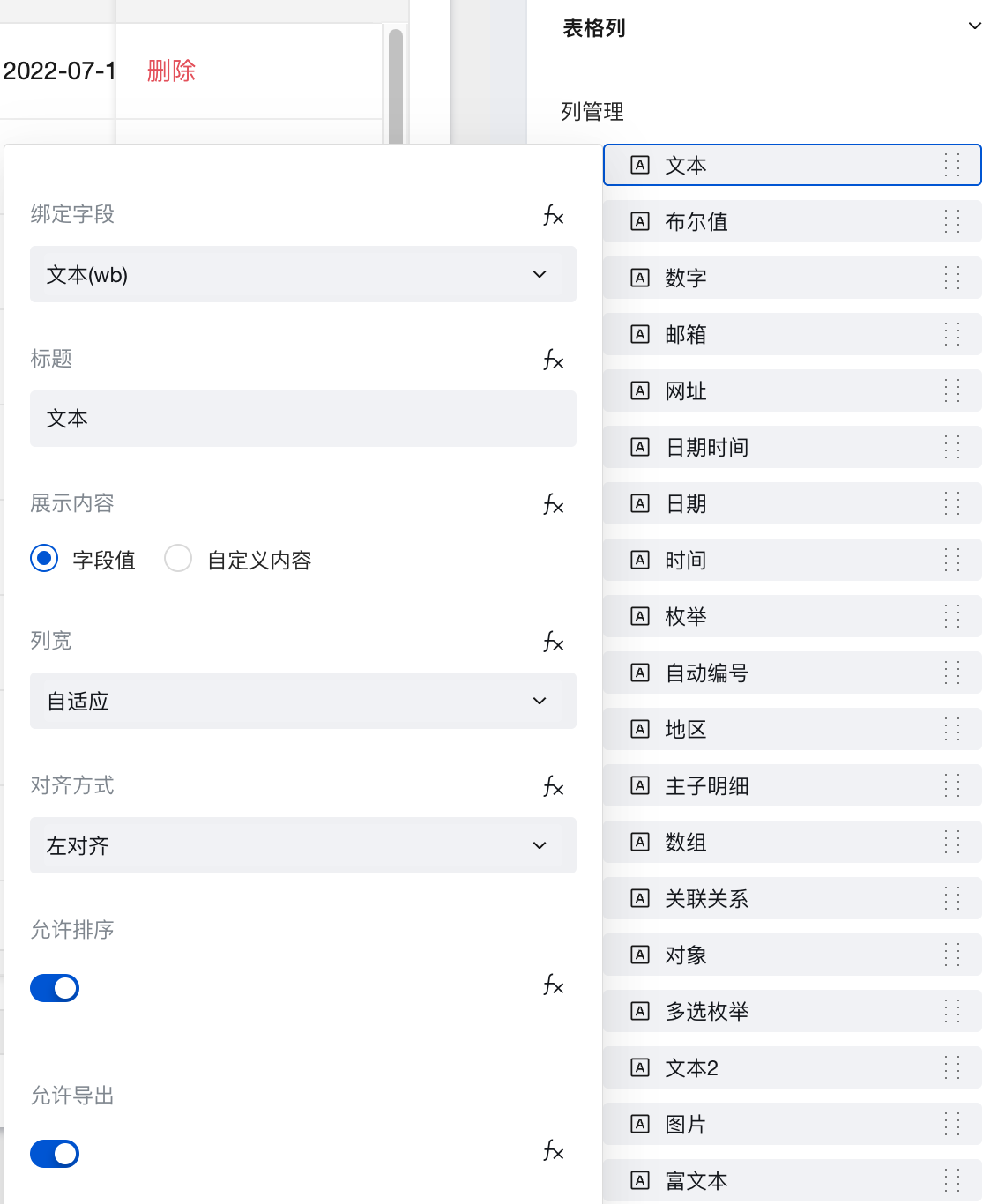
Column Settings
After selecting a column item in "Column Management", a column settings pop-up window will be displayed to configure the column title, display content type, column width, alignment, sorting, and exporting.
Export Relationship Fields
When the data source is a data model, only model fields with one-to-one or many-to-one relationships are supported for export for relationship type fields. The enabling methods are as follows:
-
In "Column Management", select the subfields of the relationship model that meet the export conditions. For example, to export the "phone" field in the "many-to-one relationship" table.
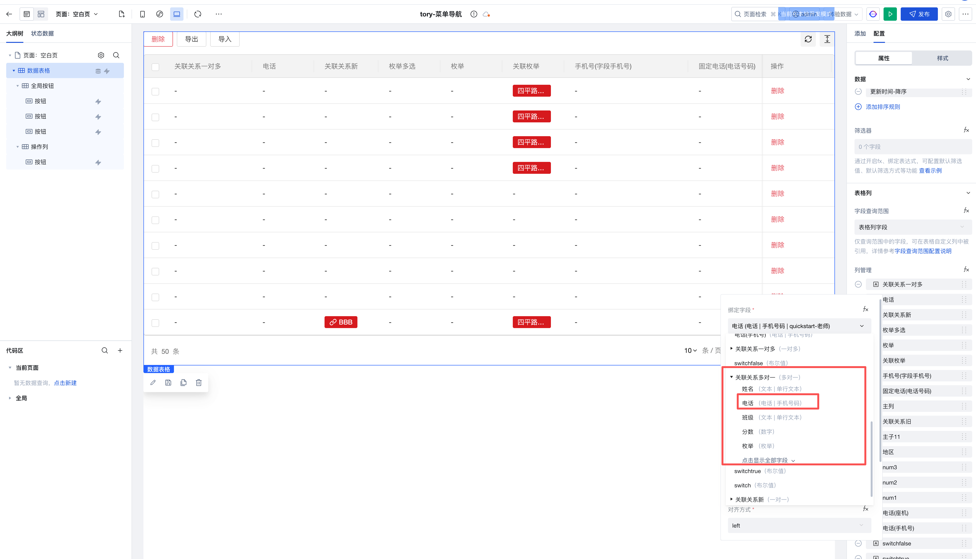
-
Enable export
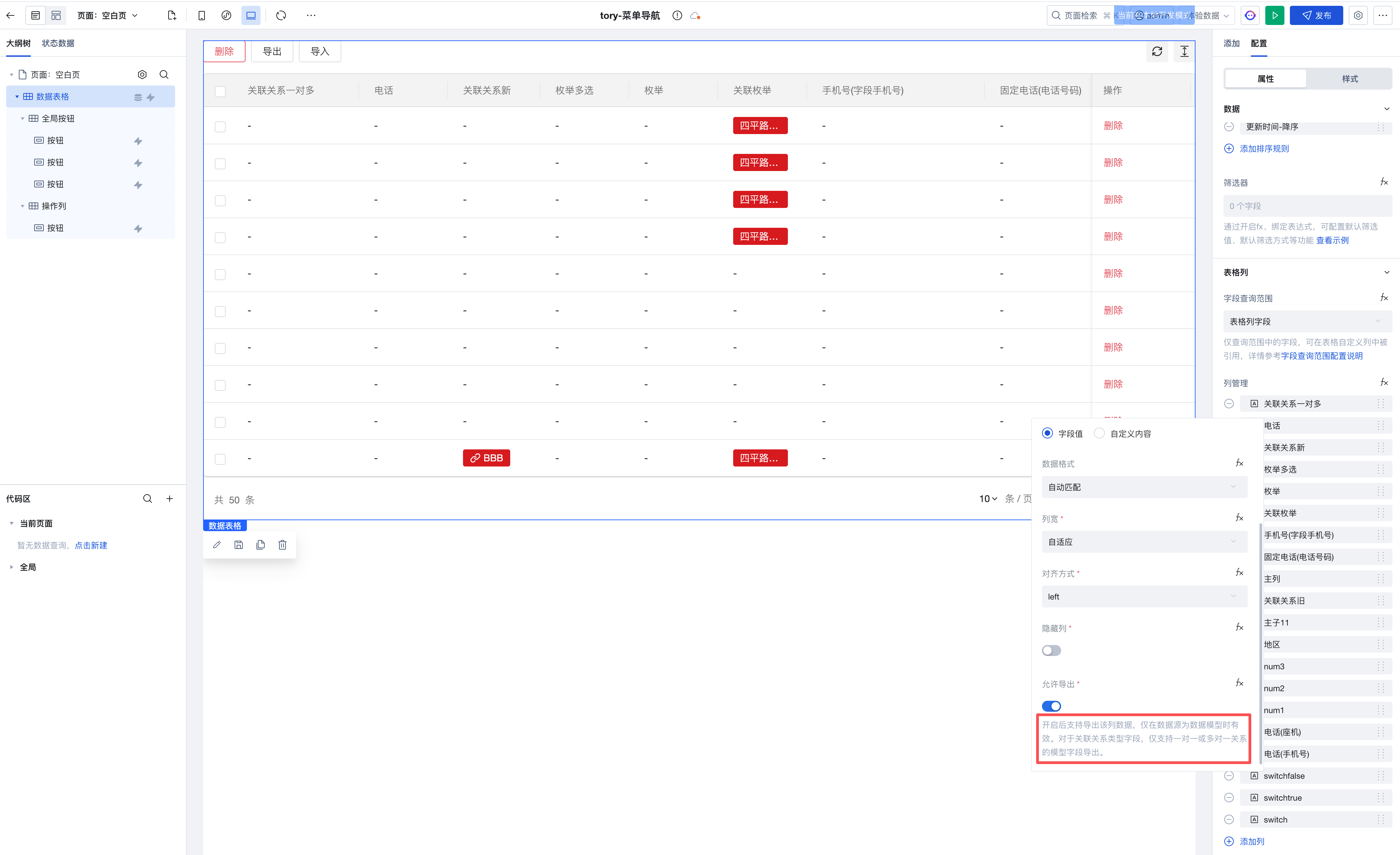
- After enabling, click the Export button to select the relationship model fields in the pop-up window.

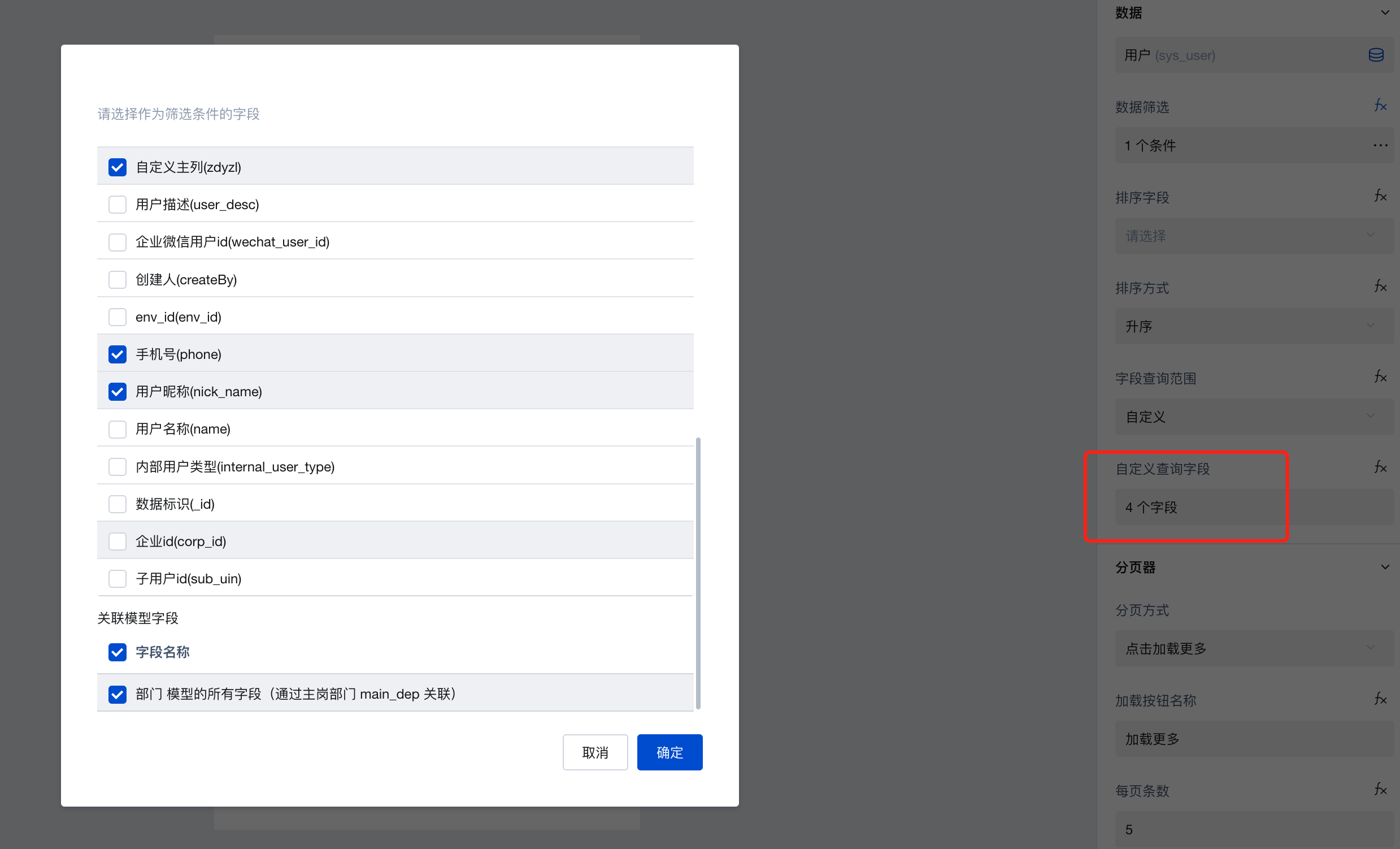
Field Query Scope Configuration
After the Data Table supports the v2 Query Protocol, it allows on-demand configuration of field query scopes to enhance query performance.
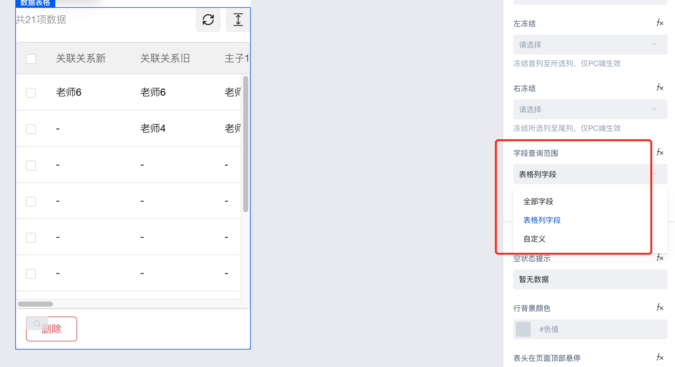
Field Query Scope Configuration supports the following three methods:
-
All fields: Returns all fields, including all fields from this table and associated tables.
-
Table column fields: Returns all fields of the table columns, excluding fields from associated tables. (Default setting)
-
Custom query fields: Supports on-demand configuration of primary table fields to be returned and whether to return associated table fields.
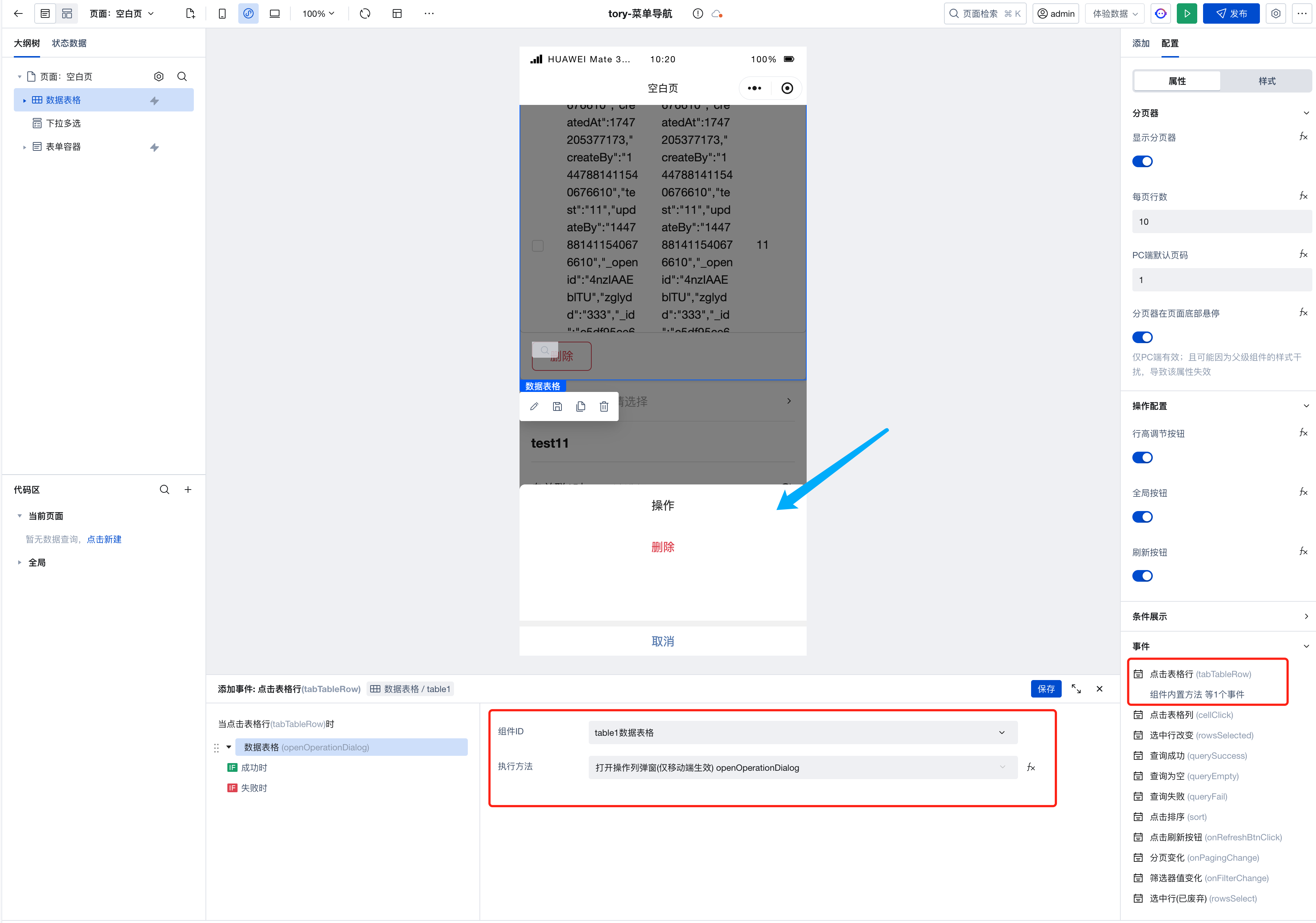
Mobile Operation Column Configuration
-
On the pc side, the operation column area is located in the last column of the table. On the h5 side, the operation column area is displayed as a pop-up window, which is invoked by configuring the table row click event to open the operation column pop-up.
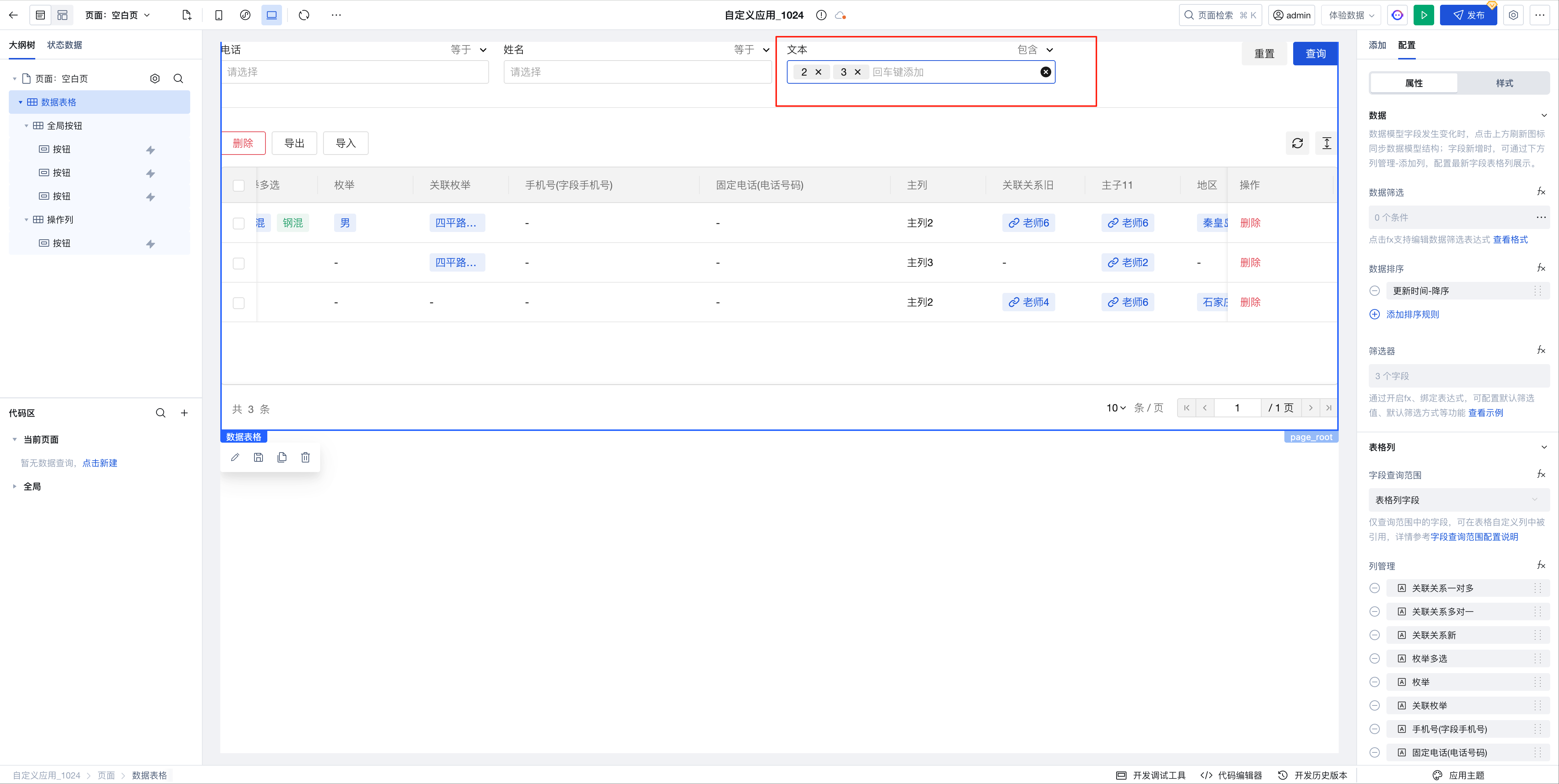
Filter Supports Visual Configuration of Relationship Fields
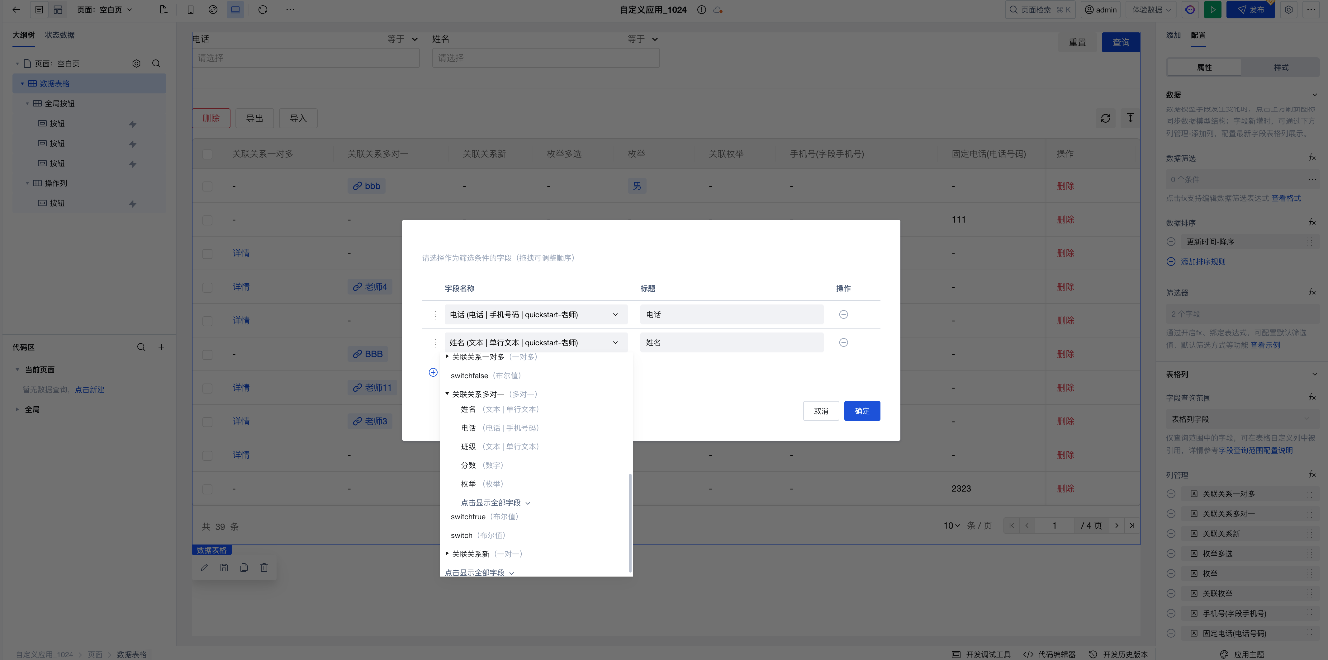
Filter Supports Tag Input
-
Supports quick data filtering through tag input for array and string field types, improving query efficiency for complex datasets.
Extended Scenarios Description
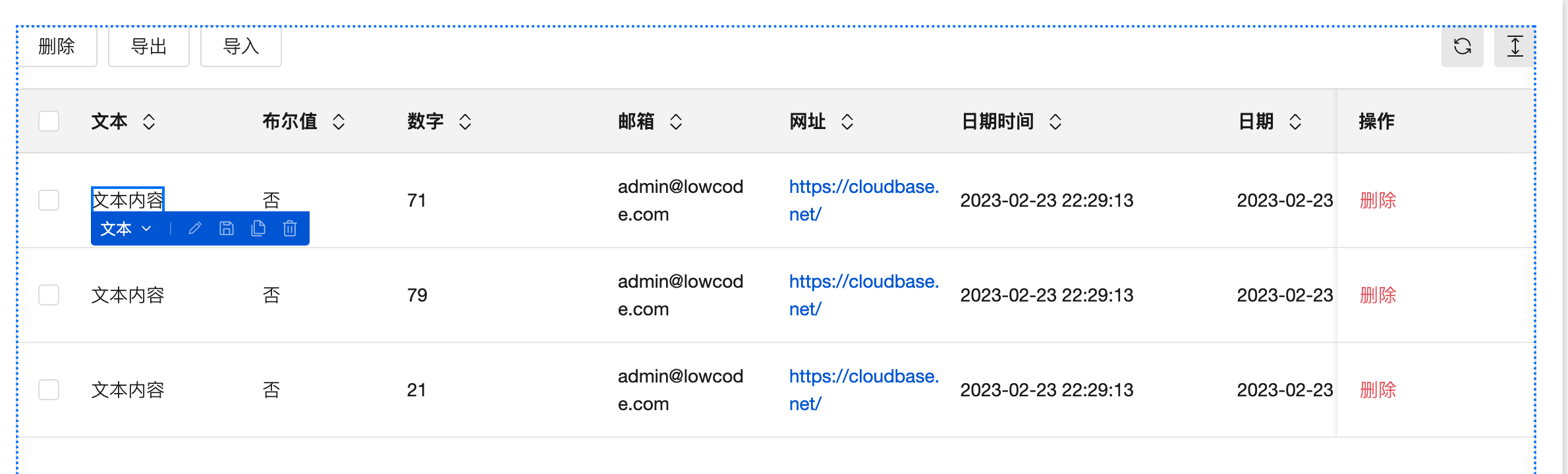
Custom Column Configuration and Display Customization
-
When the display content property of a table column is set to "custom content", the column will generate a slot that allows placing other components.
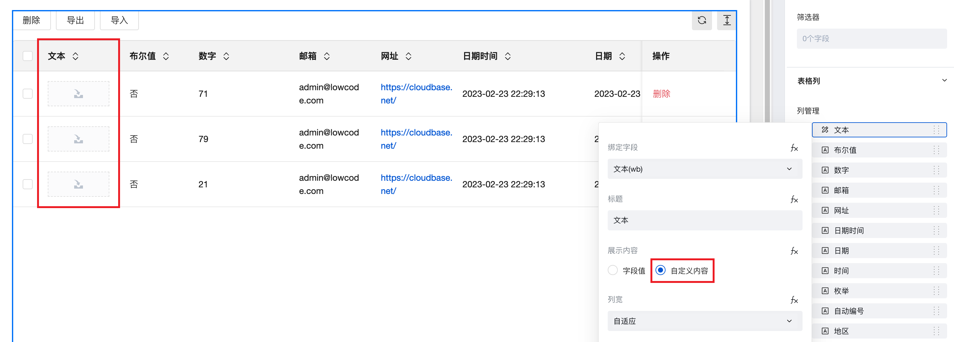
-
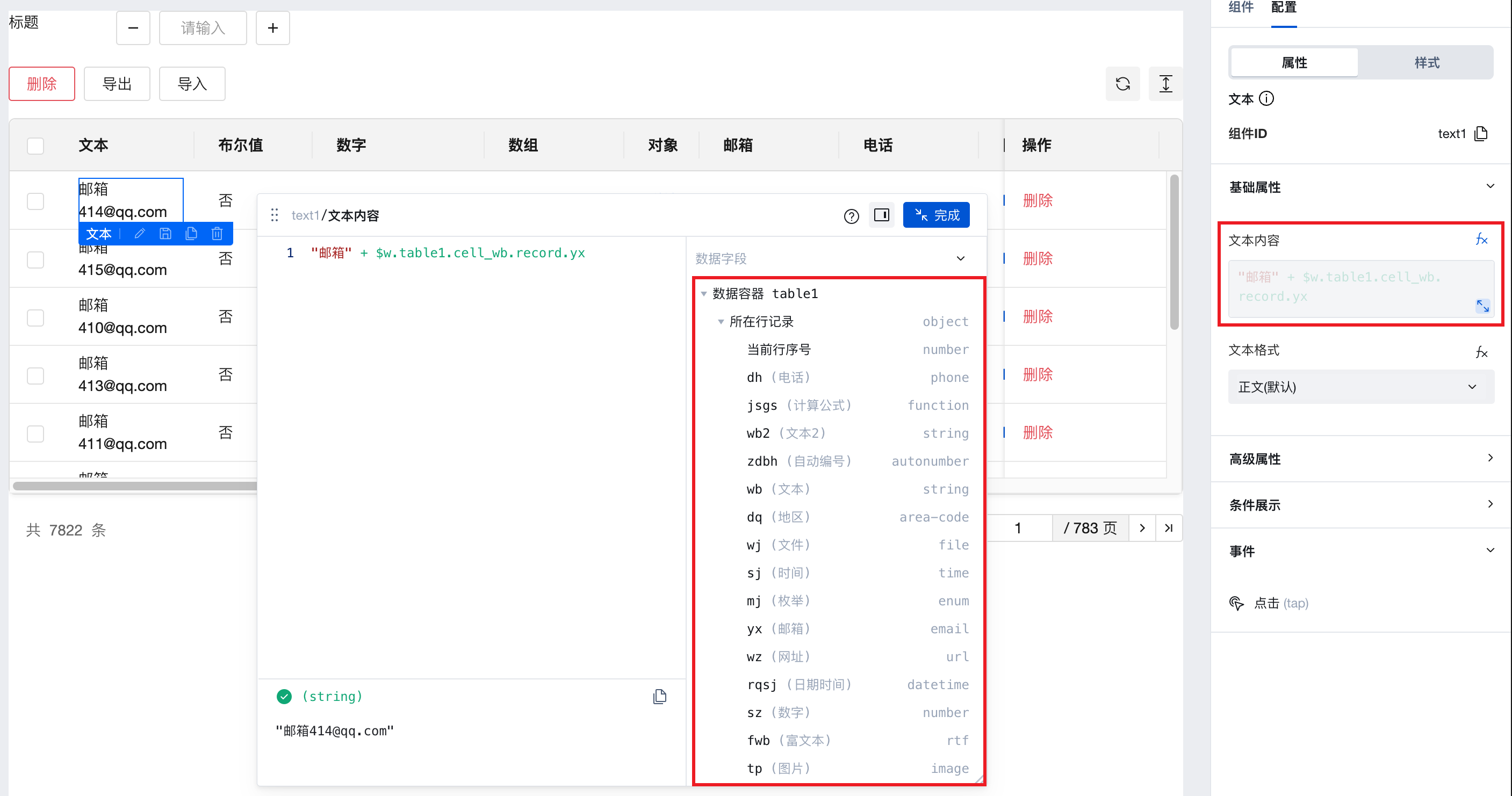
The properties of components within the slot can access current row information through expressions. For example: Drag a text component into the custom column's slot, select the component, click the data binding button next to the "Text Content" property, and choose row data fields or write custom functions in the expression editor to display required information.
Data Table Supports Form Value Management Capabilities
-
In data model binding scenarios, table values can be managed through custom slots combined with form components.
- After adding a table column, select the model, enable the custom slot, add an input box, update the corresponding name attribute, and the input box will automatically retrieve the model field value
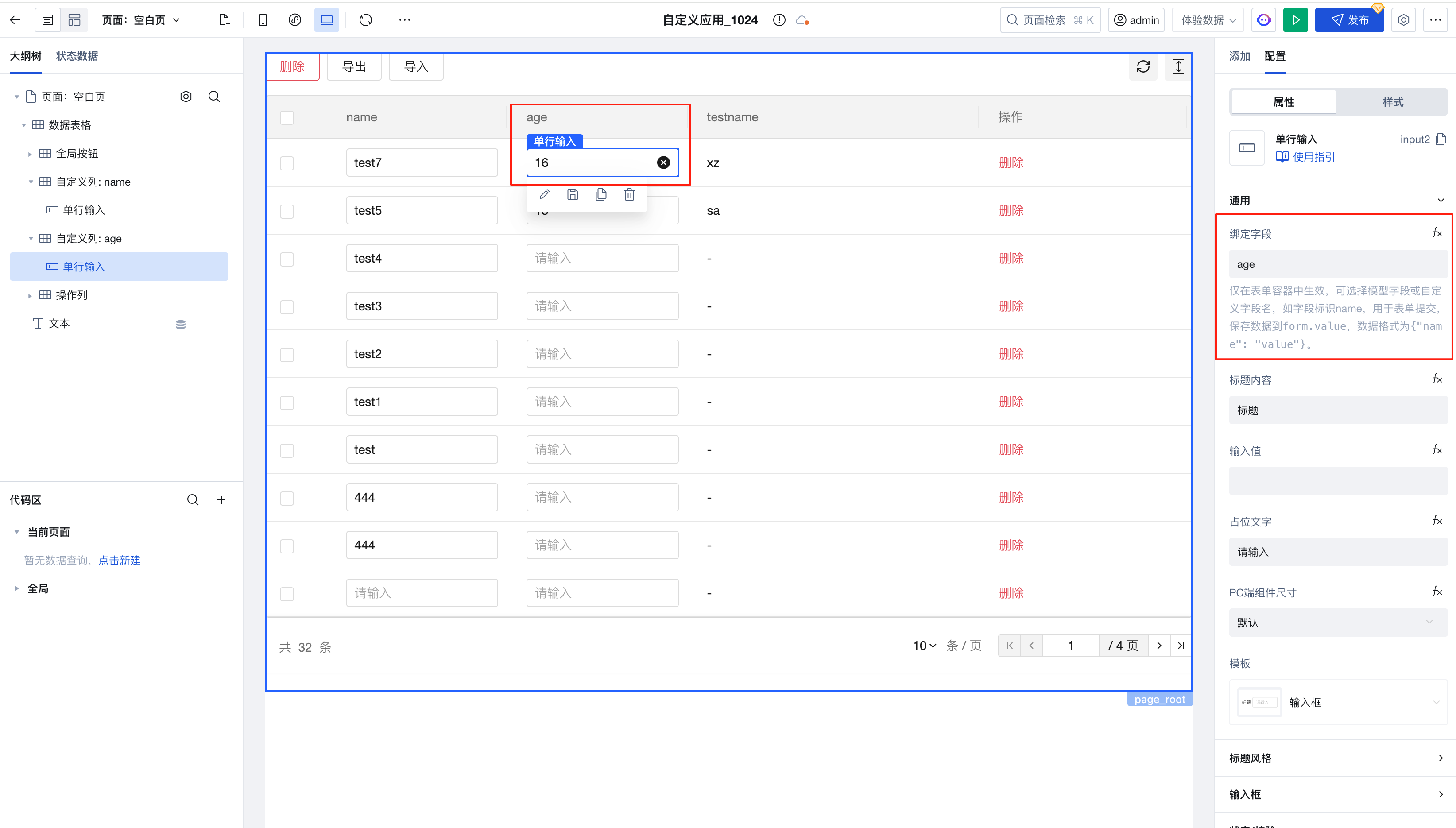
- By using $w.table1.value, you can obtain real-time table data
- Within custom slots, use $w.table1.cell_xxx.rowValue to obtain real-time table row data, which can be used in computational scenarios
-
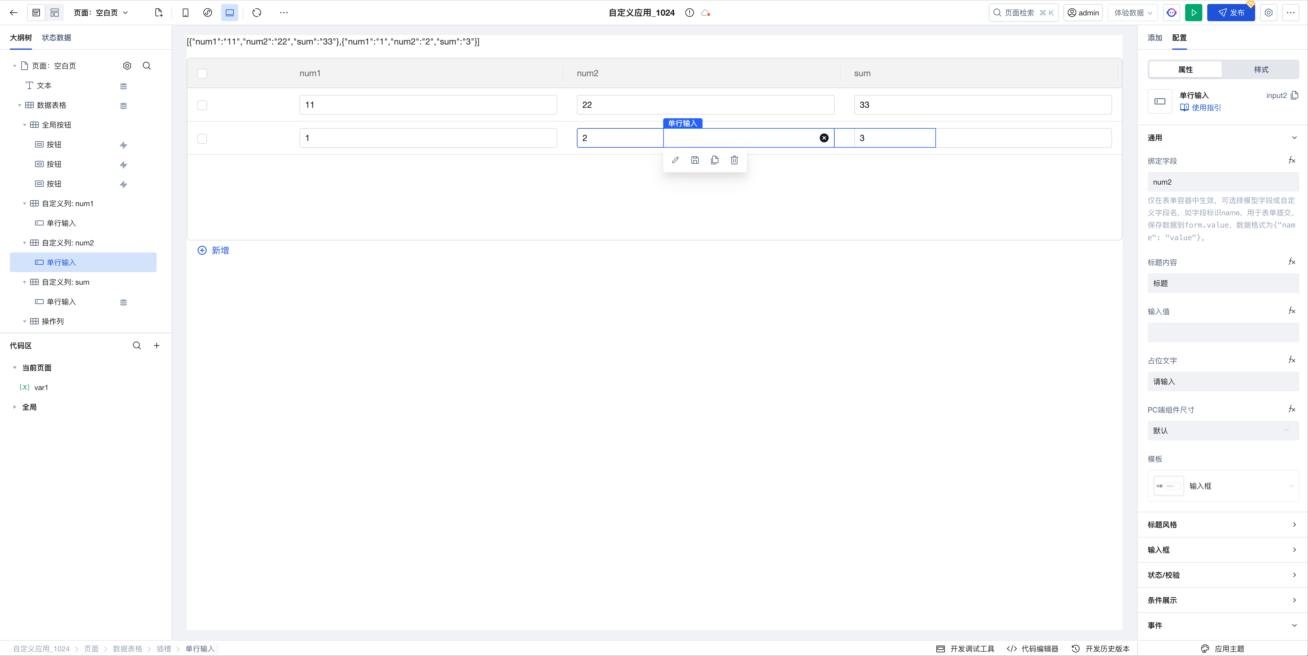
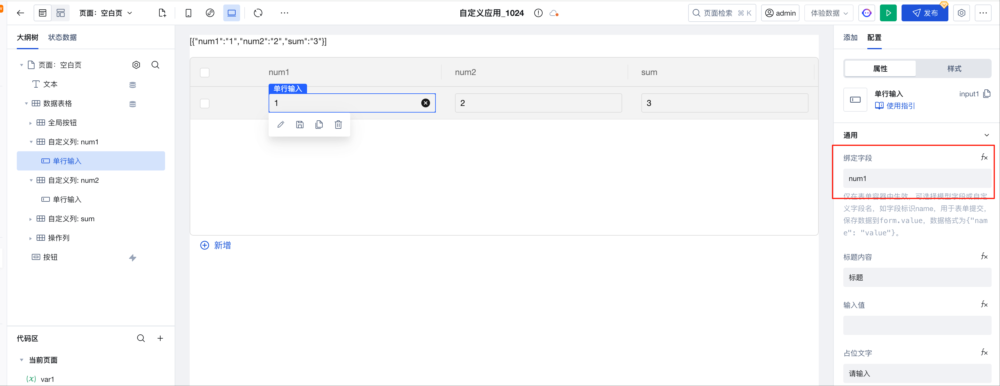
In binding expression scenarios, table values can also be managed through custom slots combined with form components.
-
After adding a table column, enable the custom slot, add an input box, and update the corresponding name attribute
-
Obtain real-time table data through the value attribute of the data table component
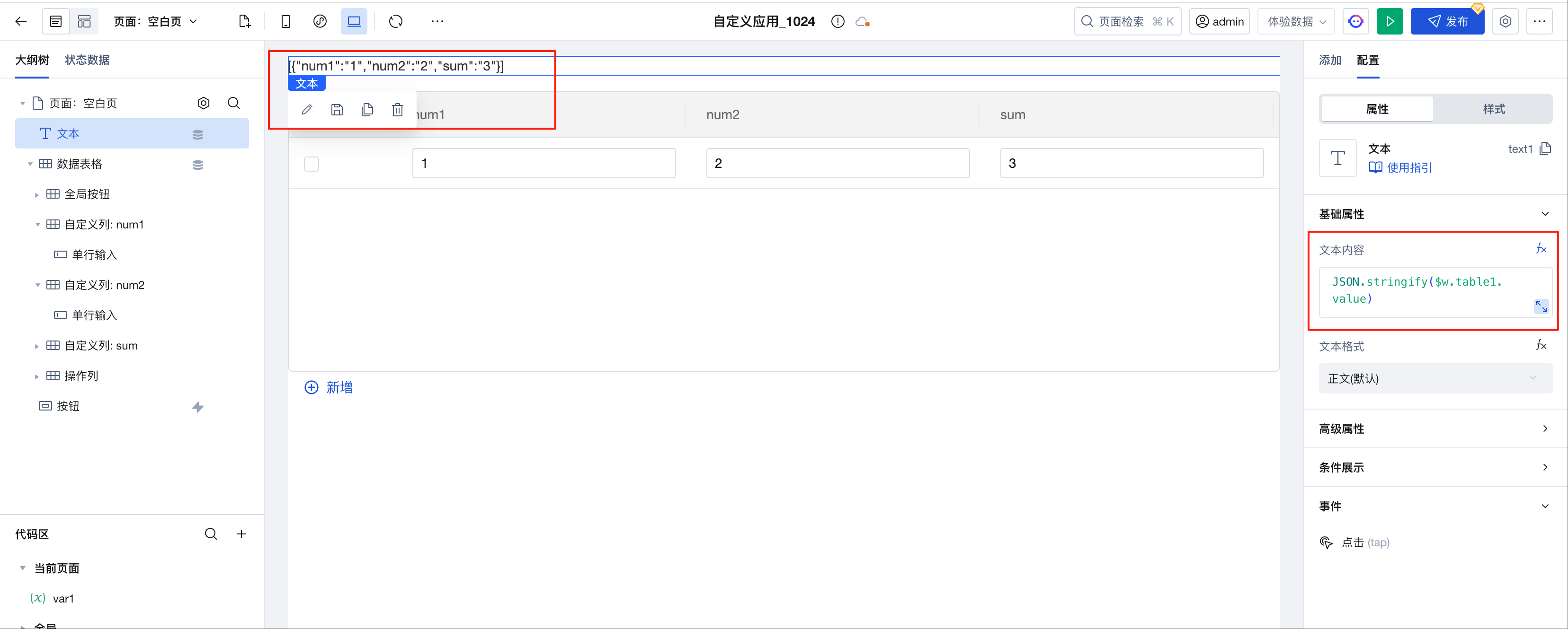 JSON.stringify($w.table1.value);
 -
Within custom slots, use $w.table1.cell_xxx.rowValue to obtain real-time table row data, which can be used in computational scenarios
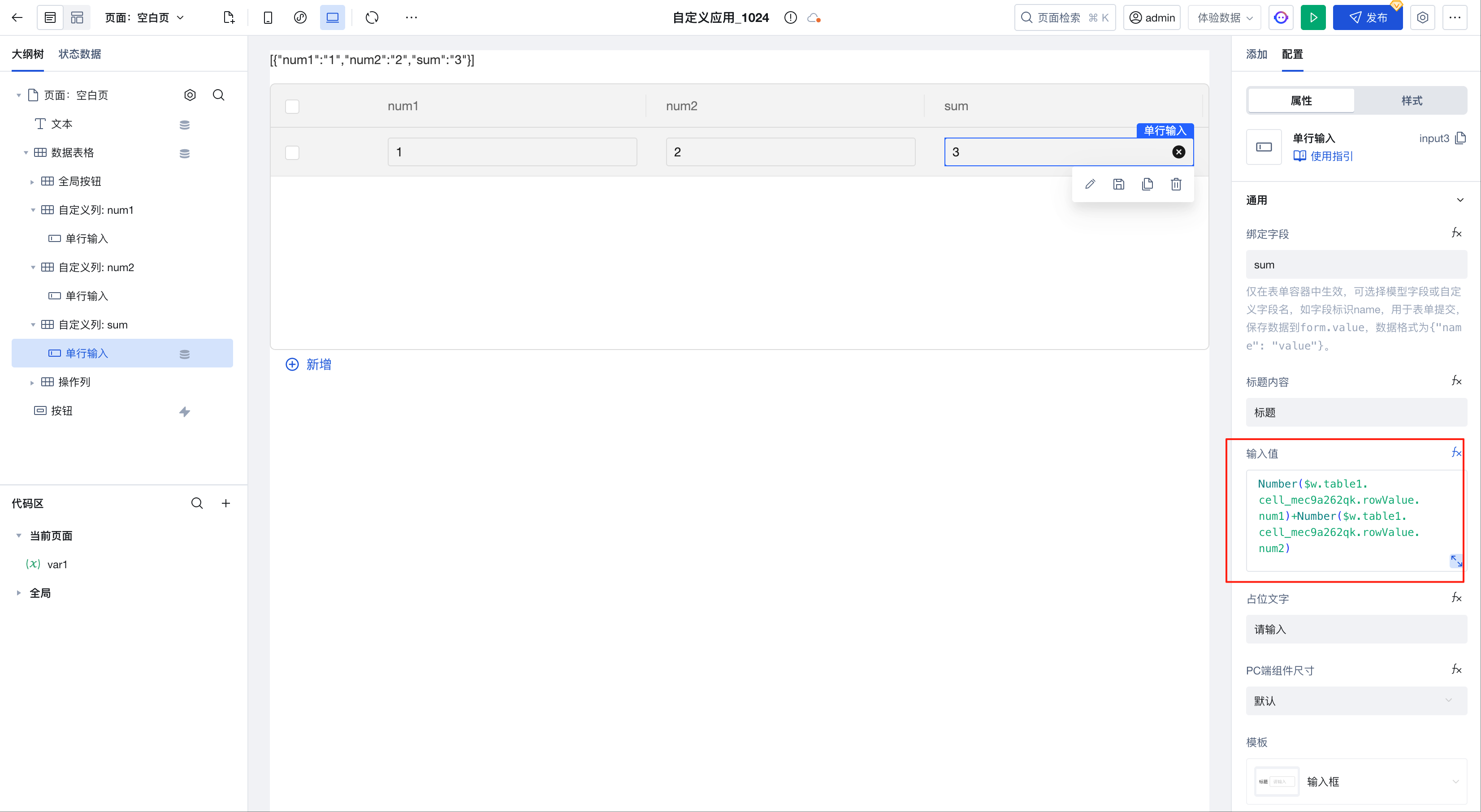 Number($w.table1.cell_mec9a262qk.rowValue.num1) +Number($w.table1.cell_mec9a262qk.rowValue.num2);
-
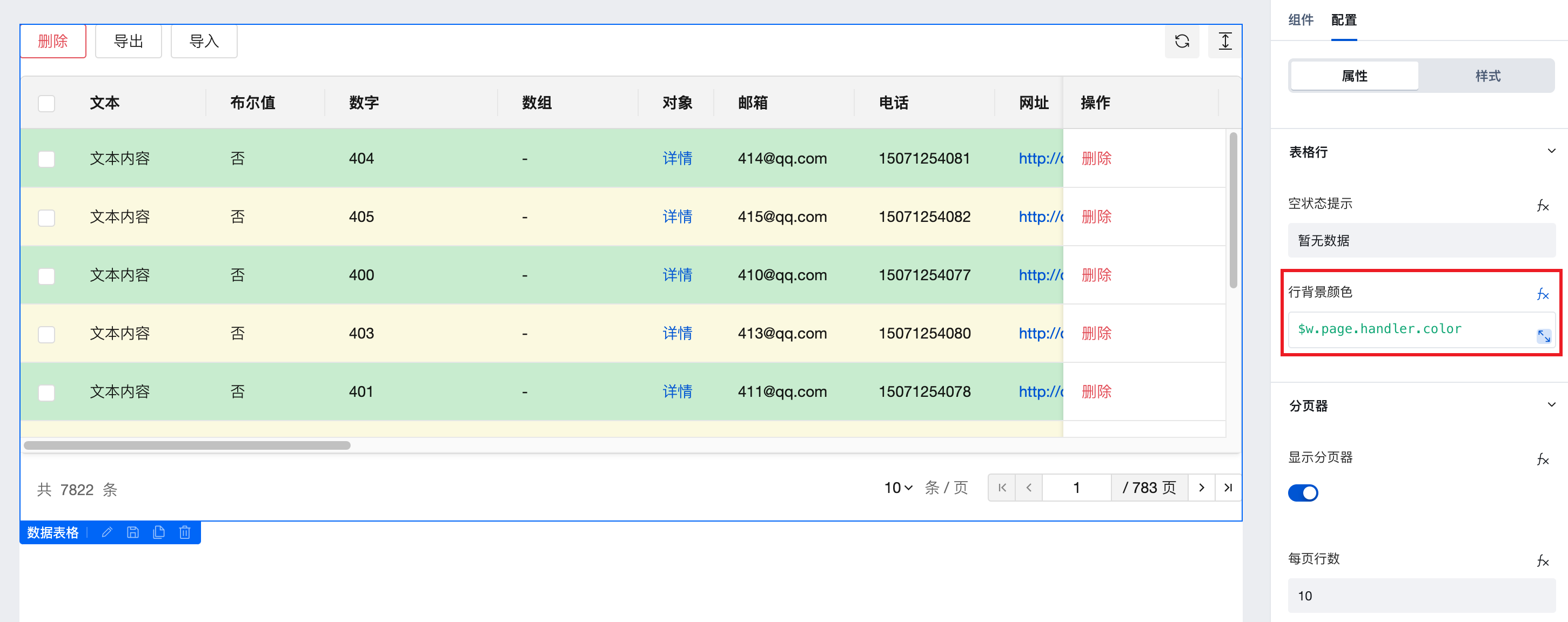
Define dynamic row background
Table components support judging row data content to display different background colors, as shown in the following example:
- Create a new method in "Code Editor - Current Page - handler"
export default function ({ event, data }) {
  // In event.detail, values such as record, rowkey, and recordIndex can be accessed for judging and controlling the row background color.
  return event.detail.recordIndex % 2 === 0
    ? 'rgb(199,237,204)'
    : 'rgb(250,249,222)';
}
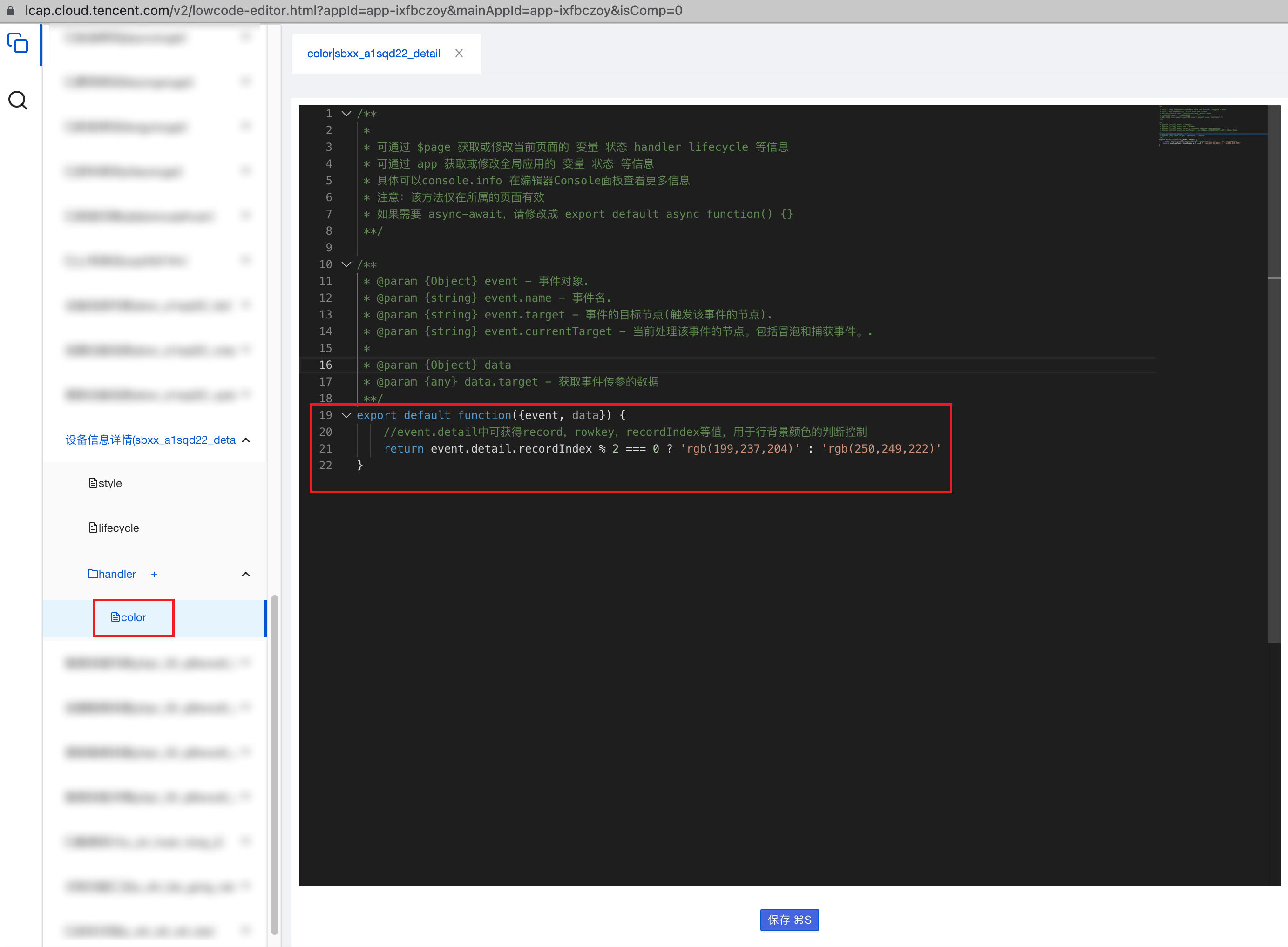
- In the 'Row Background Color' property of the table component, click the data binding button, open the pop-up window, and write $w.page.handler.color in the expression module to achieve different background colors for odd and even rows.
The operation column button jumps to the form page and passes the _id parameter of the current row data to achieve data editing and updating.
-
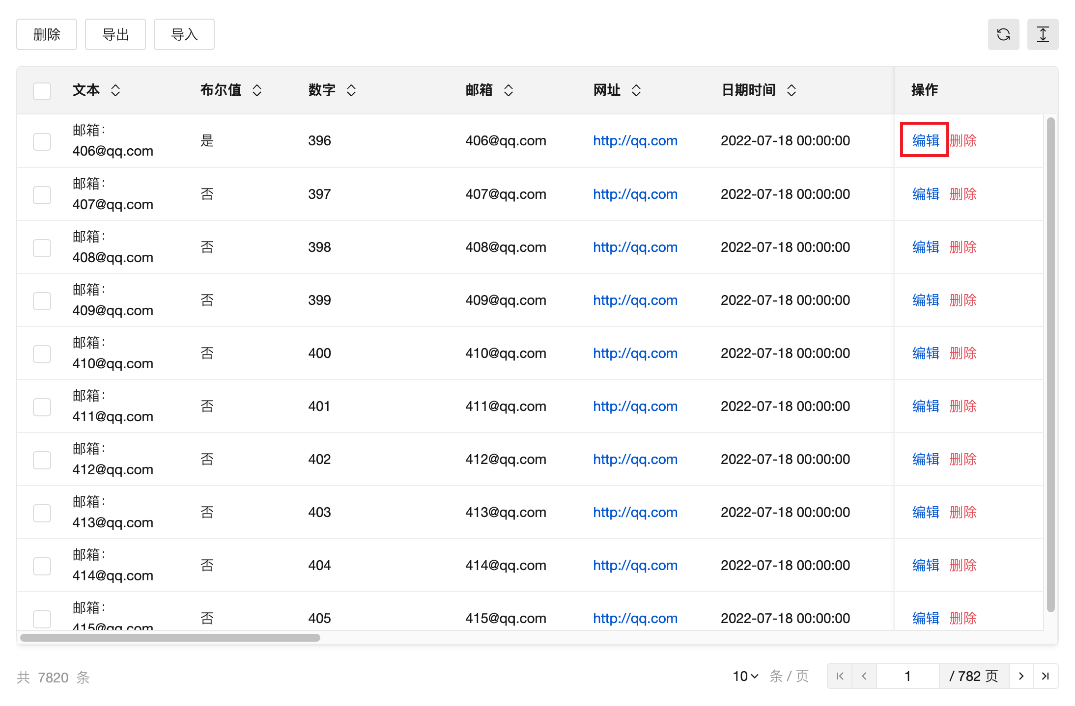
In the action column of the table component, drag and drop a button component.
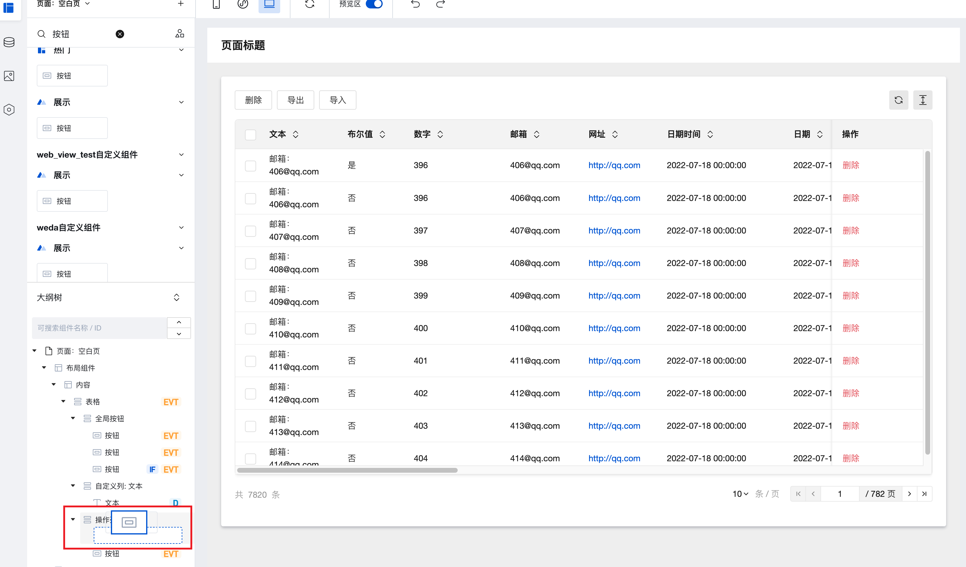
-
Change the button content to "Edit"; to ensure the button style is reasonable and aesthetically pleasing, adjust the button type to "Link".
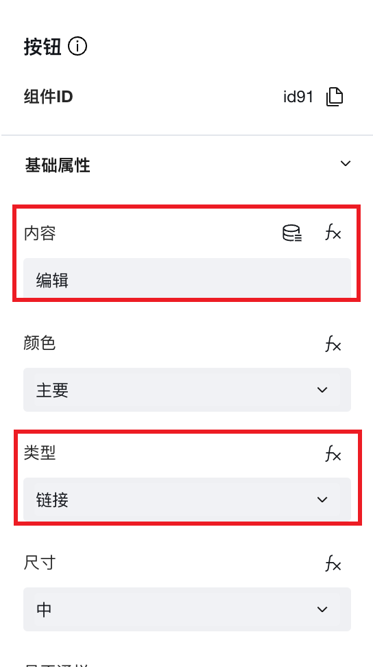
-
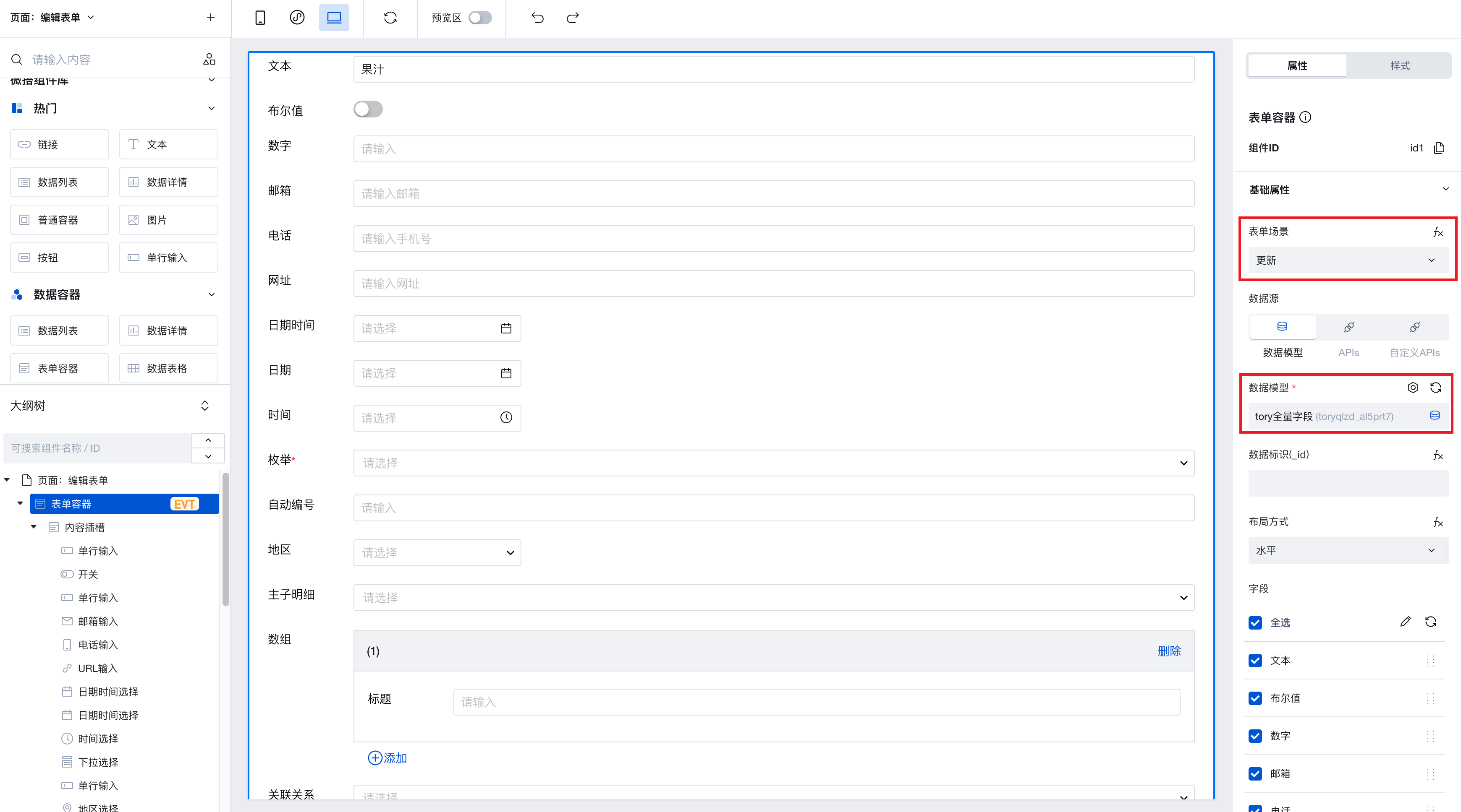
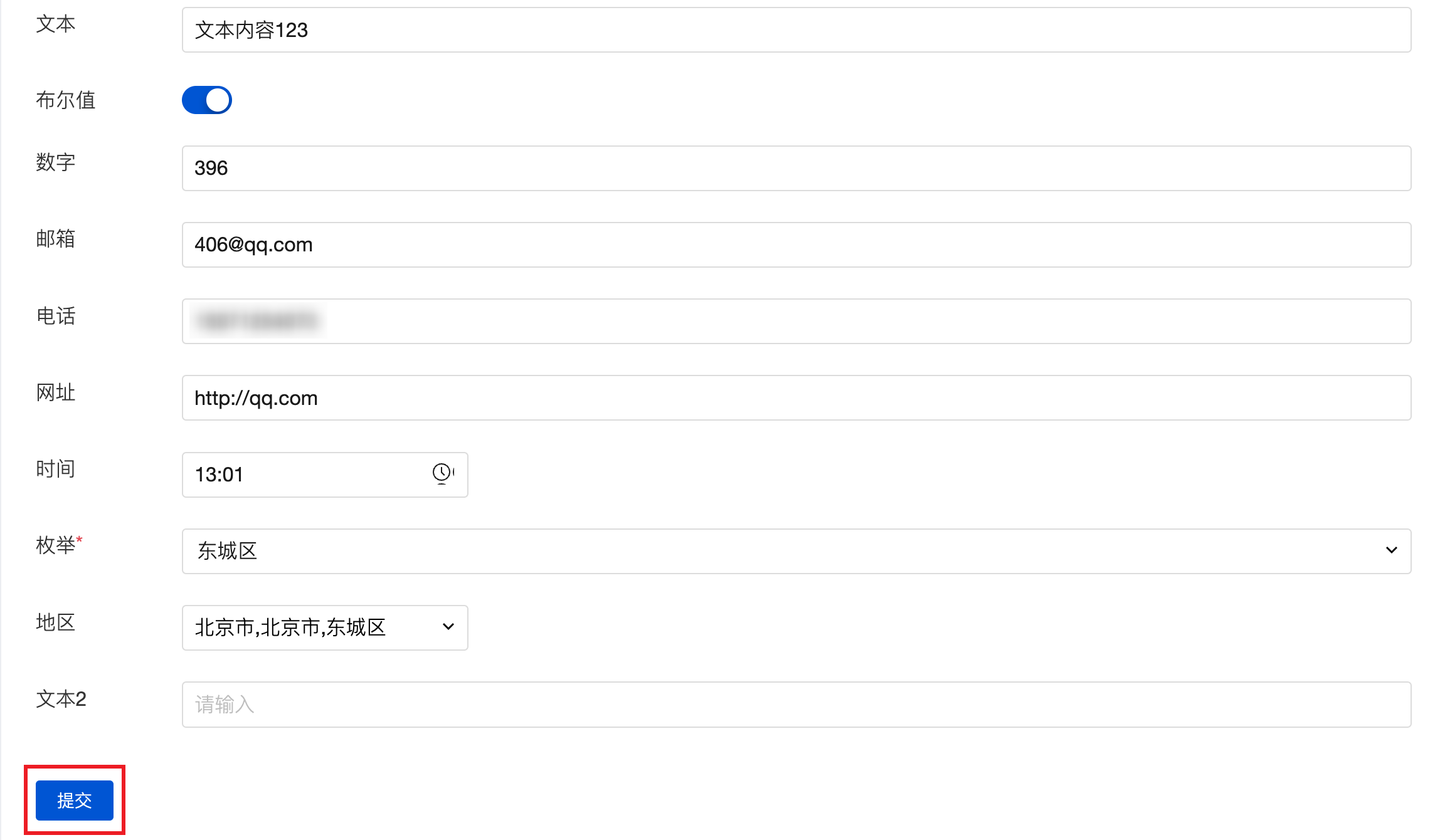
Create a form page, place a form container component, bind the same data model as the table component, and set the form scenario to "Update".
-
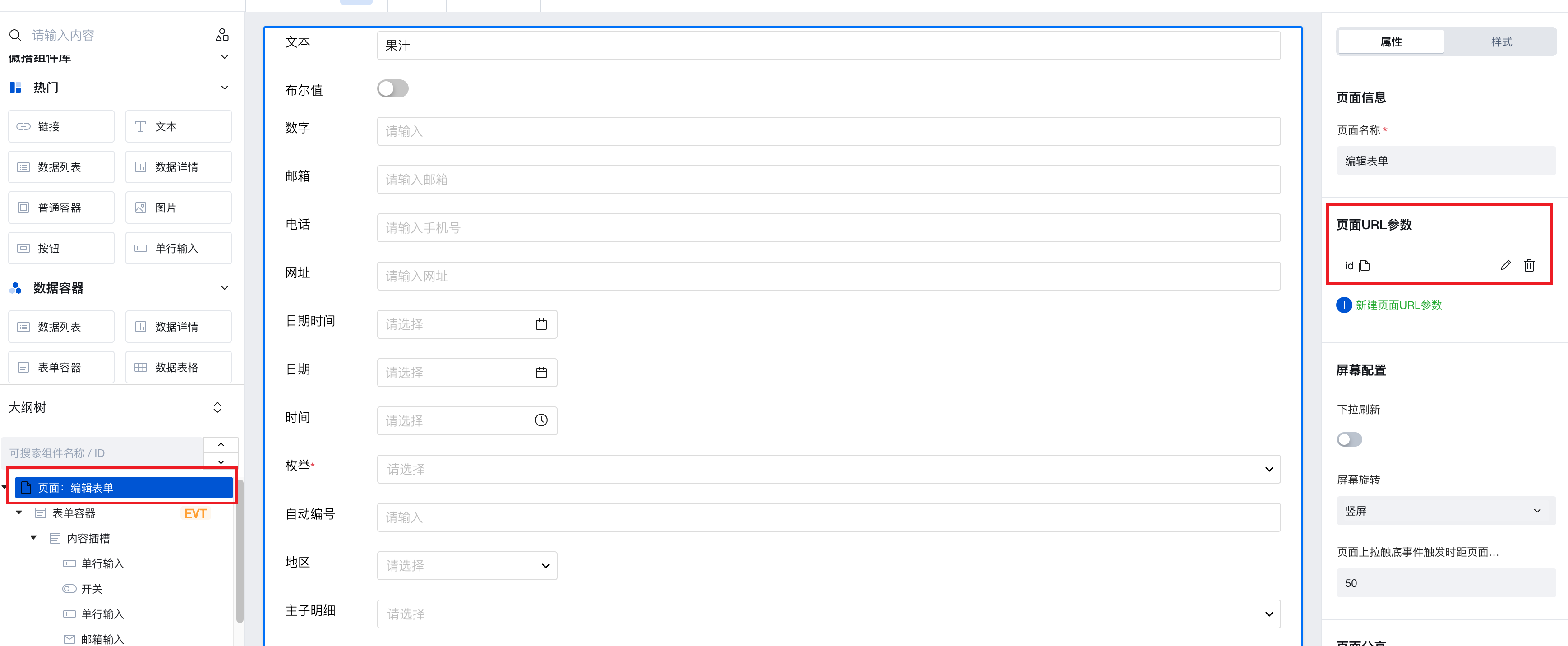
Then, in the outline tree, select the page node, add a URL parameter named "id", and bind this parameter to the data identifier attribute of the form container.
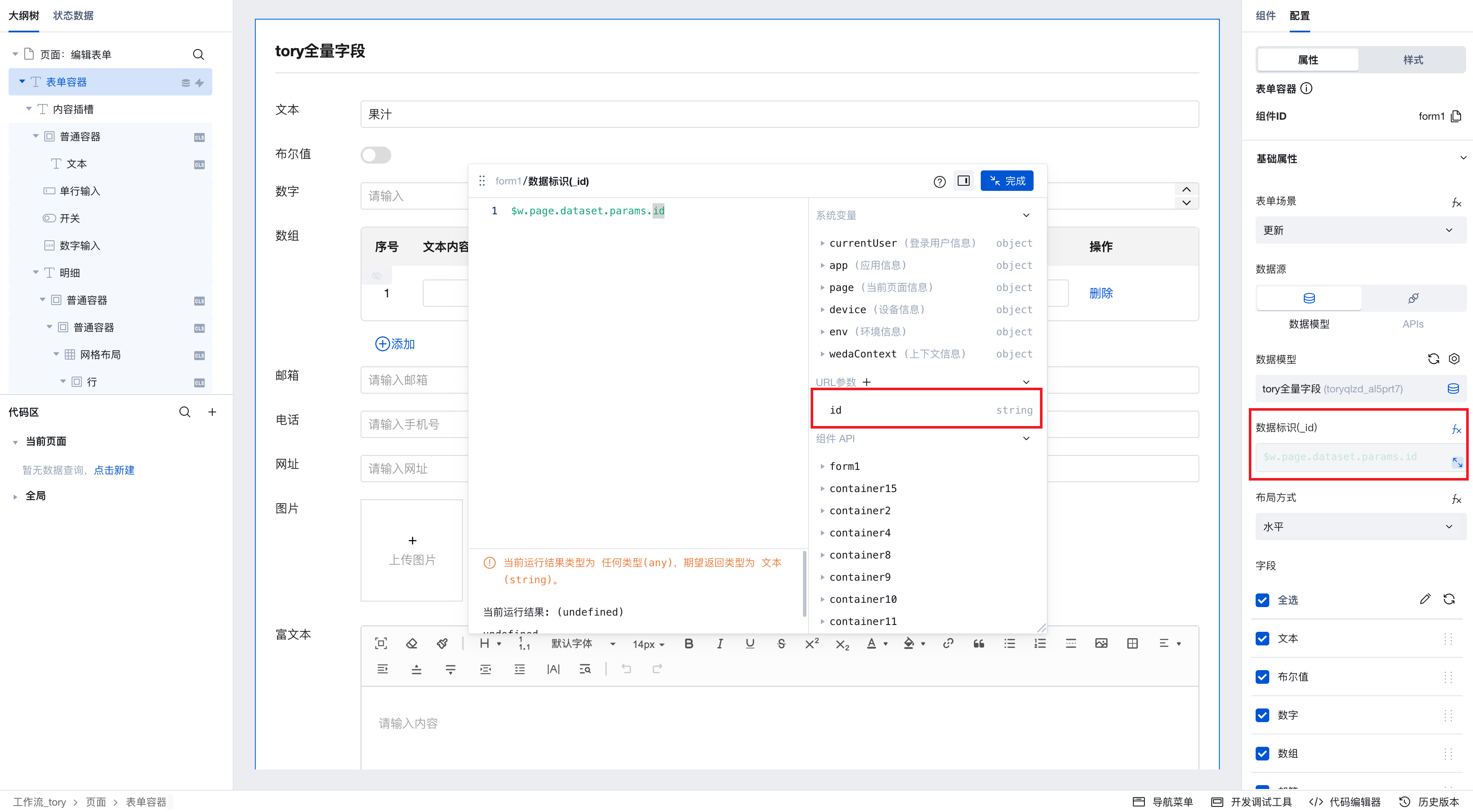
-
Return to the table page, select the button component you just added, configure its click event - open the form page you previously set up, and bind the expression to the page parameter 'id' by selecting the 'Data Identifier' field.
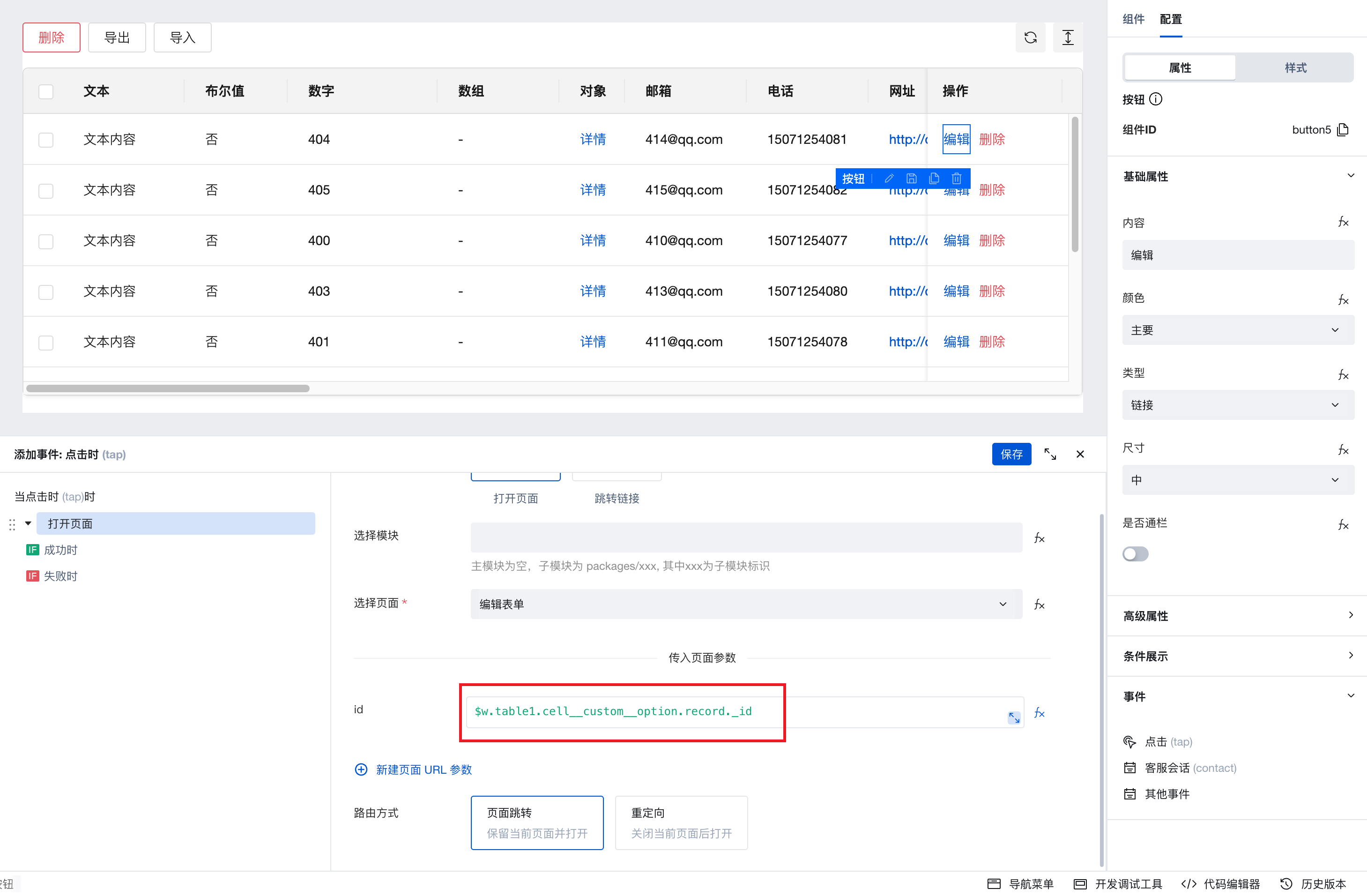
-
After completing the above configuration, you can achieve the following: clicking the "Edit" button navigates to the form page, pre-fills the form with data, and after making changes, clicking Submit updates the data and returns to the table page.
Obtain the Selected Value of the Selection Box Column
The selected row change event of the table component can obtain the data information of the selected multiple rows.
-
The "selected row change" event of the table component can obtain the data information of the selected multiple rows, which can be assigned to a variable in the form of an array.

Custom Configuration Filter
-
The 'filter' property of the table component supports binding to variables, enabling custom configuration of the filter.
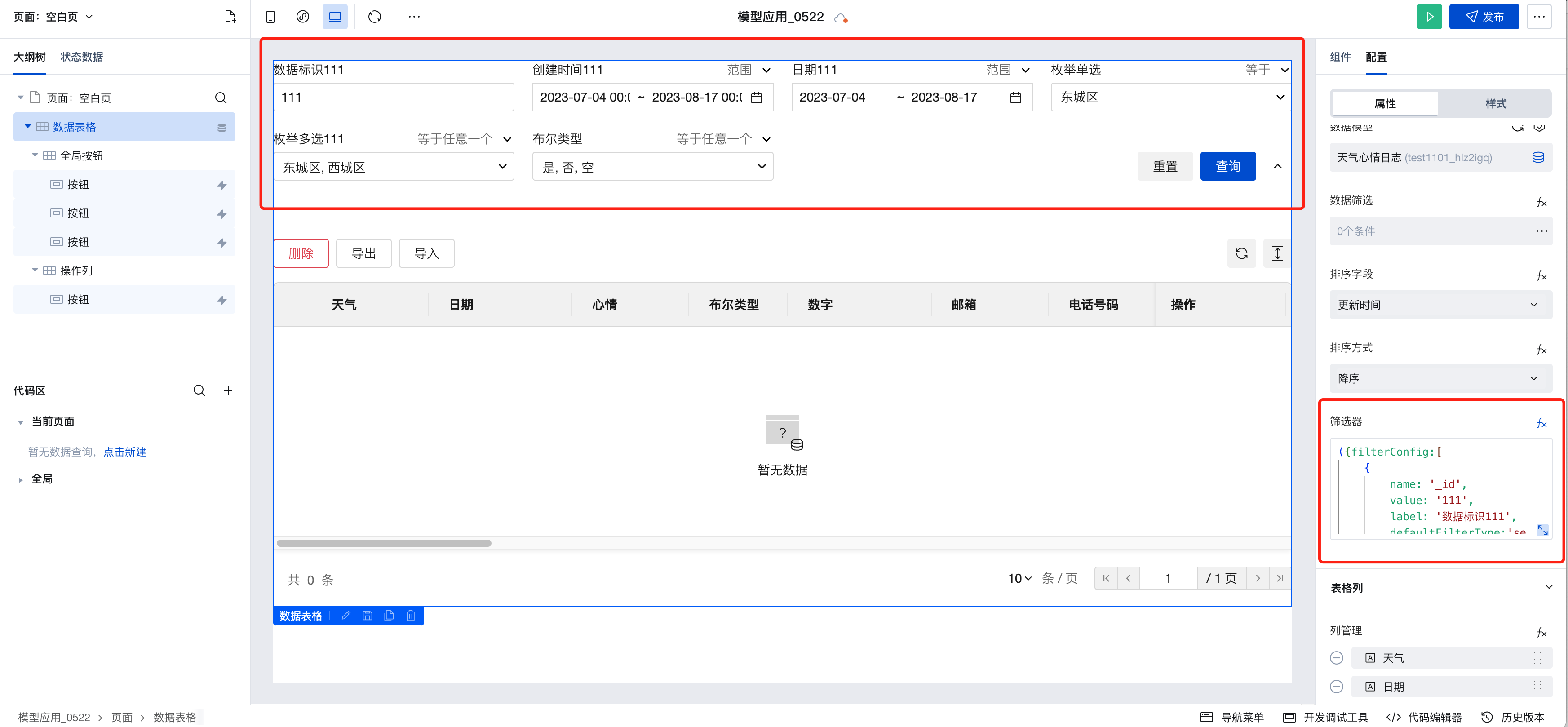
-
Variable Binding Example
({filterConfig:[
    {
        name: '_id',
        value: '111',
        label: 'data identifier 111',
        filterType:'search_ci',
        filterTypeOption:['search_ci']

    },
       {
        name: 'createdAt',
        value: ['2023-07-04 00:00:00','2023-08-17 00:00:00'],
        label: 'Creation Time 111',

    },
       {
        name: 'date',
        value:['2023-07-04','2023-08-17 00:00:00'],
        label: 'Date 111',

    },
       {
        name: 'mjdx11',
        value:'110101',

    },
       {
        name: 'mjdx',
        value:['110101','110102'],
        label: 'enum multi-select 111',

    },{
        name:'belx',
        value:[true, false, null]
    },
    {
        name: 'glgxddy',
        label: 'Many-to-One Relationship'
        relationFieldName: 'dh', // Configures the option name displayed for the relationship, corresponding to the name value of the data source field
        value:'36789d86636cf9590079242c054308e8'
    }

]})
- Field Property Description
| Property | Description | Type | Default Value | Required |
|---|---|---|---|---|
| name | The name value of the filter field, corresponding to the name value of the data source field | string | - | Yes |
| label | Custom Title | string | Data source field name | No |
| value | Initial value of the filter field | string/string[] | - | No |
| filterType | Default filter calculation method | string | Reference filter default values list | No |
| filterTypeOption | List of supported calculation methods for the filter field | string[] | Reference filter default values list | No |
| relationFieldName | Configure the displayed option names for the relationship filter, corresponding to the name value of the data source field | string[] | Default display of the primary column field | No |
- Filter Default Values List
| Data Source Field | List of default supported calculation methods | Default Calculation Method | |
| Date/Time/Number/Age Field | |||
| Range | scope | scope | |
| Equals | eq | ||
| Not Equals | neq | ||
| Greater Than | gt | ||
| Less Than | lt | ||
| Greater Than or Equal To | gte | ||
| Less Than or Equal To | lte | ||
| String/Email/URL/Mobile Number/Phone Number/Chinese Name Field | |||
| Contains | search_ci | search_ci | |
| Not Contains | nsearch_ci | ||
| Equals | eq | ||
| Not Equals | neq | ||
| Starts With | startWith | ||
| Boolean field/enum multi-select | |||
| Equals Any One | in | in | |
| Not Equal to Any One | nin | ||
| Enum Single Select/Master-Detail/Relationship | |||
| Equals | eq | eq | |
| Not Equals | neq | ||
Note:
- The valid values for the default filter calculation method (filterType) are the values of the calculation methods supported by the corresponding data source field.
- The list of supported filter types (filterTypeOption) is an array of values for the calculation methods supported by the corresponding data source field. If not passed, it defaults to the list of calculation methods supported by default for this field.
- Real-time filter configuration can be obtained via $w.componentId.filterConfig.
Example
Interactive Preview
Style API Custom Styles
// Table styles need to be used with an id selector
#wd-page-root .wd-table {
  background-color: #ecebf6;
}
#wd-page-root .wd-table__header {
  background-color: #d7d3f0;
}
#wd-page-root .wd-table--bordered {
  border: 1px solid #d7d3f0;
}
CSS Variables Custom Styles
#wd-page-root .wd-table {
  // Table background color
  --wd-table-color-bg: #f7ffee;
  // Row background color on mouse hover
  --wd-table-row-color-bg-hover: #c7e1bf;
  // Header background color
  --wd-table-header-color-bg: #c7e1bf;
  // Selected row color
  --wd-table-row-color-bg-selected: #cadbc0;
  // Table border color
  --wd-table-color-border: #c7e1bf;
  // Default table row height (medium)
  --wd-table-td-height-md: 70px;
}
Properties
External properties received by the component
Property Name | Property Identifier | Type | Description |
|---|
| Data source | dataSourceType | string | Select data source type Example: "data-model" |
| data model | bindMetadata | object | Data display data source, including data model/view |
| expression | dataSourceData | array | Data shown in the table, selectable variables. |
| Data primary key | recordKey | string | Used to distinguish different data, impacting row selection, row edit and other features. A unique auto-increment ID in the database is generally used. Example: "_id" |
| data loading status | loading | boolean | Data loading status will be shown when enabled |
| data filter | queryCondition | array | Filter data |
| Sorting method. | orderType | string | Customizable in ascending or descending order. When binding an expression, transfer values as asc for ascending and desc for descending. Default value: "desc" |
| Enable multi-field sorting | isSupportMultipleSort | boolean | Example: false |
| data sorting | sorter | array | 可设置数据排序规则,支持拖拽调整排序优先级,数组下标越小优先级越高。绑定数据示例:[{"orderBy":"updatedAt","orderType":"desc"}],升序传值asc,降序传值desc Example: [ { "orderBy": "updatedAt", "orderType": "desc", "label": "更新时间" } ] |
| filter | filterFields | object | Configure the running state filter in the table, support data binding for object type, attribute field is filterConfig Example: {} |
| APIs | bindConnectMetadata | object | Data display APIs source selection |
| calling method | connectorMethod | object | Select data API calling method |
| Query input parameters | connectorParams | string | 对APIs 调用方法获取的数据进行筛选过滤。例如 {name:'',value:''} |
| Field query scope | selectFieldType | string | Default query spreadsheet column fields Default value: "table" |
| Custom query field | selectFields | array | |
| Column management | columnSets | array | Configure table columns, support drag-and-drop column sort Example: [] |
| Operation list (last column) | enableCellCustomOption | boolean | After enabled, drag-and-drop components such as buttons into the operation list node of the outline tree or the operation list area of the spreadsheet. Example: true |
| Display associated/enumeration field tags | enableRelationTag | boolean | After being enabled, the relationship between and enumeration fields in the table are shown as tags by default. Default value: true |
| Operation list heading | customOptionTitle | string | Default value: "操作" |
| Left freeze | fixedFront | string | When left and right freeze property configured columns intersect or duplicate, the freeze property automatically disables to avoid spreadsheet horizontal scrolling. |
| Freeze on the right | fixedEnd | string | When left and right freeze property configured columns intersect or duplicate, the freeze property automatically disables to avoid spreadsheet horizontal scrolling. |
| data selection | columnSelectType | string | Control the style of select column in table data Default value: "select" |
| Disable row selection | rowDisabled | object | Disable Table Row selection feature, can be selected based on given records to determine whether disabled (disabled records are not selectable) |
| Empty status prompt | emptyText | string | Prompt note when no data exists, do not display if content is empty Default value: "暂无数据" |
| background color | rowColor | string | Set a fixed value or bind a low-code method to alter the background color of a row |
| Header hover at the top of the page | isSuspendHeader | boolean | If it does not take effect, please ensure the parent element does not have the overflow property set to hidden, scroll, or auto. These attributes can cause position: sticky to fail. Moreover, if the webpage already has fixed elements, hover may not be visible, so you may need to manually adjust the hover position via style. Default value: true |
| Open the slot at the bottom of the table | enableBottomTipSlot | boolean | Enabled, supports bottom content slot in spreadsheets |
| Display pager | enablePagination | boolean | Enabled, supports spreadsheet pagination Default value: true |
| Number of rows per page | defaultPageSize | number | Configure rows per page by default in PC spreadsheet Default value: 10 |
| Default page number on PC | defaultPageIndex | number | Configure the initial page number by default in PC spreadsheet Default value: 1 |
| Pager hovers at the bottom of the page | isSuspendFooter | boolean | If it does not take effect, please ensure the parent element does not have the overflow property set to hidden, scroll, or auto. These attributes can cause position: sticky to fail. Moreover, if the webpage already has fixed elements, hover may not be visible, so you may need to manually adjust the hover position via style. Default value: true |
| Enable server-side pagination | enableTotal | boolean | Enabled, supports server-side pagination Example: false |
| Total data | total | number | By default, the array length is the expression input. Enter the actual total data of the data table. |
| Beauty filter buttons | enableTableHeightSizeBtn | boolean | Once enabled, row height adjustment is supported Default value: true |
| global button | enableGlobalButton | boolean | After enabled, drag-and-drop components such as buttons into the global button node of the outline tree or the global button area of the spreadsheet. Example: true |
| refresh button | enableRefreshBtn | boolean | When enabled, the refresh button can be shown Default value: true |
Events
Events exposed by the component. You can listen to component events to trigger external actions
Event Name | Event Code | Event Output Parameters event.detail | Applicable Scenarios | Description |
|---|
| click the table row | tabTableRow | object
| Mobile,PC | Click a row in the spreadsheet to trigger |
| click the table column | cellClick | object
| Mobile,PC | Click a column in the spreadsheet to trigger |
| Selected row altered | rowsSelected | object
| Mobile,PC | Click data selection (multiple choice/single-choice column), trigger when altering selected rows. |
| query succeeded | querySuccess | object
| Mobile,PC | Triggered every time a data query succeeds, including when switching pages or modifying filter conditions. |
| query is empty | queryEmpty | object
| Mobile,PC | Triggered every time a data query succeeds, including when switching pages or modifying filter conditions. |
| Query failed | queryFail | object
| Mobile,PC | Triggered every time a data query fails, including when switching pages or modifying filter conditions. |
| Click Sort | sort | object
| Mobile,PC | Click Sort |
| Click the Refresh button | onRefreshBtnClick | Mobile,PC | Click the Refresh button | |
| Page transition | onPagingChange | object
| Mobile,PC | Page transition |
| filter values adjustment | onFilterChange | object
| Mobile,PC | Filter panel search value adjustment/Query trigger callback |
| Selected row (abandoned) | rowsSelect | Mobile,PC | Click data selection (multiple selection/single-choice column), trigger when altering selected rows. Use $w.component id.selectedRecords to get details of selected rows. |
Properties API
Through the Property API, you can access the internal state and property values of components. You can access internal values using$w.componentId.propertyName, such as $w.input1.value. For details, please refer to Property API
Read-only Property Name | Property Identifier | Type | Description |
|---|
| Data source | dataSourceType | string | Select data source type |
| data model | bindMetadata | object | Data display data source, including data model/view |
| expression | dataSourceData | array | Data shown in the table, selectable variables. |
| Data primary key | recordKey | string | Used to distinguish different data, impacting row selection, row edit and other features. A unique auto-increment ID in the database is generally used. |
| Column management | columnSets | array | Configure table columns, support drag-and-drop column sort |
| Number of rows per page | defaultPageSize | number | Configure rows per page by default in PC spreadsheet |
| Default page number on PC | defaultPageIndex | number | Configure the initial page number by default in PC spreadsheet |
| Table data | records | array | Table data |
| Total number of spreadsheet data | total | number | Total number of spreadsheet data |
| Page number. | pageNo | number | Spreadsheet current page |
| Page length | pageSize | number | Number of rows per page |
| Selected data in the table | selectedRecords | array | Selected data in the table |
| Error message. | error | object | Error info within component |
| Data sorted in a table | sort | array | The sorted data of the table is used for table request queries, and the format matches the current data source protocol. See query protocol example |
| Filtered table data | filter | | The sorted data of the table is used for table request queries, and the format matches the current data source protocol. See query protocol example |
| Data source protocol version | dataSourceVersion | string | When the data source type is data model, the current table supports protocol version |
| Filter panel configuration | filterConfig | array | Filter panel configuration |
| Table Row real-time value | value | array | Real-time value of spreadsheet row data, used to obtain form component values in custom slots. |
Method API
Through the Method API, you can programmatically trigger internal methods of components, such as submitting forms, displaying popups, etc. You can call component methods using $w.componentId.methodName, such as $w.form1.submit()
Method Name | Method Identifier | Parameters | Method Description |
|---|
| import | import | Importing is supported only when the data source is a data model scenario. You can upload an excel file and enter data as a template. | |
| Data export (optional export mode) | exportOptionalMode | Support exporting table data to excel. Options: export all data, filtered data, selected data | |
| export selected data | export | Support exporting the currently selected data as excel | |
| Delete a single data record | deleteOne | string删除数据的标识 | Deletion is supported for row data only when the data source is a data model. |
| Delete selected data | deleteSelected | Deletion is supported for the selected row record only when the data source is a data model. | |
| Refresh table (View data on page 1) | refresh | Refresh table (View data on page 1) | |
| Refresh table (View current page data) | refreshKeepPage | Refresh table (View current page data) | |
| Open the operation list popup (mobile terminal only) | openOperationDialog | Toggle on the operation list popup | |
| Reset filters | resetFilter | Reset filters | |
| Clear selection | clearSelection | Clear selection | |
| Enable row selection | setSelectedKeys | object
| Enable row selection |
Style API
Through the Style API, you can override the styles of internal elements in components to achieve customization. For example, in the low-code editor, you can write styles for all button components using #wd-page-root .wd-btn, and control individual component styles with :scope. For detailed instructions, please refer toStyle API
Name | Class Name | Description and Examples |
|---|
| root element | .wd-table-wrap | Data table component root element |
| PC-side table component root element | .wd-pc-table | Write styles for PC spreadsheets |
| H5 table component root element | .wd-h5-table | Write style for H5 spreadsheet |
| Header text style | .wd-table__box th>div | Header text style |
| Header background style | .wd-table__box th | Header background style |
| Text style in a table | .wd-table__box td>div | Text style in a table |
| Text style in a table | .wd-table__box td | Text style in a table |
| Table Content Text Element | .wd-table__box td .wd-text-overflow | Spreadsheet filter panel root element |
| Table body style | .wd-table | Table body style |
| Spreadsheet filter panel root element | .wd-table | Spreadsheet filter panel root element |
CSS Variables
.wd-table-wrap {
  // Default background color
  --wd-table-color-bg: var(--wd-color-bg-container);
  // Header background color
  --wd-table-header-color-bg: var(--wd-color-bg-secondarycontainer);

  // Row background color - default
  --wd-table-box-header-tr-color-bg: transparent;
  // Row background color - mouse hover
  --wd-table-row-color-bg-hover: var(--wd-color-bg-container-hover);
  // Row background color - selected state
  --wd-table-row-color-bg-selected: var(--wd-color-brand-light);

  // Table text font size
  --wd-table-font-size: var(--wd-font-size-default);
  // Table text color
  --wd-table-color-text: var(--wd-color-text-default);
  // Table text font weight
  --wd-table-color-text-weight: var(--wd-color-text-default);

  // Header text color
  --wd-table-header-color-text: var(--wd-color-text-default);
  // Header text font weight
  --wd-table-header-font-weight: var(--wd-font-weight-medium);

  // Table row height - low
  --wd-table-td-height-sm: 3rem;
  // Table row height - medium
  --wd-table-td-height-md: 3.375rem;
  // Table row height - high
  --wd-table-td-height-lg: 5.125rem;

  // Table outer border color
  --wd-table-color-border: var(--wd-color-border-default);
  // Table inner border color
  --wd-table-color-border-inner: var(--wd-color-border-separator);

  // Table rounded corners
  --wd-table-border-radius: calc(var(--wd-border-radius) * 2);

  // Mobile bottom button area border color
  --wd-table-footer-border-color: var(--wd-color-border-default);
}
Version Changes
- This upgrade provides brand-new table styles for PC end/mobile end.
- Enhanced capabilities for filters and table column configuration
- Added table row click event
- Standardize component property names and classification
Query Protocol Example
- Table sorting data is used for table request queries, with the format consistent with the current data source protocol. After the component is upgraded to version 2.30.0, newly added table components have the data model query protocol upgraded to version v2, while existing table components still use the version v1 protocol. Example of the parameter structure for the v1 version protocol:
[{"orderBy":"updateAt","orderType":"desc"}], and example for the v2 version protocol:[{"updateAt":"desc"}]. - Table filtering data is used for table request queries, with the format consistent with the current data source protocol. After the component is upgraded to version 2.30.0, newly added table components have the data model query protocol upgraded to version v2, while existing table components still use the version v1 protocol. Example of the parameter structure for the v1 version protocol:
[{"key":"test","val":"1","rel":"search"}], example for the v2 version protocol:{"where":{"$and":[{"test":{"$search":"1"}}]}}.
Upgrade Guide
- For old table components, click the upgrade button on the right to upgrade to the new table with one click. The action column and global buttons are upgraded to slots, allowing you to drag and drop components such as buttons into the global button slot or action column slot of the table.
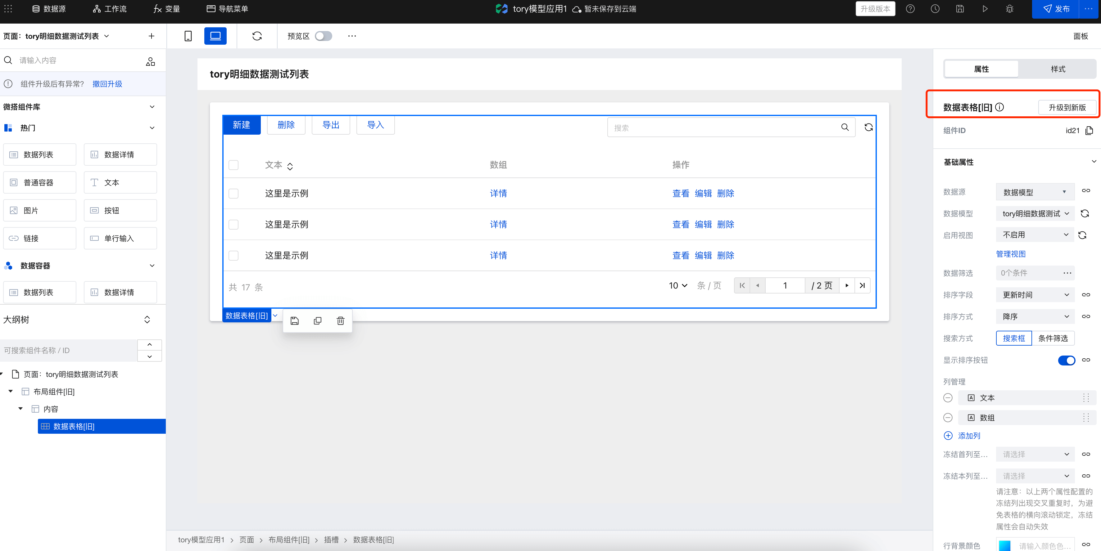
- Global Buttons and Action Column Configuration
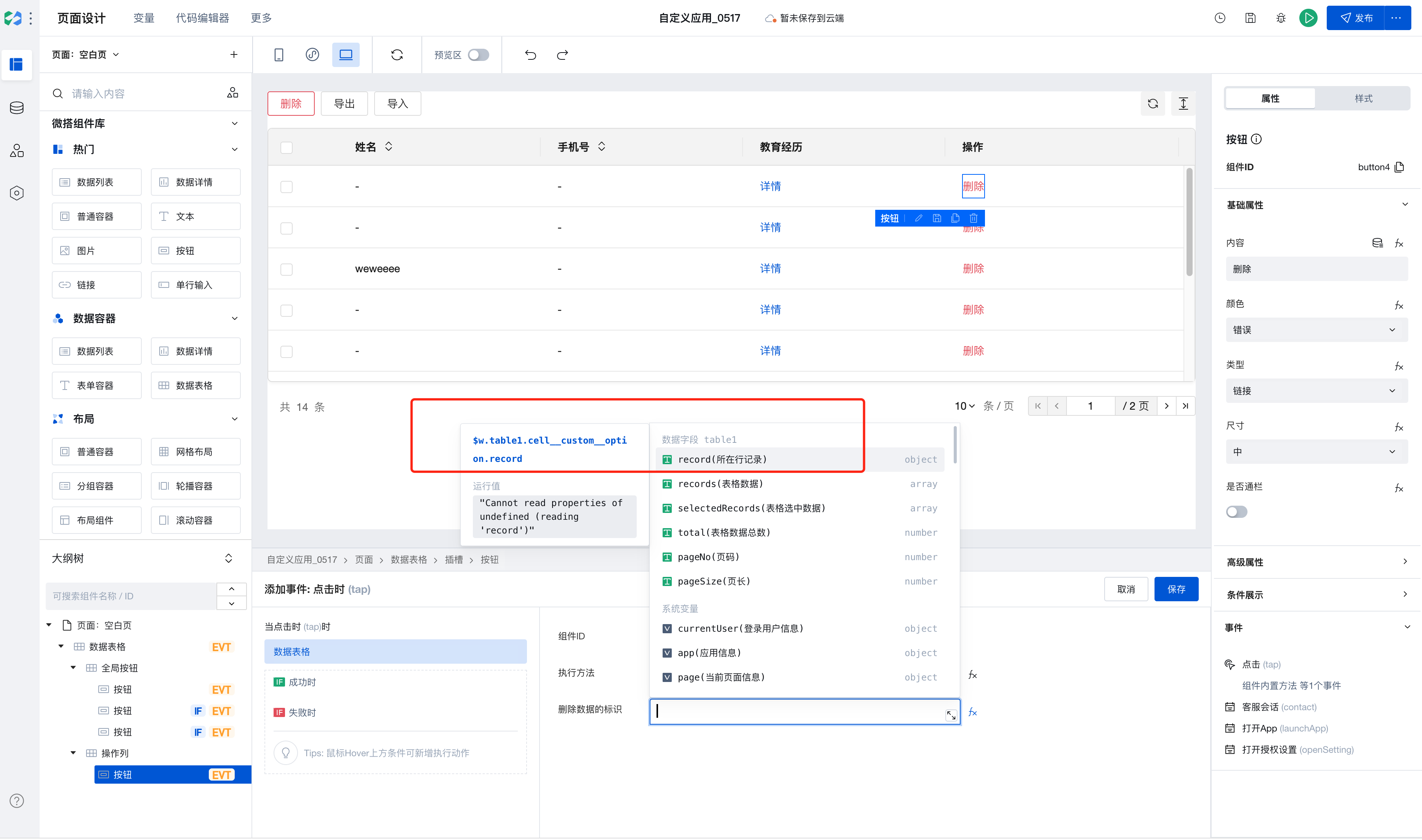
After upgrading the table, the original global buttons and action column buttons are upgraded to slots + buttons, and the previously configured selection area events are also upgraded to button events. For complex parameter passing scenarios, parameters need to be manually reconfigured. Refer to the following use case:
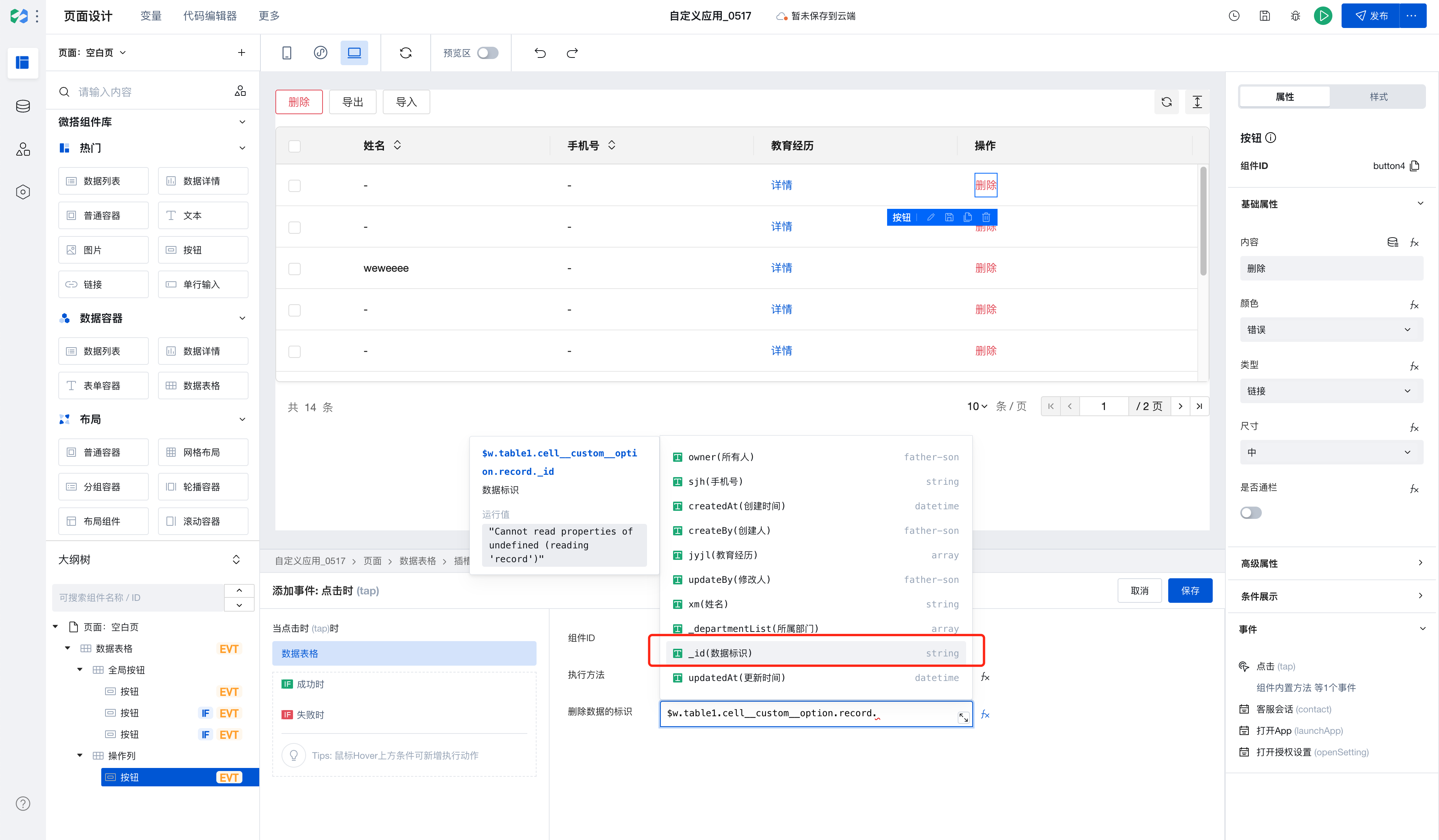
This scenario describes table deletion. Bind the table deletion event to the button while configuring input parameters.
-
- Select the button that needs adjustment, select the button event, and select the corresponding component and component method.
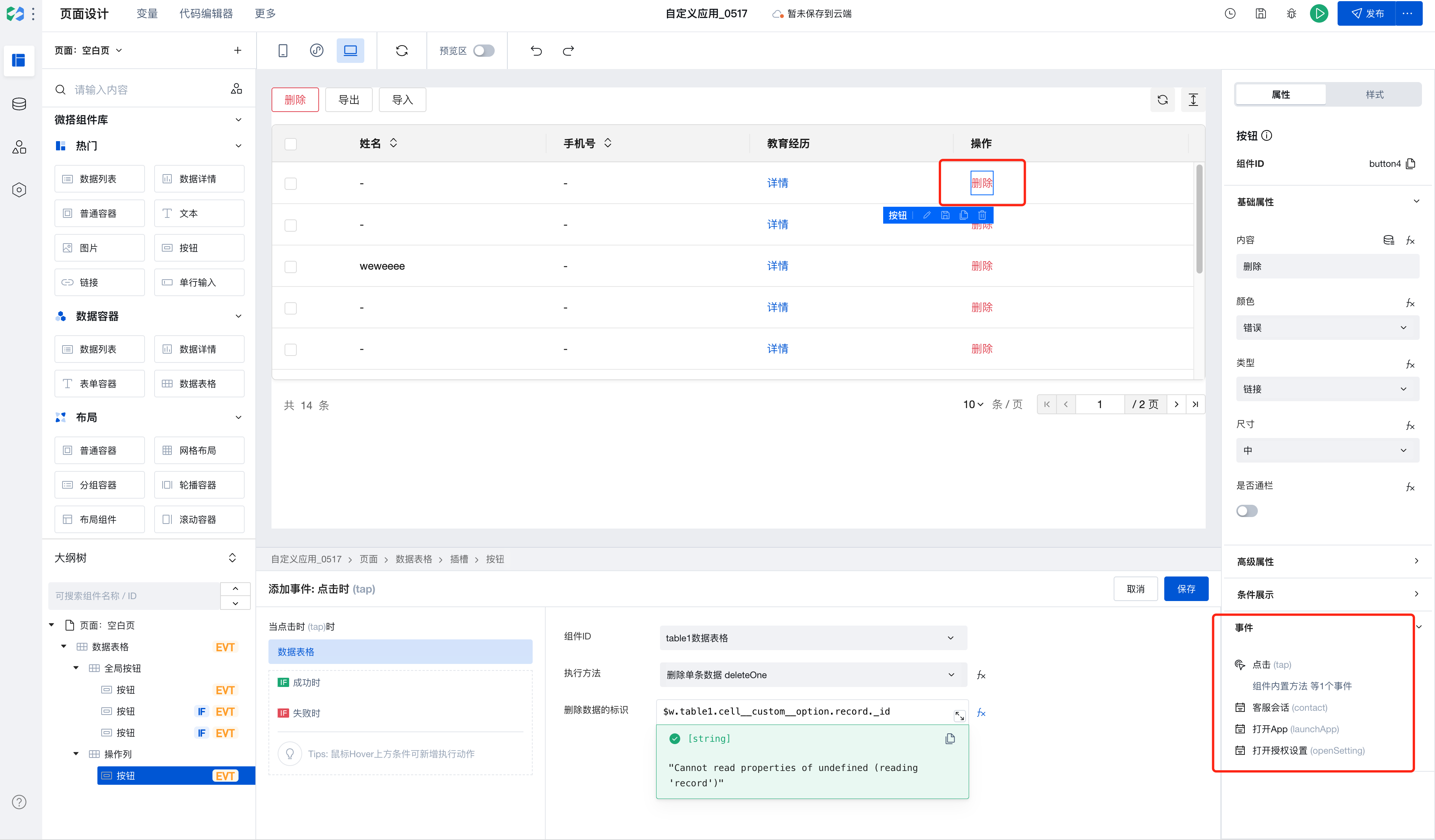
- Select the button that needs adjustment, select the button event, and select the corresponding component and component method.
-
- Edit input parameters [identifier for data deletion]. You can select the corresponding row record via prompts and click to select the parameters to be passed.
- Feature Upgrade
After upgrading to component version 3.18.0, the mobile-end filter received style enhancements to improve the query experience on mobile devices. For users requiring custom styling, the filter appearance can be adjusted via the form component's style APIs.
Frequently Asked Questions
Do I have to place components inside Data Container components?
Data Container is the core component for interaction between pages and data, enabling direct querying and display of data. In our platform, multiple data container components are available for selection, such as ListView, DataView, WdForm, and WdTable.
Data Containers enable deep integration of data with page components, significantly simplifying data operations. In addition to providing data, Data Containers support common page interaction features such as pagination, loading states, and error prompts.
When using a data container, if a component depends on the data returned by the data container, it is recommended to place the component inside the data container component. For example, to display an image from a specific field in a data detail, it's better to place the component inside the corresponding data container. This allows the data container to automatically handle loading states, loading failures, and other situations without needing to manage rendering timing.
If you only need to use the Data Container to obtain data without UI interaction, you can directly use the Query function to query data.
How to refresh other components when an event is triggered?
When you need to refresh other components upon an event trigger, you can bind a variable to the target component's properties, such as referencing this variable in filter parameter expressions. Then modify the variable's value during the event trigger, thereby updating the content of the corresponding target component.