Tab bar
WdTabBar
Applicable Scenarios
to achieve the Tab bar navigation effect for pages
Basic Capabilities Description
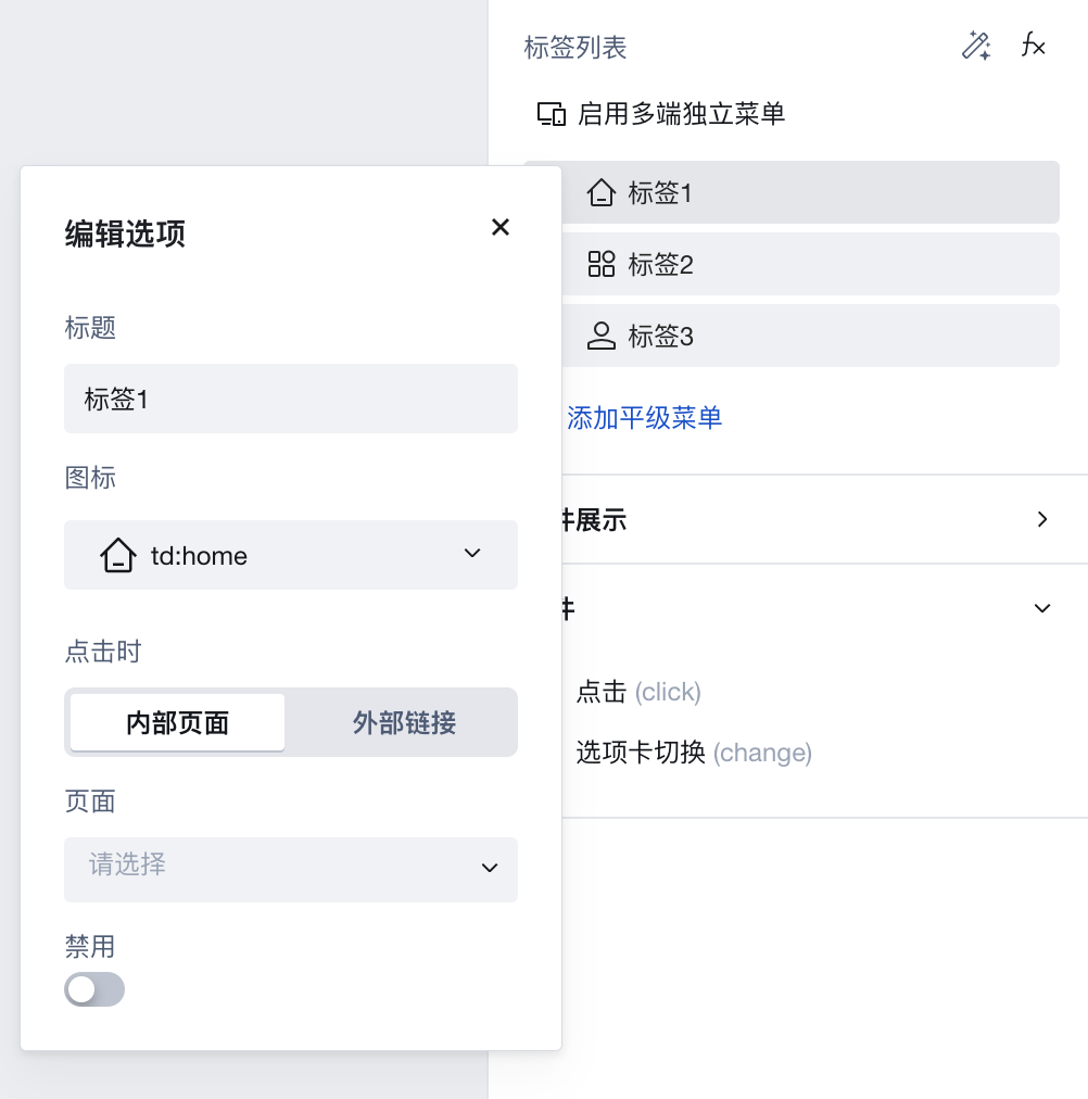
- In the label list properties, selecting a single label allows configuring properties such as label title, icon style, and redirect page. Supports setting independent menus for PC and mobile ends.
The selected state is determined by the page attributes within the tab and is automatically matched.
Extended Scenarios Description
Tab bar component fixed at the bottom of the page and reused across multiple pages
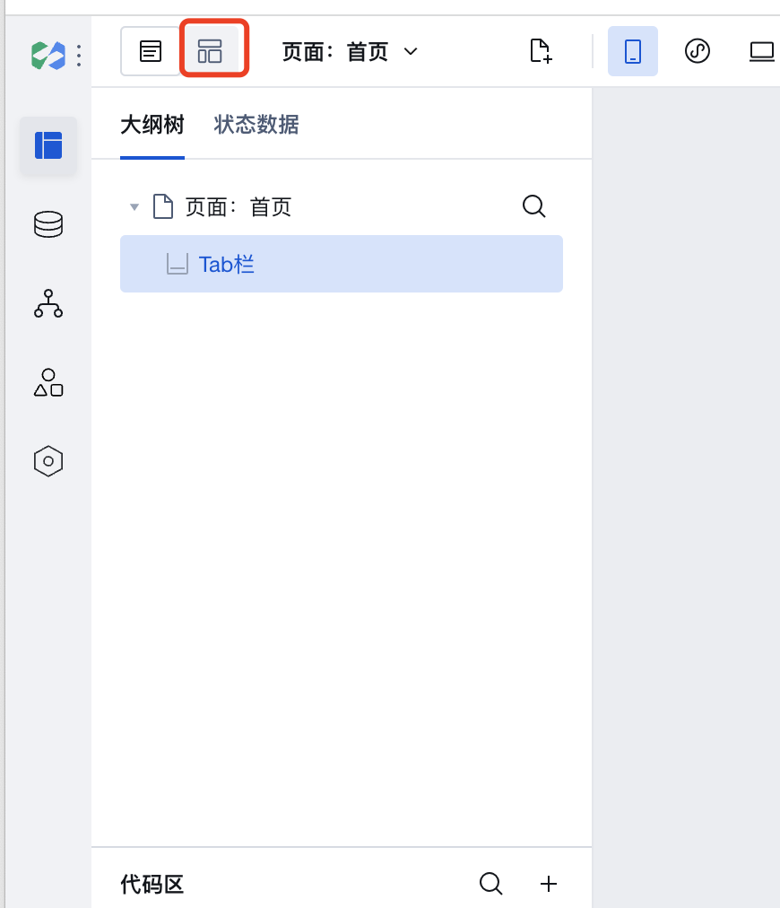
- Click Layout Design in the upper-left corner of the editor to go to the Application Layout.
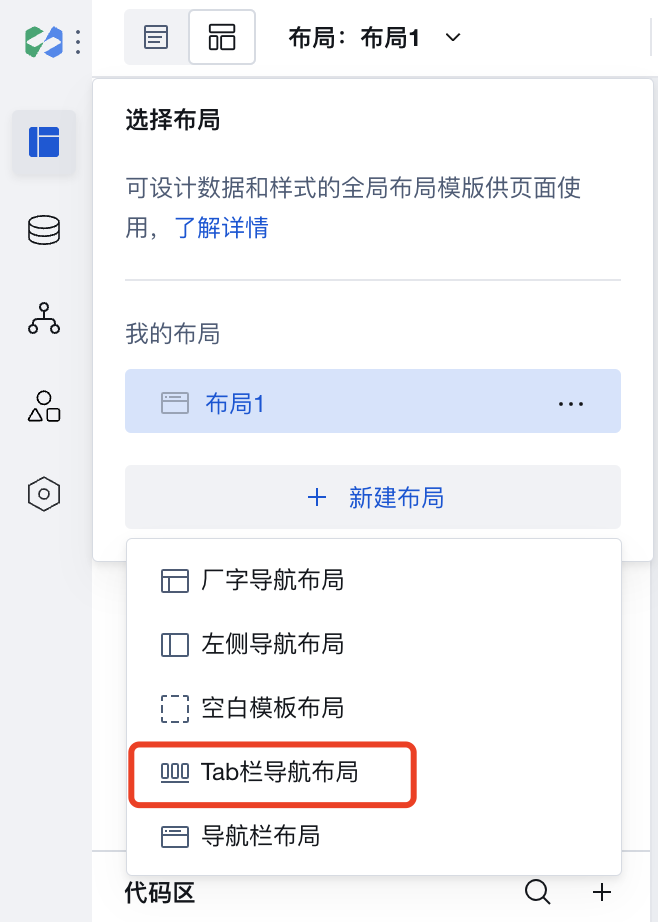
- Click New Layout and select Tab Bar Navigation Layout to create the Tab Bar Application Layout.
- Return to "Page Design", select the page node in the outline tree, and in the page properties area, set the "Page Layout" to "Tab Bar Navigation Layout" to fix it to the bottom of the page.
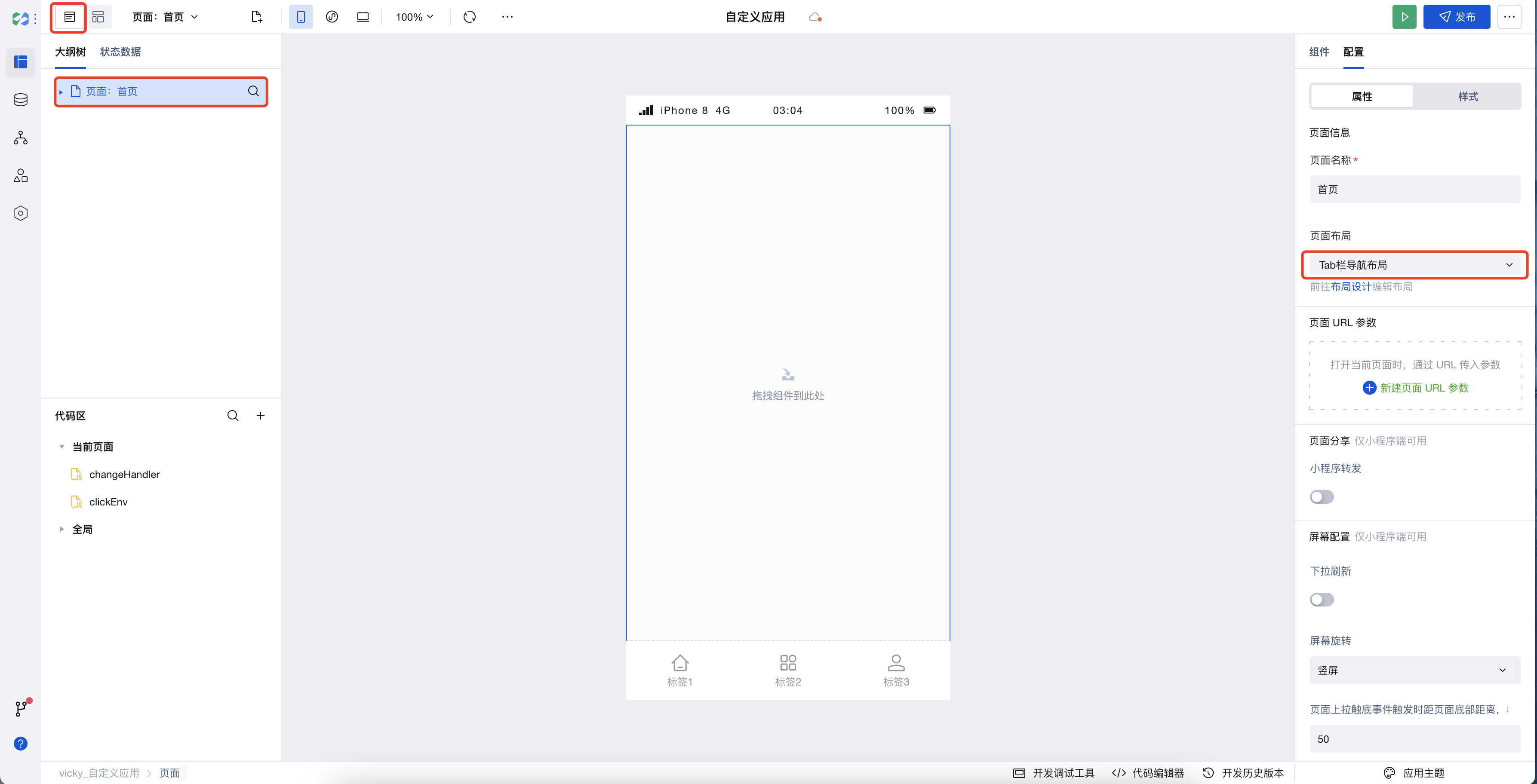
- You can select other pages and set the "Page Layout" to "Tab Bar Navigation Layout" in the page properties area to reuse it.
Example
Interactive Preview
Property Introduction
External properties received by the component
Property Name | Property Identifier | Type | Description |
|---|
| Tag list. | tabs | object | Tag list. Example: { "isMultiTerminal": false, "menuData": [ { "title": "标签1", "key": "1", "iconUrl": "td:home" }, { "title": "标签2", "iconUrl": "td:app", "key": "2" }, { "title": "标签3", "iconUrl": "td:user", "key": "3" } ], "mobileMenuData": [] } |
| routing mode | routeType | string | Route jumping method, this parameter is valid only when enable routing Example: "redirectTo" |
Events
Events exposed by the component. You can listen to component events to trigger external actions
Event Name | Event Code | Event Output Parameters event.detail | Applicable Scenarios | Description |
|---|
| click | tap | object
| Compatible with all platforms | - |
| Tab switchover | change | object
| Compatible with all platforms | - |
Properties API
Through the Property API, you can access the internal state and property values of components. You can access internal values using$w.componentId.propertyName, such as $w.input1.value. For details, please refer to Property API
Read-only Property Name | Property Identifier | Type | Description |
|---|
| Tag list. | tabs | array | |
| Selected tag | selectedTab | object | Currently selected tag |
Method API
Through the Method API, you can programmatically trigger internal methods of components, such as submitting forms, displaying popups, etc. You can call component methods using $w.componentId.methodName, such as $w.form1.submit()
Method Name | Method Identifier | Parameters | Method Description |
|---|
| Set selected tags | setSelectTab | object
| Set selected tags |
Style API
Through the Style API, you can override the styles of internal elements in components to achieve customization. For example, in the low-code editor, you can write styles for all button components using #wd-page-root .wd-btn, and control individual component styles with :scope. For detailed instructions, please refer toStyle API
Name | Class Name | Description and Examples |
|---|
| root element | .wd-tabbar | component root element |
| PC-side root element | .wd-pc-tabbar | Write styles for PC |
| H5 root element | .wd-h5-tabbar | Write style for H5 |
| Mini program root element | .wd-mp-tabbar | Write style for mini program |
| Tag container | .wd-tabbar__item | Set style for the options area |
| Tag container in selected status | .wd-tabbar__item.is-selected | Set style for the selected options area |
| Option text tag | .wd-tabbar__item-text | Set styles for option text tags |
| Option icon (image) | .wd-tabbar__item .wd-image | Set styles for option text tags |
| Option icon | .wd-tabbar__item .wd-icon | Set styles for option text tags |
Frequently Asked Questions
How to set the text color in the selected state of the Tab bar?
In the Tab bar, you can use the Style API to customize the text color in the selected state. By default, the selected state is set to blue, but this can also be modified by applying themes.