Data List
ListView
Practice Guide
Applicable Scenarios#
Suitable for scenarios where querying multiple data entries from the data source and displaying the return list in a loop, such as querying user list.
Basic Features
Data Query, Filtering, Pagination
The Data List component is one of the core components for obtaining data. It can quickly query a list from data models or APIs and render it to the page list, including features such as pagination.
Data Usage and Presentation
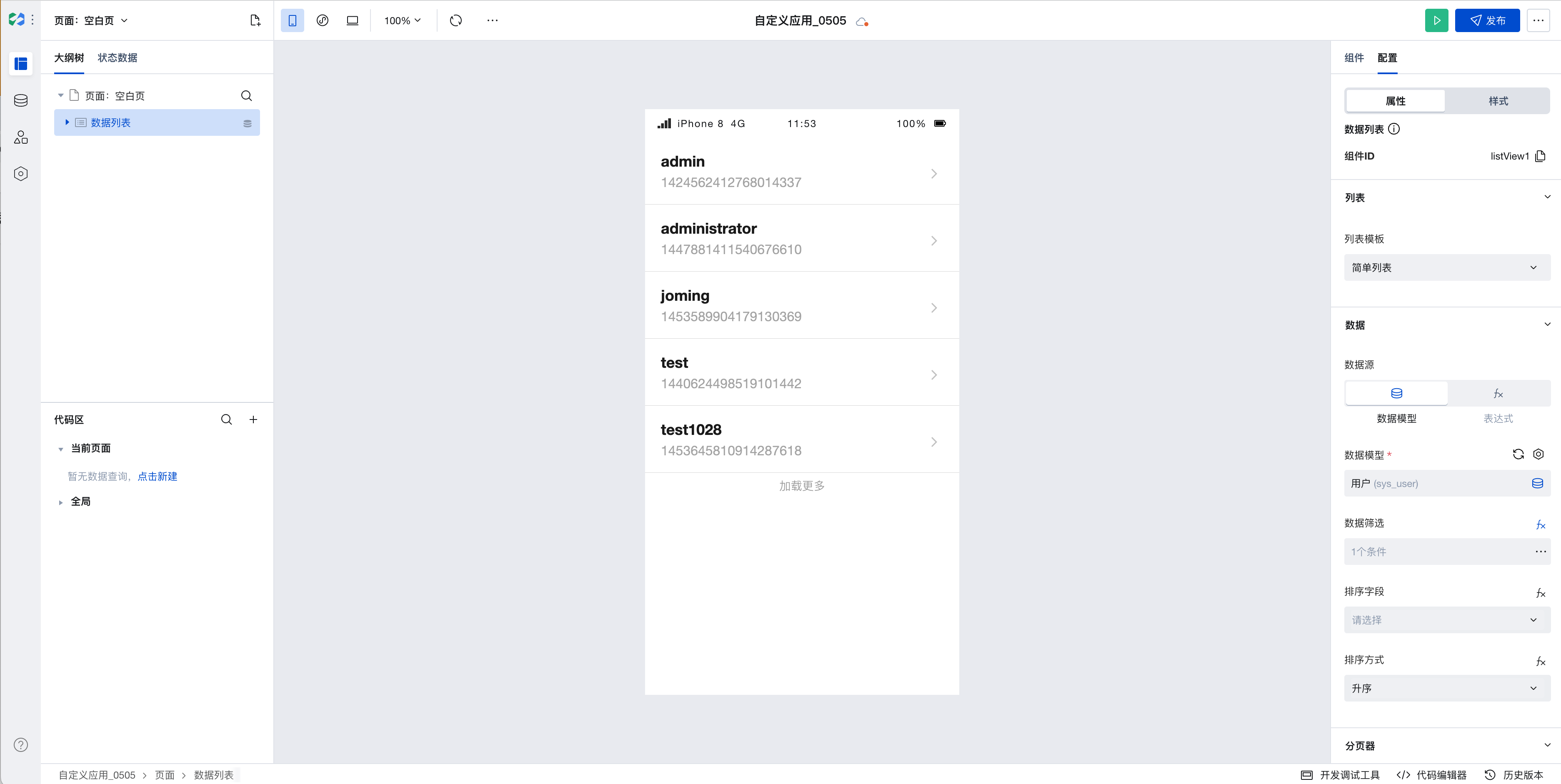
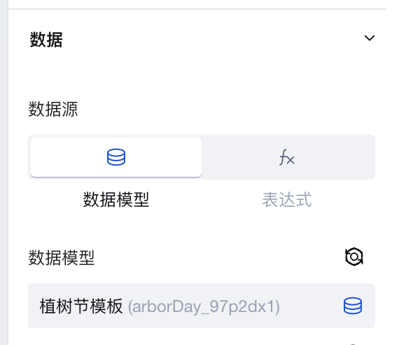
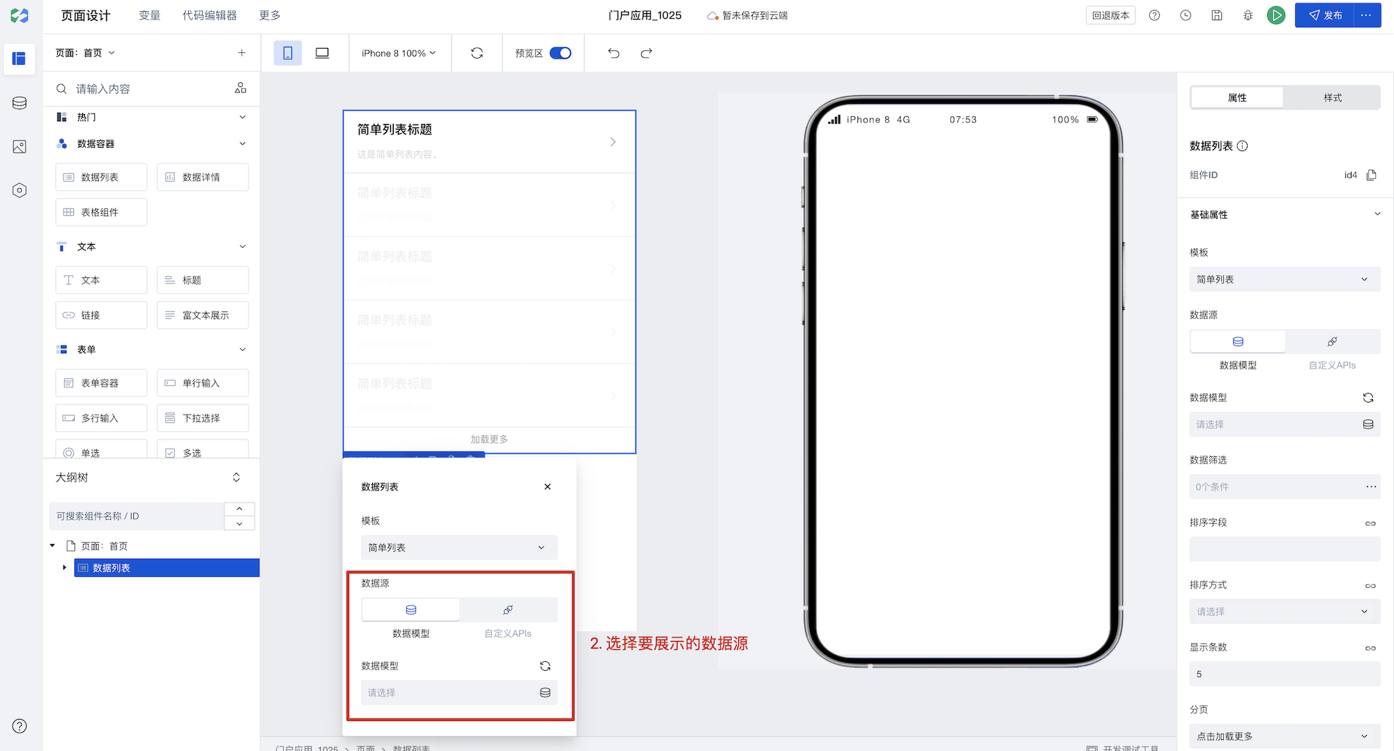
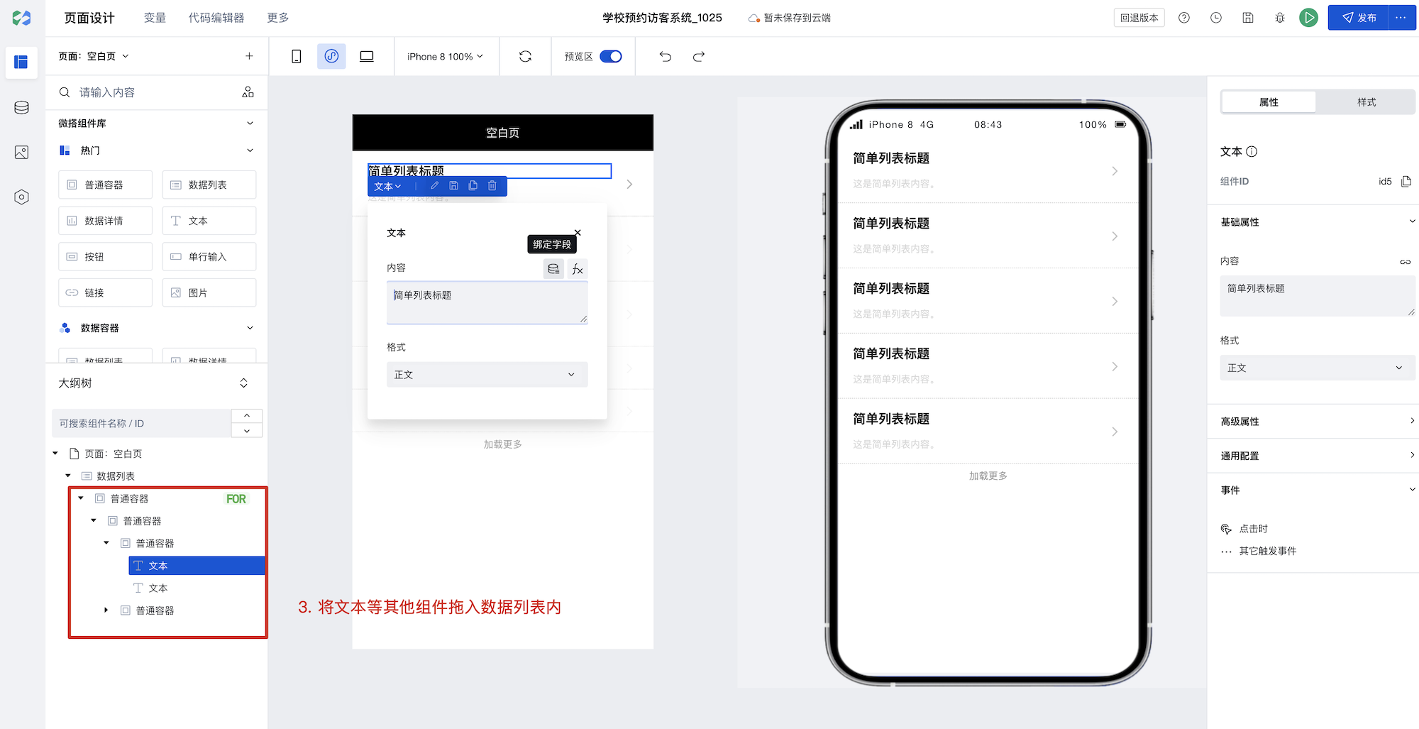
The Data List is a data provider that supplies data for all business components. The data for the Data List can be selected from data tables or bound to expressions.
1. Quick Select Data Table
Drag the component that requires data binding into the data container to select the data within it.
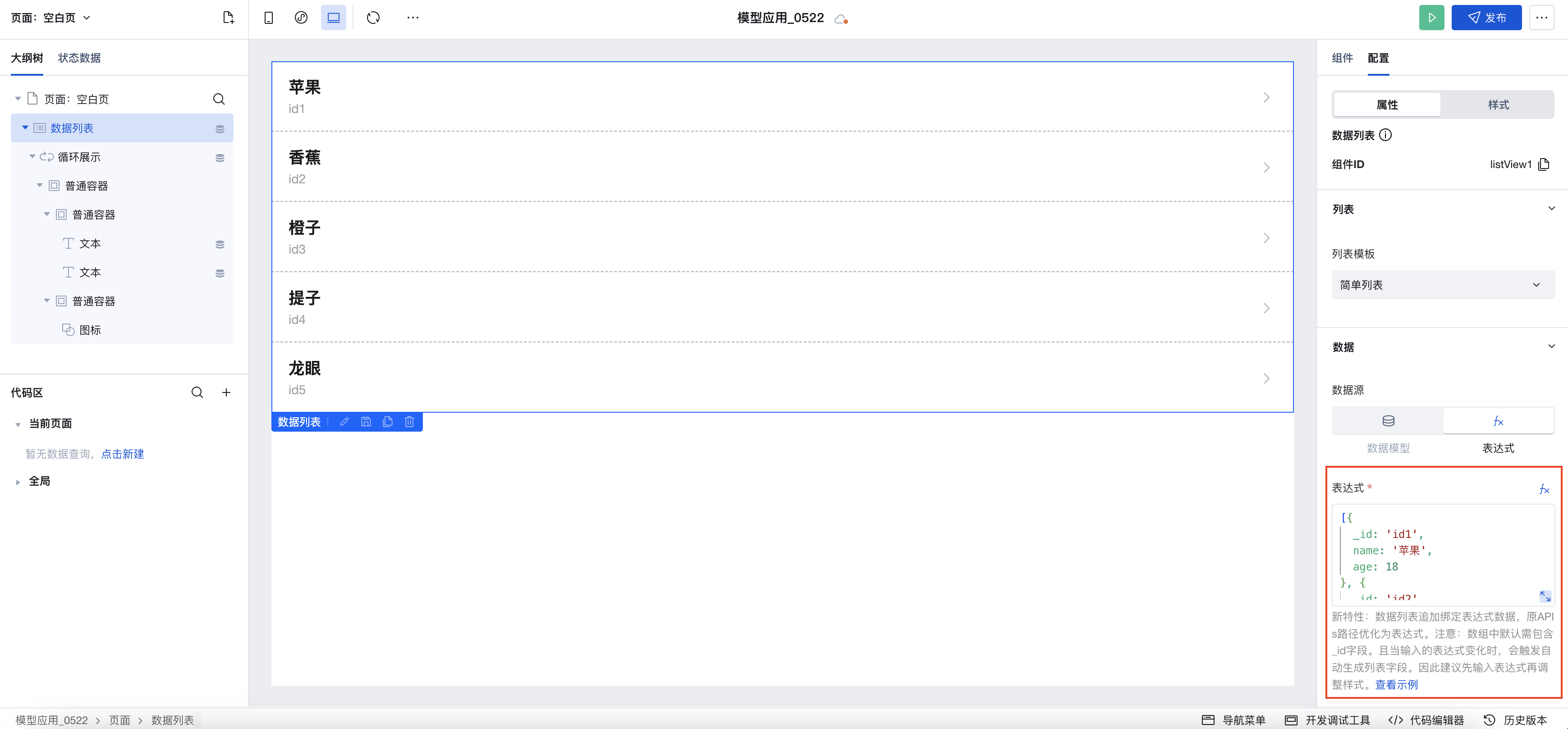
2. Binding Expression
Expressions can be static data or variables. You can use Query to connect to built-in data tables, external APIs, etc., and then select a query in the expression for binding.
3. Binding APIs (Discontinued in the latest version)
Note: Starting from version v2.30.0, the support for APIs calls in the data table has been discontinued. Please use expressions to select Query to query APIs.
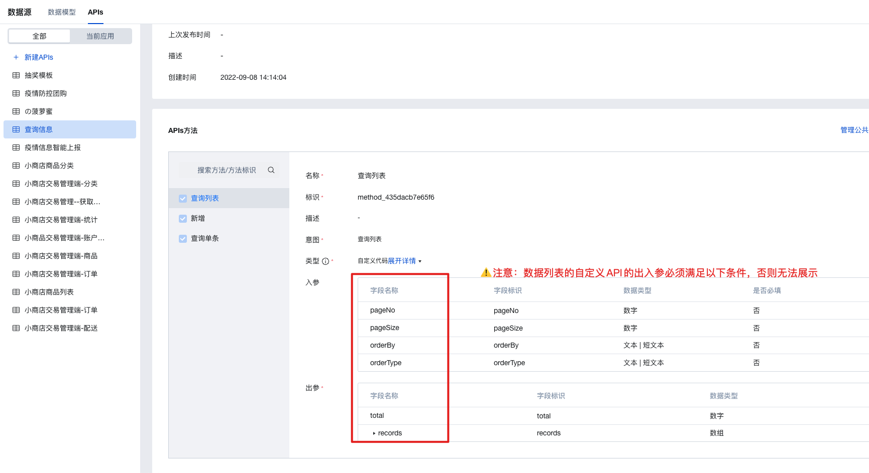
Parameter Requirements for Calling APIs
- Method parameters:
- pageNo: Page number (optional)
- pageSize: Page size (optional)
- orderBy: Field name for sorting (optional). Can pass values from the fields in the output parameter records.
- orderType: Sorting method (optional). Pass asc for ascending order; pass desc for descending order.
- Output parameters:
-
total: Total number of records (required)
-
records: Multiple data items in object array format. Note: Objects in the array must contain the data unique identifier field _id (text type) for features such as pagination to function properly.
Binding query for Dynamic Pagination
For data list binding expression scenarios, configure as follows to achieve dynamic pagination effects under these two pagination methods: click to load more and scroll to bottom to load more.
- Add Data List:
- Add Data List and switch to the expression scenario
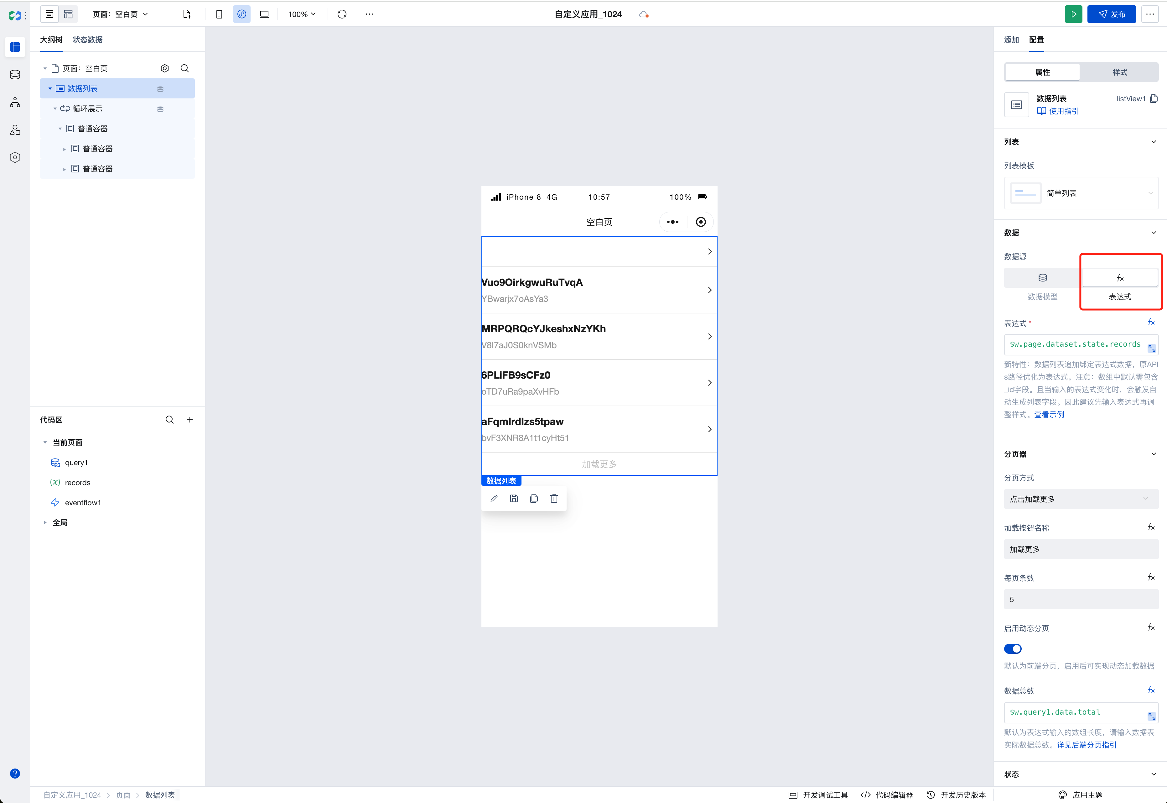
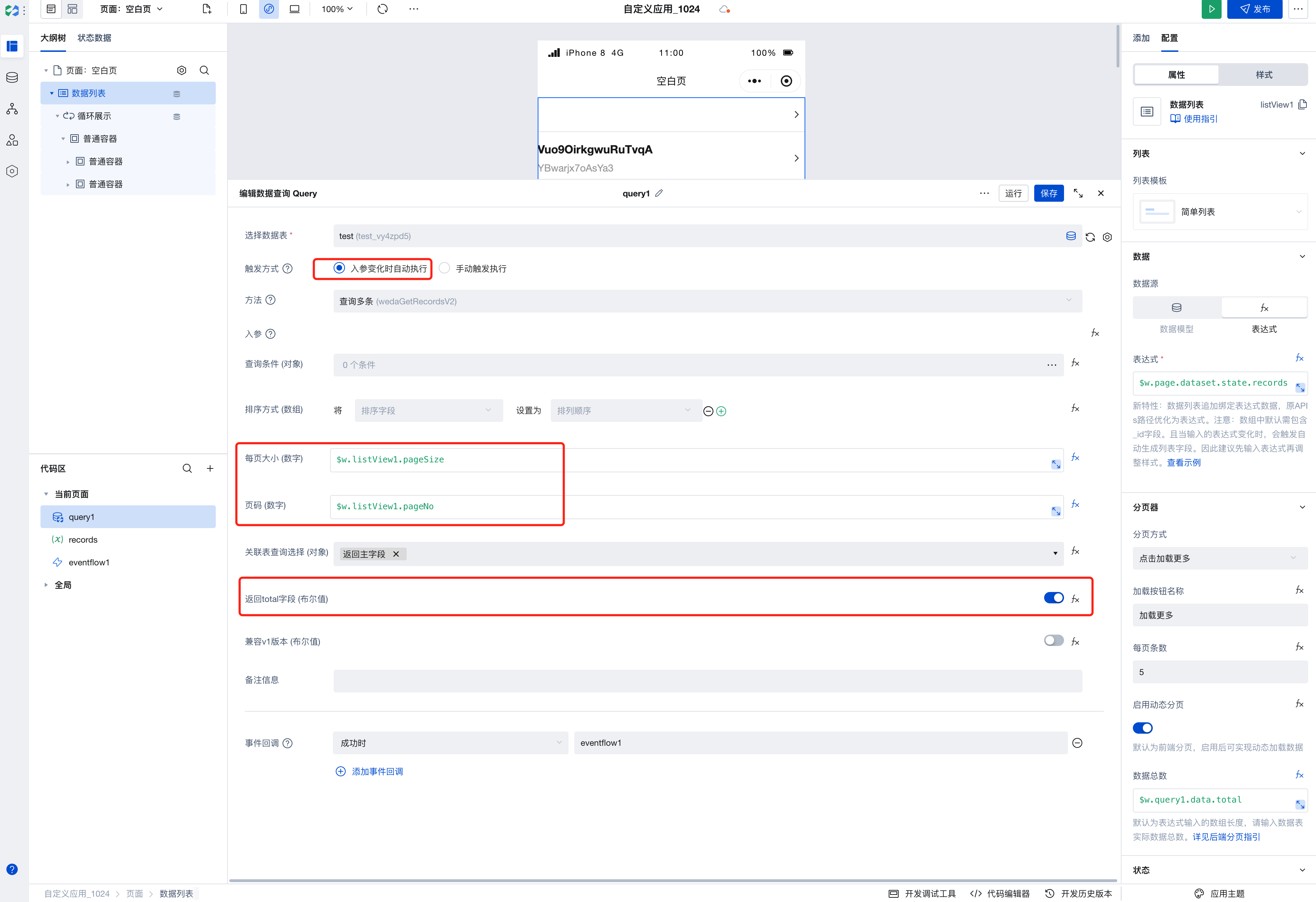
- Create query:
-
Choose data table
-
[Trigger Method] Choose to automatically execute when input parameters change
-
[Page size] Bind to the pageSize of the data list
$w.listView1.pageSize; -
[Page number] Bind to the pageNo of the data list
$w.listView1.pageNo; -
[Return total field] Enable
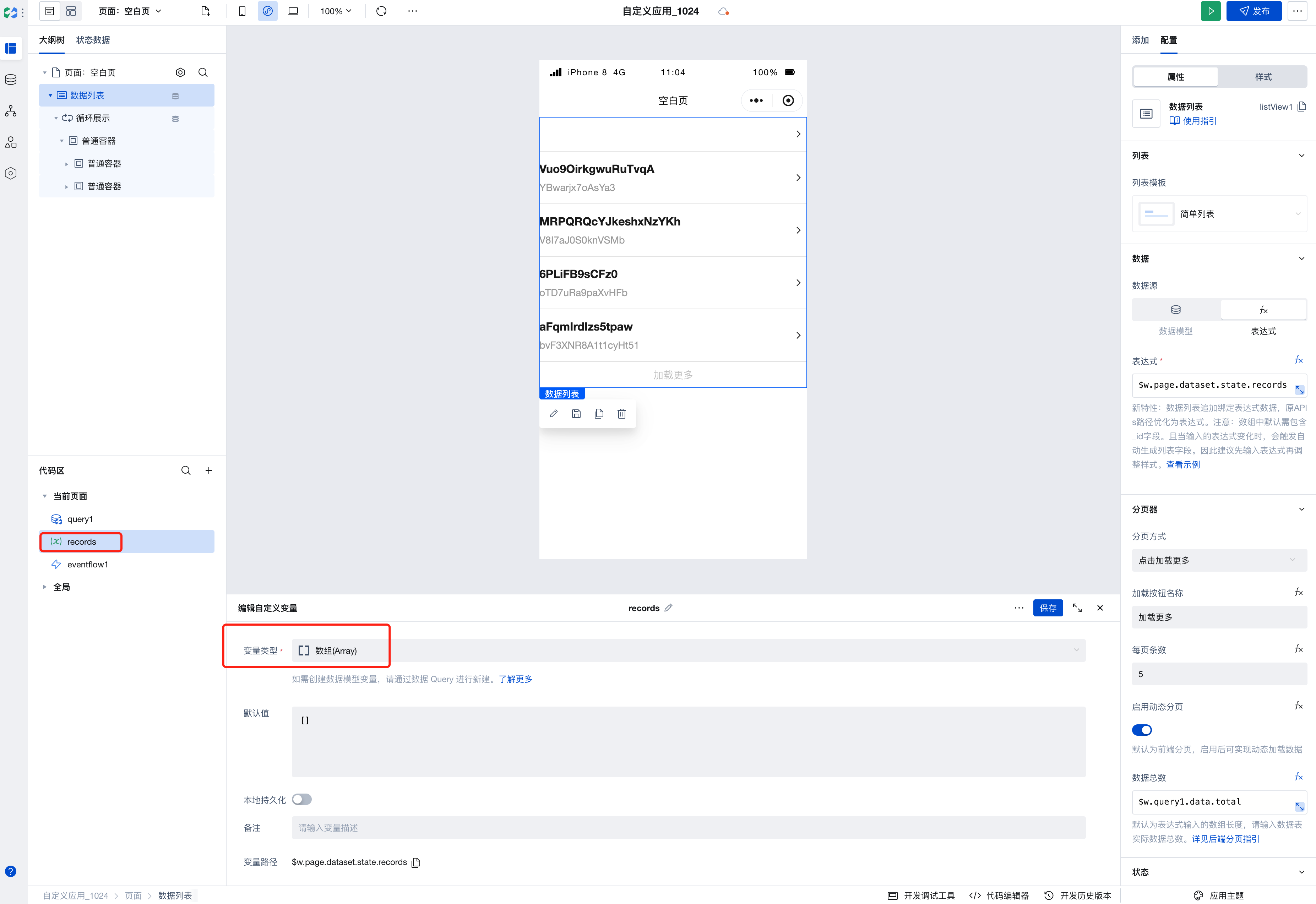
- Create array variable:
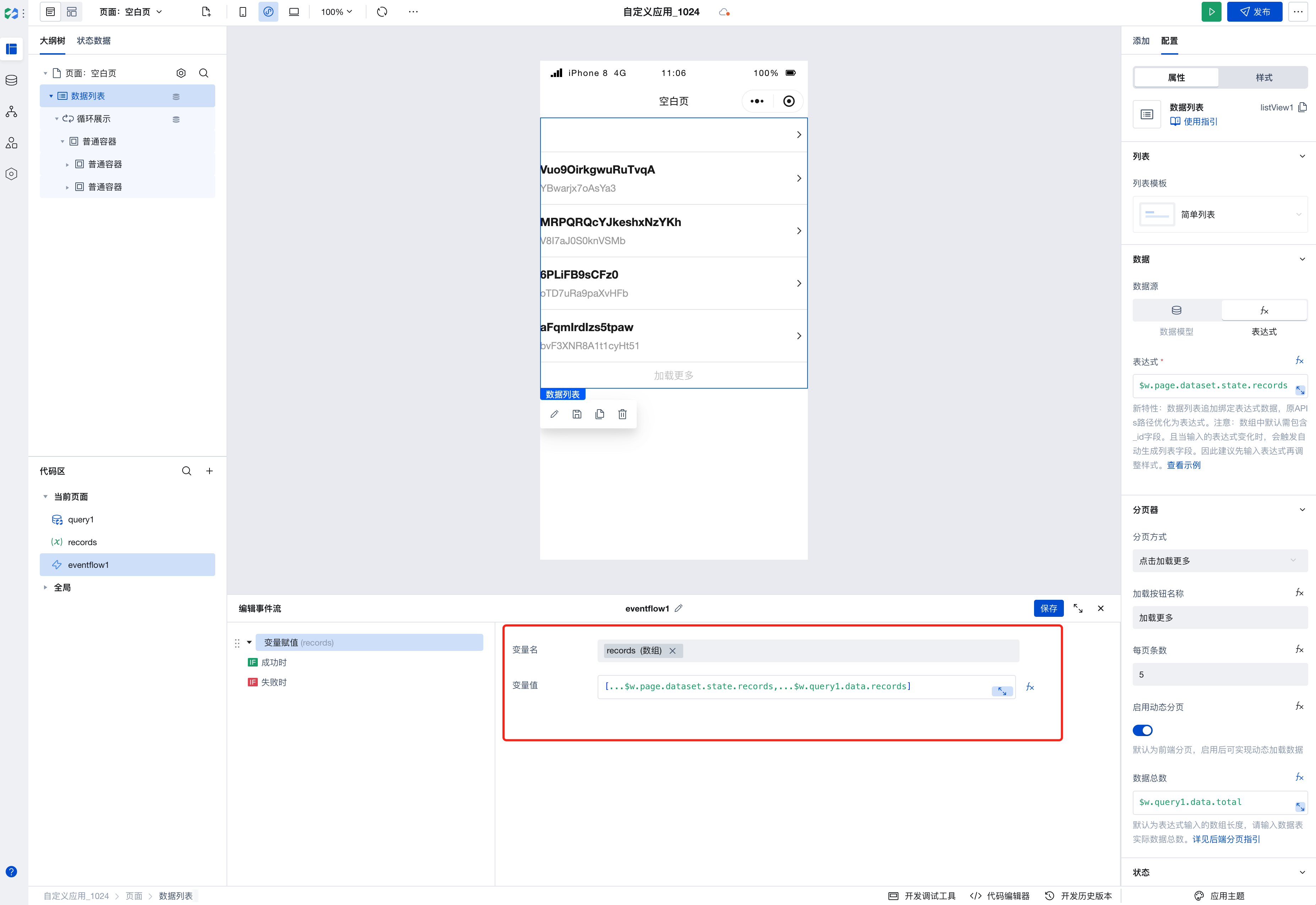
- Create event flow:
- Select [Variable Assignment] for the action to perform
- Assign the merged arrays:
[...$w.page.dataset.state.records, ...$w.query1.data.records];
- Chain the data links:
-
Add event callback to query
-
Data List expression binding array variable
$w.page.dataset.state.records; -
Enable dynamic pagination
-
Bind the total number of data records to query's total value
$w.query1.data.total;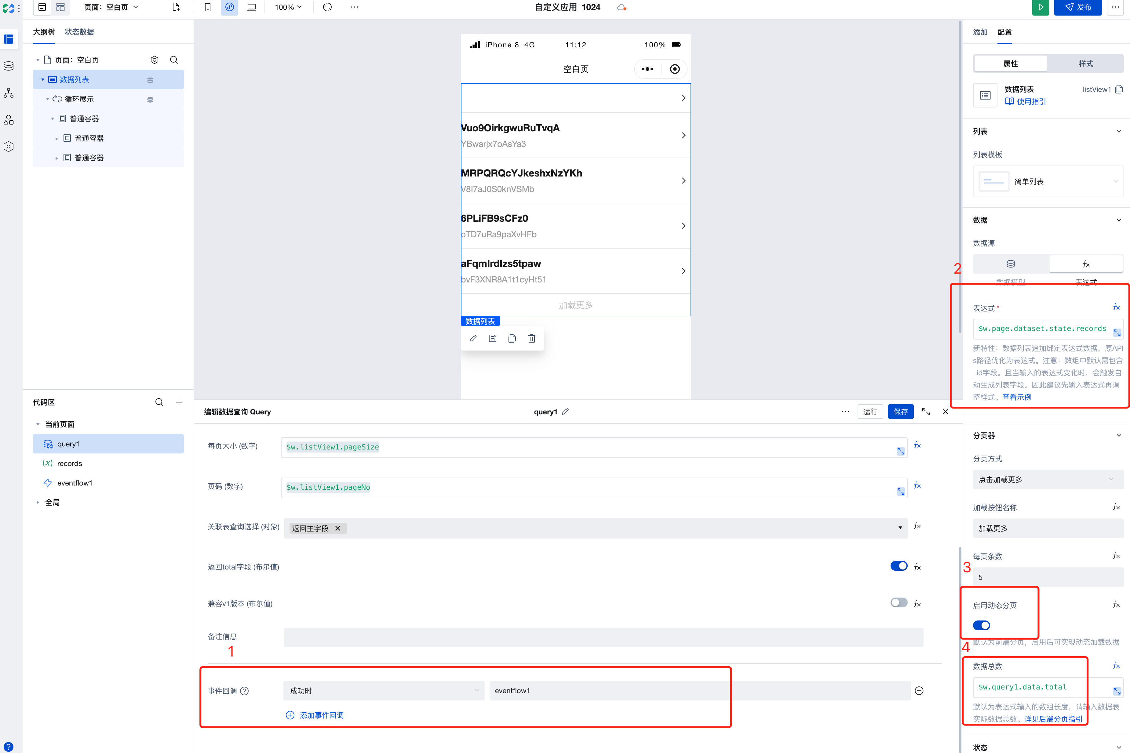
The following video demonstrates how to bind a query to retrieve data and configure pagination:
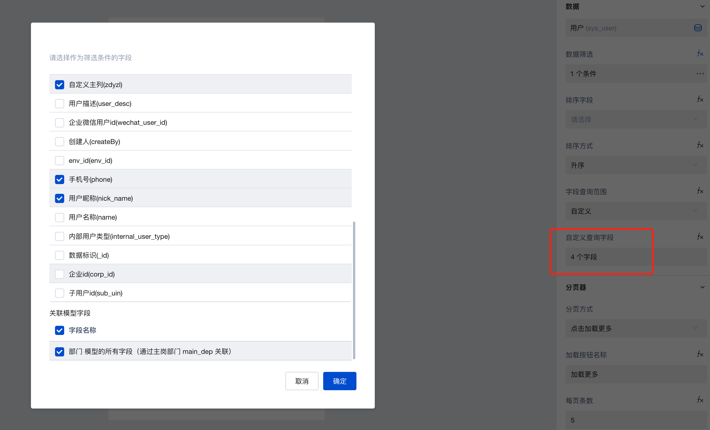
Field Query Scope Configuration
After Data List supports the v2 Query Protocol, it enables on-demand configuration of field query scopes, thereby enhancing query performance.
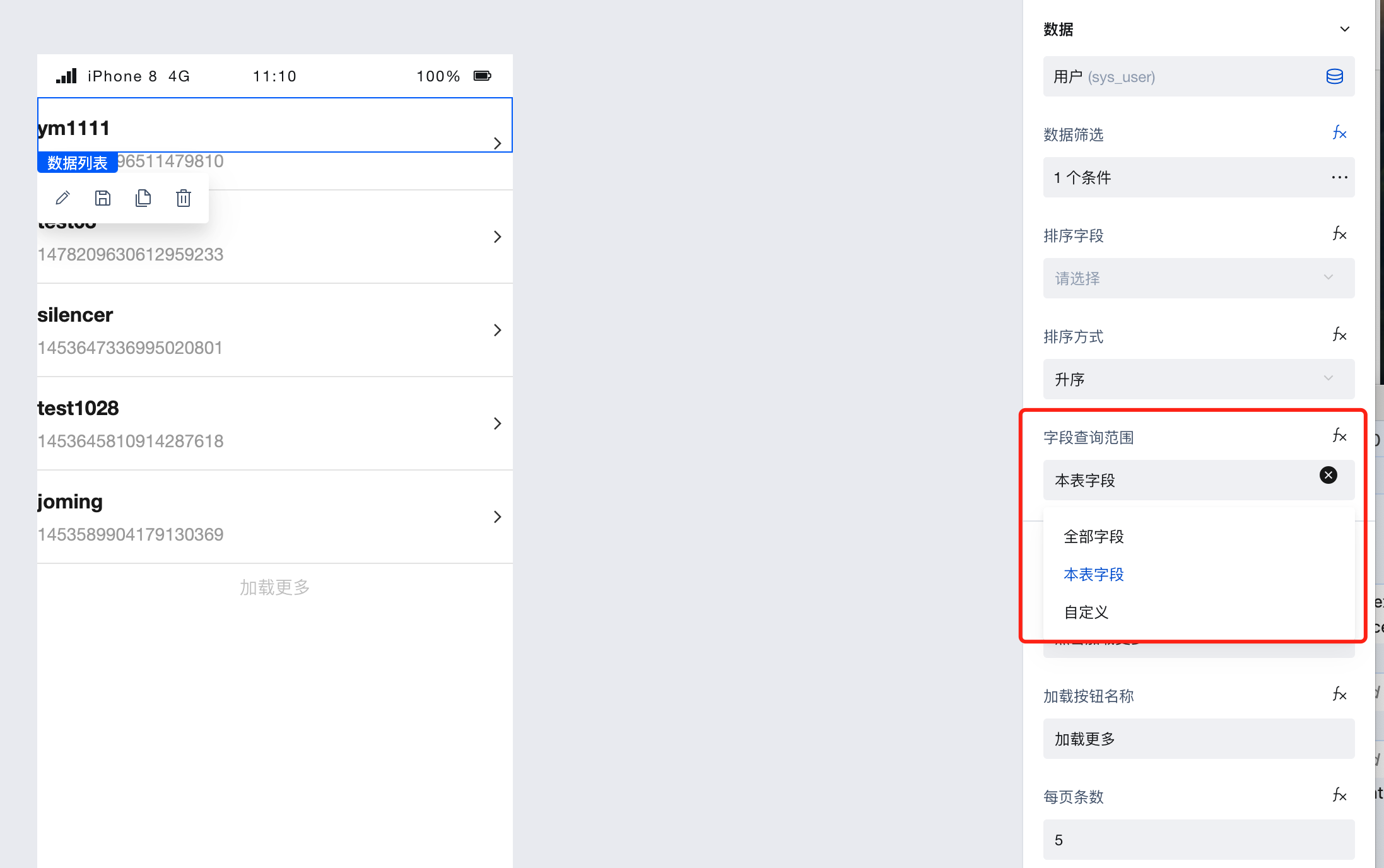
Field Query Scope Configuration supports the following three methods:
- All fields: Returns all fields, including all fields from this table and associated tables.
- Current table fields: Returns all fields of the current table, excluding fields from associated tables. (Default setting)
- Custom query fields: Supports on-demand configuration of primary table fields to be returned and whether to return associated table fields.
Property Introduction
External properties received by the component
Property Name | Property Identifier | Type | Description |
|---|
| Template list | template | string | Preset template for list content style Example: "simpleList" |
| Data source | dataSourceType | string | Data source type selection Example: "data-model" |
| data model | datasource | object | Show model data source |
| APIs | bindConnectMetadata | object | Data display APIs source selection |
| expression | dataSourceData | array | Data list display data, selectable variables. |
exprToFieldsSchema | string | ||
| calling method | connectorMethod | object | API invocation method selection for displaying data |
| Query input parameters | connectorParams | object | 对APIs调用方法获取的数据进行筛选过滤。支持对象类型,例如 {name:'',value:''} |
| data filter | queryCondition | array | Filter data |
| Sorting Fields | orderBy | string | Select the field for sorting data |
| Sorting method. | orderType | string | Set ascending or descending order Example: "asc" |
| Enable multi-field sorting | isSupportMultipleSort | boolean | Example: false |
| data sorting | sorter | array | 可设置数据排序规则,支持拖拽调整排序优先级,数组下标越小优先级越高。绑定数据示例:[{"orderBy":"updatedAt","orderType":"desc"}],升序传值asc,降序传值desc Example: [ { "orderBy": "updatedAt", "orderType": "desc", "label": "更新时间" } ] |
| Field query scope | selectFieldType | string | Default query table field Default value: "main" |
| Custom query field | selectFields | array | |
| Pagination method | pagination | string | Paging data style Example: "loadMoreButton" |
| Load button name | loadButtonText | string | Example: "加载更多" |
| Entries Per Page | pageSize | number | Set the number of data records to load at a time Example: 5 |
| Page number. | pageIndex | number | Home Page Example: 1 |
| Enable dynamic pagination | enableTotal | boolean | Enabled, dynamic pagination supported Example: false |
| Total data | total | number | By default, the array length is the expression input. Enter the actual total data of the data table. |
| Empty status prompt | emptyText | string | Prompt note when no data exists, do not display if content is empty Example: "暂无数据" |
| Load the prompt | loadCompletedText | string | Prompt note after loading all data, do not display if content is empty Example: "" |
| Display loading... | isSetLoading | boolean | Whether to enable the loading status of the data list, shown by default Default value: true |
| abnormal display status | isSetStatus | boolean | Whether to enable the abnormal status of the data list, not shown by default |
| data loading status | loading | boolean | Data loading status will be shown when enabled |
Event Introduction
Events exposed by the component. You can listen to component events to trigger external actions
Event Name | Event Code | Event Output Parameters event.detail | Applicable Scenarios | Description |
|---|
| query is empty | queryEmpty | Compatible with all platforms | Trigger when data query is empty | |
| query succeeded | querySuccess | Compatible with all platforms | Trigger when data query succeeds | |
| Query failed | queryFail | object
| Compatible with all platforms | Data query failed triggers |
| Page transition | onPagingChange | object
| Compatible with all platforms | Page transition |
Properties API
Through the Property API, you can access the internal state and property values of components. You can access internal values using$w.componentId.propertyName, such as $w.input1.value. For details, please refer to Property API
Read-only Property Name | Property Identifier | Type | Description |
|---|
| Record list | records | array | Record list |
| Total number of records | total | number | Total number of records |
| Page number. | pageNo | number | Current page number |
| Page Size | pageSize | number | Page Size |
| Error message. | error | object | Error info within component |
| Data source protocol version | dataSourceVersion | string | When the data source type is a data model, the data list supports the protocol version of the data source. |
Method API
Through the Method API, you can programmatically trigger internal methods of components, such as submitting forms, displaying popups, etc. You can call component methods using $w.componentId.methodName, such as $w.form1.submit()
Method Name | Method Identifier | Parameters | Method Description |
|---|
| refresh | refresh | string刷新方式 Default value: refreshFromStart Optional values:refreshFromStart(刷新并回到第1页) refreshKeepPage(刷新当前页) | - |
| Delete a single data record | deleteOne | string删除数据的标识 | - |
Application Example
The following example shows the model user list:
1. Add a Data Container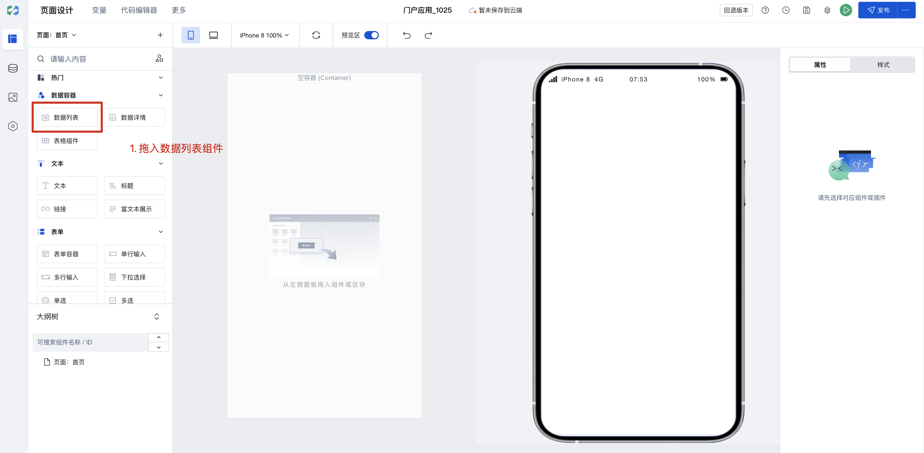 2. Select Data Source
Data sources support data models and APIs.
- Drag the component into the data list, click the binding field interface to select data.
 4. Bind the component to data fields to display user information
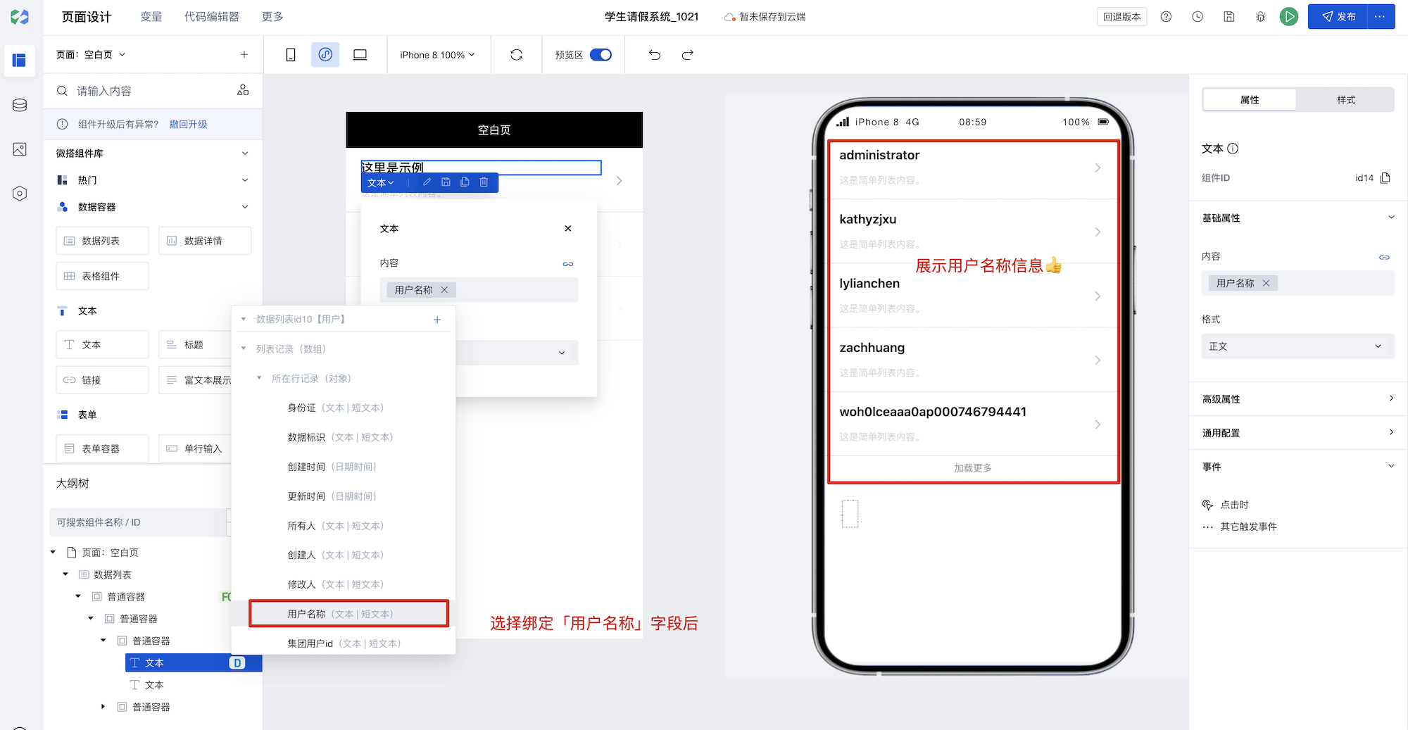
Thus, the feature of querying the user list is completed! Full implementation as follows:
Frequently Asked Questions
Do I have to place components inside Data Container components?
Data Container is the core component for interaction between pages and data, enabling direct querying and display of data. In our platform, multiple data container components are available for selection, such as ListView, DataView, WdForm, and WdTable.
Data Containers enable deep integration of data with page components, significantly simplifying data operations. In addition to providing data, Data Containers support common page interaction features such as pagination, loading states, and error prompts.
When using a data container, if a component depends on the data returned by the data container, it is recommended to place the component inside the data container component. For example, to display an image from a specific field in a data detail, it's better to place the component inside the corresponding data container. This allows the data container to automatically handle loading states, loading failures, and other situations without needing to manage rendering timing.
If you only need to use the Data Container to obtain data without UI interaction, you can directly use the Query function to query data.
How to Display Chinese Labels in Common Option Sets within Data Containers
The feature for querying values by key in Common Option Sets is now available. Those who need to use it can refer to the documentation: https://cloud.tencent.com/document/product/1301/95807
How to refresh other components when an event is triggered?
When you need to refresh other components upon an event trigger, you can bind a variable to the target component's properties, such as referencing this variable in filter parameter expressions. Then modify the variable's value during the event trigger, thereby updating the content of the corresponding target component.
How to obtain selected row data when checkboxes are added to the ListView
To obtain the selected data in the multiple selection within the data list, you can bind a custom method to the change event of the multiple selection. First, create a page array variable, such as selectedIds. In the custom method, you can process the data based on the selection state:
- When a checkbox is selected, add the data of the current row to the
selectedIdsarray. - When a checkbox is deselected, remove the current row's data from the
selectedIdsarray.
When binding a custom method, it is recommended to pass the current row's data identifier (such as _id) as a parameter to the custom method to facilitate processing the selected row's data.