Upgrade and Migration Guide
Guide for Separate Component Upgrade
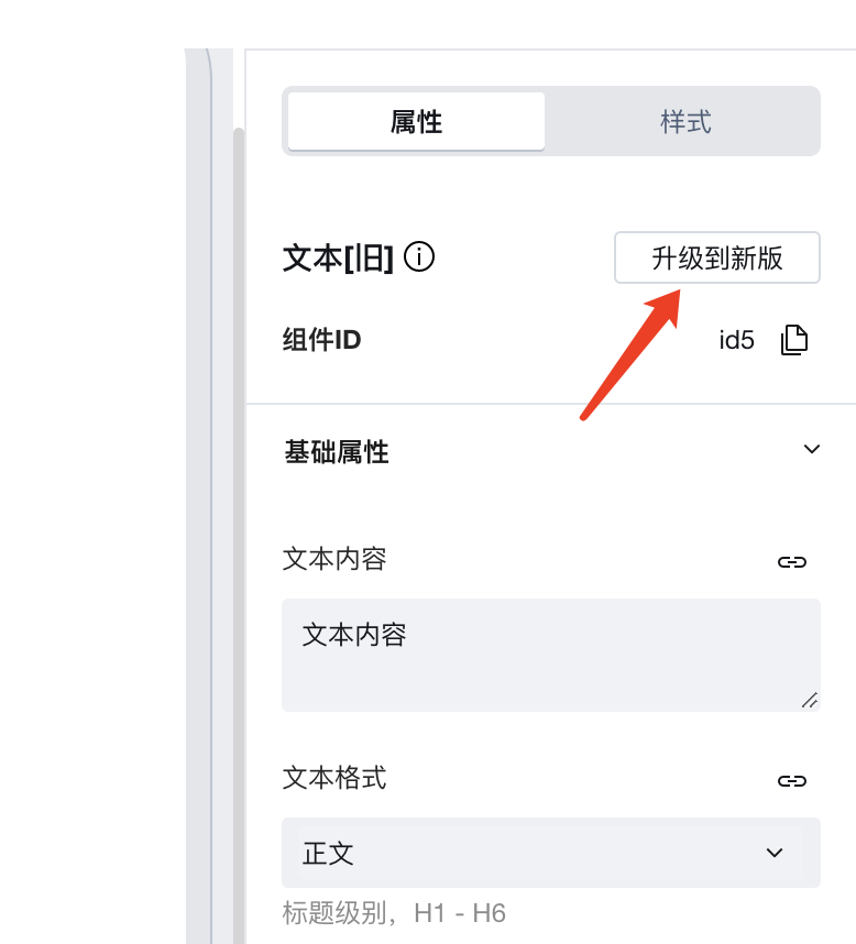
Click the [Upgrade to the new version] button in the properties area to upgrade a single component, for example,
A confirmation window then pops up, which displays the precautions for the upgrade and introduces the new version components:
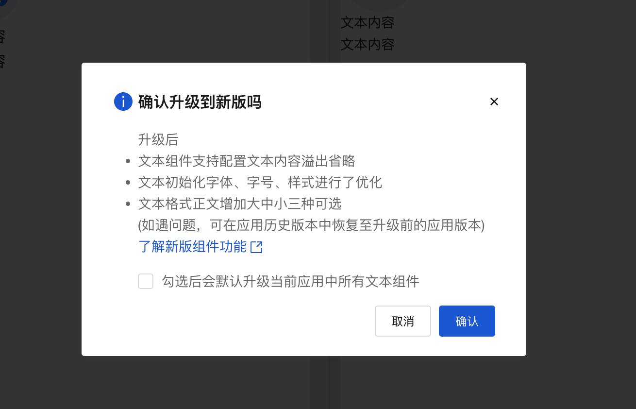
Here, "Learn about the features of the new version components" can be clicked to view details. Based on the actual situation, click to confirm the upgrade.
Expected Changes After Upgrade
Text Component
After upgrade:
- Text component supports configuration of text overflow ellipsis
- Optimized the font, font size, and style for text initialization
- Added large, medium, and small sizes as options for body text format
Preview link
Icon Component
After upgrade:
- The color configuration in the icon property panel has been removed. Icon colors can now be configured via the font color setting in the Style panel (colors from original icon configurations will be retained).
- Icon size configuration has been changed from manual numerical input to a dropdown selection of predefined sizes (existing icon size settings will be preserved)
Preview link
Button Component
After upgrade:
- The default button size has been adjusted, and full-width button configuration has been added (after upgrade, the default size of existing buttons will change)
- Removed default padding from buttons; they no longer center by default on pages, and single buttons no longer occupy a full row by default on mobile devices (after upgrade, layout changes should be noted and adjusted as needed)
- Enriched the default button colors. After upgrade, please note the changes in default button colors and adjust as needed.
- The disabled state style of buttons has been optimized
- Buttons now support configuration capability for icons within buttons
- Enriched the default button types, providing options for filled, outlined, text, and link styles
Preview link
Divider Component
After upgrade:
- Added support for selecting two divider line types: solid and dashed
Preview link
Self-Service Troubleshooting
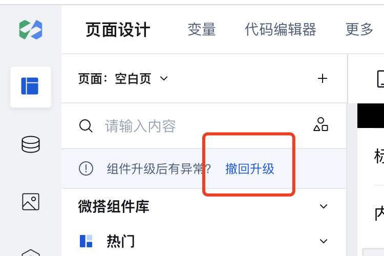
Rollback of Component Library Upgrade
If after upgrading the component library, you encounter problems and want to completely roll back the component library version, you can click the rollback button in the component list in the editor within 3 days after the upgrade to roll back the upgrade.
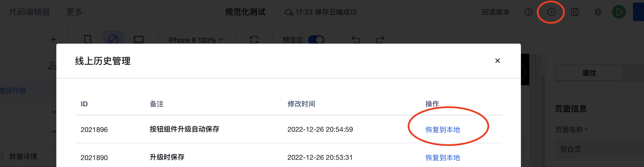
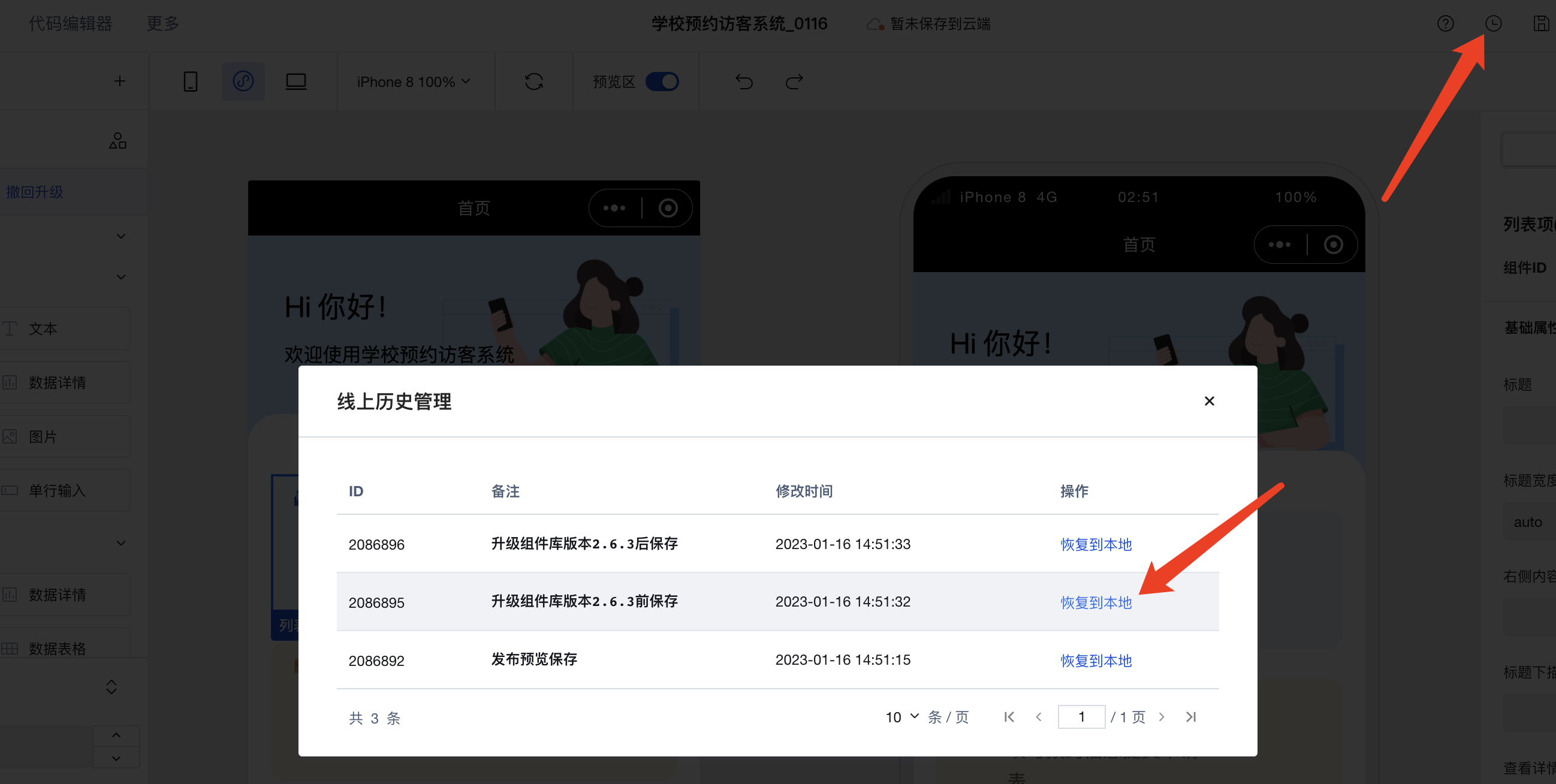
Rollback to Specified Application Version
If after upgrading the component library, you encounter problems and want to completely roll back to a specific previous application version, you can click the application history in the editor, find the snapshot before the upgrade, and restore it.
Rollback of Individual Component Upgrade
Revert Component Library Upgrade