Text
WdText
Applicable Scenarios
Used for displaying the text/title content in the page.
Basic Capabilities Description
- The basic properties of the text support configuring the text content and text format, where the text format can be set to Body or Heading.
- The advanced properties of the text support configuring text overflow ellipsis, displaying text bubbles on hover for personal computer, consecutive spaces, and whether the text can be selected.
Extended Scenarios Description
Line wrapping display when text content exceeds the limit
Example
When the text content is lengthy, it will wrap after exceeding two lines, and the overflow content will be displayed with an ellipsis.
Configuration Method
Enable the text overflow ellipsis switch in the advanced text properties, select 2 for the maximum number of lines, as shown below:
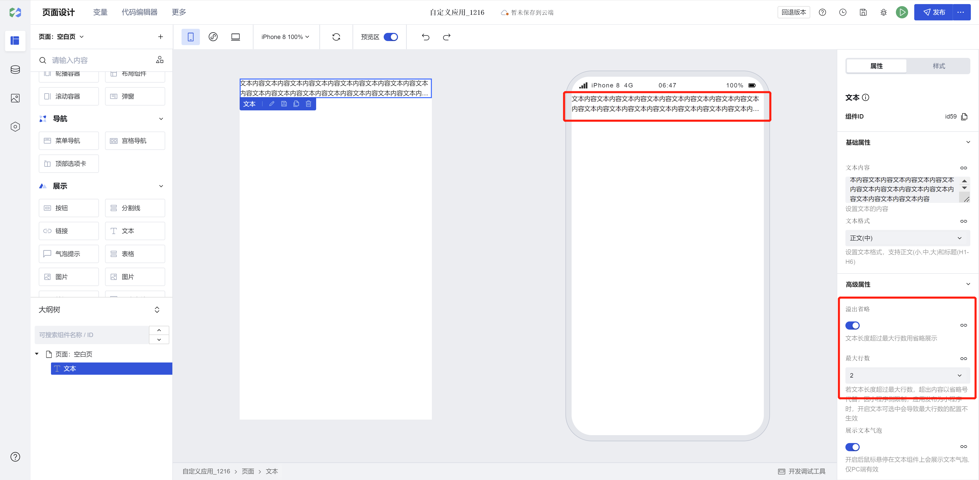
Note: Due to limitations on the Mini Program side, enabling text selection when the application is published as a Mini Program will cause the maximum number of lines configuration not to take effect.
Example
Interactive Preview
Text in Different Formats
Display Text Bubble
Text Overflow Ellipsis
Continuous Spaces
Support Selectable
Style API Custom Styles
#wd-page-root .wd-typography {
  border-color: cyan;
  background-color: black;
  border-width: 2px;
  border-radius: 6px;
}

#wd-page-root .wd-typography:hover {
  background-color: #0c0096;
}

#wd-page-root .wd-typography {
  color: cyan;
}
CSS Variables Custom Styles
#wd-page-root .wd-typography {
  --wd-body-margin-top: 10px;
  --wd-space-base: 20px;
  --wd-font-weight-regular: 600;
  --wd-font-family: cursive;
  --wd-font-size-2: 1rem;
  --wd-font-size-3: 1.125rem;
  --wd-font-size-4: 1.25rem;
  --wd-body-margin-bottom: var(--wd-space-base);
  --wd-typography-body-sm: var(--wd-font-weight-regular) var(--wd-font-size-2) /
    var(--wd-font-line-height-default) var(--wd-font-family);
  --wd-typography-body-md: var(--wd-font-weight-regular) var(--wd-font-size-3) /
    var(--wd-font-line-height-default) var(--wd-font-family);
  --wd-typography-body-lg: var(--wd-font-weight-regular) var(--wd-font-size-4) /
    var(--wd-font-line-height-default) var(--wd-font-family);
}
Properties
External properties received by the component
Property Name | Property Identifier | Type | Description |
|---|
| overflow omitted | overflow | boolean | Text length exceeds the maximum number of rows, show as omitted. When enabled, it will add display:-webkit-box !important style, which may result in text layout failure. |
| Maximum number of rows | maxLines | string | If the text length exceeds the maximum number of rows, the excess content will be replaced with an ellipsis. Due to mini program restrictions, enabling text selection in an application release for a mini program can cause the maximum number of rows configuration to be disabled. Example: "1" |
| Display text bubble | tips | boolean | When turned on, hover over the text component to display a text bubble, valid only on PC. Default value: true |
| consecutive spaces | space | boolean | Multiple spaces are automatically converted to a single space when turned off. Line breaks in web text content are shown as spaces, and line breaks do not take effect. Default value: true |
| Whether selectable | userSelect | boolean | Selecting text will be disabled after closing, and common text operations like copying will not be supported. |
| whether to inherit the parent color | inheritColor | boolean | Whether to inherit the parent color. When text color is not set, it will inherit the parent color by default. |
| Text content | text | string | Set text content Example: "文本内容" |
| Text format | level | string | Set text format, support body text (small, medium, large) and headings (H1-H6) Default value: "body-default" |
Events
Events exposed by the component. You can listen to component events to trigger external actions
Event Name | Event Code | Event Output Parameters event.detail | Applicable Scenarios | Description |
|---|
| click | tap | Compatible with all platforms | - |
Properties API
Through the Property API, you can access the internal state and property values of components. You can access internal values using$w.componentId.propertyName, such as $w.input1.value. For details, please refer to Property API
Read-only Property Name | Property Identifier | Type | Description |
|---|
| Text content | text | string | Set text content |
| Text format | level | string | Set text format, support body text (small, medium, large) and headings (H1-H6) |
| overflow omitted | overflow | boolean | Text length exceeds the maximum number of rows, show as omitted. When enabled, it will add display:-webkit-box !important style, which may result in text layout failure. |
| Maximum number of rows | maxLines | string | If the text length exceeds the maximum number of rows, the excess content will be replaced with an ellipsis. Due to mini program restrictions, enabling text selection in an application release for a mini program can cause the maximum number of rows configuration to be disabled. |
| Display text bubble | tips | boolean | When turned on, hover over the text component to display a text bubble, valid only on PC. |
| consecutive spaces | space | boolean | Multiple spaces are automatically converted to a single space when turned off. Line breaks in web text content are shown as spaces, and line breaks do not take effect. |
| Whether selectable | userSelect | boolean | Selecting text will be disabled after closing, and common text operations like copying will not be supported. |
Method API
NoneStyle API
Through the Style API, you can override the styles of internal elements in components to achieve customization. For example, in the low-code editor, you can write styles for all button components using #wd-page-root .wd-btn, and control individual component styles with :scope. For detailed instructions, please refer toStyle API
Name | Class Name | Description and Examples |
|---|
| root element | .wd-typography | text component root element |
| PC-side text root element | .wd-pc-typography | Write styles for text on the PC side |
| H5 text root element | .wd-h5-typography | Write styles for text on the H5 side |
| WeChat Mini Program root element | .wd-mp-typography | Can write styles for text in the mini program |
CSS Variables
.wd-typography {
  /* Heading h6 */
  --wd-typography-title-lg: var(--wd-font-weight-medium) var(--wd-font-size-5) /
    var(--wd-font-line-height-default) var(--wd-font-family);
  --wd-title-margin-top: 0;
  --wd-title-margin-bottom: calc(var(--wd-space-base) * 2);

  /* Heading h5 */
  --wd-typography-title-xl: var(--wd-font-weight-medium) var(--wd-font-size-6) /
    var(--wd-font-line-height-default) var(--wd-font-family);
  --wd-title-margin-top: 0;
  --wd-title-margin-bottom: calc(var(--wd-space-base) * 2);

  /* Heading h4 */
  --wd-typography-headline-sm: var(--wd-font-weight-medium) var(
      --wd-font-size-7
    ) / var(--wd-font-line-height-default) var(--wd-font-family);
  --wd-title-margin-top: 0;
  --wd-title-margin-bottom: calc(var(--wd-space-base) * 2);

  /* Heading h3 */
  --wd-typography-headline-lg: var(--wd-font-weight-medium) var(
      --wd-font-size-9
    ) / var(--wd-font-line-height-title) var(--wd-font-family);
  --wd-title-margin-top: 0;
  --wd-title-margin-bottom: calc(var(--wd-space-base) * 2);

  /* Heading h2 */
  --wd-typography-display-md: var(--wd-font-weight-medium) var(
      --wd-font-size-10
    ) / var(--wd-font-line-height-title) var(--wd-font-family);
  --wd-title-margin-top: 0;
  --wd-title-margin-bottom: calc(var(--wd-space-base) * 2);

  /* Heading h1 */
  --wd-typography-display-lg: var(--wd-font-weight-medium) var(
      --wd-font-size-11
    ) / var(--wd-font-line-height-title) var(--wd-font-family);
  --wd-title-margin-top: 0;
  --wd-title-margin-bottom: calc(var(--wd-space-base) * 2);

  /* Small Text */
  --wd-typography-body-sm: var(--wd-font-weight-regular) var(--wd-font-size-2) /
    var(--wd-font-line-height-default) var(--wd-font-family);
  --wd-body-margin-top: 0;
  --wd-body-margin-bottom: var(--wd-space-base);

  /* Medium Text */
  --wd-typography-body-md: var(--wd-font-weight-regular) var(--wd-font-size-3) /
    var(--wd-font-line-height-default) var(--wd-font-family);
  --wd-body-margin-top: 0;
  --wd-body-margin-bottom: var(--wd-space-base);

  /* Large Text */
  --wd-typography-body-lg: var(--wd-font-weight-regular) var(--wd-font-size-4) /
    var(--wd-font-line-height-default) var(--wd-font-family);
  --wd-body-margin-top: 0;
  --wd-body-margin-bottom: var(--wd-space-base);
}
Version Changes
Compared to the old version text
- Text component supports configuration of text overflow ellipsis
- Optimized the font, font size, and style for text initialization
- Added large, medium, and small sizes as options for body text format