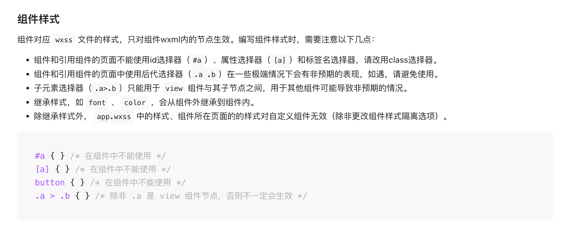
Style API
Standardized components unify implementations across PC, H5, and Mini Program platforms while openly supporting a series of standard APIs, including style APIs and custom CSS variables. Standardized components are marked with in the Component List.
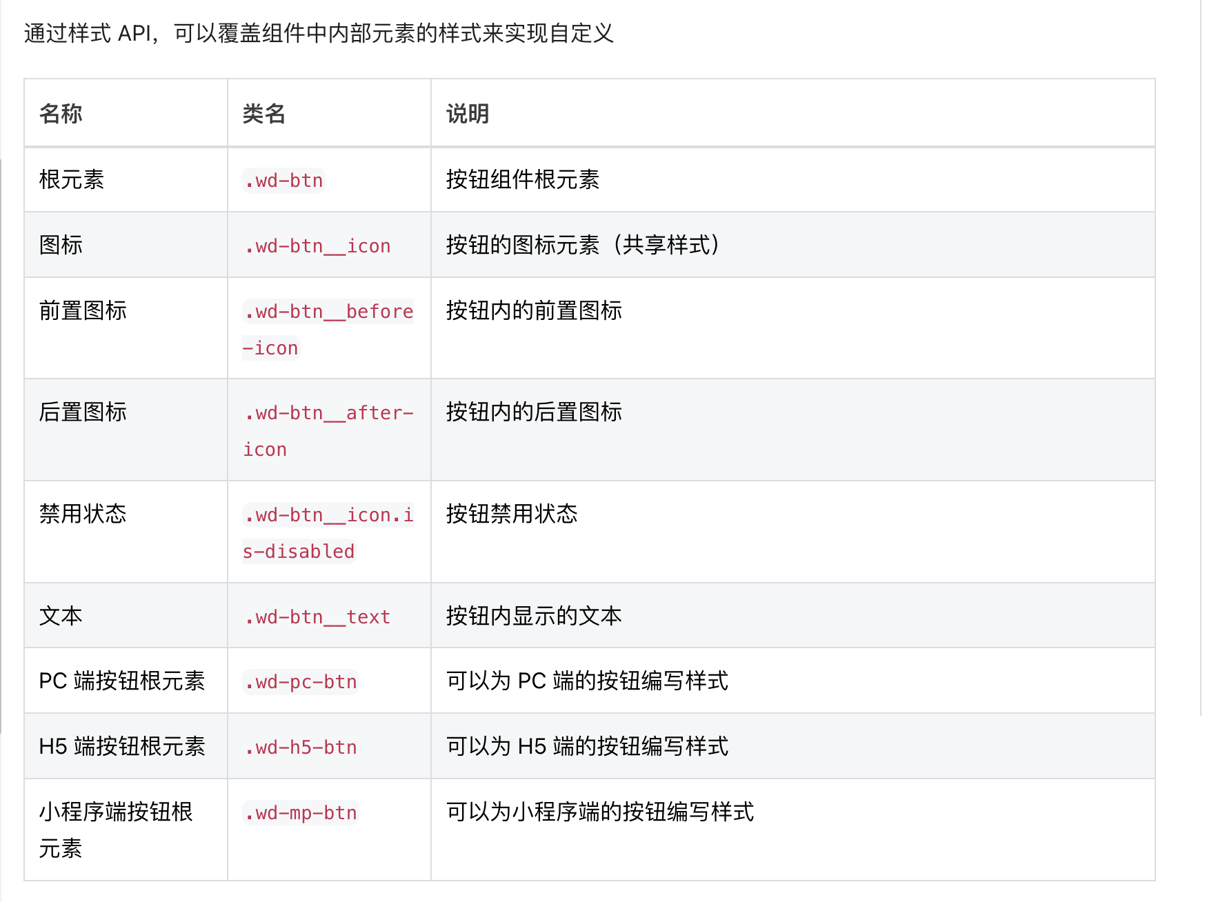
Standardized components expose external style APIs to address the issue where users cannot customize internal structure styles of components via the low-code editor.
Example
Overriding Component Global Styles
If you want to affect the styles of a specific type of components in an application, for example, to define styles for all button components, you can refer to the following steps:
- Open the code editor and locate the global
stylefile - Refer to the style APIs exposed by components to write style code. Note that to ensure the style APIs take effect, you need to add the selector
#wd-page-rootbefore the component's style APIs.
Example:
#wd-page-root .wd-btn {
  border-color: cyan;
  background-color: black;
  border-width: 2px;
  border-radius: 6px;
}

#wd-page-root .wd-btn:hover {
  background-color: #0c0096;
}

#wd-page-root .wd-btn.is-disabled {
  background-color: #888;
}

#wd-page-root .wd-btn__text {
  color: cyan;
}
Writing Styles for Specified Devices
Standardized components provide corresponding class names when rendering on different devices, allowing you to write styles for specified devices.
For example, the button component provides unique class names across the three platforms.
- The root element of the PC button, .wd-pc-btn, allows you to write styles for PC buttons
- The root element of the H5 button, .wd-h5-btn, allows you to write styles for H5 buttons
- The root element of the Mini Program button, .wd-mp-btn, allows you to write styles for Mini Program buttons
For example, if you want buttons on mobile devices to occupy the full screen width by default, you can write the following styles specifically for H5 and Mini Program buttons:
In this example, we have overridden the styles of all buttons on mobile and Mini Program sides, while the PC side remains unaffected.
#wd-page-root .wd-mp-btn,
#wd-page-root .wd-h5-btn {
  width: 100%;
}
Overriding Styles of Specific Components
If you only want to affect the styles of certain components, there are two approaches:
Override the styles of a specific component using :scope
The :scope represents the root node of a component
When you only want to override the styles of a specific component without affecting other components of the same type, you can follow these steps:
-
First, click the component, then click the
CSSbutton in the right-side style panel -
Add the following CSS code in the opened code editor
:scope {
  /* Define styles for this component individually */
  font-size: 20px;
}

/* Change the background color on pc to red */
:scope.wd-pc-btn {
  background-color: red;
}

/* The background color on h5 is blue */
:scope.wd-h5-btn {
  background-color: blue;
}

/* The background color on Mini Program is green */
:scope.wd-mp-btn {
  background-color: green;
}

/* You can also use CSS pseudo-classes to write hover styles */
:scope:hover {
  /* Background becomes purple on hover */
  background: purple;
}
Overriding styles of certain components using class
In the WeDa Low-Code Platform, the method of overriding component styles using class is implemented through custom CSS classes. Here are some steps to guide you through the process:
-
First, locate the component whose style you want to modify in the WeDa editor.
-
Click the component and locate the "className" option in the right-hand style panel.
-
Enter the custom CSS class name you wish to use in the "className" input box. For example:
custom-button. -
Open the
stylefile in the code editor. Then add the following code:
/* Adding the #wd-page-root selector is also to ensure it takes effect */
#wd-page-root .custom-button {
  /* Add the styles you want to override here */
  background-color: red; /* For example: set the button's background color to red */
  color: white; /* For example: set the button's text color to white */
}
- Save the CSS file, then return to the WeDa editor to view the effect. You can also apply this CSS class to components requiring similar effects to reuse styles.
Mini Program Notes
Due to restrictions on the Mini Program side, the following points need to be noted when writing styles. Specifically, refer to the documentation