Icon
WdIcon
Applicable Scenarios
You can achieve the icon display effect by choosing preset icons in the configuration area of the icon component. The component also supports custom upload of icons by users.
Basic Capabilities Description
- Basic properties of the icon support selecting the icon type (preset icons & custom icons) and icon size (provides five recommended sizes for selection).
Extended Scenarios Description
How to Modify Preset Icon Color and Size via the Style Panel
Example
Quickly modify preset icon color and size via the style panel.
Configuration Method
Add an icon component, open the style panel, choose a color in the Font section, and enter a value in the Font Size field.
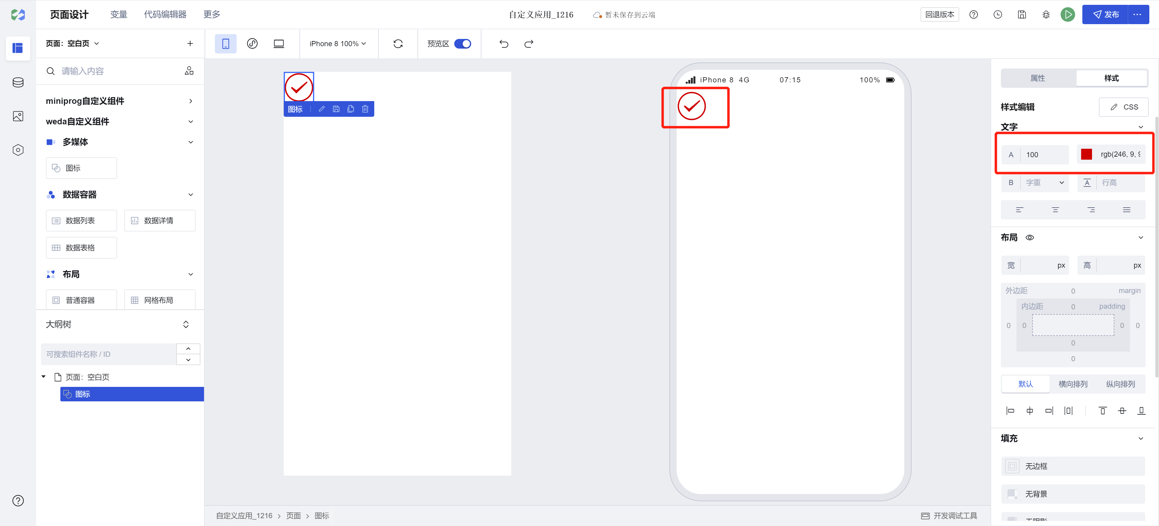
Note: The size and color of preset icons follow the font configuration.
Example
Interactive Preview
All Icons
Different Sizes of Icons
Custom Icons
Style API Custom Styles
#wd-page-root .wd-icon {
  border-color: cyan;
  background-color: black;
  border-width: 2px;
  border-radius: 6px;
}

#wd-page-root .wd-icon:hover {
  background-color: #0c0096;
}

#wd-page-root .wd-icon {
  color: cyan;
}
CSS Variables Custom Styles
/* You can redefine the icon size by overriding css variables */
#wd-page-root .wd-icon {
  --wd-icon-size-xs: 1.25rem;
  --wd-icon-size-sm: 1.5rem;
  --wd-icon-size-md: 2rem;
  --wd-icon-size-lg: 3rem;
  --wd-icon-size-xl: 4rem;
}
Properties
External properties received by the component
Property Name | Property Identifier | Type | Description |
|---|
| Icon type | type | string | Select icon type Default value: "inner" |
| Icon style | name | string | Select preset icon Example: "success" |
| custom icon | src | string | Set custom icon address |
| icon size | size | string | Settings icon dimension size Default value: "md" |
Events
Events exposed by the component. You can listen to component events to trigger external actions
Event Name | Event Code | Event Output Parameters event.detail | Applicable Scenarios | Description |
|---|
| click | tap | Compatible with all platforms | - |
Properties API
Through the Property API, you can access the internal state and property values of components. You can access internal values using$w.componentId.propertyName, such as $w.input1.value. For details, please refer to Property API
Read-only Property Name | Property Identifier | Type | Description |
|---|
| Icon type | type | string | Select icon type |
| Icon style | name | string | Select preset icon |
| custom icon | src | string | Set custom icon address |
| icon size | size | string | Settings icon dimension size |
Method API
NoneStyle API
Through the Style API, you can override the styles of internal elements in components to achieve customization. For example, in the low-code editor, you can write styles for all button components using #wd-page-root .wd-btn, and control individual component styles with :scope. For detailed instructions, please refer toStyle API
Name | Class Name | Description and Examples |
|---|
| root element | .wd-icon | chart component root element |
| PC-side icon root element | .wd-pc-icon | Write styles for PC icons |
| H5 icon root element | .wd-h5-icon | Write style for H5 icon |
| WeChat Mini Program icon root element | .wd-mp-icon | Can write style for mini program icon |
CSS Variables
.wd-icon {
  /* 16px */
  --wd-icon-size-xs: 1rem;
  /* 20px */
  --wd-icon-size-sm: 1.25rem;
  /* 24px */
  --wd-icon-size-md: 1.5rem;
  /* 32px */
  --wd-icon-size-lg: 2rem;
  /* 48px */
  --wd-icon-size-xl: 3rem;
}
Version Changes
Compared to the old version icon
- The color configuration in the icon property panel has been removed. Icon colors can now be configured via the font color setting in the Style panel (colors from original icon configurations will be retained).
- Icon size configuration has been changed from manual numerical input to a dropdown selection of predefined sizes (existing icon size settings will be preserved)