Button
WdButton
Applicable Scenarios
Used for scenarios requiring users to click to trigger specific events, such as information submission, page redirection, etc.
Basic Capabilities Description
- The basic properties of the button support configuring the button's title, color, type, size, and whether it is full-width, allowing flexible selection and combination.
- The advanced properties of the button support configuring the loading state, icon buttons, and usage scenarios in forms. Additionally, the mini-program side supports configuring the corresponding WeChat Open Capabilities for the button.
Extended Scenarios Description
Button Use Cases in Forms
Example
Submit: After entering information in the form, click the button to submit the form data to the data model.
Reset: After entering information in the form, click the button to clear the input content in the form.
Configuration Method
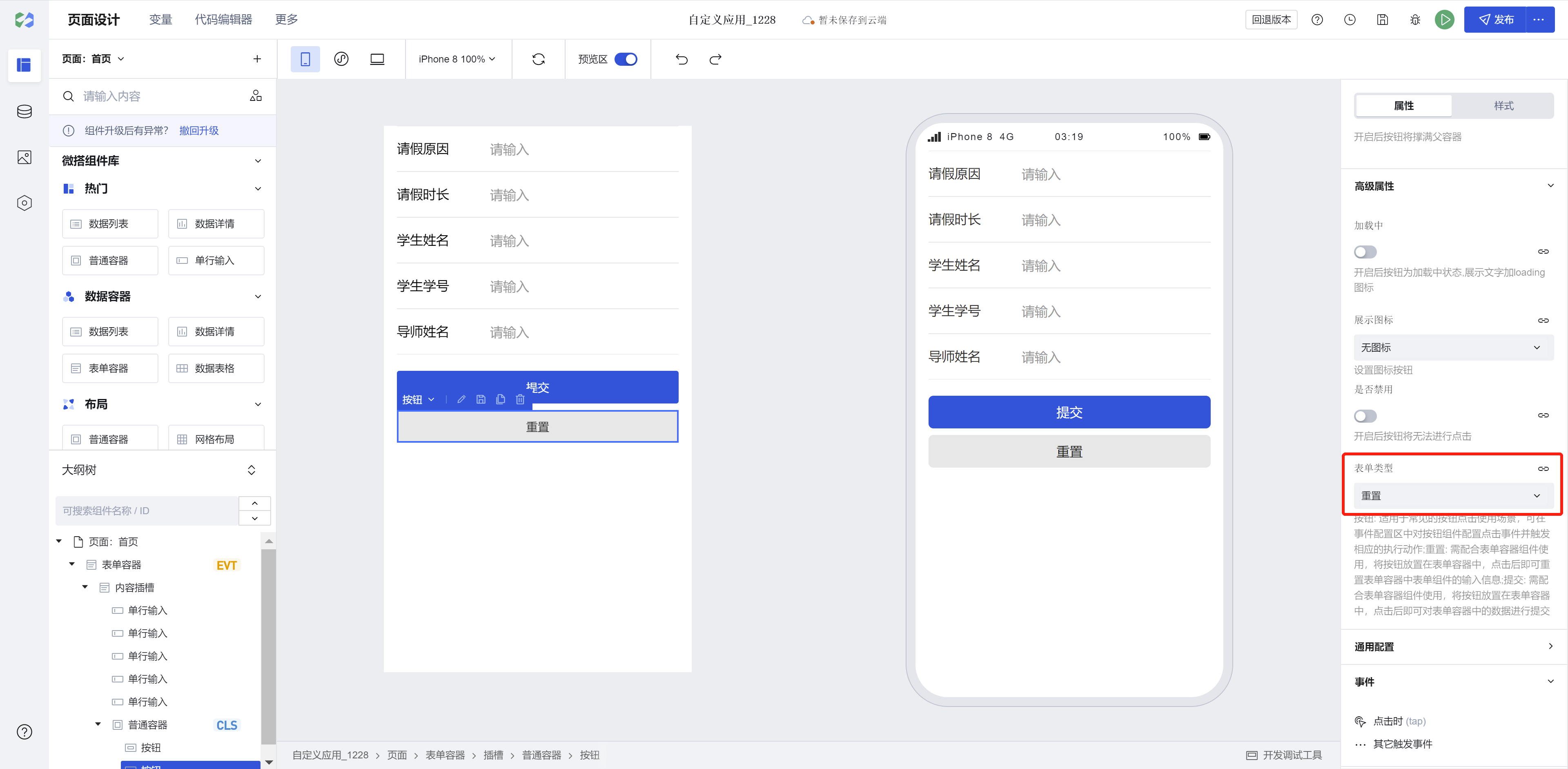
Submit: In the Button Properties Area - Advanced Properties - Form Type - Submit, after adding a form container - selecting a data model, the form and its submit button will be automatically generated. The automatically generated button in the form container has its form type selected as Submit by default.
Reset: In the Button Properties Area - Advanced Properties - Form Type - Reset, you can add a button to the form. Modify the button title to "Reset" and set its form type to Reset. After entering/selecting content in the form, clicking the Reset button will clear all input/selections. (In the button's basic properties - Color, you may choose Secondary; adjust the margin between buttons flexibly via the margin setting in the Styles Panel.)
Button Use Cases in Mini Programs
Example
Example
Interactive Preview
Different Types of Buttons
Different Sizes of Buttons
Different Colors of Buttons
Buttons with Icons
Style API Custom Styles
#wd-page-root .wd-btn {
  border-color: cyan;
  background-color: black;
  border-width: 2px;
  border-radius: 6px;
}

#wd-page-root .wd-btn:hover {
  background-color: #0c0096;
}

#wd-page-root .wd-btn.is-disabled {
  background-color: #888;
}

#wd-page-root .wd-btn__text {
  color: cyan;
}
CSS Variables Custom Styles
#wd-page-root .wd-btn {
  --wd-btn-typography-sm: var(--wd-font-weight-regular) var(--wd-font-size-3)
    var(--wd-font-family);
  --wd-btn-typography-md: var(--wd-font-weight-regular) var(--wd-font-size-4)
    var(--wd-font-family);
  --wd-btn-typography-lg: var(--wd-font-weight-regular) var(--wd-font-size-5)
    var(--wd-font-family);
  --wd-btn-border-radius: 0.3rem;
  --wd-btn-color-brand: var(--wd-color-success);
  --wd-btn-color-brand-hover: var(--wd-color-success-hover);
  --wd-btn-color-brand-active: var(--wd-color-success-active);
  --wd-btn-color-brand-focus: var(--wd-color-success-focus);
  --wd-btn-color-brand-disabled: var(--wd-color-success-disabled);
}
Properties
External properties received by the component
Property Name | Property Identifier | Type | Description |
|---|
| loading | loading | boolean | Button shows loading status when enabled, displaying text and loading icon |
| Display icon | iconType | string | Settings icon button Default value: "none" |
| Icon type | iconSource | string | Select icon type Default value: "inner" |
| Icon style | icon | string | Select preset icon Example: "success" |
| custom icon | iconSrc | string | Set custom icon address |
| Icon location | iconPosition | string | Settings icon location Default value: "before" |
| Whether to disable | disabled | boolean | When enabled, the button cannot be clicked |
| form type | formType | string | Button: Suitable for common button click scenarios. You can configure the click event and trigger the appropriate execution action for the button component in the event configuration area. Reset: Used in conjunction with the form container component. Place the button in the form container, and after clicking, it will reset the input data of the form components in the form container. Submit: Used in conjunction with the form container component. Place the button in the form container, and after clicking, it will submit the data in the form container. Default value: "button" |
| WeChat Open Capability(Mini Program) | openType | string | Only supported when building a mini program, configure button properties related to mini program capacity for WeChat-related calls. |
| Session source(Mini Program) | sessionFrom | string | |
| Message card title in session(Mini Program) | sendMessageTitle | string | |
| Message card in session click redirect Mini Program Path(Mini Program) | sendMessagePath | string | |
| Message card image in session(Mini Program) | sendMessageImg | string | |
| Whether to display message cards in session(Mini Program) | showMessageCard | boolean | |
| Parameters passed to the APP when opened(Mini Program) | appParameter | string | |
| Content | text | string | Set button text content Example: "按钮" |
| color | theme | string | Set button color Default value: "primary" |
| Type | variant | string | Set button type Default value: "base" |
| size | size | string | Set button dimension size Default value: "md" |
| is connected | block | boolean | The button will fill the parent container when enabled |
Events
Events exposed by the component. You can listen to component events to trigger external actions
Event Name | Event Code | Event Output Parameters event.detail | Applicable Scenarios | Description |
|---|
| click | tap | Compatible with all platforms | - | |
| customer service session | contact | object
| Mini Program | - |
| open App | launchApp | Mini Program | - | |
| Enable authorization | openSetting | Mini Program | - |
Properties API
Through the Property API, you can access the internal state and property values of components. You can access internal values using$w.componentId.propertyName, such as $w.input1.value. For details, please refer to Property API
Read-only Property Name | Property Identifier | Type | Description |
|---|
| Content | text | string | Set button text content |
| color | theme | string | Set button color |
| Type | variant | string | Set button type |
| size | size | string | Set button dimension size |
| is connected | block | boolean | The button will fill the parent container when enabled |
| Whether to disable | disabled | boolean | When enabled, the button cannot be clicked |
| form type | formType | string | Button: Suitable for common button click scenarios. You can configure the click event and trigger the appropriate execution action for the button component in the event configuration area. Reset: Used in conjunction with the form container component. Place the button in the form container, and after clicking, it will reset the input data of the form components in the form container. Submit: Used in conjunction with the form container component. Place the button in the form container, and after clicking, it will submit the data in the form container. |
| WeChat Open Capability | openType | string | Only supported when building a mini program, configure button properties related to mini program capacity for WeChat-related calls. |
Method API
NoneStyle API
Through the Style API, you can override the styles of internal elements in components to achieve customization. For example, in the low-code editor, you can write styles for all button components using #wd-page-root .wd-btn, and control individual component styles with :scope. For detailed instructions, please refer toStyle API
Name | Class Name | Description and Examples |
|---|
| root element | .wd-btn | button component root element |
| Icon. | .wd-btn__icon | Button icon element (share style) |
| Front icon | .wd-btn__before-icon | Pre-icon in button |
| post icon | .wd-btn__after-icon | Post icon in button |
| disable status | .wd-btn.is-disabled | Button disable status |
| Text | .wd-btn__text | Button text |
| PC-side button root element | .wd-pc-btn | Write styles for buttons on the PC side |
| H5 button root element | .wd-h5-btn | Write styles for buttons on the H5 side |
| WeChat Mini Program button root element | .wd-mp-btn | Write style for mini program button |
CSS Variables
.wd-btn {
  --wd-btn-sm-padding: 0.0625rem calc(var(--wd-space-base) * 2);
  --wd-btn-md-padding: 0.25rem calc(var(--wd-space-base) * 4);
  --wd-btn-lg-padding: 0.4375rem calc(var(--wd-space-base) * 6);

  --wd-btn-typography-sm: var(--wd-typography-body-sm);
  --wd-btn-typography-md: var(--wd-typography-body-md);
  --wd-btn-typography-lg: var(--wd-typography-body-lg);
  --wd-btn-border-radius: var(--wd-border-radius);

  // Text color
  --wd-btn-color-text: var(--wd-color-text-default);
  --wd-btn-color-text-inverse: var(--wd-color-text-inverse);
  --wd-btn-color-text-hover: var(--wd-color-text-default);
  --wd-btn-color-text-active: var(--wd-color-text-default);
  --wd-btn-color-text-focus: var(--wd-color-text-default);
  --wd-btn-color-text-disabled: var(--wd-color-text-disabled);

  // Brand color
  --wd-btn-color-brand: var(--wd-color-brand);
  --wd-btn-color-brand-hover: var(--wd-color-brand-hover);
  --wd-btn-color-brand-active: var(--wd-color-brand-active);
  --wd-btn-color-brand-focus: var(--wd-color-brand-focus);
  --wd-btn-color-brand-disabled: var(--wd-color-brand-disabled);

  // Warning color
  --wd-btn-color-warning: var(--wd-color-warning);
  --wd-btn-color-warning-hover: var(--wd-color-warning-hover);
  --wd-btn-color-warning-active: var(--wd-color-warning-active);
  --wd-btn-color-warning-focus: var(--wd-color-warning-focus);
  --wd-btn-color-warning-disabled: var(--wd-color-warning-disabled);
  // Error color
  --wd-btn-color-error: var(--wd-color-error);
  --wd-btn-color-error-hover: var(--wd-color-error-hover);
  --wd-btn-color-error-active: var(--wd-color-error-active);
  --wd-btn-color-error-focus: var(--wd-color-error-focus);
  --wd-btn-color-error-disabled: var(--wd-color-error-disabled);

  // Gray
  --wd-btn-color-gray: var(--wd-color-gray-3);
  --wd-btn-color-gray-hover: var(--wd-color-gray-4);
  --wd-btn-color-gray-active: var(--wd-color-gray-6);
  --wd-btn-color-gray-focus: var(--wd-color-gray-3);
  --wd-btn-color-gray-disabled: var(--wd-color-gray-2);

  --wd-btn-color-gray-border: var(--wd-color-gray-4);
  --wd-btn-color-gray-border-hover: var(--wd-color-gray-5);
  --wd-btn-color-gray-border-active: var(--wd-color-gray-6);
  --wd-btn-color-gray-border-disabled: var(--wd-color-gray-4);

  // White
  --wd-btn-color-white: var(--wd-white);
  --wd-btn-color-white-hover: var(--wd-color-gray-1);
  --wd-btn-color-white-active: var(--wd-color-gray-3);
  --wd-btn-color-white-disabled: var(--wd-color-gray-2);
}
Frequently Asked Questions
Why is the click event bound to the button not triggering?
Frequently Asked Questions
Version Changes
Compared to old version buttons
- The default button size has been adjusted, and full-width button configuration has been added (after upgrade, the default size of existing buttons will change)
- Removed default padding from buttons; they no longer center by default on pages, and single buttons no longer occupy a full row by default on mobile devices (after upgrade, layout changes should be noted and adjusted as needed)
- Enriched the default button colors. After upgrade, please note the changes in default button colors and adjust as needed.
- The disabled state style of buttons has been optimized
- Buttons now support configuration capability for icons within buttons
- Enriched the default button types, providing options for filled, outlined, text, and link styles