Image Upload
WdUploadImage
Applicable Scenarios
For uploading and saving local images
Basic Capabilities
Bind Image and Array Field
-
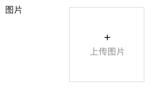
Single image upload: After the form container is bound to the data model, the "Image" field in the model will be automatically rendered as an image upload component, providing support for uploading a single image.
-
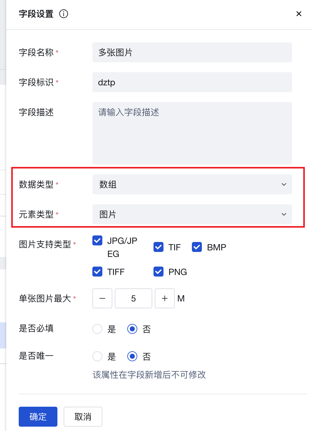
Multiple image upload: After the form container is bound to the data model, the "Array" field of image elements in the model will be automatically rendered as an image upload component, providing support for uploading multiple images.
Extended Scenarios
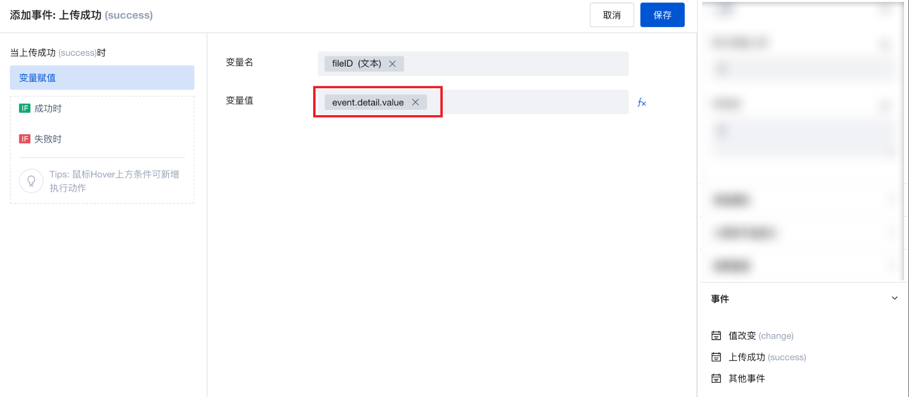
Obtain Image File ID After User Uploads Image
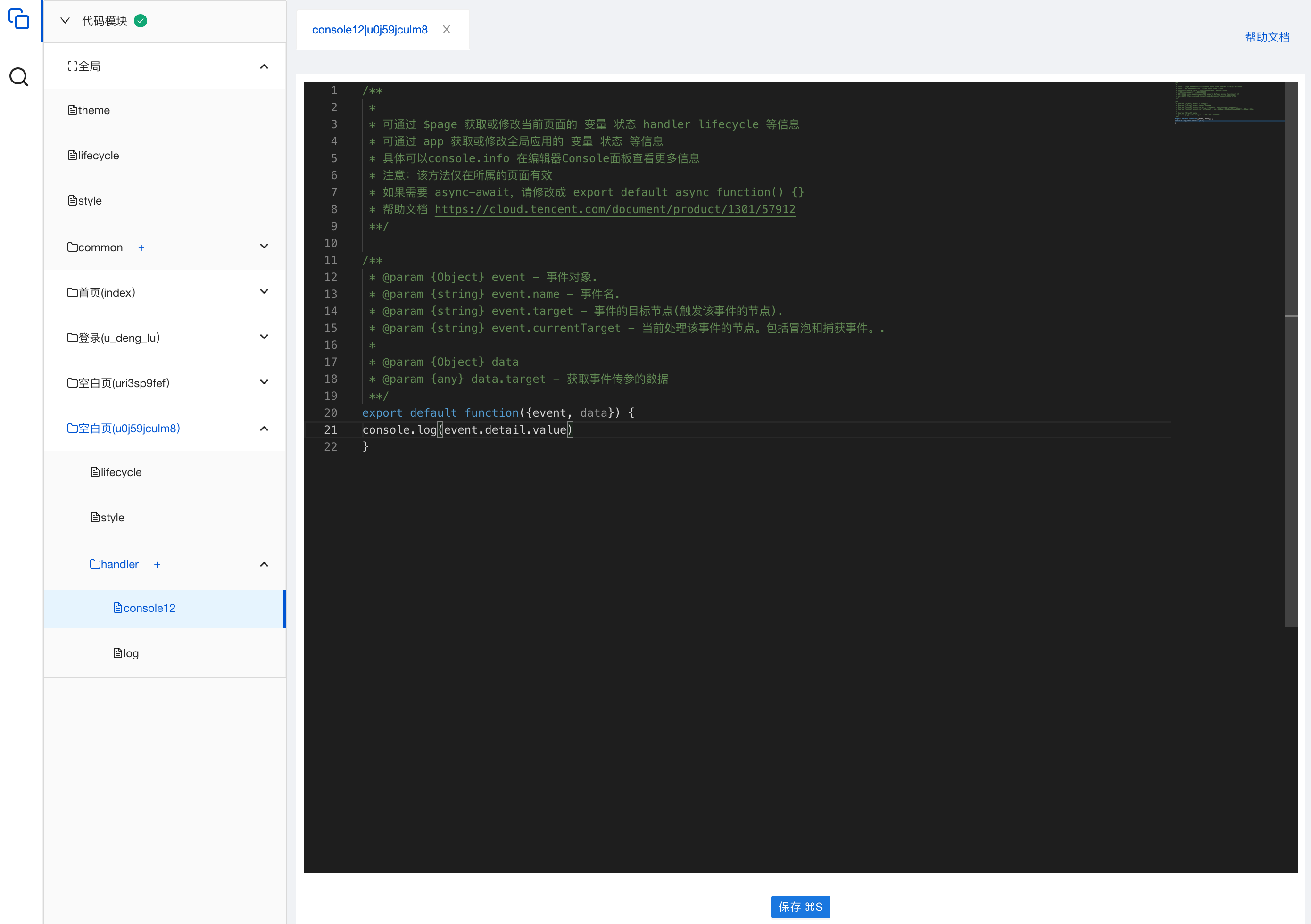
After uploading an image via the image upload component, a "File Upload" event will be triggered. The cloudID of the uploaded image can be obtained from the output parameter event.detail.value of this event. This ID can be viewed by printing logs, as shown in the following example:
-
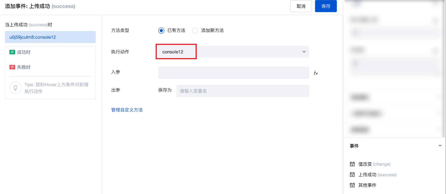
Create a custom method and write the log printing code console.log(event.detail.value). The specific content format is shown in the figure below:
-
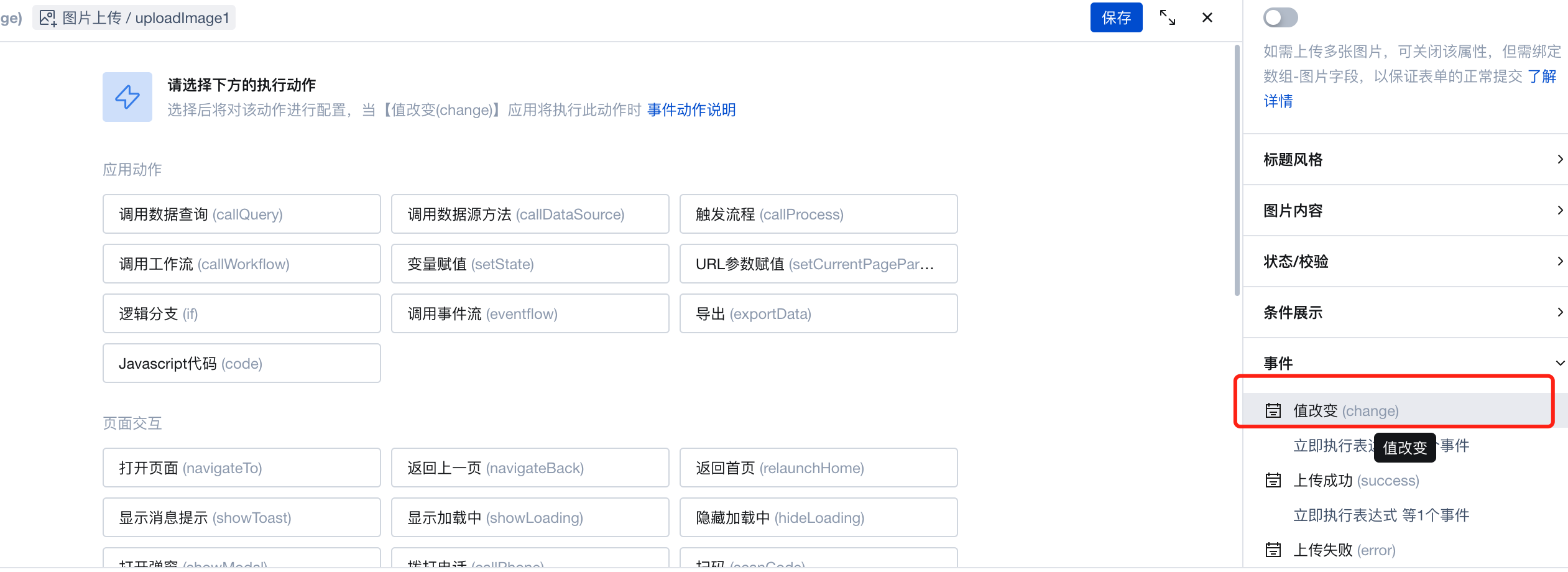
Drag and drop the "Image Upload" component into the page, and configure the "Value Change" event to trigger this log printing method.
-
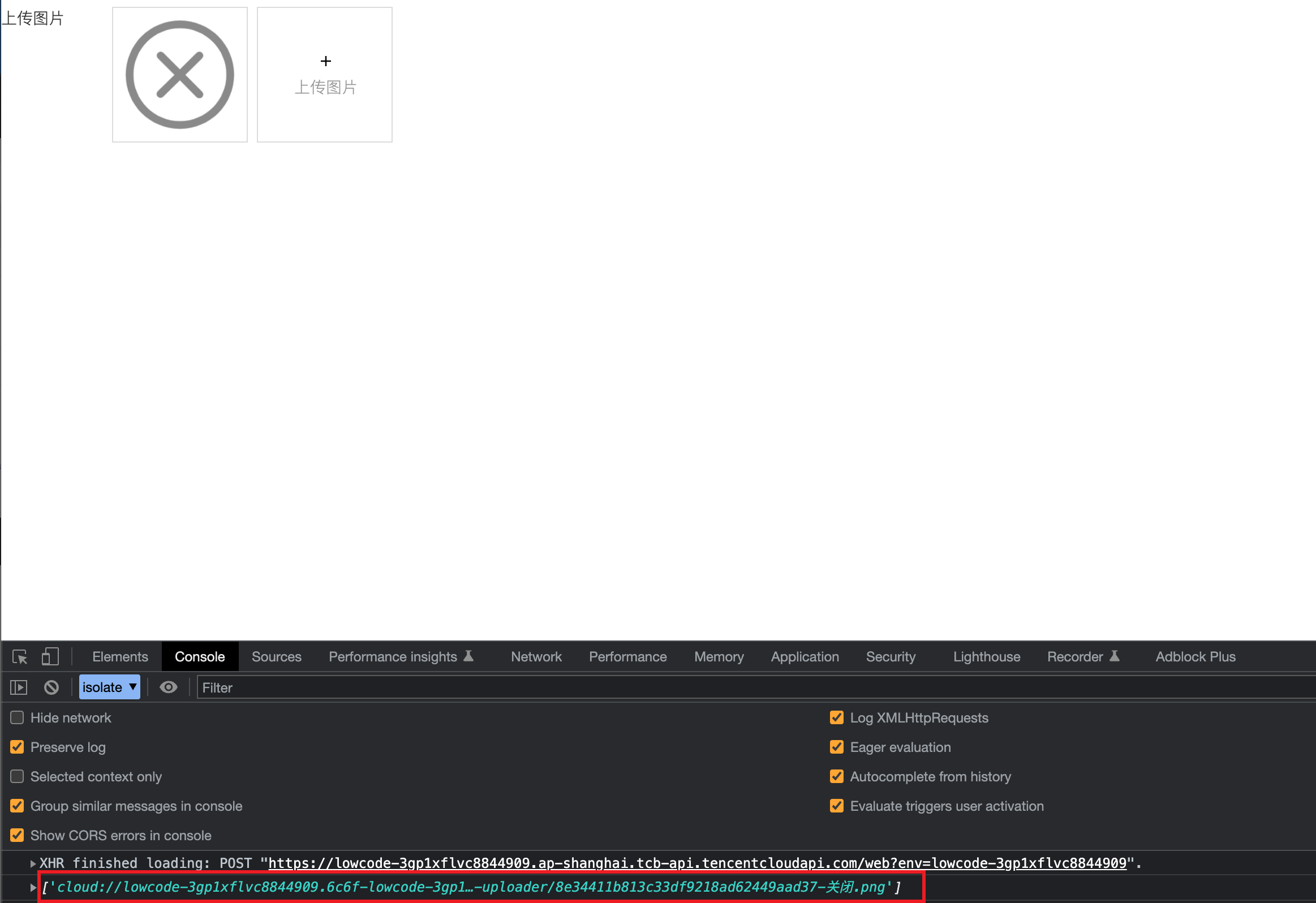
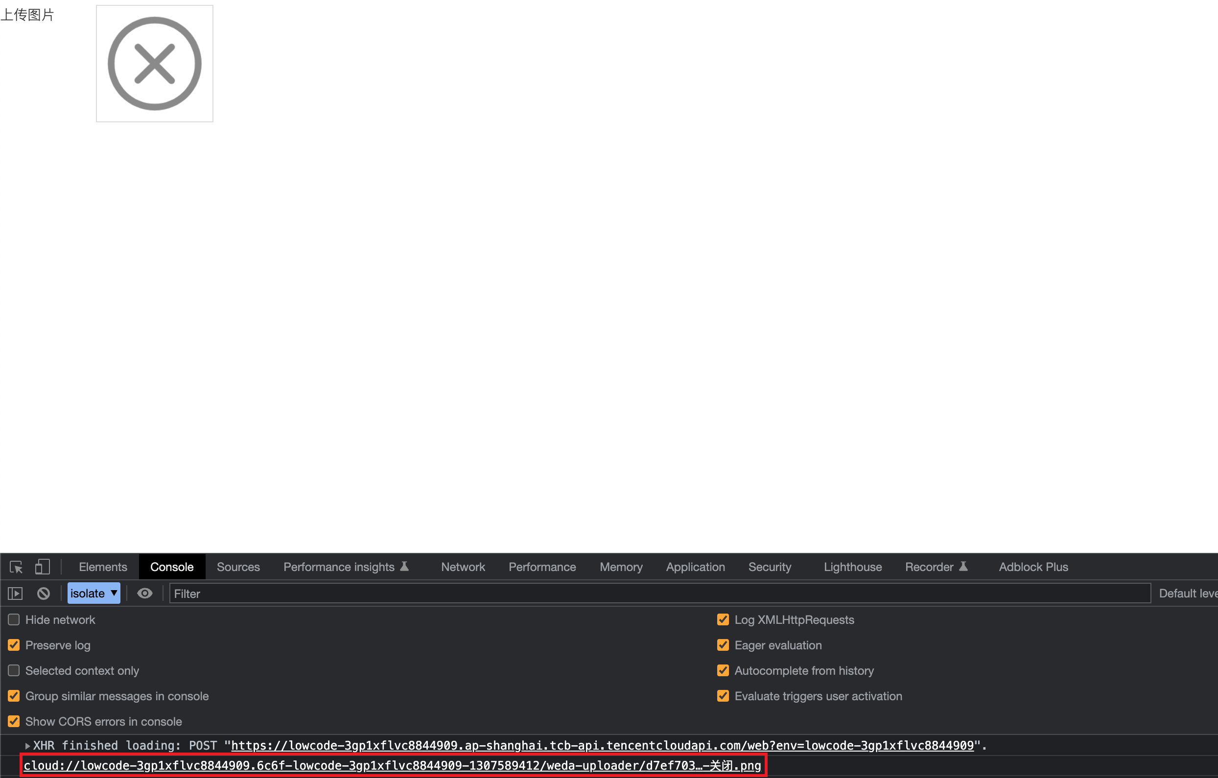
Preview the configuration effect: You will find that after selecting an image for upload, the cloudID of the uploaded image will be printed in the console. (Note: When the "Upload Single Image" feature of the component is disabled, multiple image uploads are supported, and the printed content will be array-type data; when this feature is enabled, only one image can be uploaded, and the printed content will be string-type data.)
- Print result when the Upload Single Image property is disabled.
- Print result when the Upload Single Image property is enabled.
-
In daily usage, you can store this ID in a variable through the component's upload success event, or utilize it in other ways.
Practices for Other Scenarios
Refer to the Form Scenario Practice Guide to explore various supported scenarios and implementation solutions for forms.
Notes
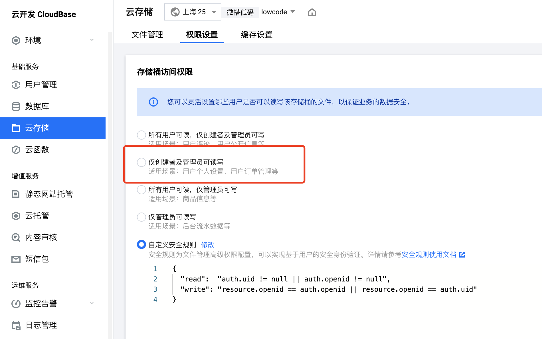
After an image is uploaded, users can download/view the image via its https URL. To restrict all file/image resources so that only the uploader can download them, adjust the bucket access permission to "Only creator and administrator have read/write access" in the Weida environment's CloudBase-Cloud Storage module.
Example
Interactive Preview
Component Input Status
Style API Example
#wd-page-root .wd-form-item.wd-pc-upload-image-root .wd-upload-image__label {
  color: #05c3c3;
  display: flex;
  justify-content: center;
  align-items: center;
}
Properties
External properties received by the component
Property Name | Property Identifier | Type | Description |
|---|
| Bound field | name | string | The Key value of a form field is used to match the field identifier of the data model when submitting data. It must be unique within the form. |
| Title content. | label | string | Example: "图片上传" |
| Value storage method | storageType | string | Specify the image storage method Default value: "cloudID" |
| Image value | value | array | Supports writing https addresses or cloudIDs to file in array format; supports string type for one upload and array type for multiple uploads. |
| Upload a single image | single | boolean | Enable the WeChat Mini Program to get the WeChat avatar, then only upload 1 image. |
| Display Headlines | labelVisible | boolean | Default value: true |
| Title alignment | labelAlign | string | In the scenario, the form by default follows the title alignment configuration of the form container. |
| Line break in heading | labelWrap | boolean | If the title content is too long when closed, show one line with overflow omitted; when enabled, show with line breaks. In form scenarios, it follows the form container's title line break configuration by default. |
| Title position | layout | string | Set title display position in form component. In the scenario, it follows the title position configuration of the form container by default. |
| Title width | labelWidth | string | In the scenario, the form follows the title width configuration of the form container by default. |
| Heading Note | labelTips | string | Configure tooltip content for the heading |
| Image source | sourceType | string | Image selection source Default value: "both" |
| WeChat Mini Program profile photo retrieval | isChooseAvatar | boolean | Once enabled, mini program users can select direct upload of WeChat avatar; effective only on the mini program side. |
| Prompt. | extra | string | The prompt content is displayed below the input box after configuration. |
| Image shape | showShape | string | Only affect the image display effect, without cropping the image Default value: "ectangle" |
| Display underscore on mobile terminal | borderedH5 | boolean | After closing, the mobile terminal does not show the bottom underline Default value: true |
callbacks | object | configuration-related functions | |
| Image Compression Before Upload | isCompressBeforeUpload | boolean | |
| compression quality | compressQuality | number | Default value: 70 |
| Compressed image width (px) | compressedWidth | number | |
| compressed image height (px) | compressedHeight | number | |
| Image type | acceptTypes | array | Supported image type formats Default value: ["image/*"] |
| Single image size cap (M) | maxSize | number | single image size cap Default value: 10 |
| Maximum number of images | maxUploadCount | number | Maximum number of uploads allowed Default value: 9 |
| Status. | status | string | Example: "edit" |
| Required | required | boolean | |
| Required identifier | requiredFlag | boolean | Enabled, the component will display a required asterisk tag if mandatory. Default value: true |
| Required validation note | requiredMsg | string | Example: "该项为必填项" |
| Image upload template | template | string | Specify an image upload template Default value: "normal" |
Pre-upload Handler Function Property
You can preprocess uploaded images using the pre-upload handler function, such as compressing, cropping, etc.
Function Parameter Types:
type BeforeUploadParams0 = {
  // base64 uri
  base64Uri: string[];
  // Mini Program only, temporary file path array
  tempFilePaths?: string[];
  // web end only, File object
  files: File[];
};
On the Web end, you can call external libraries like compressorjs to process File objects. For Mini Programs, you can use provided APIs such as wx.compressImage and wx.cropImage to handle temporary file paths.
Function Return Value Types:
boolean | File[] | string[]
- Return true to continue the default upload logic.
- Return false to disable the default upload logic.
- The Web end returns an array of File. The Web end accepts the file[] returned by the function as the upload object to complete the upload logic.
- The Mini Program returns a string[] array of temporary file paths. The Mini Program receives the array of temporary file paths returned by the function as the upload object to complete the upload logic.
Applications can determine the runtime environment using the Platform API to optimize multi-end custom upload logic.
Example: Custom Upload
For example, to customize the upload to other destinations such as COS Below is an example using CloudBase Cloud Storage in the WeDa environment:
async (result) => {
  console.log('beforeUpload', result);
  // Files can be processed before upload, such as compression
  // result.files[0] = FAKE_COMPRESS(result.files[0])

  const tcb = await $w.cloud.getCloudInstance();
  const res = await tcb.uploadFile({
    cloudPath: 'ttt/abc.jpg',
    filePath: result.files[0]
  });

  console.log(res.download_url); // Image HTTP address
  $w.uploadImage1.setValue({ value: [res.download_url] }); // Set the obtained http address to the image upload component
  return false; // Abort the upload
};
Events
Events exposed by the component. You can listen to component events to trigger external actions
Event Name | Event Code | Event Output Parameters event.detail | Applicable Scenarios | Description |
|---|
| value change | change | object
| Compatible with all platforms | Trigger when a user modifies a component value |
| upload succeeded | success | object
| Compatible with all platforms | - |
| upload failed | error | Compatible with all platforms | - | |
| Image upload initialization complete | onReady | object 图片上传实例
| Compatible with all platforms | - |
Properties API
Through the Property API, you can access the internal state and property values of components. You can access internal values using$w.componentId.propertyName, such as $w.input1.value. For details, please refer to Property API
Read-only Property Name | Property Identifier | Type | Description |
|---|
| Bound field | name | string | The Key value of a form field is used to match the field identifier of the data model when submitting data. It must be unique within the form. |
| Title content. | label | string | |
| Image value | value | array | Supports writing https addresses or cloudIDs to file in array format; supports string type for one upload and array type for multiple uploads. |
| Required | required | boolean | |
| Indicates whether to display | visible | boolean | Whether to display the component |
| Whether to disable | disabled | boolean | Component Disabled |
| Specify whether it is read-only or not. | readOnly | boolean | Whether the component is read-only |
| Image upload instance | uploadInstance | object | |
| Image preview list | previewFile | array |
Method API
Through the Method API, you can programmatically trigger internal methods of components, such as submitting forms, displaying popups, etc. You can call component methods using $w.componentId.methodName, such as $w.form1.submit()
Method Name | Method Identifier | Parameters | Method Description |
|---|
| set value | setValue | object
| 通过 $w.id1.setValue("weda") 设置组件值 |
| Show/Hide Settings | setVisible | boolean显示 | Set the component to hidden via $w.id1.setVisible(false) |
| Set Disabled | setDisabled | boolean禁用 | Set the component to disabled with $w.id1.setDisabled(true) |
| Clear value | clearValue | Clear the component value with $w.id1.clearValue() | |
| Set as read-only | setReadOnly | boolean只读 | Set the component to read-only via $w.id1.setReadOnly(true) |
| Trigger validation | handleValidate | Validate the component value via $w.id1.handleValidate() | |
| Clear verification | clearValidate | Clear component validation via $w.id1.clearValidate() | |
| upload image upload images image upload upload picture upload pictures | upload | Upload images via $w.id1.upload(), used when the upload template supports selecting custom images | |
| Delete a single image | delete | string图片cloudId | Delete a single image with $w.id1.delete(), used when support selecting custom image upload template |
| Update image upload configuration | setConfig | object 图片上传配置 通过 $w.id1.setConfig()更新图片上传配置项,仅在支持选择自��定义图片上传模板时使用
| - |
Style API
Through the Style API, you can override the styles of internal elements in components to achieve customization. For example, in the low-code editor, you can write styles for all button components using #wd-page-root .wd-btn, and control individual component styles with :scope. For detailed instructions, please refer toStyle API
Name | Class Name | Description and Examples |
|---|
| root element | .wd-upload-image-root | Outermost component element |
| H5 root element | .wd-h5-upload-image-root | Settable root element style for the H5 side |
| PC-side root element | .wd-pc-upload-image-root | Settable root element style for the PC side |
| Mini program root element | .wd-mp-upload-image-root | Settable root element style for mini program |
| borderless status | .wd-upload-image-root.is-borderless | Set component borderless status style |
| Required status | .wd-upload-image-root.is-required | Set component required status style |
| Title. | .wd-upload-image__label | Component title element |
| Heading disable status | .wd-upload-image__label.is-disabled | Set component title disable status style |
| Create and bind a policy Query an instance Reset the access password of an instance | .wd-upload-image__label.is-nowrap | Set component title no-wrap status style |
| prompt text | .wd-upload-image__help | Set the text style of the component prompt |
| Verification information | .wd-upload-image__error | Set component verification information style |
| PC image upload click area container style | .weda-uploader-btn__box | PC image upload click area container style |
| H5, mini program side image upload click area container style | .weui-uploader__input-box | H5, mini program side image upload click area container style |
| H5 and mini program side image upload + vertical line style | .weui-uploader__input-box::before | Image upload + vertical line style |
| H5 and mini program side image upload + line style | .weui-uploader__input-box::after | Image upload + line style |
| H5, mini program side image display container style | .weui-uploader__file | H5, mini program side image display container style |
Version Changes
- Property Changes
- Style Changes
- widget api Changes
Frequently Asked Questions
What are the possible reasons for the Mini Program image upload being unresponsive?
- When an upload fails, print error logs in the upload failure event to check the reason.
- For Mini Program image uploads, the interface called is wx.chooseMedia. It primarily supports capturing or selecting images/videos from the phone album. When opening the Mini Program on a pc, compatibility issues with the upload interface may cause unresponsiveness. It is recommended to implement uploads via the web end instead.
- Compatibility issues exist when using Mini Programs within WeCom. For details, refer to WeCom Mini Program API Support