multi-line input
WdTextarea
Applicable Scenarios
For multi-line content input.
Basic Capabilities Description
-
Bind a "Text" type field. After the form container is bound to the data model, text fields in the model (with the format set to multi-line text) will be automatically rendered as multi-line input components, enabling multi-line data entry. Configurable options include input value, placeholder text, component size, and whether to horizontally fill the space (component size and whether to horizontally fill the space are effective on PC but not on mobile).
-
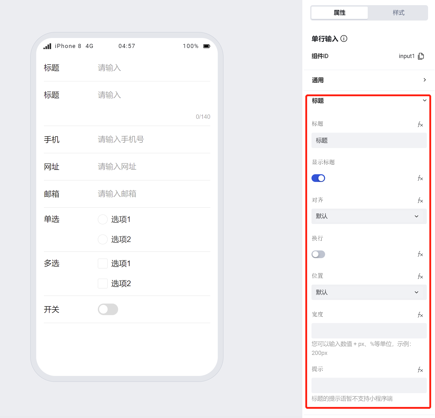
Supports personalized configuration for titles, including title content, alignment, whether to wrap text (when enabled, the title wraps to the next line if it exceeds one line; when disabled, the title is truncated if it exceeds one line), title position, width, and tooltip text.
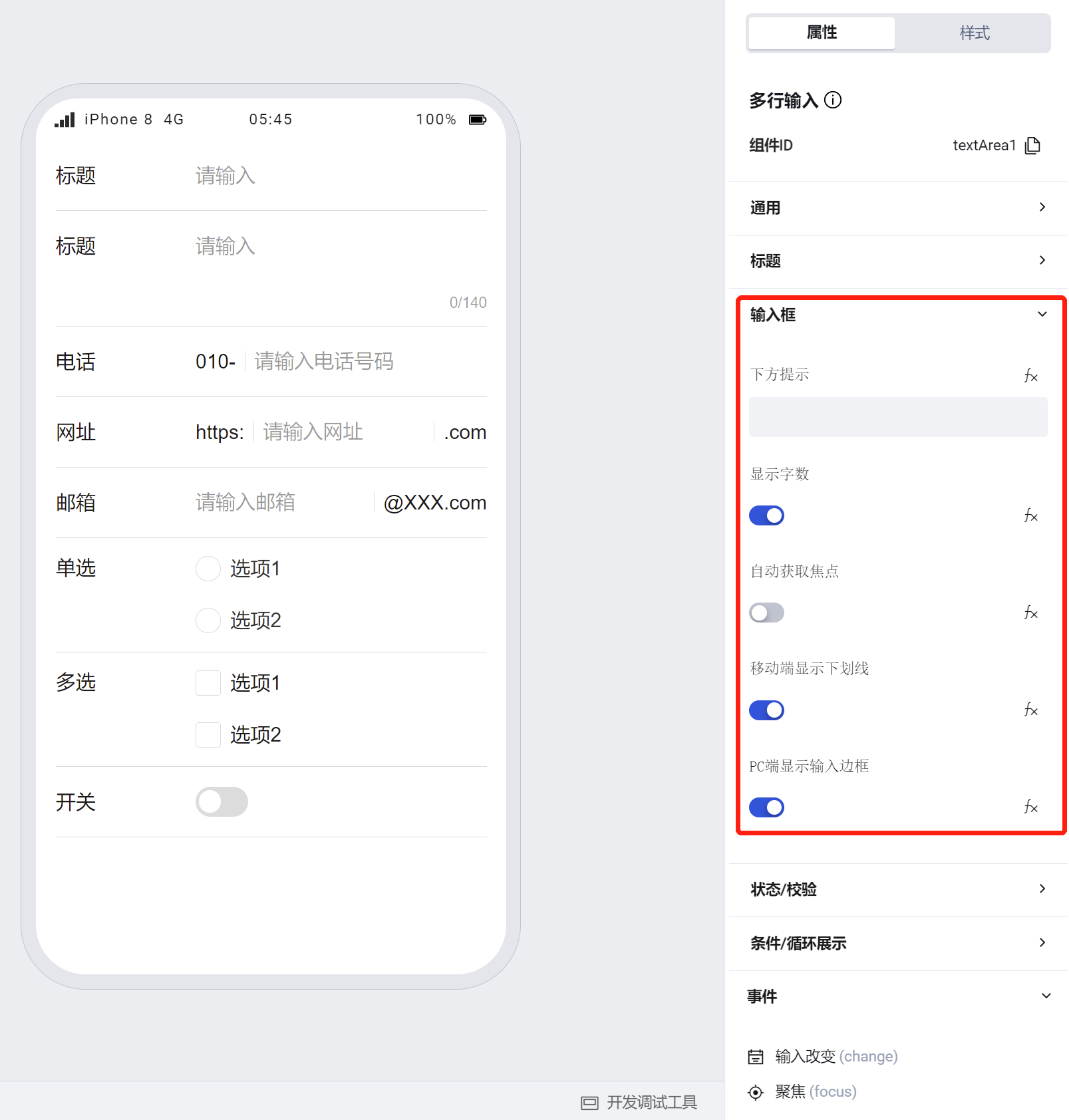
- Supports personalized configuration for input fields, including the hint text below the input field, whether to display the character count, whether to autofocus, whether to display underlines on mobile / whether to show the input box on PC.
Note:
- Unlike single-line input, the multi-line input component lacks configurations for prefix/suffix text and prefix/suffix icons.
- Size configuration applies only to the PC side
- If a component is within a form container, its size, title alignment, position, line wrapping, and width will default to the property configuration of the form container
- The multi-line input component displays the character count of the input content by default.
- The multi-line input component has a default height of two lines. During runtime, its height automatically increases based on the input content. You can set the maximum height of the content input area in the multi-line input box to enable content viewing via scrollbars when the content exceeds the set height.
/* Content input area of multi-line input box */
:scope .wd-textarea__content {
  max-height: 100px;
  overflow: auto;
}
To learn more about form component usage scenarios, refer to the Form Common Scenario Practice Guide
Example
Interactive Preview
Component Styling
Component Size
Component Alignment
Component Input Status
Component Style API Example
#wd-page-root .wd-form-item .wd-textarea-textarea {
  border-color: cyan;
  color: cyan;
  background-color: black;
  border-width: 2px;
  border-radius: 6px;
  --wd-color-text-placeholder: red;
}
Properties
External properties received by the component
Property Name | Property Identifier | Type | Description |
|---|
| Display Headlines | labelVisible | boolean | Default value: true |
| Title alignment | labelAlign | string | In the scenario, the form by default follows the title alignment configuration of the form container. |
| Line break in heading | labelWrap | boolean | If the title content is too long when closed, show one line with overflow omitted; when enabled, show with line breaks. In form scenarios, it follows the form container's title line break configuration by default. |
| Title position | layout | string | Set title display position in form component. In the scenario, it follows the title position configuration of the form container by default. |
| Title width | labelWidth | string | In the scenario, the form follows the title width configuration of the form container by default. |
| Heading Note | labelTips | string | Configure tooltip content for the heading |
| Distance between cursor and keyboard | cursorSpacing | number | Specify the distance between the cursor and the keyboard. Use the smaller of the distance from the textarea to the bottom and the distance specified by cursor-spacing as the distance between the cursor and the keyboard; takes effect only in the mini program. |
| Prompt. | extra | string | The prompt content is displayed below the input box after configuration. |
| Character count | counterVisible | boolean | Default value: true |
| automatically obtain focus | focus | boolean | After enabled, the cursor automatically positions to the input box when page loading completes. |
| Automatic height adjustment | autoHeight | boolean | Whether to enable automatic height adjustment. When setting style.height, auto-height is disabled. Default value: true |
| Display underscore on mobile terminal | borderedH5 | boolean | After closing, the mobile terminal does not show the bottom underline Default value: true |
| Display input border on PC | borderedPc | boolean | After closing, do not display input border on PC Default value: true |
| Maximum length | maxLength | number | Default value: 140 |
| Verification rule | rules | array | Default value: [] |
| Status. | status | string | Example: "edit" |
| Required | required | boolean | |
| Required identifier | requiredFlag | boolean | Enabled, the component will display a required asterisk tag if mandatory. Default value: true |
| Required validation note | requiredMsg | string | Example: "该项为必填项" |
| Bound field | name | string | The Key value of a form field is used to match the field identifier of the data model when submitting data. It must be unique within the form. Example: "formTextarea" |
| Title content. | label | string | Example: "标题" |
| input value | value | string | Example: "" |
| Placeholder text | placeholder | string | Example: "请输入" |
| PC component dimension | size | string | Size configuration is only applicable to PC and takes effect by default in form container scenarios. |
Events
Events exposed by the component. You can listen to component events to trigger external actions
Event Name | Event Code | Event Output Parameters event.detail | Applicable Scenarios | Description |
|---|
| value change | change | object
| Compatible with all platforms | Trigger when a user modifies a component value |
| focus | focus | object
| Compatible with all platforms | - |
| Out of focus | blur | object
| Compatible with all platforms | - |
| confirm | confirm | object
| Compatible with all platforms | Trigger on keyboard input of enter in web |
Properties API
Through the Property API, you can access the internal state and property values of components. You can access internal values using$w.componentId.propertyName, such as $w.input1.value. For details, please refer to Property API
Read-only Property Name | Property Identifier | Type | Description |
|---|
| Bound field | name | string | The Key value of a form field is used to match the field identifier of the data model when submitting data. It must be unique within the form. |
| Title content. | label | string | |
| input value | value | string | |
| Required | required | boolean | |
| Indicates whether to display | visible | boolean | Whether to display the component |
| Whether to disable | disabled | boolean | Component Disabled |
| Specify whether it is read-only or not. | readOnly | boolean | Whether the component is read-only |
Method API
Through the Method API, you can programmatically trigger internal methods of components, such as submitting forms, displaying popups, etc. You can call component methods using $w.componentId.methodName, such as $w.form1.submit()
Method Name | Method Identifier | Parameters | Method Description |
|---|
| set value | setValue | string值 | 通过 $w.id1.setValue("weda") 设置组件值 |
| Show/Hide Settings | setVisible | boolean显示 | Set the component to hidden via $w.id1.setVisible(false) |
| Set Disabled | setDisabled | boolean禁用 | Set the component to disabled with $w.id1.setDisabled(true) |
| Clear value | clearValue | Clear the component value with $w.id1.clearValue() | |
| Set as read-only | setReadOnly | boolean只读 | Set the component to read-only via $w.id1.setReadOnly(true) |
| Trigger validation | handleValidate | Validate the component value via $w.id1.handleValidate() | |
| Clear verification | clearValidate | Clear component validation via $w.id1.clearValidate() |
Style API
Through the Style API, you can override the styles of internal elements in components to achieve customization. For example, in the low-code editor, you can write styles for all button components using #wd-page-root .wd-btn, and control individual component styles with :scope. For detailed instructions, please refer toStyle API
Name | Class Name | Description and Examples |
|---|
| root element | .wd-textarea-root | Outermost component element |
| H5 root element | .wd-h5-textarea-root | Settable root element style for the H5 side |
| PC-side root element | .wd-pc-textarea-root | Settable root element style for the PC side |
| Mini program root element | .wd-mp-textarea-root | Settable root element style for mini program |
| Component title style | .wd-textarea-root .wd-form-item-wrap__label | Component title element |
| form control root node style | .wd-textarea-root .wd-form-item-wrap__control | Set form control root element style |
| Input box style - editing status | .wd-textarea-root .wd-form-input-wrap | Component border, margin style, background color, font size, font color |
| Editing status - Input box style (gain focus) | .wd-textarea-root .wd-form-input-wrap.is-focused | Editing status - Input box style (gain focus) |
| Editing status - Placeholder text style | .wd-textarea-root textarea::placeholder, .wd-textarea-root .weui-input__placeholder | Set placeholder text style |
| Editing status - Verification information | .wd-textarea-root .wd-g-text-error | Set component verification information style |
| prompt text | .wd-textarea-root .wd-form-item__help-text | Set the text style of the component prompt |
| Disabled state - Input box style | .wd-textarea-root .wd-form-input-wrap.is-disabled | Component disabled style |
| read-only status - form value style | .wd-textarea-root .wd-form-item__readonly-value | Set component read-only status |
| Multiline input box content input area | .wd-textarea__content | Multiline input box content input area |
| word count | .wd-textarea-textarea__count-text | Character count for multiline input box |
| word count | .wd-textarea__count-text | Character count for multiline input box |
Version Changes
- Property Changes
- Style Changes
- widget api Changes
Frequently Asked Questions
Why does changing the bound variable for "cursor-to-keyboard distance" not take effect on ios devices?
The Mini Program has a Bug where this property only takes effect for the initial value passed.
Why does setting a fixed height after disabling auto-resize not take effect on ios devices?
Compatibility issue with ios Mini Programs: After disabling the auto-resize property, a fixed height must be assigned to the native textarea; otherwise, it defaults to expanding to fill the page.
By default, height: 3rem is set in this case.
If you need to set a custom height for the textarea, you can specify it via the following style api.
:scope.wd-mp-textarea-root .wd-form-input-wrap textarea.wd-textarea__ios{
  height: 300px
}