Array Nested Form
WdFormArr
Basic Capabilities
- The array nested form allows adding multiple sub-fields and supports entering multiple data entries.
- After upgrading the component to version 3.25, when the array nesting component selects the object array template, it adds a web table template. When switching to the web table, it regenerates the template and does not retain the internal child form items of the nested object component.
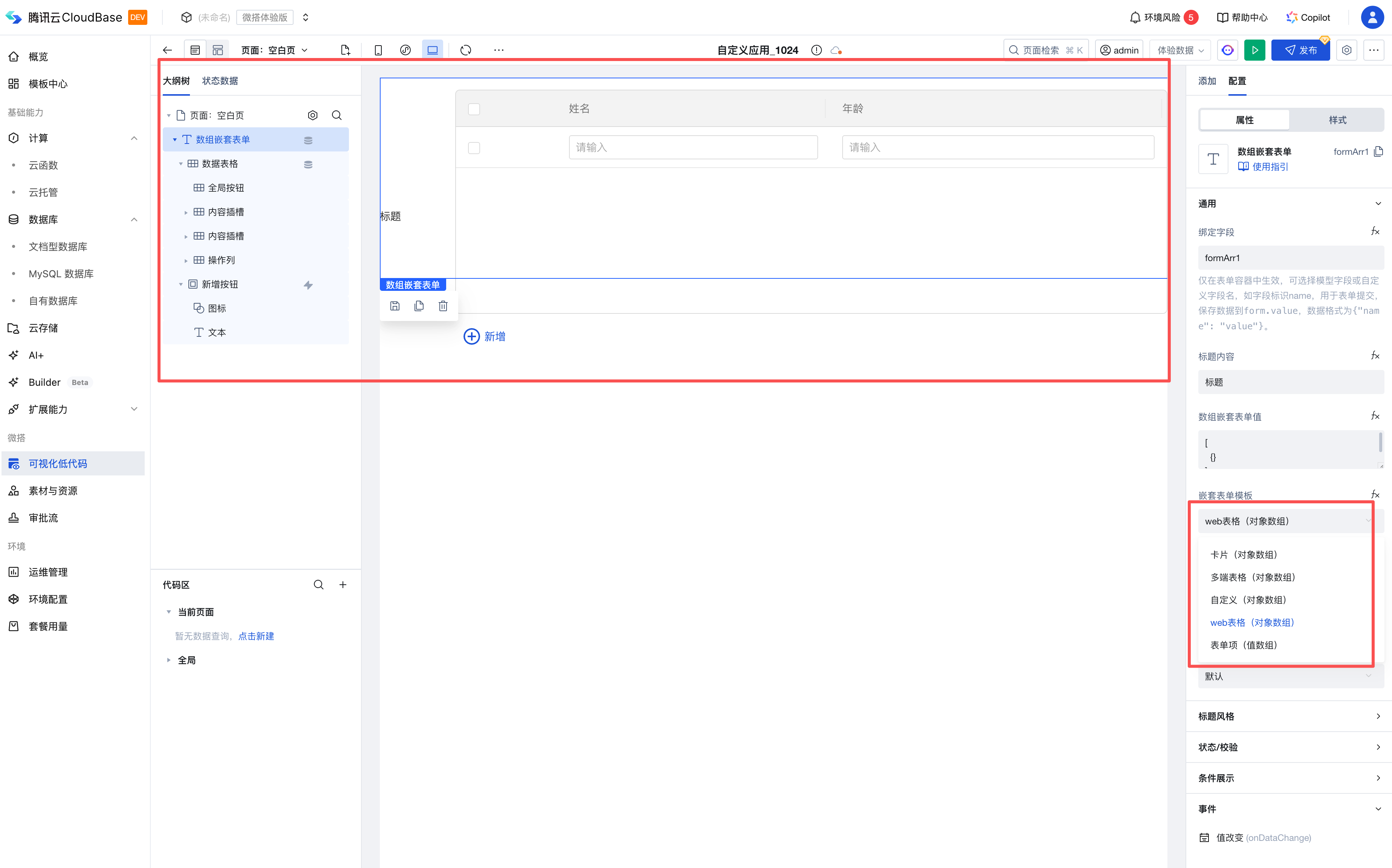
- After upgrading to version 3.12, when the array nesting component selects the object array template, it supports switching among card, table, and custom UI modes while retaining the child form items inside the nested object component.
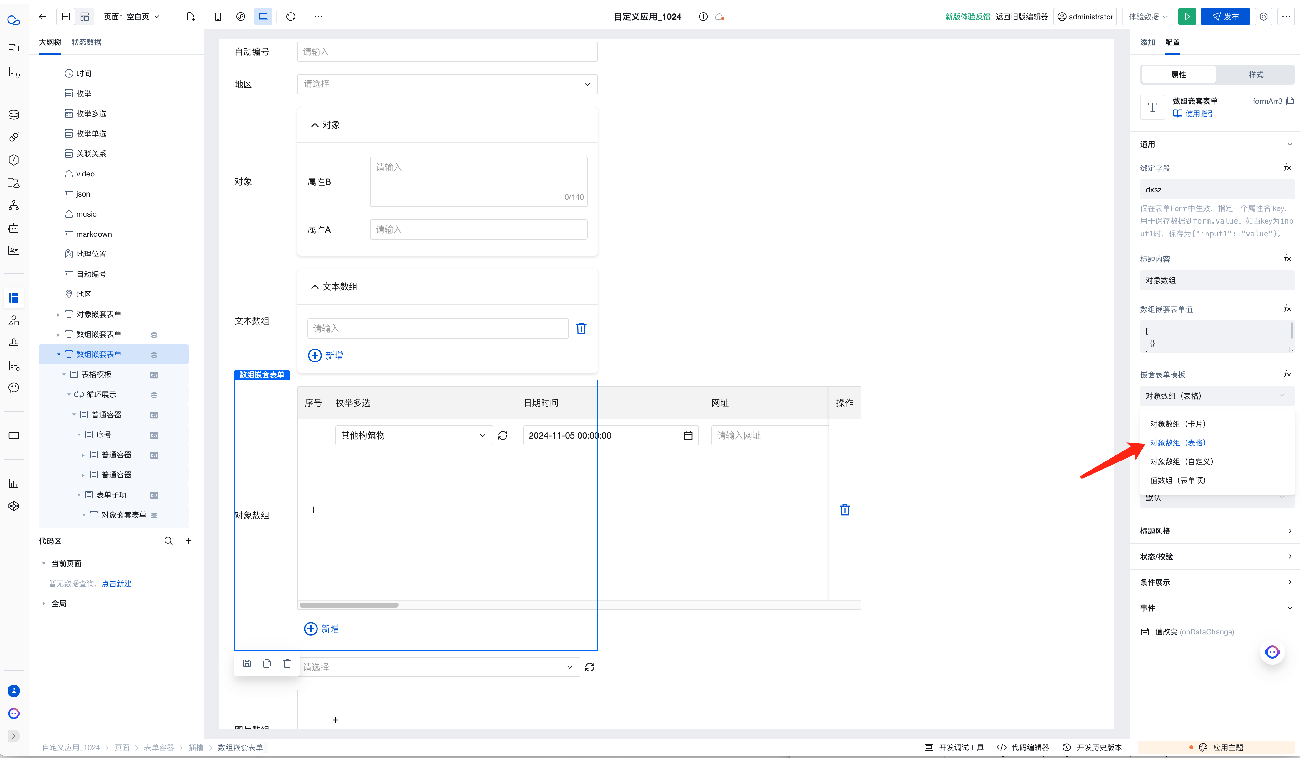
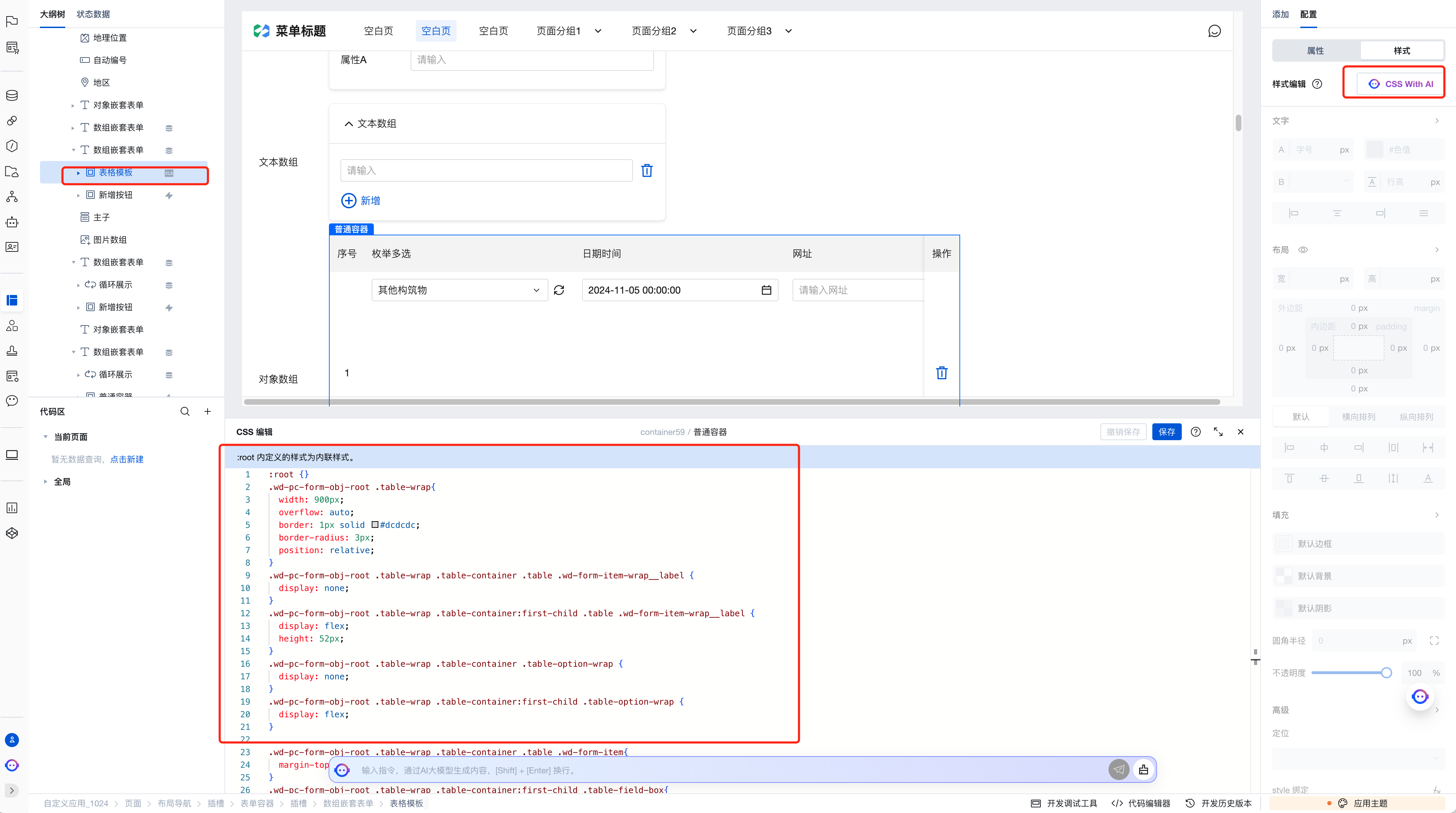
- Select the corresponding component node, click Style Editing to modify the table template style.
Property Description
External properties received by the component
Property Name | Property Identifier | Type | Description |
|---|
| Display Headlines | labelVisible | boolean | Default value: true |
| Title alignment | labelAlign | string | In the scenario, the form by default follows the title alignment configuration of the form container. |
| Line break in heading | labelWrap | boolean | If the title content is too long when closed, show one line with overflow omitted; when enabled, show with line breaks. In form scenarios, it follows the form container's title line break configuration by default. |
| PC title position | layout | string | Set title display position in form component. In the scenario, it follows the title position configuration of the form container by default. |
| Title width | labelWidth | string | In the scenario, the form follows the title width configuration of the form container by default. |
| Heading Note | labelTips | string | Configure tooltip content for the heading |
| Status. | status | string | Example: "edit" |
| Bound field | name | string | The Key value of a form field is used to match the field identifier of the data model when submitting data. It must be unique within the form. |
| Title content. | label | string | Example: "标题" |
| Array nested form value | value | array | Example: [] |
| Nested form template | mode | string | Example: "obj" |
| Initial value of a newly-added form item | addDefaultValue | string | |
| PC component dimension | size | string | Size configuration is only applicable to PC and takes effect by default in form container scenarios. |
Event Description
Events exposed by the component. You can listen to component events to trigger external actions
Event Name | Event Code | Event Output Parameters event.detail | Applicable Scenarios | Description |
|---|
| value change | onDataChange | object
| Compatible with all platforms | Trigger when the data content in a component changes |
Properties API
Through the Property API, you can access the internal state and property values of components. You can access internal values using$w.componentId.propertyName, such as $w.input1.value. For details, please refer to Property API
Read-only Property Name | Property Identifier | Type | Description |
|---|
| Bound field | name | string | The Key value of a form field is used to match the field identifier of the data model when submitting data. It must be unique within the form. |
| Title content. | label | string | |
| Array nested form value | value | array | |
| Indicates whether to display | visible | boolean | Whether to display the component |
| Whether to disable | disabled | boolean | Component Disabled |
| Specify whether it is read-only or not. | readOnly | boolean | Whether the component is read-only |
Method API
Through the Method API, you can programmatically trigger internal methods of components, such as submitting forms, displaying popups, etc. You can call component methods using $w.componentId.methodName, such as $w.form1.submit()
Method Name | Method Identifier | Parameters | Method Description |
|---|
| add a row | add | - | |
| Delete the row | remove | object
| - |
| value change | change | object
| - |
Style API
Through the Style API, you can override the styles of internal elements in components to achieve customization. For example, in the low-code editor, you can write styles for all button components using #wd-page-root .wd-btn, and control individual component styles with :scope. For detailed instructions, please refer toStyle API
Name | Class Name | Description and Examples |
|---|
| root element | .wd-form-obj-root | Outermost component element |
| H5 root element | .wd-h5-form-obj-root | Settable root element style for the H5 side |
| PC-side root element | .wd-pc-form-obj-root | Settable root element style for the PC side |
| Mini program root element | .wd-mp-form-obj-root | Settable root element style for mini program |