WdRegion
Region Select
WdRegion
Applicable Scenarios
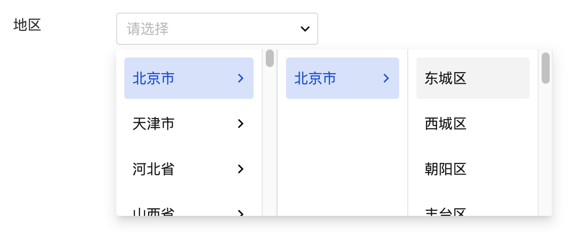
Used for selecting administrative divisions at all levels (province, city, district)
Basic Capabilities Description
Bind Region Field
After the form container is bound to the data model, the "region" field in the model will be automatically rendered as a region selection component, enabling the selection and input of region information.
Extended Scenarios Description
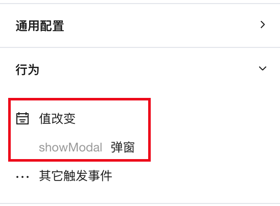
Region selection component obtains the selected region code
Best Practices:
Obtain the selected region information via the output parameters of the chang event in the region selection component.
Configuration Method:
-
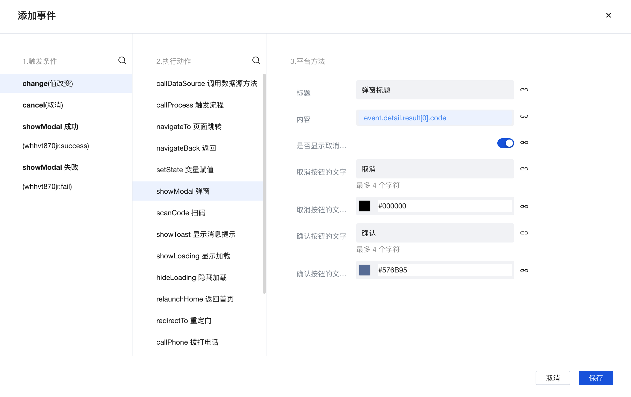
Region Selection component: Obtain the code of the currently selected region through the component's change event.
-
Parameter Format
- The provincial-level code can be obtained from event.detail.result[0].code
- The provincial/municipal code can be obtained from event.detail.result[1].code
- The provincial/municipal/district code can be obtained from event.detail.result[2].code
- The complete array-type output parameters can be obtained from event.detail.value
- Note: To be compatible with future street codes, the current output parameter is in a 12-digit format.
-
Operation Example: Under the change (value change) event of the region selection component, trigger a pop-up action, enter the expression in the pop-up content: event.detail.result[0].code, to display the provincial-level code of the selected region in a pop-up.
The method for event configuration is as follows.
The runtime effect is as follows:
Practices for Other Scenarios
Refer to the Form Scenario Practice Guide to explore various supported scenarios and implementation solutions for forms.
Example
Interactive Preview
Component Input Status
Style API Example
#wd-page-root .wd-form-item .wd-region-region {
  border-color: cyan;
  color: cyan;
  background-color: black;
  border-width: 2px;
  border-radius: 6px;
}
Properties
External properties received by the component
Property Name | Property Identifier | Type | Description |
|---|
| Display Headlines | labelVisible | boolean | Default value: true |
| Title alignment | labelAlign | string | In the scenario, the form by default follows the title alignment configuration of the form container. |
| Line break in heading | labelWrap | boolean | If the title content is too long when closed, show one line with overflow omitted; when enabled, show with line breaks. In form scenarios, it follows the form container's title line break configuration by default. |
| Title position | layout | string | Set title display position in form component. In the scenario, it follows the title position configuration of the form container by default. |
| Title width | labelWidth | string | In the scenario, the form follows the title width configuration of the form container by default. |
| Heading Note | labelTips | string | Configure tooltip content for the heading |
| Display clear button | clearable | boolean | Enabled, quick clear button is provided by Default value: true |
| Prefix text | before | string | The input box in the form displays the prefix text. In the form submission scenario, the prefix text is submitted as part of the form content to the data model. |
| suffix text | after | string | The input box in the form displays suffix text. In the scenario of form submission, the suffix text is submitted as form content to the data model together. |
| Prefix icon type | prefixType | string | Select icon type Example: "" |
| Prefix icon | prefixIcon | string | Show icon before the form input box Example: "success" |
| Prefix icon | prefixSrc | string | Set custom icon address |
| suffix icon type | suffixType | string | Select icon type Example: "fixed" |
| suffix icon | suffixIcon | string | Show icon in the form input box Example: "success" |
| suffix icon | suffixSrc | string | Set custom icon address |
| Prompt. | extra | string | The prompt content is displayed below the input box after configuration. |
| Display underscore on mobile terminal | borderedH5 | boolean | After closing, the mobile terminal does not show the bottom underline Default value: true |
| Display input border on PC | borderedPc | boolean | After closing, do not display input border on PC Default value: true |
| Status. | status | string | Example: "edit" |
| Required | required | boolean | |
| Required identifier | requiredFlag | boolean | Enabled, the component will display a required asterisk tag if mandatory. Default value: true |
| Required validation note | requiredMsg | string | Example: "该项为必填项" |
| Bound field | name | string | The Key value of a form field is used to match the field identifier of the data model when submitting data. It must be unique within the form. |
| Title content. | label | string | Example: "地区" |
| Region type | regionType | string | Default value: "levelThree" |
| Select region | value | string | Province, city, district/county |
| Placeholder text | placeholder | string | Example: "请选择" |
| PC component dimension | size | string | Size configuration is only applicable to PC and takes effect by default in form container scenarios. |
Events
Events exposed by the component. You can listen to component events to trigger external actions
Event Name | Event Code | Event Output Parameters event.detail | Applicable Scenarios | Description |
|---|
| value change | change | object
| Compatible with all platforms | Trigger when a user modifies a component value |
Properties API
Through the Property API, you can access the internal state and property values of components. You can access internal values using$w.componentId.propertyName, such as $w.input1.value. For details, please refer to Property API
Read-only Property Name | Property Identifier | Type | Description |
|---|
| Bound field | name | string | The Key value of a form field is used to match the field identifier of the data model when submitting data. It must be unique within the form. |
| Title content. | label | string | |
| input value | value | string | |
| Prefix text | before | string | The input box in the form displays the prefix text. In the form submission scenario, the prefix text is submitted as part of the form content to the data model. |
| suffix text | after | string | The input box in the form displays suffix text. In the scenario of form submission, the suffix text is submitted as form content to the data model together. |
| Required | required | boolean | |
| Indicates whether to display | visible | boolean | Whether to display the component |
| Whether to disable | disabled | boolean | Component Disabled |
| Specify whether it is read-only or not. | readOnly | boolean | Whether the component is read-only |
Method API
Through the Method API, you can programmatically trigger internal methods of components, such as submitting forms, displaying popups, etc. You can call component methods using $w.componentId.methodName, such as $w.form1.submit()
Method Name | Method Identifier | Parameters | Method Description |
|---|
| set value | setValue | string值 | 通过 $w.id1.setValue("weda") 设置组件值 |
| Show/Hide Settings | setVisible | boolean显示 | Set the component to hidden via $w.id1.setVisible(false) |
| Set Disabled | setDisabled | boolean禁用 | Set the component to disabled with $w.id1.setDisabled(true) |
| Clear value | clearValue | Clear the component value with $w.id1.clearValue() | |
| Set as read-only | setReadOnly | boolean只读 | Set the component to read-only via $w.id1.setReadOnly(true) |
| Trigger validation | handleValidate | Validate the component value via $w.id1.handleValidate() | |
| Clear verification | clearValidate | Clear component validation via $w.id1.clearValidate() |
Style API
Through the Style API, you can override the styles of internal elements in components to achieve customization. For example, in the low-code editor, you can write styles for all button components using #wd-page-root .wd-btn, and control individual component styles with :scope. For detailed instructions, please refer toStyle API
Name | Class Name | Description and Examples |
|---|
| root element | .wd-region-root | Outermost component element |
| H5 root element | .wd-h5-region-root | Settable root element style for the H5 side |
| PC-side root element | .wd-pc-region-root | Settable root element style for the PC side |
| Mini program root element | .wd-mp-region-root | Settable root element style for mini program |
| Component title style | .wd-region-root .wd-form-item-wrap__label | Component title element |
| form control root node style | .wd-region-root .wd-form-item-wrap__control | Set form control root element style |
| 编辑态-选择框样式 | .wd-region-root .wd-form-input-wrap | Component border, margin style, background color, font size, font color |
| 编辑态-选择框样式(获取焦点) | .wd-region-root .wd-form-input-wrap.is-focused | 编辑态-选择框样式(获取焦点) |
| Editing status - Placeholder text style | .wd-region-root input::placeholder, .wd-region-root .weui-input__placeholder | Set placeholder text style |
| Editing status - Verification information | .wd-region-root .wd-g-text-error | Set component verification information style |
| prompt text | .wd-region-root .wd-form-item__help-text | Set the text style of the component prompt |
| 禁用态-选择框样式 | .wd-region-root .wd-form-input-wrap.is-disabled | Component disabled style |
| read-only status - form value style | .wd-region-root .wd-form-item__readonly-value | Set component read-only status |
| Prefix text style | .wd-region-root .wd-form-input-group__addon-left | Set component prefix text style |
| Suffix text style | .wd-region-root .wd-form-input-group__addon-right | Set component suffix text style |
Version Changes
- Property Changes
- Style Changes
- widget api Changes