Rich Text Editor
WdRichText
Applicable Scenarios
Rich-text form components that allow text styling adjustments and support inserting images, links, and other content.
Basic Capabilities
Rich Text Editor Component: Can be bound to "Rich Text" type fields to achieve data entry and query result display.
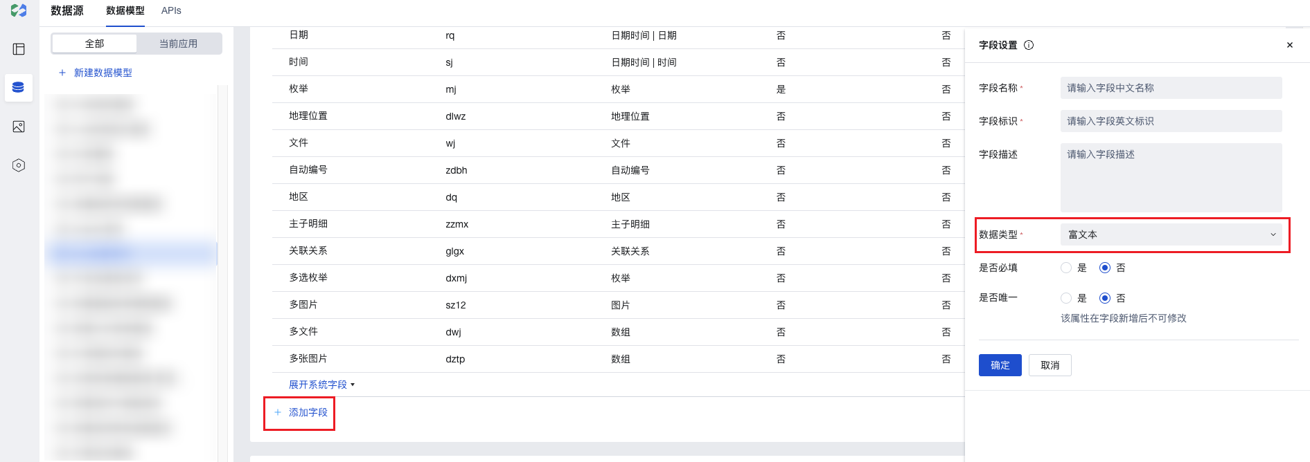
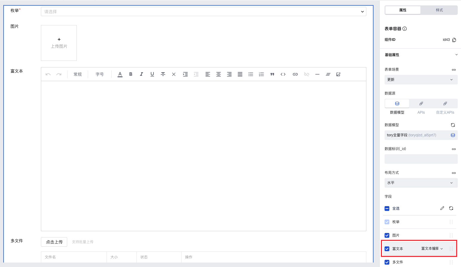
- After creating a data model, add a field of the "Rich Text" type to the model.
- In the page editor, place the "Form Container" component and bind it to this data model. The "Rich Text" field will be automatically rendered as a "Rich Text Editor" component, where rich text content can be input.
Extended Scenarios
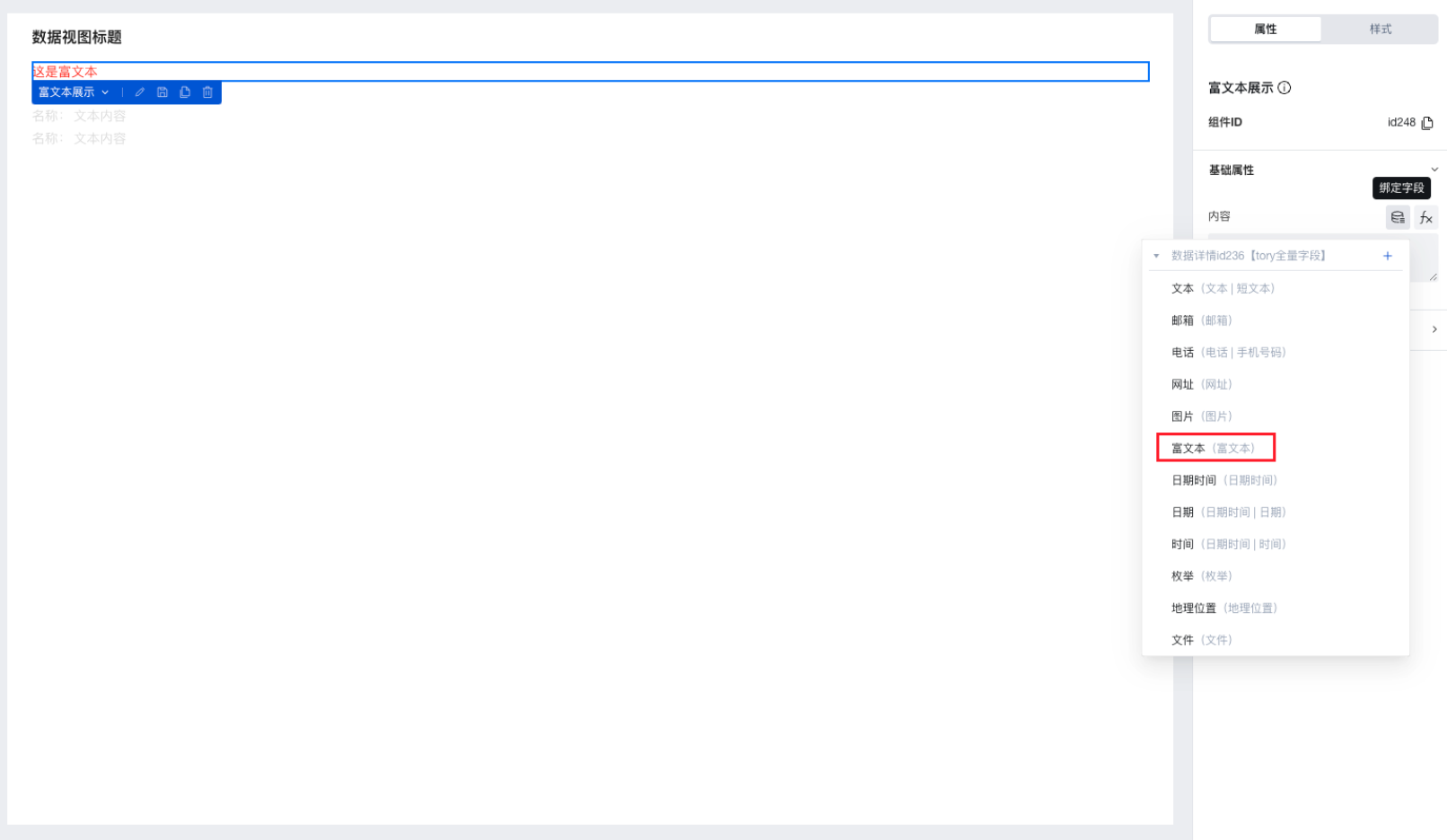
Rich text content can be displayed and viewed using the "Rich Text Display" component.
After binding the "Data Details" or "Data List" component to the data model, place the "Rich Text Display" component within it and bind its content property to the rich text field. This enables the display of rich text content stored in the field.
Practices for Other Scenarios
Refer to the Form Scenario Practice Guide to explore various supported scenarios and implementation solutions for forms.
Example
Interactive Preview
Component Input Status
Style API Example
#wd-page-root .wd-form-item.wd-pc-rich-text-root .wd-rich-text__label {
  color: #05c3c3;
  display: flex;
  justify-content: center;
  align-items: center;
}
#wd-page-root .wd-pc-rich-text-root {
  color: red;
}
Properties
External properties received by the component
Property Name | Property Identifier | Type | Description |
|---|
| Display Headlines | labelVisible | boolean | Default value: true |
| Title alignment | labelAlign | string | In the scenario, the form by default follows the title alignment configuration of the form container. |
| Line break in heading | labelWrap | boolean | If the title content is too long when closed, show one line with overflow omitted; when enabled, show with line breaks. In form scenarios, it follows the form container's title line break configuration by default. |
| Title position | layout | string | Set title display position in form component. In the scenario, it follows the title position configuration of the form container by default. |
| Title width | labelWidth | string | In the scenario, the form follows the title width configuration of the form container by default. |
| Heading Note | labelTips | string | Configure tooltip content for the heading |
| Prompt. | extra | string | The prompt content is displayed below the input box after configuration. |
| Display underscore on mobile terminal | borderedH5 | boolean | After closing, the mobile terminal does not show the bottom underline Default value: true |
| Status. | status | string | Example: "edit" |
| Required | required | boolean | |
| Required identifier | requiredFlag | boolean | Enabled, the component will display a required asterisk tag if mandatory. Default value: true |
| Required validation note | requiredMsg | string | Example: "该项为必填项" |
| Bound field | name | string | The Key value of a form field is used to match the field identifier of the data model when submitting data. It must be unique within the form. Example: "formTextarea" |
| Title content. | label | string | Example: "富文本" |
| Value storage method | storageType | string | Specify the image storage method Default value: "cloudID" |
| input value | value | string | Example: "" |
Events
Events exposed by the component. You can listen to component events to trigger external actions
Event Name | Event Code | Event Output Parameters event.detail | Applicable Scenarios | Description |
|---|
| value change | change | object
| Compatible with all platforms | Trigger when a user modifies a component value |
Properties API
Through the Property API, you can access the internal state and property values of components. You can access internal values using$w.componentId.propertyName, such as $w.input1.value. For details, please refer to Property API
Read-only Property Name | Property Identifier | Type | Description |
|---|
| Bound field | name | string | The Key value of a form field is used to match the field identifier of the data model when submitting data. It must be unique within the form. |
| Title content. | label | string | |
| input value | value | string | |
| Required | required | boolean | |
| Indicates whether to display | visible | boolean | Whether to display the component |
| Whether to disable | disabled | boolean | Component Disabled |
| Specify whether it is read-only or not. | readOnly | boolean | Whether the component is read-only |
Method API
Through the Method API, you can programmatically trigger internal methods of components, such as submitting forms, displaying popups, etc. You can call component methods using $w.componentId.methodName, such as $w.form1.submit()
Method Name | Method Identifier | Parameters | Method Description |
|---|
| set value | setValue | string值 | 通过 $w.id1.setValue("weda") 设置组件值 |
| Show/Hide Settings | setVisible | boolean显示 | Set the component to hidden via $w.id1.setVisible(false) |
| Set Disabled | setDisabled | boolean禁用 | Set the component to disabled with $w.id1.setDisabled(true) |
| Clear value | clearValue | Clear the component value with $w.id1.clearValue() | |
| Set as read-only | setReadOnly | boolean只读 | Set the component to read-only via $w.id1.setReadOnly(true) |
| Trigger validation | handleValidate | Validate the component value via $w.id1.handleValidate() | |
| Clear verification | clearValidate | Clear component validation via $w.id1.clearValidate() |
Style API
Through the Style API, you can override the styles of internal elements in components to achieve customization. For example, in the low-code editor, you can write styles for all button components using #wd-page-root .wd-btn, and control individual component styles with :scope. For detailed instructions, please refer toStyle API
Name | Class Name | Description and Examples |
|---|
| root element | .wd-rich-text-root | Outermost component element |
| H5 root element | .wd-h5-rich-text-root | Settable root element style for the H5 side |
| PC-side root element | .wd-pc-rich-text-root | Settable root element style for the PC side |
| Mini program root element | .wd-mp-rich-text-root | Settable root element style for mini program |
| Component title style | .wd-rich-text-root .wd-form-item-wrap__label | Component title element |
| form control root node style | .wd-rich-text-root .wd-form-item-wrap__control | Set form control root element style |
| Input box style - editing status | .wd-rich-text-root .ExEditor-basic | component border, margin style |
| Editing status - Input box style (gain focus) | .wd-rich-text-root .ExEditor-basic.ProseMirror-focused | Editing status - Input box style (gain focus) |
| Text style - placeholder (PC/H5) | .wd-rich-text-root .exeditor-placeholder-container | Set placeholder text style |
| Disabled state - Input box style | .wd-rich-text-root .is-disabled .ExEditor-basic | Disabled state - Input box style |
| read-only status - form value style | .wd-rich-text-root .is-readonly .ExEditor-basic | Status - Form value style |
| Editing status - Verification information | .wd-rich-text-root .wd-g-text-error | Set component verification information style |
| prompt text | .wd-rich-text-root .wd-form-item__help-text | Set the text style of the component prompt |
Version Changes
- Property Changes
- Style Changes
- widget api Changes
Frequently Asked Questions
Why do uploaded images in rich text display abnormally?
To ensure the security of your resources, the rich text image upload plugin has implemented hotlink protection logic. Images uploaded to cloud storage use the cloud protocol, preventing users from obtaining permanent addresses.
The rich text editor component and rich text display component internally convert private images using the cloud protocol. Specifically, they transform private addresses with the cloud://xxxx protocol into publicly accessible addresses using the http protocol, then display the images using the generated temporary access links.
Therefore, if the rich text contains images obtained via the built-in image upload plugin of the rich text editor, then:
- Directly copy the displayed html code (the image validity period may have expired)
- Directly use the original html code from the database (images remain in the original cloud protocol)
- When exporting via template installation, the rich text html template data (containing cloud protocol links) is exported, but the actual file data corresponding to the links is not synchronously exported, resulting in the inability to obtain the corresponding files during final image display.
- or other operations that bypass hotlink protection logic, etc.
may cause images to display abnormally.
Users can also flexibly convert and utilize images using the cloud protocol stored in the database. For details, refer to Obtaining Temporary Access Links for Cloud Storage Files
Why do externally linked images display abnormally?
Many websites' images verify the page referrer, likely due to enabled hotlink protection. When accessed directly, there's no referrer source, but when used on your page, access may be blocked by referrer verification. You may try alternative image resources or check the loading failure messages in F12 developer tools.
How to customize the display of rich text content with images
Images uploaded via rich text are stored as cloud protocol addresses. The rich text display component internally performs the following conversion to automatically display images. To customize image display handling, you can implement using the following methods.
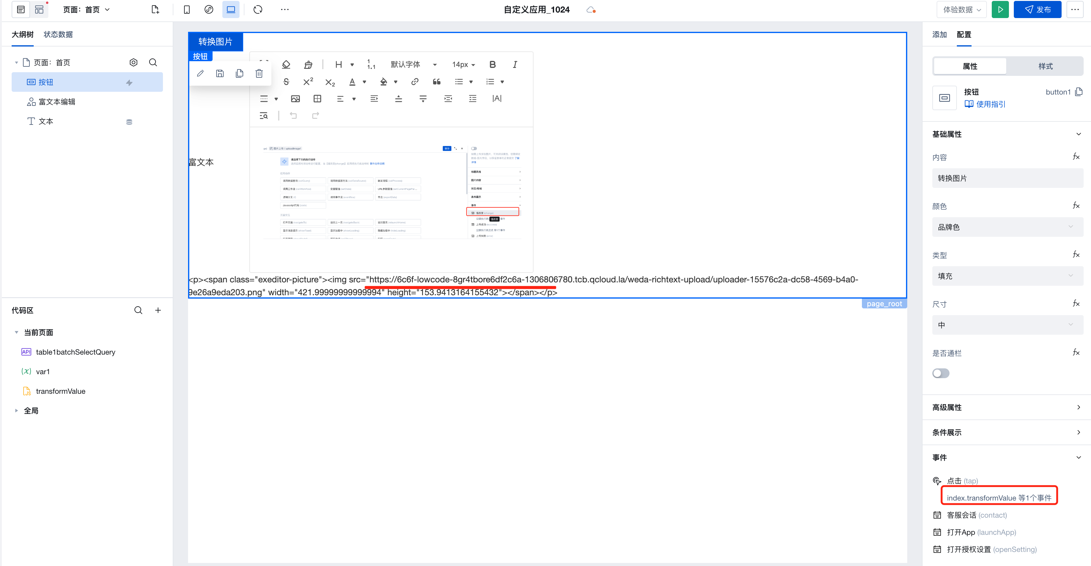
- Define a transformValue method to match rich text image content via regular expressions and transform the image addresses
export default function () {
  // Regular expression to match img
  const regex = new RegExp(/<img [^>]*src=\\*"([^"]*?)\\*"/g);
  const transformImg = (value) => {
    return (value || '')
      .toString()
      .replace(/<img style="/g, `<img style="max-width:100%;`)
      .replace(/<img /g, `<img `);
  };

  /**
   * By calling [$w.cloud.getTempFileURL](https://docs.cloudbase.net/lowcode/api/cloud#wcloudgettempfileurl) to obtain temporary access links for cloud storage files, converting private addresses with the loud://xxxx protocol into normal http protocol addresses.
   * Note: For cloud://xxx protocol address errors or lack of access permissions, this method will not return an address. Do not arbitrarily modify the default permissions of cloud storage.
   */
  const getSrc = async (img) => {
    const url = img.replace(regex, '$1');
    if (img.includes('cloud://')) {
      return await $w.cloud.getTempFileURL(url);
    }
  };

  // Obtain the img with image addresses in the cloud protocol via regular expressions
  const imgs = $w.richText1.value.match(regex);

  let tempValue = transformImg($w.richText1.value);

  if (imgs && imgs.length > 0) {
    (async () => {
      // Iterate through the image array to obtain the http protocol address
      const imgRes = await Promise.all(
        imgs.map(async (img) => {
          return await getSrc(img);
        })
      );
      // Set the obtained http address to the image's src for display
      imgs.forEach((img, index) => {
        const url = img.replace(regex, '$1');
        if (imgRes[index]) {
          tempValue = tempValue.replace(new RegExp(url, 'g'), imgRes[index]);
        }
      });
      $w.page.dataset.state.var1 = tempValue;
    })();
  }
}
- Trigger the transformValue event to obtain the transformed rich text value