WdDepartment
Department Select
WdDepartment
Applicable Scenarios
to choose departments at all levels in the organizational structure
Basic Capabilities
Supports binding the "Association Relationship of the Department Model" field to enable department selection in the organization.
This component is currently only supported in model applications. The usage is as follows:
- Create an 'Association Relationship' type field in the data model, and select the built-in platform department model (Model ID: sys_department) for the associated model.
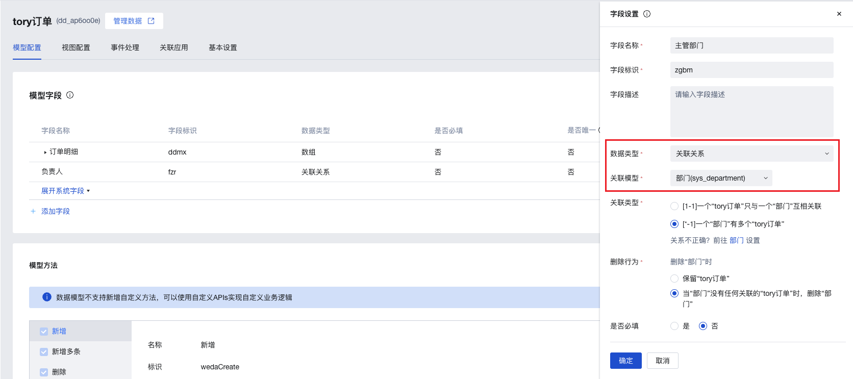
- In the page editor, add a form container and bind it to the above data model. A department selection component will be automatically generated on the page (if a dropdown selection component is generated by default, you can switch the corresponding component of this field to the department selection component in the field properties of the form container).
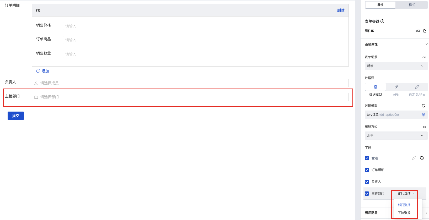
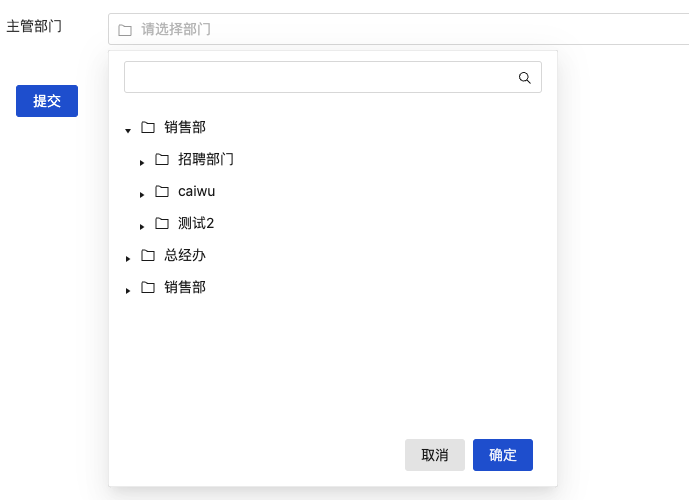
- In the preview area and application runtime, you can select departments within the organization.
Extended Scenarios
Refer to the Form Scenario Practice Guide to explore various supported scenarios and implementation solutions for forms.
Example
Interactive Preview
Component Input Status
Style API Example
#wd-page-root .wd-form-item .wd-department-department {
  border-color: cyan;
  background-color: black;
  border-width: 2px;
  border-radius: 6px;
  color: cyan;
}
Properties
External properties received by the component
Property Name | Property Identifier | Type | Description |
|---|
| Display Headlines | labelVisible | boolean | Default value: true |
| Title alignment | labelAlign | string | In the scenario, the form by default follows the title alignment configuration of the form container. |
| Line break in heading | labelWrap | boolean | If the title content is too long when closed, show one line with overflow omitted; when enabled, show with line breaks. In form scenarios, it follows the form container's title line break configuration by default. |
| Title position | layout | string | Set title display position in form component. In the scenario, it follows the title position configuration of the form container by default. |
| Title width | labelWidth | string | In the scenario, the form follows the title width configuration of the form container by default. |
| Heading Note | labelTips | string | Configure tooltip content for the heading |
| Display clear button | clearable | boolean | Enabled, quick clear button is provided by Default value: true |
| Prefix text | before | string | The input box in the form displays the prefix text. In the form submission scenario, the prefix text is submitted as part of the form content to the data model. |
| suffix text | after | string | The input box in the form displays suffix text. In the scenario of form submission, the suffix text is submitted as form content to the data model together. |
| Prefix icon type | prefixType | string | Select icon type Example: "" |
| Prefix icon | prefixIcon | string | Show icon before the form input box Example: "success" |
| Prefix icon | prefixSrc | string | Set custom icon address |
| suffix icon type | suffixType | string | Select icon type Example: "inner" |
| suffix icon | suffixIcon | string | Show icon in the form input box Example: "td:folder" |
| suffix icon | suffixSrc | string | Set custom icon address |
| Prompt. | extra | string | The prompt content is displayed below the input box after configuration. |
| support multiple selections | multiple | boolean | beta property: When enabled, you can retrieve multi-option member data. However, multiple selection submission is not currently supported. Enable with caution. |
| optional range | departmentScope | array | Fill in the department id, then select departments within range. Default value: [] |
| Display underscore on mobile terminal | borderedH5 | boolean | After closing, the mobile terminal does not show the bottom underline Default value: true |
| Display input border on PC | borderedPc | boolean | After closing, do not display input border on PC Default value: true |
| Status. | status | string | Example: "edit" |
| Required | required | boolean | |
| Required identifier | requiredFlag | boolean | Enabled, the component will display a required asterisk tag if mandatory. Default value: true |
| Required validation note | requiredMsg | string | Example: "该项为必填项" |
| Bound field | name | string | The Key value of a form field is used to match the field identifier of the data model when submitting data. It must be unique within the form. |
| Title content. | label | string | Example: "部门" |
| selected value | value | string | Example: null |
| Placeholder text | placeholder | string | Example: "请选择部门" |
| PC component dimension | size | string | Size configuration is only applicable to PC and takes effect by default in form container scenarios. |
Events
Events exposed by the component. You can listen to component events to trigger external actions
Event Name | Event Code | Event Output Parameters event.detail | Applicable Scenarios | Description |
|---|
| value change | change | object
| Compatible with all platforms | Trigger when a user modifies a component value |
Properties API
Through the Property API, you can access the internal state and property values of components. You can access internal values using$w.componentId.propertyName, such as $w.input1.value. For details, please refer to Property API
Read-only Property Name | Property Identifier | Type | Description |
|---|
| Bound field | name | string | The Key value of a form field is used to match the field identifier of the data model when submitting data. It must be unique within the form. |
| Title content. | label | string | |
| input value | value | string | |
| Prefix text | before | string | The input box in the form displays the prefix text. In the form submission scenario, the prefix text is submitted as part of the form content to the data model. |
| suffix text | after | string | The input box in the form displays suffix text. In the scenario of form submission, the suffix text is submitted as form content to the data model together. |
| Required | required | boolean | |
| Indicates whether to display | visible | boolean | Whether to display the component |
| Whether to disable | disabled | boolean | Component Disabled |
| Specify whether it is read-only or not. | readOnly | boolean | Whether the component is read-only |
Method API
Through the Method API, you can programmatically trigger internal methods of components, such as submitting forms, displaying popups, etc. You can call component methods using $w.componentId.methodName, such as $w.form1.submit()
Method Name | Method Identifier | Parameters | Method Description |
|---|
| set value | setValue | string值 | 通过 $w.id1.setValue("weda") 设置组件值 |
| Show/Hide Settings | setVisible | boolean显示 | Set the component to hidden via $w.id1.setVisible(false) |
| Set Disabled | setDisabled | boolean禁用 | Set the component to disabled with $w.id1.setDisabled(true) |
| Clear value | clearValue | Clear the component value with $w.id1.clearValue() | |
| Set as read-only | setReadOnly | boolean只读 | Set the component to read-only via $w.id1.setReadOnly(true) |
| Trigger validation | handleValidate | Validate the component value via $w.id1.handleValidate() | |
| Clear verification | clearValidate | Clear component validation via $w.id1.clearValidate() |
Style API
Through the Style API, you can override the styles of internal elements in components to achieve customization. For example, in the low-code editor, you can write styles for all button components using #wd-page-root .wd-btn, and control individual component styles with :scope. For detailed instructions, please refer toStyle API
Name | Class Name | Description and Examples |
|---|
| root element | .wd-select-root | Outermost component element |
| H5 root element | .wd-h5-select-root | Settable root element style for the H5 side |
| PC-side root element | .wd-pc-select-root | Settable root element style for the PC side |
| Mini program root element | .wd-mp-select-root | Settable root element style for mini program |
| borderless status | .wd-select-root.is-borderless | Set component borderless status style |
| Required status | .wd-select-root.is-required | Set component required status style |
| Title. | .wd-select__label | Component title element |
| Heading disable status | .wd-select__label.is-disabled | Set component title disable status style |
| Create and bind a policy Query an instance Reset the access password of an instance | .wd-select__label.is-nowrap | Set component title no-wrap status style |
| prompt text | .wd-select__help | Set the text style of the component prompt |
| Verification information | .wd-select__error | Set component verification information style |
| Prefix text | .wd-select__text-before | Set component prefix text style |
| suffix text | .wd-select__text-after | Set component suffix text style |
| Prefix icon | .wd-select__icon-before | Set component prefix icon style |
| suffix icon | .wd-select__icon-after | Set component suffix icon style |
| component border | .wd-select-select | component border, margin style |
| Component Input Disable Status | .wd-select-select.is-disabled | Component disabled style |
Version Changes
- Property Changes
- Style Changes
- widget api Changes