Switch
WdSwitch
Applicable Scenarios
Used to control true and false (Boolean values).
Basic Capabilities Description
-
Bind to a field of the "Boolean value" type. After the form container is bound to the data model, Boolean values in the model will be automatically rendered as switch components to control true/false states. The initial state of the switch (enabled/disabled) and component size (effective on PC, not on mobile) can be configured.
-
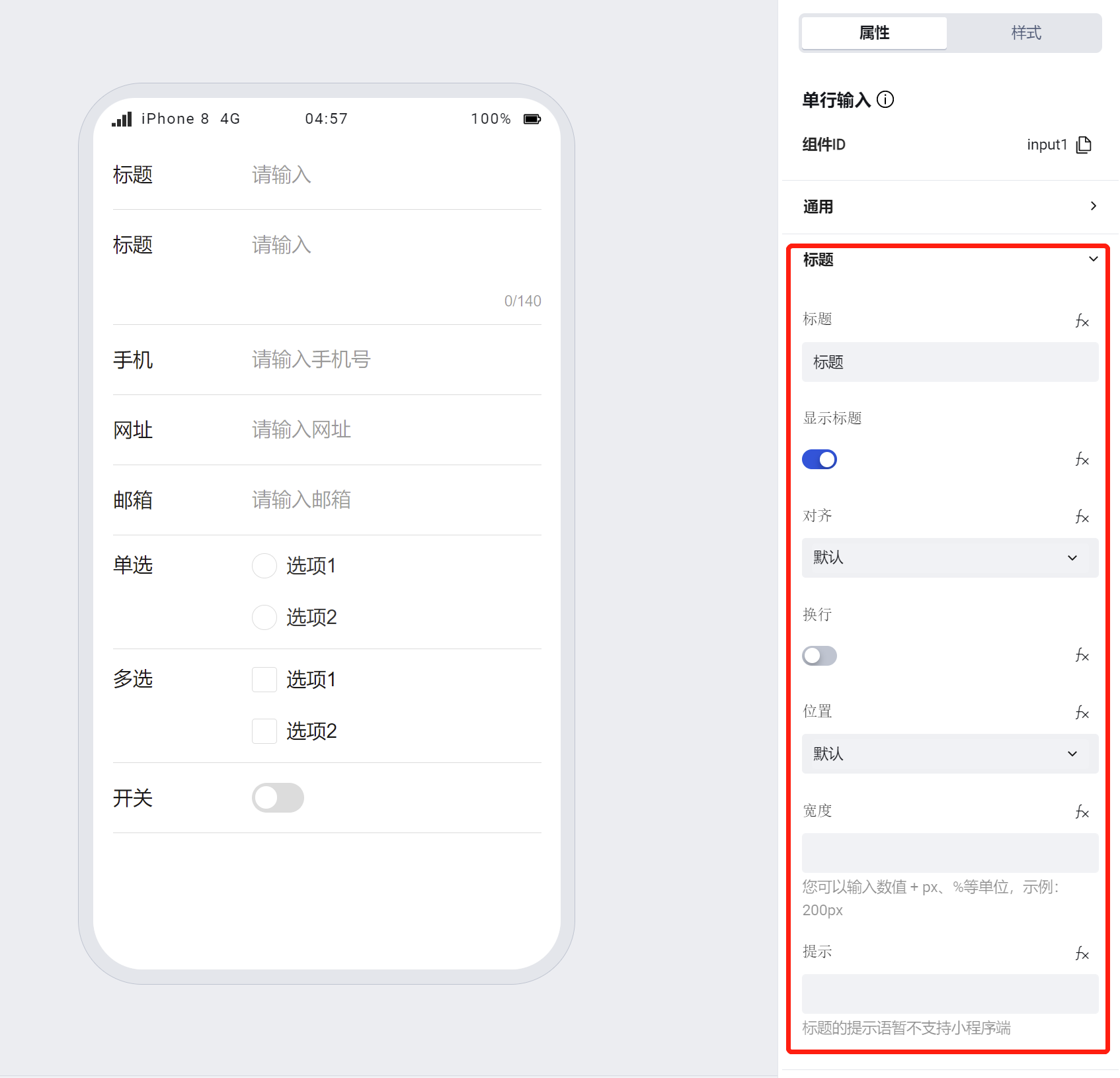
Supports personalized configuration for titles, including title content, alignment, whether to wrap text (when enabled, the title wraps to the next line if it exceeds one line; when disabled, the title is truncated if it exceeds one line), title position, width, and tooltip text.
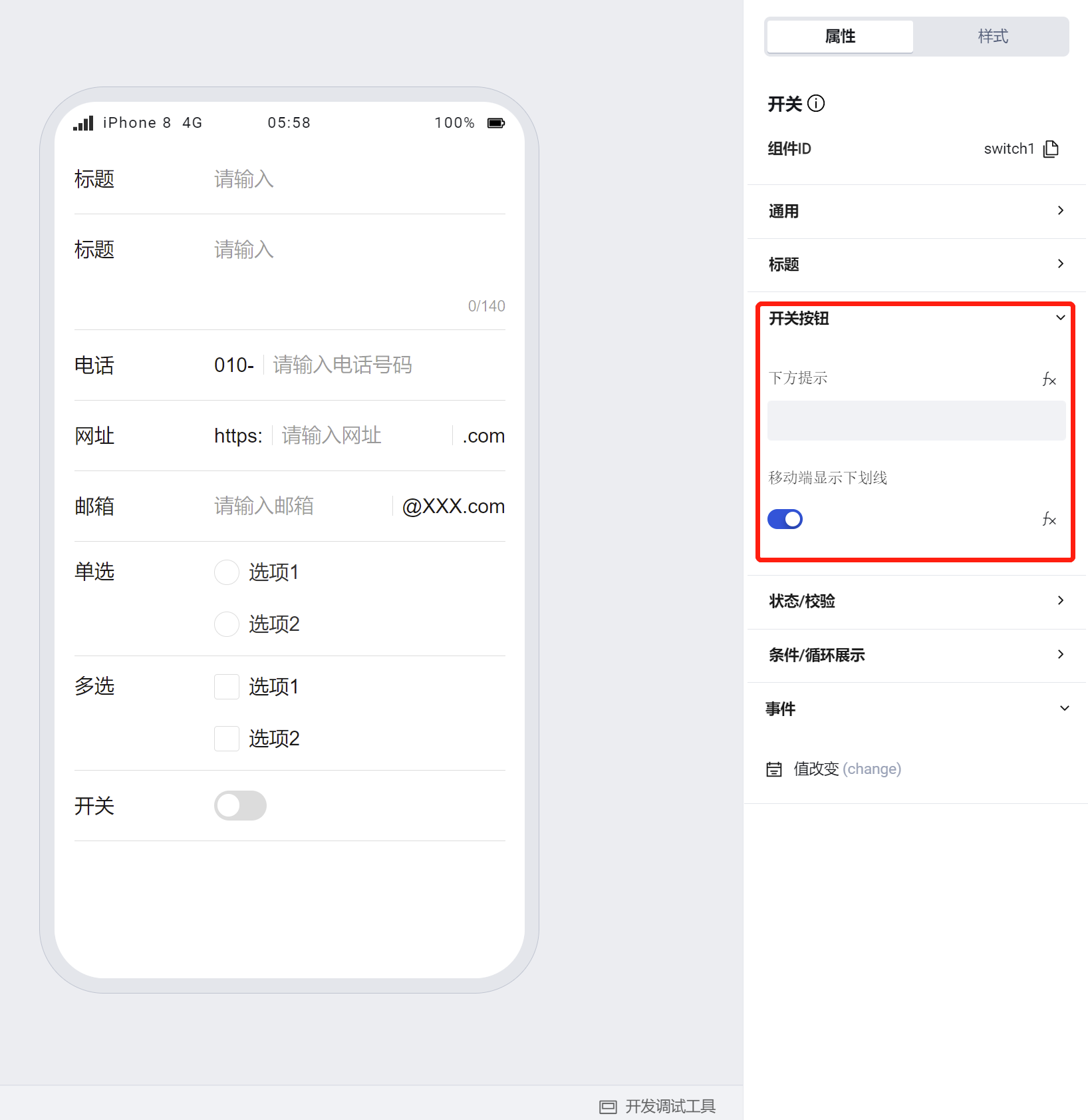
- Supports personalized configuration for the switch button, including the tooltip below the switch button and whether to display an underline on mobile devices.
Note:
- The size configuration of the switch button is only effective on PC.
- If a component is within a form container, its size, title alignment, position, line wrapping, and width will default to the property configuration of the form container
To learn more about form component usage scenarios, refer to the Form Common Scenario Practice Guide
Example
Interactive Preview
Different Types of Switches
Different Layouts of Switches
Switch Disabled State
Required Indicator, Title Hint, Hint Below, etc.
Style API Custom Styles
#wd-page-root .wd-form-item .wd-switch.is-checked .wd-switch__box {
  background-color: green;
}
Properties
External properties received by the component
Property Name | Property Identifier | Type | Description |
|---|
| Display Headlines | labelVisible | boolean | Default value: true |
| Title alignment | labelAlign | string | In the scenario, the form by default follows the title alignment configuration of the form container. |
| Line break in heading | labelWrap | boolean | If the title content is too long when closed, show one line with overflow omitted; when enabled, show with line breaks. In form scenarios, it follows the form container's title line break configuration by default. |
| Title position | layout | string | Set title display position in form component. In the scenario, it follows the title position configuration of the form container by default. |
| Title width | labelWidth | string | In the scenario, the form follows the title width configuration of the form container by default. |
| Heading Note | labelTips | string | Configure tooltip content for the heading |
| Prompt. | extra | string | Prompt content is displayed below the component after configuration. |
| Display underscore on mobile terminal | borderedH5 | boolean | After closing, the mobile terminal does not show the bottom underline Example: true |
| Required | required | boolean | Enable required for this component, value cannot be empty Example: false |
| Required identifier | requiredFlag | boolean | Enabled, the component will display a required asterisk tag if mandatory. Example: true |
| Required validation note | requiredMsg | string | Enable required, prompting message when component value is empty Example: "该项为必填项" |
| Status. | status | string | Example: "edit" |
| Bound field | name | string | The Key of the form field is used to match the field identifier of the data model when submitting data. Ensure uniqueness inline. |
| Title content. | label | string | Example: "标题" |
| Enabling status | value | boolean | Default switch status Example: false |
| Component size(PC) | size | string | Switch dimension size, takes effect on PC only Example: "" |
Events
Events exposed by the component. You can listen to component events to trigger external actions
Event Name | Event Code | Event Output Parameters event.detail | Applicable Scenarios | Description |
|---|
| value change | change | object
| Compatible with all platforms | - |
Properties API
Through the Property API, you can access the internal state and property values of components. You can access internal values using$w.componentId.propertyName, such as $w.input1.value. For details, please refer to Property API
Read-only Property Name | Property Identifier | Type | Description |
|---|
| Bound field | name | string | The Key of the form field is used to match the field identifier of the data model when submitting data. Ensure uniqueness inline. |
| Title content. | label | string | |
| Enabling status | value | boolean | Default switch status |
| Required | required | boolean | Enable required for this component, value cannot be empty |
| Indicates whether to display | visible | boolean | Whether to display the component |
| Whether to disable | disabled | boolean | Component Disabled |
| Specify whether it is read-only or not. | readOnly | boolean | Whether the component is read-only |
Method API
Through the Method API, you can programmatically trigger internal methods of components, such as submitting forms, displaying popups, etc. You can call component methods using $w.componentId.methodName, such as $w.form1.submit()
Method Name | Method Identifier | Parameters | Method Description |
|---|
| set value | setValue | boolean值 | 通过 $w.id1.setValue("weda") 设置组件值 |
| Show/Hide Settings | setVisible | boolean显示 | Set the component to hidden via $w.id1.setVisible(false) |
| Set Disabled | setDisabled | boolean禁用 | Set the component to disabled with $w.id1.setDisabled(true) |
| Clear value | clearValue | Clear the component value with $w.id1.clearValue() | |
| Set as read-only | setReadOnly | boolean只读 | Set the component to read-only via $w.id1.setReadOnly(true) |
| Trigger validation | handleValidate | Validate the component value via $w.id1.handleValidate() | |
| Clear verification | clearValidate | Clear component validation via $w.id1.clearValidate() |
Style API
Through the Style API, you can override the styles of internal elements in components to achieve customization. For example, in the low-code editor, you can write styles for all button components using #wd-page-root .wd-btn, and control individual component styles with :scope. For detailed instructions, please refer toStyle API
Name | Class Name | Description and Examples |
|---|
| root element | .wd-switch-root | Outermost component element |
| H5 root element | .wd-h5-switch-root | Settable root element style for the H5 side |
| PC-side root element | .wd-pc-switch-root | Settable root element style for the PC side |
| Mini program root element | .wd-mp-switch-root | Settable root element style for mini program |
| Component title style | .wd-switch-root .wd-form-item-wrap__label | Component title element |
| form control root node style | .wd-switch-root .wd-form-item-wrap__control | Set form control root element style |
| Button style in editing status (selected) | .wd-switch-root .is-checked .wd-switch__box::before | Button style in editing status (selected) |
| Editing status - Unselected button style | .wd-switch-root .wd-switch__box::before | Editing status - Unselected button style |
| Editing status - Verification information | .wd-switch-root .wd-g-text-error | Set component verification information style |
| prompt text | .wd-switch-root .wd-form-item__help-text | Set the text style of the component prompt |
| Disabled state - Selected button style | .wd-switch-root .is-disabled.is-checked .wd-switch__box::before | Disabled state - Selected button style |
| Disabled state - Unselected button style | .wd-switch-root .is-disabled .wd-switch__box::before | Disabled state - Unselected button style |
| read-only status - button select style | .wd-switch-root .is-readonly.is-checked .wd-switch__box::before | read-only status - button select style |
| read-only status - unselected button style | .wd-switch-root .is-readonly .wd-switch__box::before | read-only status - unselected button style |
Version Changes
- Property Changes
- Style Changes
- widget api Changes