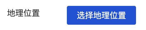
Map Positioning
WdLocation
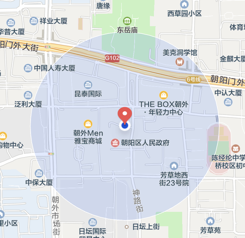
Applicable Scenarios
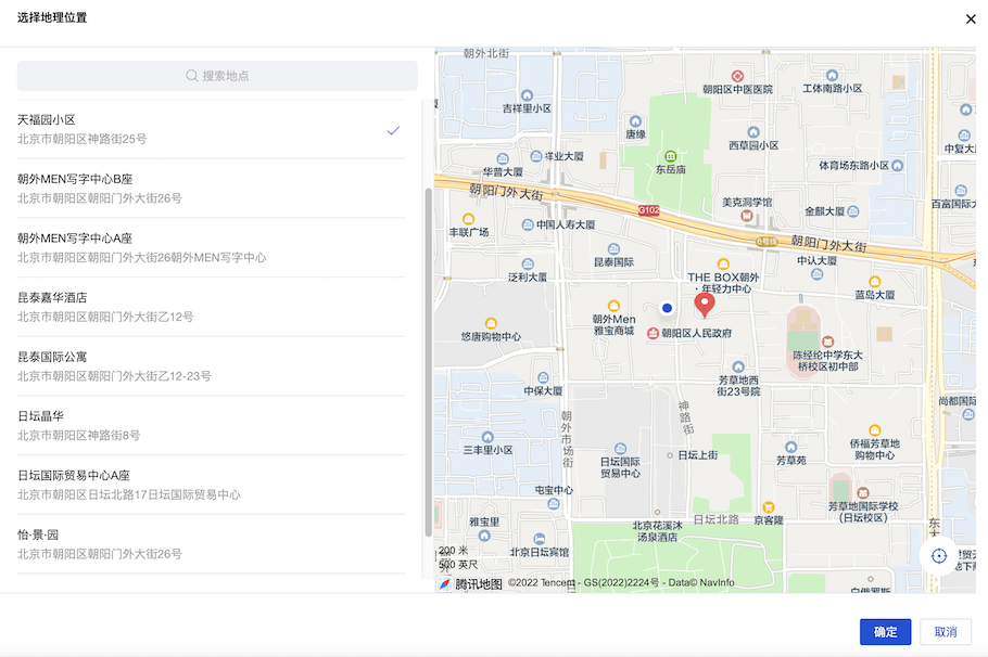
Point Selection and Positioning in Forms
Basic Capabilities
Bind Geographic Location Field
After the form container binds to the data model, the "geographic location" field in the model is automatically rendered as a map positioning component, enabling point selection and positioning.
Precautions
Before using the map positioning component, ensure that the following configurations are completed; otherwise, the component may fail to function properly.
1. Tencent Maps API Configuration (Required)
The map positioning component requires map API configuration to function. Click the map API and select Tencent Maps API. If no API is available, first create a new Tencent Maps API. For details, see Tencent Maps API.
This component calls Tencent Maps services and consumes relevant API quotas. To view key consumption status, visit Tencent Maps Open Platform. For details, refer to Quota Description.
The main services used within the component include:
| Service Name | Service Path |
|---|---|
| Nearby Recommendations | /ws/place/v1/explore |
| Place Search | /ws/place/v1/search |
| Keyword Input Suggestion | /ws/place/v1/suggestion |
| Geocoding | /ws/geocoder/v1/?address=* |
2. Permission Configuration (V2 Protocol)
The component has supported the use of V2 protocol APIs since version 3.30.0. When using the V2 protocol, non-super administrator roles require permission configuration. See APIs 2.0 User Role Permission Configuration Guide to grant permissions in the cloud console.
3. Request Domain Configuration (V2 Protocol + Mini Program Side)
The component has supported the use of V2 protocol APIs since version 3.30.0. When using the V2 protocol on the Mini Program side, additional request domain configuration is required:
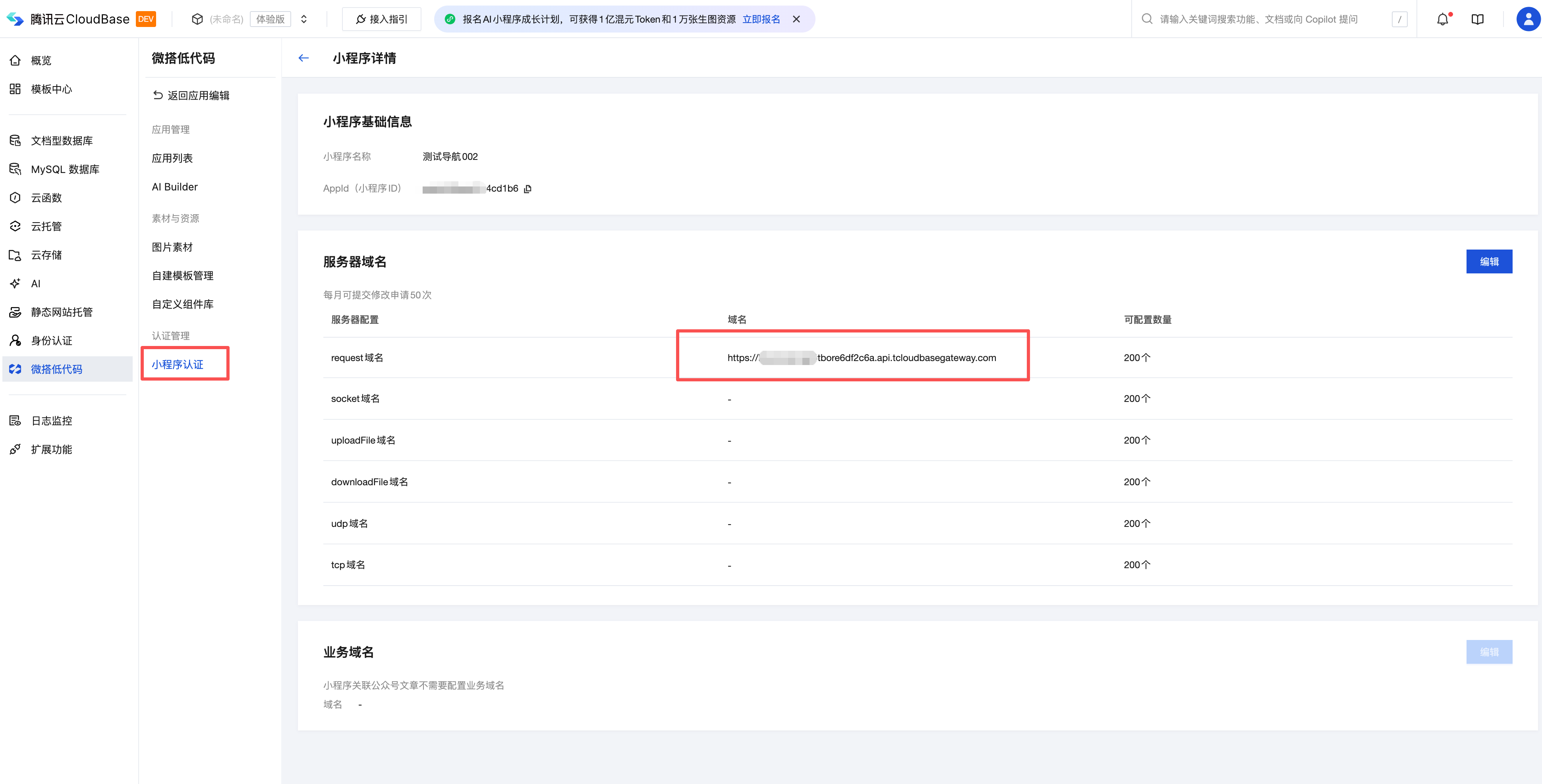
The request domain format is https://{envId}.api.tcloudbasegateway.com, where the domain prefix is the current TCB environment ID.
4. Mini Program Configuration
To use the map positioning component on the Mini Program side, configure it according to the following steps:
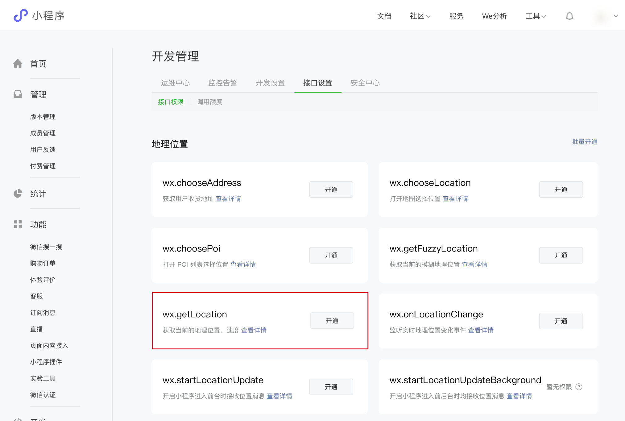
Step 1: Enable Location API Permissions
The Mini Program application calls the WeChat official wx.getLocation API to implement positioning. This must conform to the category requirements restricted by Mini Programs. On the WeChat Official Account Platform, navigate to "Development" - "Development Settings" - "API Settings" module, and self-activate the permission for the "Obtain current geographic location and speed" API.
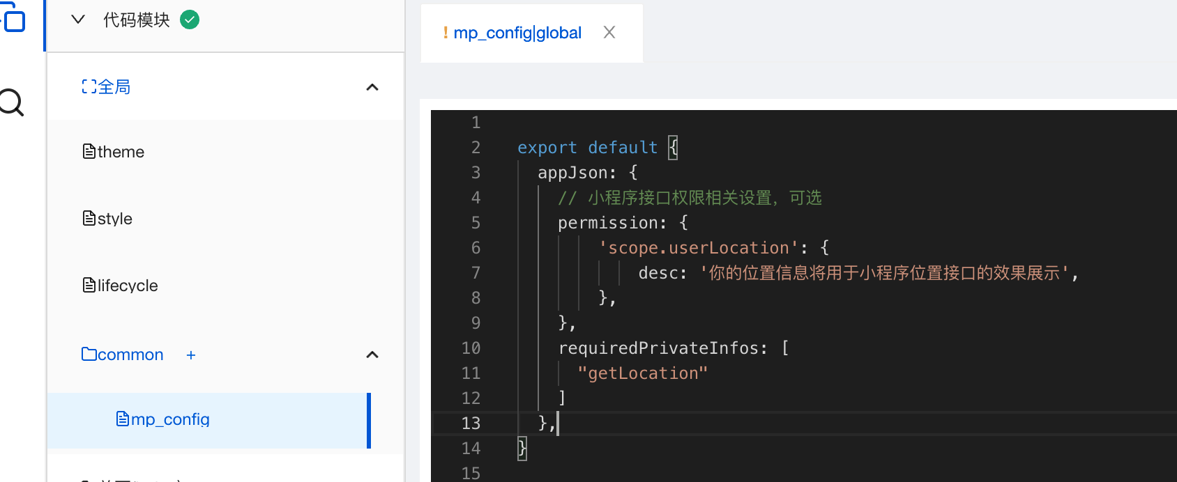
Step 2: Configure appJson
Starting from July 14, 2022, developers need to configure in app.json in advance when using location-related APIs. Please open the low-code editor commom/mp_config file and configure the following properties for appJson:
appJson: {
  permission: {
    'scope.userLocation': {
      desc: 'Your location information will be used to present the functionality of the location API in the Mini Program',
    },
  },
  requiredPrivateInfos: [ "getLocation" ]
}
Step 3: Refine the Privacy Agreement
After submitting the official Mini Program for review, it is necessary to refine the user privacy agreement protection. Specifically, see Mini Program Privacy Protection Guidance Adaptation Instructions.
5. Frequently Asked Questions
Error Reported During Mini Program Submission for Review
| Error Message | Solution |
|---|---|
| The code contains the privacy API getLocation that is not configured in ext.json | Please see Step 2: Configure appJson above to complete the configuration |
| The privacy API getLocation configured in ext.json lacks permission | Please see Step 1: Enable Location API Permission above to apply for permission |
Browser Positioning Failure
| Error Message | Cause and Solution |
|---|---|
| Browser not Support html5 geolocation | The browser does not support the native geolocation API, such as lower versions of Internet Explorer |
| Geolocation permission denied | The user has disabled location permission; enable location permission for the device and browser, or the browser blocks location requests from non-secure domains; upgrade the site to HTTPS. |
| Get geolocation time out | Browser geolocation timeout; consider increasing the timeout attribute setting value |
| Get geolocation failed | Geolocation failed; browsers like Chrome and Firefox access geolocation services located overseas, resulting in a higher failure rate |
Extended Scenarios
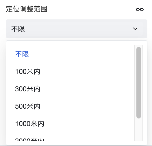
Positioning Adjustment Range Configuration
The component provides the "Positioning Adjustment Range" attribute, which can constrain the user's selected point positioning range to only within a certain range of the current actual location.
Other Scenario Practices
Refer to the Form Scenario Practice Guide to learn about various supported scenarios and implementation solutions for forms.
Example
Interactive Preview
Component Input State
Style API Example
#wd-page-root .wd-pc-location-root .wd-location__label {
  color: cyan;
  background-color: black;
  display: flex;
  justify-content: center;
}
#wd-page-root .wd-h5-location-root .wd-location-location {
  border-color: cyan;
  color: cyan;
  background-color: black;
  border-width: 2px;
  border-radius: 6px;
}
Properties
External properties received by the component
Property Name | Property Identifier | Type | Description |
|---|
| Display Headlines | labelVisible | boolean | Default value: true |
| Title alignment | labelAlign | string | In the scenario, the form by default follows the title alignment configuration of the form container. |
| Line break in heading | labelWrap | boolean | If the title content is too long when closed, show one line with overflow omitted; when enabled, show with line breaks. In form scenarios, it follows the form container's title line break configuration by default. |
| Title position | layout | string | Set title display position in form component. In the scenario, it follows the title position configuration of the form container by default. |
| Title width | labelWidth | string | In the scenario, the form follows the title width configuration of the form container by default. |
| Heading Note | labelTips | string | Configure tooltip content for the heading |
| Display clear button | clearable | boolean | Enabled, quick clear button is provided by Default value: true |
| Prompt. | extra | string | The prompt content is displayed below the input box after configuration. |
| Display longitude and latitude | showLngLat | boolean | Display longitude and latitude of the selected location |
| display map | showMap | boolean | Display the selected location on the map |
| 打开微信内置地图(Mini Program) | openLocation | boolean | 使用微信内置地图查看位置 |
| Display underscore on mobile terminal | borderedH5 | boolean | After closing, the mobile terminal does not show the bottom underline Default value: true |
| Locating adjustment range | locationRange | string | 0 |
| custom scope | customRange | number | 0 |
| Permission to scale | zoom | boolean | Permission to scale the map Default value: true |
| Allow drag | drag | boolean | Permission to drag the map Example: true |
| Status. | status | string | Example: "edit" |
| Required | required | boolean | |
| Required identifier | requiredFlag | boolean | Enabled, the component will display a required asterisk tag if mandatory. Default value: true |
| Required validation note | requiredMsg | string | Example: "该项为必填项" |
| Bound field | name | string | The Key value of a form field is used to match the field identifier of the data model when submitting data. It must be unique within the form. |
| Title content. | label | string | Example: "地图" |
| Map APIs | dataSource | object | Associate Tencent Maps APIs, the mini program will call the Official WeChat API for localization. Please ensure the relevant APIs are approved. For details, refer to the component documentation. |
| Default position | locationType | number | Default location value Example: 1 |
| Default value | value | object | Example: null |
| Placeholder text | placeholder | string | Example: "选择地理位置" |
Events
Events exposed by the component. You can listen to component events to trigger external actions
Event Name | Event Code | Event Output Parameters event.detail | Applicable Scenarios | Description |
|---|
| value change | change | object
| Compatible with all platforms | Trigger when a user modifies a component value |
| Map component error event | error | object
| Mobile,PC | Map loading failed, or trigger on abnormality in map component usage |
Properties API
Through the Property API, you can access the internal state and property values of components. You can access internal values using$w.componentId.propertyName, such as $w.input1.value. For details, please refer to Property API
Read-only Property Name | Property Identifier | Type | Description |
|---|
| Bound field | name | string | The Key value of a form field is used to match the field identifier of the data model when submitting data. It must be unique within the form. |
| Title content. | label | string | |
| Default value | value | object | |
| Required | required | boolean | |
| Indicates whether to display | visible | boolean | Whether to display the component |
| Whether to disable | disabled | boolean | Component Disabled |
| Specify whether it is read-only or not. | readOnly | boolean | Whether the component is read-only |
Method API
Through the Method API, you can programmatically trigger internal methods of components, such as submitting forms, displaying popups, etc. You can call component methods using $w.componentId.methodName, such as $w.form1.submit()
Method Name | Method Identifier | Parameters | Method Description |
|---|
| set value | setValue | object
| 通过 $w.id1.setValue({address:"深圳站",geopoint:{coordinates:[114.117209,22.53168]}}) 设置组件值 |
| Show/Hide Settings | setVisible | boolean显示 | Set the component to hidden via $w.id1.setVisible(false) |
| Set Disabled | setDisabled | boolean禁用 | Set the component to disabled with $w.id1.setDisabled(true) |
| Clear value | clearValue | Clear the component value with $w.id1.clearValue() | |
| Set as read-only | setReadOnly | boolean只读 | Set the component to read-only via $w.id1.setReadOnly(true) |
| Trigger validation | handleValidate | Validate the component value via $w.id1.handleValidate() | |
| Clear verification | clearValidate | Clear component validation via $w.id1.clearValidate() |
Style API
Through the Style API, you can override the styles of internal elements in components to achieve customization. For example, in the low-code editor, you can write styles for all button components using #wd-page-root .wd-btn, and control individual component styles with :scope. For detailed instructions, please refer toStyle API
Name | Class Name | Description and Examples |
|---|
| root element | .wd-location-root | Outermost component element |
| H5 root element | .wd-h5-location-root | Settable root element style for the H5 side |
| PC-side root element | .wd-pc-location-root | Settable root element style for the PC side |
| Mini program root element | .wd-mp-location-root | Settable root element style for mini program |
| Component title style | .wd-location-root .wd-form-item-wrap__label | Component title element |
| form control root node style | .wd-location-root .wd-form-item-wrap__control | Set form control root element style |
| Editing status - Location information style | .wd-location-root .wd-location__info | Editing status - Location information style |
| Editing status - Placeholder text style | .wd-location-root .form-location-con__text | Editing status - Placeholder text style |
| Editing status - Verification information | .wd-location-root .wd-g-text-error | Set component verification information style |
| prompt text | .wd-location-root .wd-form-item__help-text | Set the text style of the component prompt |
| Disabled status - Location information style | .wd-location-root .is-disabled .wd-location__info | Disabled status - Location information style |
| read-only status - form value style | .wd-location-root .wd-form-item__readonly-value | Set component read-only status |
Version Changes
- Properties Changes
- Style Changes
- widget api changes