QR code
QrCode
Practice Guide
QR code components convert to image format in the H5 end.
Basic Description
It generates and displays a QR code based on your configured links, text, etc.
QR code display scenarios include both static and dynamic scenarios.
-
The display of static QR codes can be directly achieved through the Image component. Specific scenarios include: displaying personal WeChat QR codes, group QR codes, official account QR codes, etc.
-
Dynamic QR codes are generated based on specified parameters. They are primarily used in scenarios such as one object one code, reservation codes, voucher codes, and membership codes.
Usage Instructions
-
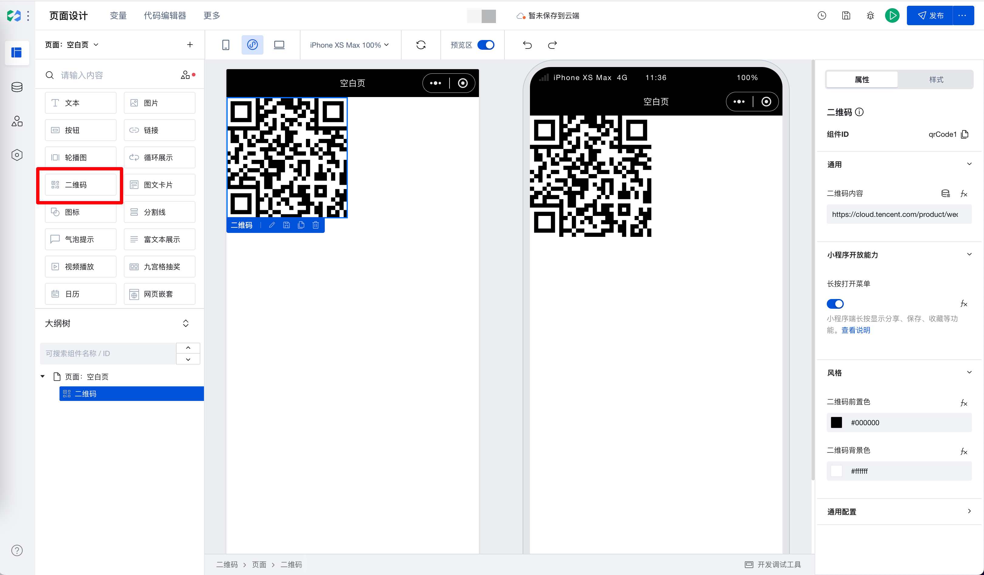
Add the QR code component in the editor
-
In the Properties panel > General, enter the QR code content. For example, enter the official website address of WeDa: https://cloud.tencent.com/product/weda. Scanning the generated QR code with a mobile phone will direct you to WeDa's official website.
-
In the Properties panel, under Mini Program Open Capabilities, the Long Press to Open Menu option is enabled by default. After the mini program is published, long pressing the generated QR code will bring up menu options that support collecting, saving, and sharing the QR code.
-
In the Properties panel > Style, you can set the foreground color and background color of the QR code. Adjust the colors according to the overall style of your app/page.
Properties
External properties received by the component
Property Name | Property Identifier | Type | Description |
|---|
| Long-press to open menu | showMenuByLongpress | boolean | Example: true |
| QR code front color | foregroundColor | string | Example: "#000000" |
| QR code background color | backgroundColor | string | Example: "#ffffff" |
| QR code content | text | string | Example: "https://cloud.tencent.com/product/weda" |
Properties API
Through the Property API, you can access the internal state and property values of components. You can access internal values using$w.componentId.propertyName, such as $w.input1.value. For details, please refer to Property API
Read-only Property Name | Property Identifier | Type | Description |
|---|
| QR code content | text | string | |
| Long-press to open menu | showMenuByLongpress | boolean | |
| QR code front color | foregroundColor | string | |
| QR code background color | backgroundColor | string |
Style API
Through the Style API, you can override the styles of internal elements in components to achieve customization. For example, in the low-code editor, you can write styles for all button components using #wd-page-root .wd-btn, and control individual component styles with :scope. For detailed instructions, please refer toStyle API
Name | Class Name | Description and Examples |
|---|
| root element | .wd-qrcode | qr code component root element |
| PC-side QR code root element | .wd-pc-qrcode | Write style for PC QR code |
| H5 QR code root element | .wd-h5-qrcode | Can write styles for QR codes on H5 |
| WeChat Mini Program QR code root element | .wd-mp-qrcode | Write styles for QR codes on the mini program |