Carousel
Carousel
Applicable Scenarios
Used to quickly set up a carousel display effect, supporting features such as click redirection and playback interval configuration.
Basic Capabilities Description
Configurable Carousel Display Effect
Only simple configuration in the component settings area is required to achieve the carousel display effect. You can also set redirect pages for each image in the configuration area. Additionally, advanced properties such as playback animation and anchor points of the carousel component can be deeply customized in the advanced settings.
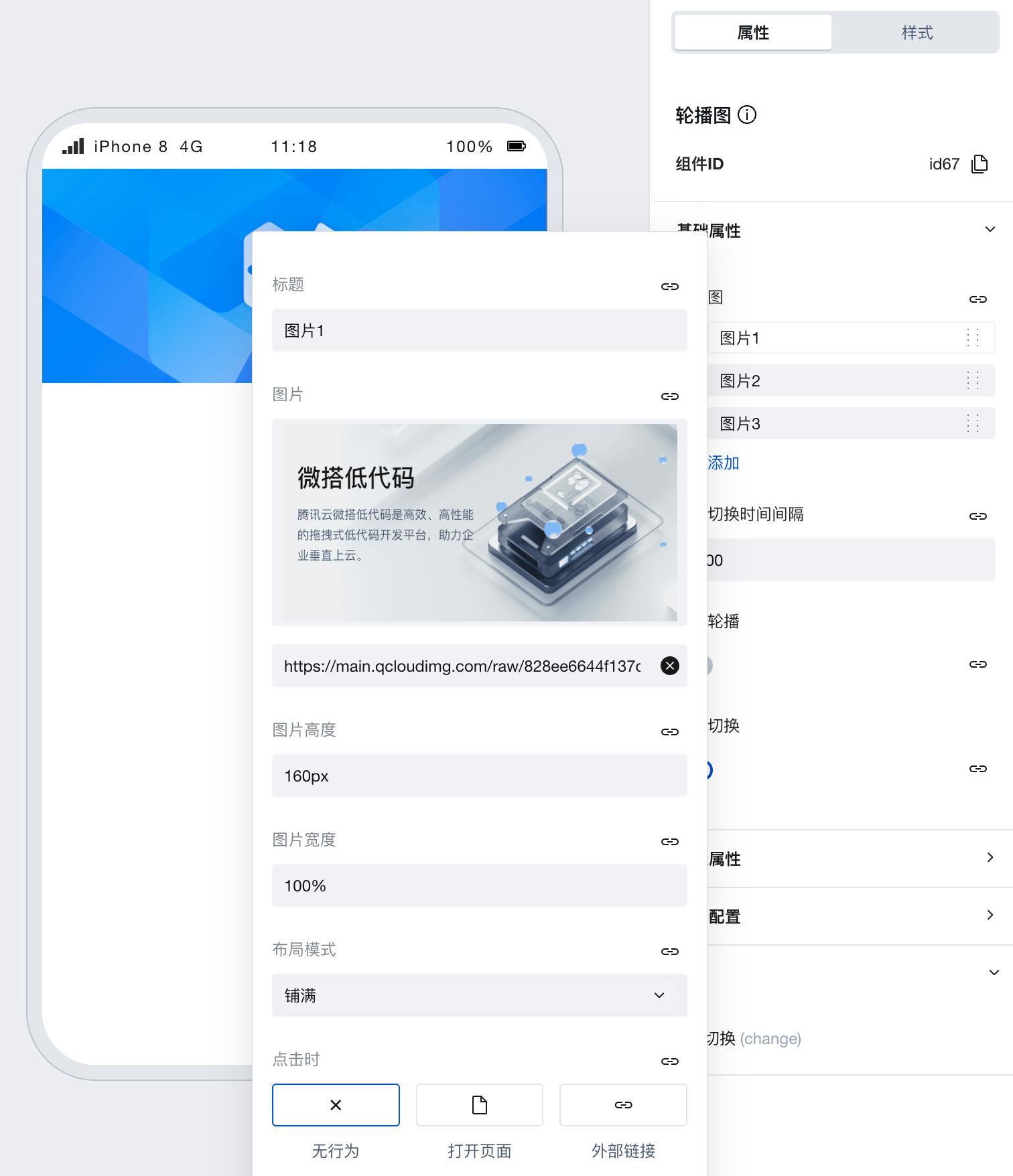
Property Introduction
External properties received by the component
Property Name | Property Identifier | Type | Description |
|---|
| carousel | images | array | Example: [ { "image": "https://main.qcloudimg.com/raw/828ee6644f137d166b063ad7f5dda842.png", "title": "图片1", "fit": "cover", "tapMode": "tap", "height": "160px", "width": "100%" }, { "image": "https://main.qcloudimg.com/raw/880b5277dc7d8f62fd6b5f964bee3af4.png", "title": "图片2", "fit": "cover", "tapMode": "tap", "height": "160px", "width": "100%" }, { "image": "https://main.qcloudimg.com/raw/af8d7dff73fea17aa099876bc3a811fa.png", "title": "图片3", "fit": "cover", "tapMode": "tap", "height": "160px", "width": "100%" } ] |
| Auto switch interval (ms) | interval | number | Configure the carousel scroll time interval in ms Example: 5000 |
| vertical carousel | vertical | boolean | Once enabled, the carousel will change from scrolling horizontally to vertically. Example: false |
| automatic switching | autoplay | boolean | Once enabled, the carousel will auto-scroll automatically based on the configured time interval. After disabling, it only supports switching via anchor clicks. Example: true |
| Anchor active color | indicatorActiveColor | string | Change the color of the anchor when selected Example: "rgba(0, 0, 0, 0.9)" |
| Anchor color | indicatorColor | string | Change the color of the anchor in regular status Example: "rgba(200, 200, 200, 0.9)" |
| Sliding animation duration | duration | number | Change the sliding animation duration of the carousel during switching Example: 500 |
| Current slider index | current | number | Change the default display position of the carousel. 0 displays the first image by default, and so on. Example: 0 |
| transition slide | circular | boolean | Change the sliding method of the carousel animation during switching Example: true |
| Navigation anchor | indicatorDots | boolean | Enable/disable carousel anchor Example: true |
Event Introduction
Events exposed by the component. You can listen to component events to trigger external actions
Event Name | Event Code | Event Output Parameters event.detail | Applicable Scenarios | Description |
|---|
| switchover | change | Compatible with all platforms | - |