Tree
WdTree
Applicable Scenarios
Display multi-level data content in a tree structure, such as organizational structures, material information, customer classifications, etc.
Basic Capabilities Description
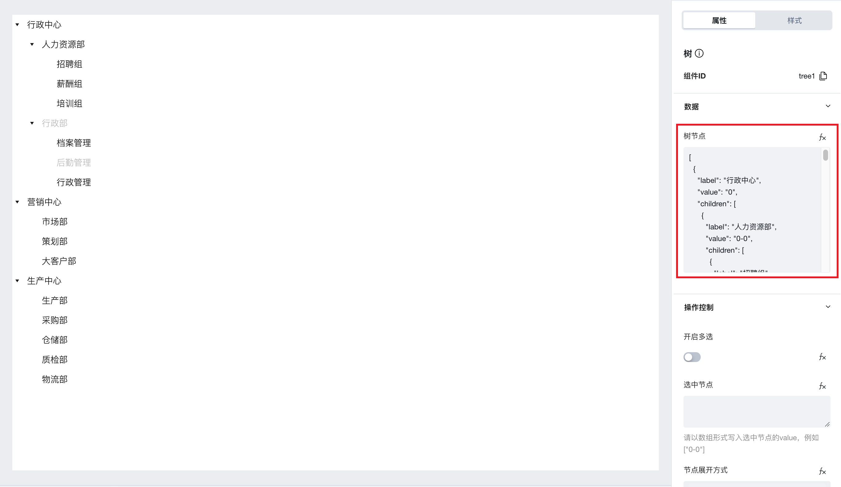
Bind JSON data to create a Tree Component
-
After dragging the tree component from the component library, a sample JSON data is bound by default. Developers can refer to this sample data to build the tree structure required for the business.
-
Besides binding static JSON data, click the fx button to the right of the tree node property to bind format-matching variables/expressions in the expression editor, enabling tree rendering.
-
Tree node data must be of object data type, and the key of each object must be named
- label: node name, which will be directly displayed on each node of the component.
- value: node identifier, which can be used to control the selected node and expand nodes.
- disabled: Boolean, set to true indicates the current node is disabled.
- foldIcon: icon when the node is collapsed (when the current node is a parent node and the component's "Show Node Icon" property is enabled, set an image URL with https protocol to display this icon when the node is collapsed)
- expandIcon: icon when the node is expanded (when the current node is a parent node and the component's "Show Node Icon" property is enabled, set an image URL with https protocol to display this icon when the node is expanded)
- leafIcon: leaf node icon (when the current node is a leaf node and the component's "Show Node Icon" property is enabled, set an image URL with https protocol to display this icon on the current node)
- children: child node data must be placed in the value corresponding to this key in the form of an array of objects
-
Complete tree node data example is as follows (if you need to display icons, please enable the "Show Node Icon" property; if you expect only nodes configured with foldIcon, expendIcon, and leafIcon parameters to display icons, please clear the values in the "Default Icon When Node Collapsed", "Default Icon When Node Expanded", and "Default Leaf Node Icon" properties).
[{"label": "Administrative Center","value": "0","foldIcon": "0a94df-1307578329.tcloudbaseapp.com/resources/2023-05/lowcode-1177832","expendIcon": "https://lowcode-1gk9y5ik310a94df-1307578329.tcloudbaseapp.com/resources/2023-05/lowcode-1177833","children": [{"label": "Human Resources Department","value": "0-0","foldIcon": "0a94df-1307578329.tcloudbaseapp.com/resources/2023-05/lowcode-1177832","expendIcon": "https://lowcode-1gk9y5ik310a94df-1307578329.tcloudbaseapp.com/resources/2023-05/lowcode-1177833","children": [{"label": "Recruitment Group","value": "0-0-0","leafIcon": "https://lowcode-1gk9y5ik310a94df-1307578329.tcloudbaseapp.com/resources/2023-05/lowcode-1177834"},{"label": "Compensation Group","value": "0-0-1"},{"label": "Training Group","value": "0-0-2"}]},{"label": "Administrative Department","value": "0-1","children": [{"label": "Records Management","value": "0-1-0"},{"label": "Logistics Management","value": "0-1-1","disabled": true},{"label": "Administrative Management","value": "0-1-2"}],"disabled": true}]},{"label": "Marketing Center","value": "1","disabled": true,"children": [{"label": "Marketing Department","value": "1-0","disabled": true},{"label": "Planning Department","value": "1-1"},{"label": "Key Account Department","value": "1-2"}]}]
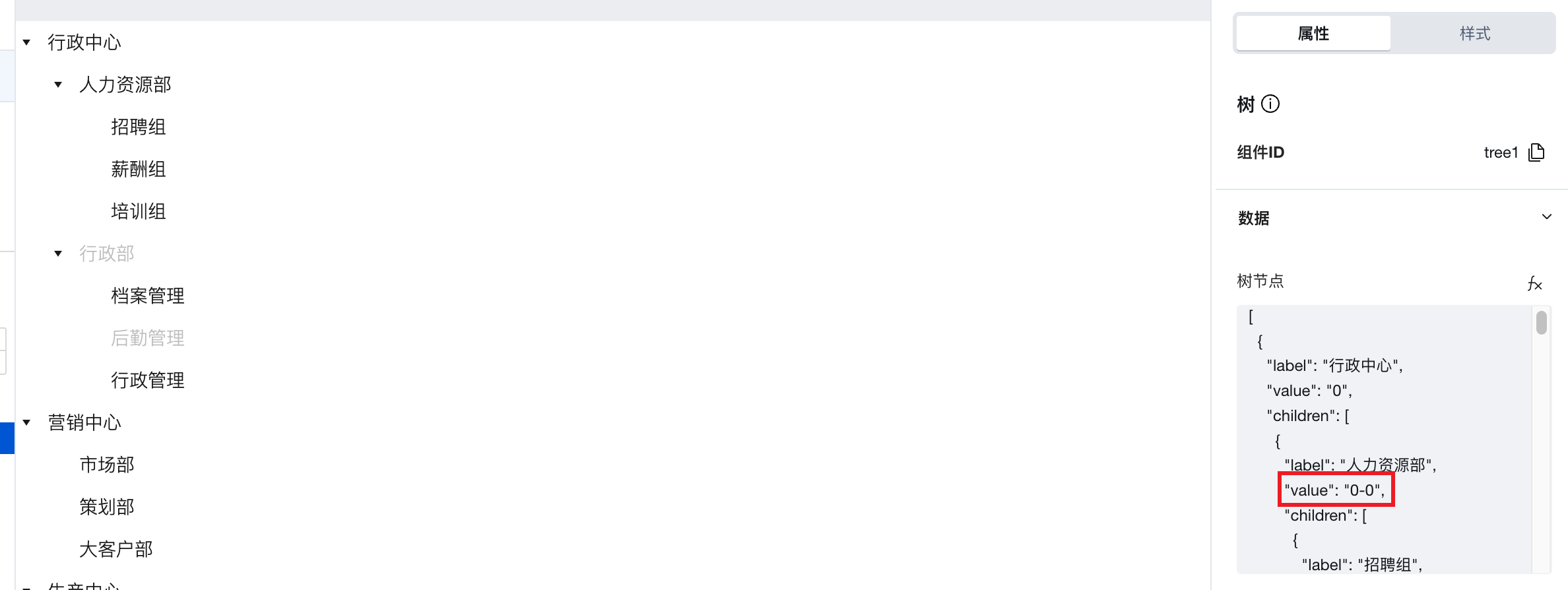
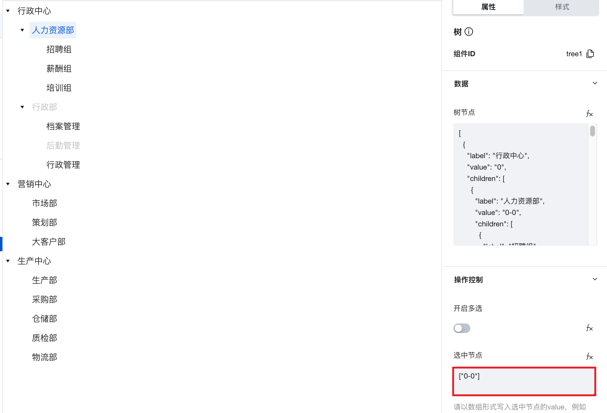
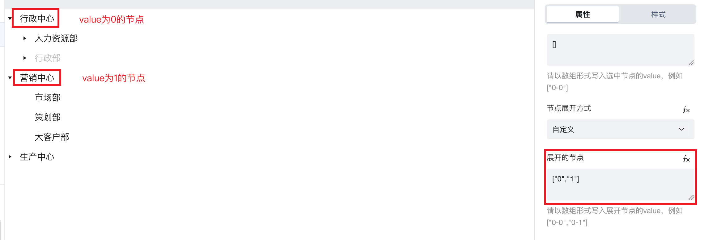
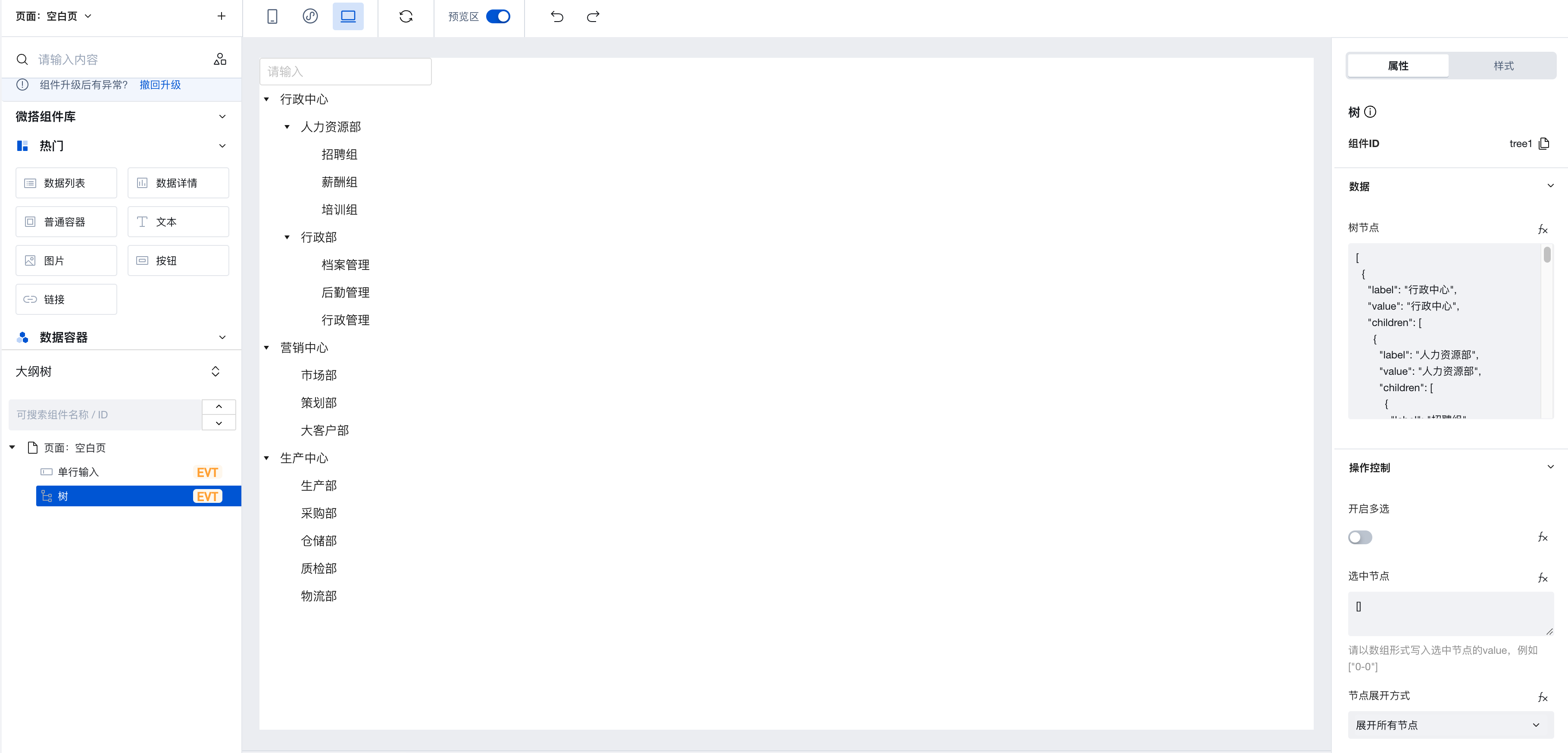
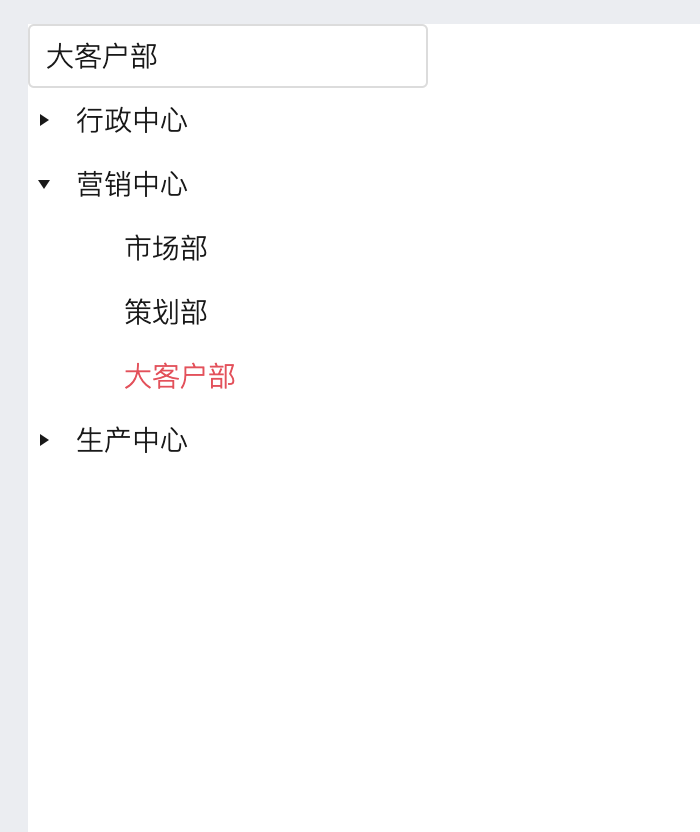
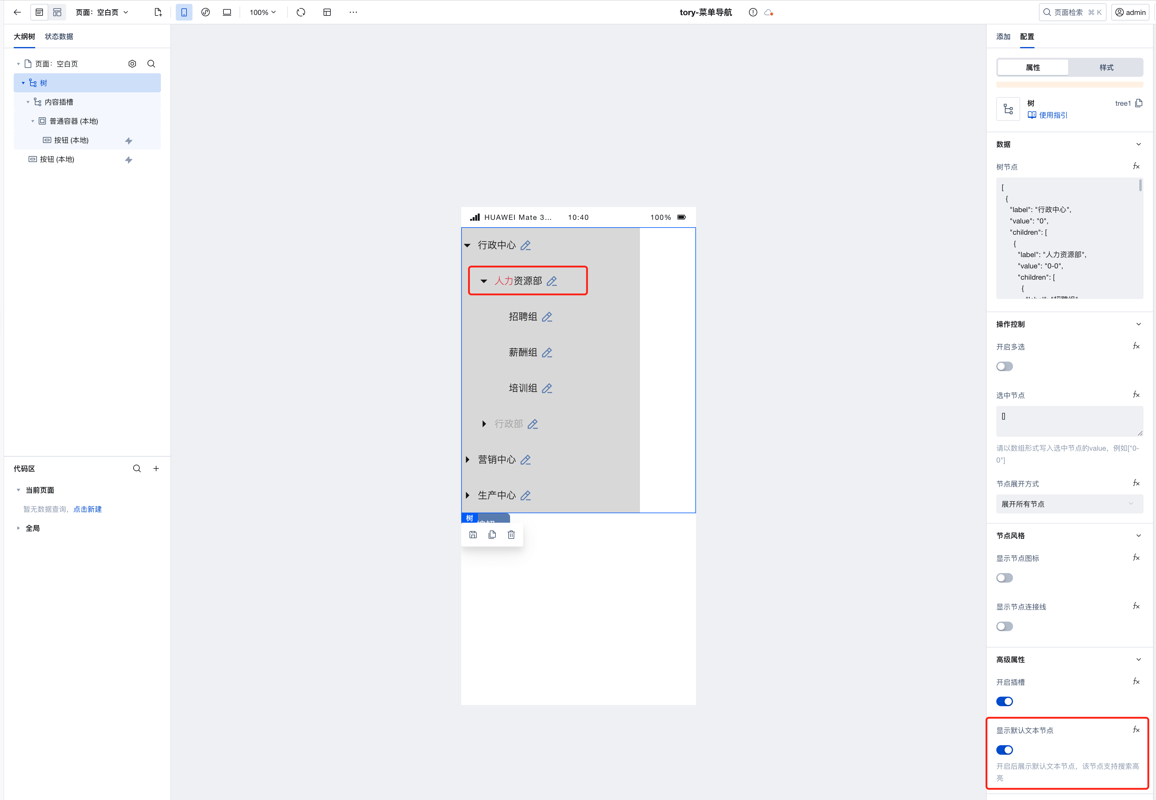
Configure Selected Nodes
-
The component provides a 'Selected Nodes' property, which supports passing the node's value in array format, e.g.:
-
In the figure below, the value of the Human Resources Group node is 0-0.
-
To select this node by default, simply write ["0-0"] in the 'Selected Nodes' property.
-
-
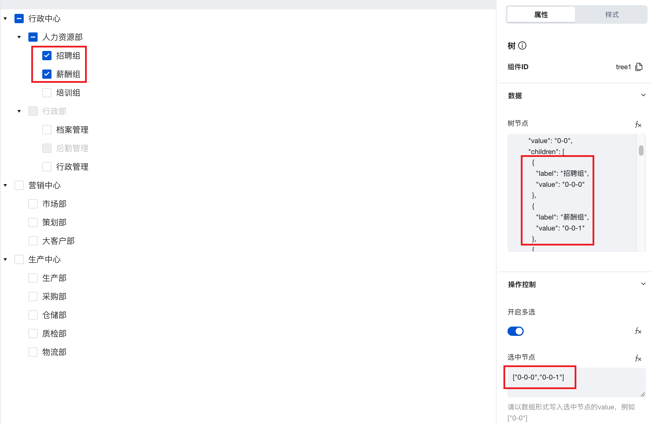
When the 'Enable Multiple Selection' property is true, checkboxes will be displayed before each node, enabling multiple selection. In this case, the 'Selected Nodes' property can pass in the values of multiple nodes, formed as an array, to achieve default selection of multiple nodes.
Configure Node Expansion Method
-
Node expansion method can be chosen: expand all nodes, do not expand, custom.
-
After choosing 'Custom', the 'Expanded Nodes' property will be displayed. Similar to the configuration method of the 'Selected Nodes' property, pass the value of the nodes to be expanded in array format.
Extended Scenarios Description
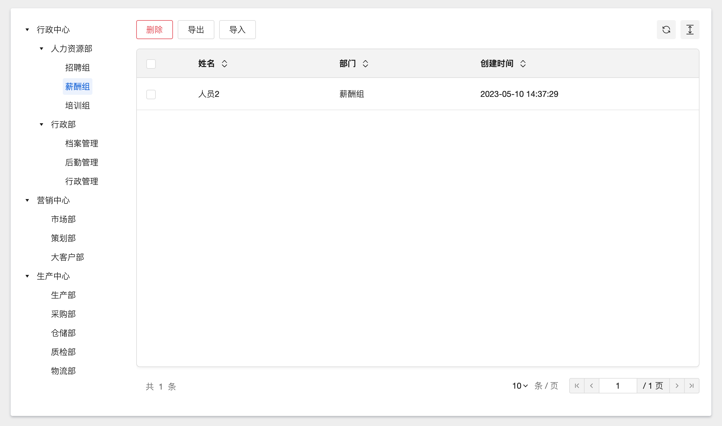
When different nodes are selected, obtain node information to dynamically filter the data table
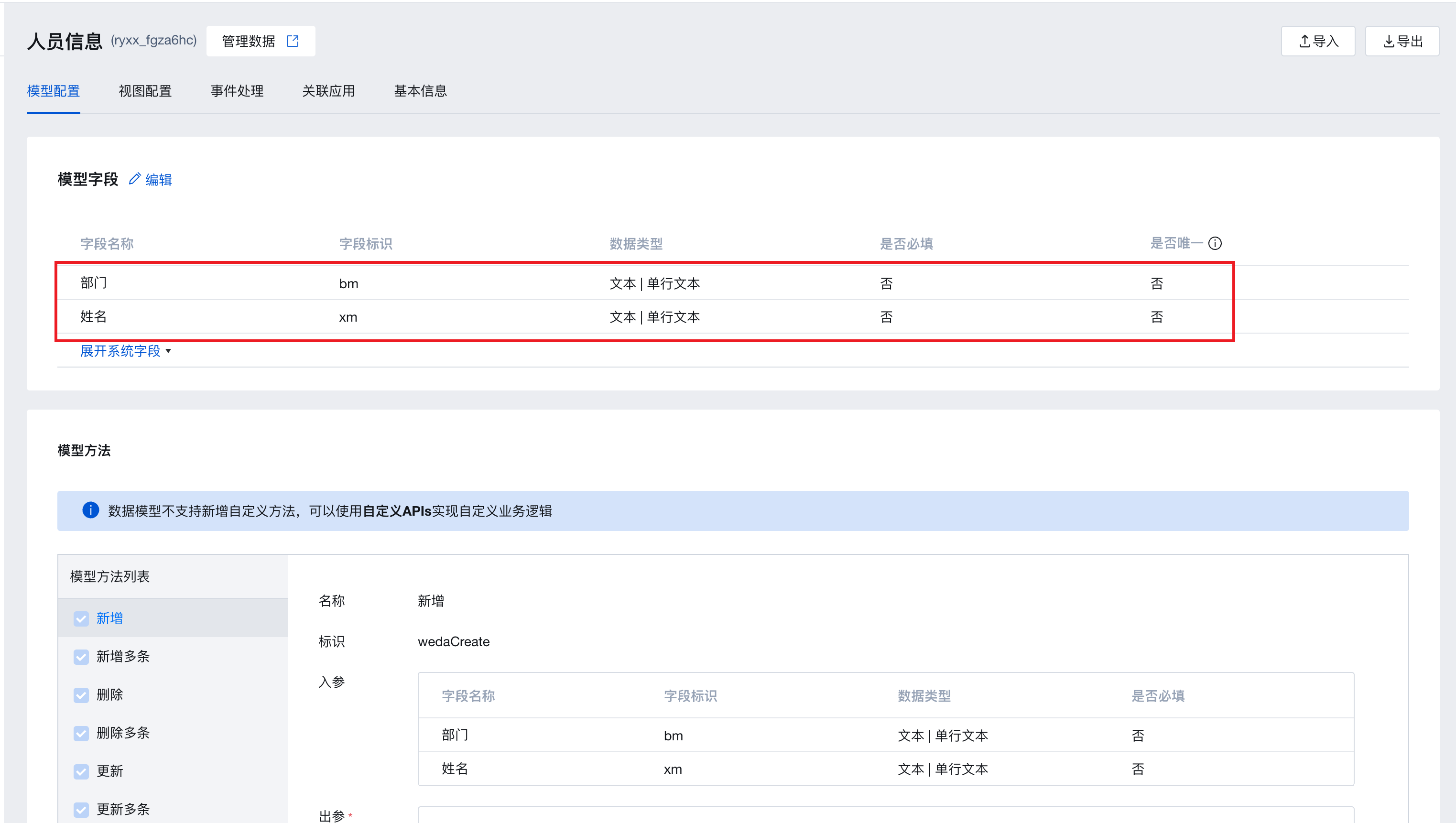
Taking the example of filtering personnel information tables through an organizational structure tree for illustration:
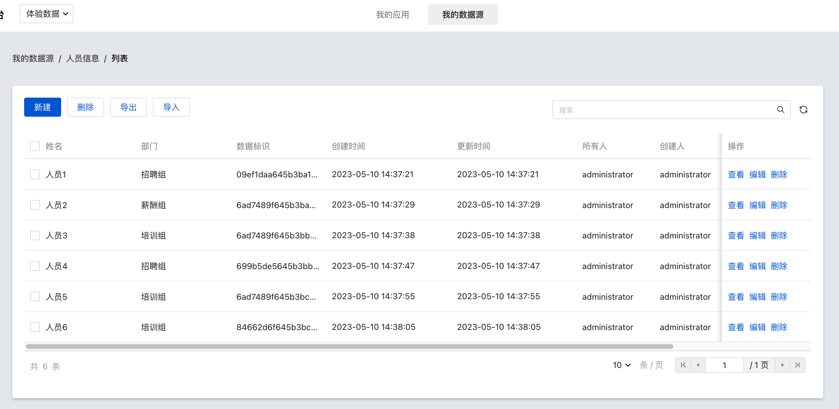
- Create a personnel information data model, add name and department fields, and enter the required sample data for personnel and departments.
- Use layout components and grid layout components in conjunction with tree components and data table components to build the following page layout: a tree directory on the left and a data table on the right.
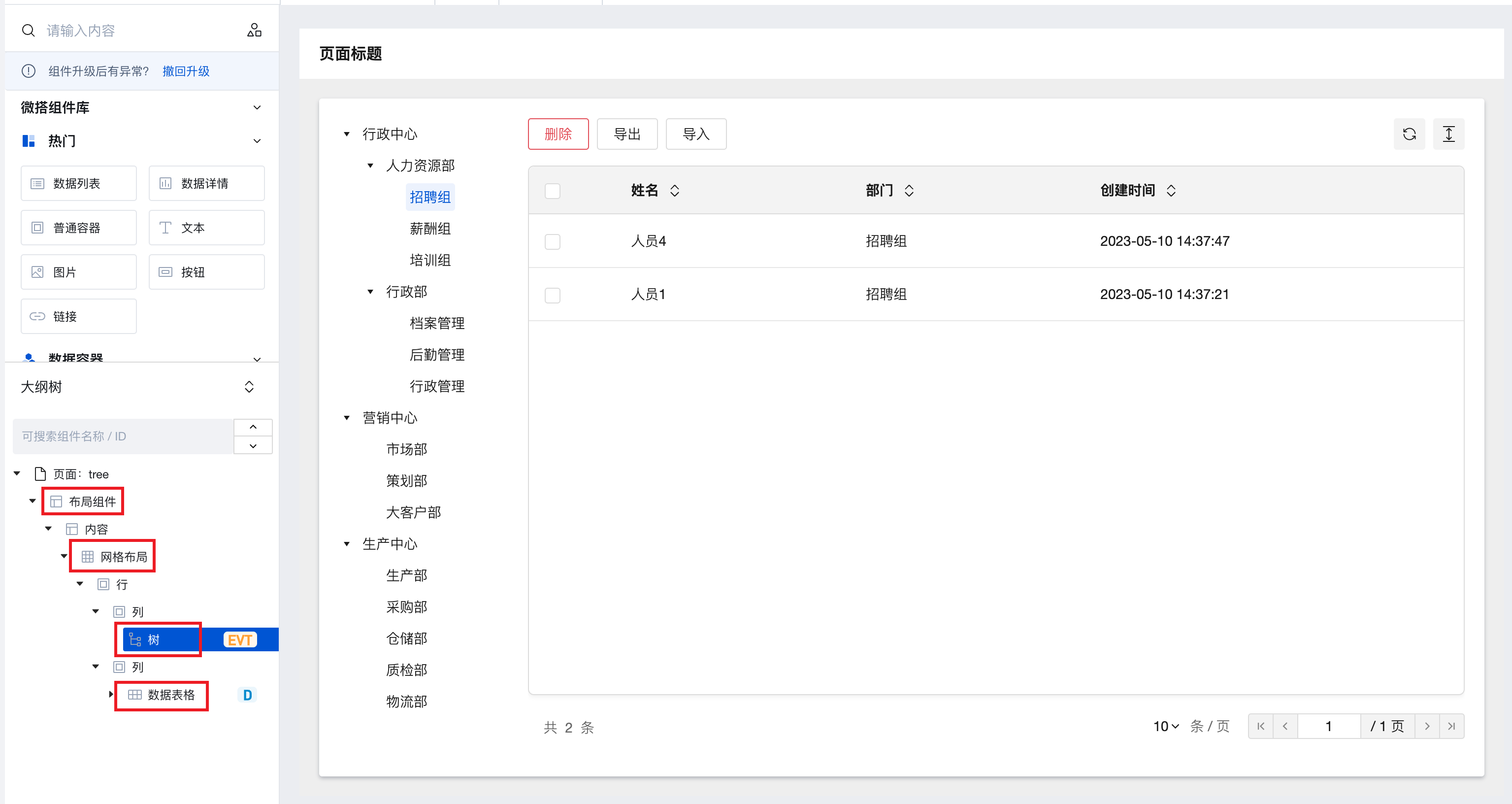
- Bind the data table component to the required personnel information model and configure the columns to be displayed.
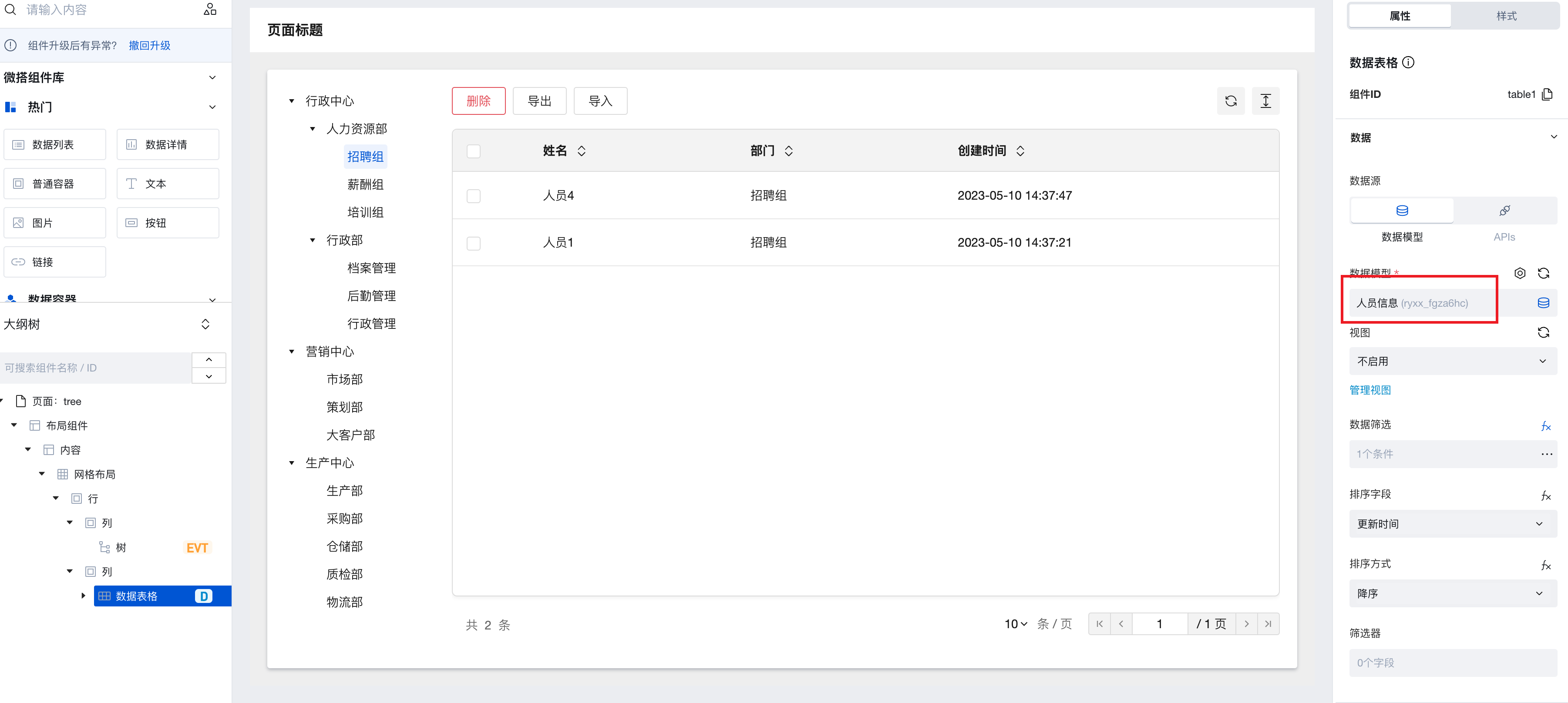
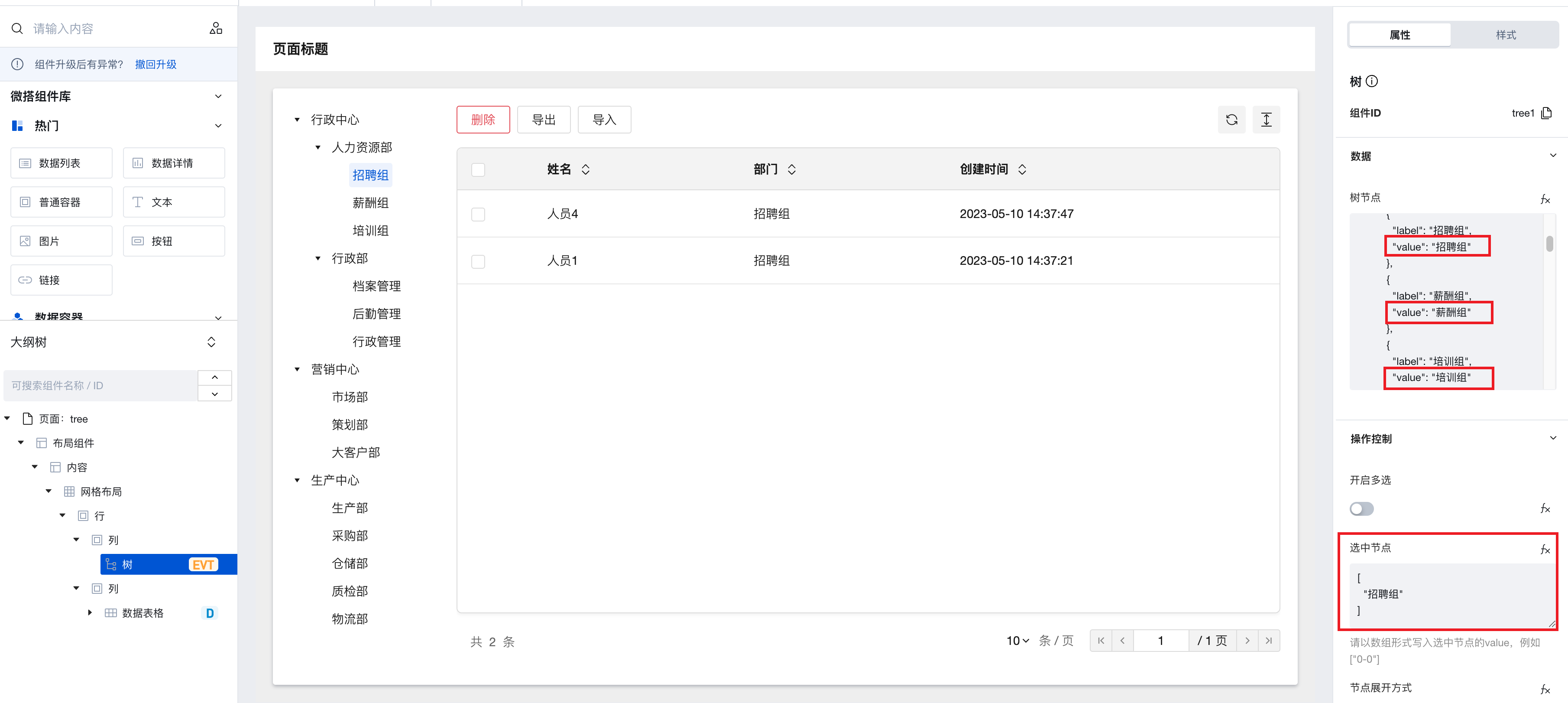
- Build on demand the tree node data, assemble the organizational structure, ensure that the value of each node matches the department field value in the personnel information model, and configure the selected node property to ["Recruitment Group"].
- Configure the data filtering property for the data table component. To view the component id of the tree component as tree1, set the department field equal to the selected value of the tree component: $w.tree1.treeInfo.checked[0]
(This function is the expression syntax for obtaining component property API, where
$w.\{tree component id\}.treeInfo.checkedcan obtain the selected node value of the tree component. Since the multi-selection property is not currently enabled, taking the first selected node [0] is sufficient.)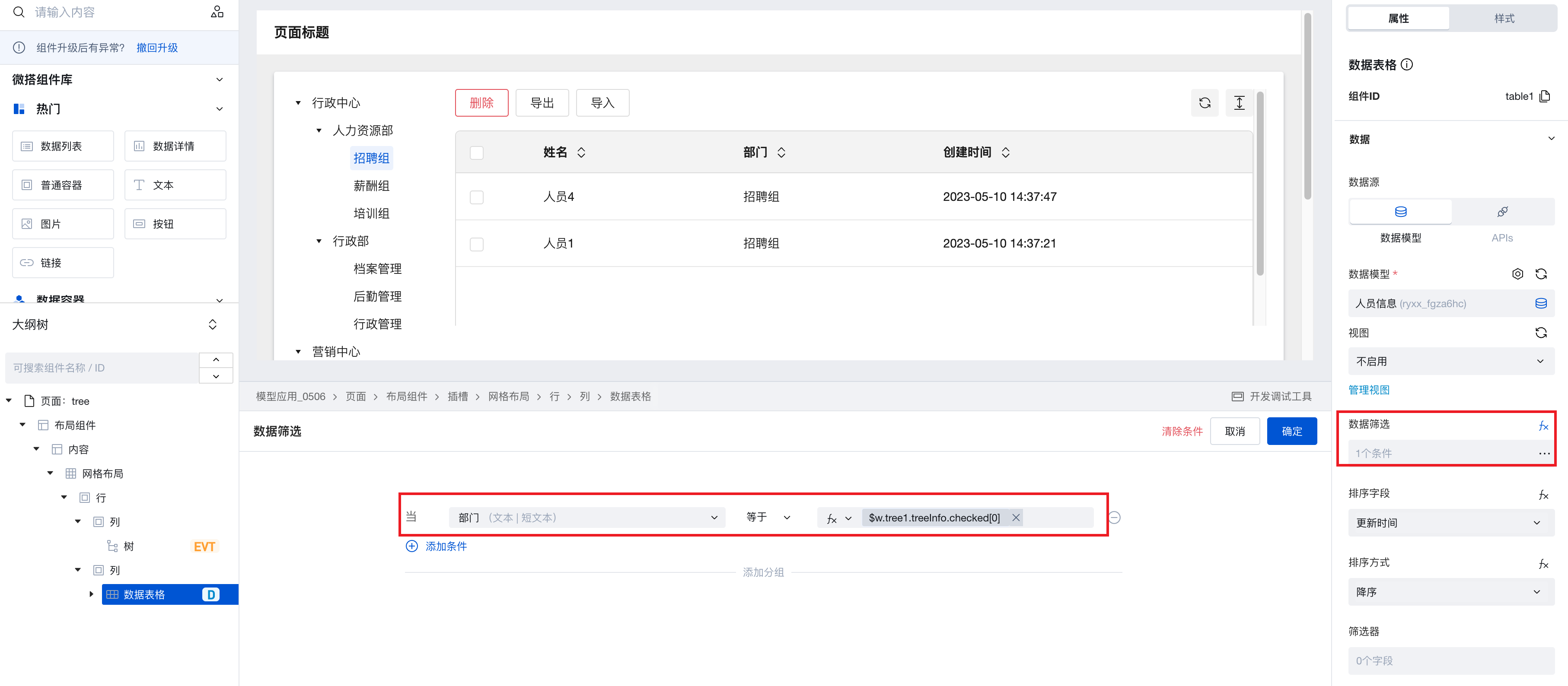
- When configuring the "selected node change" event for the tree component, trigger the refresh event of the personnel information table.
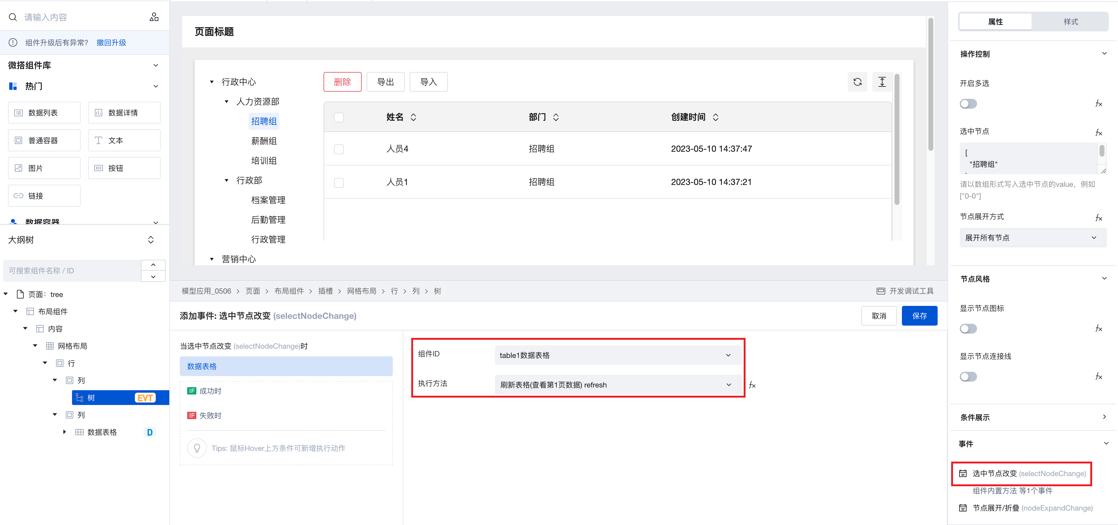
- After completing the above configurations, switch departments in the tree component to dynamically filter data in the personnel information table.
Search and Filter Tree Nodes
Taking the example of searching the organizational structure tree through a single-line input component for illustration:
-
Add a single-line input component to the page and hide its title; then add a tree component and configure organizational structure data as needed.
-
Configure the blur event of the single-line input component to trigger the tree component's node search method, writing the search content to $w.input1.value.
(This function is the expression syntax for obtaining component property API, where
$w.{form component id}.valuecan obtain the form value.)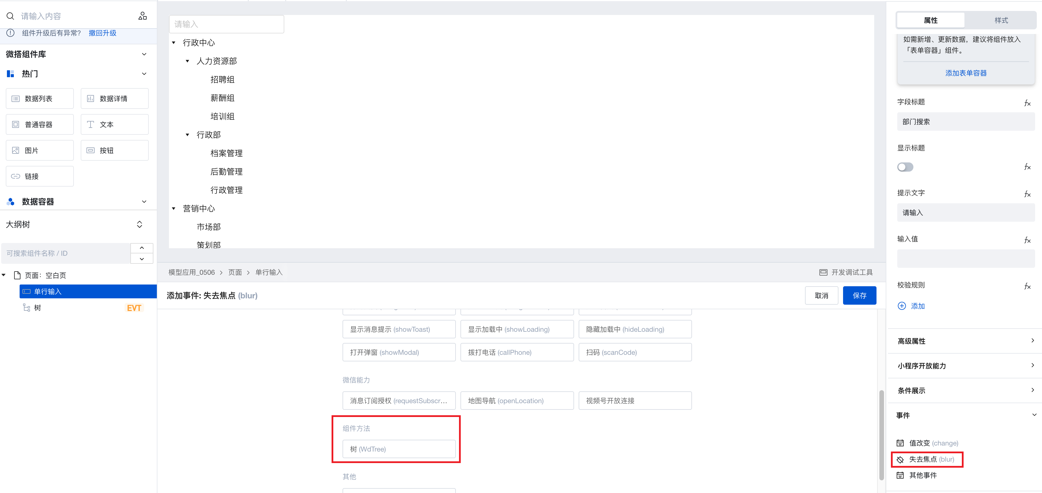
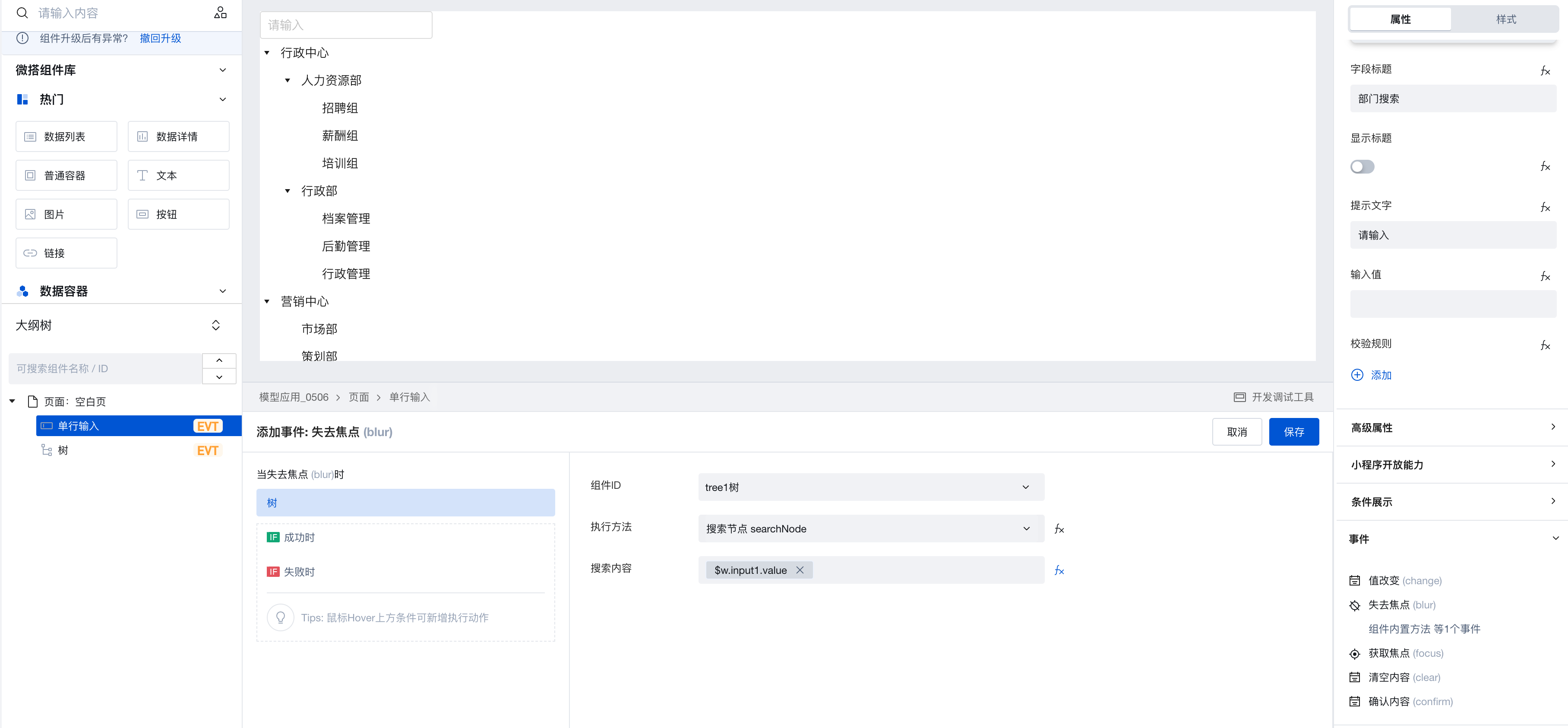
-
After completing the above configurations, enter a department name in the single-line input component. When the component loses focus, the tree component's nodes will be searched and filtered, with matching content automatically highlighted in red.
Tree Component Supports Scoped Slots
-
After the component is upgraded to 3.19.0, the tree component supports scoped slots. Select advanced properties and enable the slot, then the outline tree will add a content slot, allowing you to add custom content to the slot node.
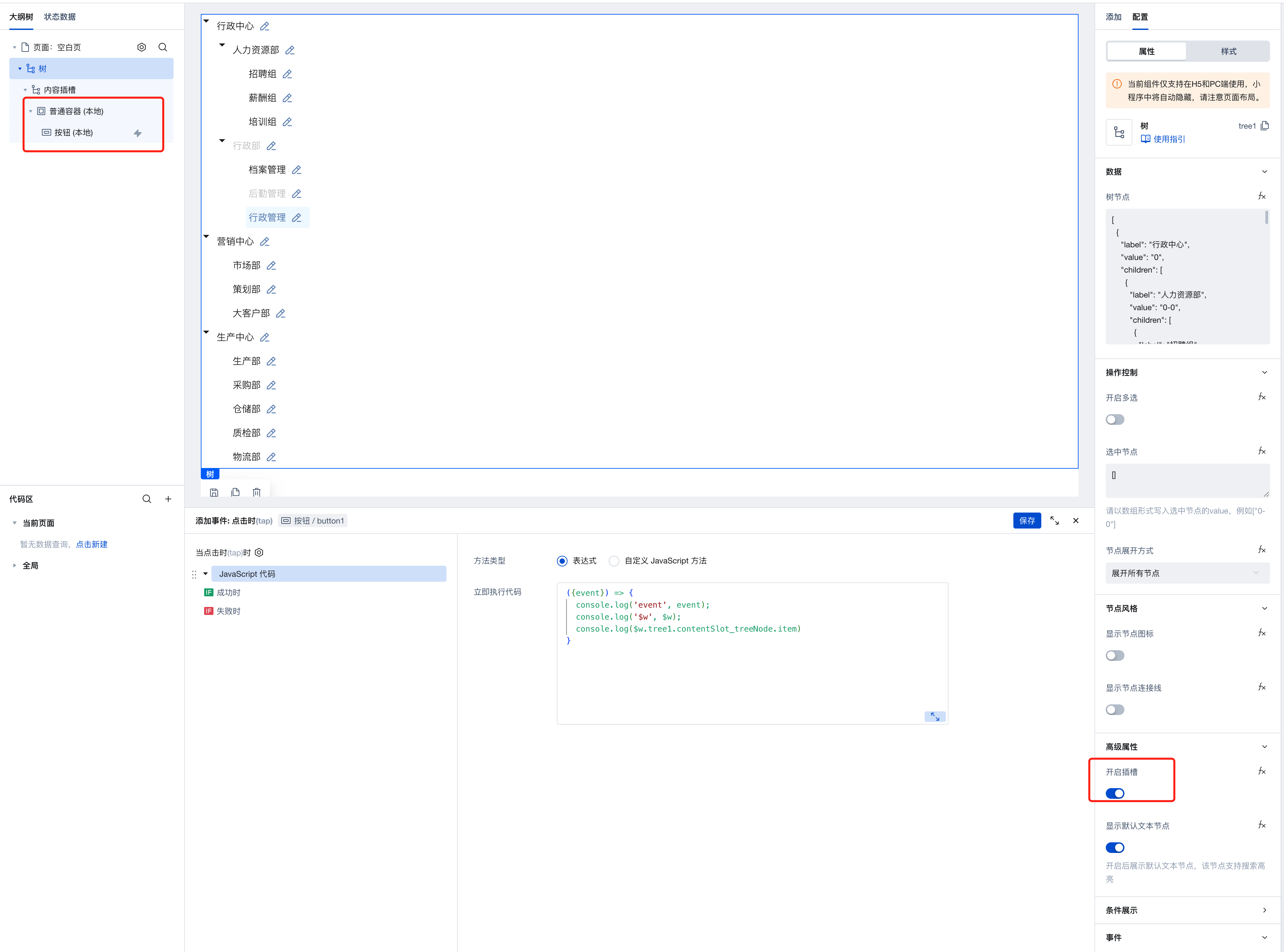
-
You can use the expression
$w.tree1.contentSlot_treeNode.itemto obtain detailed information of the tree node.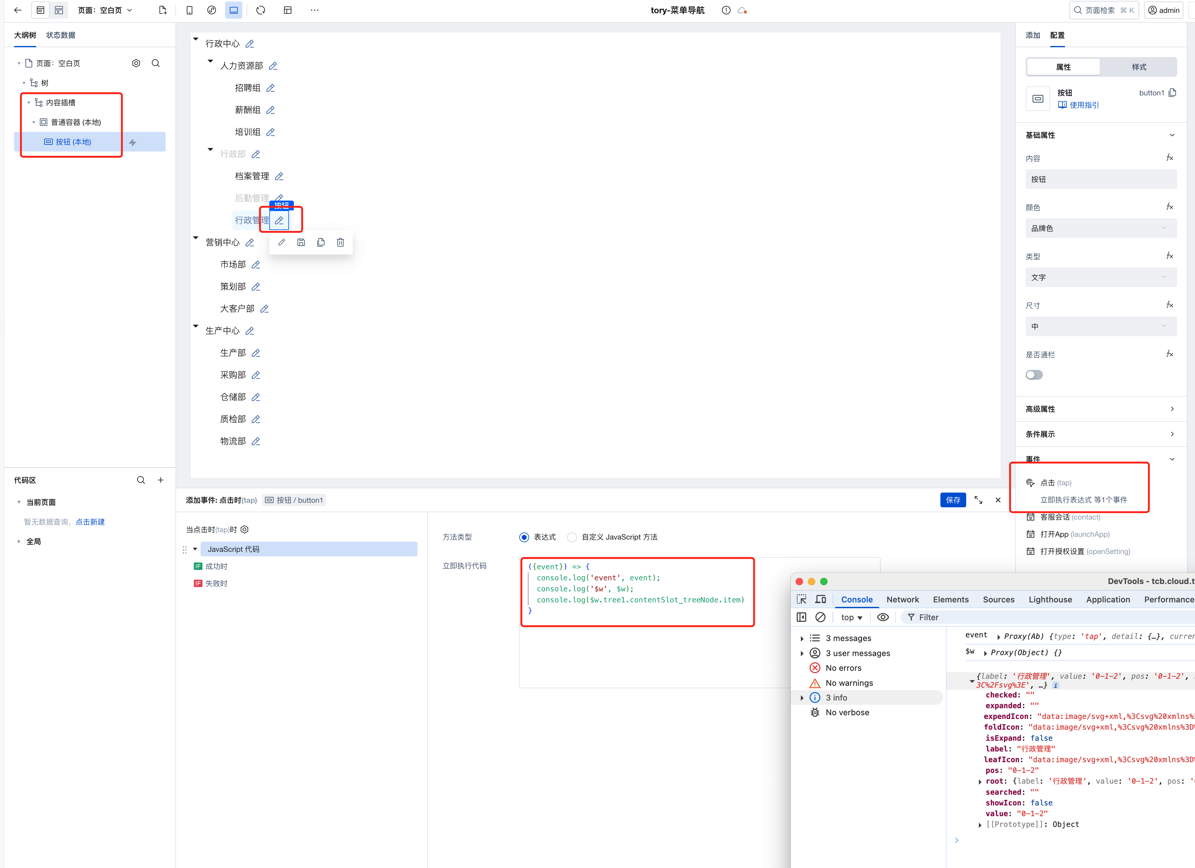
-
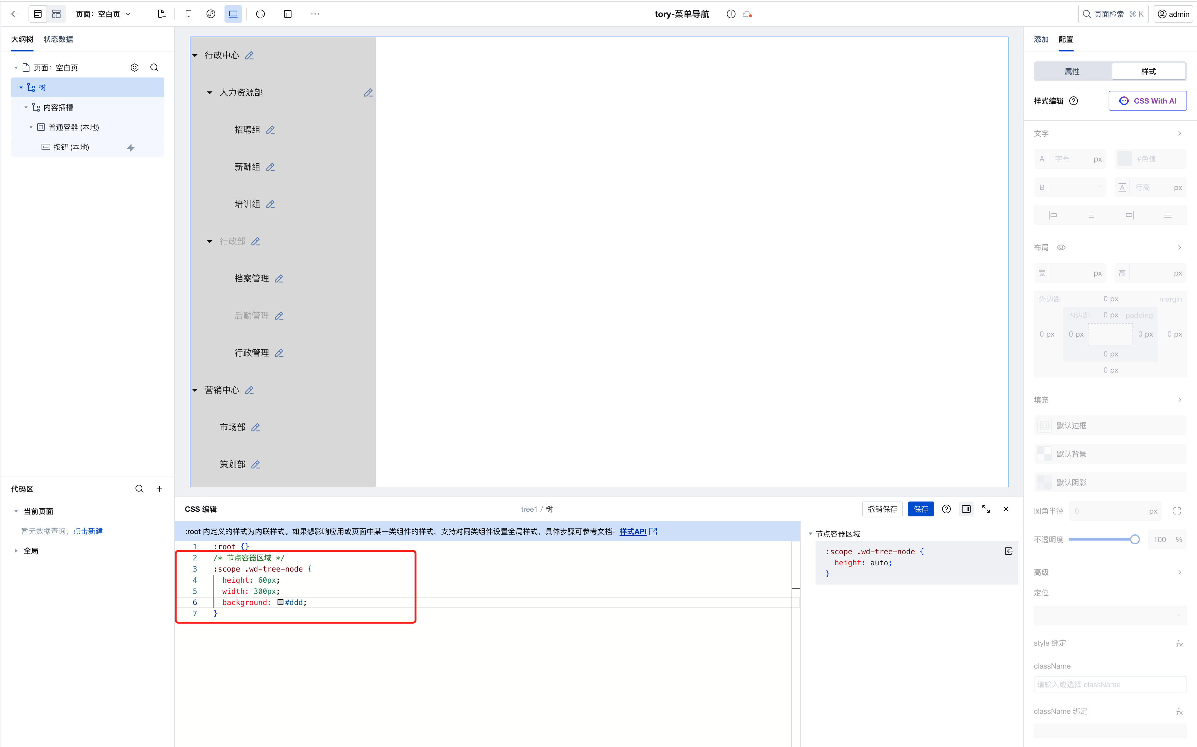
You can customize tree node styles via style APIs.
-
Default text nodes support search highlighting. You can disable this feature and customize the display via text nodes.
Property Description
External properties received by the component
Property Name | Property Identifier | Type | Description |
|---|
| Enable multiple selection | checkable | boolean | Once enabled, checkboxes will be shown to support multiple selections of nodes. Example: false |
| selected node | checkedCustom | array | 请以数组形式写入选中节点的value,例如["0-0"] Example: [] |
| Node expansion | expandType | string | Set the node expand mode for the tree component Example: "all" |
| unfolded nodes | expandCustom | array | Example: [] |
| display node icon | showIcon | boolean | When enabled, each node will display icons on the left side. Example: false |
| Fold node default icon | foldIcon | string | When a node is folded, the default display icon is set. If the node property provides a custom icon (foldIcon) parameter, it has a higher priority than the property. Example: "data:image/svg+xml,%3Csvg%20xmlns%3D%22http%3A%2F%2Fwww.w3.org%2F2000%2Fsvg%22%20width%3D%2214%22%20height%3D%2212%22%20viewBox%3D%220%200%2014%2012%22%20fill%3D%22none%22%3E%0A%20%20%20%20%20%20%20%20%3Cpath%20d%3D%22M0.5%201.5C0.5%200.947715%200.947716%200.5%201.5%200.5H4.42857H4.5906L4.72183%200.595029L6.66202%202H12.5C13.0523%202%2013.5%202.44772%2013.5%203V11C13.5%2011.5523%2013.0523%2012%2012.5%2012H1.5C0.947716%2012%200.5%2011.5523%200.5%2011L0.5%201.5ZM4.26655%201.5L1.5%201.5V11H12.5V3H6.5H6.33798L6.20675%202.90497L4.26655%201.5Z%22%20fill%3D%22black%22%20fill-opacity%3D%220.9%22%2F%3E%0A%20%20%20%20%20%20%20%20%3C%2Fsvg%3E" |
| Unfold node default icon | expendIcon | string | Set the default display icon when a node is unfolded. If the node property provides a custom icon (expendIcon) parameter, it has a higher priority than this property. Example: "data:image/svg+xml,%3Csvg%20xmlns%3D%22http%3A%2F%2Fwww.w3.org%2F2000%2Fsvg%22%20width%3D%2216%22%20height%3D%2216%22%20viewBox%3D%220%200%2016%2016%22%20fill%3D%22none%22%3E%0A%20%20%20%20%20%20%20%20%3Cpath%20d%3D%22M4.00594%207.01372C4.08104%206.82224%204.26574%206.69629%204.47142%206.69629H14.3231C14.6754%206.69629%2014.9172%207.05089%2014.7886%207.37886L12.5892%2012.9863C12.5141%2013.1778%2012.3294%2013.3037%2012.1237%2013.3037H2.27206C1.91976%2013.3037%201.67794%2012.9491%201.80658%2012.6211L4.00594%207.01372Z%22%20stroke%3D%22black%22%2F%3E%0A%20%20%20%20%20%20%20%20%3Cpath%20fill-rule%3D%22evenodd%22%20clip-rule%3D%22evenodd%22%20d%3D%22M0.789062%203.19629C0.789062%202.64401%201.23678%202.19629%201.78906%202.19629L5.39249%202.19629L7.46392%203.84701H11.7891C12.3413%203.84701%2012.7891%204.29472%2012.7891%204.84701V6.19629H11.7891V4.84701H7.1142L5.04278%203.19629L1.78906%203.19629V12.8017L6.78906%2012.8017V13.8017L1.78906%2013.8017C1.23678%2013.8017%200.789062%2013.354%200.789062%2012.8017V3.19629Z%22%20fill%3D%22black%22%20fill-opacity%3D%220.9%22%2F%3E%0A%20%20%20%20%20%20%20%20%3C%2Fsvg%3E" |
| leaf node default icon | leafIcon | string | Set the default display icon for leaf nodes. If the node property provides a custom icon (leafIcon) parameter, it has a higher priority than the property. Example: "data:image/svg+xml,%3Csvg%20xmlns%3D%22http%3A%2F%2Fwww.w3.org%2F2000%2Fsvg%22%20width%3D%2212%22%20height%3D%2214%22%20viewBox%3D%220%200%2012%2014%22%20fill%3D%22none%22%3E%0A%20%20%20%20%20%20%20%20%3Cpath%20d%3D%22M1.49534%200C1.02005%200%200.5%200.337268%200.5%200.921911V13.0781C0.5%2013.6627%201.02005%2014%201.49534%2014L10.5047%2014.0001C10.9799%2014.0001%2011.5%2013.6628%2011.5%2013.0782V4.70718C11.5%204.44196%2011.3946%204.18761%2011.2071%204.00007L7.5%200.292962C7.31246%200.105429%207.05812%207.22706e-05%206.7929%206.88434e-05L1.49534%200ZM6.50005%201.00007V5.01283H10.5V13.0001L1.5%2013V1L6.50005%201.00007ZM7.50005%201.70722L9.80565%204.01283H7.50005V1.70722Z%22%20fill%3D%22black%22%20fill-opacity%3D%220.9%22%2F%3E%0A%20%20%20%20%20%20%20%20%3C%2Fsvg%3E" |
| Display node connection | line | boolean | When enabled, connecting lines will display between nodes Example: false |
| Enable slot | isSupportSlot | boolean | Example: false |
| Display default text node | enableSearchText | boolean | Default value: true |
| Tree Node | data | array | Node data of the tree component Example: [ { "label": "行政中心", "value": "0", "children": [ { "label": "人力资源部", "value": "0-0", "children": [ { "label": "招聘组", "value": "0-0-0" }, { "label": "薪酬组", "value": "0-0-1" }, { "label": "培训组", "value": "0-0-2" } ] }, { "label": "行政部", "value": "0-1", "disabled": true, "children": [ { "label": "档案管理", "value": "0-1-0" }, { "label": "后勤管理", "value": "0-1-1", "disabled": true }, { "label": "行政管理", "value": "0-1-2" } ] } ] }, { "label": "营销中心", "value": "1", "children": [ { "label": "市场部", "value": "1-0" }, { "label": "策划部", "value": "1-1" }, { "label": "大客户部", "value": "1-2" } ] }, { "label": "生产中心", "value": "2", "children": [ { "label": "生产部", "value": "2-0" }, { "label": "采购部", "value": "2-1" }, { "label": "仓储部", "value": "2-2" }, { "label": "质检部", "value": "2-3" }, { "label": "物流部", "value": "2-4" } ] } ] |
Event Description
Events exposed by the component. You can listen to component events to trigger external actions
Event Name | Event Code | Event Output Parameters event.detail | Applicable Scenarios | Description |
|---|
| selected node altered | selectNodeChange | object
| Mobile,PC | Trigger when the selected data changes, output the selected node data |
| Node unfold/fold | nodeExpandChange | object
| Mobile,PC | Triggered when a user unfolds/folds a node, with the unfolded/folded node data as output. |
Properties API
Through the Property API, you can access the internal state and property values of components. You can access internal values using$w.componentId.propertyName, such as $w.input1.value. For details, please refer to Property API
Read-only Property Name | Property Identifier | Type | Description |
|---|
| Tree Node | data | array | Node data of the tree component |
| Enable multiple selection | checkable | boolean | Once enabled, checkboxes will be shown to support multiple selections of nodes. |
| Selected node list | checkedNodes | array | |
| Unfolded node list | expandedNodes | array | |
| selected node | checkedCustom | array | 请以数组形式写入选中节点的value,例如["0-0"] |
| Node expansion | expandType | string | Set the node expand mode for the tree component |
| unfolded nodes | expandCustom | array | |
| display node icon | showIcon | boolean | When enabled, each node will display icons on the left side. |
| Fold node default icon | foldIcon | string | When a node is folded, the default display icon is set. If the node property provides a custom icon (foldIcon) parameter, it has a higher priority than the property. |
| Unfold node default icon | expendIcon | string | Set the default display icon when a node is unfolded. If the node property provides a custom icon (expendIcon) parameter, it has a higher priority than this property. |
| leaf node default icon | leafIcon | string | Set the default display icon for leaf nodes. If the node property provides a custom icon (leafIcon) parameter, it has a higher priority than the property. |
| Display node connection | line | boolean | When enabled, connecting lines will display between nodes |
| Current tree information | treeInfo | object | Tree information after user operations |
| Flat structure of the current tree | treeNodeList | array |
Method API
Through the Method API, you can programmatically trigger internal methods of components, such as submitting forms, displaying popups, etc. You can call component methods using $w.componentId.methodName, such as $w.form1.submit()
Method Name | Method Identifier | Parameters | Method Description |
|---|
| search node | searchNode | object
| search value |
Style API
Through the Style API, you can override the styles of internal elements in components to achieve customization. For example, in the low-code editor, you can write styles for all button components using #wd-page-root .wd-btn, and control individual component styles with :scope. For detailed instructions, please refer toStyle API
Name | Class Name | Description and Examples |
|---|
| root element | .wd-tree | tree component root element |
| PC-side component root element | .wd-pc-tree | Write styles for buttons on the PC side |
| H5 component root element | .wd-h5-tree | Write styles for buttons on the H5 side |
| Unfold/Fold Arrow | .wd-tree__switcher | Unfold/fold arrow style |
| Display tag | .wd-tree__label-text | Display tag style |
| Click the node background | .wd-tree-node.is-selected | User click node tag style |
| connecting line | .wd-tree--line | Show line style |
| Container zone of the node | .wd-tree-node | Write styles for the node container |