Grid Layout
Grid
Applicable Scenarios
Grid Layout (Grid) is the most powerful layout solution. It allows specifying the positions of multiple components within a container.
It divides the page into grid cells, allowing free combination of these cells to create diverse layouts.
Previously, effects that could only be achieved by nesting multiple ordinary containers layer by layer can now be directly implemented, realizing two-dimensional layout.
Basic Features
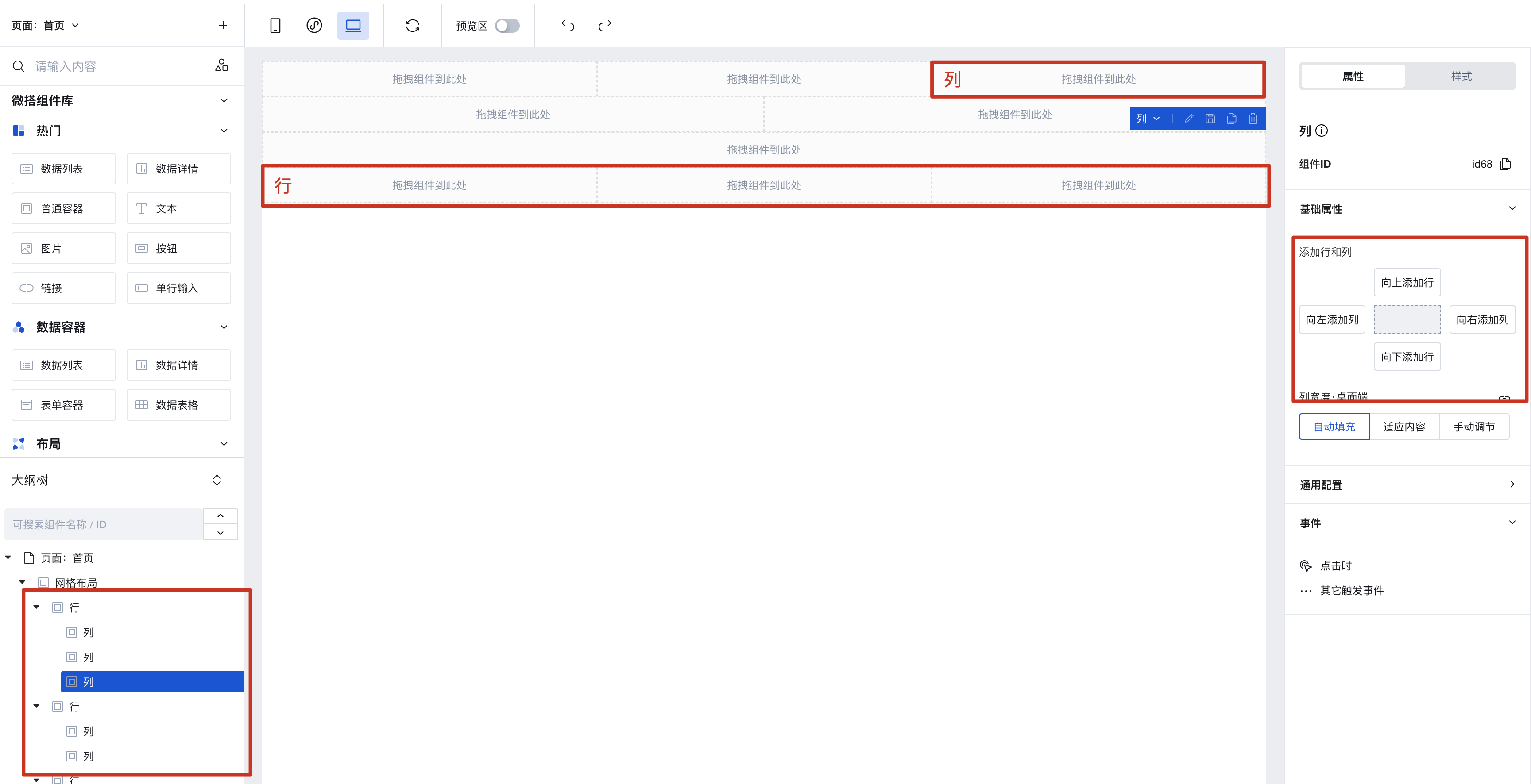
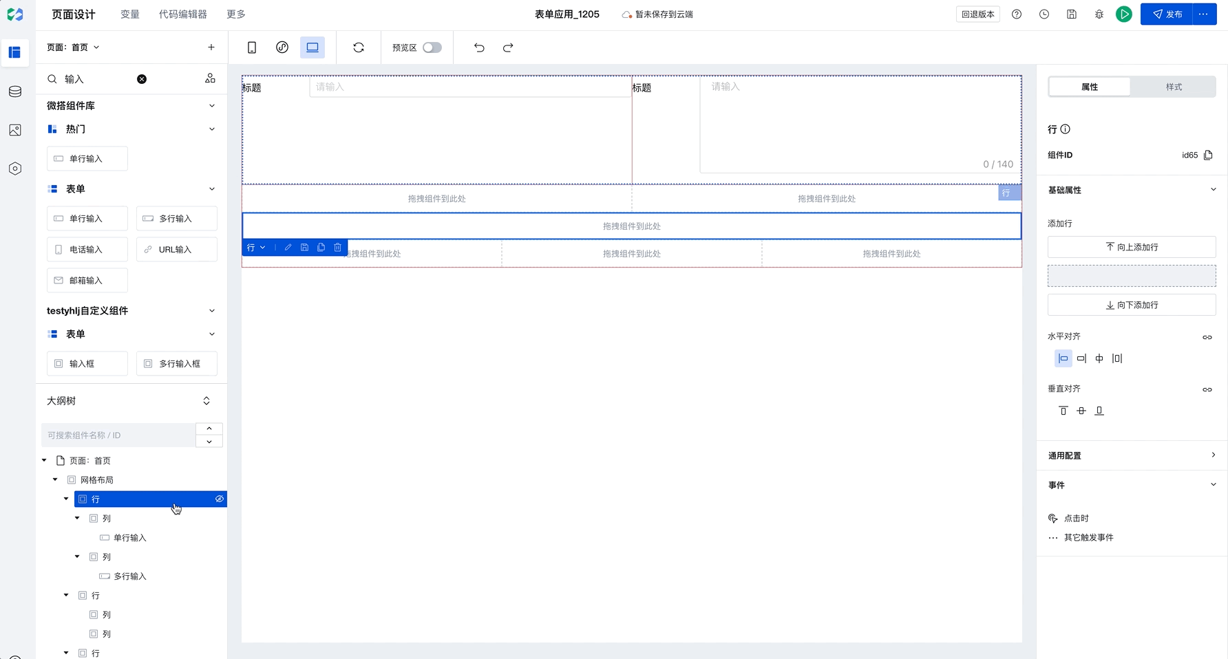
Add Rows and Columns
Grid Layout is divided into "rows" and "columns". You can quickly add rows and columns on the right, then drag components into a "column".
Batch Copy Row and Column Styles
When you have selected a column and click to add rows or columns, newly added components will copy the style of the selected row or column by default, as shown below:
This capability will significantly improve batch setting efficiency. Only need to configure once to apply to multiple rows and columns in batches. For example, in Chinese-style forms, simply set the border for the first row, then select the current column and click to add rows or columns to batch copy styles, improving configuration efficiency.
Setting Spacing
The Grid Layout component supports batch setting of row spacing and column spacing, with several default presets built-in.
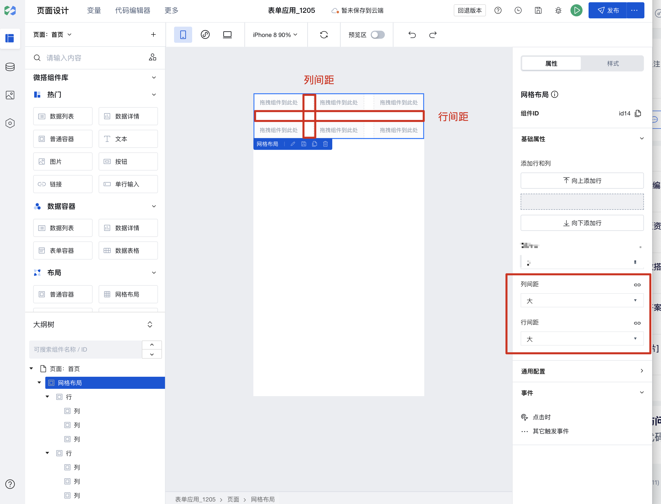
If the default margins do not meet your needs, you can also select a row or column, switch to the style configuration, and set the padding and margins for rows and columns.
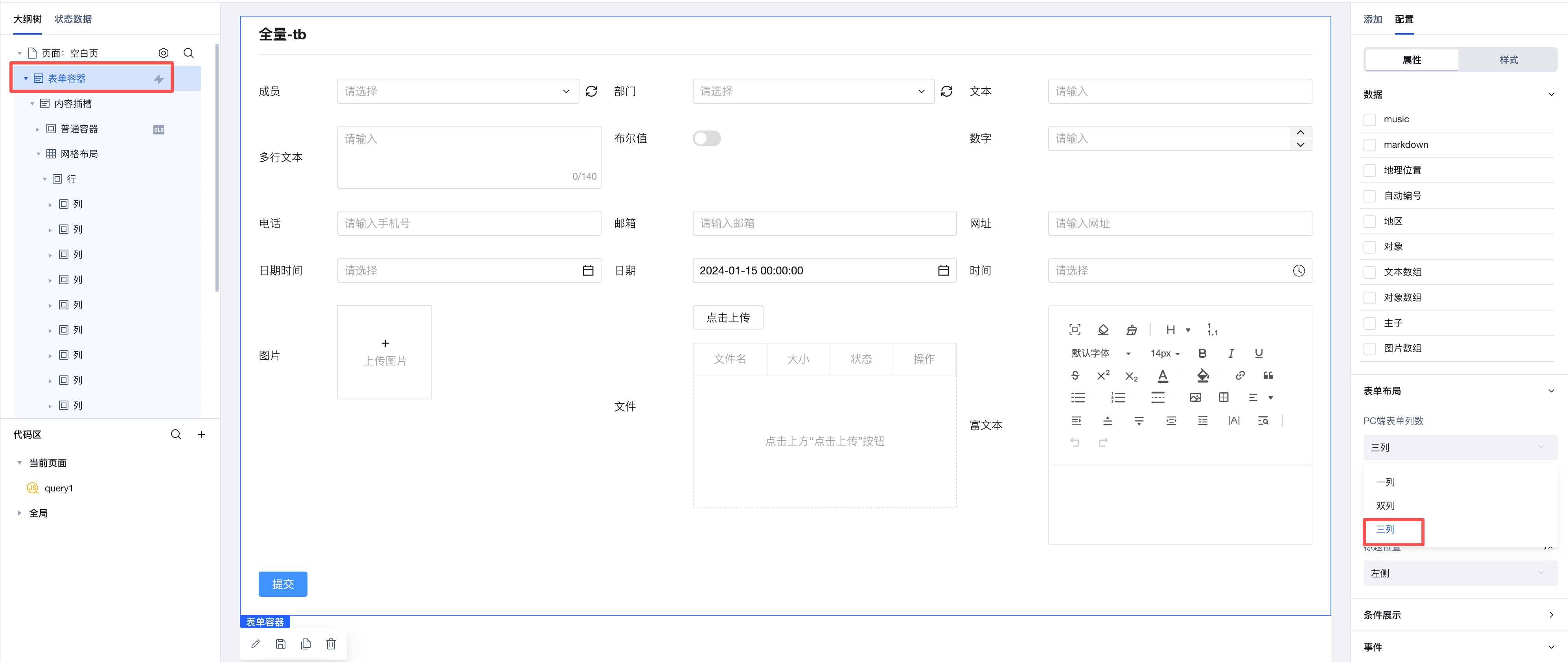
Setting Column Width (Multi-end Adaptation)
Each row of the Grid Layout component has been set to Flex layout.
Three Adjustment Methods for Multi-end Column Width
The column width setting shows the currently active device at the top, allowing different widths to be set for mobile and PC.
- Auto-fill
The column will distribute the remaining width equally. Since the row uses flex layout, setting "Auto-fill" means setting "flex: 1".
- Fit Content
It means that the column width follows the content width. When the content width is 100px, the column width will be 100px.
- Manual Operation
Allows specifying manual column width settings. In grid layout, each row is divided into 12 columns. When you set a column to span 2 columns, its width becomes 2/12 of the row width. Columns exceeding 12 columns will wrap automatically.
Example: Column Settings for Form Scenarios Across Different Devices
At the top of the column width setting, it shows the currently active device end. Mobile and PC set different column widths.
Step 1: Configure Two Columns for PC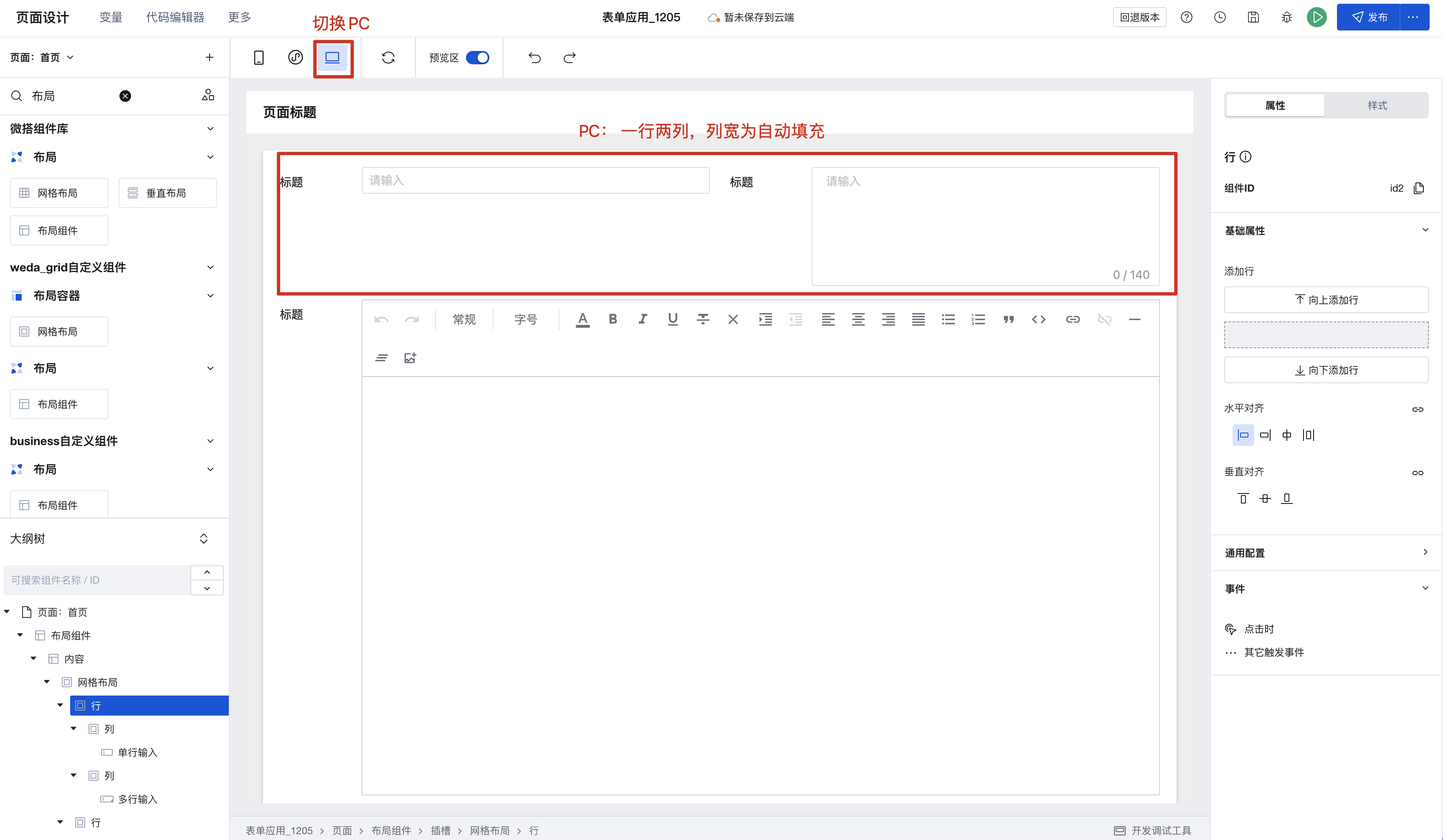 Step 2: Configure Mobile Display with Automatic Wrapping
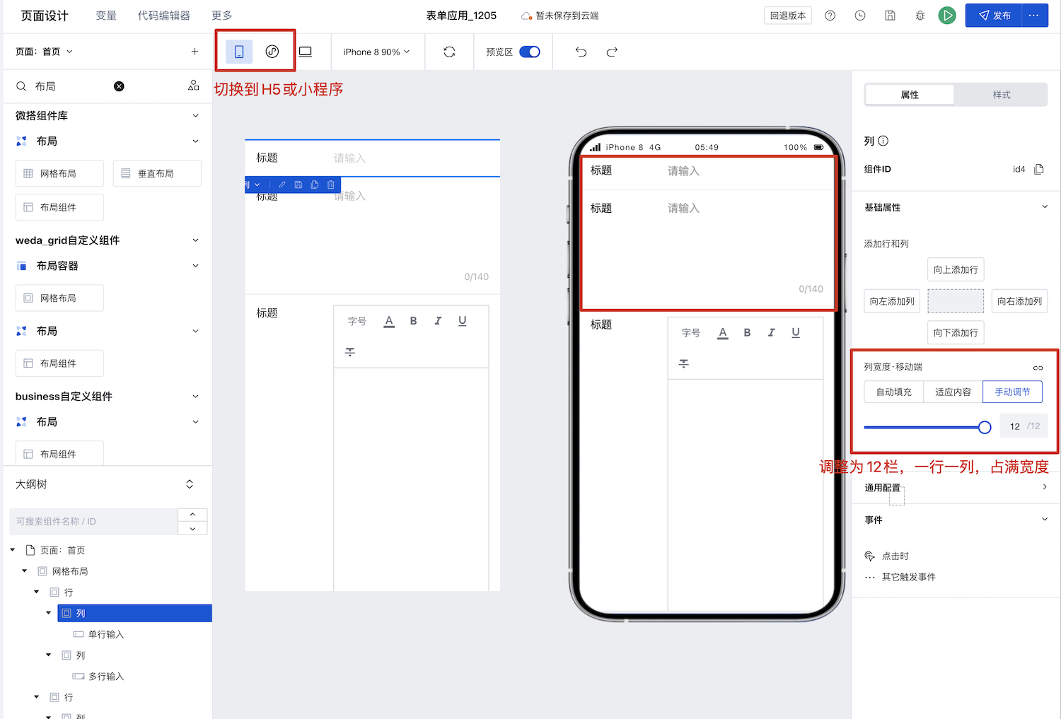
Set Horizontal and Vertical Alignment
The grid layout component itself is a regular container div. Rows are set to flex by default, making them flex containers, while columns are container items (flex items). Therefore, horizontal and vertical alignment of columns can be configured at the row level.
1. Set Vertical Alignment for Rows (align-items)
When the heights of multiple columns in a row are inconsistent, vertical alignment can be set.
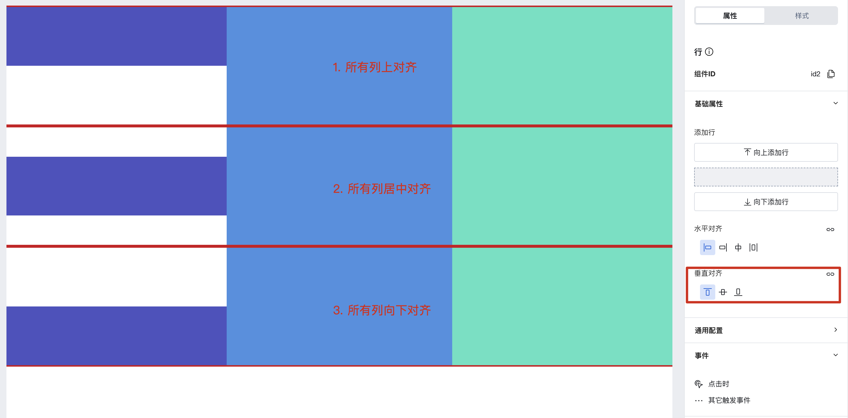
Row height is determined by content by default, but can also be set in the style panel.
3. Column Alignment Settings
A column is a standard container component. Alignment can be configured in the style panel, as described in the Common Style Settings section below.
General Style Settings
Grid layout containers, rows, and columns are standard components with layout capabilities. Their layout, borders, shadows, and other properties can be configured in the style panel.
Usage Example
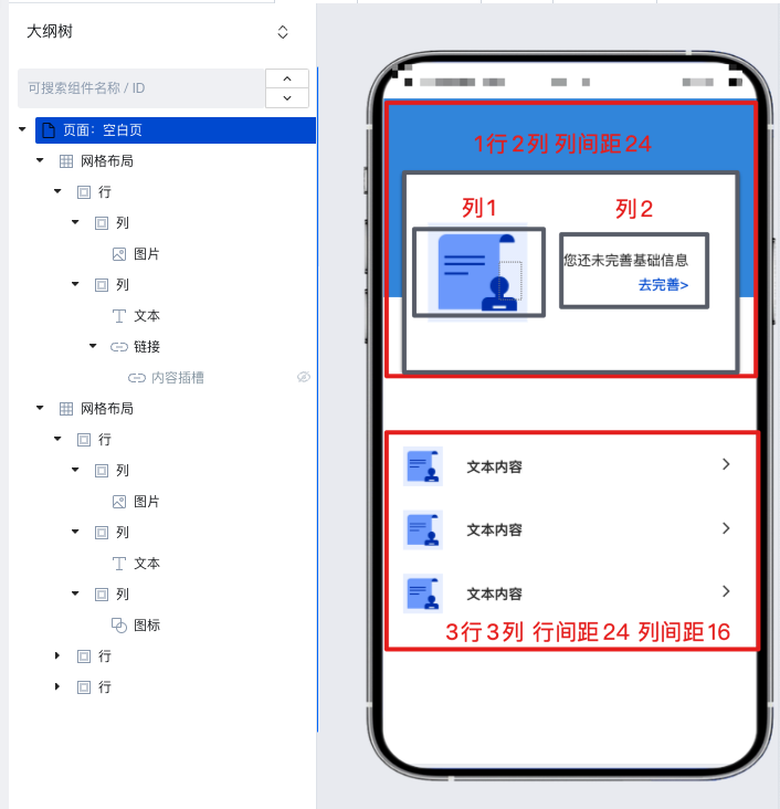
Example 1: Implement Multi-column Layout Per Row for Forms in 3 Minutes
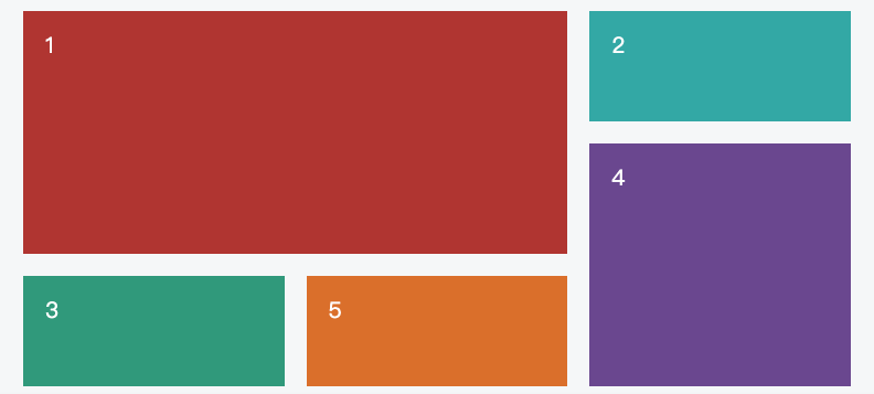
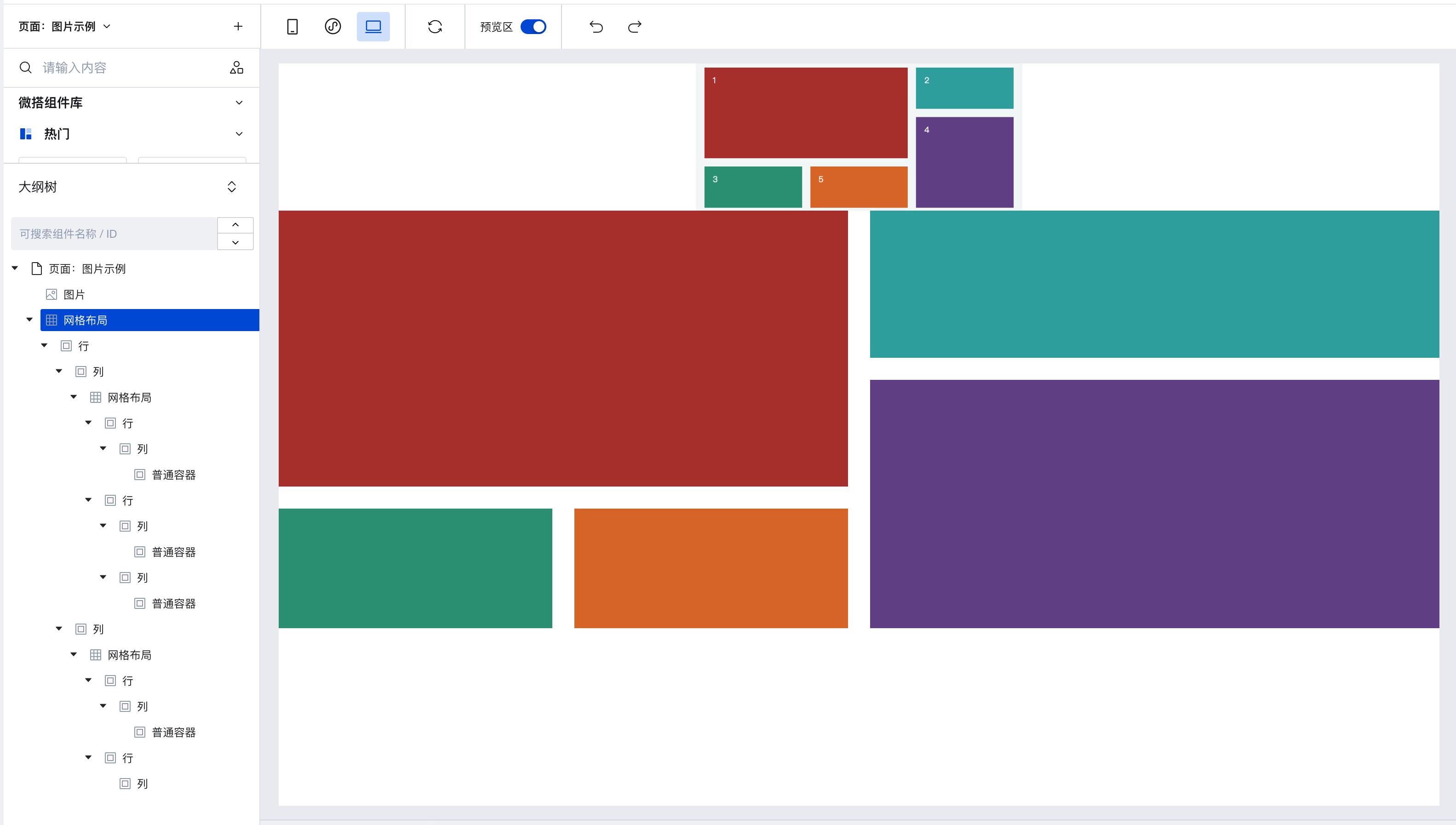
Example 2: Implement a Visitor Appointment Homepage with Grid Layout in 6 Minutes
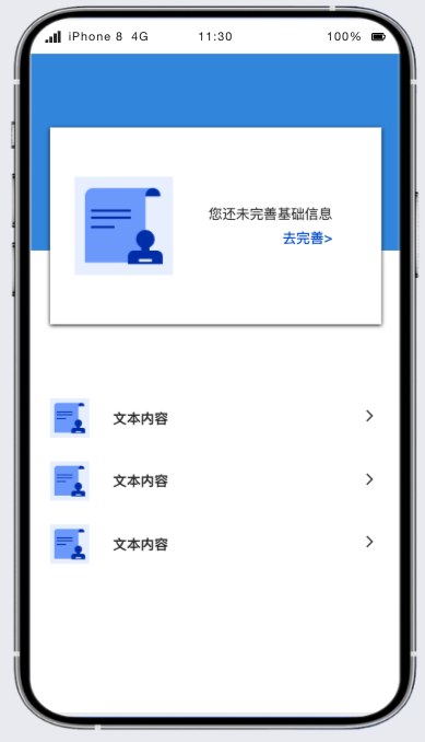
First, decompose the page using a grid layout. You can see that the page can be divided into upper and lower parts. Since the row spacing differs between the upper and lower areas, we implement this with two grid layouts. The upper part is 1 row by 2 columns, and the lower part is 3 rows by 3 columns. Combined with the padding and margin settings in the style panel, the implementation video is as follows:
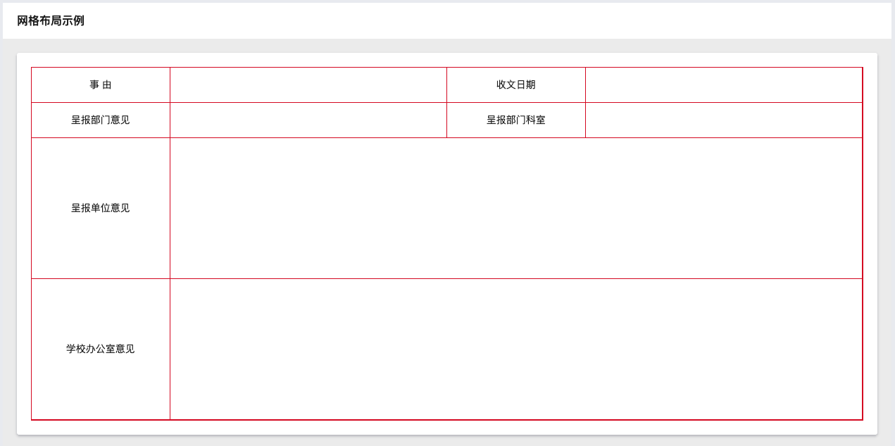
Example 2: How to Recreate a Table Using Grid Layout
The row height is determined by content by default, but can also be set in the style panel.
Implementation Details
Overall, it references the bootstrap grid system implemented based on flexbox
The Row component is a display: flex container that configures the horizontal alignment and vertical alignment of the columns inside it via justifyContent and alignItems, respectively.
The Col is a flex item that can only be placed inside a Row. It can be divided into three types corresponding to different forms of column widths.
- Auto-fill At this time,
flex-growis set to1, so the Col will automatically fill the width and equally share the remaining space with other auto-filled Cols. - Fit Content At this time, both
flex-growandflex-shrinkare set to0, andflex-basisandwidthare set toauto, so the width of the Col will automatically adapt to the content. - Manual Adjustment In this case, a fixed percentage width is set based on the 12-column layout.
By differentiating screen widths through media query, device-specific configuration is implemented.
The Grid is a container that controls the gaps between rows and columns by setting CSS custom properties.
/* Column spacing is implemented using Col padding-(left / right) */
--wd-grid-gutter-x: 2rem;

/*
The line break spacing between columns when a line break occurs within a row
Consistent with bootstrap, it is implemented using the margin-top of Col, while applying a negative margin on the Row to eliminate extra spacing within the line.
*/
--wd-grid-gutter-y: 0px;

/*
The spacing between rows and rows,
It is achieved by setting the margin-bottom for Rows that are not the last-child.
*/
--wd-grid-gutter-rb: 0px;
Style API
Grid
Through the Style API, you can override the styles of internal elements in components to achieve customization. For example, in the low-code editor, you can write styles for all button components using #wd-page-root .wd-btn, and control individual component styles with :scope. For detailed instructions, please refer toStyle API
Name | Class Name | Description and Examples |
|---|
| root element | .wd-grid | grid layout component root element |
| PC-side root element | .wd-pc-grid | grid layout component PC root element |
| H5 root element | .wd-h5-grid | grid layout component H5 root element |
| Mini program root element | .wd-mp-grid | grid layout component WeChat Mini Program root element |
Row
Through the Style API, you can override the styles of internal elements in components to achieve customization. For example, in the low-code editor, you can write styles for all button components using #wd-page-root .wd-btn, and control individual component styles with :scope. For detailed instructions, please refer toStyle API
Name | Class Name | Description and Examples |
|---|
| root element | .wd-grid-row | Row component root element |
| PC-side root element | .wd-pc-grid-row | Root element of the PC component |
| H5 root element | .wd-h5-grid-row | Component H5 root element |
| Mini program root element | .wd-mp-grid-row | Row component Mini program Root element |
Column
Through the Style API, you can override the styles of internal elements in components to achieve customization. For example, in the low-code editor, you can write styles for all button components using #wd-page-root .wd-btn, and control individual component styles with :scope. For detailed instructions, please refer toStyle API
Name | Class Name | Description and Examples |
|---|
| root element | .wd-grid-col | List component root element |
| PC-side root element | .wd-pc-grid-col | Root element of PC components |
| H5 root element | .wd-h5-grid-col | Component H5 root element |
| Mini program root element | .wd-mp-grid-col | List component Mini program Root element |
Properties API
Grid
Through the Property API, you can access the internal state and property values of components. You can access internal values using$w.componentId.propertyName, such as $w.input1.value. For details, please refer to Property API
Read-only Property Name | Property Identifier | Type | Description |
|---|
| column spacing | gutterX | string | |
| line spacing | gutterY | string |
Row
Through the Property API, you can access the internal state and property values of components. You can access internal values using$w.componentId.propertyName, such as $w.input1.value. For details, please refer to Property API
Read-only Property Name | Property Identifier | Type | Description |
|---|
| Number of columns | colCount | number | |
| column spacing | gutterX | string | Take effect on all columns of the current row. After configuration, it will override the attributes of the parent grid layout. |
| vertical alignment | alignItems | string |
Column
Through the Property API, you can access the internal state and property values of components. You can access internal values using$w.componentId.propertyName, such as $w.input1.value. For details, please refer to Property API
Read-only Property Name | Property Identifier | Type | Description |
|---|
| Mobile terminal column width | widthType | string | |
| PC column width | lgWidthType | string |
Frequently Asked Questions
What is the difference between Generic Container / Grid Layout / Scroll Container?
Generic Container/Grid Layout/Scroll Container are three commonly used container types in WeDa. Their differences are as follows:
- Generic Container: The Generic Container is the most basic container type, used to carry text, images, and other content on the page. It can nest other components and achieve different layout effects by setting styles. By default, it does not have a scrolling feature. If the content does not have a height set, it will automatically expand. Similar to
Viewin mini-programs anddivon the Web. - Grid Layout: Grid Layout is a container used for layout, expanding flexible layout functions based on ordinary containers. It divides the page into grids, allowing arbitrary combination of different grids to create various layouts, such as left-right layouts and multi-column rows. It also supports displaying different layouts on multiple devices.
- Scroll Container: A container with scroll bars. After setting width and height, if the content exceeds the container's boundaries, users can scroll through the content within it. Similar to
ScrollViewin mini-programs.
In actual development, it is recommended to use Grid Layout for detailed arrangements of entire pages and internal modules. For multi-device requirements, you can configure display effects across different platforms. When content exceeds the visible area, implement scrolling functionality using Scroll Container.
How to Implement Partial Scrolling?
Scroll Container can be used to display content that requires scrolling when it exceeds boundaries.
When the total width/height of the component content within a scroll container exceeds the Scroll Container's own width/height, scroll bars will appear, allowing users to view all content within the container by scrolling through these bars.
Note that you must set the width and height for the Scroll Container to ensure that the dimensions of the internal content exceed those of the container, enabling the scrolling effect.
To achieve horizontal scrolling only, ensure that the width of the Scroll Container is less than the width of the content within it.
To achieve vertical scrolling only, ensure that the height of the Scroll Container is less than the height of the content within it.