Carousel Container
Swiper
Applicable Scenarios#
For quick page building with a carousel display effect, supporting carousel redirection and playback configuration.
Basic Features
Carousel Container Default Display
In scenarios requiring carousel content management using data, the Carousel Container component can be used. The procedure is as follows:
-
Add a Carousel Container component to the editing area; you can see that image components are automatically generated under the Carousel Container.
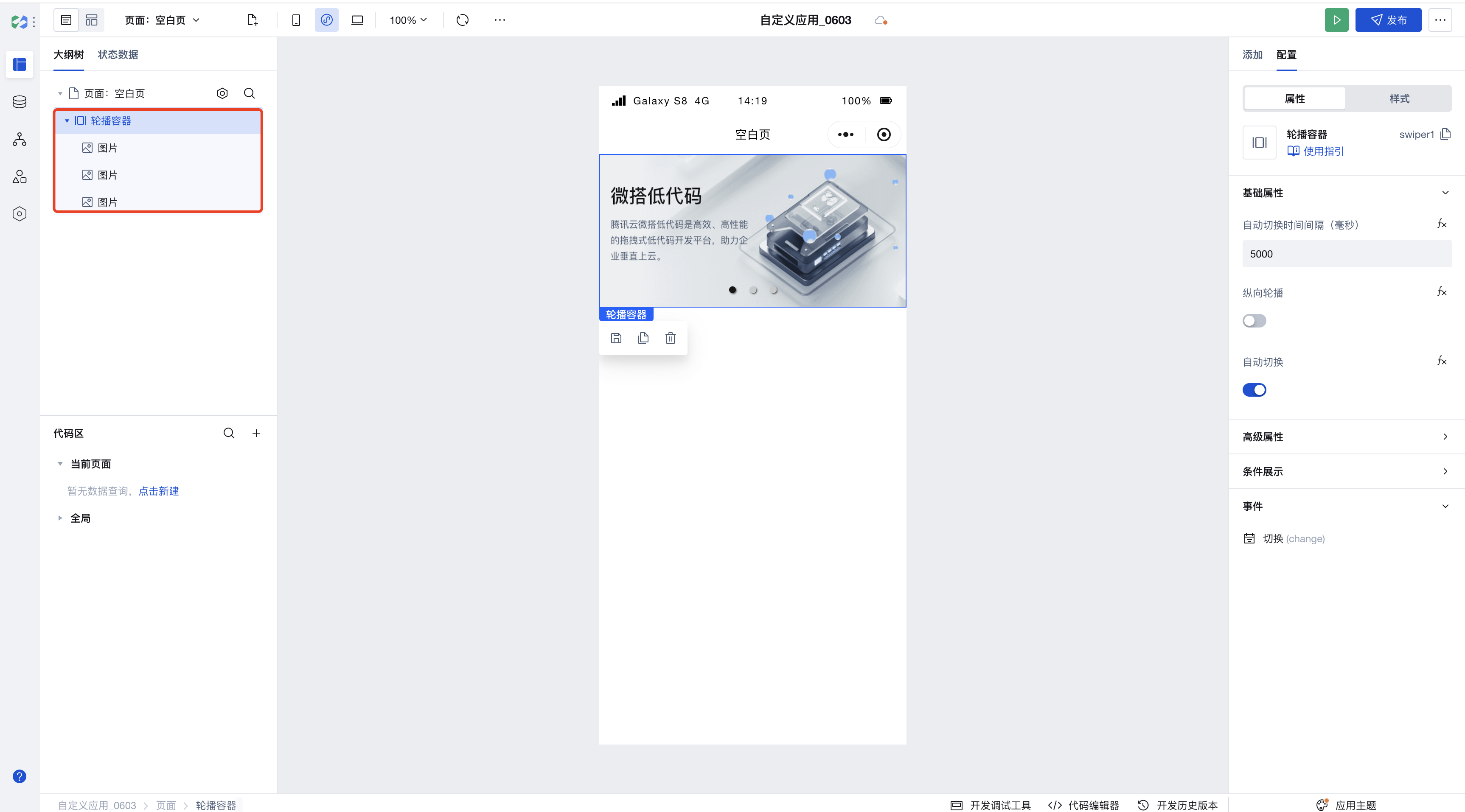
-
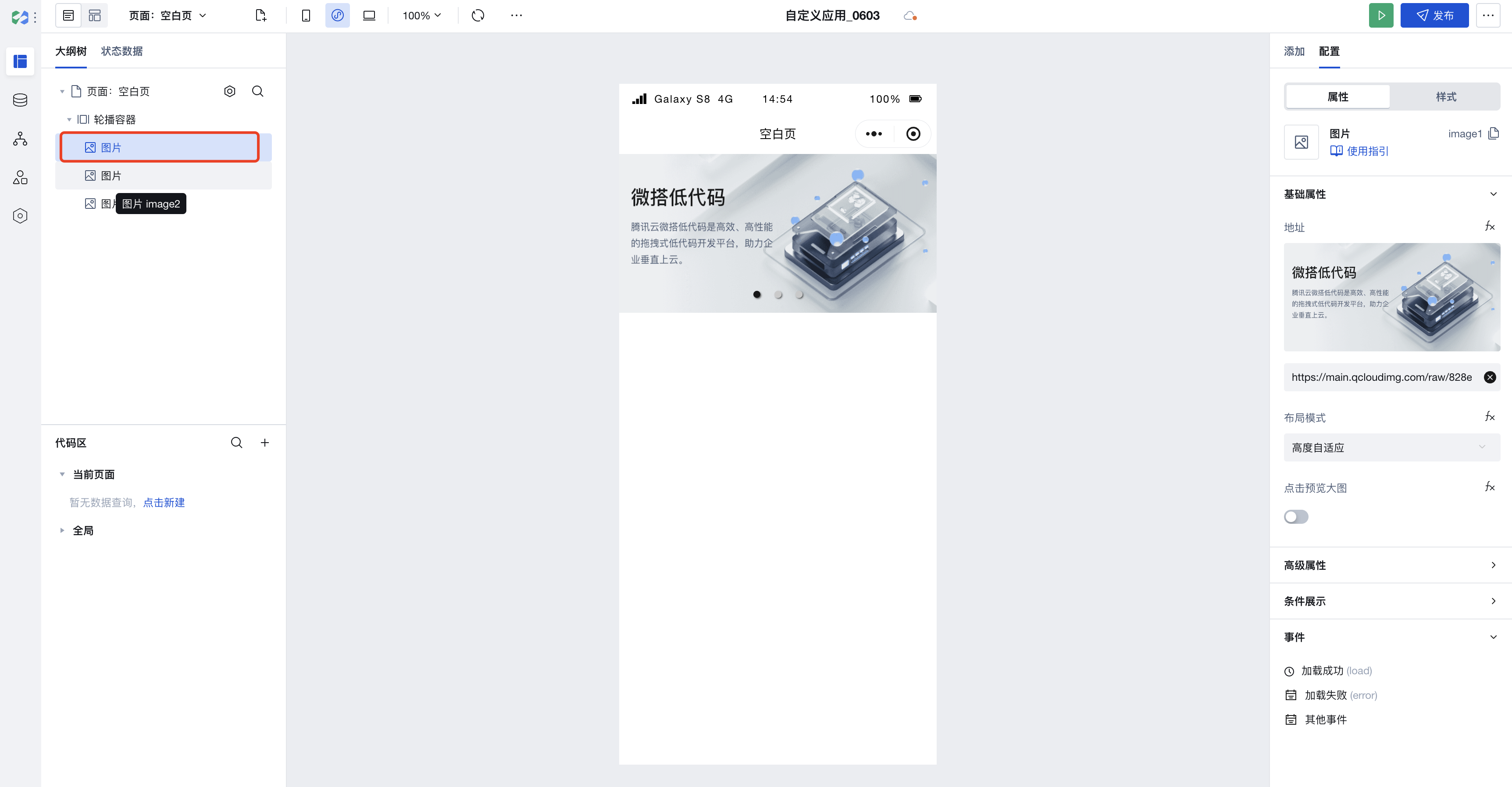
Click the image component under the Carousel Container to modify the image information.
-
For more carousel features, use the Carousel component.
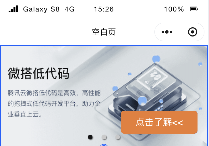
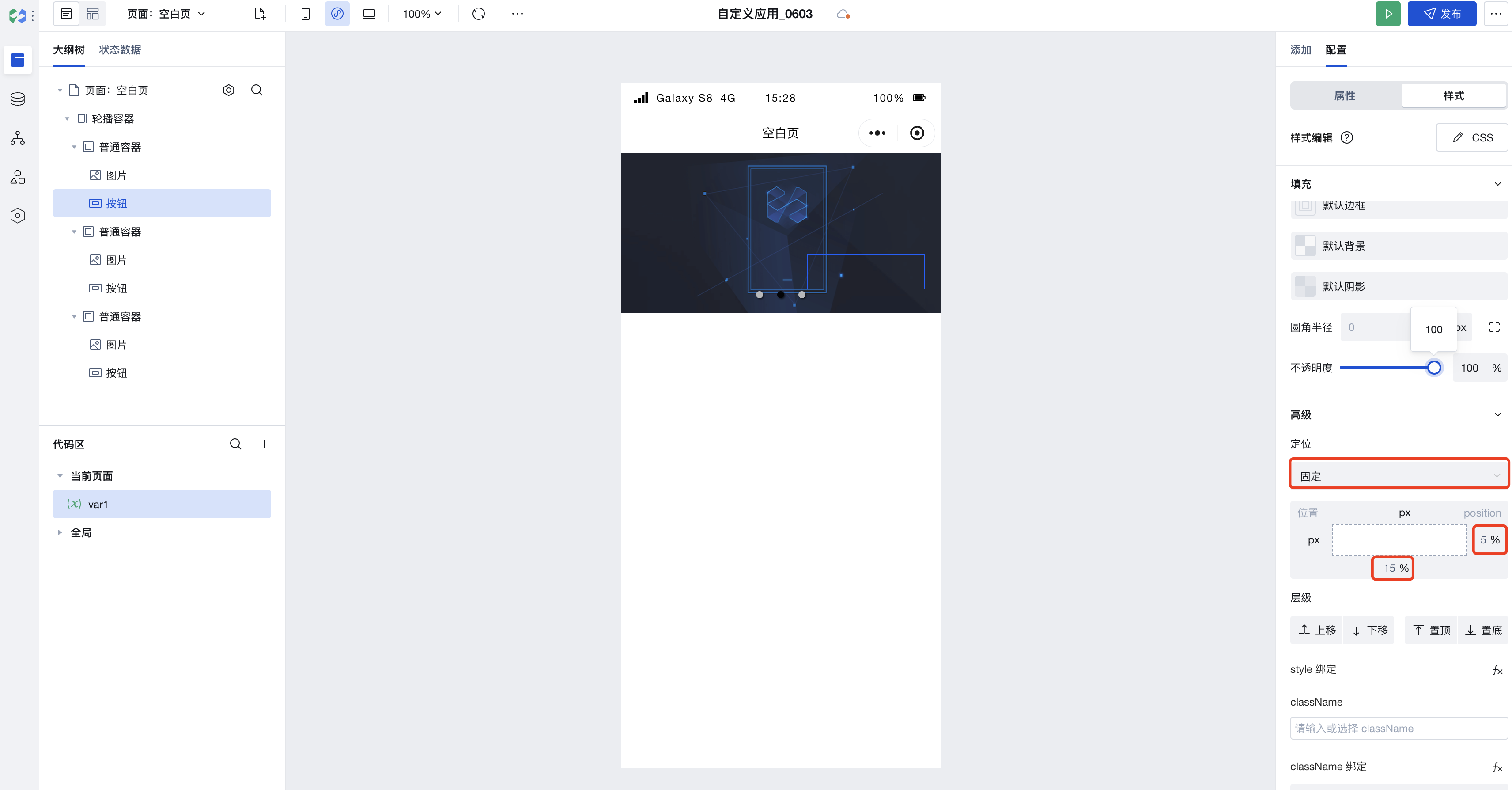
Implementing Advanced Carousel Scenarios with Carousel Container
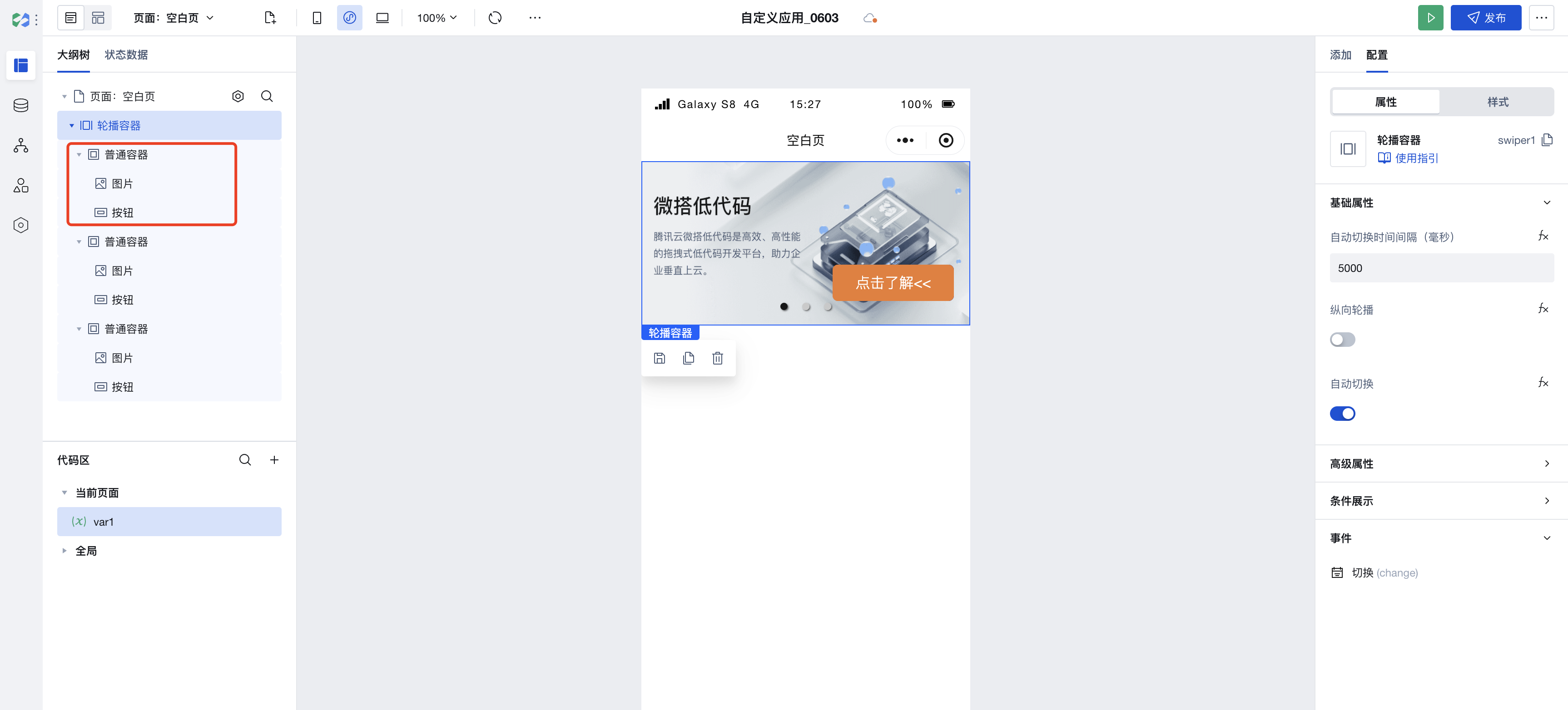
We can use the Carousel Container to implement more complex carousel scenarios, as shown below:
-
Add a regular container component under the child node of the Carousel Container, then add image and button components under the child node of the regular container component.
-
Set the positioning mode of the button component to fixed, then adjust its position to achieve similar complex carousel scenarios.
Properties
External properties received by the component
Property Name | Property Identifier | Type | Description |
|---|
| Anchor active color | indicatorActiveColor | string | Change the color of the anchor when selected Example: "rgba(0, 0, 0, 0.9)" |
| Anchor color | indicatorColor | string | Change the color of the anchor in regular status Example: "rgba(200, 200, 200, 0.9)" |
| Sliding animation duration | duration | number | Change the sliding animation duration of the carousel during switching Example: 500 |
| Current slider index | current | number | Change the default display position of the carousel. 0 displays the first image by default, and so on. Example: 0 |
| transition slide(Mini Program) | circular | boolean | whether to use transition sliding Example: true |
| Navigation anchor | indicatorDots | boolean | Enable/disable carousel anchor Example: true |
| rendering mode(Mini Program) | layoutType | string | Rendering mode Mini program Skyline unique attributes Example: "normal" |
| Specify animation type(Mini Program) | transformType | string | Specify the animation type when layout-type is transformer, a unique attribute of the mini program Skyline Example: "scaleAndFade" |
| Margin before the current item(Mini Program) | previousMargin | string | Margin before the current item, applicable to partially reveal the previous item, accepts px and rpx values Example: "0px" |
| margin-bottom(Mini Program) | nextMargin | string | back margin, applicable to partially reveal the next item, accepts px and rpx values Example: "0px" |
| Easing animation type(Mini Program) | easingFunction | string | Specify swiper easing animation type Example: "default" |
| Auto switch interval (ms) | interval | number | Configure the carousel scroll time interval in ms Example: 5000 |
| vertical carousel | vertical | boolean | Once enabled, the carousel will change from scrolling horizontally to vertically. Example: false |
| autoplay | autoplay | boolean | Once enabled, the carousel will auto-scroll automatically based on the configured time interval. After disabling, it only supports switching via anchor clicks. Example: true |
| Cycle switch(Web) | loop | boolean | Once enabled, the carousel supports cycle switch. Example: true |
Events
Events exposed by the component. You can listen to component events to trigger external actions
Event Name | Event Code | Event Output Parameters event.detail | Applicable Scenarios | Description |
|---|
| switchover | change | object
| Compatible with all platforms | The currently selected loop banner item can be obtained through the event. In the handling method of this event, the index where the current loop banner item resides can be obtained via event.detail.current. |
Component Usage Limits
- Due to styling limitations on the Mini Program side, the image height within the Carousel Container must not be set to auto; otherwise, it will fail to render.
- Due to Mini Program limitations, the Carousel Container does not support rounded corner styles; you can set rounded corner styles for images within the Carousel Container instead.