Generic Container
Container
Applicable Scenarios
Can accommodate multiple components, commonly used for layout management.
Extended Scenarios Description
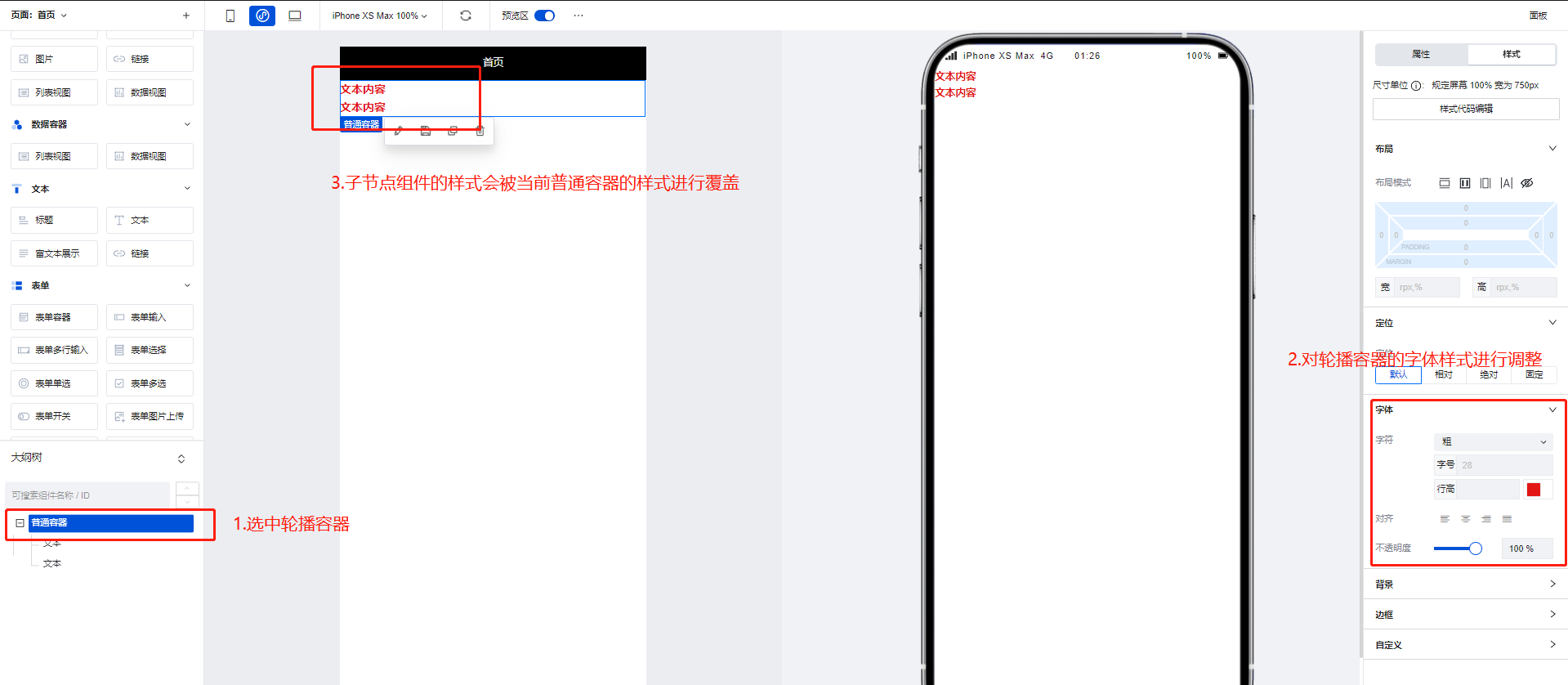
Using the Generic Container for Unified Control of Component Styles
Generic Containers are often used as parent nodes for other components. When the style properties of a Generic Container are modified, its child components will be modified accordingly.
Property Introduction
External properties received by the component
Property Name | Property Identifier | Type | Description |
|---|
| Container remarks(PC) | title | string | prompt on mouse hover |
| Data. | data | object | The property is used for block dynamic item configuration and can be referenced via $w. Example: {} |
Event Introduction
Events exposed by the component. You can listen to component events to trigger external actions
Event Name | Event Code | Event Output Parameters event.detail | Applicable Scenarios | Description |
|---|
| click | tap | Compatible with all platforms | - | |
| long-press | longpress | Compatible with all platforms | - | |
| Touch Start | touchstart | Compatible with all platforms | - | |
| Touch and move | touchmove | Compatible with all platforms | - | |
| Touch Cancel | touchcancel | Compatible with all platforms | - | |
| Touch End | touchend | Compatible with all platforms | - |
Frequently Asked Questions
What is the difference between Generic Container / Grid Layout / Scroll Container?
Generic Container/Grid Layout/Scroll Container are three commonly used container types in WeDa. Their differences are as follows:
- Generic Container: The Generic Container is the most basic container type, used to carry text, images, and other content on the page. It can nest other components and achieve different layout effects by setting styles. By default, it does not have a scrolling feature. If the content does not have a height set, it will automatically expand. Similar to
Viewin mini-programs anddivon the Web. - Grid Layout: Grid Layout is a container used for layout, expanding flexible layout functions based on ordinary containers. It divides the page into grids, allowing arbitrary combination of different grids to create various layouts, such as left-right layouts and multi-column rows. It also supports displaying different layouts on multiple devices.
- Scroll Container: A container with scroll bars. After setting width and height, if the content exceeds the container's boundaries, users can scroll through the content within it. Similar to
ScrollViewin mini-programs.
In actual development, it is recommended to use Grid Layout for detailed arrangements of entire pages and internal modules. For multi-device requirements, you can configure display effects across different platforms. When content exceeds the visible area, implement scrolling functionality using Scroll Container.
How to Implement Partial Scrolling?
Scroll Container can be used to display content that requires scrolling when it exceeds boundaries.
When the total width/height of the component content within a scroll container exceeds the Scroll Container's own width/height, scroll bars will appear, allowing users to view all content within the container by scrolling through these bars.
Note that you must set the width and height for the Scroll Container to ensure that the dimensions of the internal content exceed those of the container, enabling the scrolling effect.
To achieve horizontal scrolling only, ensure that the width of the Scroll Container is less than the width of the content within it.
To achieve vertical scrolling only, ensure that the height of the Scroll Container is less than the height of the content within it.