Dialog
WdModal
Applicable Scenarios
Used to achieve the basic display effect of dialogs (pop-ups). Support varies across different platforms.
Basic Features
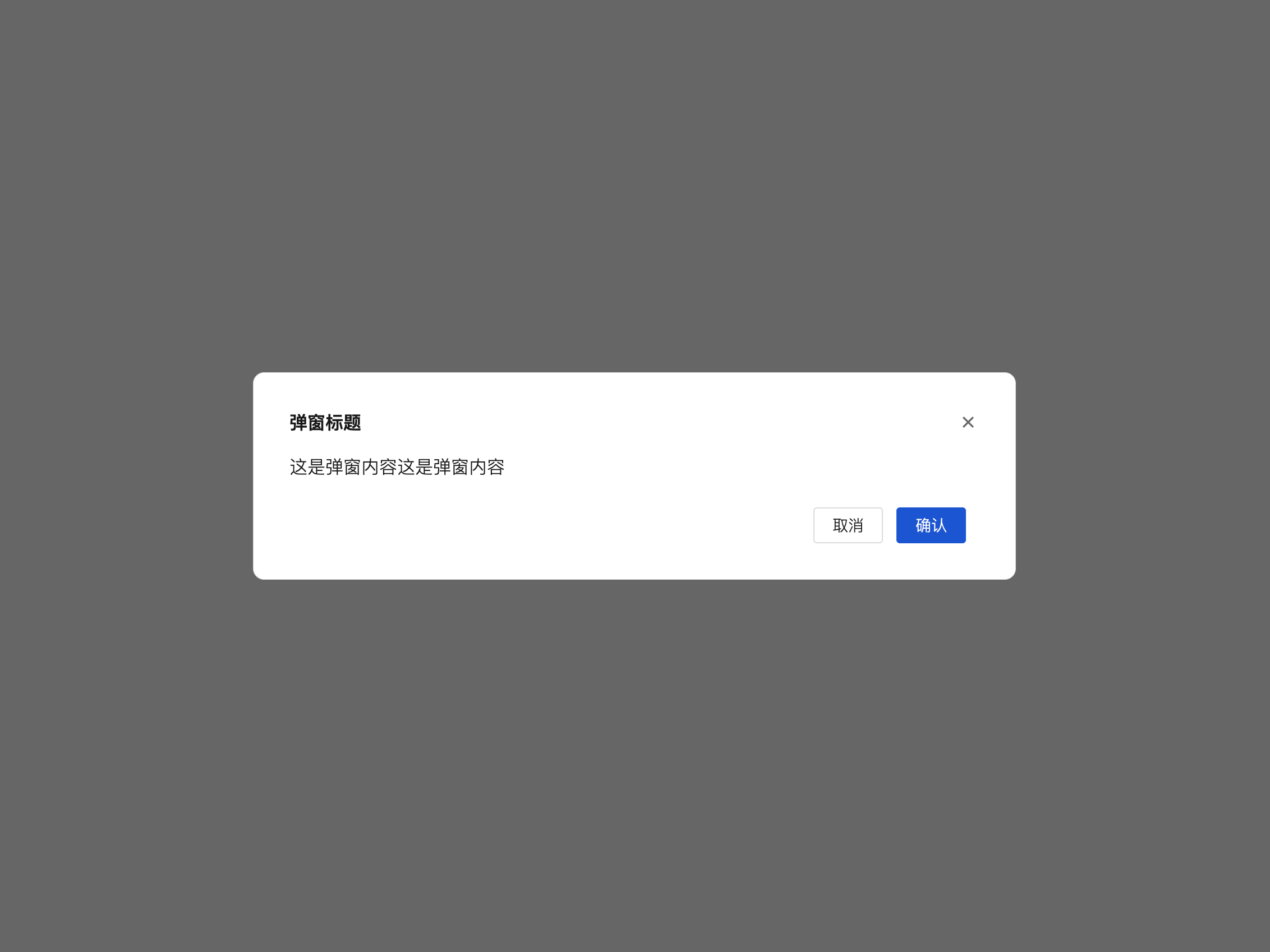
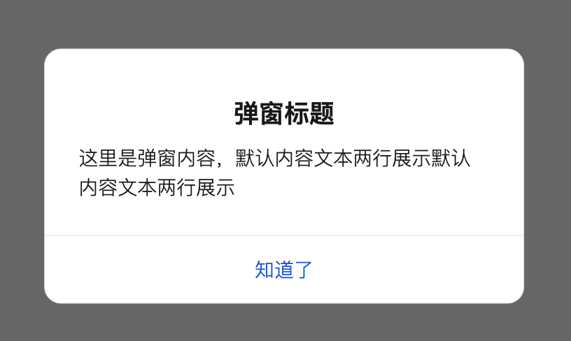
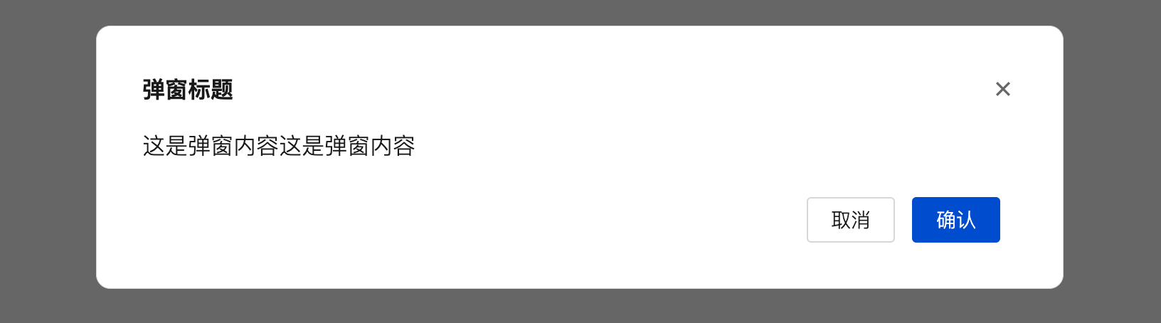
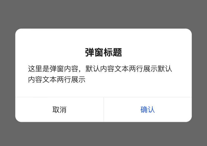
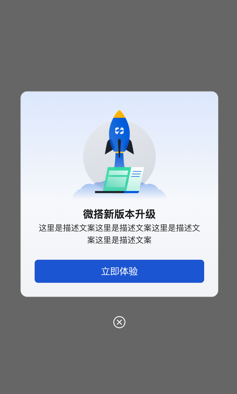
1. Dialog Template
This component provides several sets of commonly used dialog templates, such as default dialog, confirmation dialog, alert dialog, promotional dialog, etc.
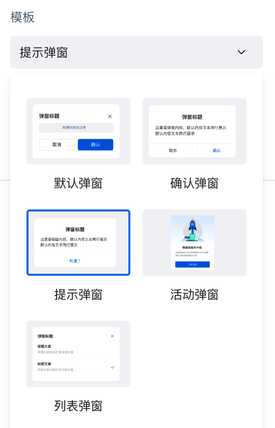
The following default dialog, alert dialog, confirmation dialog, and promotional dialog are provided. You can also customize the styles as needed:
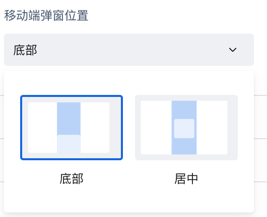
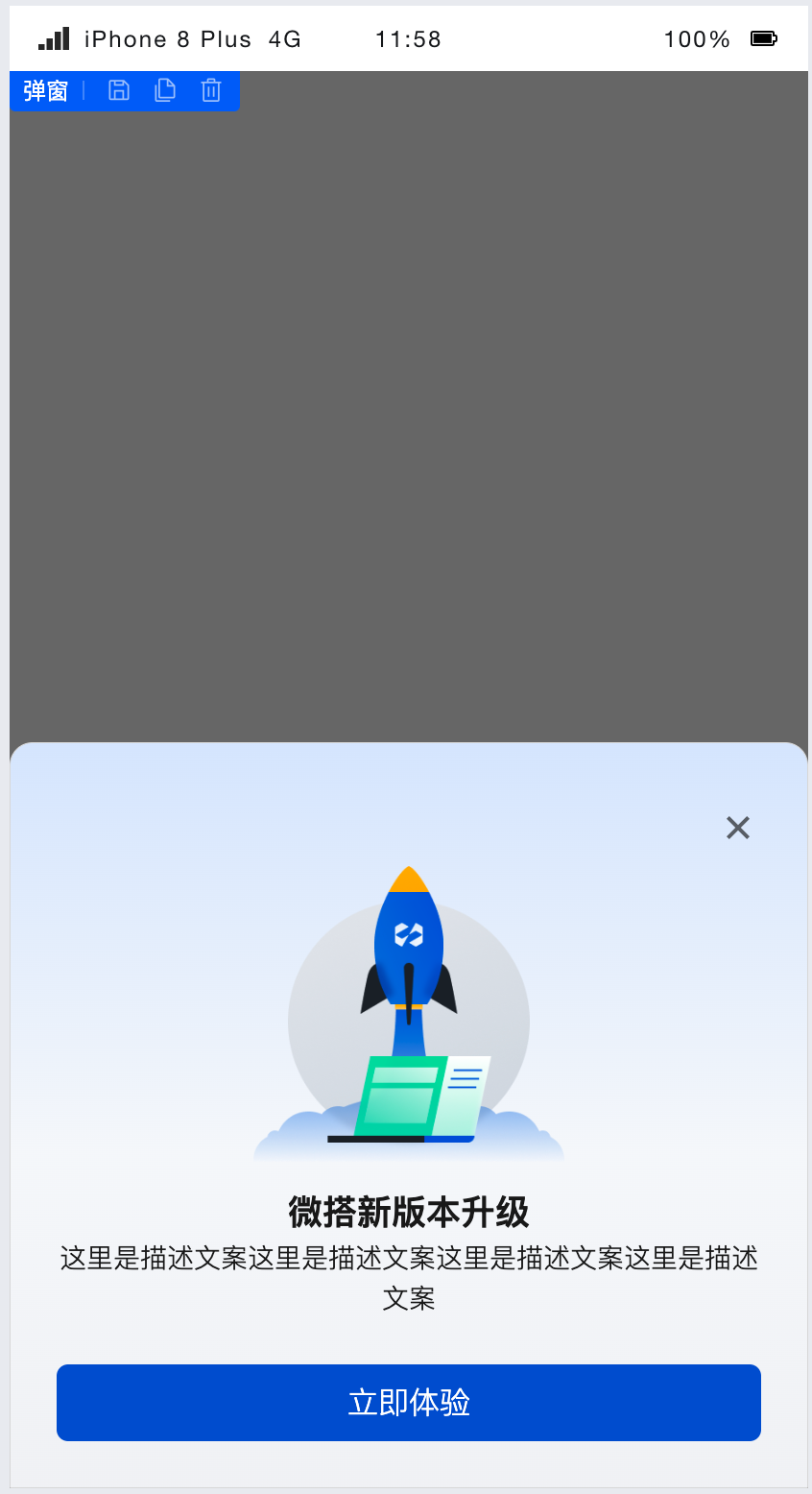
2. Mobile Dialog Position
On mobile devices, dialogs can be set to appear at the bottom of the page.
The effect in activity scenarios is as follows:
3. Open/Close Dialog
-
In the dialog's "Default Open Dialog" property, it controls the initial open/close state of the dialog.
-
In the 'Event-Component Methods', call the dialog's open/close methods to dynamically control the dialog.
-
When opening or closing the dialog, you can configure info as the passed-in parameter. After it is passed in, obtain the parameter via
$w.modal1.openInfoor$w.modal1.closeInfo. Here, modal1 is the dialog component ID.
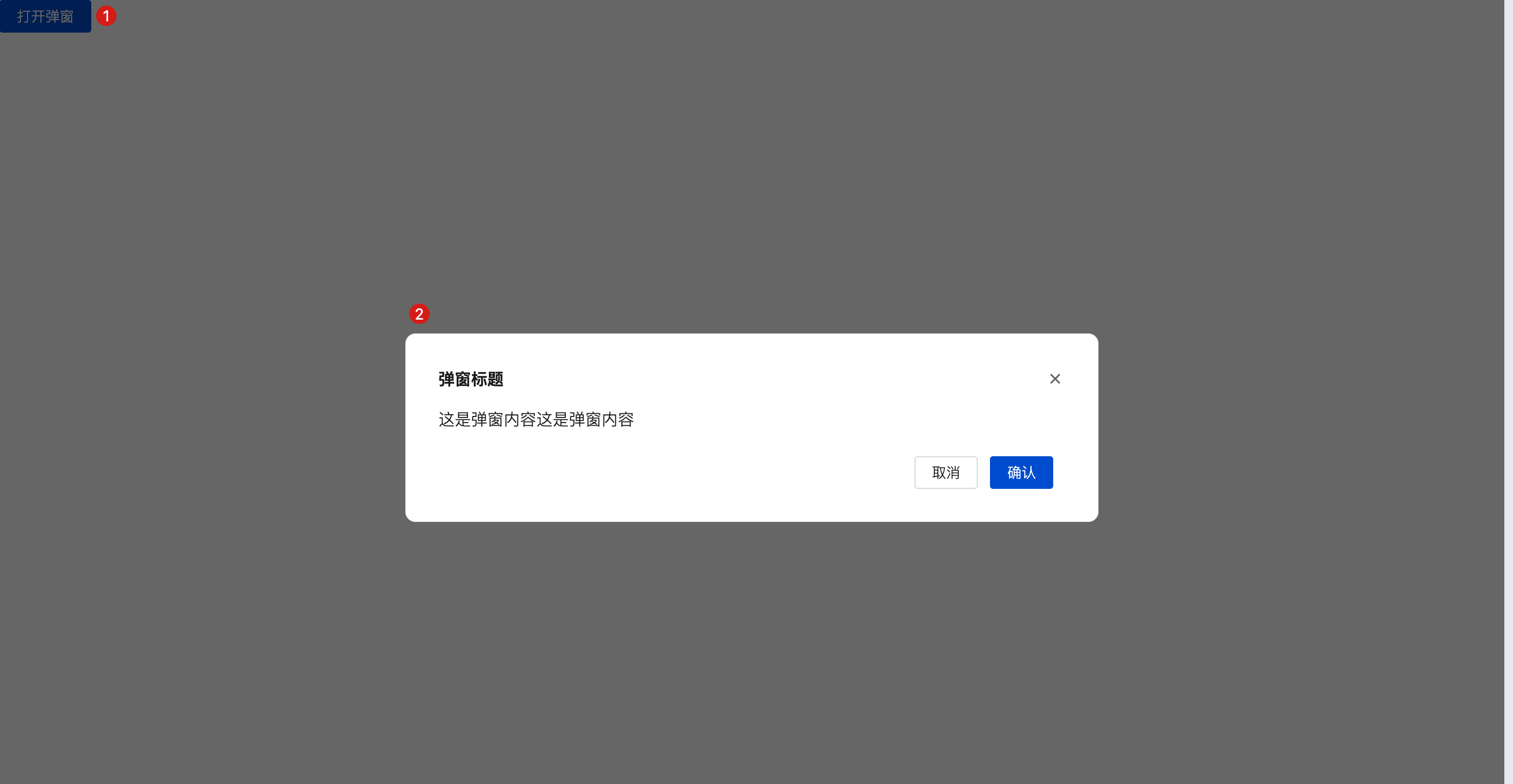
Example: Button Opening the Dialog
- Add a button and dialog component
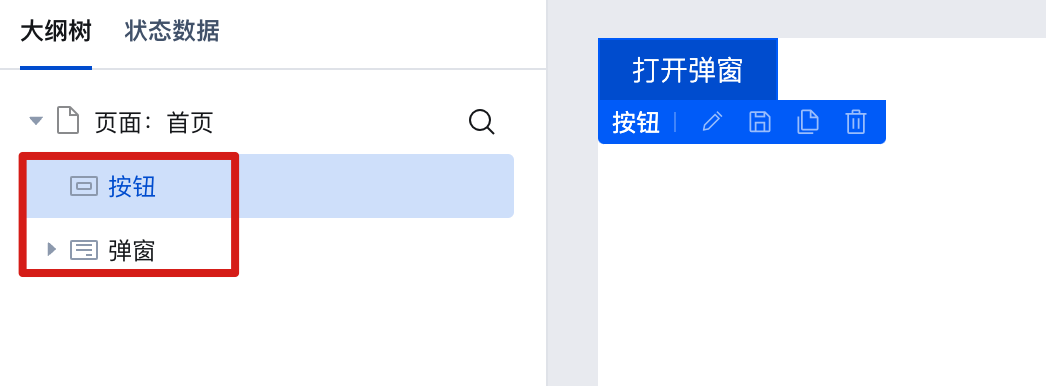
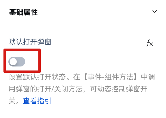
- Select the dialog component, set the dialog to be closed by default, and disable the dialog property "Default Open Dialog".
- Select the button component and add a click event.
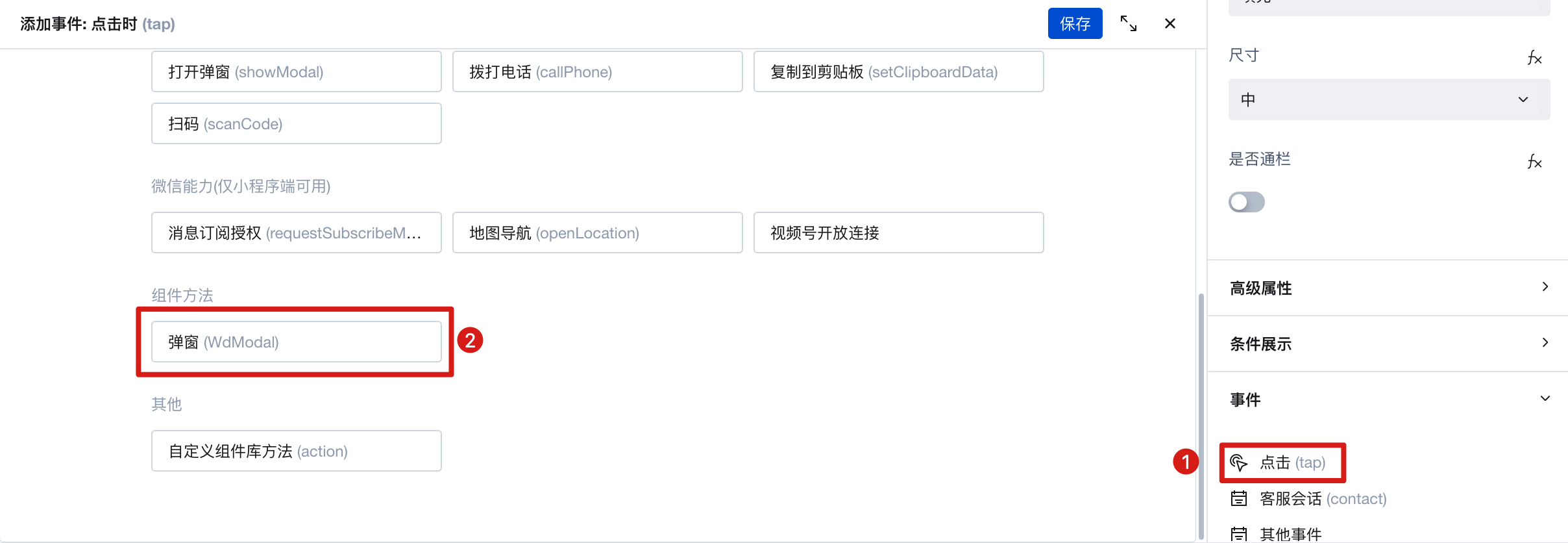
- Select the dialog to be opened and execute the method. Then select the component on the page and call the "open Dialog" method.
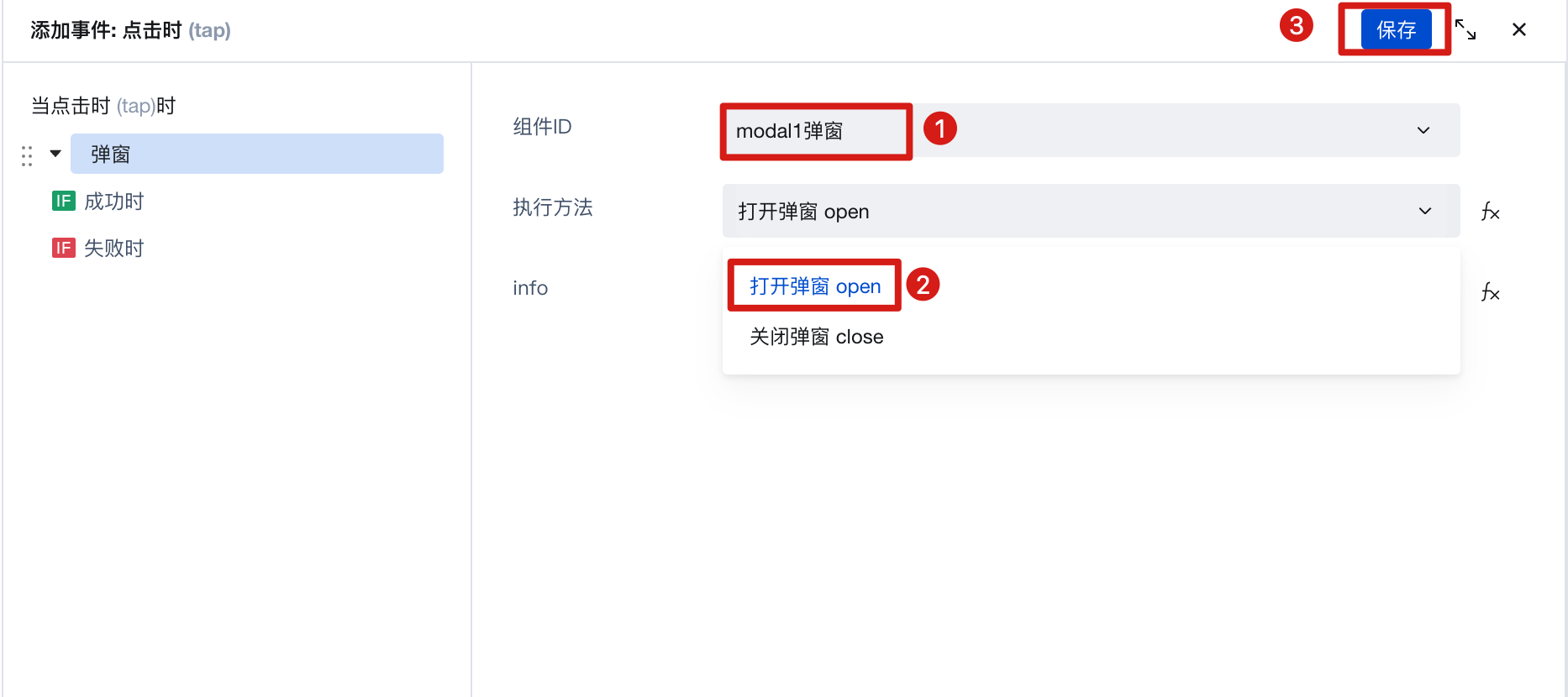
You can achieve opening the dialog by clicking the button, as shown below:
Property Description
External properties received by the component
Property Name | Property Identifier | Type | Description |
|---|
| Disable method | closeType | array | Multi-selection mode, mask-click to close the mask layer, esc-click the ESC key to close (only takes effect on PC) Example: [ "mask" ] |
| Show mask | defaultMaskShow | boolean | Example: true |
| Popup is open by default | defaultShow | boolean | Example: true |
| Template | template | string | Preset template, select different templates for quick configuration of required pop-up type Example: "default" |
| Mobile terminal popup location(Mini Program,Mobile) | position | string | bottom - pop up at the bottom center - pop up in the middle of the page Example: "center" |
Event Description
Events exposed by the component. You can listen to component events to trigger external actions
Event Name | Event Code | Event Output Parameters event.detail | Applicable Scenarios | Description |
|---|
| Popup opens | open | object
| Compatible with all platforms | - |
| Popup closes | close | object
| Compatible with all platforms | - |
Properties API
Through the Property API, you can access the internal state and property values of components. You can access internal values using$w.componentId.propertyName, such as $w.input1.value. For details, please refer to Property API
Read-only Property Name | Property Identifier | Type | Description |
|---|
| Popup status | modalState | string | |
openInfo | | Transparent transmission of information, receive the message when triggering the popup to open, the info comes from the component calling the open method | |
closeInfo | | Transparent transmission of information, info received when the popup is closed, info comes from the component's close method call |
Method API
Through the Method API, you can programmatically trigger internal methods of components, such as submitting forms, displaying popups, etc. You can call component methods using $w.componentId.methodName, such as $w.form1.submit()
Method Name | Method Identifier | Parameters | Method Description |
|---|
| Open popup | open | object
| - |
| close popup | close | object
| - |
Style API
Through the Style API, you can override the styles of internal elements in components to achieve customization. For example, in the low-code editor, you can write styles for all button components using #wd-page-root .wd-btn, and control individual component styles with :scope. For detailed instructions, please refer toStyle API
Name | Class Name | Description and Examples |
|---|
| root element | .wd-modal | component root element |
| PC-side root element | .wd-pc-modal | Write styles for PC |
| H5 root element | .wd-h5-modal | Write style for H5 |
| Mini program root element | .wd-mp-modal | Write style for mini program |
| Pop-up mask layer style | .wd-modal-mask | Write styles for the mask layer |
| Popup container style | .wd-modal-content | Write styles for the main container |
| Pop-up title area style | .wd-modal-bd__hd | Set style for the heading area |
| Pop-up content area style | .wd-modal-bd__main | Write styles for the content area |
| Popup button area style | .wd-modal-bd__ft | Write styles for the button area |
Frequently Asked Questions
How to Implement Partial Scrolling?
Scroll Container can be used to display content that requires scrolling when it exceeds boundaries.
When the total width/height of the component content within a scroll container exceeds the Scroll Container's own width/height, scroll bars will appear, allowing users to view all content within the container by scrolling through these bars.
Note that you must set the width and height for the Scroll Container to ensure that the dimensions of the internal content exceed those of the container, enabling the scrolling effect.
To achieve horizontal scrolling only, ensure that the width of the Scroll Container is less than the width of the content within it.
To achieve vertical scrolling only, ensure that the height of the Scroll Container is less than the height of the content within it.