Drawer
WdDrawer
Applicable Scenarios
It is used to implement a side drawer display effect, commonly applied in scenarios such as navigation menus, detail panels, and filters. It supports sliding out from all four directions of the page.
Basic Features
1. Opening/Closing the Drawer
-
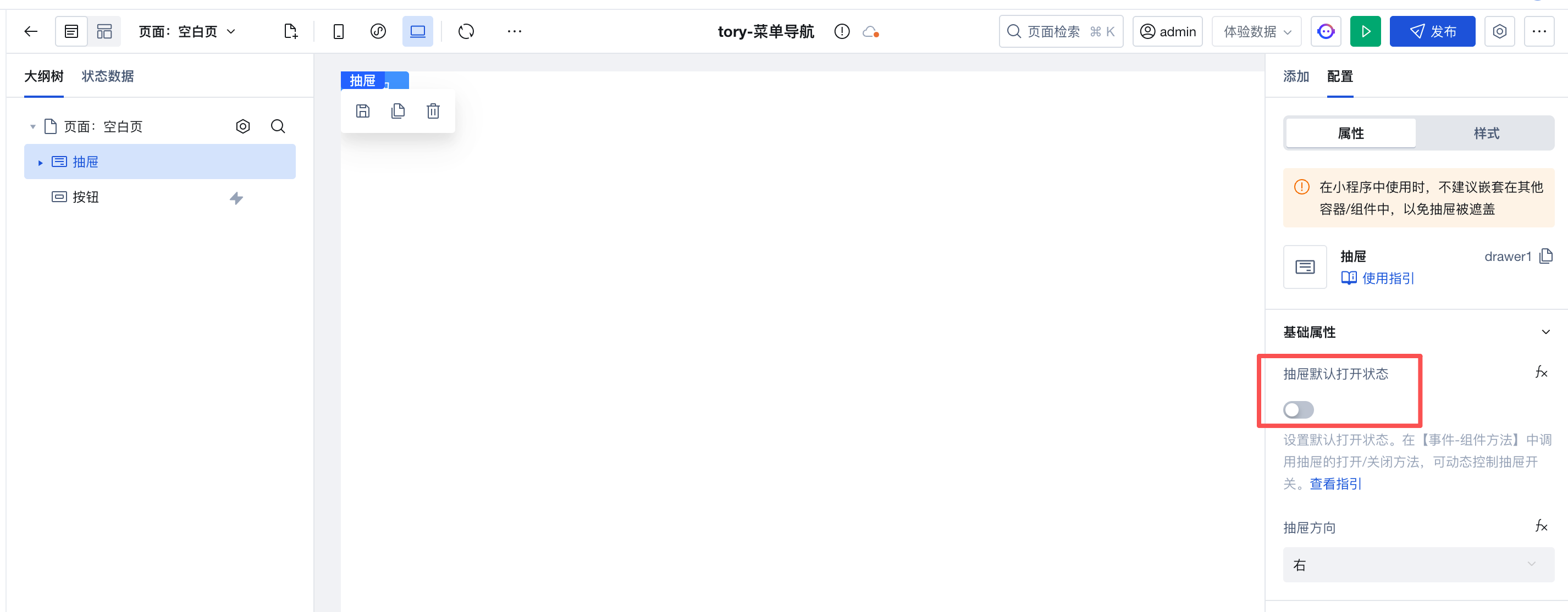
In the drawer's "Default Open Drawer" property, it controls the initial open/close state of the drawer.
-
In the 'Event-Component Methods', call the drawer's opening/closing methods to dynamically control the open/close state of the drawer.
-
When opening or closing the drawer, you can configure info as the passed-in parameter. After it is passed in, obtain the parameter via
$w.drawer1.openInfoor$w.drawer1.closeInfo. Here, drawer1 is the drawer component ID.
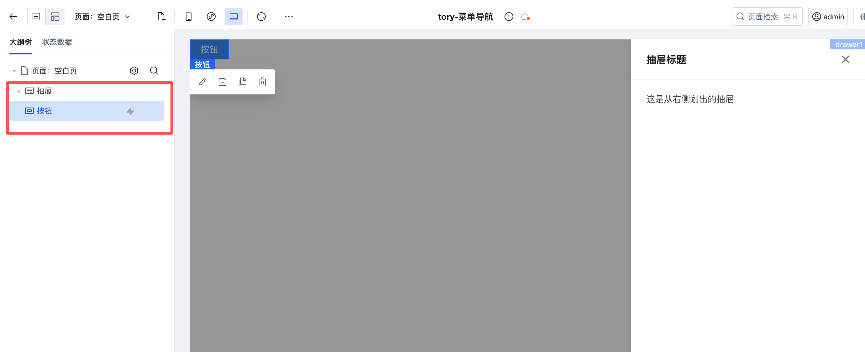
Example: Button Opening the Drawer
- Add a button and drawer component
- Select the drawer component, set the drawer to be closed by default, and disable the drawer property "Default Open Drawer".
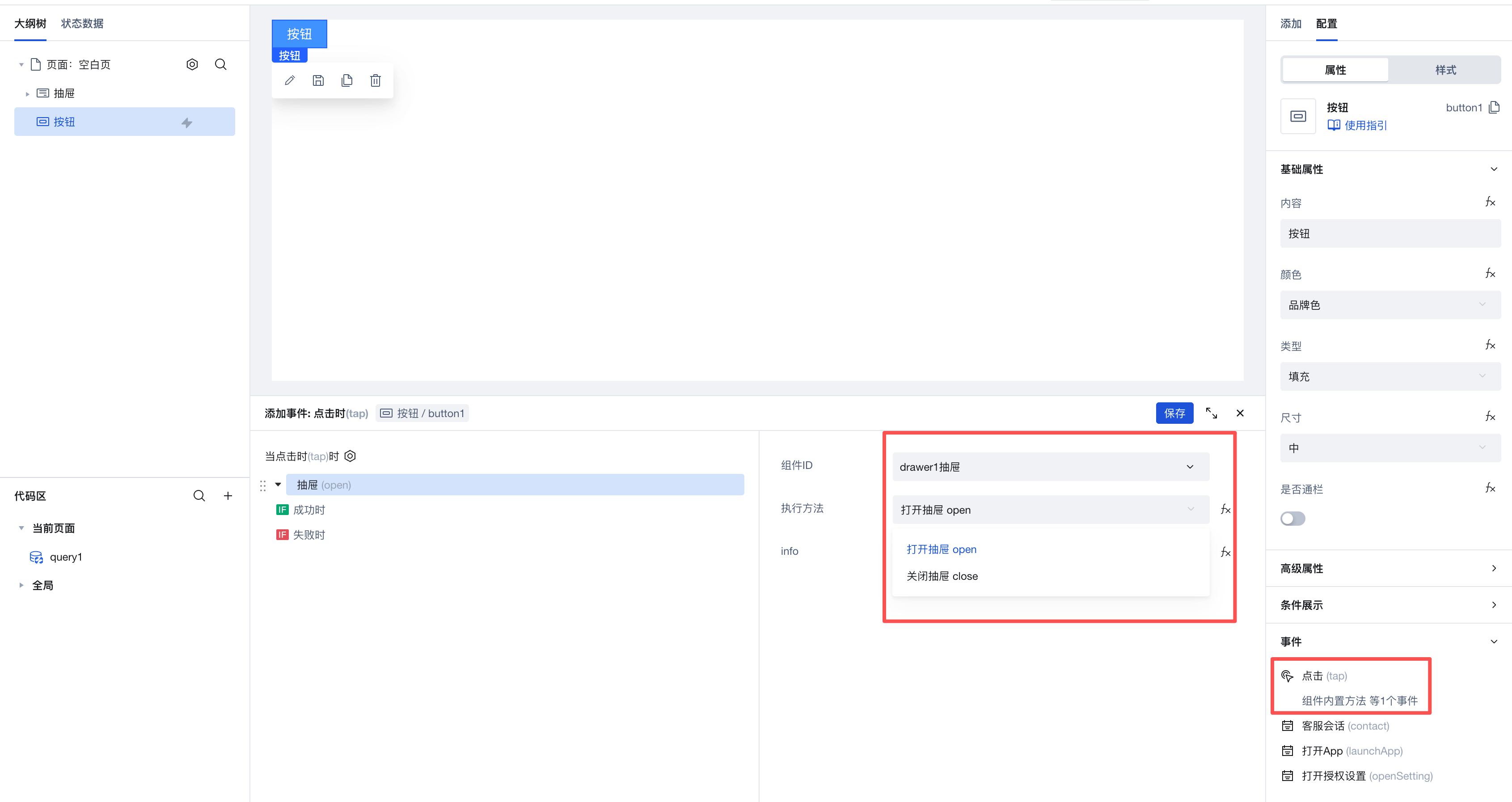
- Select the button component and add a click event.
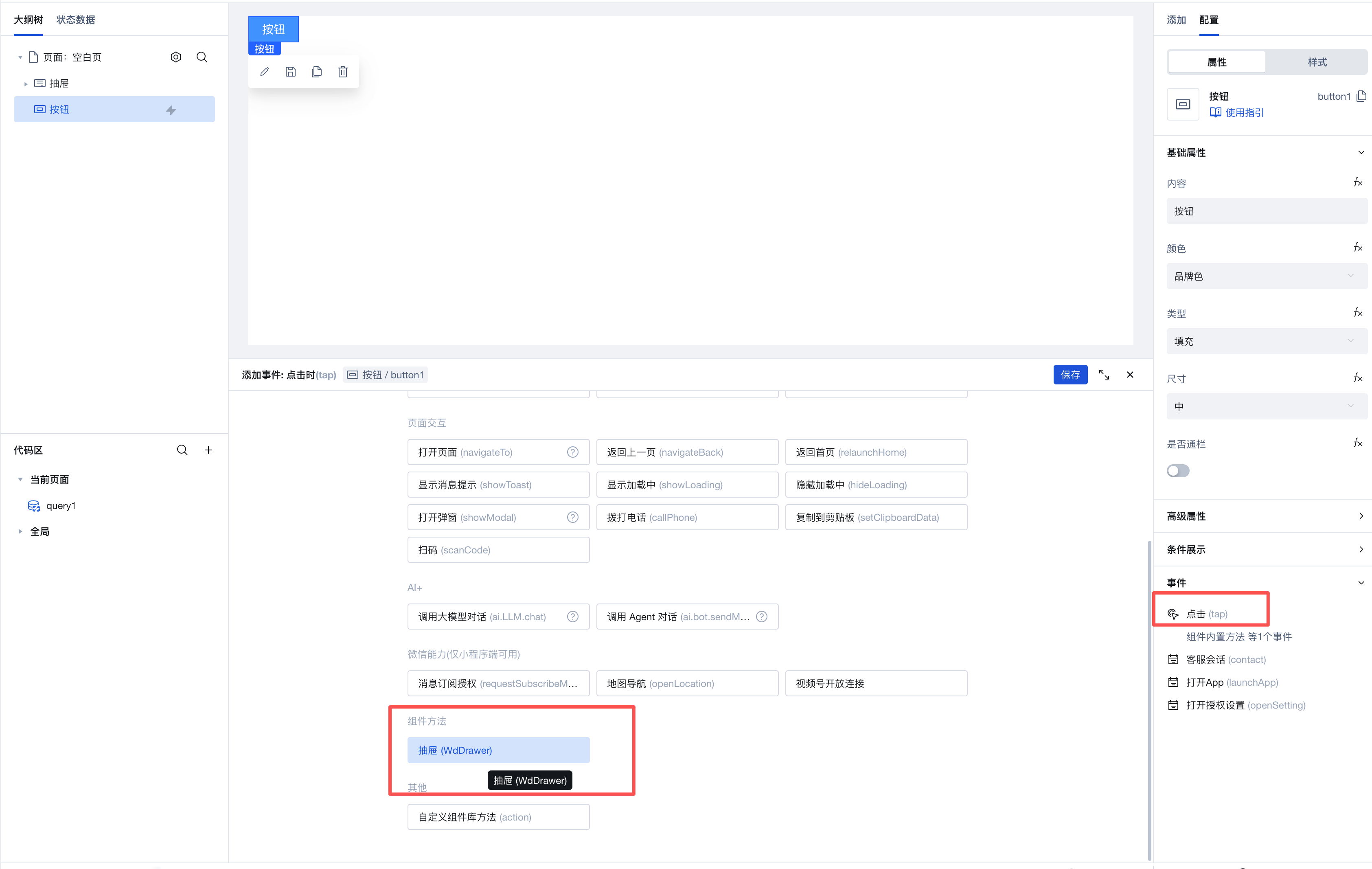
- Select the drawer to be opened and execute the method. Then select the component on the page and call the "open Drawer" method to implement opening the drawer by clicking the button.
Interactive Preview
Style API Custom Styles
Property Description
External properties received by the component
Property Name | Property Identifier | Type | Description |
|---|
| Disable method | closeType | array | Multi-selection mode, outerClick-click to close the overlay, esc-click the ESC key to close (only takes effect on PC) Example: [ "outerClick" ] |
| Show mask | mask | boolean | Example: true |
| Top slot | enableHeaderSlot | boolean | Default value: true |
| Content slot | enableContentSlot | boolean | Default value: true |
| bottom slot | enableFooterSlot | boolean | |
| Drawer default open status | visible | boolean | Example: true |
| drawer direction | placement | string | Drawer direction. Options: left/right/top/bottom Example: "right" |
Event Description
Events exposed by the component. You can listen to component events to trigger external actions
Event Name | Event Code | Event Output Parameters event.detail | Applicable Scenarios | Description |
|---|
| Drawer on | open | object
| Compatible with all platforms | - |
| drawer when closed | close | object
| Compatible with all platforms | - |
Properties API
Through the Property API, you can access the internal state and property values of components. You can access internal values using$w.componentId.propertyName, such as $w.input1.value. For details, please refer to Property API
Read-only Property Name | Property Identifier | Type | Description |
|---|
| drawer status | modalState | string | |
openInfo | | Transparent transmission of information, info received when the drawer is opened, info comes from the component's open method call | |
closeInfo | | Transparent transmission of information, info received when the drawer is closed, info comes from the component calling the close method |
Method API
Through the Method API, you can programmatically trigger internal methods of components, such as submitting forms, displaying popups, etc. You can call component methods using $w.componentId.methodName, such as $w.form1.submit()
Method Name | Method Identifier | Parameters | Method Description |
|---|
| open the drawer | open | object
| - |
| close drawer | close | object
| - |
Style API
Through the Style API, you can override the styles of internal elements in components to achieve customization. For example, in the low-code editor, you can write styles for all button components using #wd-page-root .wd-btn, and control individual component styles with :scope. For detailed instructions, please refer toStyle API
Name | Class Name | Description and Examples |
|---|
| root element | .wd-drawer | component root element |
| PC-side root element | .wd-pc-drawer | component root element |
| H5 root element | .wd-h5-drawer | Write style for H5 |
| Mini program root element | .wd-mp-drawer | Write style for mini program |
| Drawer mask layer style | .wd-drawer-mask | Write styles for the mask layer |
| Drawer main container style | .wd-drawer-content-wrapper | Write styles for the main container |
| Drawer top container style | .wd-drawer-header | Write styles for the top container |
| Drawer content container style | .wd-drawer-body | Write styles for the content container |
| Drawer bottom container style | .wd-drawer-footer | Write styles for the bottom container |