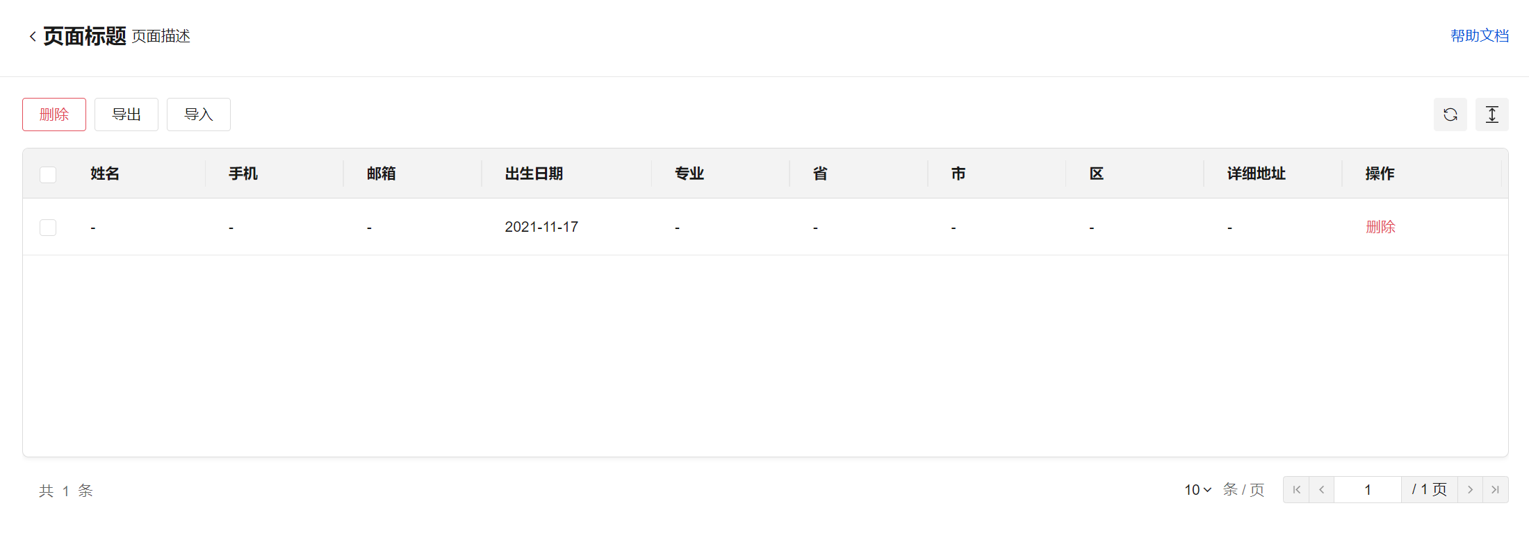
Layout Component
WdLayout
Applicable Scenarios
Build a page layout with top navigation
Basic Features
Usage Instructions
The top of the component is divided into left and right slot areas. The left slot can contain components such as buttons and headings, while the right slot can accommodate components like links. The central content slot area can hold other components for building page content.

Property Description
External properties received by the component
Property Name | Property Identifier | Type | Description |
|---|
| layout template | template | string | Preset template for layout component Example: "white" |
| Head slot | enableHeaderSlot | boolean | Default value: true |
| Content slot | enableContentSlot | boolean | Default value: true |
Event Description
Properties API
NoneMethod API
NoneStyle API
Through the Style API, you can override the styles of internal elements in components to achieve customization. For example, in the low-code editor, you can write styles for all button components using #wd-page-root .wd-btn, and control individual component styles with :scope. For detailed instructions, please refer toStyle API
Name | Class Name | Description and Examples |
|---|
| root element | .wd-layout-root | layout component root element |
| PC-side layout component root element | .wd-pc-layout-root | Write styles for PC layout components |
| H5 layout component root element | .wd-h5-layout-root | Write style for H5 layout component |
| Mini program layout component root element | .wd-mp-layout-root | Write style for mini program layout component |
| Top layout element | .wd-layout__header | Write styles for the top of layout components |
| Layout content element | .wd-layout__body | Write styles for layout component content |