Scroll Container
ScrollView
Usage Instructions
Scroll Containers enable scrolling effects for pages or functional modules. When the total width/height of the component content within a scroll container exceeds the container's own width/height, scroll bars will appear. Users can view all content within the container by scrolling through these bars, as shown in the following example:
- Drag a Scroll Container component, and set the height to 300
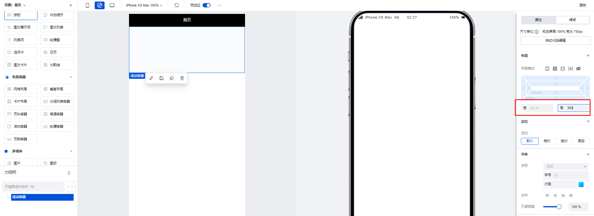
- Add three image components to the scroll container, setting the height of each image component to 200. This causes the total height of components inside the container to exceed the container's own height, making scroll bars appear.
Property Introduction
External properties received by the component
Property Name | Property Identifier | Type | Description |
|---|
| Rolled element ID | scrollIntoView | string | Scroll the current element into the viewable area of the browser window |
| horizontal scroll bar position | scrollLeft | number | Input default value, the horizontal scroll bar will move to the position by default |
| vertical scroll position | scrollTop | number | Input default value, the vertical scroll bar will move to the location by default |
| Trigger scrolltolower event when distance from bottom/right is reached | lowerThreshold | number | Example: 50 |
| How far from the top/left to trigger the scrolltoupper event | upperThreshold | number | Example: 50 |
| 滚动到目标元素附近,触发scrollToTarget事件 | observerSelector | array | |
| 用来扩展(或收缩)参照节点布局区域的边界 | rootMargin | object | 指定页面显示区域作为参照区域之一,使用margins来扩展(或收缩)参照节点布局区域的边界,单位px。 |
| Control scrollbar visibility(Mini Program) | showScrollbar | boolean | Control whether to show/hide the scrollbar Example: true |
| EnableEnable scroll-view enhanced feature(Mini Program) | enhanced | boolean | Enable scroll-view enhanced feature Example: true |
| Elastic control of scroll-view boundary on iOS(Mini Program) | bounces | boolean | Example: true |
| Paginate slide effect(Mini Program) | pagingEnabled | boolean | Example: false |
| Sliding deceleration rate control(Mini Program) | fastDeceleration | boolean | Example: false |
| enable pull-down refresh(Mini Program) | refresherEnabled | boolean | Enabled, you can customize pull-down refresh settings Example: false |
| Set custom pull-down refresh threshold(Mini Program) | refresherThreshold | number | Example: 50 |
| Set custom pull-down refresh default style(Mini Program) | refresherDefaultStyle | string | Example: "block" |
| Set custom pull-down refresh area background color(Mini Program) | refresherBackground | string | Example: "#fff" |
| Set current dropdown refresh status(Mini Program) | refresherTriggered | boolean | Example: true |
| Enable scroll anchoring feature(Mini Program) | scrollAnchoring | boolean | Enable scroll-anchoring feature Example: false |
| Enable flexbox layout(Mini Program) | enableFlex | boolean | Enable flexbox layout Example: false |
| On iOS, click the top status bar. On Android, double tap the title bar to return to top. Supports only vertical scrollbar.(Mini Program) | enableBackToTop | boolean | When enabled, the scrollbar will automatically return to top after performing corresponding operations. Example: false |
| Use animation transition when setting the scrollbar position(Mini Program) | scrollWithAnimation | boolean | Enable scrollbar animation Example: false |
| Enable horizontal scroll | scrollX | boolean | When enabled, the horizontal scroll bar will be activated, and the component supports scrolling left and right. Example: false |
| Vertically scrollable | scrollY | boolean | When enabled, the vertical scroll bar will be activated, and the component supports scrolling up and down. Example: true |
Event Introduction
Events exposed by the component. You can listen to component events to trigger external actions
Event Name | Event Code | Event Output Parameters event.detail | Applicable Scenarios | Description |
|---|
| 滚动容器初次渲染完成时触发 | onReady | Compatible with all platforms | - | |
| Trigger on scroll | scroll | Compatible with all platforms | - | |
| 滚动到指定位置时触发 | scrollToTarget | object
| Compatible with all platforms | - |
| Trigger on scroll to bottom/right | scrolltolower | Compatible with all platforms | - | |
| Trigger on scroll to top/left | scrolltoupper | Compatible with all platforms | - | |
| Slide start event (Enable enhanced property simultaneously to take effect) | dragstart | Mini Program | - | |
| sliding event (enable simultaneously with enhanced property to take effect) | dragging | Mini Program | - | |
| Sliding end event (Enable enhanced property simultaneously to take effect) | dragend | Mini Program | - | |
| Custom pull-down refresh control was scrolled down | refresherpulling | Mini Program | - | |
| Custom pull-down refresh triggered | refresherrefresh | Mini Program | - | |
| Custom pull-down refresh was reset | refresherrestore | Mini Program | - | |
| Custom pull-down refresh terminated | refresherabort | Mini Program | - |
Frequently Asked Questions
What is the difference between Generic Container / Grid Layout / Scroll Container?
Generic Container/Grid Layout/Scroll Container are three commonly used container types in WeDa. Their differences are as follows:
- Generic Container: The Generic Container is the most basic container type, used to carry text, images, and other content on the page. It can nest other components and achieve different layout effects by setting styles. By default, it does not have a scrolling feature. If the content does not have a height set, it will automatically expand. Similar to
Viewin mini-programs anddivon the Web. - Grid Layout: Grid Layout is a container used for layout, expanding flexible layout functions based on ordinary containers. It divides the page into grids, allowing arbitrary combination of different grids to create various layouts, such as left-right layouts and multi-column rows. It also supports displaying different layouts on multiple devices.
- Scroll Container: A container with scroll bars. After setting width and height, if the content exceeds the container's boundaries, users can scroll through the content within it. Similar to
ScrollViewin mini-programs.
In actual development, it is recommended to use Grid Layout for detailed arrangements of entire pages and internal modules. For multi-device requirements, you can configure display effects across different platforms. When content exceeds the visible area, implement scrolling functionality using Scroll Container.
How to Implement Partial Scrolling?
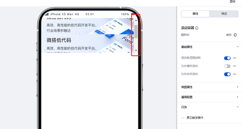
Scroll Container can be used to display content that requires scrolling when it exceeds boundaries.
When the total width/height of the component content within a scroll container exceeds the Scroll Container's own width/height, scroll bars will appear, allowing users to view all content within the container by scrolling through these bars.
Note that you must set the width and height for the Scroll Container to ensure that the dimensions of the internal content exceed those of the container, enabling the scrolling effect.
To achieve horizontal scrolling only, ensure that the width of the Scroll Container is less than the width of the content within it.
To achieve vertical scrolling only, ensure that the height of the Scroll Container is less than the height of the content within it.