Data Table Custom Column Usage Guide
Scenario Description
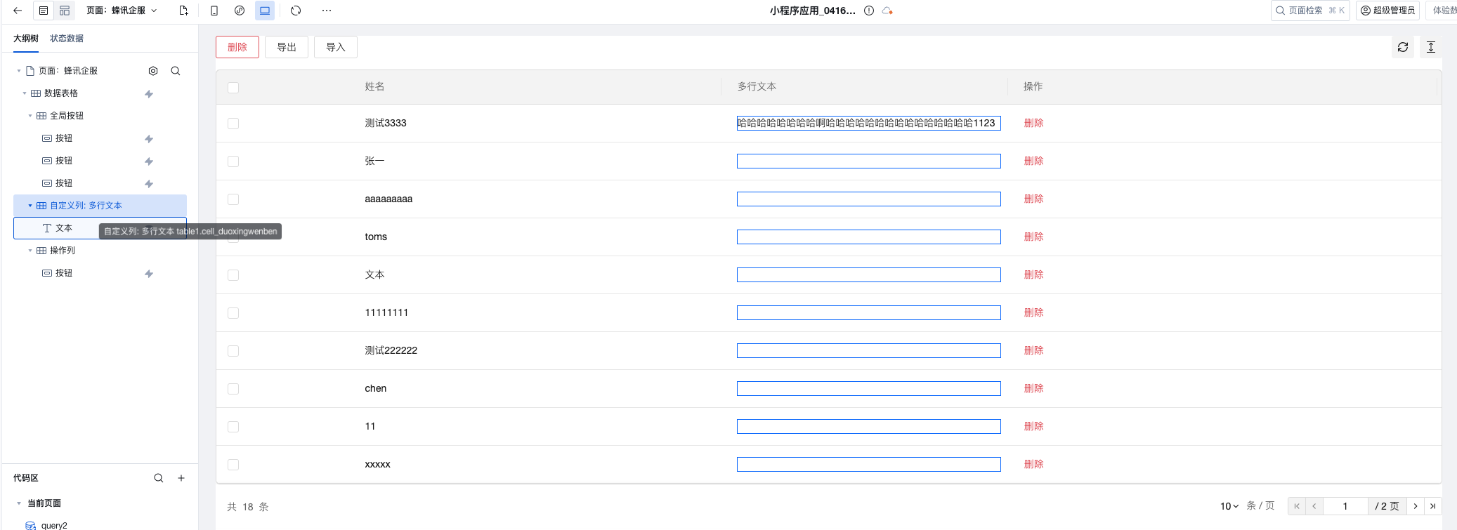
In low-code development, the default column display of the data table component may not meet complex business requirements. Through the custom column feature, you can embed various components in table columns to achieve richer data display and interaction effects, such as:
- Status Tag Display
- Action Button Group
- Image Preview
- Progress Bar Display
- Custom Formatting Content
Basic Implementation Steps
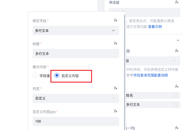
1. Configure custom columns
In the Table Column-Column Management section of the data table component, set the display content for fields requiring custom presentation to custom content.
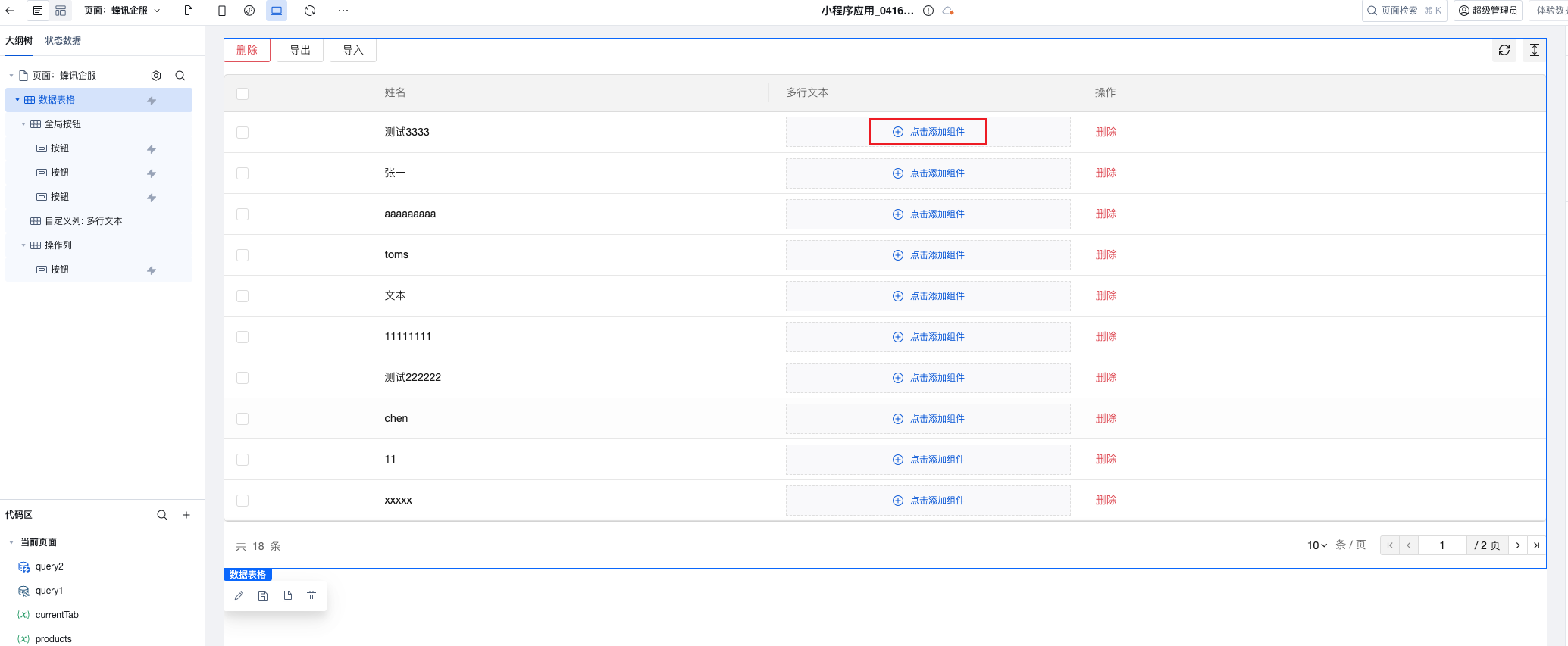
2. Add Custom Components
In the custom column area of the data table, drag and drop the components to be displayed. Supported component types include:
- Text Component
- Button Component
- Image Component
- Tag Component
- Progress Bar Component
- Other UI Components
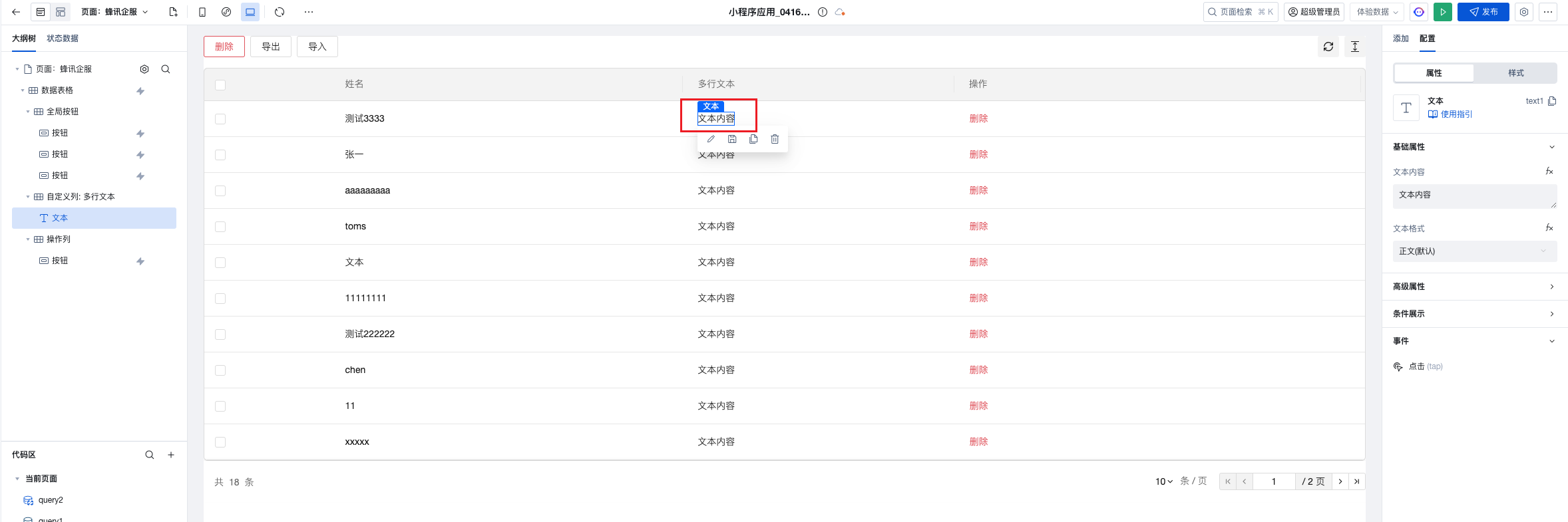
3. Configure Component Content
Using the Text Component as an example, drag the component into the custom column area:
4. Bind Data Fields
Bind the corresponding data field values to the component to achieve dynamic content display:
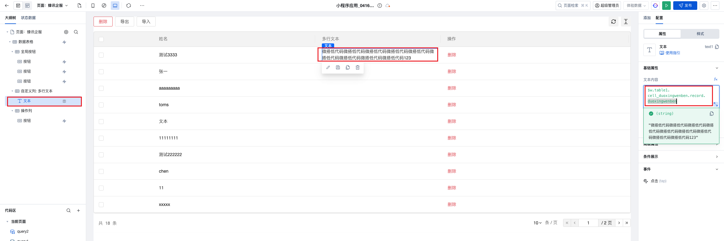
Data Binding Syntax
Basic Syntax
$w.table1.cell_duoxingwenben.record.duoxingwenben; // Get data of the specified field in the current row
Syntax Explanation
$w.table1: Table component instancecell_duoxingwenben: Identifier for a custom columnrecord: Data object of the current rowduoxingwenben: Specific field name
Common Data Binding Examples
// Get the current row ID
$w.table1.cell_custom.record.id;

// Get the current row status field
$w.table1.cell_custom.record.status;

// Get the current row username
$w.table1.cell_custom.record.username;

// Get the current row creation time
$w.table1.cell_custom.record.createTime;
Advanced Application Scenarios
Scenario 1: Status Tag Display
Use the tag component to display tags in different colors based on the data status:
// Label Text Binding
$w.table1.cell_status.record.status;

// Label color binding (conditional expression)
$w.table1.cell_status.record.status === "Completed"
  ? "success"
  : $w.table1.cell_status.record.status === "In Progress"
  ? "warning"
  : "error";
Scenario 2: Action Button Group
Add multiple buttons in the custom column to implement row-level operations:
// Edit button click event
({ event }) => {
  const rowData = $w.table1.cell_actions.record;
  // Execute edit logic
  console.log("Edit data:", rowData);
};

// Delete button click event
({ event }) => {
  const rowData = $w.table1.cell_actions.record;
  // Execute delete logic
  console.log("Delete data:", rowData);
};
Scenario 3: Progress Bar Display
Use the progress bar component to display completion:
// Progress value binding
$w.table1.cell_progress.record.progress;

// Progress bar color binding
$w.table1.cell_progress.record.progress >= 80
  ? "success"
  : $w.table1.cell_progress.record.progress >= 50
  ? "warning"
  : "error";
- Avoid using overly complex components in custom columns
- Keep the number of custom columns reasonable
- For tables with large data volumes, consider using virtual scrolling
Frequently Asked Questions
Q: How to get the current row data in component events within custom columns?
A: Use the $w.table1.cell_xxx.record syntax to get the complete data object of the current row.
Q: How to implement conditional display in custom columns?
A: You can control the display state of components through conditional expressions.
// Component display condition
$w.table1.cell_custom.record.status === "Published";
Q: How to adjust the width of custom columns?
A: Set the width property of the corresponding column in the table column management, or use CSS styles for fine-grained control.