Customize Display Fields for Dropdown Component
Overview
In the WeDa Low-Code Platform, the dropdown component (Select) is one of the commonly used form elements for selecting one or multiple values from a predefined list of options. By default, dropdown options directly display the value or label of each option. However, in actual business scenarios, we may need to customize how dropdown options are displayed based on data characteristics, for example:
- Display a combination of multiple fields
- Customize the display of a specific field
This article will introduce how to customize display fields for dropdown components in WeDa to meet various business requirements.
Basic Configuration
Data Source for Dropdown Component
In WeDa, the data sources for dropdown components typically include the following types:
- Static Options: Configure a fixed list of options directly in the component properties panel.
- Data Model: Obtain data from the data model as options
- API Interface: Obtain option data via API interfaces
Options Data Structure
Regardless of which data source is used, the data structure for dropdown options is typically:
[
  { label: "Option 1", value: "value1", ... },
  { label: "Option 2", value: "value2", ... },
  ...
]
Among them:
label: The text displayed on the interfacevalue: The value actually stored when selected- Other custom fields: Can contain any additional information
Practical Cases
Case 1: Binding query Variables
Use the data model query variable as the data source for dropdown options
Configuring the Dropdown Options Component:**
- Select "Data Model" as the data source and select
$w.query1.data.records
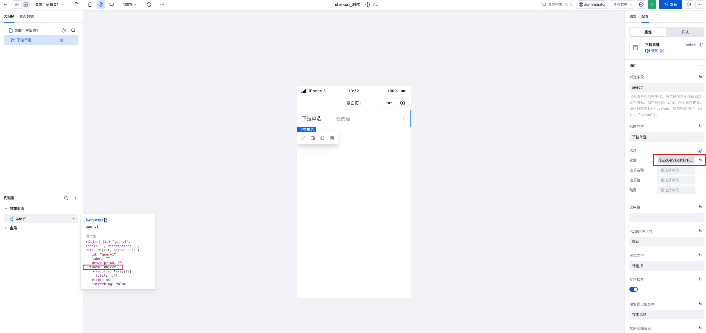
- Configure option mapping:
- Value to select: value
- Option name: label
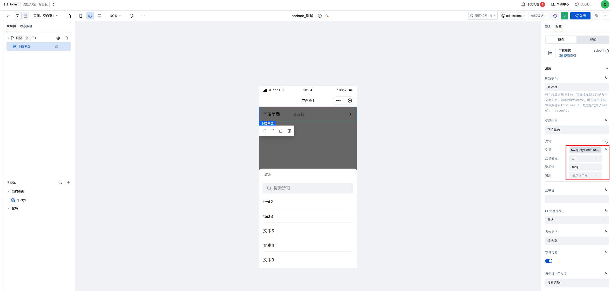
Case 2: Binding Data Model
In practical applications, we often need to obtain data from the data model as dropdown options. The following is a complete example:
-
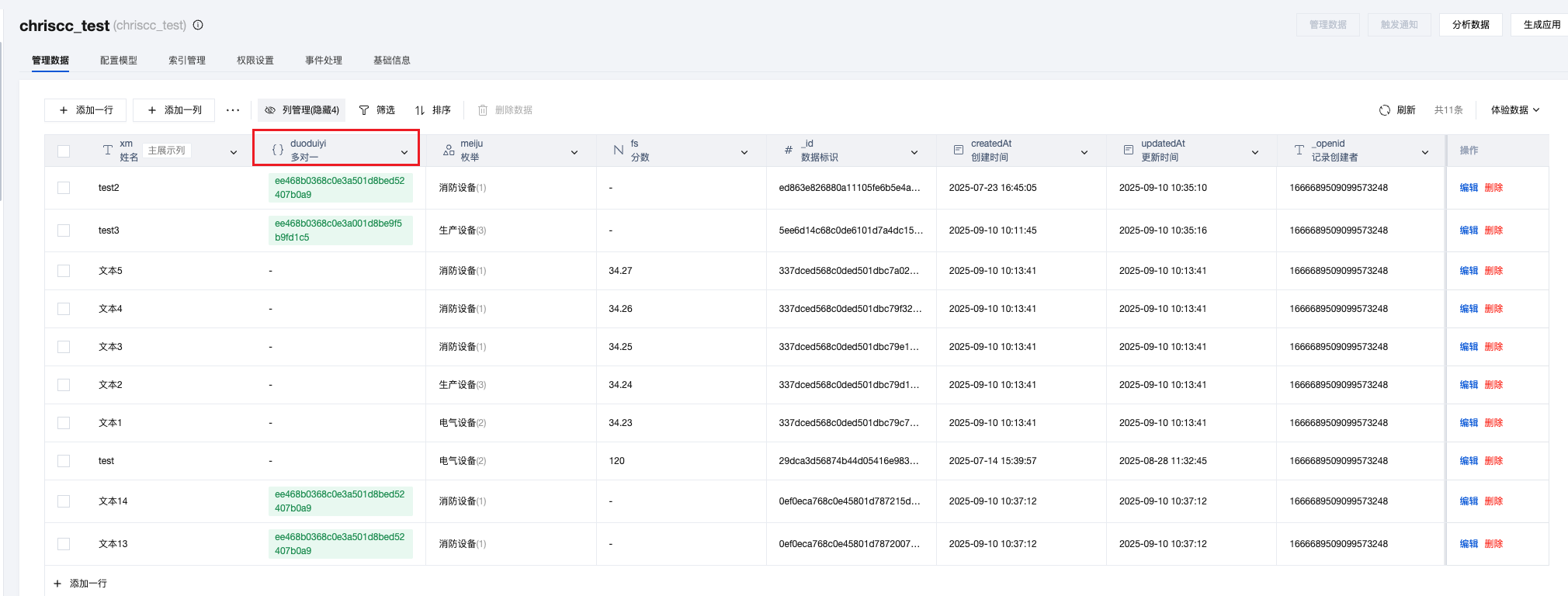
Create a Data Model:
- Create a data model named "chriscc_test"
- Add field: many-to-one association field, and populate with test data
-
Configure the Dropdown Options Component:
- Drag a form container
- Select the "chriscc_test" data model as the data source
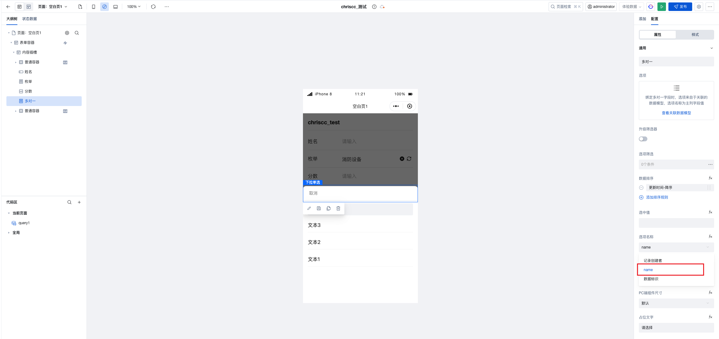
- You can see that the association field automatically generates dropdown options and displays the data identifier (default primary column field) from the associated model by default.
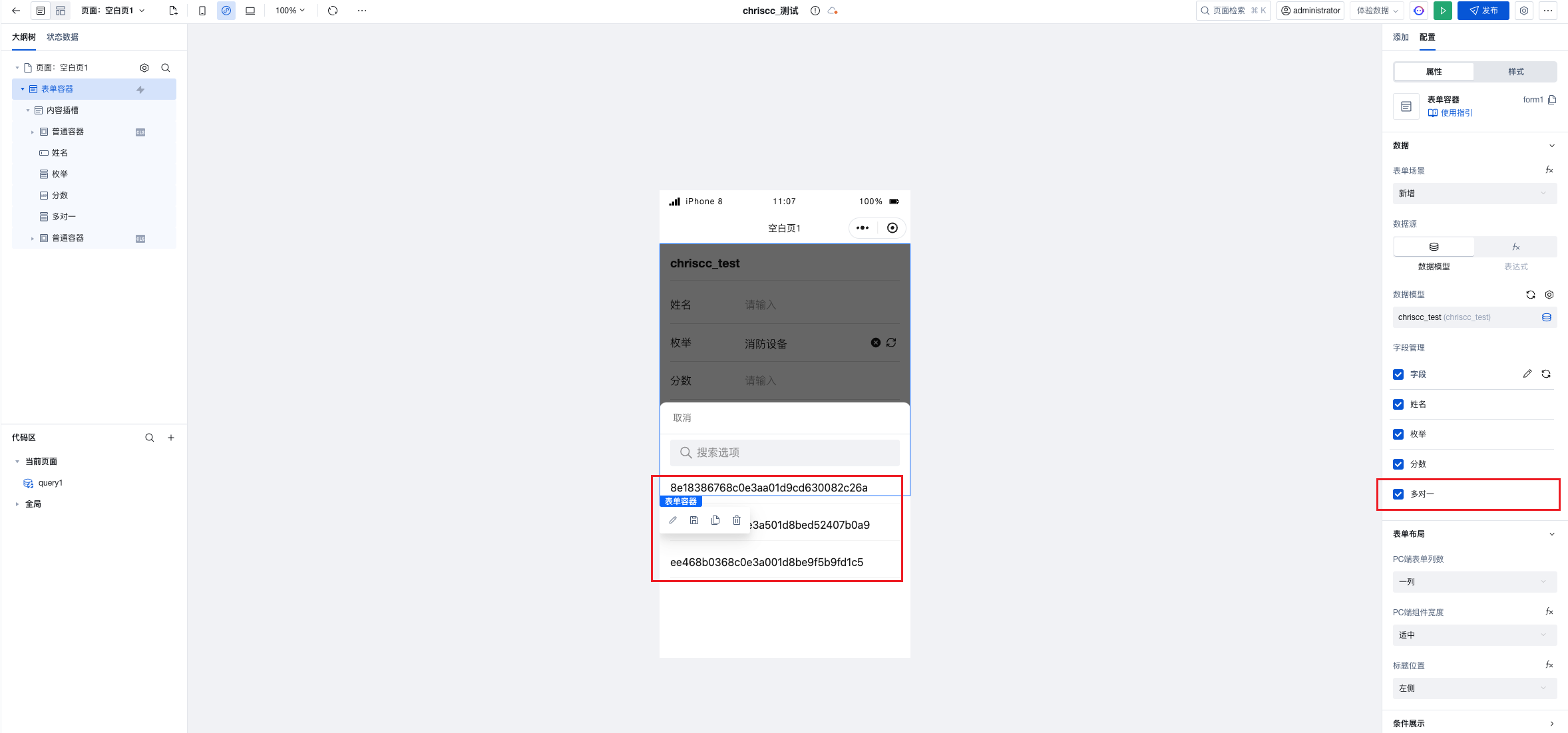
-
Dropdown Component Configuration Items:
You can set the option name to another field, such as "name", in the dropdown component configuration area.
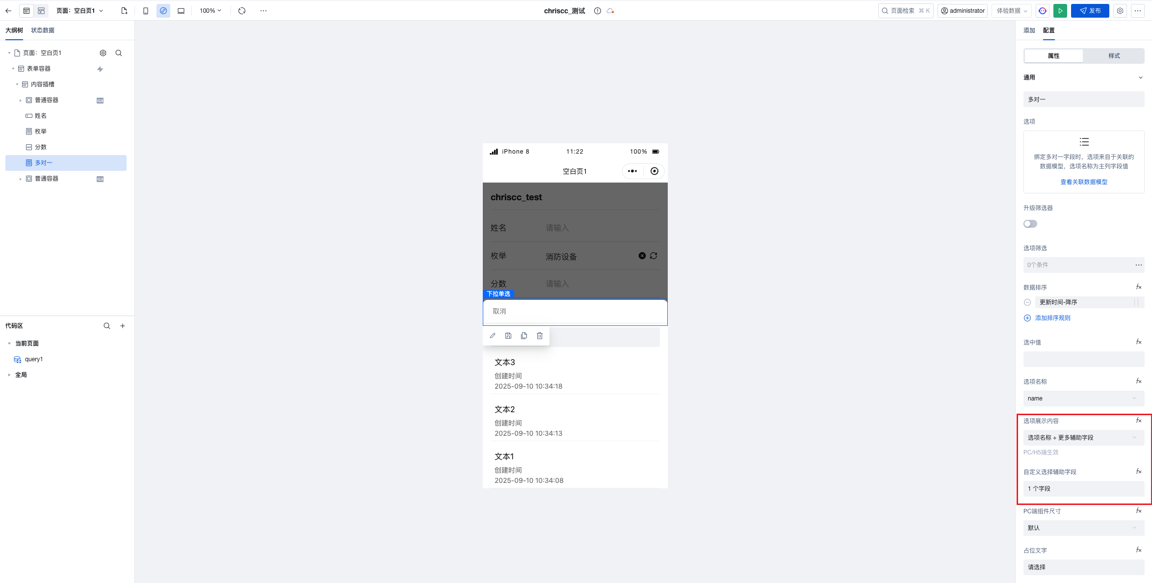
Set auxiliary field display:
Frequently Asked Questions
Question 1: Selected value displays abnormally after custom rendering
Problem Description: After using a custom rendering function, when an option is selected, the value displayed in the input box does not match the expected format.
Solution: Ensure that both the label and value properties are handled in the custom rendering function.
Question 2: Performance issues caused by excessive dropdown options data
Problem Description: When the option data volume is large, the dropdown list opens slowly or scrolls with lag.
Solution:
- Implement pagination loading: Integrate with the search feature to achieve on-demand data loading.
- Use a tree selector: For data with hierarchical relationships, consider using a tree selector component.
Summary
By customizing the display fields of dropdown components, we can achieve a more flexible and user-friendly interface. Depending on business requirements, custom rendering functions can be implemented. In complex scenarios, techniques such as event handling and conditional rendering can be combined to create a powerful dropdown selection experience.
We hope this article helps you better utilize dropdown components in the WeDa low-code platform to create application interfaces that meet your business requirements.