Layout Navigation
WdMenuLayout
Applicable Scenarios
Commonly used in application layout design to achieve navigation + layout effects.
Basic Capabilities Description
- In the layout type properties, you can select "top navigation", "left navigation", "T-shaped navigation", "navigation bar", and "Tab bar navigation". Each layout is adaptive on mobile devices.
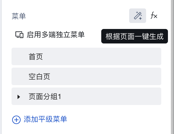
- The menu properties support configuring multi-end menu data, allowing flexible customization of menu display content and navigation logic. Supports up to three-level menus. Initial menu items can be "generated with one click based on the page".
- Dynamic menu implementation. For specific operations, refer to How to Configure a Dynamic Navigation Menu
Property Introduction
Properties
External properties received by the component
Property Name | Property Identifier | Type | Description |
|---|
| layout template | template | string | Example: "horizontal" |
| menu | menu | object | menu Example: [] |
| Side menu unfold | defaultOpened | boolean | Left menu on PC and sidebar menu on mobile terminal expand by default Example: true |
| Click public collapse menu | outerClickClosable | boolean | Click public collapse menu on mobile terminal Example: true |
| Selected menu key | selectedMenuKey | string | Example: "" |
Events
Events exposed by the component. You can listen to component events to trigger external actions
Event Name | Event Code | Event Output Parameters event.detail | Applicable Scenarios | Description |
|---|
| Click menu item | menuClick | object
| Compatible with all platforms | User click menu option, unavailable for Tab layout, top navigation bar layout |
Properties API
NoneMethod API
Through the Method API, you can programmatically trigger internal methods of components, such as submitting forms, displaying popups, etc. You can call component methods using $w.componentId.methodName, such as $w.form1.submit()
Method Name | Method Identifier | Parameters | Method Description |
|---|
| Set selected menu item | setSelectedInfo | object 选中项信息
| Set selected menu item |
Style API
Through the Style API, you can override the styles of internal elements in components to achieve customization. For example, in the low-code editor, you can write styles for all button components using #wd-page-root .wd-btn, and control individual component styles with :scope. For detailed instructions, please refer toStyle API
Name | Class Name | Description and Examples |
|---|
| root element | .wd-menulayout | component root element |
| PC-side text root element | .wd-pc-menulayout | Write styles for components on the PC side |
| H5 text root element | .wd-h5-menulayout | Write styles for components on the H5 side |
| WeChat Mini Program root element | .wd-mp-menulayout | Write style for mini program component |
| Layout navigation header | .wd-menulayout-header | Write styles for the header of layout navigation |
| Layout navigation brand slot | .wd-menulayout-header__logo-wrap | Write styles for the brand slot in layout navigation |
| Layout navigation body | .wd-menulayout-body | Write styles for the main body of layout navigation |
| Layout navigation left-side content | .wd-menulayout-body__left | The menu body for the left-side layout navigation can be styled |
| Layout navigation bottom content | .wd-menulayout-body__footer | Write styles for the bottom of layout navigation |
| Layout navigation page content | .wd-menulayout-body__content | The page content for layout navigation can be styled |
| Tab bar layout navigation root element | .wd-menulayout--tab | Write styles for the root element of Tab layout navigation |