Top Tabs
WdTopTab
1. Applicable Scenarios
Provides a top tab layout that supports switching between multiple tab options.
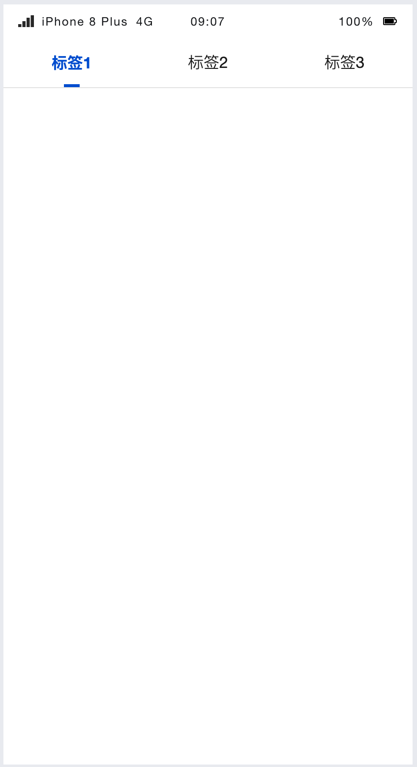
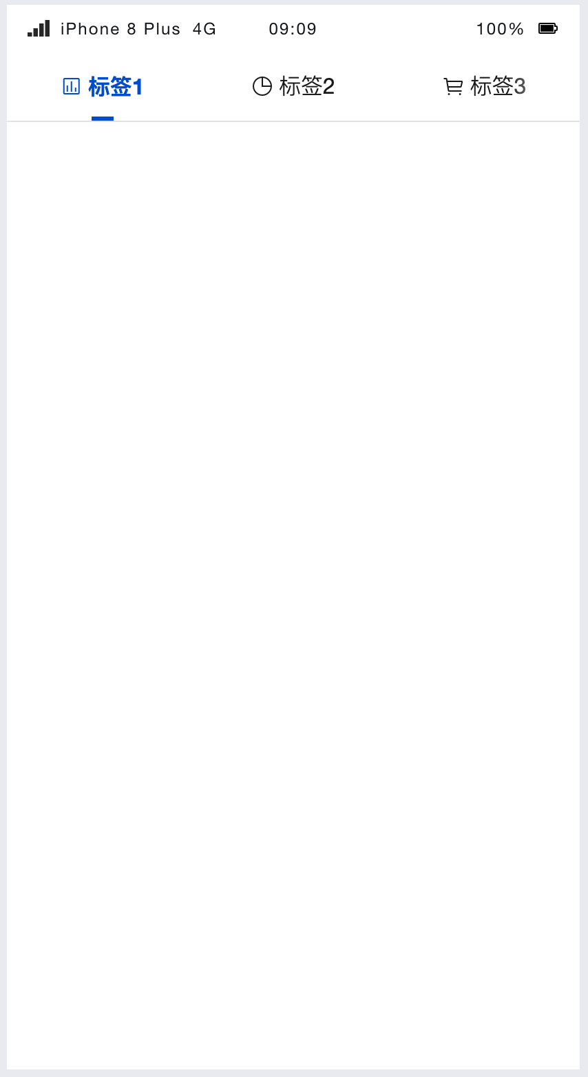
Top Tabs with Icons, Leading Icon:
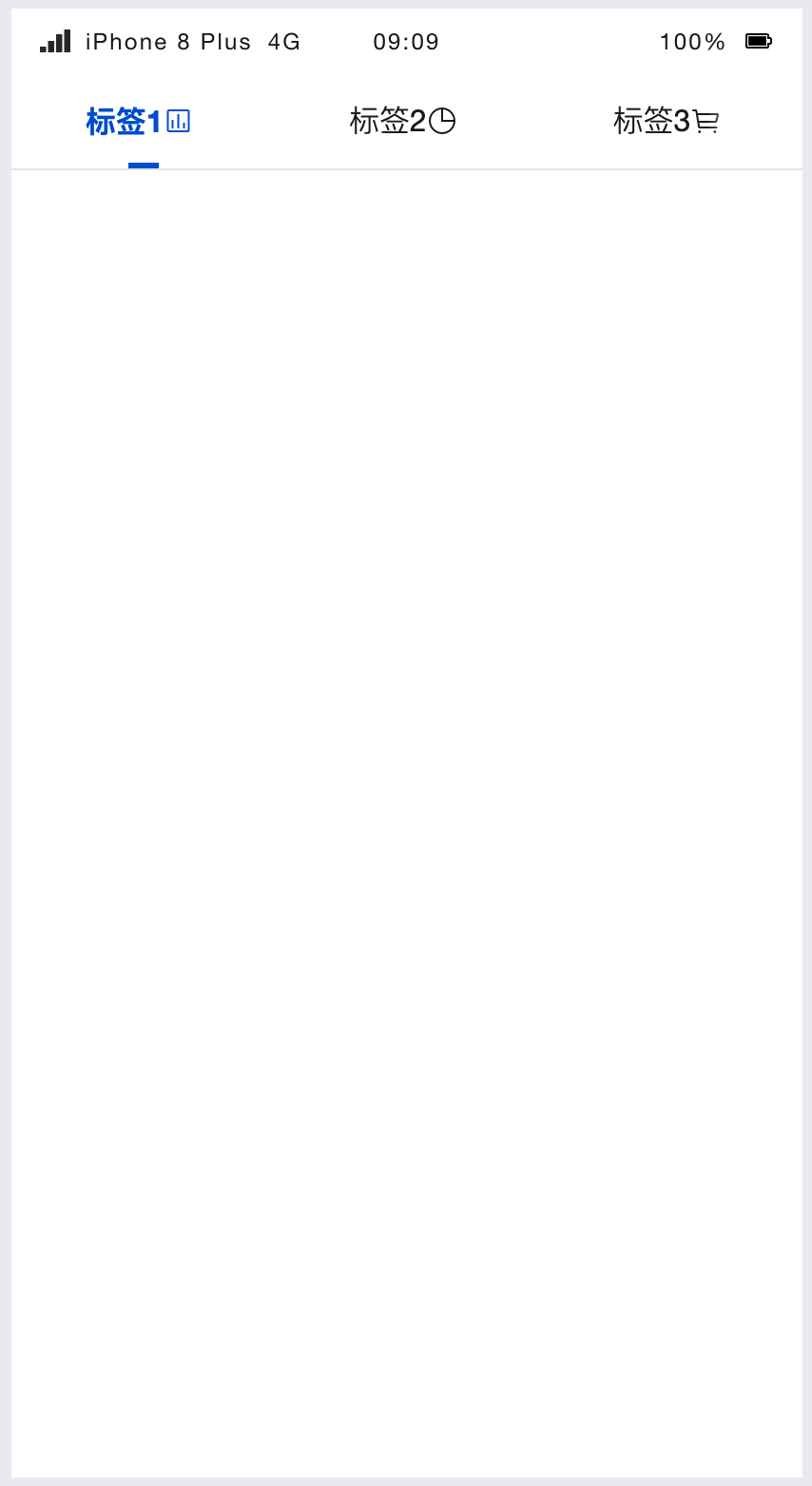
Top Tabs with Icons, Trailing Icon:
2. Basic Capabilities Description
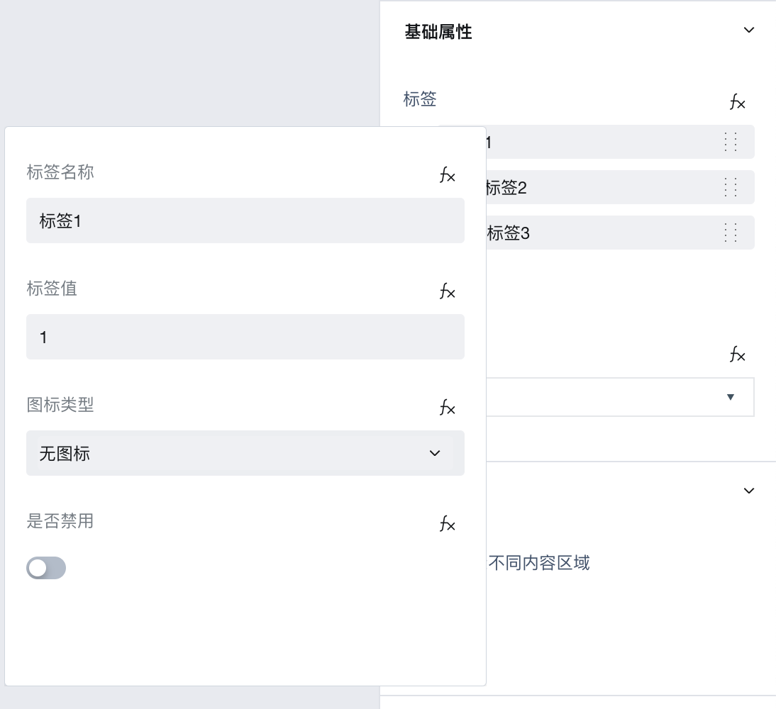
2.1 Configure Tags List
Configure the display name and label value directly via the [label] property. Note: The label value must be unique.
If you need to configure dynamic tags, refer to the configuration dynamic tags list.
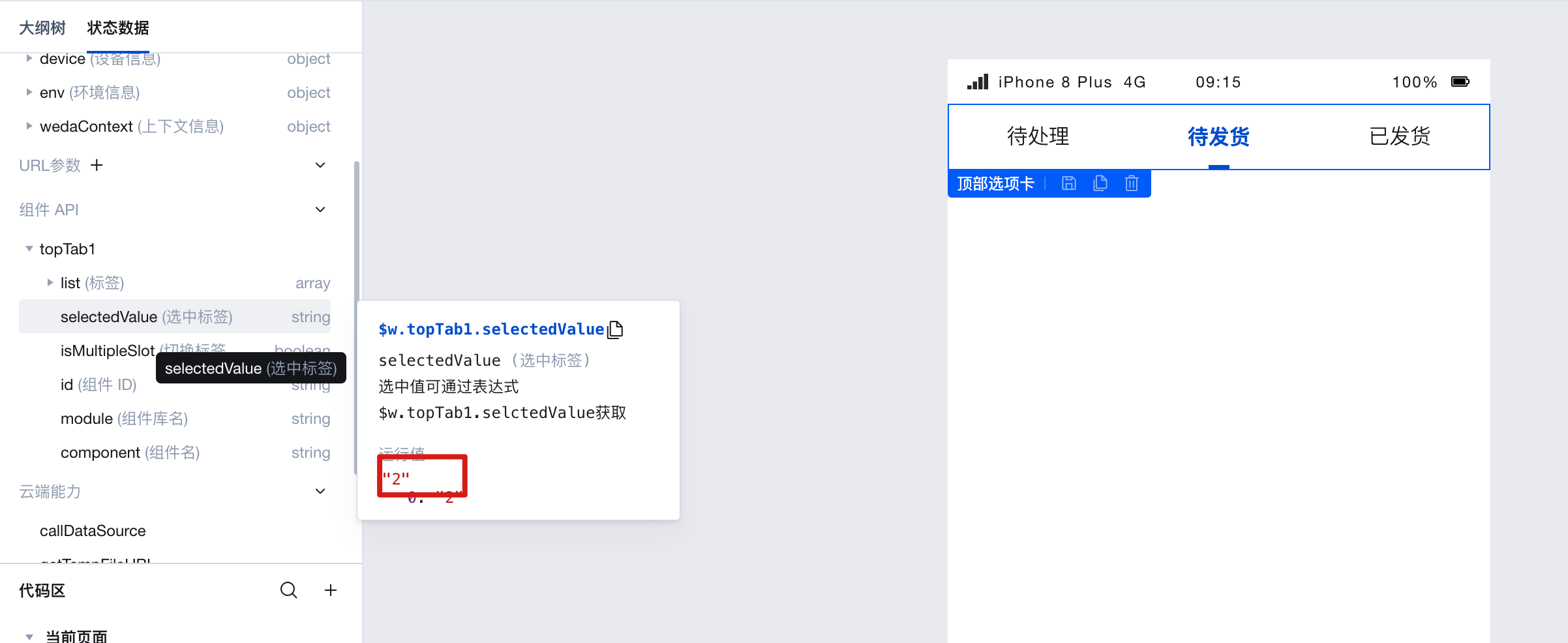
2.2 Obtain Selected Label Value
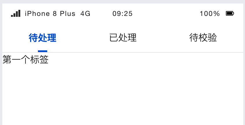
The selected label value can be obtained via $w.topTab1.selectedValue, where topTab1 is the component ID. Refer to the image below to view the current selected value:
Example: Dynamically filter different data in the display list when switching tab labels.
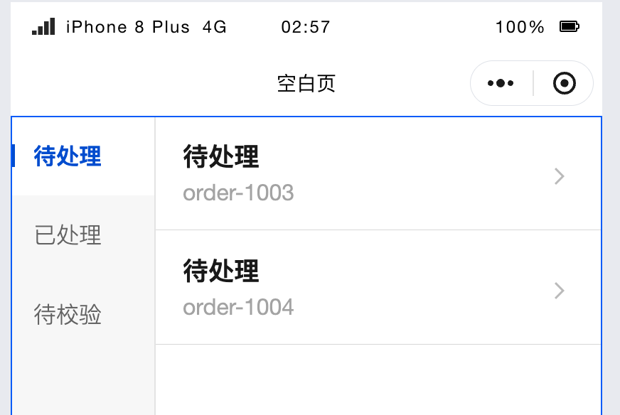
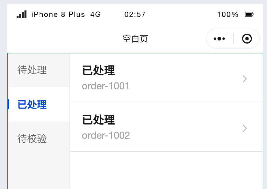
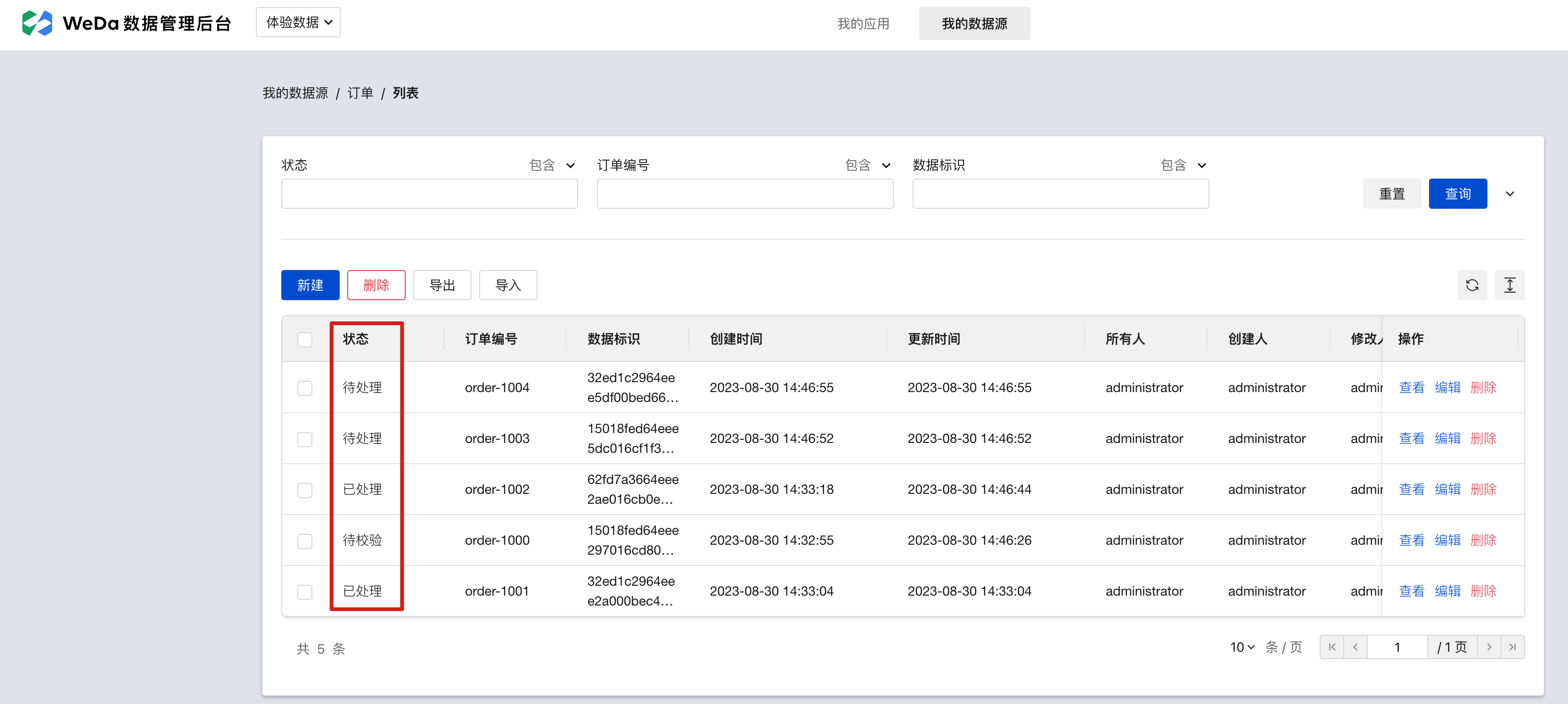
As shown in the figure below, we want to filter and display the following 'Order' data table separately by 'Status'. The expected results are as follows:
- Pending
- Processed
Let's demonstrate how to achieve the above effect.
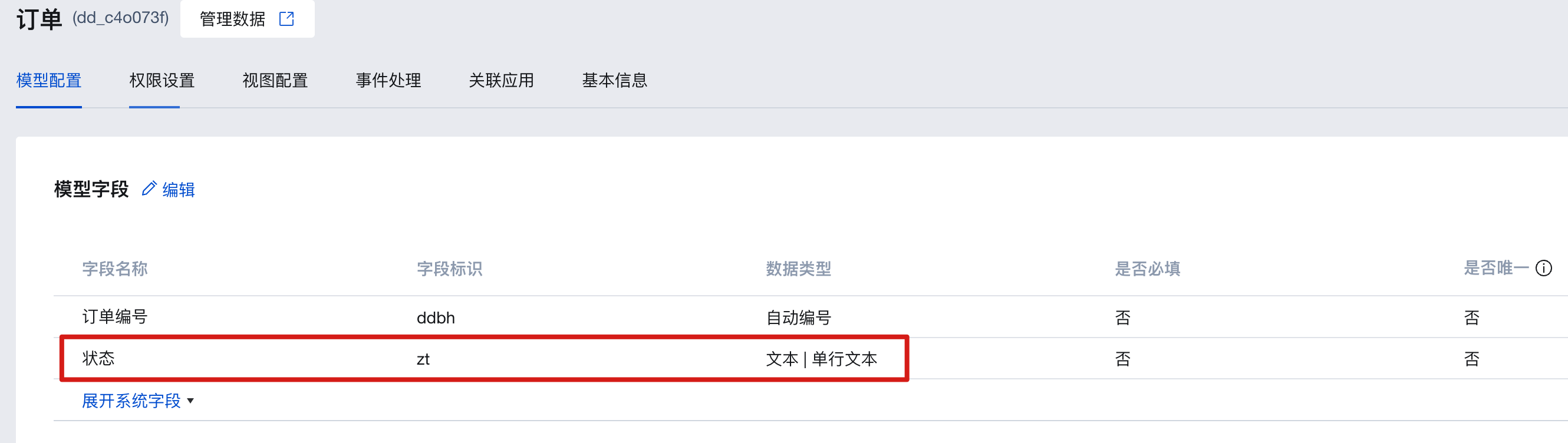
- First, create a new data model and add test data. As shown in the figure below:
-
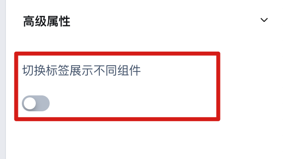
Select the side tab component and disable the "Switch tabs to display different components" property.
-
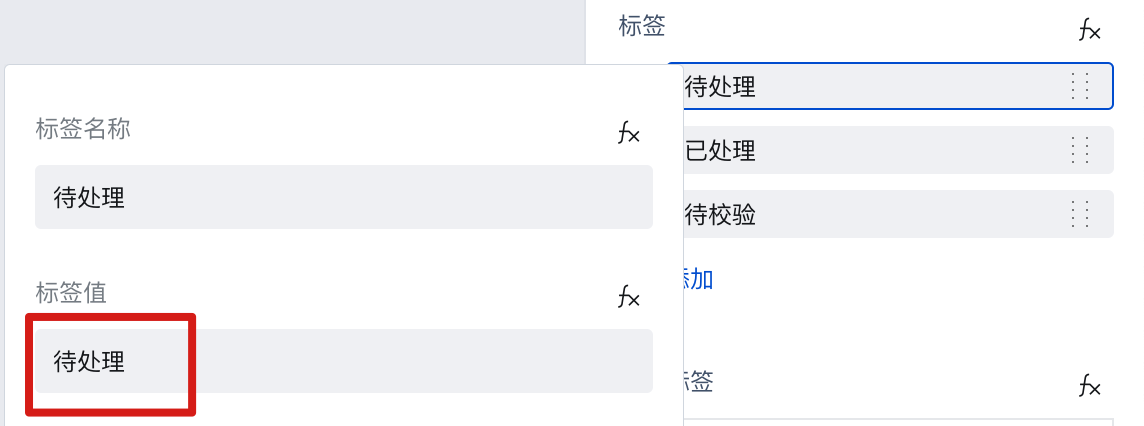
Set the tag list in the "Tag List" property. Note: Tag values will be used as query input parameters and must exactly match the status values in the data source.
-
Place a data list below the component and bind it to the required data source.
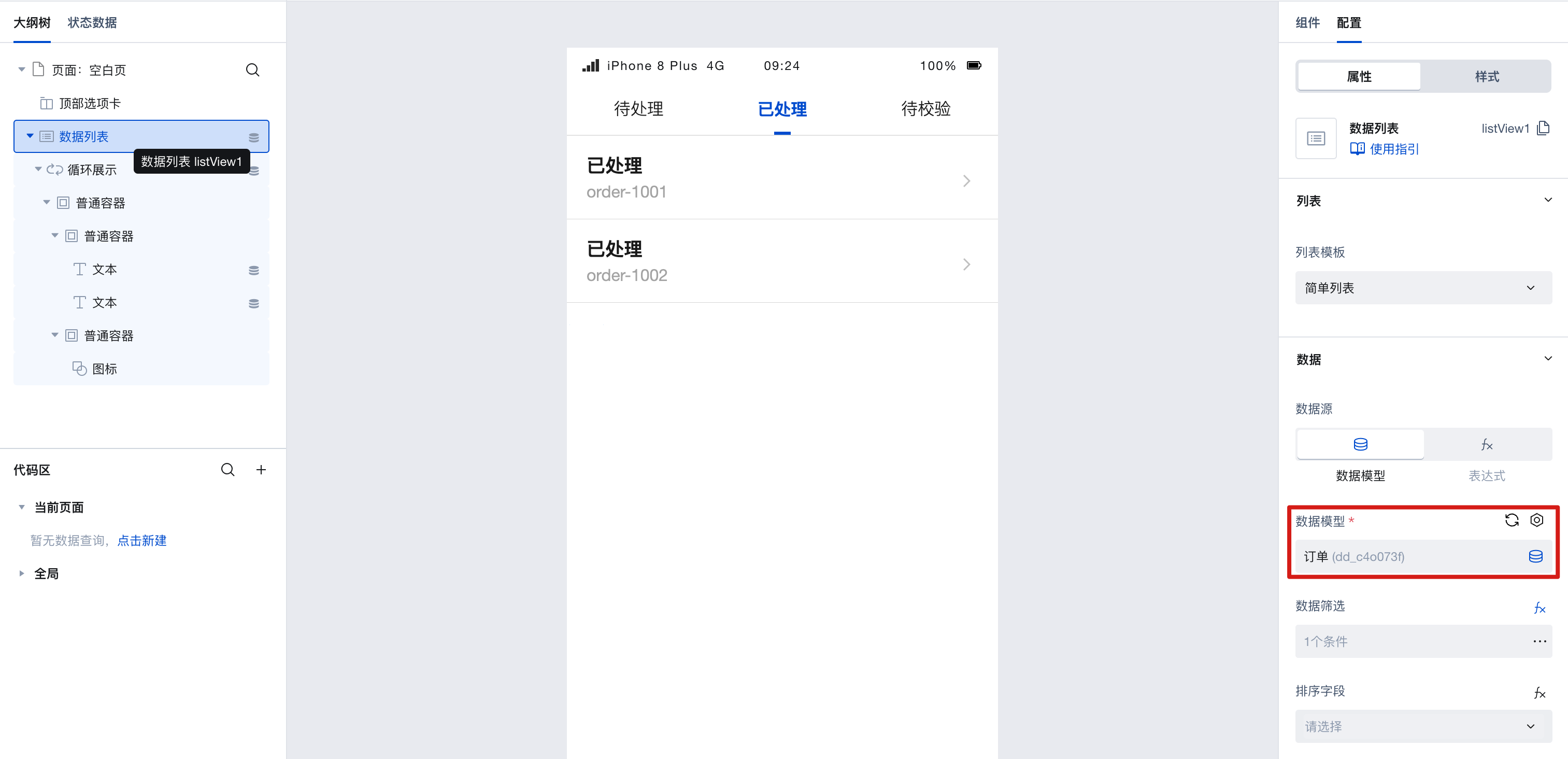
-
Set it as the filter condition for the data list, and obtain the currently selected label value via ``$w.topTab1.selectedValue`.
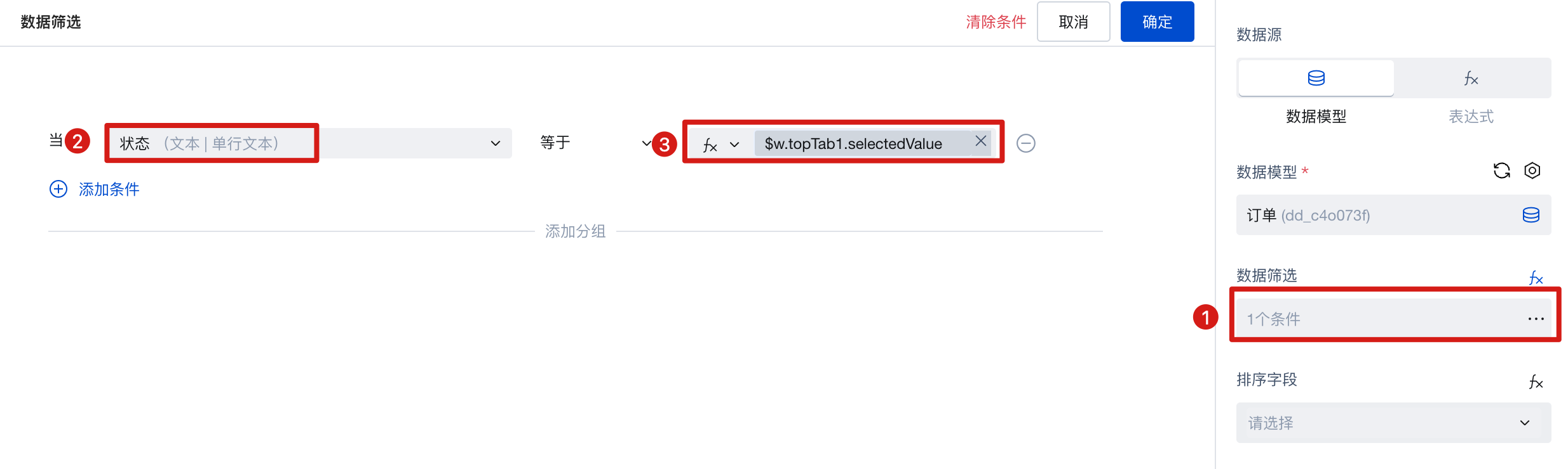
When switching tabs, the corresponding "label value" will be used as a query input parameter to achieve dynamic data filtering.
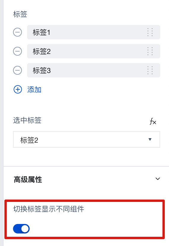
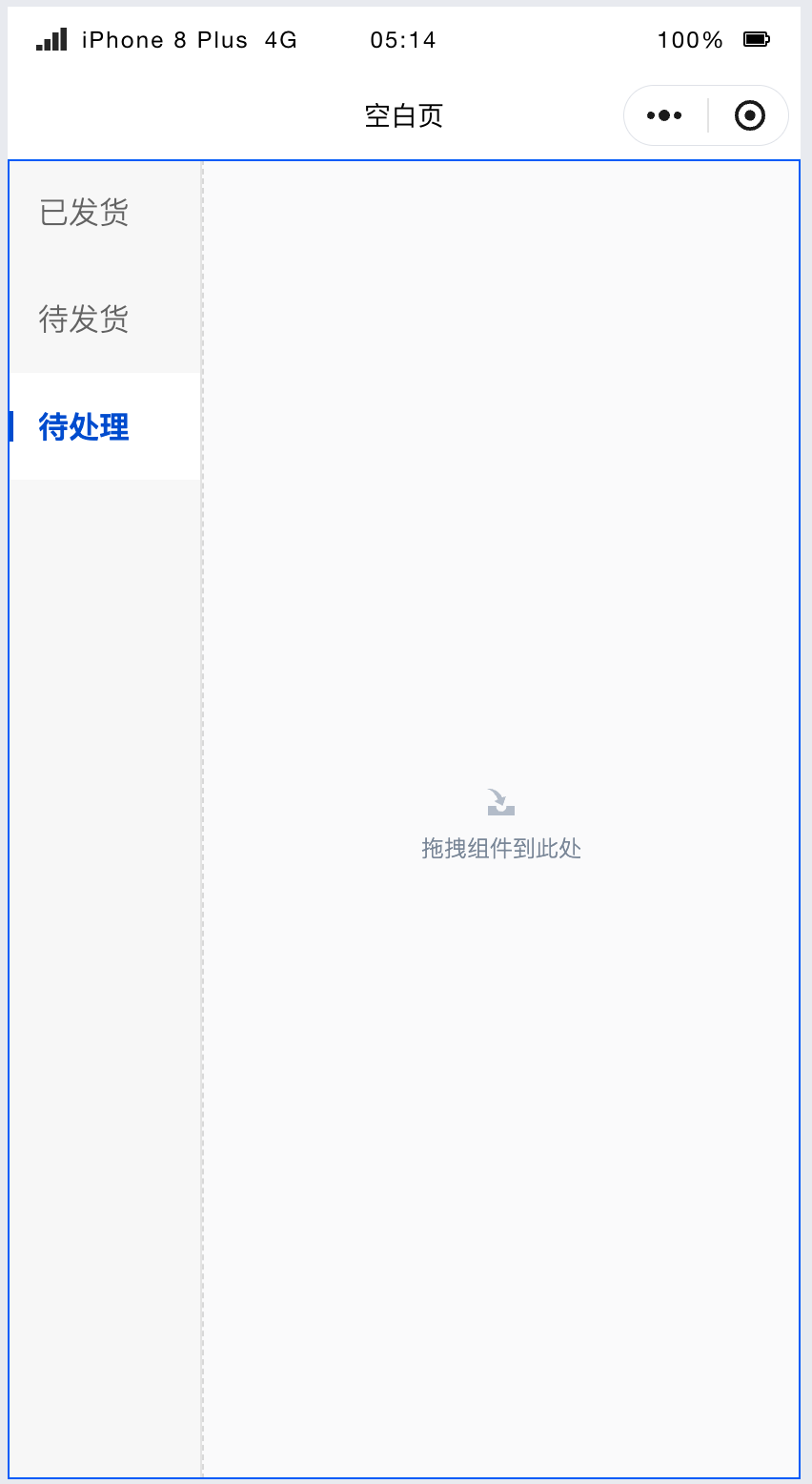
2.3 Implement the [Side Navigation] effect and enable the "Switch tabs to display different components" property.
How to implement the [side navigation effect] by switching tabs to display different components within a single page. Take the following text as an example:
- Enable the [Switch tabs to display different components] property, as shown below:
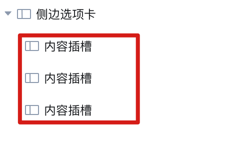
- After enabling, several content slots will appear in the outline tree, each corresponding to different tabs, as shown below:
- Add different components to the content slots as needed. For example, add a text component and an image component respectively, as shown below:
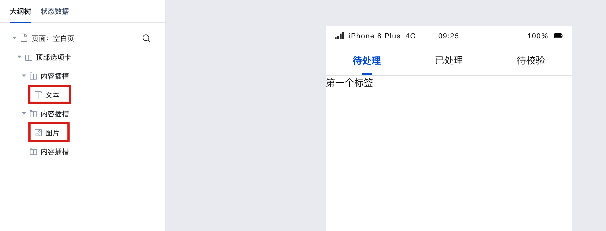
As can be seen, when switching tabs, different tabs display different component contents.
- Tab 1
- Tab 2
Similarly, you can place more components into the content slots of other tabs.
2.4 Configure Dynamic Tags List
When the tab items are dynamic data obtained from the database, you need to bind dynamic expressions, as shown below.
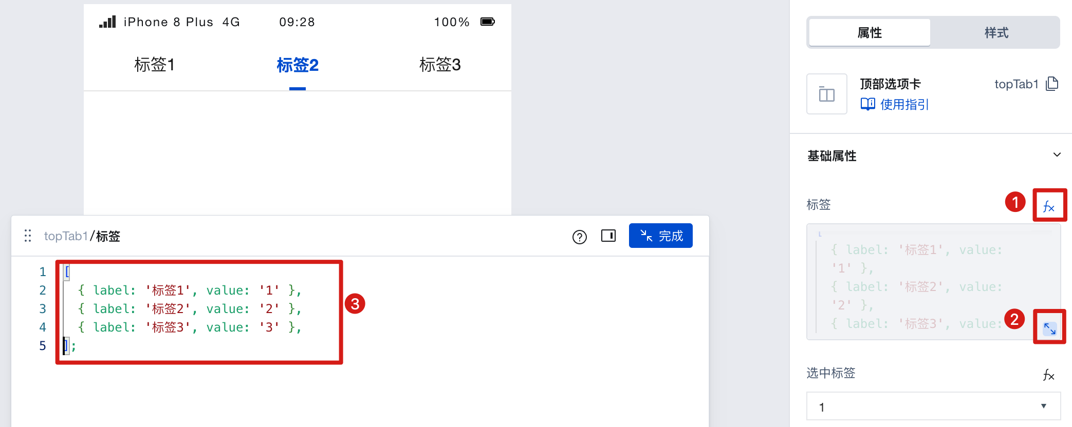
At this point, the data format must be:
[
  { label: 'Tab 1', value: '1' },
  { label: 'Tab 2', value: '2' },
  { label: 'Tab 3', value: '3' }
];
Example: Dynamically generate tab labels via data model data
The tab items of the side tabs are dynamically retrieved from the data model. The expected effect is as follows:
-
Create one data model and add a new "Status Name" field.
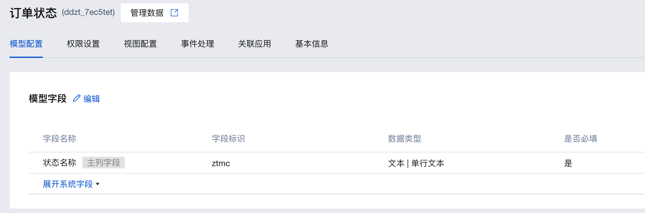
-
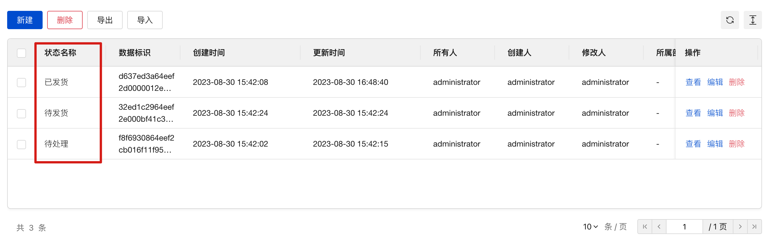
Enter several status example values in this model, such as: Pending, Ready to Ship, Shipped
-
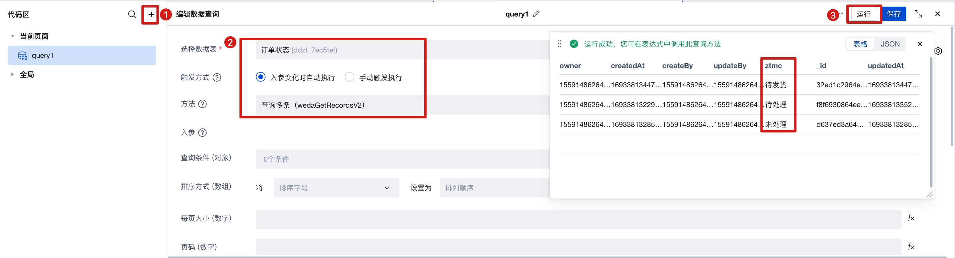
Create a query named query1, select the data model you just created as the data table. Trigger method [Automatic], method [Query Multiple], run it to view the results and save. As shown below:
-
Disable the component's "Switch tabs to display different components" property.
-
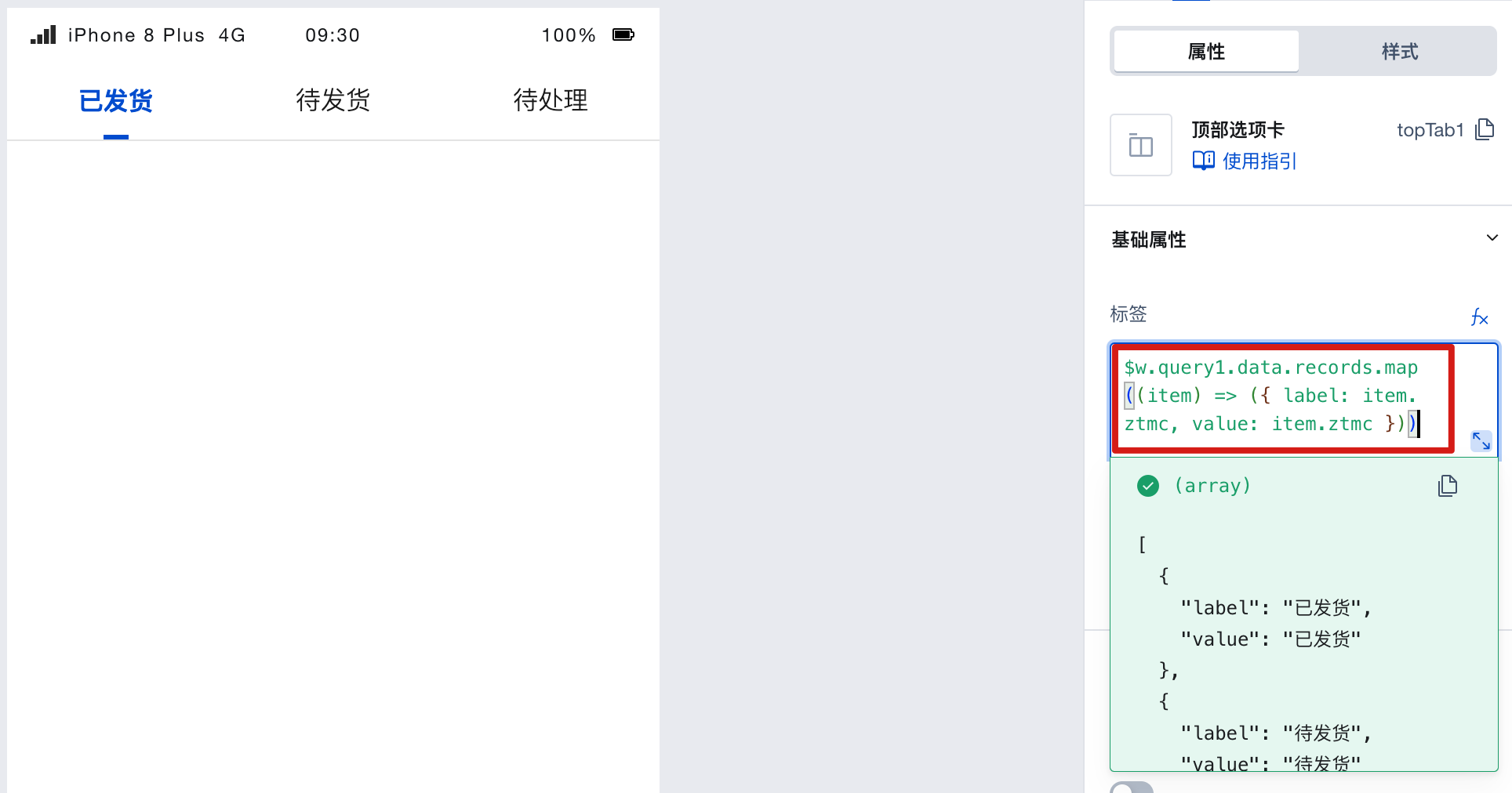
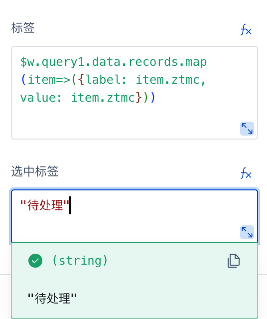
Click the binding variable to bind the query result of query1
$w.query1.data.records, and convert the format into label and value format.
$w.query1.data.records.map((item) => ({ label: item.ztmc, value: item.ztmc }));
where ztmc is the status field in the model
- Set [Default Label] as text
You will find that the tab labels display the pre-entered data from the data model.
Properties
External properties received by the component
Property Name | Property Identifier | Type | Description |
|---|
| Tag. | list | array | Set the title of each tag in the top navigation panel Example: [ { "label": "标签1", "value": "1", "iconType": "none", "innerIcon": "", "outerImage": "", "iconPosition": "prefix", "isDisabled": false, "slotKey": "1" }, { "label": "标签2", "value": "2", "iconType": "none", "innerIcon": "", "outerImage": "", "iconPosition": "prefix", "isDisabled": false, "slotKey": "2" }, { "label": "标签3", "value": "3", "iconType": "none", "innerIcon": "", "outerImage": "", "iconPosition": "prefix", "isDisabled": false, "slotKey": "3" } ] |
| Selected tag | selectedValue | string | The selected value can be obtained using the expression $w.topTab1.selectedValue Default value: "1" |
| Switch tags to show different components | isMultipleSlot | boolean | When enabled, each tag can show different content areas Example: false |
Events
Events exposed by the component. You can listen to component events to trigger external actions
Event Name | Event Code | Event Output Parameters event.detail | Applicable Scenarios | Description |
|---|
| click | tap | Compatible with all platforms | - | |
| Tab switchover | change | object
| Compatible with all platforms | - |
Properties API
Through the Property API, you can access the internal state and property values of components. You can access internal values using$w.componentId.propertyName, such as $w.input1.value. For details, please refer to Property API
Read-only Property Name | Property Identifier | Type | Description |
|---|
| Tag. | list | array | Set the title of each tag in the top navigation panel |
| Selected tag | selectedValue | string | The selected value can be obtained using the expression $w.topTab1.selectedValue |
| Switch tags to show different components | isMultipleSlot | boolean | When enabled, each tag can show different content areas |
Method API
Through the Method API, you can programmatically trigger internal methods of components, such as submitting forms, displaying popups, etc. You can call component methods using $w.componentId.methodName, such as $w.form1.submit()
Method Name | Method Identifier | Parameters | Method Description |
|---|
| Set selected tags | selectTab | object
| Set selected tags |
Style API
Through the Style API, you can override the styles of internal elements in components to achieve customization. For example, in the low-code editor, you can write styles for all button components using #wd-page-root .wd-btn, and control individual component styles with :scope. For detailed instructions, please refer toStyle API
Name | Class Name | Description and Examples |
|---|
| root element | .wd-top-tab-root | top tab root element |
| PC-side top tab root element | .wd-pc-top-tab-root | Write styles for the top tab on PC |
| Top tab root element on H5 | .wd-h5-top-tab-root | Write style for H5 top tab |
| WeChat Mini Program top tab root element | .wd-mp-top-tab-root | Can write style for top tab in mini program |
| Top options area | .wd-top-tab-root .wd-tabs__header | Write styles for the top tab option area |
| Tag container | .wd-top-tab-root .wd-tabs__item | Write styles for the text tag container in the top tab |
| Tag container in selected status | .wd-top-tab-root .wd-tabs__item.is-selected | Write styles for the selected tag container in the top tab |
| Text label. | .wd-top-tab-root .wd-tabs__item-text | Can write styles for the top tab text tag |
| Option icon (image) | .wd-top-tab-root .wd-tabs__item .wd-image | Set styles for option text tags |
| Option icon | .wd-top-tab-root .wd-tabs__item .wd-icon | Set styles for option text tags |
| content area | .wd-top-tab-root .wd-tabs__body | You can write styles for the top tab content area, such as setting the top tab content area height to fill the webpage. |
| Overly long tab auto-sliding mask | .wd-tabs-h5-root .wd-tabs__header-item-mask | Set swipe background color for mobile terminal tabs. Note: Slide if tab content is overly long. |