Form Container
WdForm
Practice Guide
-
Practice Guide for Binding Expressions (query) in Form/Table Components
-
Submit Corresponding Form Data When Form Components Are Hidden
-
Implementation Approach for Paginated or Step-by-Step Form Submission
-
Modify Field Default Values in Form Container Update Scenarios
Applicable Scenarios
Quickly implement scenarios for submitting and displaying form data. After binding the data source, components such as single-line input, dropdown select, submit button, etc., can be automatically generated based on field types.
Basic Capabilities Description
- Perform addition, updating, and viewing of form data via form containers
- Supports binding data sources of data models or APIs type to achieve data interaction between frontend and backend.
- Through field properties, you can control the sorting, visibility of internal form components, and switch the component type for field mapping.
- For more practical instructions, refer to the Practical Guide for Common Form Scenarios
Extended Scenarios Description
Calculate and Display User-Entered Data in Forms
Example
Below is a complex value calculation scenario.
- formArr1: is an array where the c value in each row is the sum of a and b
- formArr2: is an array where the c value in each row is the sum of a and b
- sum1: the sum of the c values in formArr1
- sum2: the sum of the c values in formArr2
Configuration Method
-
Drag the form container and nested components into place as shown in the figure, then configure them as needed.
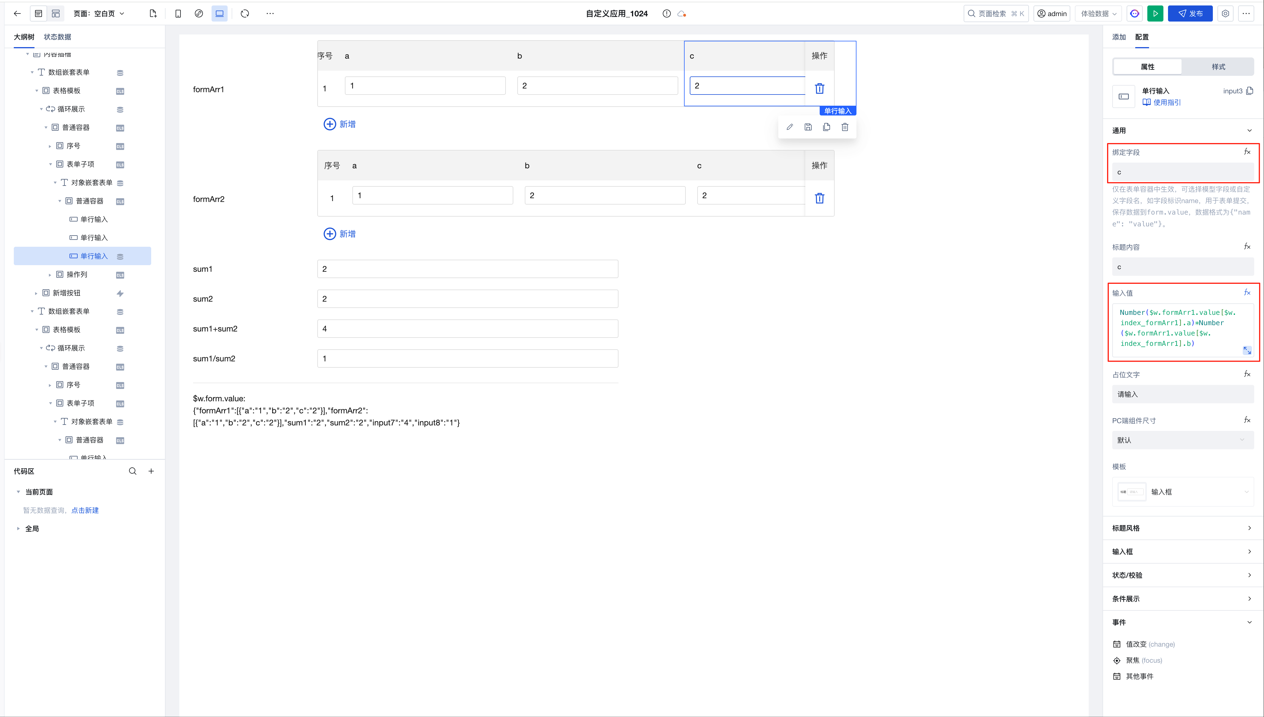
The expression for the c value being the sum of a and b in the nested component is implemented as follows:
Number($w.formArr1.value[$w.index_formArr1].a)*Number($w.formArr1.value[$w.index_formArr1].b) -
sum1 is the cumulative sum of the c values in the array formArr1
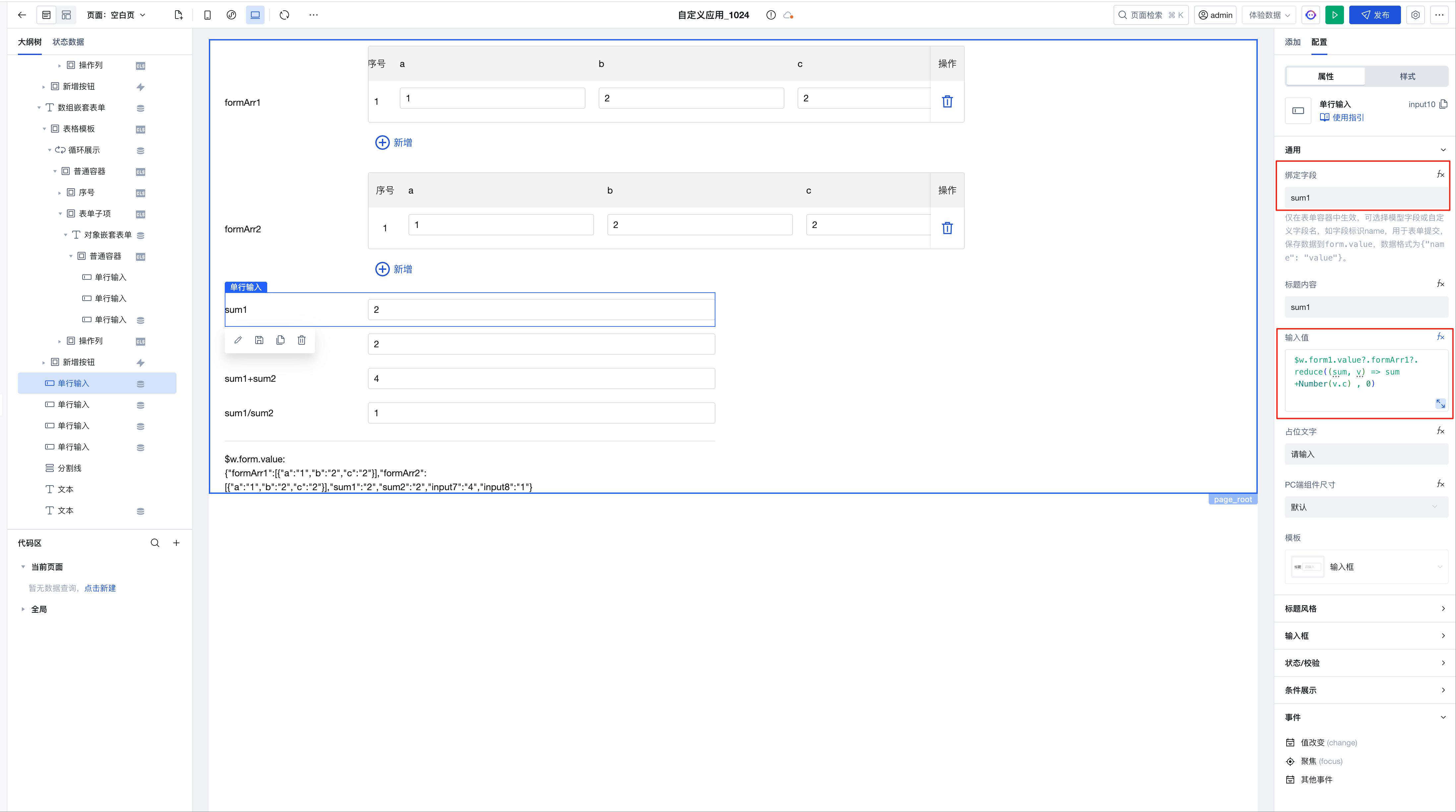
The expression is implemented as follows:
$w.form1.value?.formArr1?.reduce((sum, v) => sum +Number(v.c) , 0) -
sum1+sum2
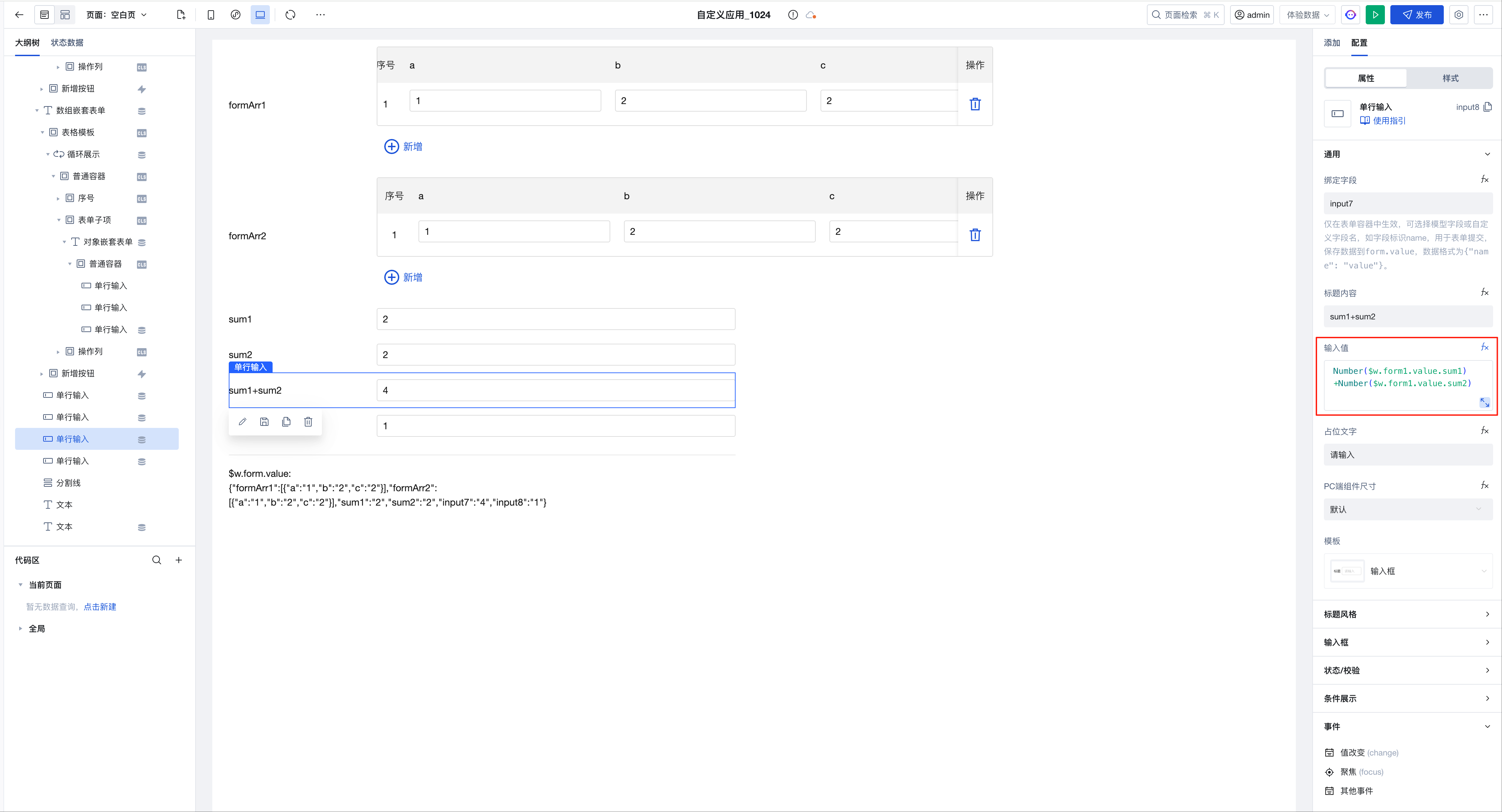
The expression is implemented as follows:
Number($w.form1.value.sum1)+Number($w.form1.value.sum2) -
sum1/sum2
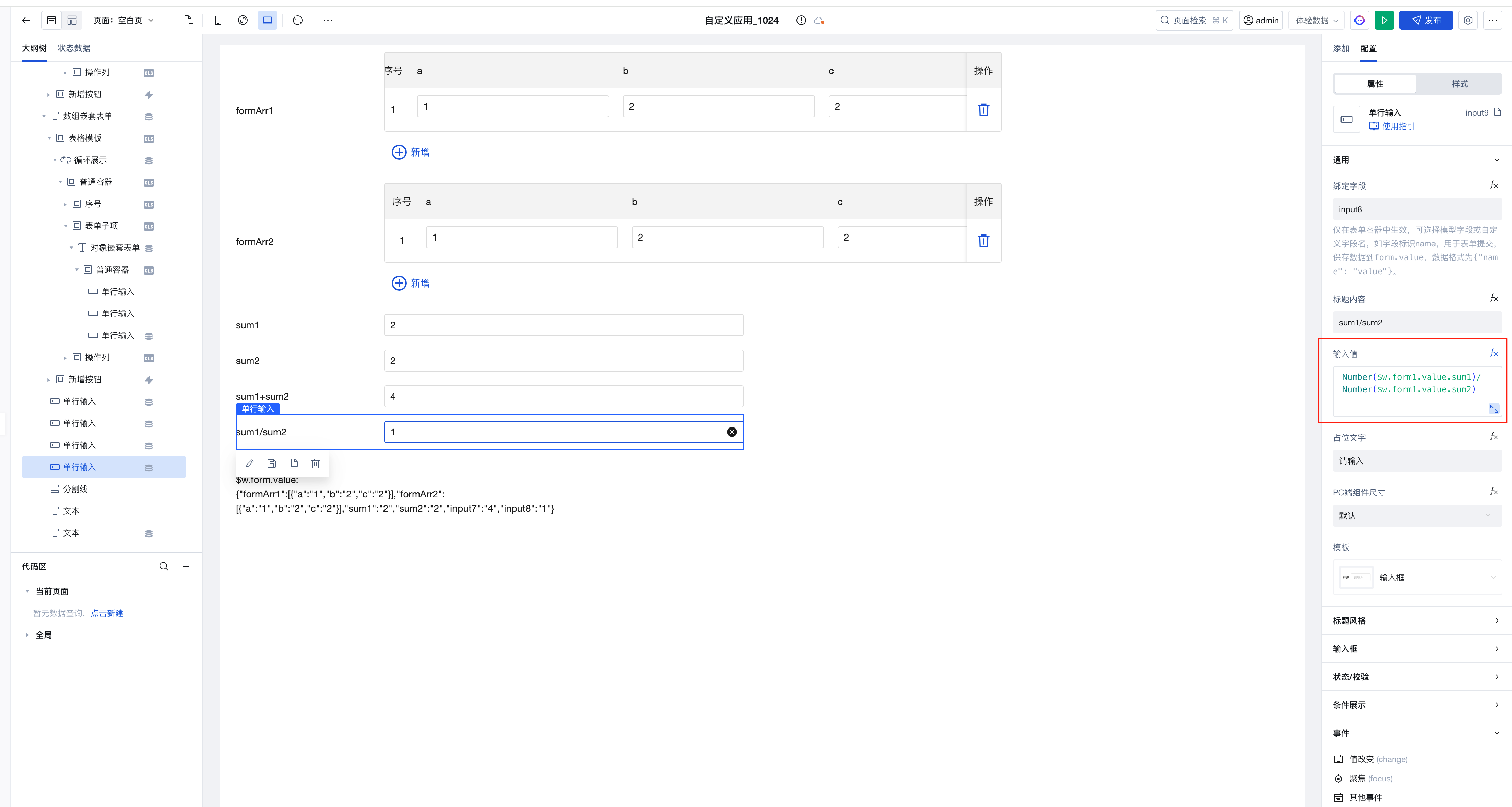
The expression is implemented as follows:
Number($w.form1.value.sum1)/Number($w.form1.value.sum2)
Use one form container component to dynamically implement data addition, update, and view scenarios.
Example
Bind a variable to the "Form Scenario" property of the form container to implement addition, update, and view scenarios by assigning different values to the variable.
Configuration Method
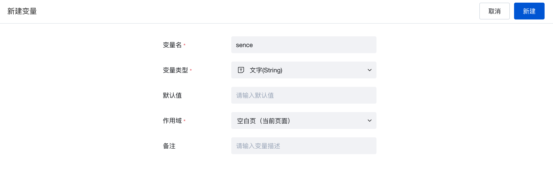
- Create a variable of type string named sence
- Bind a form container to a required data model to render and generate form components, then bind the "Form Scenario" property of the form container to this sence variable.
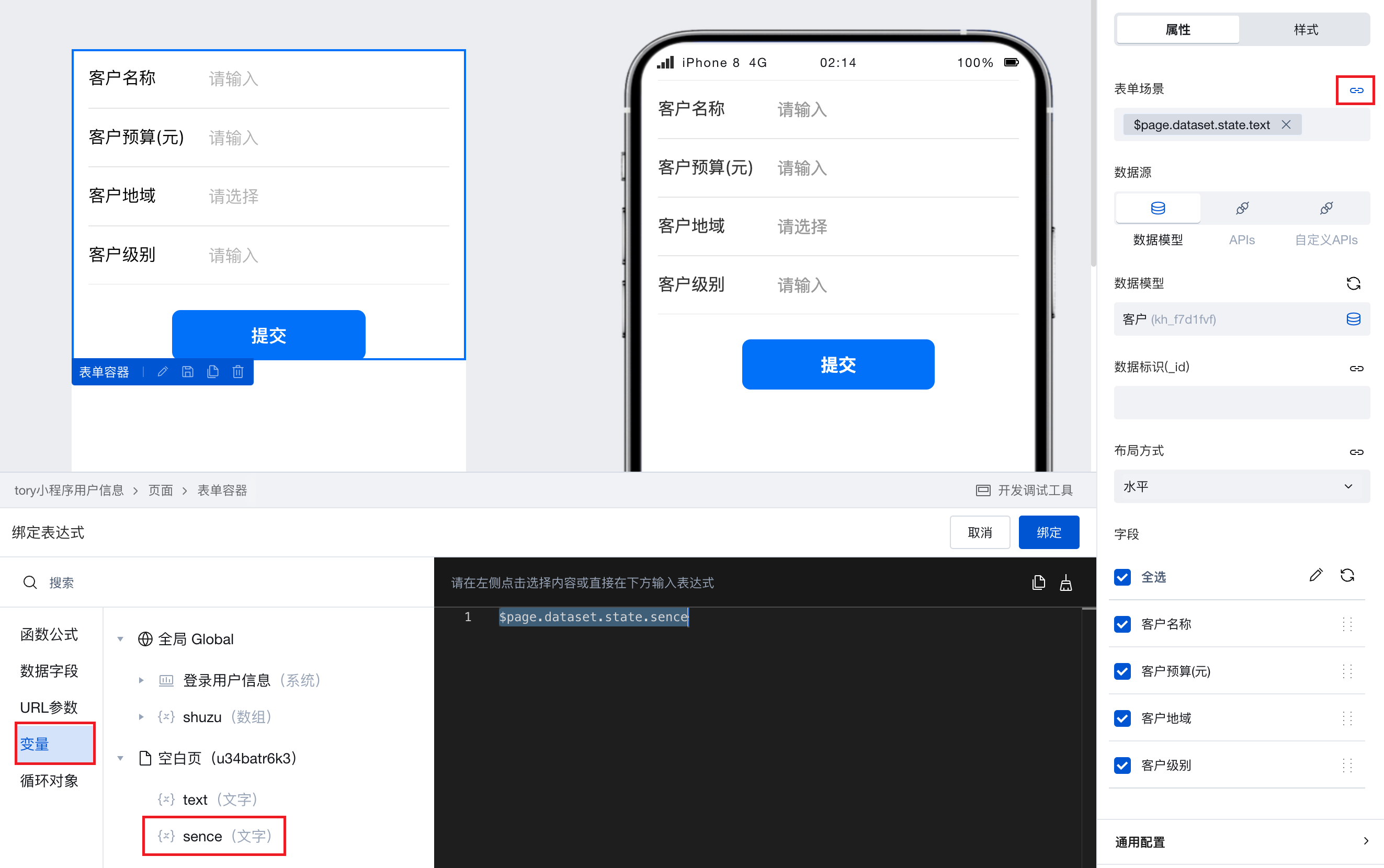
- Under different business scenarios, assign different values to the sence variable to enable the form container to serve different purposes.
- Assign the value 'create' → The form container serves as an addition scenario for submitting new data.
- Assign the value 'edit' → The form container serves as an update scenario for editing and updating existing data.
- Assign the value 'read' → The form container serves as a view scenario for users to view the display of existing data.
Binding Expression
Expressions can be static data or variables. You can use Query to connect to built-in data tables, external APIs, etc., and then select a query in the expression for binding.
Format Requirements for Method Parameters When Data Source Type is APIs (Discontinued in the Latest Version)
-
When the form scenario is "addition", configuration is required.
- New method: Requires business-required form fields to be flattened in the root node of input parameters. Example:
- New method: Requires business-required form fields to be flattened in the root node of input parameters. Example:
-
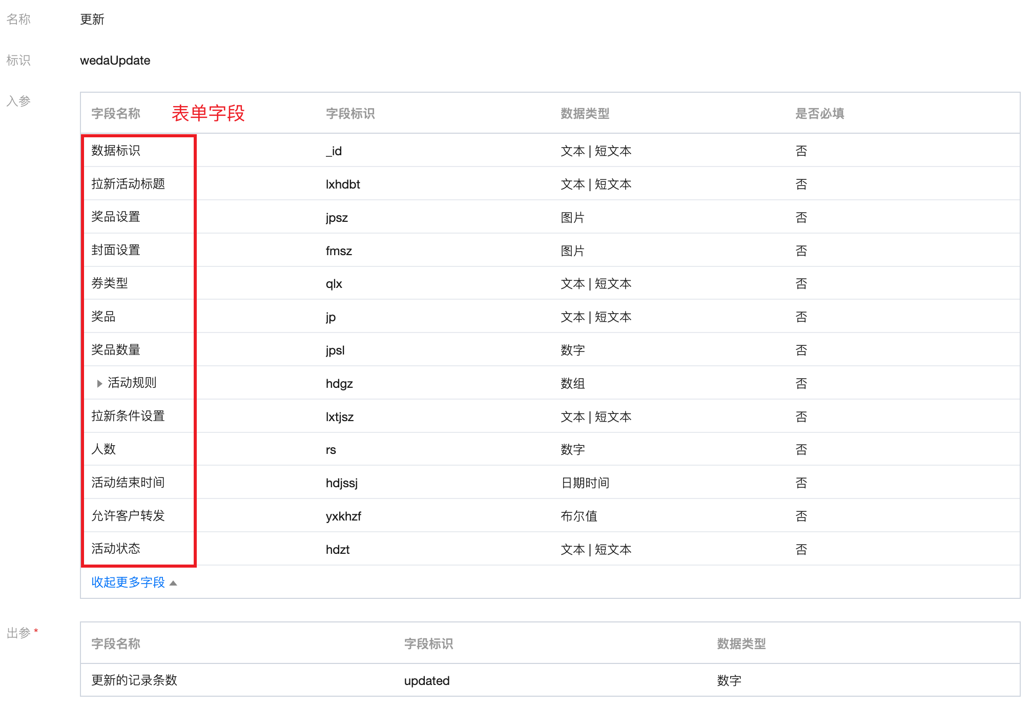
When the form scenario is "update", configuration is required.
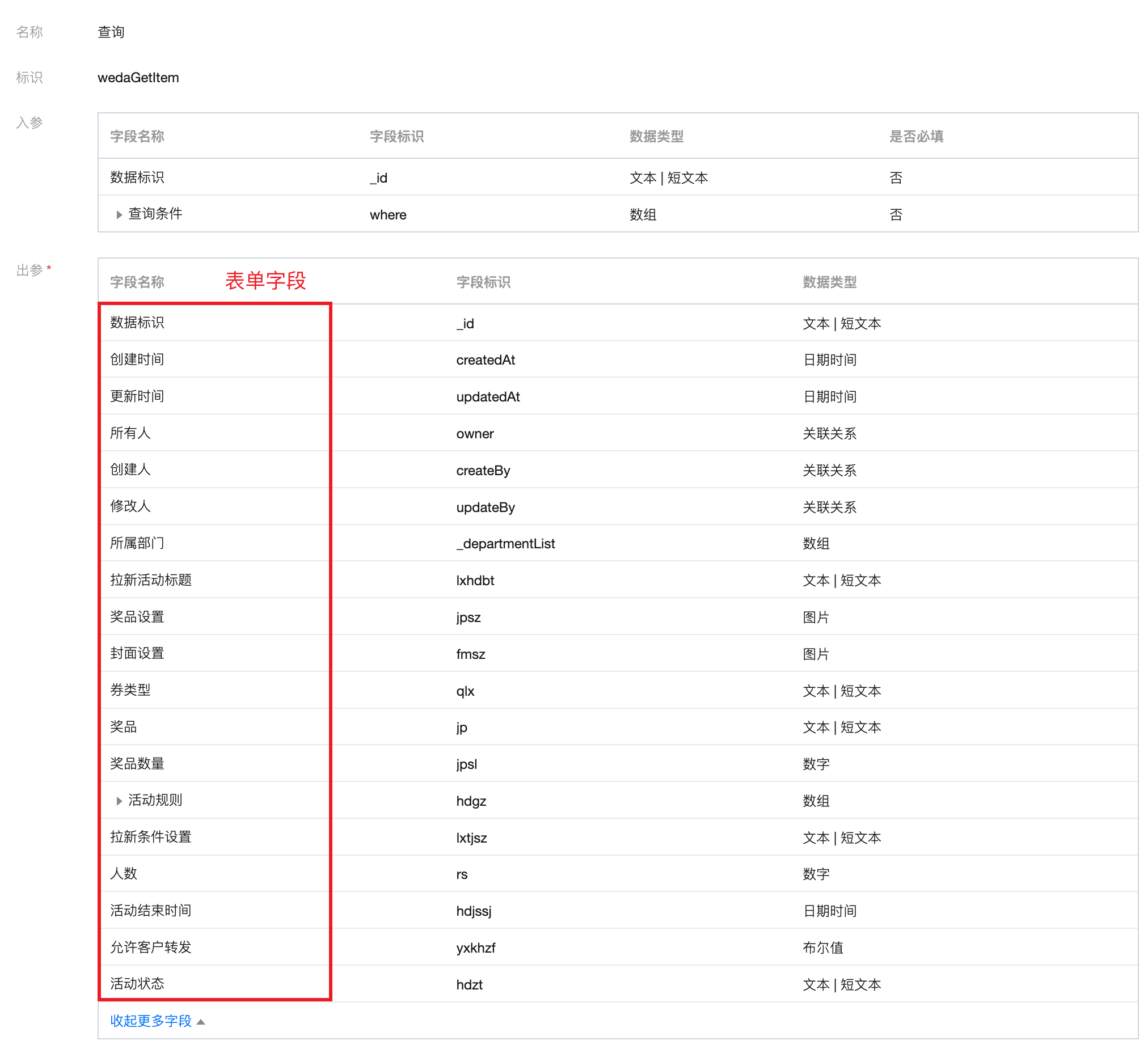
- Query method: Requires form fields to be flattened in the root node of output parameters. Example:
- Update method: Requires business-required form fields to be flattened in the root node of input parameters. Example:
- Query method: Requires form fields to be flattened in the root node of output parameters. Example:
-
When the form scenario is "view", configuration is required.
- Query method: Requires form fields to be flattened in the root node of output parameters. Example:
- Query method: Requires form fields to be flattened in the root node of output parameters. Example:
Property Introduction
External properties received by the component
Property Name | Property Identifier | Type | Description |
|---|
| Form scenario | formType | string | Default value: "create" |
| Data source | datasourceType | string | Default value: "model" |
| data model | dataSourceName | string | Example: "" |
| Field management | fields | array | |
| data identification (_id) | _id | string | Example: "" |
| Form value | value | object | Auto-fill form input data. Each key is assigned to an input with a matching form data key. |
| Query method | methodGetItem | string | Example: "" |
| Query input parameters | paramGetItem | object | Enter object literals directly, such as {status: 1} Example: {} |
| Add method | methodCreate | string | Example: "" |
| Update method | methodUpdate | string | Example: "" |
| Number of form columns on PC | colNum | string | Default value: "1" |
| PC component width | lgWidth | string | Size configuration only applicable to PC Default value: "hundred" Example: "md" |
| Title position | layout | string | Set the title and input selection region of the current form component in the container to left and right layout or up-down layout Default value: "horizontal" |
Event Introduction
Events exposed by the component. You can listen to component events to trigger external actions
Event Name | Event Code | Event Output Parameters event.detail | Applicable Scenarios | Description |
|---|
| submit | submit | Compatible with all platforms | - | |
| verified successfully | validateSuccess | object
| Compatible with all platforms | - |
| Verification failed | validateFail | object
| Compatible with all platforms | - |
| query is empty | queryEmpty | object
| Compatible with all platforms | - |
| query succeeded | querySuccess | object
| Compatible with all platforms | - |
| Query failed | queryFail | object
| Compatible with all platforms | - |
Properties API
Through the Property API, you can access the internal state and property values of components. You can access internal values using$w.componentId.propertyName, such as $w.input1.value. For details, please refer to Property API
Read-only Property Name | Property Identifier | Type | Description |
|---|
| Whether submission is disabled | isDisabledSubmit | boolean | Whether the form is disabled for submission |
| Form scenario | formType | string | |
| data model | dataSourceName | string | |
| Title position | layout | string | Set the title and input selection region of the current form component in the container to left and right layout or up-down layout |
| Error message. | errors | object | Verification error information of the submission object |
| Data source initial value | remoteValue | object | Data source initialization request initial value |
| Frontend form value | value | object | Frontend form state value |
| data source type information | dataSourceProfile | | Data source information |
| Submit input parameters for the data source method | submitParams | object | Submit parameters to the data source method, no query bind when |
| Clear verification | clearValidate | object | Clear verification |
Method API
Through the Method API, you can programmatically trigger internal methods of components, such as submitting forms, displaying popups, etc. You can call component methods using $w.componentId.methodName, such as $w.form1.submit()
Method Name | Method Identifier | Parameters | Method Description |
|---|
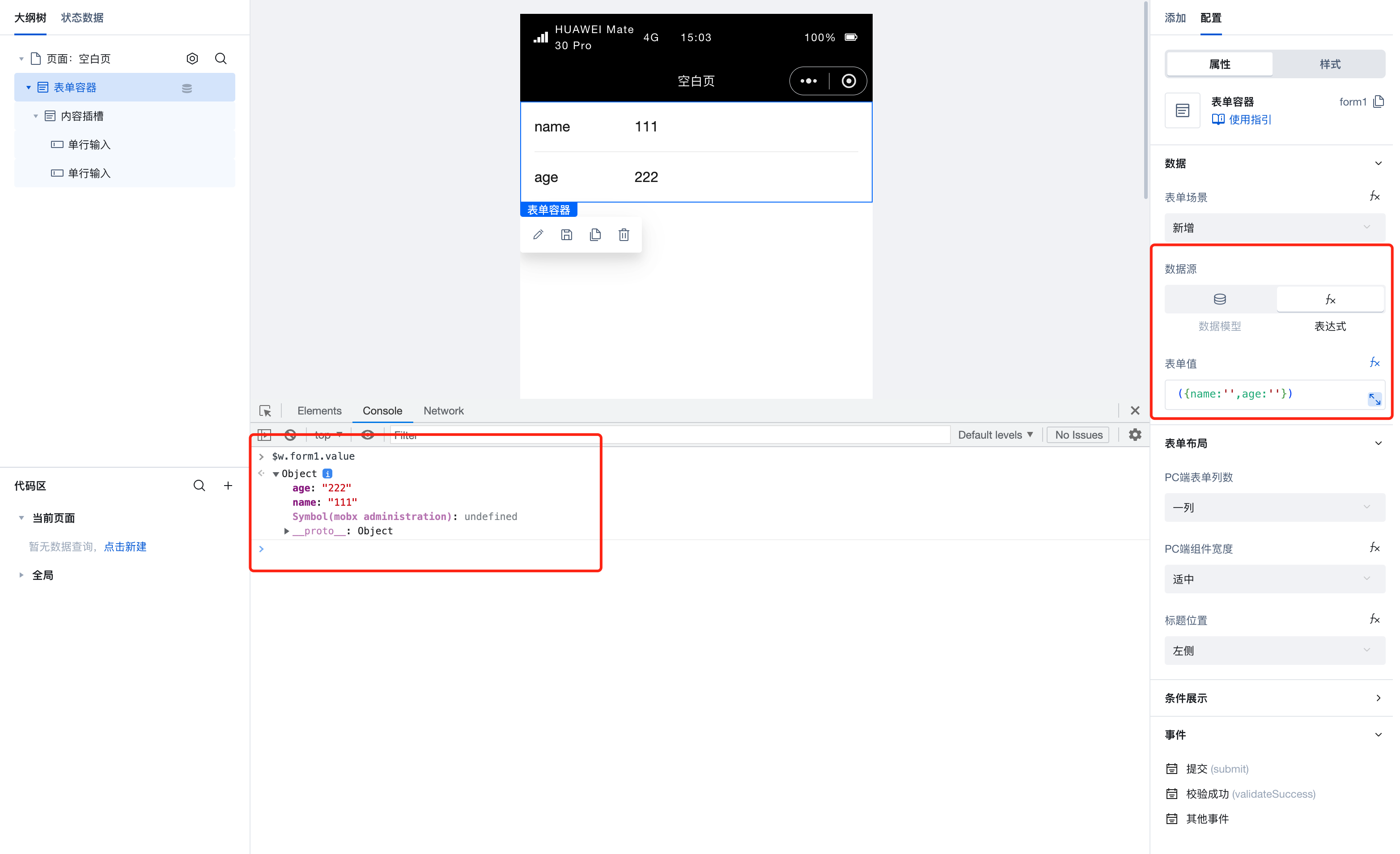
| set value | setValue | object
| 通过 $w.form1.setValue({value:{a:'111'}}) 设置组件值 |
| submit | submit | Trigger form submission via $w. | |
| Create and bind policy Query instance Reset instance access password | clearValue | object
| Clear the form with $w. |
| Clear verification | clearValidate | Clear validation with $w. | |
| verification | validate | Trigger form submission via $w. | |
| Disable submission | disableSubmit | Disable form submission via $w. | |
| Enable submission | enableSubmit | Enable form submission via $w. |
Style API
Through the Style API, you can override the styles of internal elements in components to achieve customization. For example, in the low-code editor, you can write styles for all button components using #wd-page-root .wd-btn, and control individual component styles with :scope. For detailed instructions, please refer toStyle API
Name | Class Name | Description and Examples |
|---|
| root element | .wd-form | form component root element |
| Root element of the PC form | .wd-pc-form | Write styles for PC forms |
| H5 form root element | .wd-h5-form | Write style for H5 form |
| WeChat Mini Program form root element | .wd-mp-form | Can write style for mini program form |
Frequently Asked Questions
Do I have to place components inside Data Container components?
Data Container is the core component for interaction between pages and data, enabling direct querying and display of data. In our platform, multiple data container components are available for selection, such as ListView, DataView, WdForm, and WdTable.
Data Containers enable deep integration of data with page components, significantly simplifying data operations. In addition to providing data, Data Containers support common page interaction features such as pagination, loading states, and error prompts.
When using a data container, if a component depends on the data returned by the data container, it is recommended to place the component inside the data container component. For example, to display an image from a specific field in a data detail, it's better to place the component inside the corresponding data container. This allows the data container to automatically handle loading states, loading failures, and other situations without needing to manage rendering timing.
If you only need to use the Data Container to obtain data without UI interaction, you can directly use the Query function to query data.
How to prevent duplicate form submissions?
On the form submission button, create a boolean variable with a default value of false and bind it to the button's disabled property. When the form container's submit event triggers a "variable assignment", set this variable to true. Then, in the success branch, call the data source method to submit the data. After successful submission, trigger another "variable assignment" to reset the variable to false. During submission, when the variable value is true, the button remains disabled, thus preventing duplicate submissions.
How to refresh other components when an event is triggered?
When you need to refresh other components upon an event trigger, you can bind a variable to the target component's properties, such as referencing this variable in filter parameter expressions. Then modify the variable's value during the event trigger, thereby updating the content of the corresponding target component.