WdOfficialAccount
Added "Official Account Follow" Component
WdOfficialAccount
Applicable Scenarios
You can configure the Official Account Follow component within Mini Programs, enabling users to quickly follow Official Accounts.
Usage Instructions
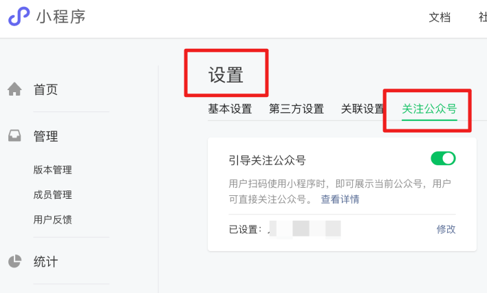
- Before using the component, you need to go to WeChat Official Accounts Platform and set the Official Account to be displayed under "Settings" -> "Follow Official Accounts". Note: The set Official Account must be under the same entity or a related entity as the Mini Program.
-
Please confirm that the selected application supports mini-program-side builds. For specific operations, refer to the Create Application Guide.
-
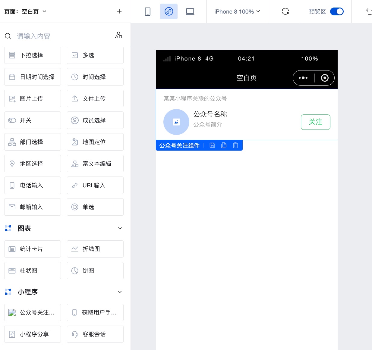
Add the Official Account Follow component to the editor area. This component does not require attribute configuration. After the Mini Program is published, it will directly display the Official Account bound to the WeChat Official Accounts Platform.
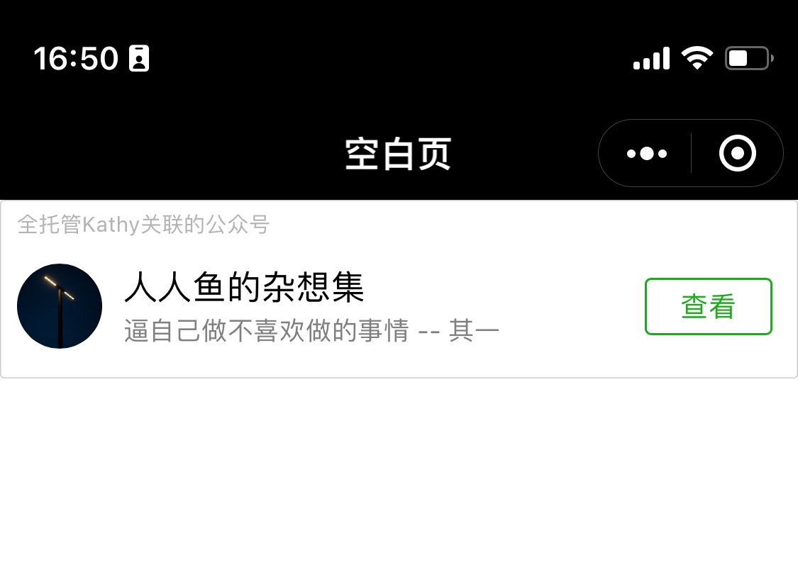
- Publish the application to the Mini Program. After scanning the QR code to enter the Mini Program, you can see that the Official Account Follow component has been successfully rendered.
Component Usage Limits
- This component must be used in a WeChat Mini Program to see the actual effect. After publishing, scan the Mini Program QR code to preview.
- The Official Account Follow component is displayed only in specific scenarios. Please note to adjust the layout accordingly.
-
When the scene value of the Mini Program hits the following values, the Official Account Follow component can be displayed. View details
-
1011 Scan QR code
-
1017 Go to the entry page of the Mini Program trial version
-
1025 Scan barcode
-
1047 Scan Mini Program code
-
1124 Scan "One Thing One Code" to open the Mini Program
-
-
When the hot start scene value of the Mini Program hits the following values, and the cold start scene value is among [1011, 1017, 1025, 1047, 1124], the Official Account Follow component can be displayed.
-
1001 Discover tab Mini Program main entry, 'Recently Used' list
-
1038 Return from another Mini Program
-
When the hot start scene value of the Mini Program hits the following values, and the cold start scene value is among [1011, 1017, 1025, 1047, 1124], the Official Account Follow component can be displayed.
-
1089 Pull down the main chat interface of WeChat to reveal the 'Recently Used' section
"- 1090 Long press the menu in the upper right corner of the Mini Program to bring up the recently used history"
-
1104 Pull down the main chat interface of WeChat to reveal the 'My Mini Programs' section
-
1131 Floating window
-
1187 New version Floating Window, since WeChat 8.0
-
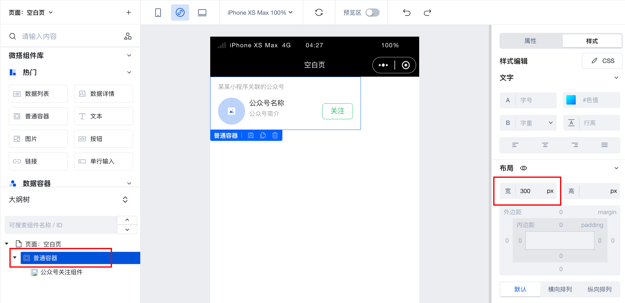
- The component has a minimum width of 300px and a fixed height of 84px. You can nest a regular container outside the Official Account Follow component and adjust its width by modifying the container's dimensions.
- Each page can only configure one such component. If multiple Official Account Follow components are configured on a single page, only the first one will be displayed.
Properties
NoneEvents
Events exposed by the component. You can listen to component events to trigger external actions
Event Name | Event Code | Event Output Parameters event.detail | Applicable Scenarios | Description |
|---|
| WeChat Official Account loads successfully | load | object
| Mini Program | Trigger when the WeChat Official Account loads successfully |
| Failed to load WeChat Official Account | error | object
| Mini Program | Failed to load WeChat Official Account trigger |
The status values in the output parameters have the following meanings
| Value | Description |
|---|---|
| -2 | Network error |
| -1 | Data parsing error |
| 0 | Load successful |
| 1 | Mini Program Official Account follow feature banned |
| 2 | Linked Official Account banned |
| 3 | Association unlinked or no linked Official Account selected |
| 4 | Official Account follow feature not enabled |
| 5 | Scene value error |
| 6 | Duplicate creation |
Method API
NoneStyle API
Through the Style API, you can override the styles of internal elements in components to achieve customization. For example, in the low-code editor, you can write styles for all button components using #wd-page-root .wd-btn, and control individual component styles with :scope. For detailed instructions, please refer toStyle API
Name | Class Name | Description and Examples |
|---|
| root element | .wd-official-account | Public account subscription component Root element |
| Mini program root element | .wd-mp-official-account | Write style for mini program component |