Global CSS Variables
tip
Standardized components unify implementations across PC, H5, and Mini Program platforms while openly supporting a series of standard APIs, including style APIs and custom CSS variables. Standardized components are marked with in the Component List.
WeDa Component Library provides a set of global CSS variables that enable quick theme switching through variable configuration.
CSS Variables
:root,
page,
:root[theme-mode='light'],
page[theme-mode='light'],
.wd-theme-light {
// ********************************************************************* //
// Basic colors and extensions for hover / focus / disabled / click and other states
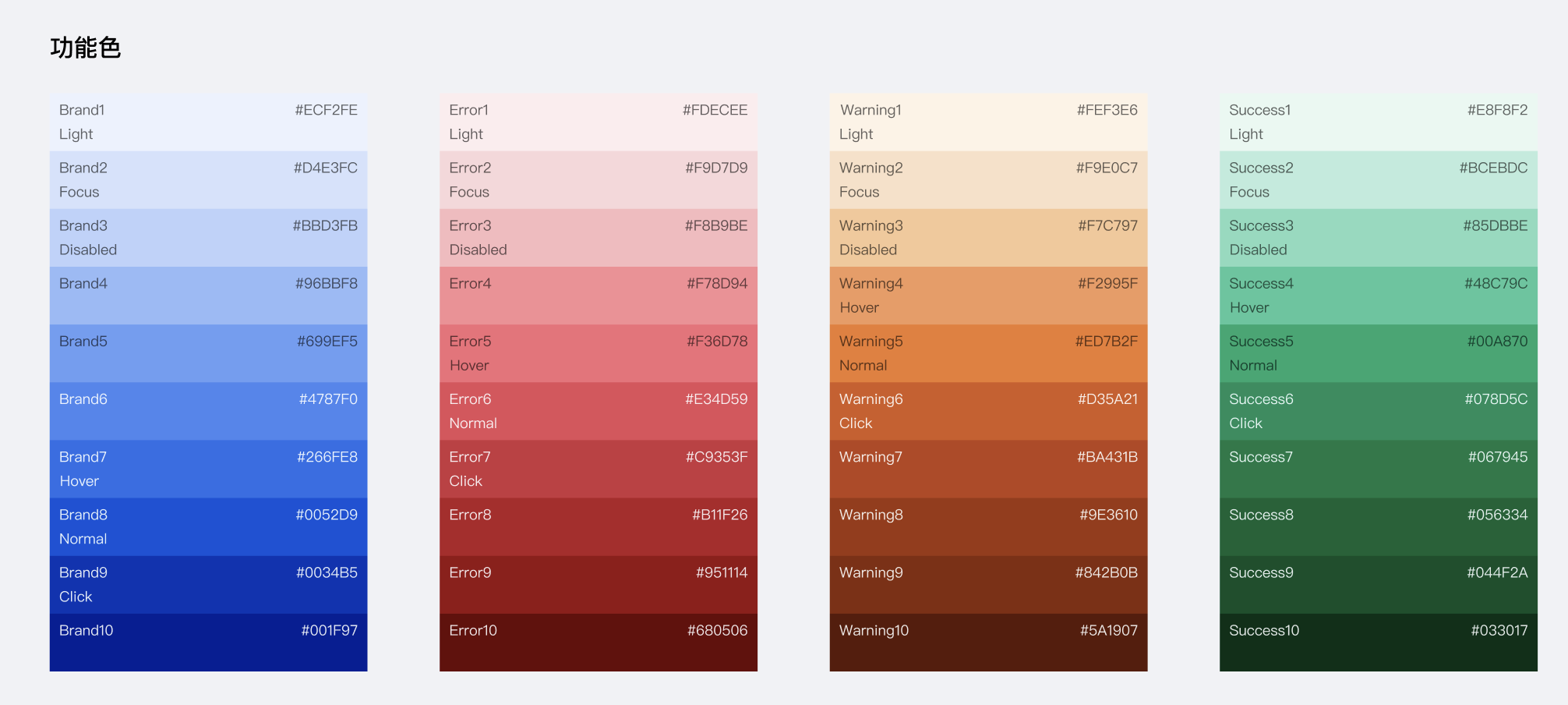
--wd-color-brand: var(--wd-color-brand-8); // Brand-Color-Actionable
--wd-color-brand-light: var(--wd-color-brand-1); // Light
--wd-color-brand-dark: var(--wd-color-brand-9); // Dark
--wd-color-brand-hover: var(--wd-color-brand-7); // hover
--wd-color-brand-focus: var(--wd-color-brand-2); // focus (includes mouse and keyboard)
--wd-color-brand-active: var(--wd-color-brand-9); // click
--wd-color-brand-disabled: var(--wd-color-brand-3); // disabled
// Warning color extensions
--wd-color-warning: var(--wd-color-warning-5); // Feature-Warning-Color
--wd-color-warning-light: var(--wd-color-warning-1);
--wd-color-warning-dark: var(--wd-color-warning-9);
--wd-color-warning-hover: var(--wd-color-warning-4);
--wd-color-warning-focus: var(--wd-color-warning-2);
--wd-color-warning-active: var(--wd-color-warning-6);
--wd-color-warning-disabled: var(--wd-color-warning-3);
// Failure/Error color extensions
--wd-color-error: var(--wd-color-error-6); // Feature-Error-Color
--wd-color-error-light: var(--wd-color-error-1);
--wd-color-error-dark: var(--wd-color-error-9);
--wd-color-error-hover: var(--wd-color-error-5);
--wd-color-error-focus: var(--wd-color-error-2);
--wd-color-error-active: var(--wd-color-error-7);
--wd-color-error-disabled: var(--wd-color-error-3);
// Success color extensions
--wd-color-success: var(--wd-color-success-5); // Feature-Success-Color
--wd-color-success-light: var(--wd-color-success-1);
--wd-color-success-dark: var(--wd-color-success-9);
--wd-color-success-hover: var(--wd-color-success-4);
--wd-color-success-focus: var(--wd-color-success-2);
--wd-color-success-active: var(--wd-color-success-6);
--wd-color-success-disabled: var(--wd-color-success-3);
// Mask
--wd-bg-mask: rgba(var(--wd-black-rgb), 80%);
--wd-bg-mask-inverse: rgba(var(--wd-white-rgb), 60%);
// Text color
--wd-color-text-default: var(--wd-font-gray-1); // Text-Primary-Color
--wd-color-text-secondary: var(--wd-font-gray-2); // Text-Secondary-Color
--wd-color-text-placeholder: var(--wd-font-gray-3); // Text-Placeholder/Description-Color
--wd-color-text-disabled: var(--wd-font-gray-4); // Text-Disabled-Color
--wd-color-text-inverse: var(--wd-white); // Text-Inverse-Color
--wd-color-text-brand: var(--wd-color-brand-6); // Text-Brand-Color
--wd-color-text-link: var(--wd-color-brand); // Text-Link-Color
--wd-color-text-link-hover: var(--wd-color-brand-hover); // Text-Link-Color
--wd-color-text-link-active: var(--wd-color-brand-active); // Text-Link-Color
--wd-color-text-link-focus: var(--wd-color-brand-focus); // Text-Link-Color
--wd-color-text-link-disabled: var(
--wd-color-brand-disabled
); // Text-Link-Color
--wd-color-text-tooltips: var(--wd-white);
--wd-color-text-success: var(--wd-color-success-6);
--wd-color-text-error: var(--wd-color-error-6);
--wd-color-text-warning: var(--wd-color-warning-6);
// Divider
--wd-color-border-separator: var(--wd-color-gray-2);
// Border
--wd-color-border-default: var(--wd-color-gray-3);
--wd-color-border-hover: var(--wd-color-gray-4);
--wd-color-border-disabled: var(--wd-color-gray-3);
}