Component-level CSS Variables
tip
Standardized components unify implementations across PC, H5, and Mini Program platforms while openly supporting a series of standard APIs, including style APIs and custom CSS variables. Standardized components are marked with in the Component List.
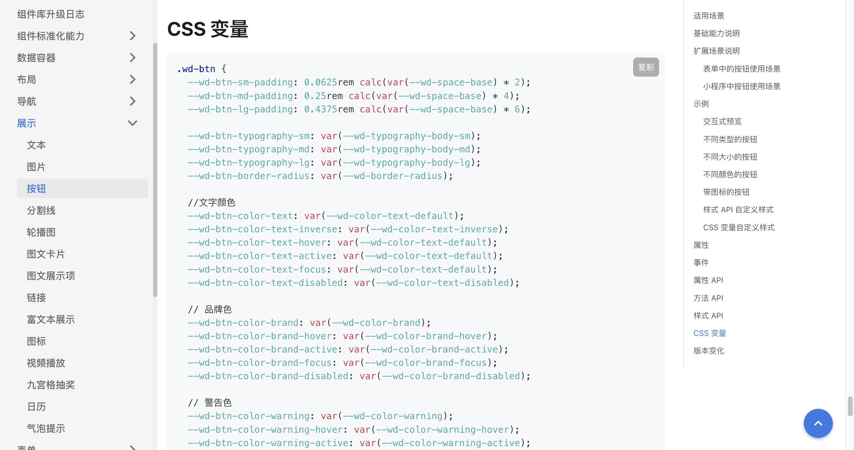
Standardized components expose the CSS variables they support in their documentation, allowing users to uniformly modify component styles across applications by customizing CSS variables.
Example
For example, to uniformly modify button styles, you can adjust the CSS variables exposed by buttons across the page.
.wd-btn {
  --wd-btn-border-radius: 0.3rem;
  --wd-btn-color-brand: var(--wd-color-success);
  --wd-btn-color-brand-hover: var(--wd-color-success-hover);
  --wd-btn-color-brand-active: var(--wd-color-success-active);
  --wd-btn-color-brand-focus: var(--wd-color-success-focus);
  --wd-btn-color-brand-disabled: var(--wd-color-success-disabled);
}
(To ensure style modifications take effect, it is recommended to add an id selector before custom styles to increase CSS specificity.)