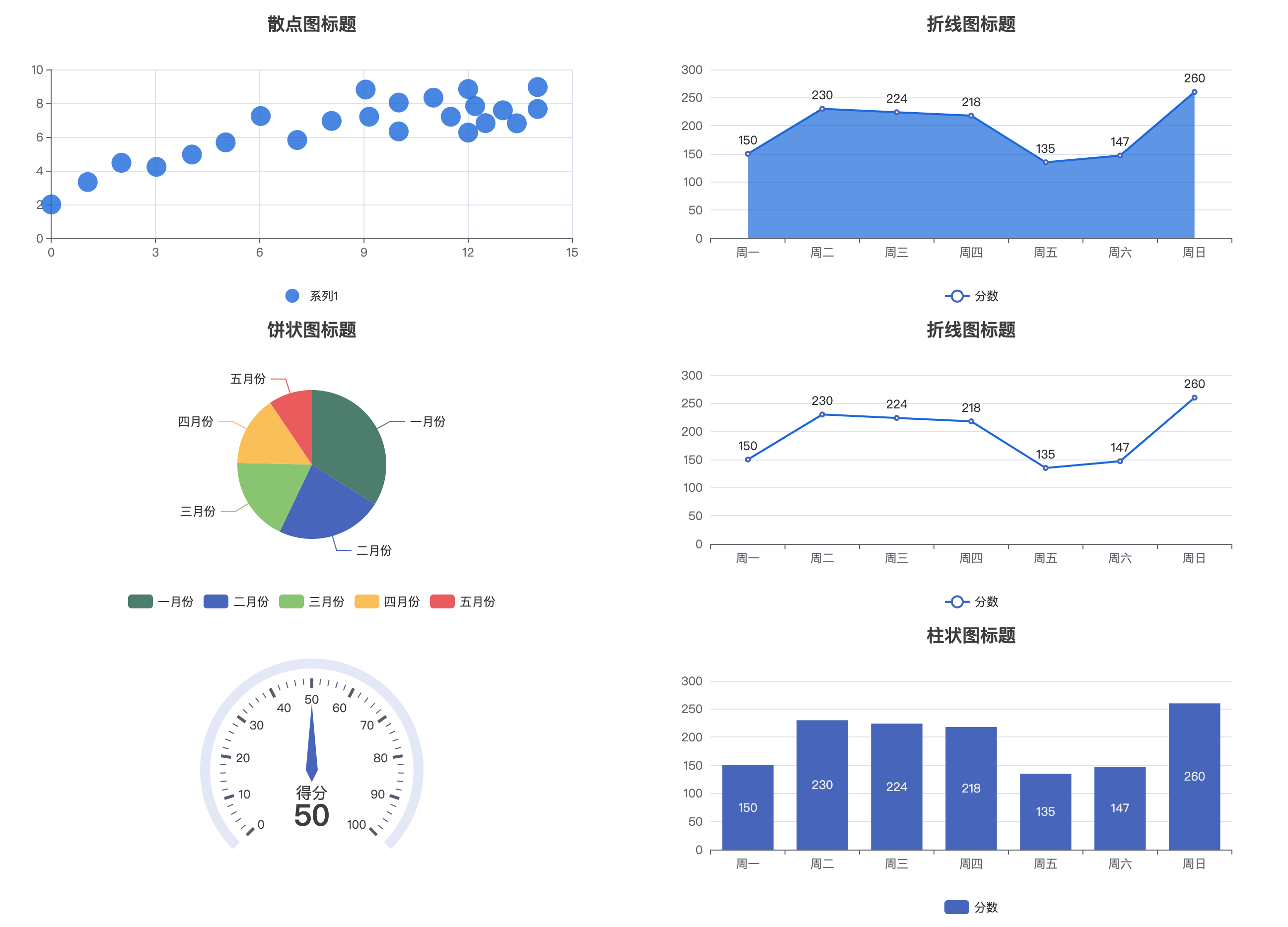
More Charts
This is a versatile chart component that can be configured to create various charts such as line charts, pie charts, area charts, maps, funnel charts, gauges, and all other charts. Using this component, you can quickly integrate all ECharts charts.
Use Cases
When the bar chart, line chart, and pie chart in the official component library do not meet your needs, you can use this component.
-
Before using, please visit the ECharts official website to view chart examples to find the chart you need.
-
When using, directly configure Options to set chart data, styles, etc. You can also learn about configuration options through this document.
Basic Features
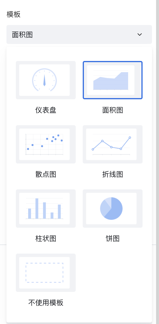
1. Templates
This component provides several commonly used chart templates, such as line charts, area charts, pie charts, etc.
2. Chart Configuration Options (Option)
You can also modify the Chart Configuration Option yourself to immediately create any chart. Go to the example configuration, copy the configuration object Option, and quickly implement the chart. As follows:
For configuration options, here is a brief introduction. For details, please visit the ECharts official website to learn and view the ECharts Official Configuration Documentation
Setting Data
Data is mainly configured through xAxis and series. series allows configuring multiple data sets, such as multiple lines in a line chart. See details
xAxis: {
    data: ['Mon', 'Tue', 'Wed', 'Thu', 'Fri', 'Sat', 'Sun'],  // X-axis data
},
yAxis: {},
series: [
  	{
      type: 'line',  // type specifies chart type, can be set to line, pie, bar, etc.
  	  // Chart values
      data: [150, 230, 224, 218, 135, 147, 260], // Y-axis data
      name: 'Series 1'  // Series name
    }
]
Setting Labels
Control chart labels through the label property. See details
label: {
      show: true,   // Whether to display
      formatter: function(params){  // Custom label display
        return params
      }
},
If you need to customize labels, please refer to the formatting formatter function documentation
Setting Title
Control chart title and position through the title property. See details
title: {
	    text: 'Chart Title',
	    x: '50%' // Chart title position
}
Setting Legend
Control chart legend and position through the legend property. See details
Setting Colors
Set colors and styles for different series through lineStyle, itemStyle, areaStyle in series. See Chart Custom Styles
series: [{
    lineStyle: {
        color: '#2A70E2',
        width:'2',
        type: 'solid'
      },
      itemStyle:{
        color: 'auto',
      },
      areaStyle: {
        color: '#2A70E2',
        opacity: '0.5'
      }
   },{
    lineStyle: {
        color: '#2A70E2',
        width:'2',
        type: 'solid'
      },
      itemStyle:{
        color: 'auto',
      },
      areaStyle: {
        color: '#2A70E2',
        opacity: '0.5'
      }
}]
3. Initialize Chart Opts
You can configure chart width, height, etc. See Chart initialization init method opts configuration
4. ECharts Official Examples
Taking ECharts' Flight Seat Selection official example, to implement this effect in WeDa component, follow these steps:
1) Create a new JavaScript method "chartInit" on the current page
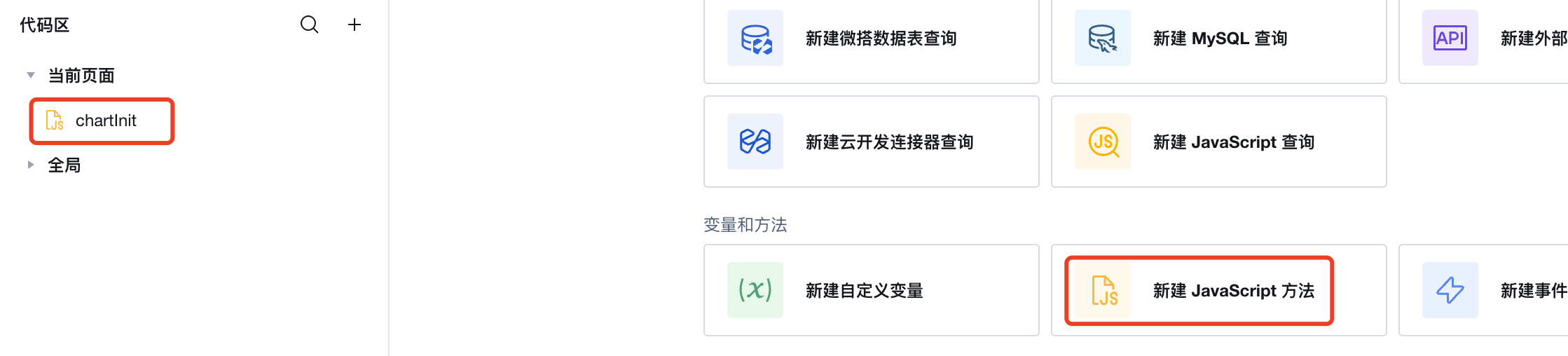
2) Define the "chartInit" method
Modify based on the echarts example, replace corresponding component properties in the code: Replace echarts with $w.chart1.echarts, Replace myChart with $w.chart1.echartsInstance
export default async function ({ event, data }) {
  const res = await fetch(
    "https://lowcode-6g4bqrjy45e3e14b-1300677802.tcloudbaseapp.com/resources/2024-07/lowcode-1875317",
    {
      method: "GET",
      headers: {
        "Content-Type": "image/svg+xml",
      },
    }
  );
  const svg = await res.text();
  $w.chart1.echarts.registerMap("flight-seats", { svg: svg });
  const takenSeatNames = ["26E", "26D", "26C", "25D", "23C", "21A", "20F"];
  const option = {
    tooltip: {},
    geo: {
      map: "flight-seats",
      roam: true,
      selectedMode: "multiple",
      layoutCenter: ["50%", "50%"],
      layoutSize: "95%",
      tooltip: {
        show: true,
      },
      itemStyle: {
        color: "#fff",
      },
      emphasis: {
        itemStyle: {
          color: undefined,
          borderColor: "green",
          borderWidth: 2,
        },
        label: {
          show: false,
        },
      },
      select: {
        itemStyle: {
          color: "green",
        },
        label: {
          show: false,
          textBorderColor: "#fff",
          textBorderWidth: 2,
        },
      },
      regions: makeTakenRegions(takenSeatNames),
    },
  };
  function makeTakenRegions(takenSeatNames) {
    var regions = [];
    for (var i = 0; i < takenSeatNames.length; i++) {
      regions.push({
        name: takenSeatNames[i],
        silent: true,
        itemStyle: {
          color: "#bf0e08",
        },
        emphasis: {
          itemStyle: {
            borderColor: "#aaa",
            borderWidth: 1,
          },
        },
        select: {
          itemStyle: {
            color: "#bf0e08",
          },
        },
      });
    }
    return regions;
  }
  $w.chart1.echartsInstance.setOption(option);
  // Get selected seats.
  $w.chart1.echartsInstance.on("geoselectchanged", function (params) {
    const selectedNames = params.allSelected[0].name.slice();
    // Remove taken seats.
    for (var i = selectedNames.length - 1; i >= 0; i--) {
      if (takenSeatNames.indexOf(selectedNames[i]) >= 0) {
        selectedNames.splice(i, 1);
      }
    }
    console.log("selected", selectedNames);
  });
}
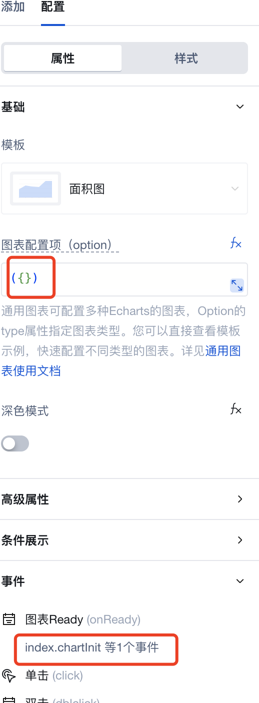
3) Set component properties and bindthe "chartInit" function
5. More Charts Supports Mini Program
After upgrading to component version 3.30.0, newly dragged More Charts components support Mini Program.
Due to Mini Program package size limitations, the official preset package only includes bar chart, line chart, and pie chart three common chart types.
6. Custom Chart Types for Mini Program
If you need to use chart types beyond the official preset package in Mini Program (such as maps, funnel charts, gauges, etc.), you can implement them through custom component libraries.
1) Create a Custom Component Library
Refer to the Custom Component Quick Start documentation to create your custom component library based on the Official Open Source Custom Component Library.
This component needs to be viewed in the Mini Program real device environment. During development, you can use the official "More Charts" component for preview, as both have the same option configuration.
2) Download Customized ECharts File
Go to the ECharts Online Customization Page, select the chart types you need, and download.
To control Mini Program package size, it is recommended to only select the chart types you actually need.
3) Replace ECharts File and Publish
Replace the downloaded file with src/mp/components/chart/common/lib/echarts.min.js in the custom component library, and republish the component library.
Property Description
External properties received by the component
Property Name | Property Identifier | Type | Description |
|---|
| initialization parameter | opts | object | For Echarts chart configuration, see configure project Example: {} |
| Template | template | string | System preset template Can be used to select different templates for quick configuration of required chart types Example: "square" |
| Chart configuration options | option | object | For Echarts chart configuration, see configure project Example: {} |
| dark mode | dark | boolean | Example: false |
Event Description
Events exposed by the component. You can listen to component events to trigger external actions
Event Name | Event Code | Event Output Parameters event.detail | Applicable Scenarios | Description |
|---|
| Chart Ready | onReady | object
| Compatible with all platforms | The current chart has completed instance initialization. |
| click | click | Mobile,PC | This method is triggered when a coordinate point in the graph is clicked. For details, see [Echarts Official Event Description](echarts.apache.org/zh/api.html#events.% E9%BC%A0%E6%A0%87%E4%BA%8B%E4%BB%B6.click) | |
| double-click | dblclick | Mobile,PC | Double-click A coordinate point in the chart to trigger this method. See the Echarts official event description for details. |
Property API
Through the Property API, you can access the internal state and property values of components. You can access internal values using$w.componentId.propertyName, such as $w.input1.value. For details, please refer to Property API
Read-only Property Name | Property Identifier | Type | Description |
|---|
| Chart instance | echartsInstance | object | Chart operations can be performed through the chart instance. For specific operation content, see the official documentation from Echarts. |
| echarts object | echarts | object | This is equivalent to directly introducing echarts into the project. You can directly call its internal methods through the echarts object to perform corresponding operations, such as echarts.color, echarts.graphic, etc. For details, see Official Description of Echarts. |
Method API
Through the Method API, you can programmatically trigger internal methods of components, such as submitting forms, displaying popups, etc. You can call component methods using $w.componentId.methodName, such as $w.form1.submit()
Method Name | Method Identifier | Parameters | Method Description |
|---|
| Configure charts | setOption | object
| Set the configuration item and data of a chart instance. The versatile api allows ALL parameter and data modification through setOption. You can directly view the official Echarts illustrative example. |
| Set topic | setTheme | object
| Set the theme of the chart instance. Different types of themes are supported, with dart and auto as defaults. You can also register a theme through the registerTheme method officially provided by Echarts. |
Style API
Through the Style API, you can override the styles of internal elements in components to achieve customization. For example, in the low-code editor, you can write styles for all button components using #wd-page-root .wd-btn, and control individual component styles with :scope. For detailed instructions, please refer toStyle API
Name | Class Name | Description and Examples |
|---|
| root element | .wd-chart | tree component root element |
| PC-side root element | .wd-pc-chart | Write styles for PC |
| H5 root element | .wd-h5-chart | Write style for H5 |
FAQ
Relationship Between Chart Component and General Chart Component
- The General Chart component is a versatile chart component that can be configured to create various charts such as line charts, pie charts, area charts, maps, funnel charts, gauges, and all other charts. Using this component, you can quickly integrate all ECharts charts.
- The General Chart component has more flexible UI configuration and supports basically all common chart types.
- The General Chart component itself is data-independent. Data statistics can be implemented through Query, using APIs or MySQL connectors for data statistics, and then binding to the General Chart component.