bar chart
Applicable Scenarios#
Data size comparison for report scenario.
Usage Instructions
Go to the Application Editor page, then drag the Chart Component > Bar Chart component into the corresponding container.
Properties
External properties received by the component
Property Name | Property Identifier | Type | Description |
|---|
| histogram orientation | directionType | string | Support horizontal and vertical. The vertical dimension is the X-axis, and the numeric value is the Y-axis, and conversely for horizontal. This document uses vertical as the attribute setting example. Example: "lengthways" |
| Whether to stack | isPile | boolean | This property takes effect only when multiple Y-axes exist Example: false |
| Display Headlines | isTitle | boolean | Example: true |
| chart title | title | string | Example: "柱状图标题" |
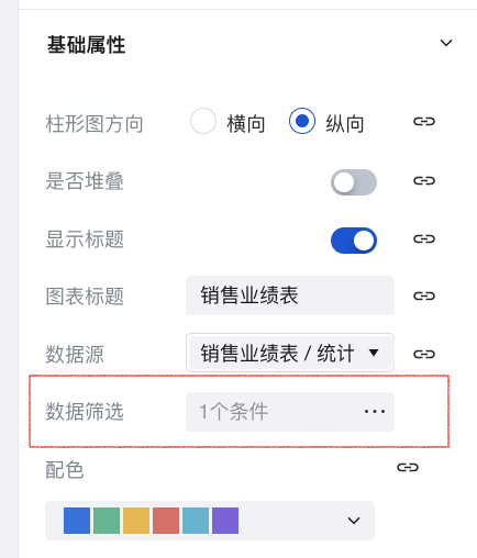
| data filter | filterData | object | Configurable data value ranges, see data filtering configuration |
| color scheme | setColor | array | When multiple numerical or dimensional field groups exist, different categories are shown based on different color schemes, supporting customizable color palettes. Example: [ "#2A70E2", "#46B690", "#EDB539", "#E46961", "#4FB3D2", "#805FDC" ] |
| Display null coordinates | xIsCountEmpty | boolean | Example: false |
| Display axis name | isXaxisName | boolean | Example: true |
| Name | xAxisName | string | Example: "" |
| Display tag | isXaxisAxisLabelShow | boolean | Example: true |
| Display X-axis scale | isXaxisAxisTickShow | boolean | Example: true |
| Text auto skew | isXaxisAxisLabelRotate | boolean | Example: false |
| Display grid lines | isYAxisSplitlineLinestyleWidth | boolean | Example: true |
| grid lines line | yAxisSplitlineLinestyleType | string | Example: "solid" |
| Maximum value | yAxisMax | number | |
| Minimum value | yAxisMin | number | |
| Display Y-axis name | isYAxisName | boolean | Example: true |
| Name | yAxisName | string | Example: "" |
| display numeric value | isYAxisShow | boolean | Numeric value (Y-axis) display numeric value Example: true |
| display numeric value | isSeriesShowSymbol | boolean | data tag display numeric value Example: true |
| display unit | isUnit | boolean | Example: false |
| Numeric value magnitude | unit | number | Example: 1 |
| number of decimal places | decimalDigits | number | Example: 0 |
| suffix | suffix | string | Example: "" |
| Data source | dataSourceType | string | Data source type selection Example: "data-model" |
| data model | dataModel | object | Show model data source |
| data source variable | datasourceVariable | array | data source variable |
| APIs | connector | object | Data display APIs source selection |
| calling method | connectorMethod | object | API invocation method selection for displaying data |
| Query input parameters | connectorParams | object | 对APIs调用方法获取的数据进行筛选过滤。支持对象类型,例如 {name:'',value:''} |
| field selection | xField | object | X-axis value field selection |
| Statistical dimension | xStatistics | string | |
| field selection | yField | object | Numeric value (Y-axis) field selection |
| group | groupKey | string | When only one field is selected for the Y-axis, the X-axis can be grouped by a fixed field. Example: X-axis shows salesperson, grouped by sales region. |
| grouping dimension | groupKeyTimeSpan | string | |
| Display legends | isLegend | boolean | Example: true |
| legend position | legend | string | Example: "bottom" |
Events
NoneAdvanced Properties
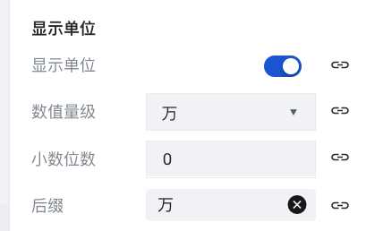
Supports configuration of axis styles, data labels, display units, and other properties.
- Display unit: supports numerical magnitudes such as
units/tens/hundreds/thousands/ten thousands/hundred thousands/millions/ten millions/hundred millions. - Decimal places: supports setting
0-10decimal places. - Suffix: supports customization. By default, it is generated based on magnitude:
-/tens/hundreds/thousands/ten thousands/hundred thousands/millions/ten millions/hundred millions.
API Use Cases
When selecting APIs as the data source during configuration, users need to define the data according to the parameter structure within the APIs themselves for it to render properly in the statistical card component. For details, refer to Chart Component Parameter Definition.
?When using APIs, data filtering, field selection, statistical methods, and statistical properties for null values all need to be defined by the user within the created APIs. Other properties remain consistent with the configuration of the data model usage scenario.
Usage Example
The following example data source is a sales performance table. The example data configuration is shown in the table below. For more data configuration operations, please refer to Data Model.
| Salesperson Name | Customer Region | Total Sales | Number of Orders | Gender |
|---|---|---|---|---|
| Zhang San | Beijing | 1000000 | 3 | Male |
| Zhao Si | Beijing | 2000000 | 2 | Male |
| Zhao Si | Shanghai | 100000 | 1 | Male |
| Wang Wu | Shanghai | 200000 | 1 | Male |
| Wang Wu | Shenzhen | 500000 | 1 | Male |
| Li Liu | Beijing | 5000000 | 6 | Female |
| Li Liu | Shenzhen | 200000 | 1 | Female |
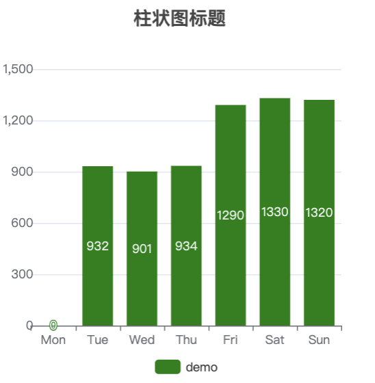
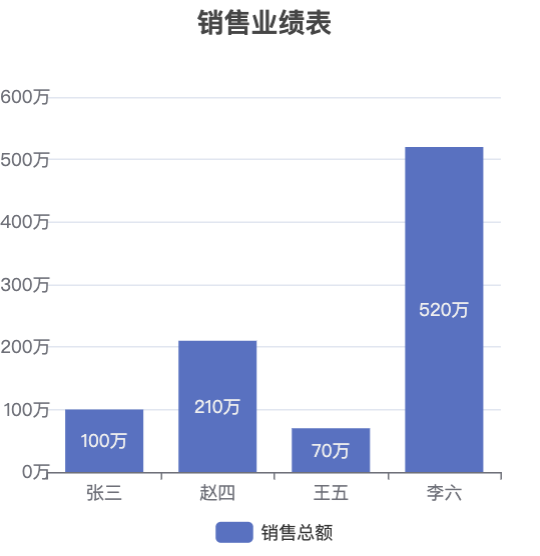
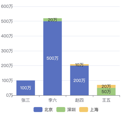
Example 1: Comparison of each salesperson's total sales performance (Vertical)
-
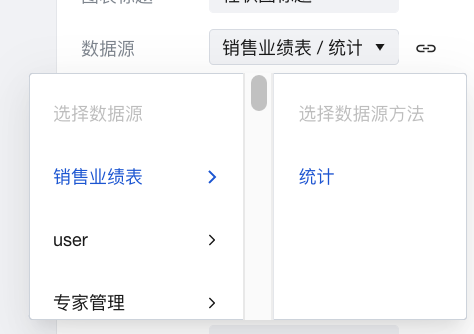
Create a new Bar Chart component, go to the Properties > Basic Properties page on the right, click the Data Source dropdown menu, select the Sales Performance Table, and choose the Aggregation method.
-
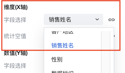
In Dimension (X-axis), click the Field Selection dropdown menu and select Salesperson Name.
-
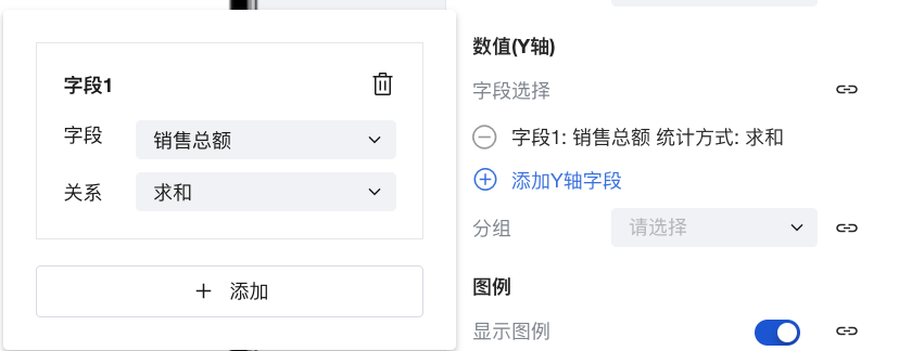
Under Value (Y-axis), click Add Y-axis Field. Select Sales Total for the field type and select Sum for the relationship type.
-
Scroll down the properties panel on the right, go to Advanced Properties, and click to enable Display Unit. Click the Quantity Level dropdown menu and set it to Ten Thousand, then set the Suffix item to Ten Thousand.
-
Modify properties such as the title, axis style, and legend style as needed. The final effect is as shown in the figure below:
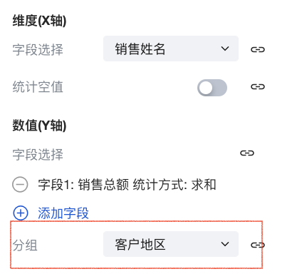
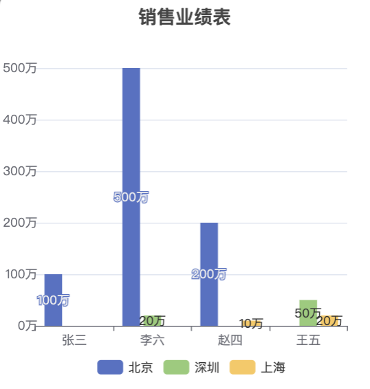
Example 2: Comparison of each salesperson's total sales performance (Vertical) - By Region
Based on the configuration in [Example 1], add a grouping field. Click the Group dropdown menu and select Customer Region.
Final Effect Display:
Click to enable the Stacking feature to view the stacking effect:
Example 3: Comparison of each salesperson's total sales performance (Vertical) - Viewing only data where gender is male
-
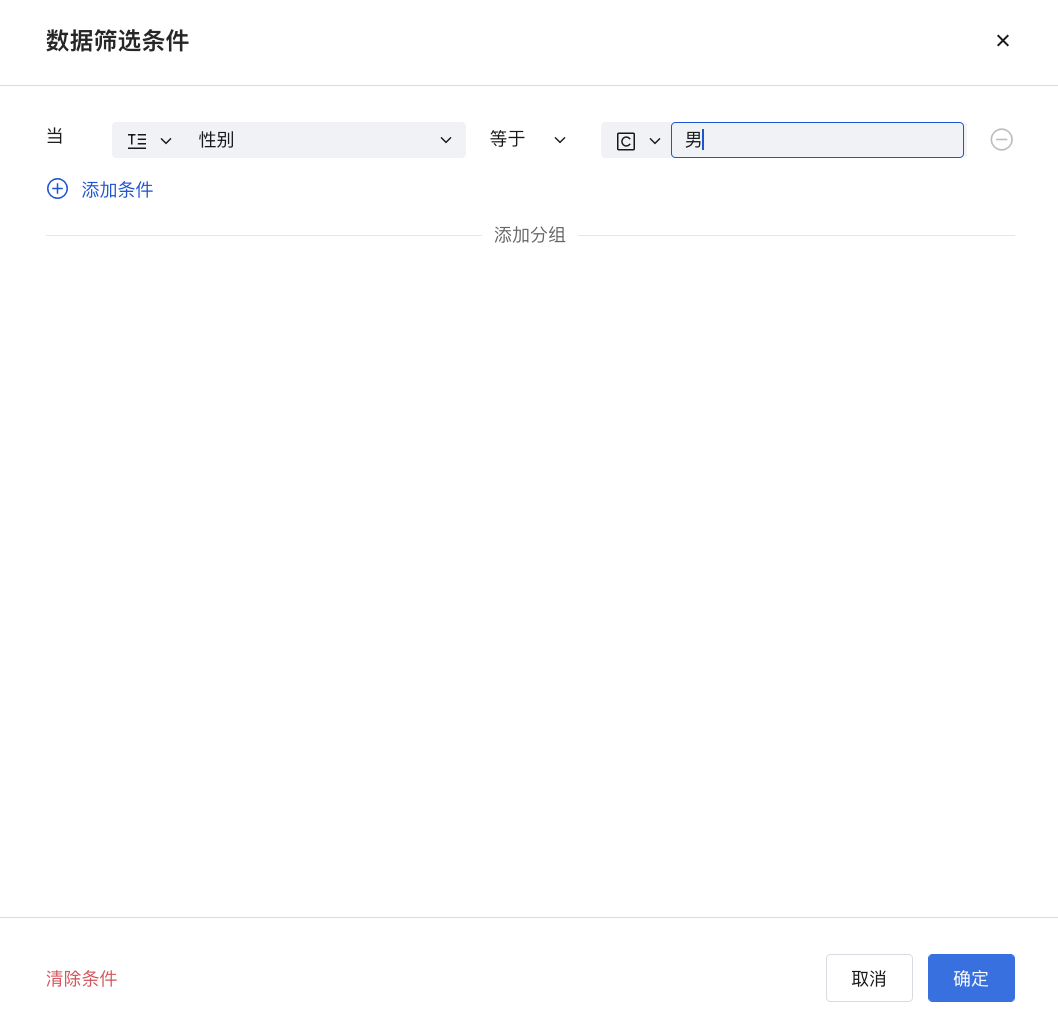
Based on the configuration in [Example 1], click Data Filtering.
-
Set the corresponding data filtering parameters and click OK to add the filter condition.
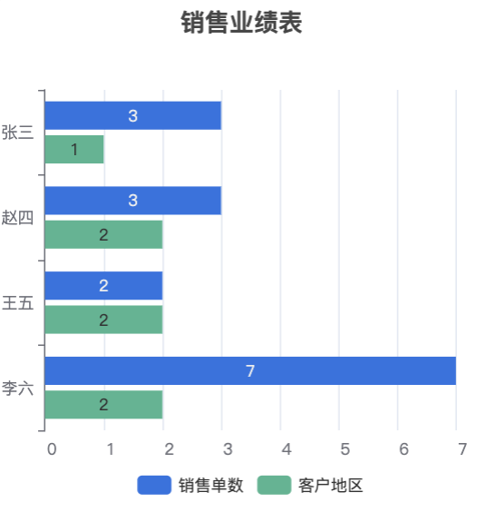
Example 4: Comparison of each salesperson's "number of customer coverage areas" and "total sales orders" (Horizontal)
-
For Bar Chart Orientation, click to select Horizontal.

-
In Dimension (Y-axis), click the Field Selection dropdown menu and select Salesperson Name.
-
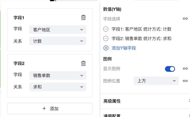
Under Value (X-axis), click Add Field. Add the following two fields:
-
Field 1: Customer Region; Statistical Method: Count
-
Field 2: Number of Sales Orders; Statistical Method: Sum
-
Final Effect Display:
Limits Description
The dimension axis does not support setting the time type, but you can set the date type and datetime type.
Frequently Asked Questions
The reason why charts do not support displaying Chinese names for association/enumeration fields
Since the chart component retrieves statistical data by querying the server, it currently does not support displaying Chinese names for association/enumeration/option set fields. If you need precise control over chart display, you can use the Universal Chart, which allows flexible display configurations through customization.
How to flexibly control various chart styles, such as centering the title?
Since the chart component itself only provides common configurations, for elements that cannot be configured within the chart component, you can use the Universal Chart to achieve various flexible display effects.
Relationship Between Chart Component and Universal Chart Component
- The Universal Chart component is a versatile chart component capable of configuring various charts such as line charts, pie charts, area charts, maps, funnel charts, dashboards, and all other chart types. Using this component enables quick integration of all Echarts charts.
- The UI configuration of the Universal Chart component is more flexible, supporting virtually all common chart types.
- The Universal Chart component itself is data-agnostic. Data statistics can be achieved through Query, where data aggregation is performed via APIs or the MySQL connector, and then bound to the Universal Chart component.