Style Processing and Debugging
Introduction
- Whether developing for the mini-program side or PC side, first configure the overall framework (menu bar, navigation bar, etc.)
- Then develop the page and link its URL to the menu bar
- Next, finalize the page layout, then adjust the component styles individually.
In Visual Development (WeDa):
-
Overall Framework is implemented through Page Layout.
-
Content Layout is implemented via Layout Components.
-
Component Styles can be implemented in the following ways:
-
Quick Configuration
-
Component CSS (Supports AI Generation)
-
Application Theme
-
Global CSS
-
This article will explain how to customize styles.
Component Basics
Before starting to adjust styles, understanding some basic knowledge will help us better comprehend page construction and style adjustments. Be sure to read this section
What is a Box?
In web design, each component can be viewed as a rectangular box. Components are the smallest atomic units of page composition, and pages are assembled by piecing together these components.
This box consists of four parts:
- Content: The items contained within the box, such as text, images, etc.
- Padding: The distance between the content and the border, which is transparent.
- Border: A line surrounding the padding and content, with a width.
- Margin: The distance between the box and other boxes, which is also transparent.
The structure is as follows:

Box Characteristics
-
Content affects the box size:
- An increase in content expands the box.
- Width and height constraints can be manually configured.
-
Spacing Control:
- margin: Controls the distance between the box and other elements.
- padding: controls the distance between the content and the border
-
Nesting Support: Boxes can be nested within another box.
Block-level and Inline Components
Boxes are primarily divided into two categories: block-level boxes (Block) and inline boxes (Inline), here referred to as block-level components and inline components.
They behave differently on the page:
| Feature | Block-level Components | Inline Components |
|---|---|---|
| Default Display | Each block-level element occupies the entire line, with the next element automatically wrapping to a new line | Only occupies the width of its content; multiple inline elements can be displayed on the same line until there's insufficient space, then they wrap |
| Common Components | Text, Text Boxes, Dropdowns, Generic Containers, etc. | Buttons, Images |
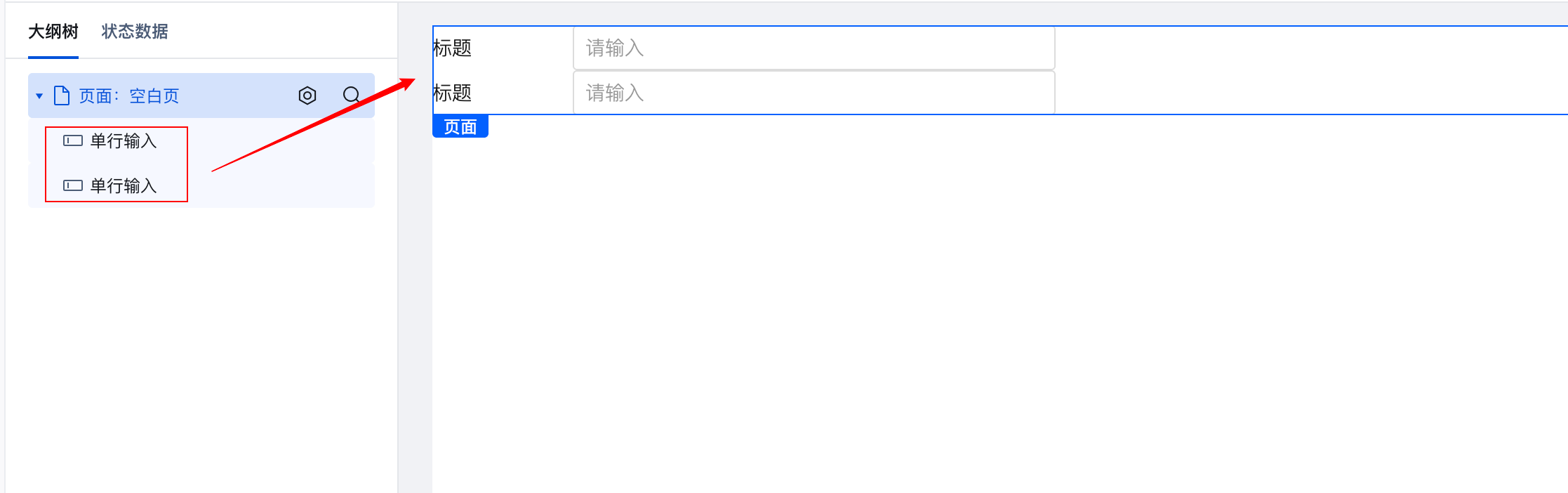
Block-level Component Example
Two single-line input components each occupy a separate line.
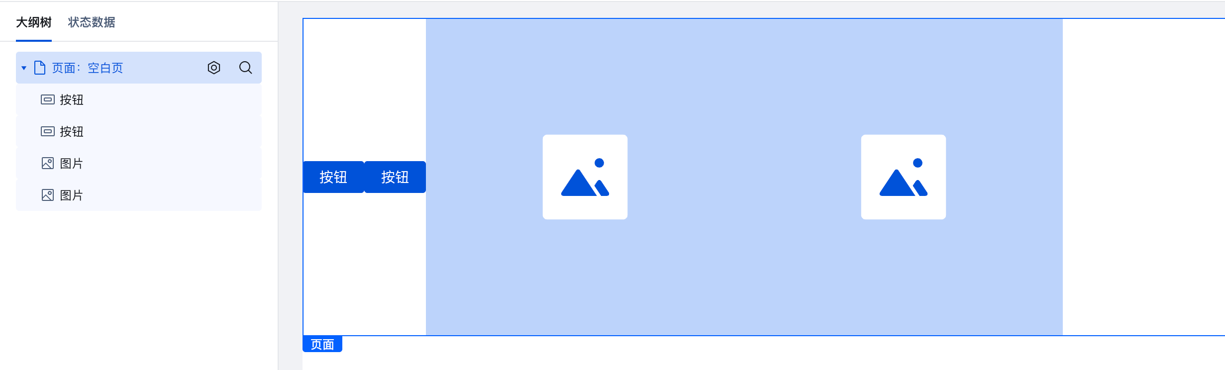
Inline Component Example
Buttons and images each occupy a separate line.
Basic Concepts of Style
Each component has specified class (class name) or id. class serves as a label for the component and can be multiple, while id serves as the component's ID and must be unique.
Components have their own class by default. You can also manually add class to them (component style properties support configuring className).
Components specify which styles to apply via class or id.
Example:
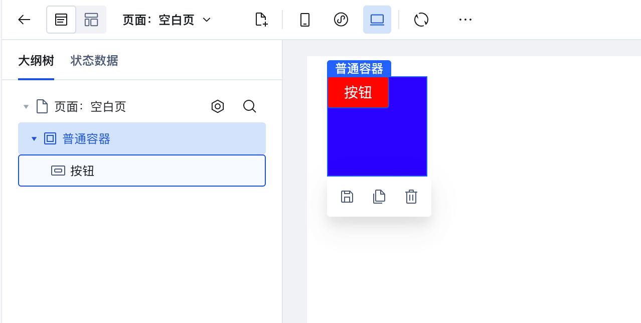
The following is a simple HTML code snippet: a div component with a child button component.
where the div has an id of page-container and a class of container; the button has a class of btn
<div id="page-container" class="container">
    <button class="btn">Button</button>
</div>
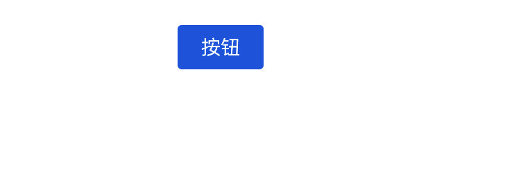
By default, this div is invisible as it carries no styles. We can only see the button (don't worry about why the button is blue; it's the platform's default style).
If we wish to adjust the component's style, we can set styles via class or id, where id is represented by # and class by a dot .
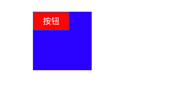
#page-container {
    /* Set background color */
    background: blue;
    /* Set height */
    height: 100px;
    /* Set width */
    width: 100px;
}

.btn {
    /* Set background color */
    background: red;
}
The following figure shows the effect.
Cloud Development Platform Styling Adjustment
When developing on the cloud development platform, you don't need to worry about writing html code. The platform visually encapsulates various components, allowing you to simply drag and drop to adjust their positions. The outline tree on the left displays the hierarchical relationships between components.
Therefore, the example of a div wrapping a button can be implemented using the component layout shown in the figure below. Then, set the styles in the corresponding component properties.
Next, we will explain how to adjust styles in the Cloud Development Platform.
Quick Configuration
If you only need to adjust some basic styles, simply make the adjustments in the component configuration panel.
In the components newly created in the Visual Application, there is a configuration panel for the currently selected component on the right. Switch to the style module to see many quick configurations. For details, refer to Component Style Configuration.
In Quick Configuration, you can adjust properties such as text, layout, border, background color, shadow, rounded corners, opacity, and positioning. If you are unsure about the meaning of any term, AI consultation is available.
Therefore, for the above example, we can set the width and height to 100px in a normal container, assign a color value to the background, and adjust the button's background color.
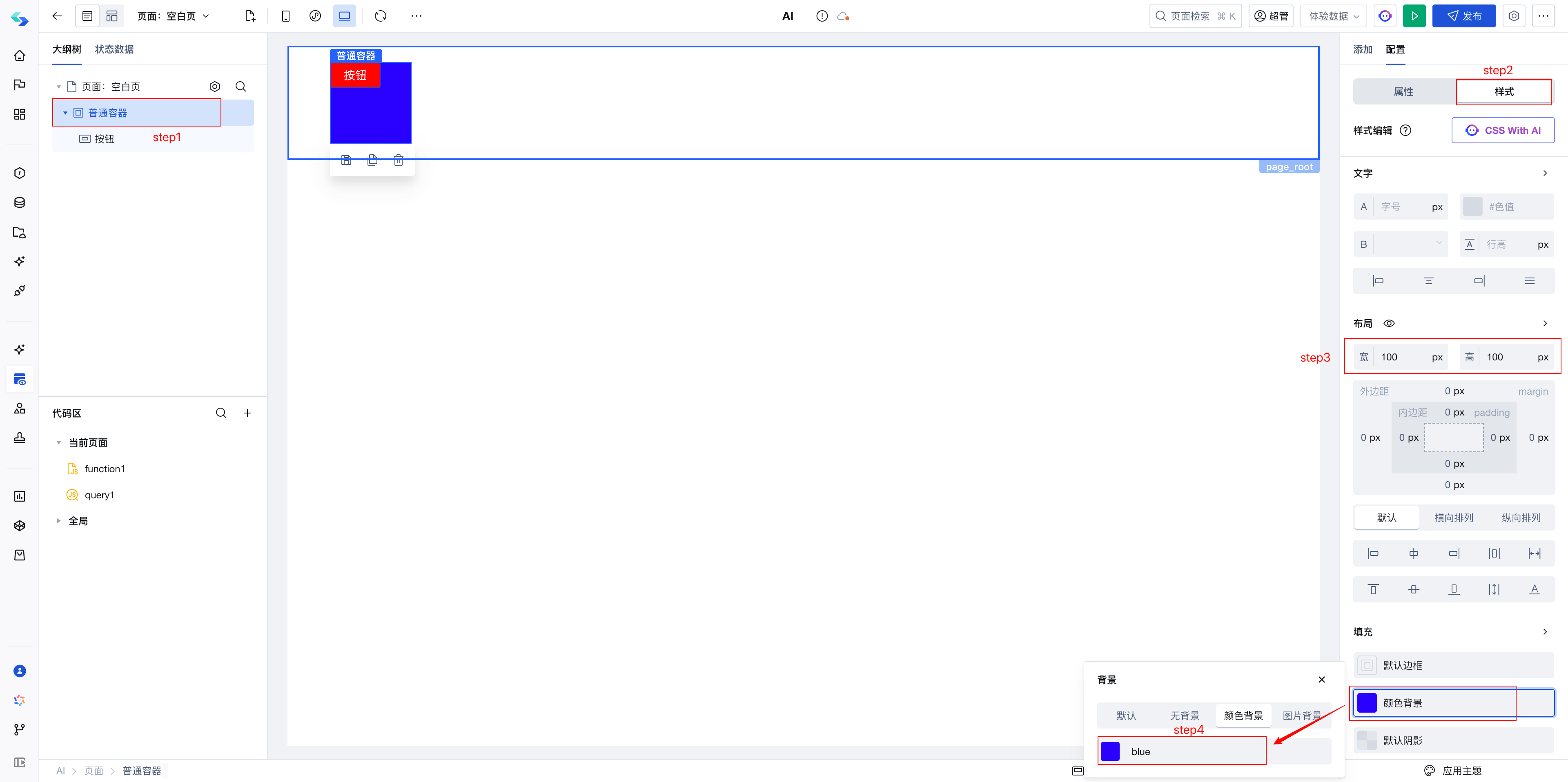
Component CSS
If the configurations in the style properties panel cannot meet your business requirements, you can write style APIs in the component's CSS editing panel to achieve fine-grained control of component styles through style selectors.

For details, refer to:
How to Debug Styles
Now that you know how to adjust styles via class or id, the next question is how to determine the component's class or id.
Therefore, the sequence for debugging styles should be as follows:
-
Locate the class or id of the component for which you want to adjust the style.
-
Write css based on class
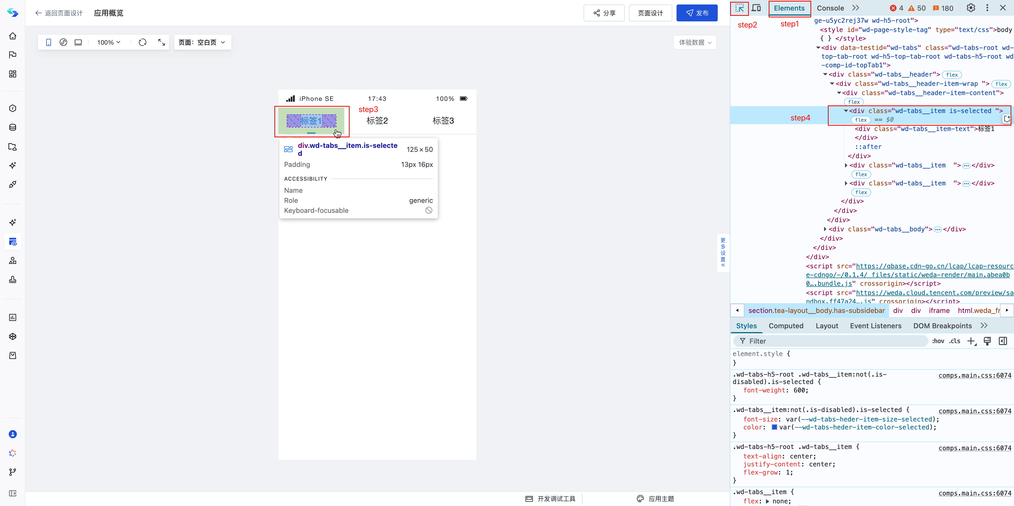
Let's examine the implementation of the first step:
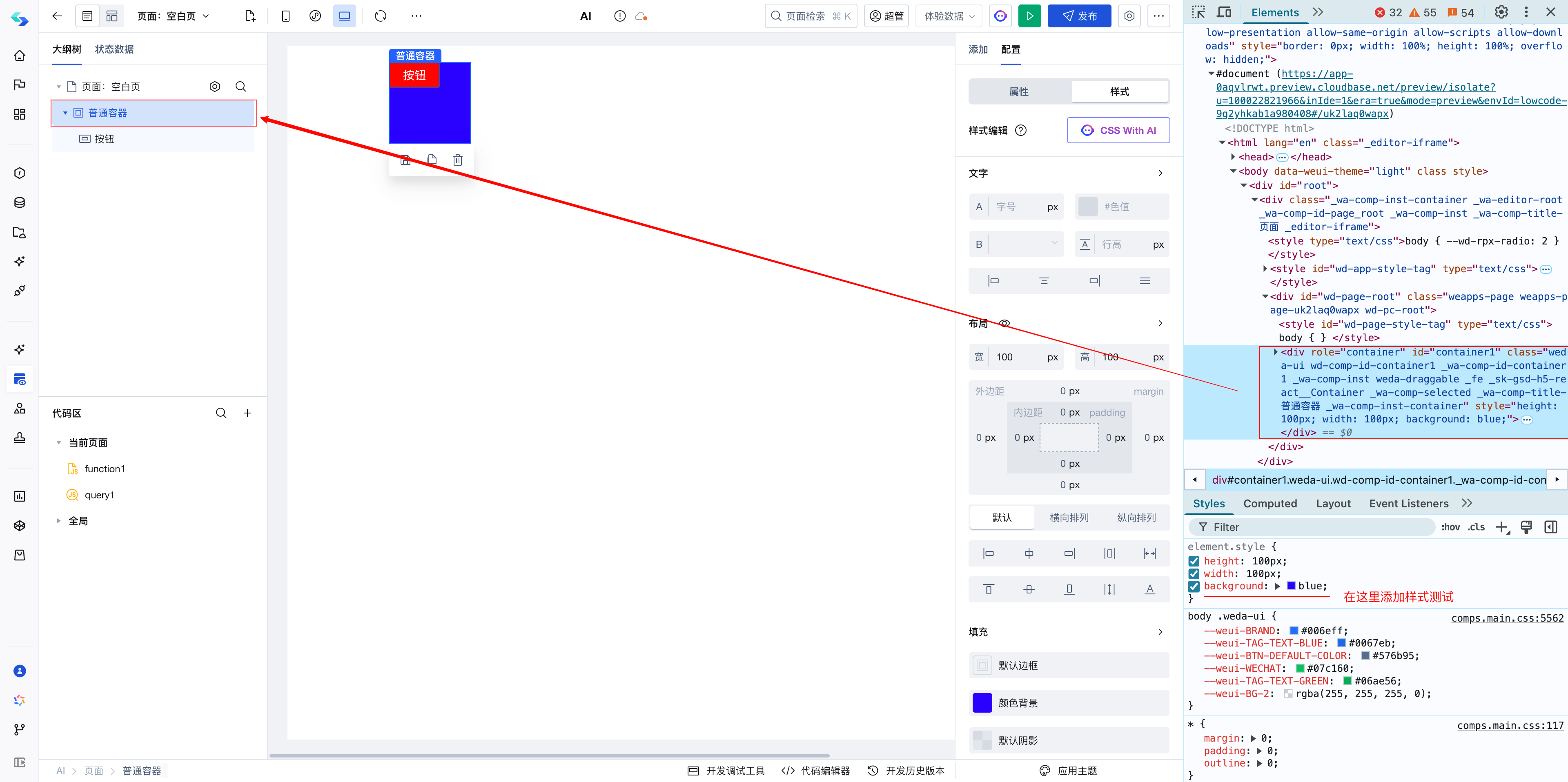
The component's class or id needs to be located using browser debugging tools. You can right-click the page and select "Inspect" to open the browser debugging tools.
-
Switch to the Elements tab
-
Click the Select button; the button will be highlighted after being clicked.
-
Select the component you want to debug. Its position in the component tree on the right will be highlighted, allowing you to see the node's class or id
The Elements panel displays the structure of the current page. If a specific component is not located, you can navigate up or down the component tree on the right.
- Write css based on class
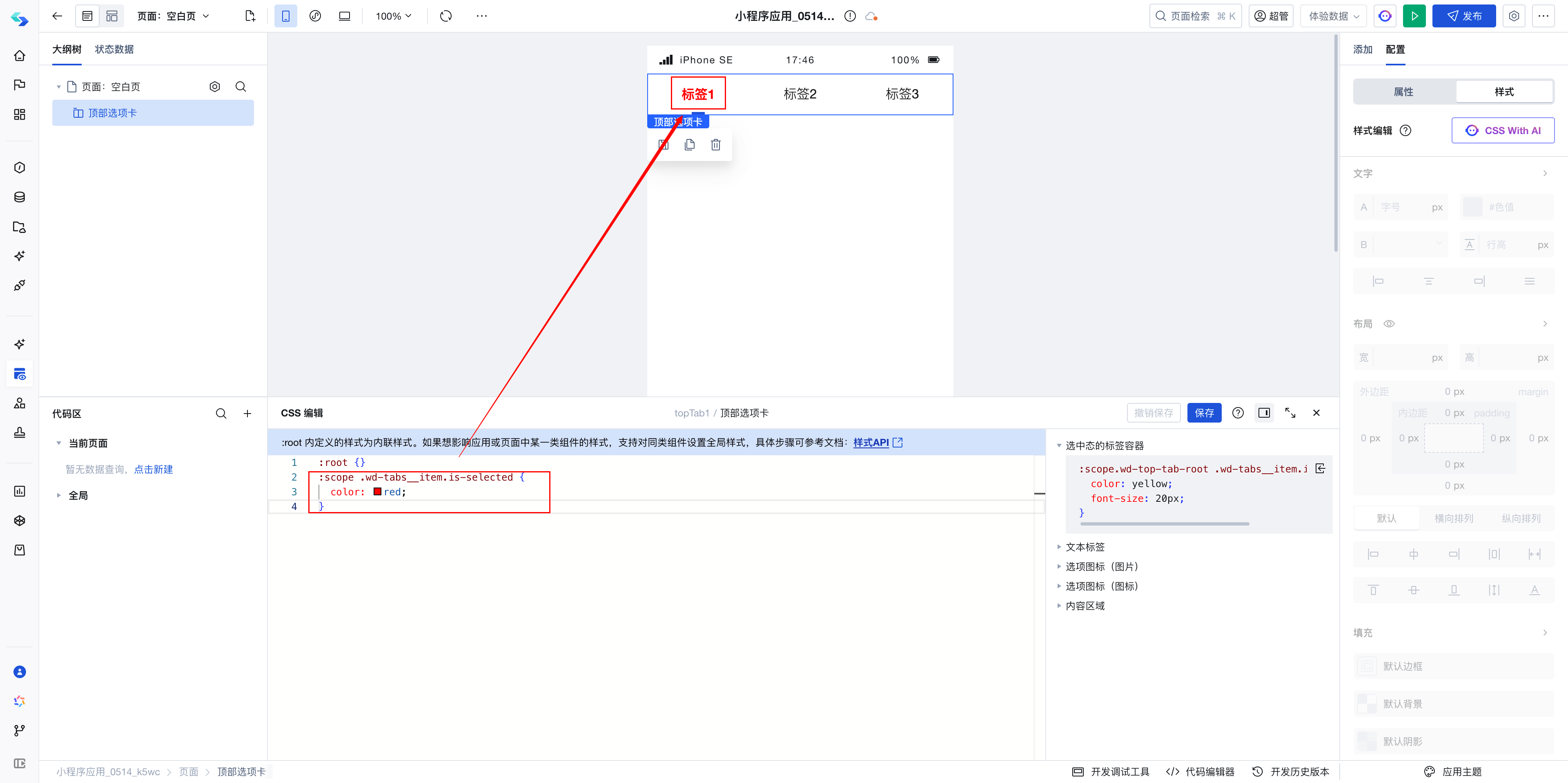
As shown in the figure above, to change the font color of the selected component to red, the following style needs to be written:
:scope .wd-tabs__item.is-selected {
    color: red;
}
.wd-tabs__item.is-selected is the class of the currently selected div. Since the style color: var(--wd-tabs-heder-item-color-selected) is present under this div, it can be determined that the text style is controlled by this div. Therefore, the style can be modified via this class.
Quick Style Debugging
Open the debugging tools, select the node, then directly write CSS in the element.style section at the bottom of the debugging panel. Changes take effect immediately; after successful debugging, copy the CSS to the component's CSS.
Note
Generally, components have multiple layers, composed of multiple div or other HTML elements. Therefore, adjusting styles requires focusing on locating the corresponding element position.
If style modifications do not take effect, it is highly likely due to targeting an incorrect component hierarchy level. You can navigate up or down the hierarchy and debug using the aforementioned Quick Style Debugging method.
For example, when setting width and height does not take effect:
A1: Check if a parent component has fixed the width and height, causing the child node's width and height settings to not take effect.
A2: It could also be due to insufficient style priority. You can add !important after the style rule.
:scope .wd-tabs__item.is-selected {
    color: red !important;
}
Example reference: Top Tabs Custom Styles
Application Theme
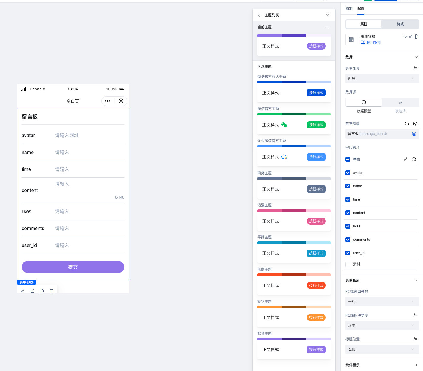
If you wish to modify the overall style, you can use the Application Theme to make unified adjustments.
The Cloud Development Platform provides multiple sets of application themes. Using application themes allows predefining styles for page elements, enabling different themes to change the appearance of default text, backgrounds, buttons, icons, etc.
For details, refer to Application Theme
Global CSS
If the Application Theme does not fully meet your customization needs, you can write Global CSS to uniformly modify properties across the entire application.
If you wish to reuse styles, you can bind a class to the component and define the class style globally to achieve style reuse.
For details, refer to Code Editor
Page Layout
Adjusting page layout primarily involves arranging inline components and block-level components. Since these two types of components have different default display effects, layout containers such as regular containers or grid layouts should be used for processing during adjustments.
A regular container is a div, so you can effectively utilize divs for layout purposes.
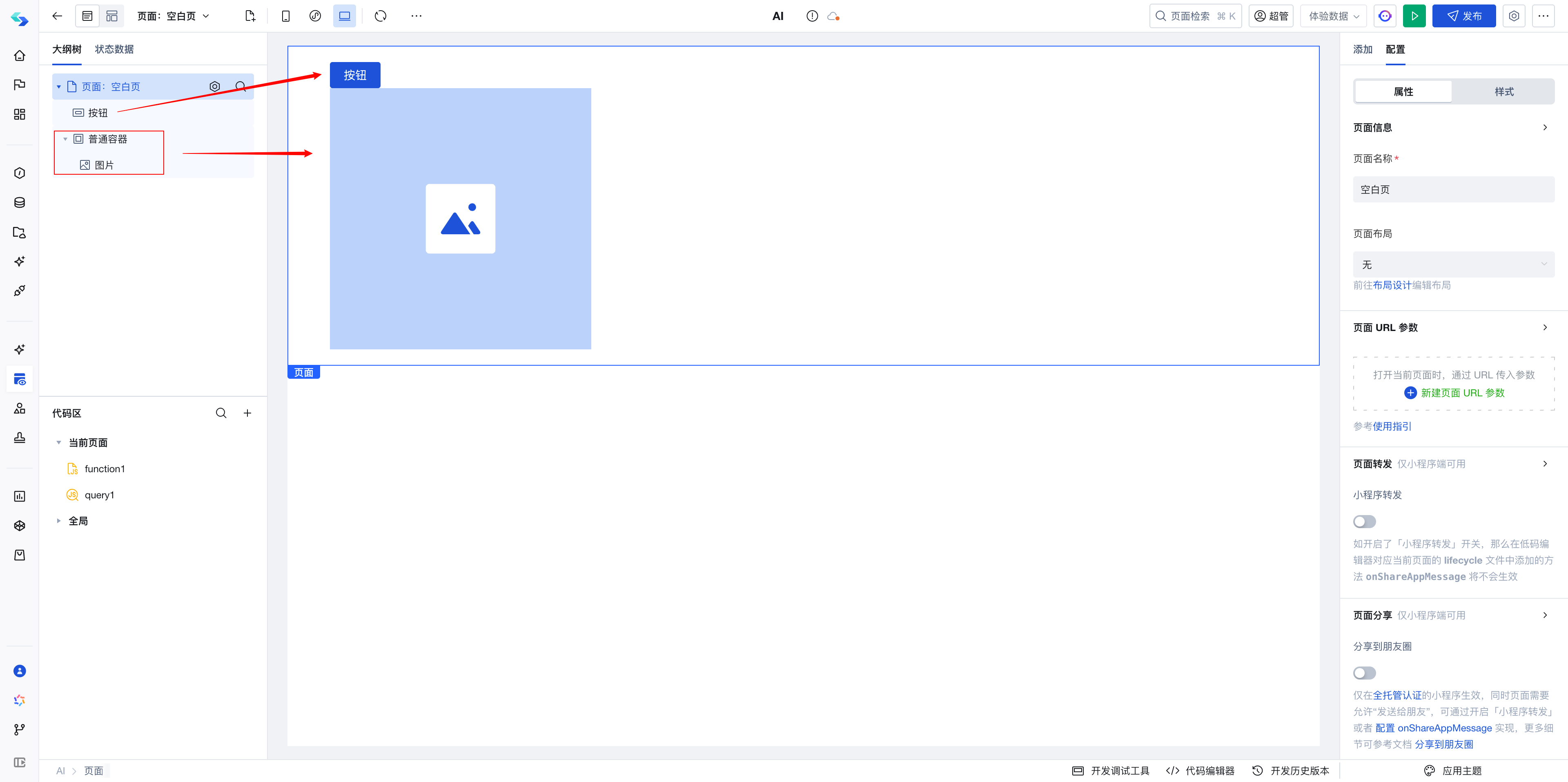
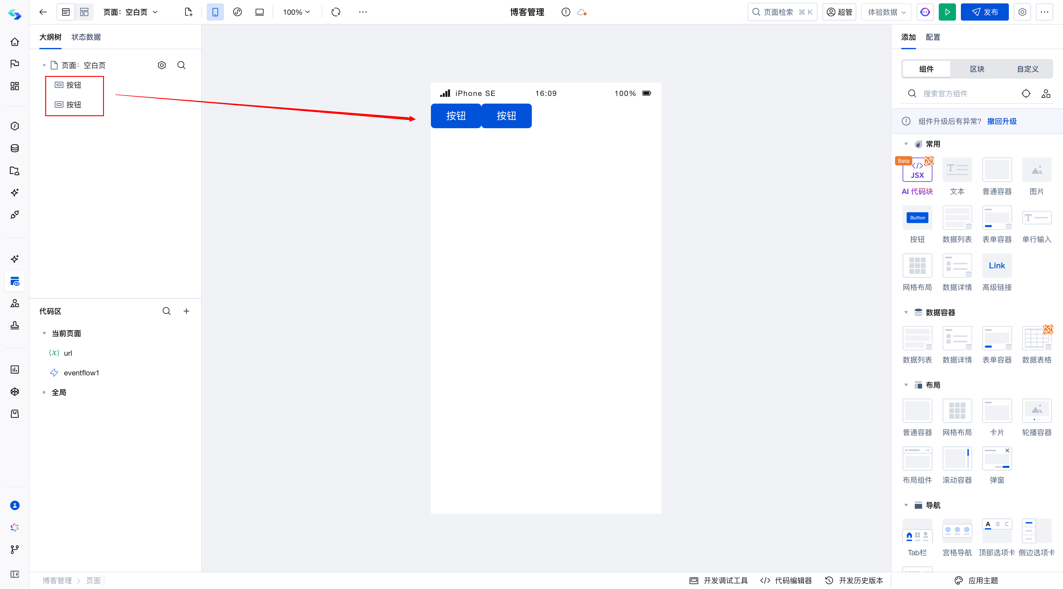
Example (Inline Component Wrapping)
Images and buttons are both inline components and are displayed in a single line by default.
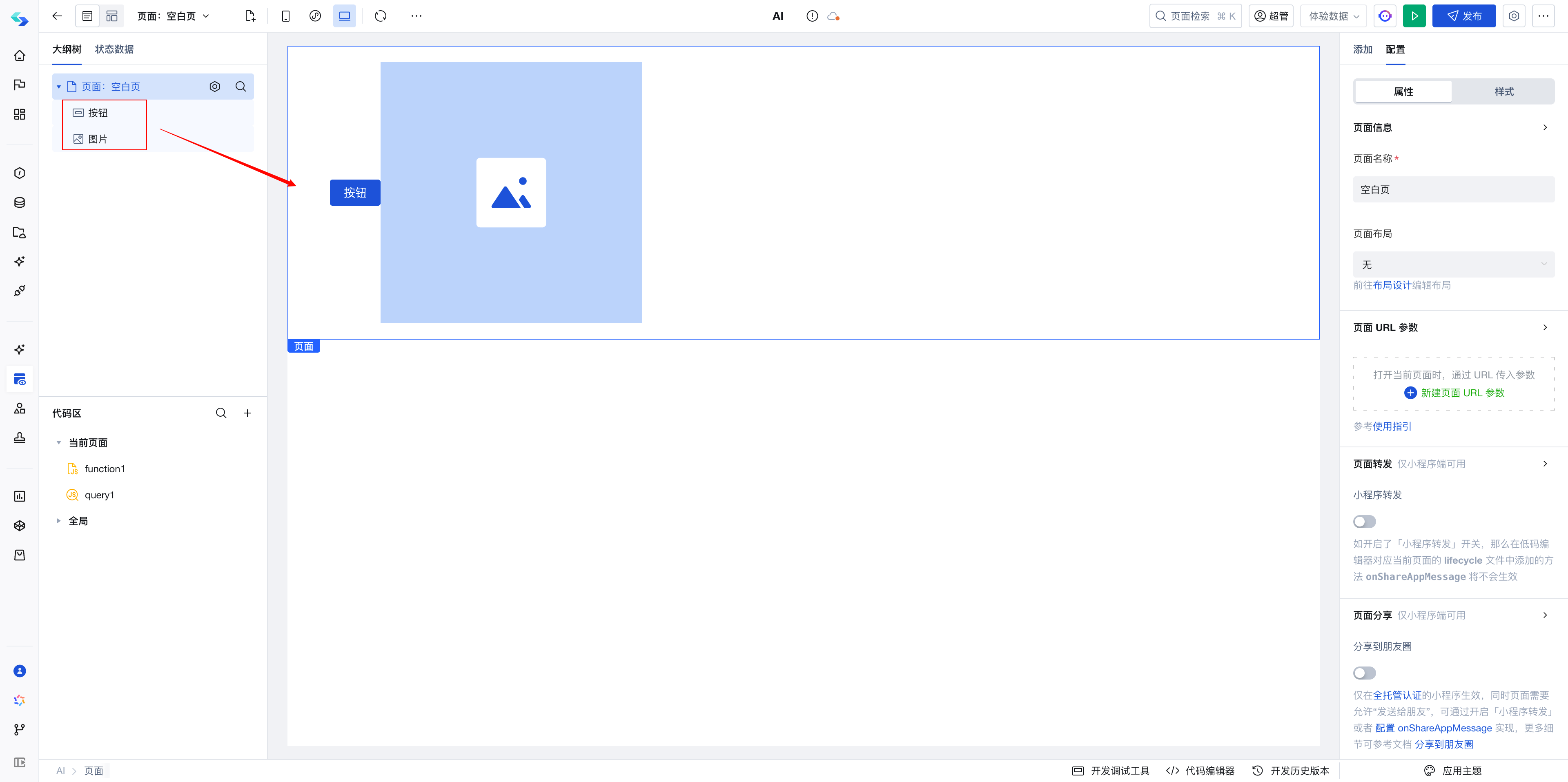
If I want buttons and images to wrap to a new line, I can wrap the images in a normal container to make the container wrap.
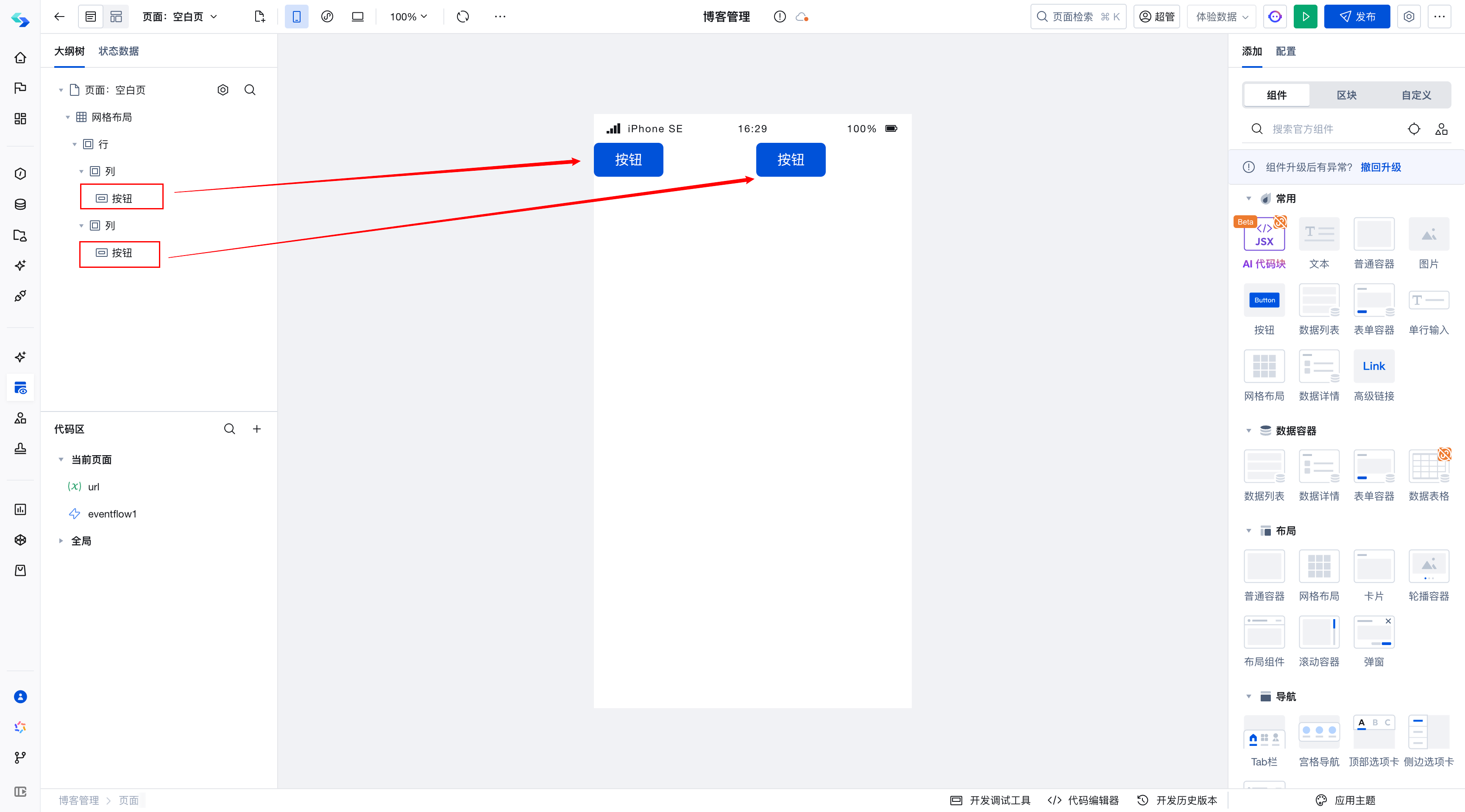
Example (Justified Alignment):
The page in the figure below contains two button components. Buttons are inline components, so they occupy the same line by default, arranged from left to right.
If you wish to place Button2 on the far right to achieve justified alignment
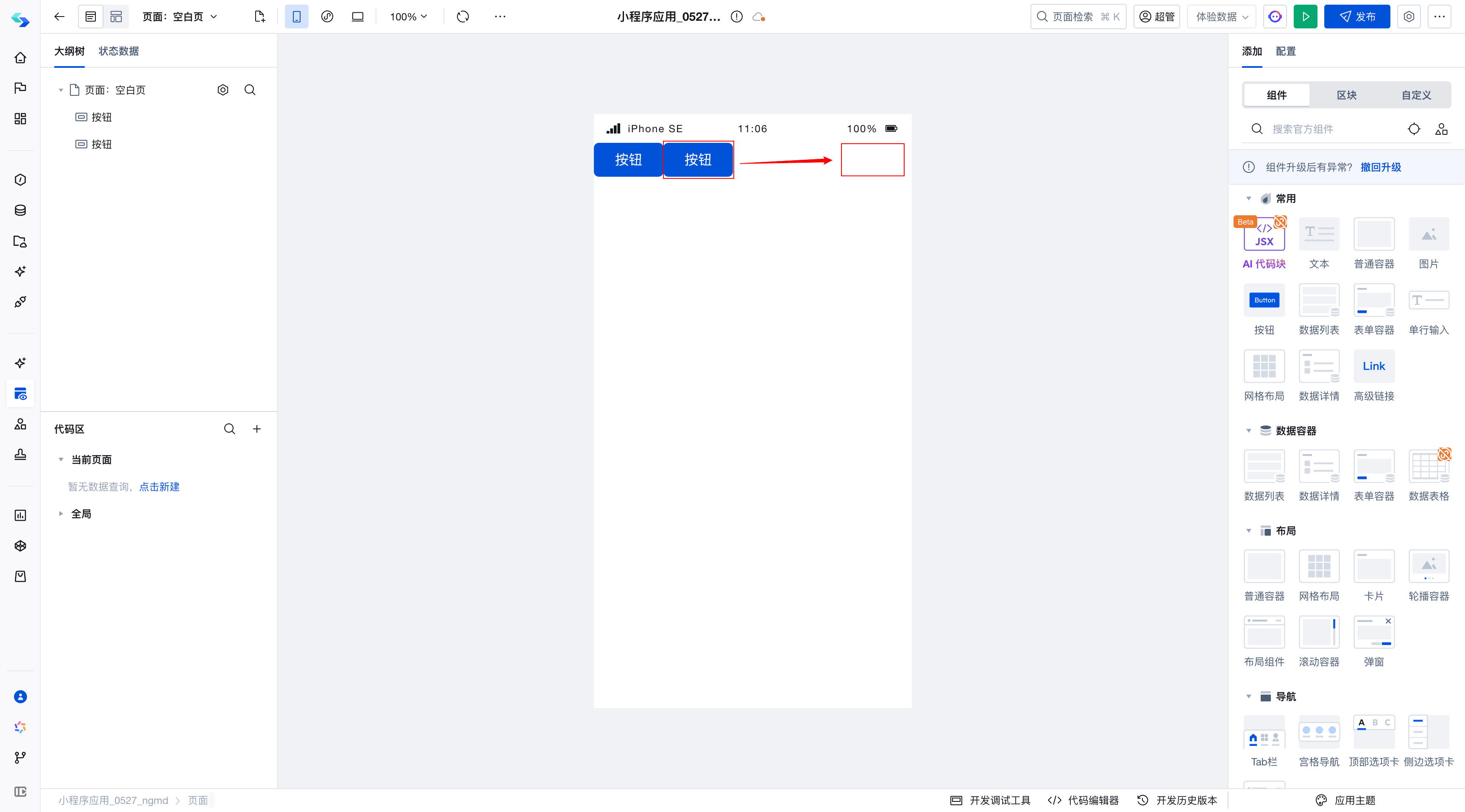
This requirement is not convenient to achieve with the button component itself; we need to implement it using a regular container or grid layout.
Regular Container Solution
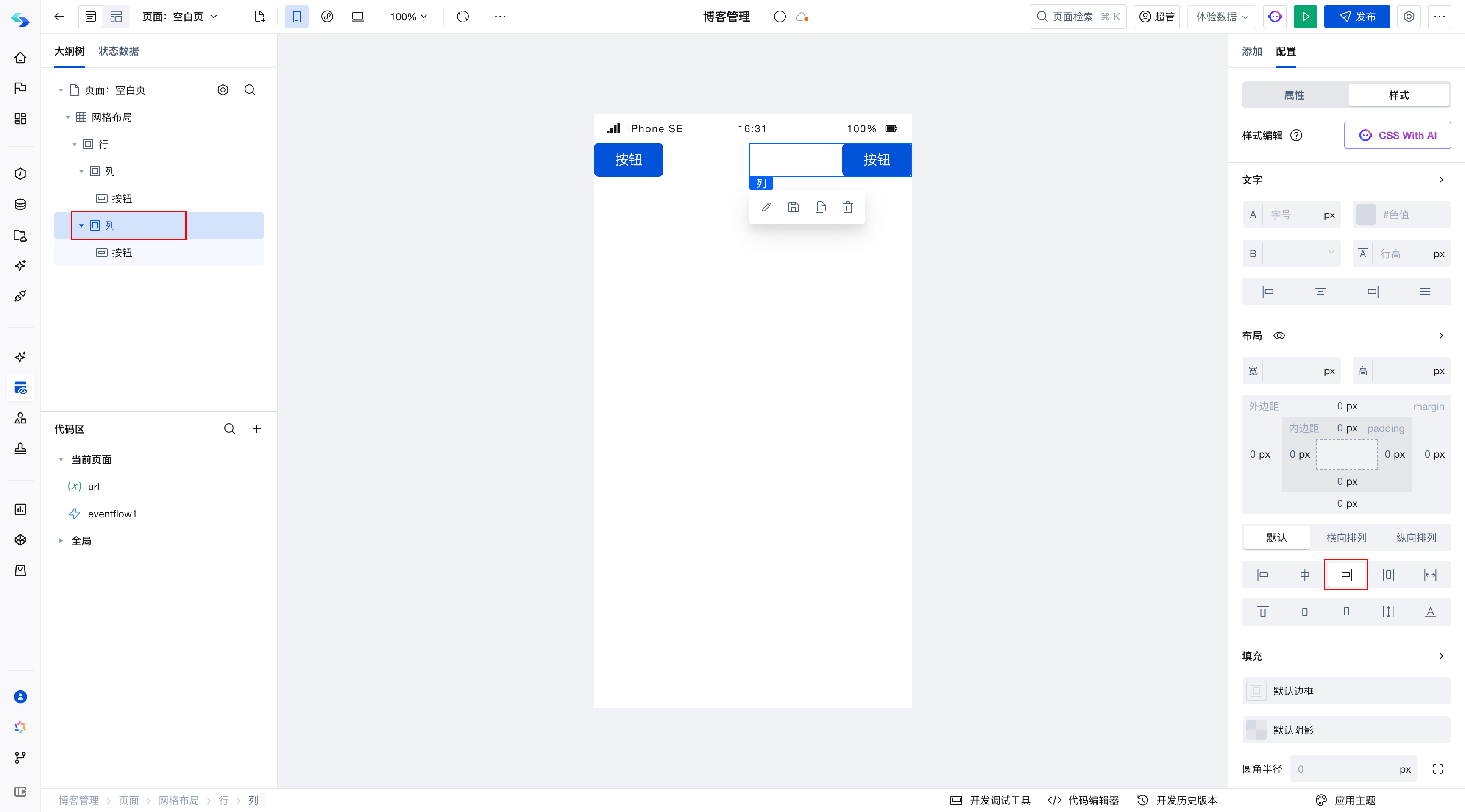
By placing Button1 and Button2 in a regular container component, setting the container's layout mode to justify achieves justified alignment.
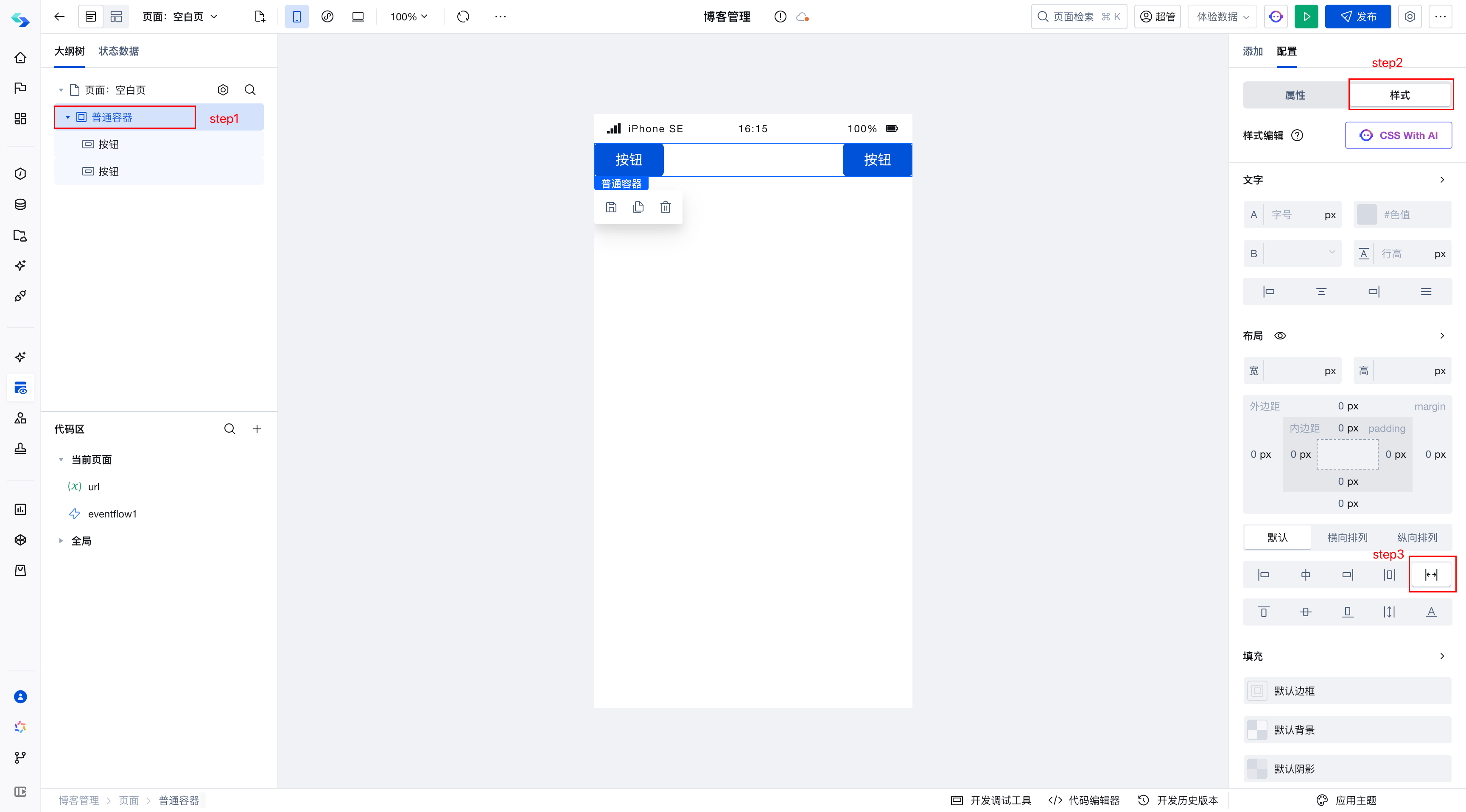
Regular containers also have other alignment methods, such as center, left-aligned, right-aligned, horizontally centered, top-aligned, bottom-aligned, and so on.
Grid Layout Solution
Grid layout is relatively easy to understand: it divides the page into rows and columns, analogous to excel cells. It can be divided into up to 12 columns, and components can be dragged into column cells to achieve layout.
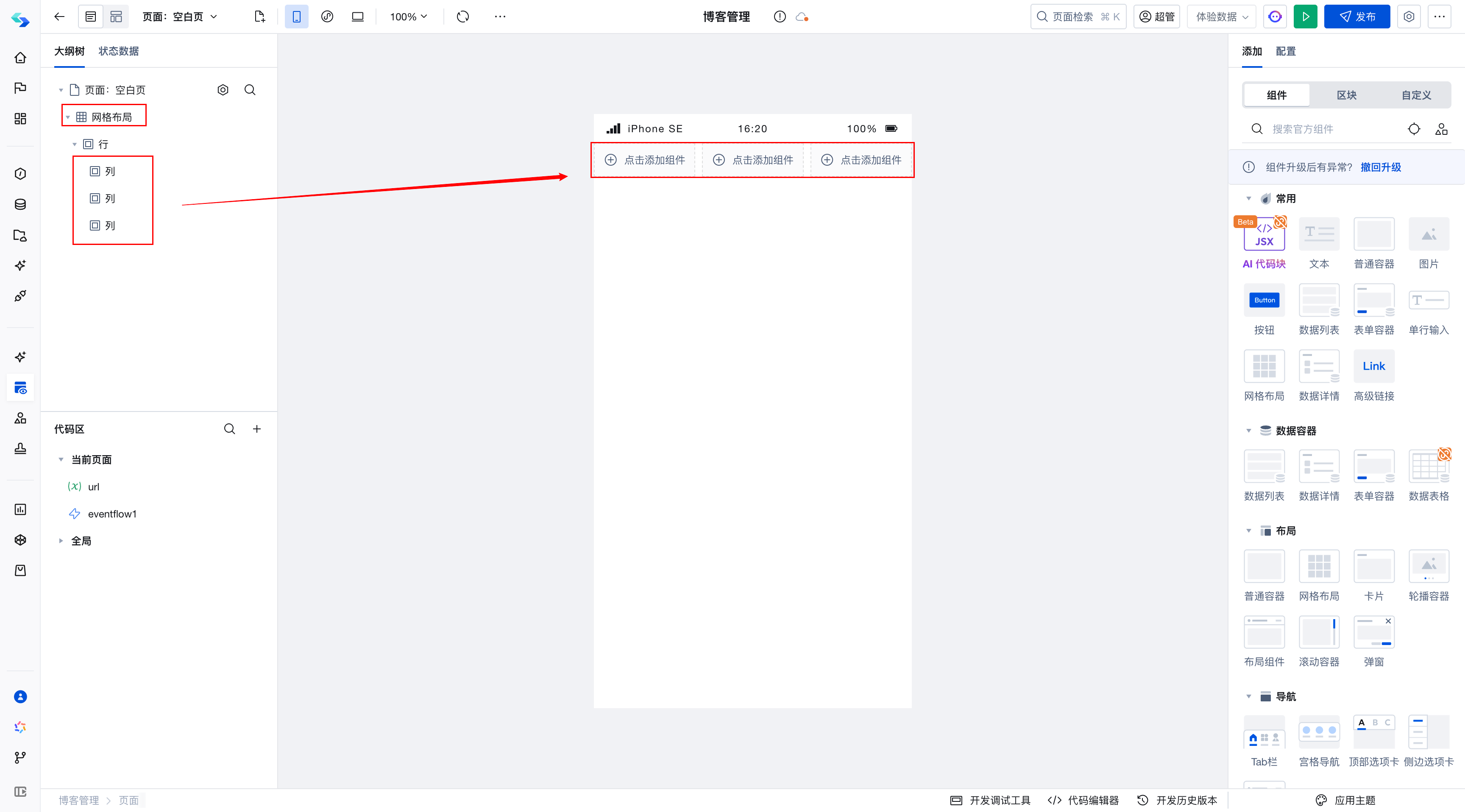
Therefore, in the aforementioned requirement, simply place Button1 and Button2 in column cells to achieve an equal distribution effect.
Of course, this effect is not what we want. We expect Button2 to be flush with the right side, so we can set the alignment of the second column to right-aligned.
Similarly, block-level components such as text and text boxes occupy a full row by default, similar to vertical arrangement. To achieve horizontal alignment, the layout can also be adjusted using the two methods mentioned above.
Solution Comparison
Grid layout is primarily used for layout scenarios involving equal division, such as one row with 3 elements or multiple rows of rendering.
Regular container can be likened to a box with no built-in styles, thus it can be effectively used for local layout.
Therefore, in the component alignment case mentioned above, we recommend using regular containers for implementation.
Page Layout
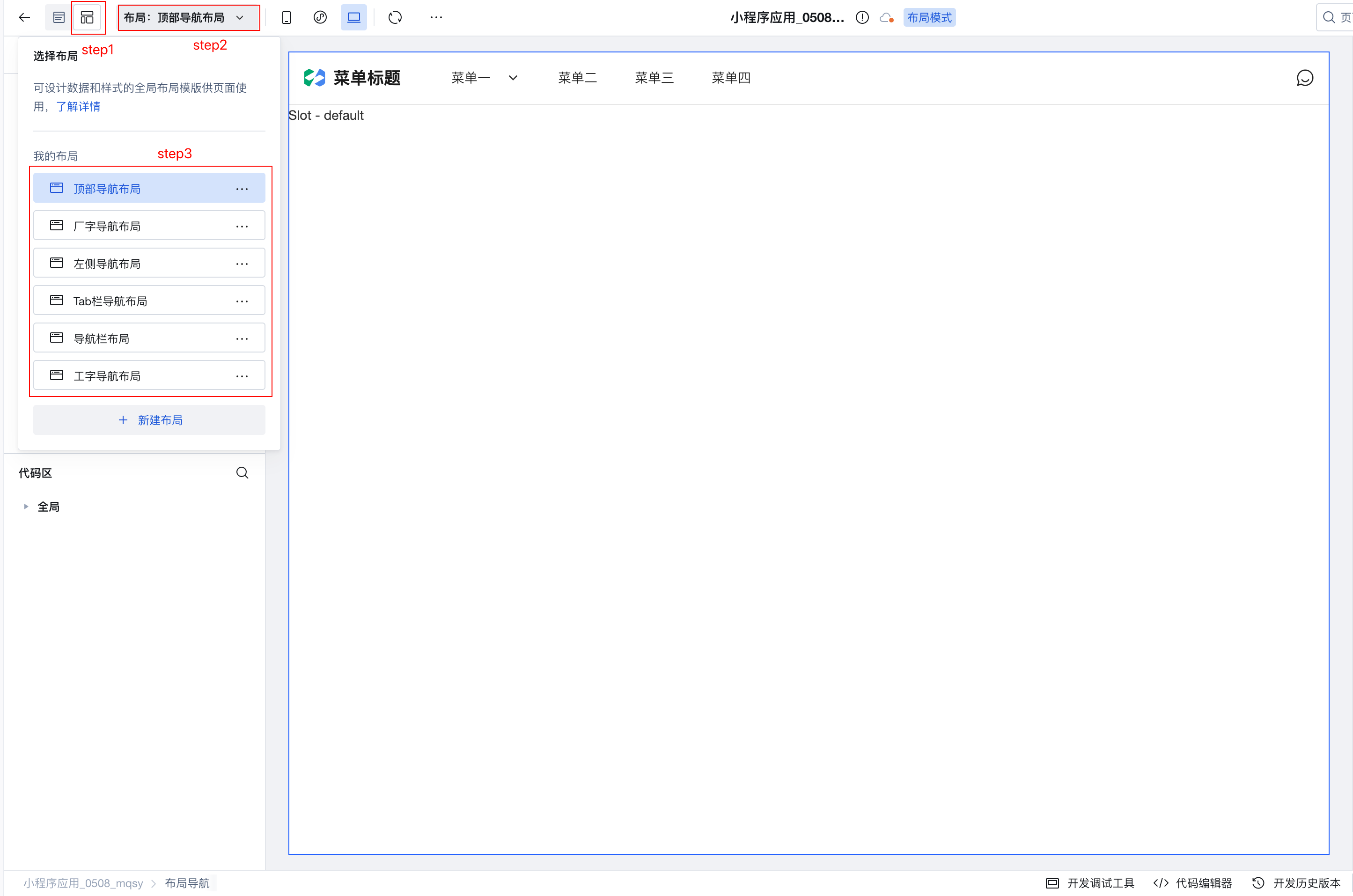
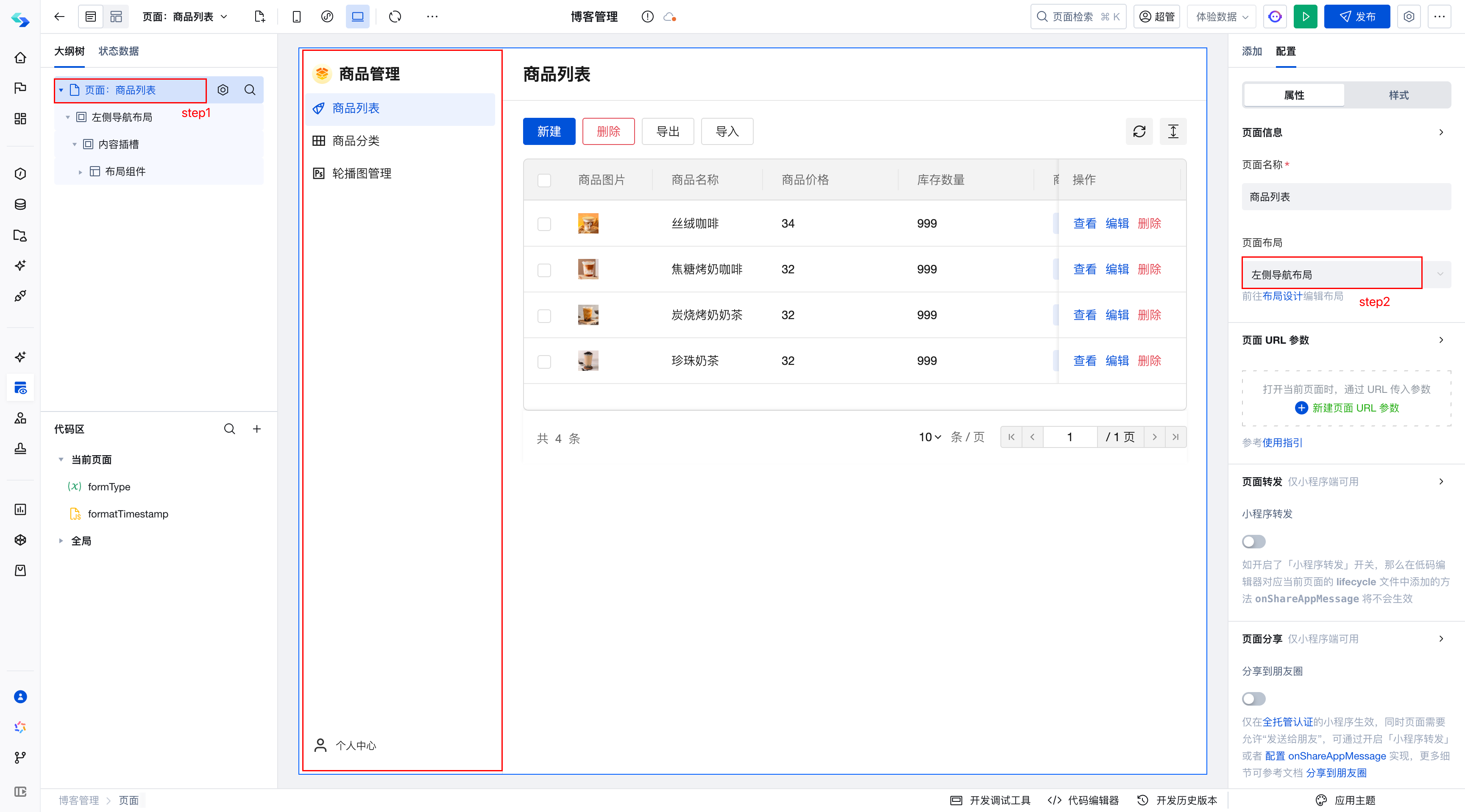
Page layout primarily focuses on the arrangement of Menu Bar, Top Navigation Bar, and Page Body sections.
The platform provides multiple default layout modes. You can select a layout for secondary adjustments and then reference it in your page.

The operations are as follows:
After entering the visual application, switch to Page Layout.
For mobile devices, there is also a standard bottom tab bar layout solution:
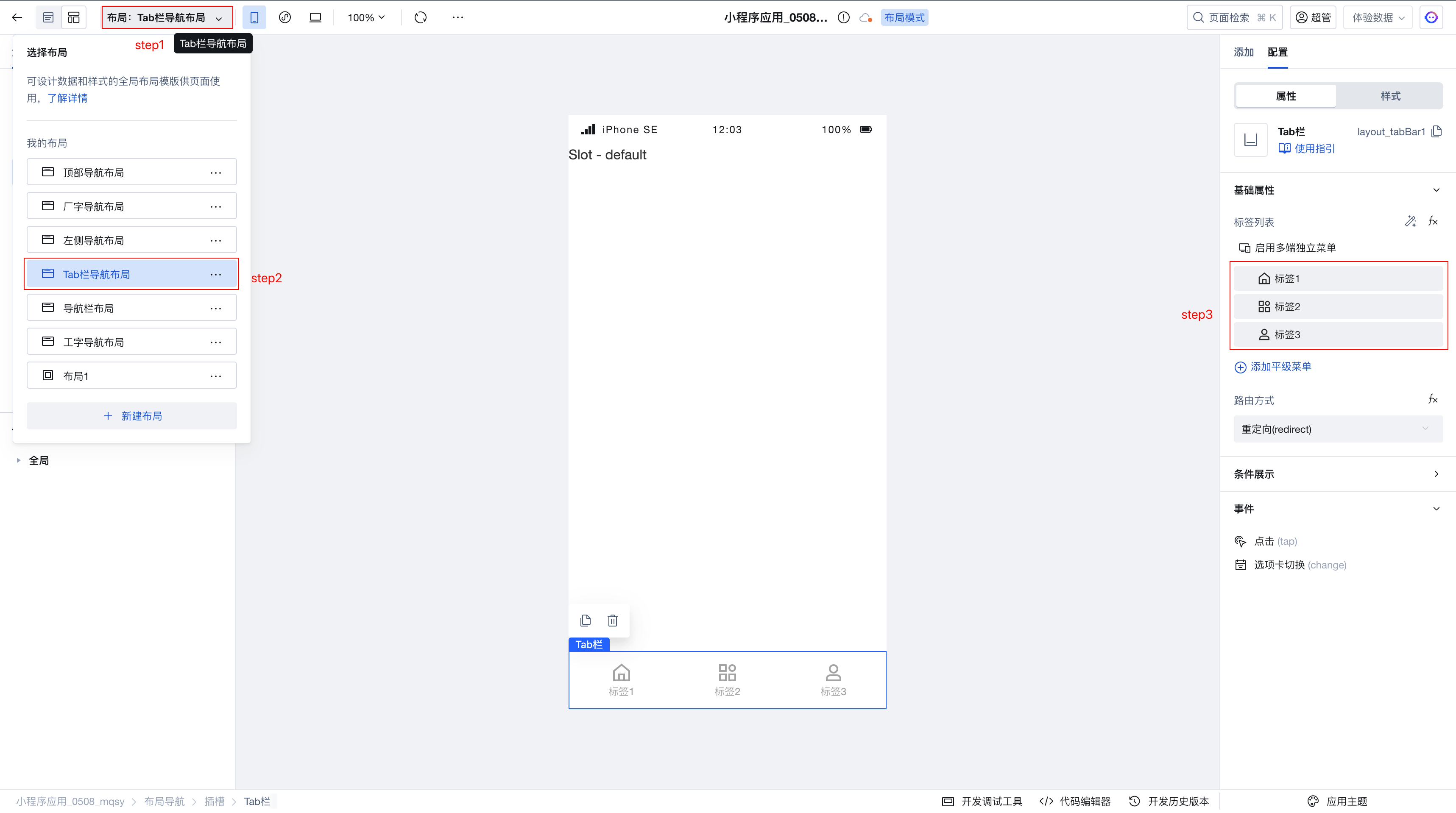
After adjusting the logo, title, and Menu Bar properties, reference the layout in your page.
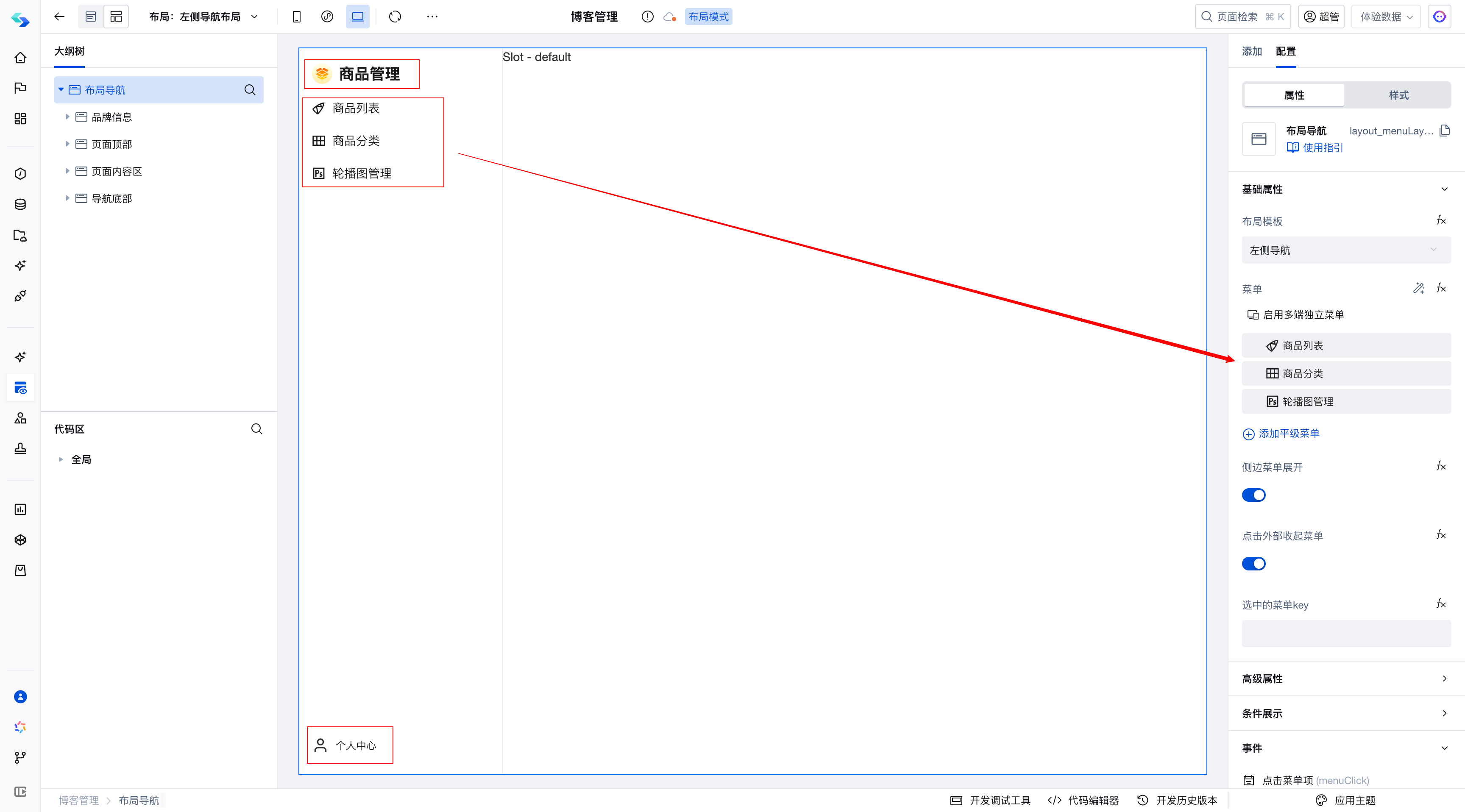
Reference the Page Layout within the page.
Debugging Case
Requirement: In the data table, to highlight certain columns, some columns are expected to be displayed using tag components. Here, the Blog Name column is displayed using a tag component.
Current Status: When the content in this column is too long and exceeds the component's width, the overflow portion is automatically displayed as an ellipsis.
Objective: We aim to increase the width of this column slightly to prevent it from displaying an ellipsis.
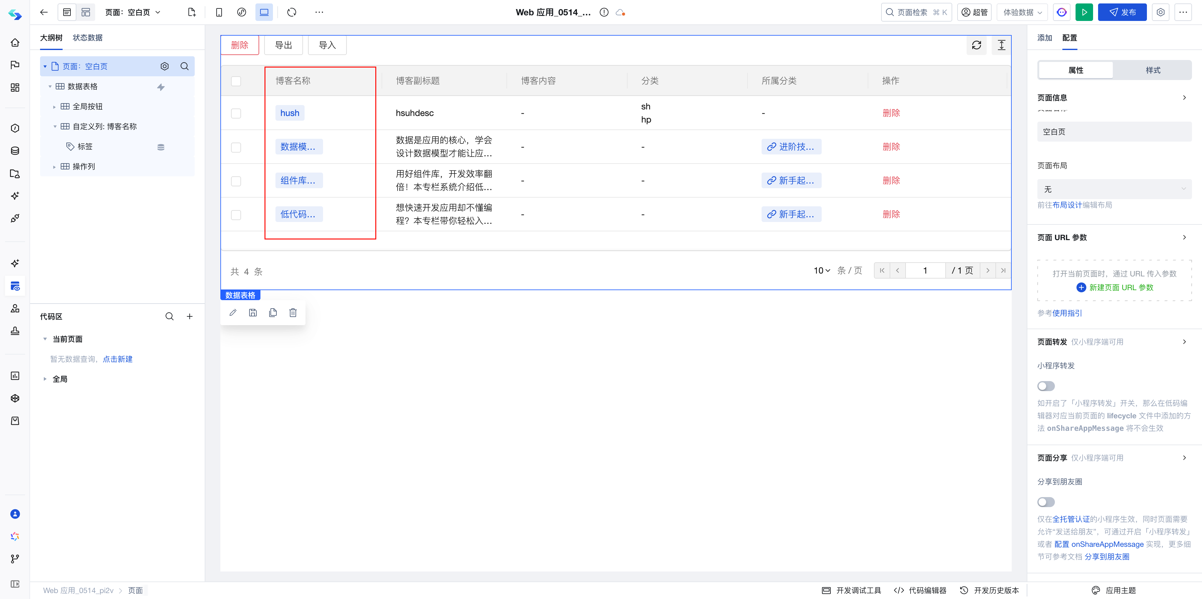
This issue appears relatively simple; simply adjust the column and component width.
At this point, we will proceed with the following approach:
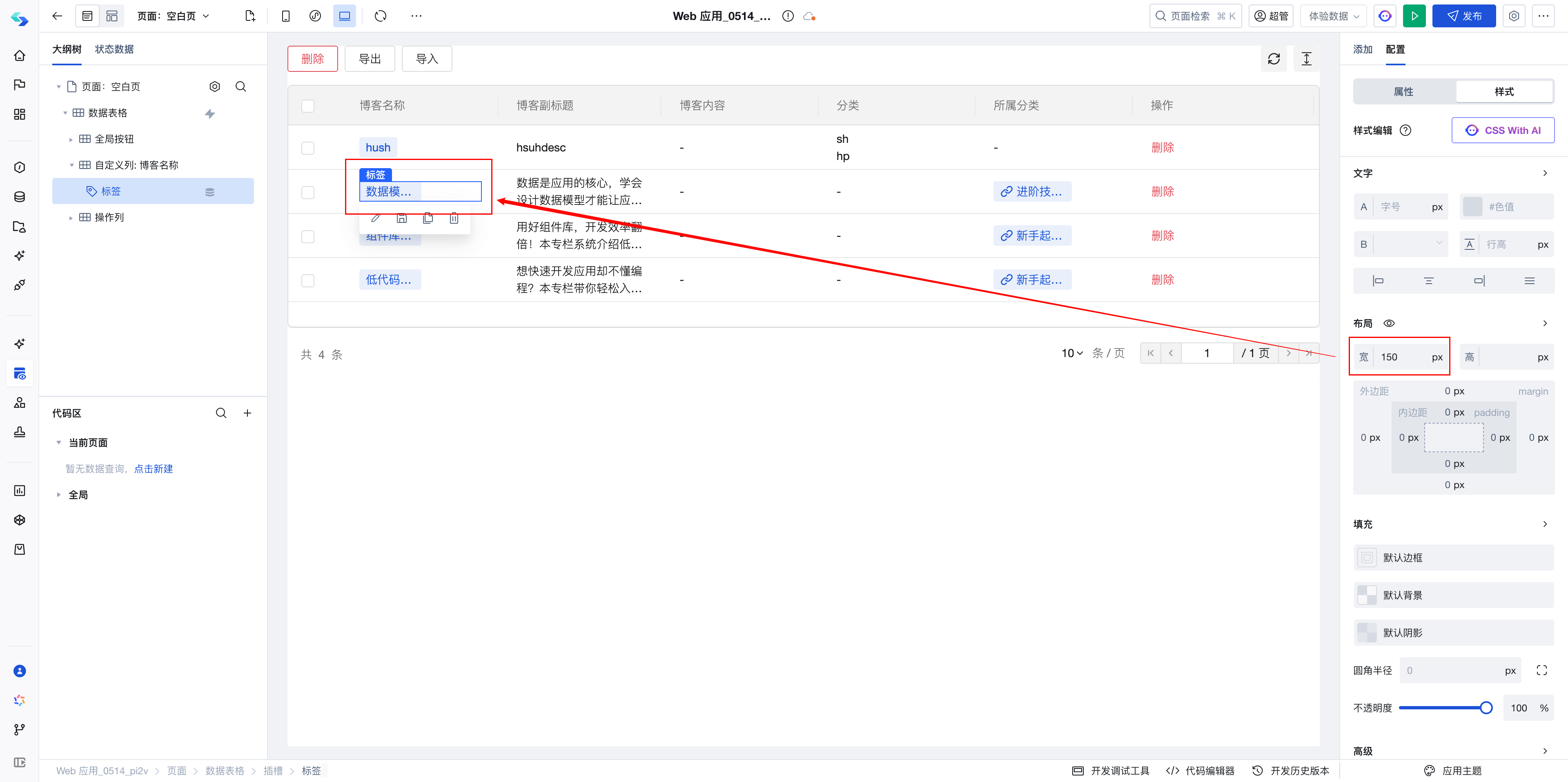
- Adjust the column and tag component width to 150px
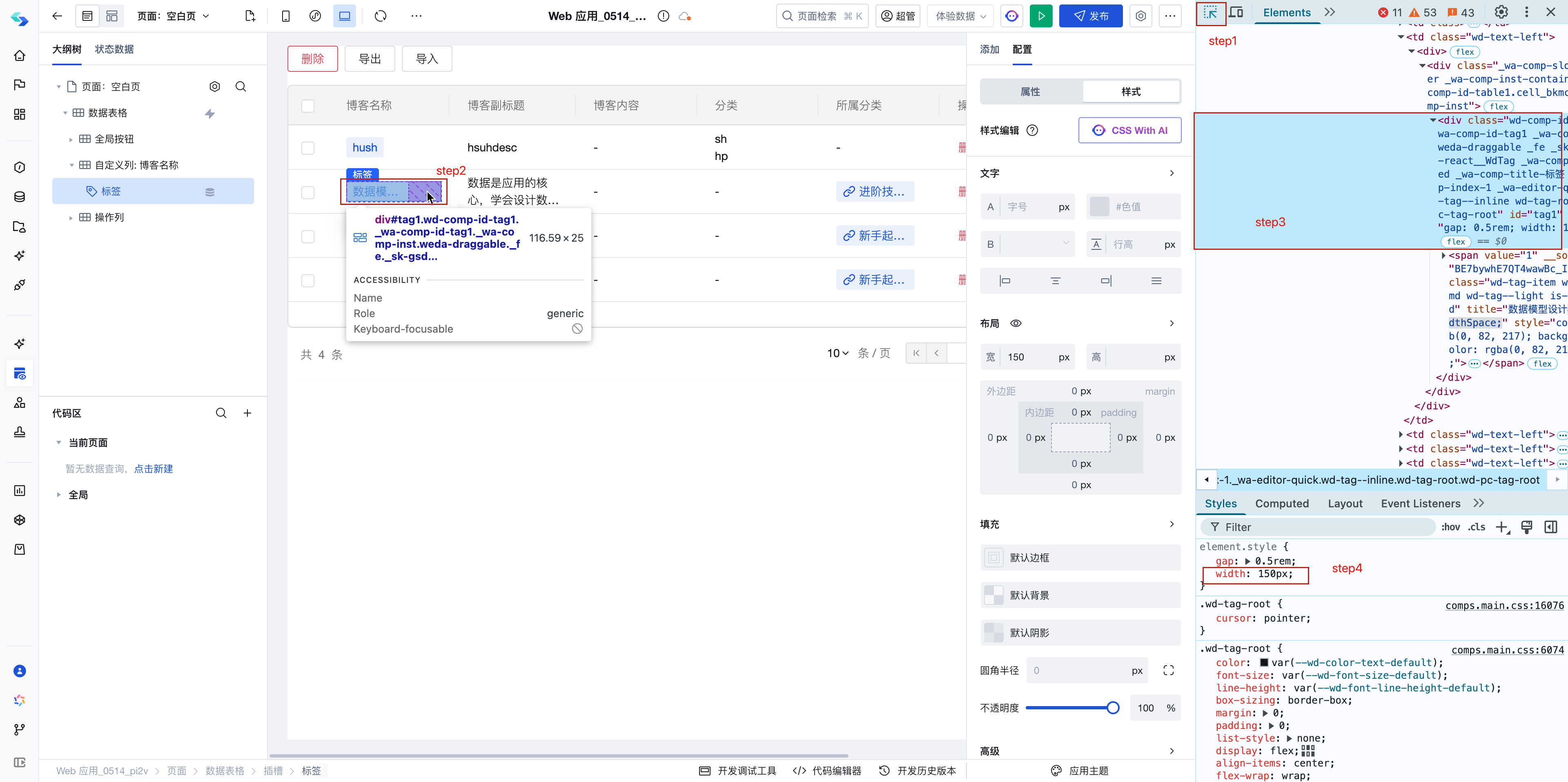
At this point, it is observed that the change has not taken effect, but the width of the component selection box in the Editing Area (the blue border around the selected component in the image below) has changed, indicating that the component width has indeed been modified, but the issue with the inner component's width remains unresolved. Therefore, we need to use browser debugging tools to debug, locate the corresponding component, and adjust its width.
- Open the browser debugging tools, switch to the Elements tab, click the Select button, and select the tag component.
According to debugging, it can be seen that width: 150px has been applied but is not taking effect. Therefore, we need to investigate whether the subcomponents are being affected by other styles.
- In the debugging tools, expand the component and select the subcomponent.
It can be observed that in the Editing Area, the component is highlighted, but its width does not fill the container. Therefore, we need to set its width to width:100%
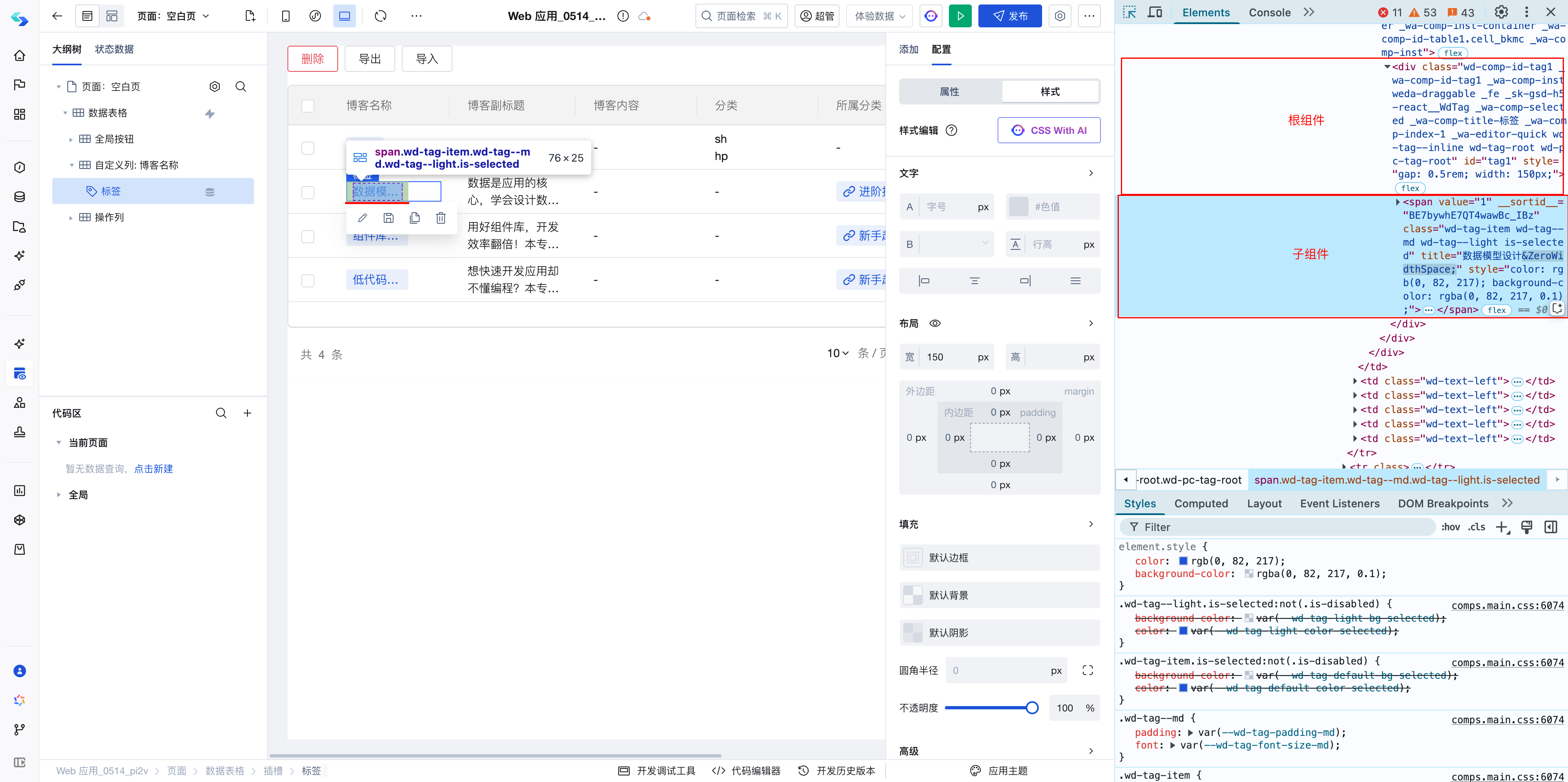
Observing that the current subcomponent's class is wd-tag-item, we can therefore set the style using this class name.
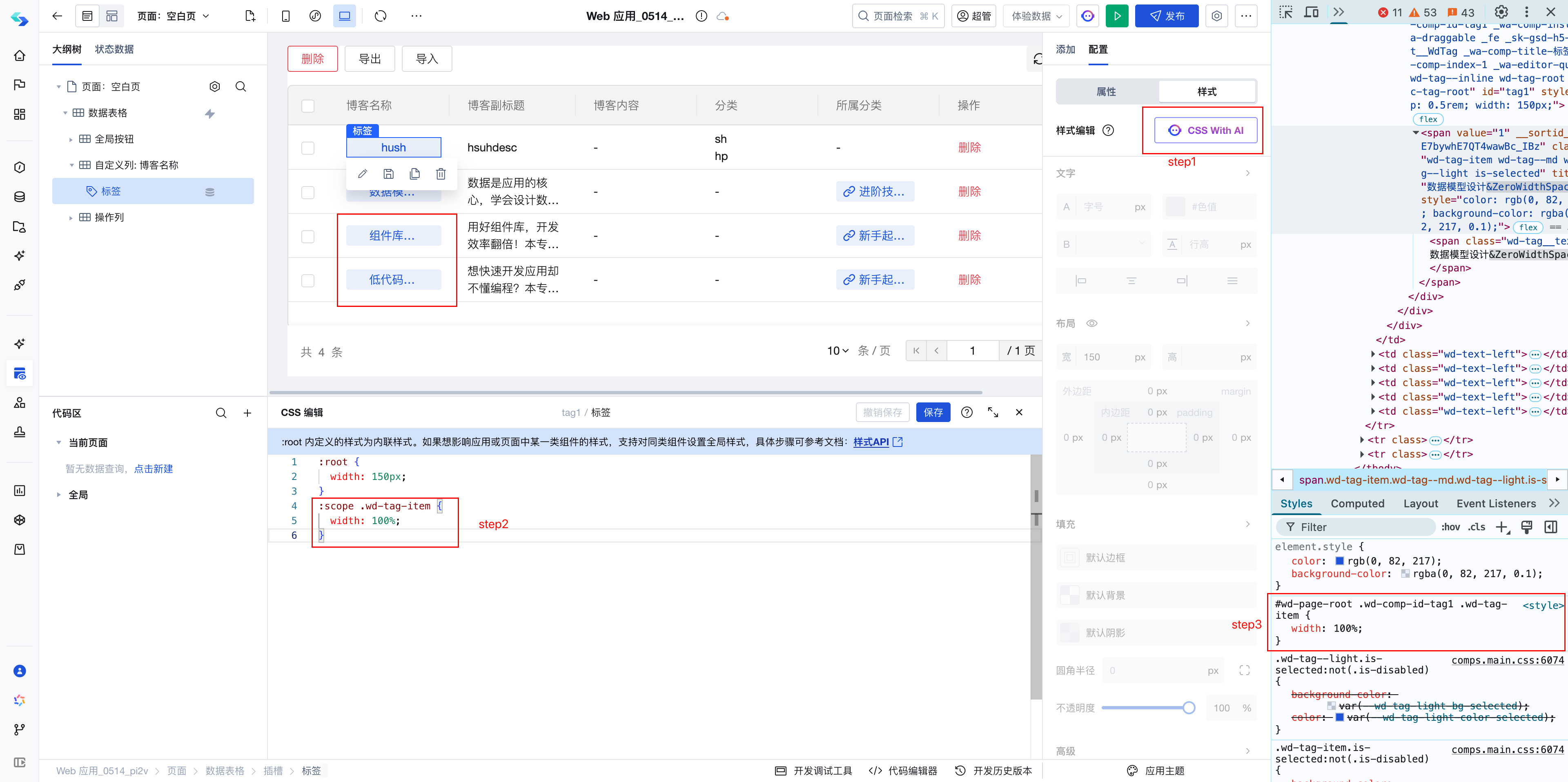
- Open the style editor and append styles in CSS
:scope .wd-tag-item {
    width: 100%;
}
It can be observed that the style is displayed in the editor and takes effect on the page.
However, it is observed that the text ellipsis has not been removed yet. Therefore, we need to continue troubleshooting by examining the subcomponent's styles.
- Select the next-level subcomponent and inspect its styles.
Here we observe that this subcomponent has a max-width: 60px, which causes the text display width to be limited to a maximum of 60px regardless of the outer component's width. Therefore, we adjust the style of the component with the class wd-tag__text.
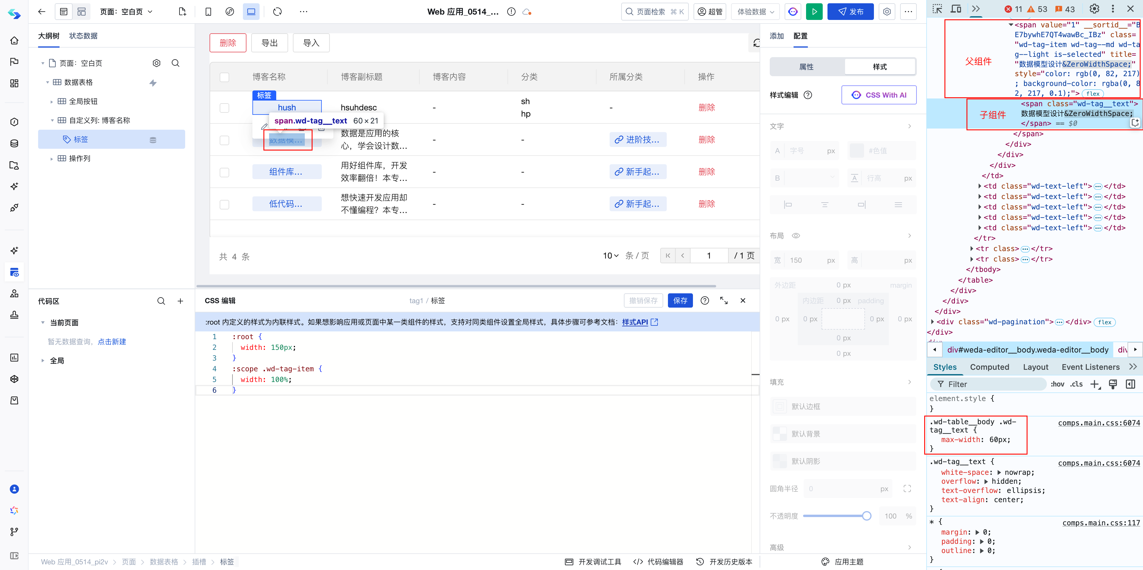
- Open the style editor and continue adding styles in CSS
:scope .wd-tag__text {
    max-width: unset;
}
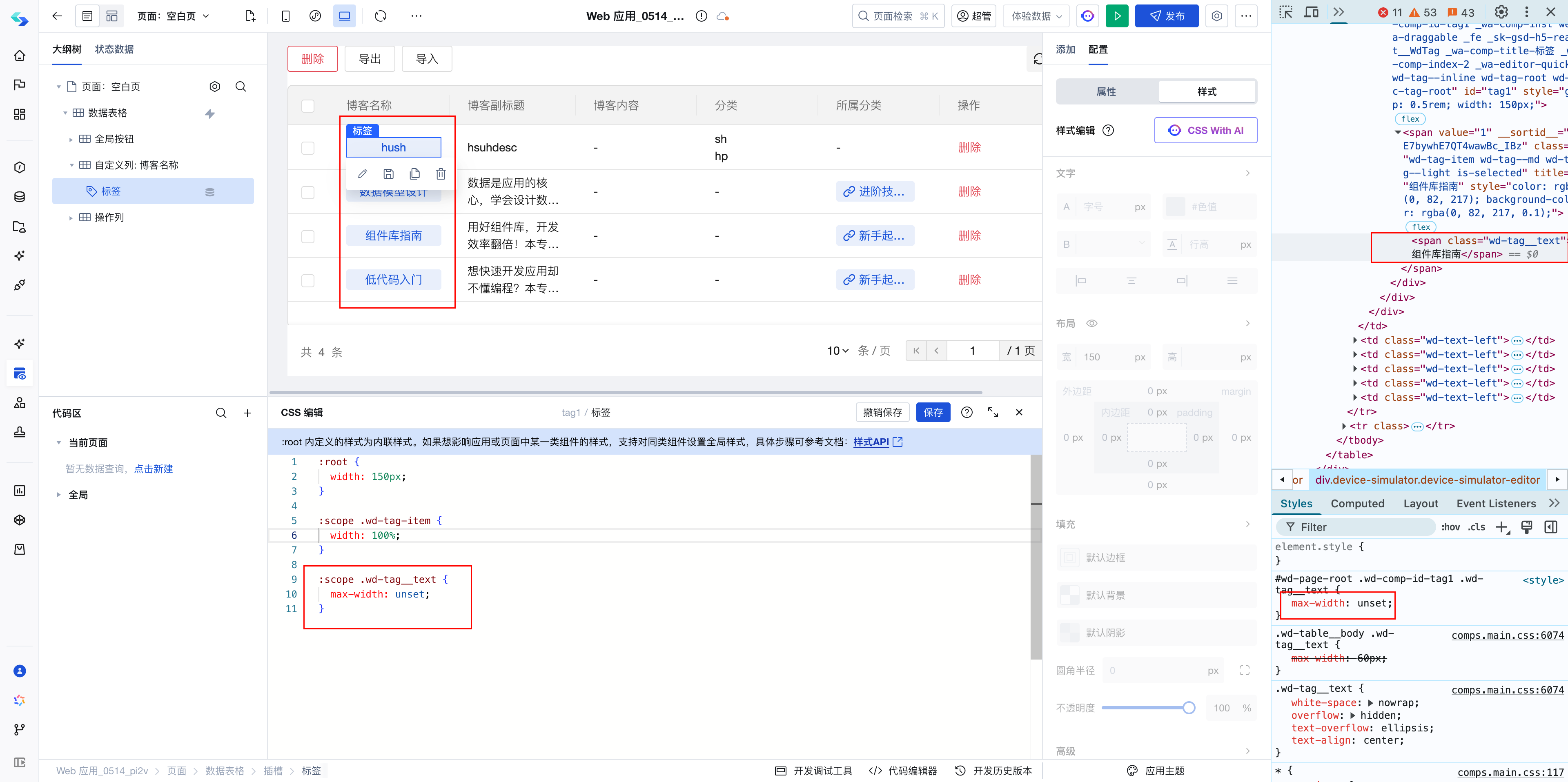
The effect is now correct, so the overall solution is to append the following CSS styles:
:scope .wd-tag-item {
    width: 100%;
}

:scope .wd-tag__text {
    max-width: unset;
}