Component Configuration
Component configuration is a JSON file used to describe the component's metadata, properties, events, methods, and other information. The editor displays and configures the component based on the property declarations.
The JSON Schema for component configuration can be viewed at WeDa Component Declaration Syntax Specification
Configuration Example
The following example uses a button component to demonstrate the component configuration format.
{
  "$schema": "https://comp-public-1303824488.cos.ap-shanghai.myqcloud.com/schema/lcds_component.json",
  "data": {
    "type": "object",
    "properties": {
      "text": {
        "title": "Button Text",
        "default": "Button",
        "type": "string"
      },
      "size": {
        "title": "Button Size",
        "type": "string",
        "default": "default",
        "x-component": "radio",
        "enum": [
          {
            "label": "default",
            "value": "default"
          },
          {
            "label": "mini",
            "value": "mini"
          }
        ]
      },
      "type": {
        "title": "Button Type",
        "type": "string",
        "default": "primary",
        "x-component": "radio",
        "enum": [
          {
            "label": "default",
            "value": "default"
          },
          {
            "label": "primary",
            "value": "primary"
          },
          {
            "label": "warn",
            "value": "warn"
          }
        ]
      },
      "loading": {
        "title": "Loading",
        "type": "boolean",
        "default": false
      },
      "disabled": {
        "title": "Disabled",
        "type": "boolean",
        "default": false
      },
      "plain": {
        "title": "Hollow",
        "type": "boolean",
        "default": false
      },
      "titleSlot": {
        "type": "slot"
      }
    }
  },
  "events": [{ "name": "customevent", "title": "Custom Event" }],
  "methods": [{ "name": "innermethod", "label": "Component Internal Method" }],
  "defaultStyles": {
    "width": "400px",
    "height": "100px"
  },
  "meta": {
    "title": "Button",
    "description": "Button component, compatible with Mini Program and H5 platforms",
    "icon": "./icon.svg",
    "category": "Form",
    "componentOrder": 1
  }
}
The following describes each attribute configuration in JSON.
data Property Declaration
Optional, data that the component can receive, used as input parameters, must comply with the JSON Schema specification.
The editor will also render the component's data panel based on this configuration.
Example
{
  "data": {
    "properties": {
      "string": {
        "title": "String",
        "type": "string",
        "default": "This is the property value",
        "description": "The property description in the editor",
        "required": true,
        "x-index": 1
      },
      "enumString": {
        "title": "enum dropdown selector",
        "enum": [
          {
            "label": "Default",
            "value": "default"
          },
          {
            "label": "Warning",
            "value": "warn"
          }
        ],
        "type": "string",
        "x-index": 13
      },
      "contentSlot": {
        "title": "Slot",
        "type": "slot",
        "x-index": 6
      },
      "customRadio": {
        "title": "Custom Radio Button",
        "type": "string",
        "x-component": "radio",
        "enum": [
          {
            "label": "option1",
            "value": "1"
          },
          {
            "label": "option2",
            "value": "2"
          }
        ],
        "x-index": 7
      }
    }
  }
}
How Property Configuration Appears in the Editor
The configuration in the example applies to both the component and the editor. Take the string property as an example:
-
In the component, it indicates that a string property is accepted in the component's input, which is of string type with a default value of "This is the property value";
-
In the editor, the input form for this component's properties will be automatically generated in the properties area.
The input form of properties in the editor is determined by "type", "enum", and 'x-component', with priority order being 'x-component' > "enum" > "type". The correspondence between values and input forms is as follows:
| type | x-component | Description | Diagram |
|---|---|---|---|
| "string" | Not set | Indicates that the property is of string type and is displayed as an input box in the editor | 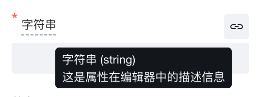 |
| "number" | Not set | Indicates that the property is of number type and is displayed as a number input box in the editor | 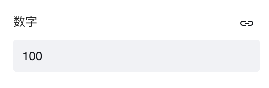 |
| "boolean" | Not set | Indicates that the property is of boolean type and is displayed as a toggle switch in the editor | 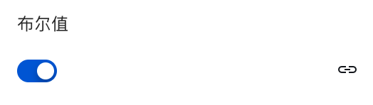 |
| "object" | Not set | Indicates that the property is of object type and is displayed as an object input in the editor | 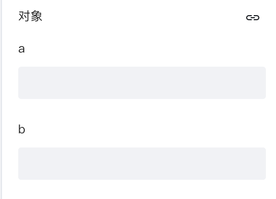 |
| "array" | Not set | Indicates that the property is of array type and is displayed as multiple input boxes in the editor | 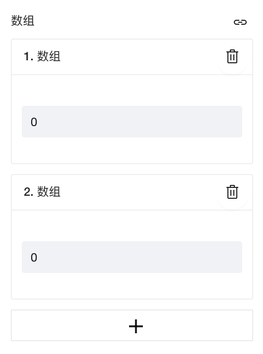 |
| "slot" | Not set | Indicates that the property is of slot type. The editor does not display slot properties. When set as a slot, the component can directly render with the slot property, while the editor allows dragging other components into this slot. For slot implementation in component source code, for web please refer to Web Component Source Code, for Mini Program please refer to Mini Program Component Source Code, where the relevant code for titleSlot can be used as reference | None |
| "string", "number", or "boolean" | "radio" | The editor displays the property as a radio button. | 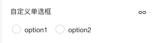 |
| "string", "number", or "boolean" | "checkbox" | The editor displays the property as a checkbox. | 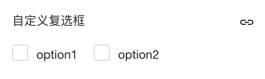 |
| "string" | "textarea" | The editor displays the property as a multi-line text input box | 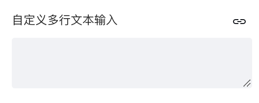 |
| "string" | "color" | The editor displays the property as a color picker. | 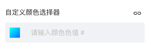 |
| "string" | "image" | The editor displays the property as an image picker. | 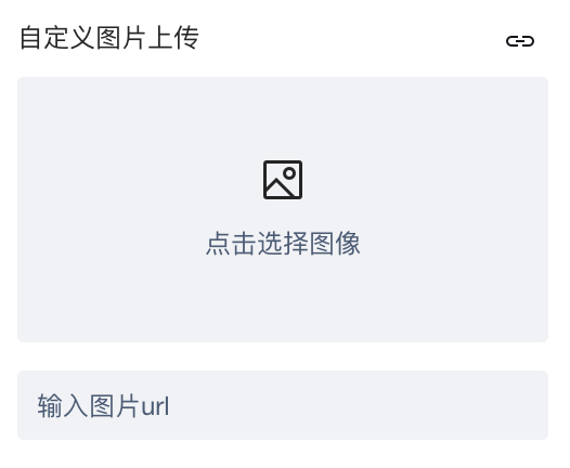 |
| string | "page-list" | The editor displays the property as a page navigation selector | 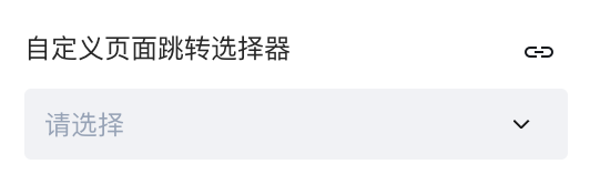 |
| type | enum | Description | Diagram |
|---|---|---|---|
| "string" | Format: {lable:string, value:string}[] | Indicates that the property is of string type and is displayed as a dropdown selector in the editor | 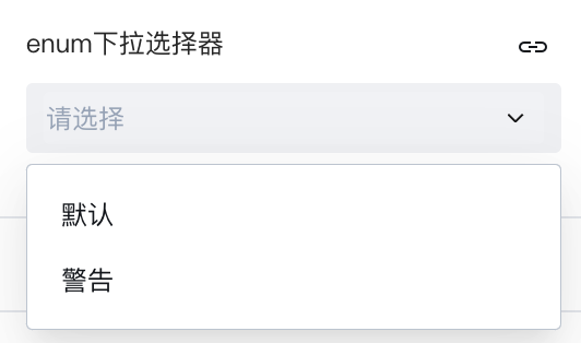 |
Property Default Values
If a property is configured with default, it will be used as the property's default value in the editor.
The type of the default value must match the property. For example, if the property is an object, the default value must also be of object type.
Property Expression Default Values
If a property is configured with x-dataBind-default, it will serve as the default value for expression binding of this property in the editor.
Note:
x-dataBind-defaultdiffers fromdefaultin that it is of string type and is displayed in the expression panel, for example"{foo:bar}"x-dataBind-defaulttakes precedence overdefault. If configured, the expression binding value will be used first.x-dataBind-defaultconfiguration only takes effect for newly dragged component instances. After modification, the component needs to be re-dragged.
Slot Properties
Declaring the property type as "slot" indicates that the property is of slot type. The editor does not display slot properties in the property area. When set as a slot, the editor allows dragging other components into this slot.
The component can directly render with the slot property. For slot implementation in component source code, for web please refer to Web Component Source Code, for Mini Program please refer to Mini Program Component Source Code, where the relevant code for titleSlot can be used as reference.
events Event Declaration
Optional, capturable event information for the component.
The low-code editor will also render the Trigger Conditions in the component's Events panel based on this configuration.
Example
{
  "events": [
    {
      "title": "Custom Event",
      "name": "customevent",
      "detail": {
        "type" : "object",
        "properties": {
          "value": {
            "type": "string",
            "title": "Input Value"
          }
        }
      }
    }
  ]
}
Notes
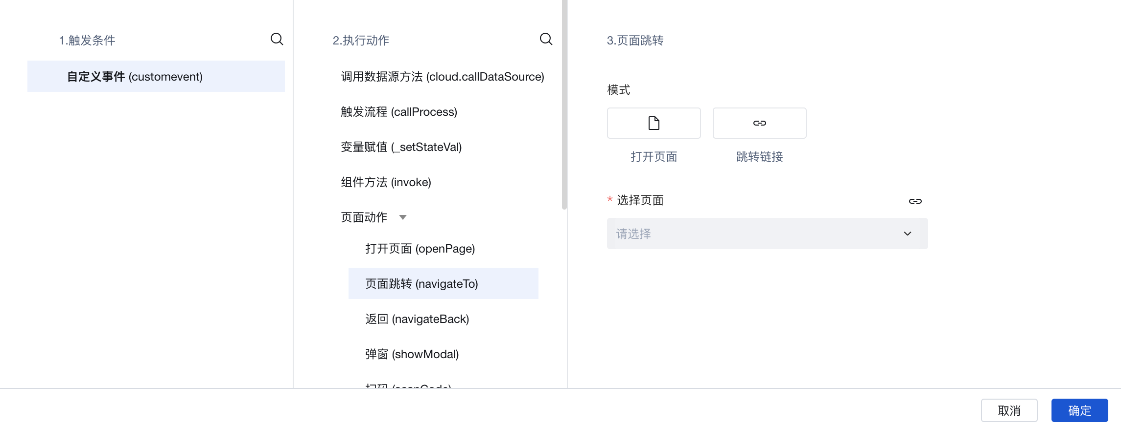
The configuration of events in the example indicates that the component provides a "customevent" event externally.
title: Declares the Chinese name of the eventname: Declares the English identifier of the eventdetail: Declares the output parameters of the event. The format must comply with JSON Schema specifications, defining how to retrieve values exposed by the event in the event handler. For example, the sample declares that the event output is an object with avalueproperty, exposing an "Input Value" attribute. This value can be obtained viaevent.detail.valuein the event panel's handler function.
The triggering timing of events and the parameters they accept are determined by the component itself. For the source code implementation of component methods, web developers can refer to Web Component Source Code, where the events.customevent related code can be referenced; Mini Program developers can refer to Mini Program Component Source Code, where the this.triggerEvent("customevent", e) related code can be referenced.
The method body ultimately executed by the event is bound to a specific low-code method in the editor, as shown in the following diagram:
methods Component Method Declaration
Optional, custom methods defined within the component.
Example
{
  "methods": [
    {
      "name": "innermethod",
      "label": "Component Internal Method",
      "params": {
        "type" : "object",
        "properties": {
          "value": {
            "type": "string",
            "title": "Input Value"
          }
        }
      }
    }
  ]
}
Notes
The configuration methods in the example indicate that the component externally exposes the component method "innermethod". Component methods can be bound to events. When an event is executed, it actually invokes the bound component method.
For the source code implementation of component methods, web developers can refer to Web Component Source Code, and Mini Program developers can refer to Mini Program Component Source Code, where the innermethod related code can be referenced.
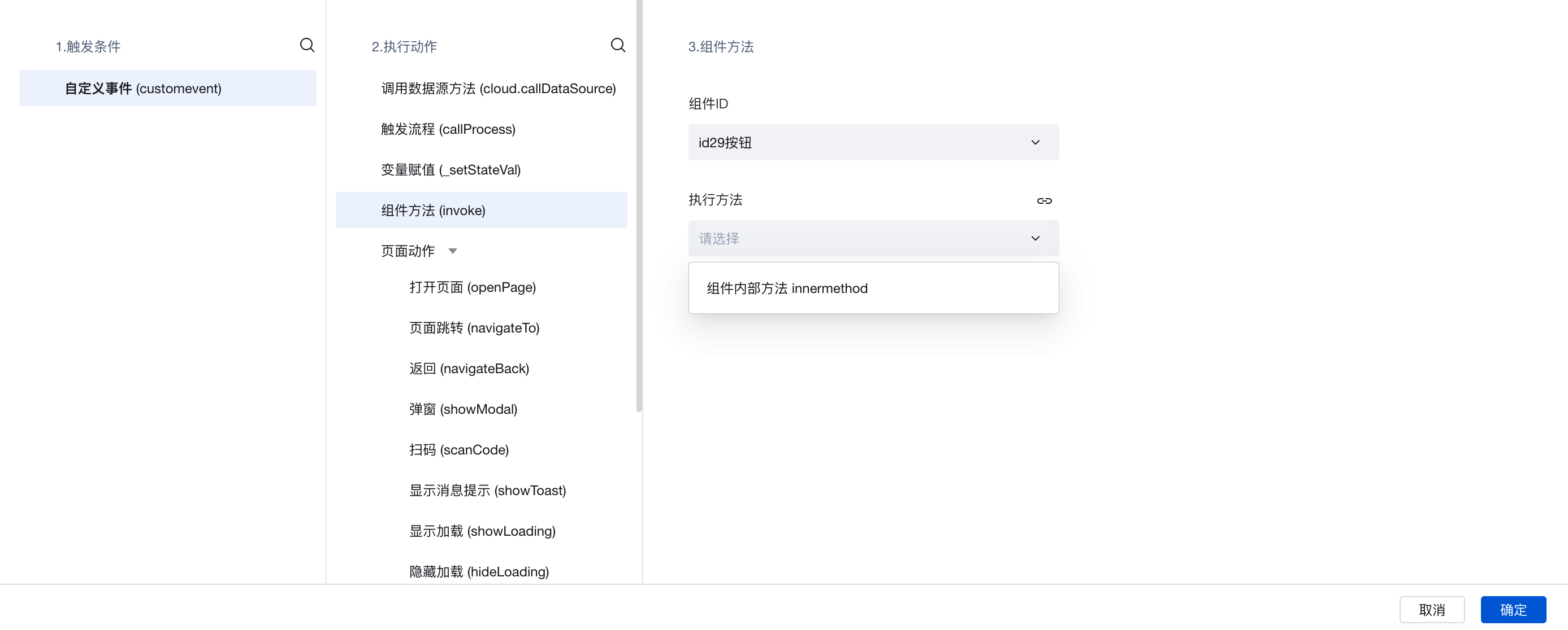
In addition to executing component methods through event binding, you can also trigger internal component methods programmatically by invoking $w.componentId.methodName, such as $w.form1.submit()
Through params, you can declare the input parameter format of the component method. It must comply with the JSON Schema specification. Currently, only a single parameter is supported, and the type must be an object.
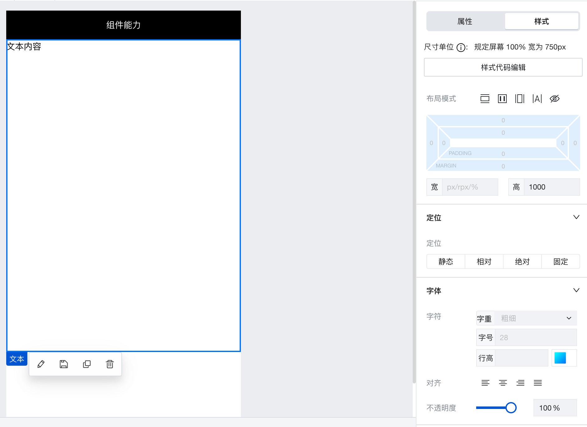
defaultStyles Component Default Styles
Optional. Default styles of the component. Once configured, the values will be displayed in the editor's style panel.
Accepts a React.CSSProperties object.
Example
{
  "defaultStyles": {
    "height": "1000px"
  }
}
Notes
The configuration defaultStyles in the example indicates that the component has a default style with a height of 1000px. This default style is displayed in the style panel on the right side of the editor and can be modified.
meta Component Metadata Declaration
Optional, for information display in the low-code platform.
Example
{
  "meta": {
    "title": "Button",
    "description": "Button component, compatible with Mini Program and H5 platforms",
    "icon": "./icon.svg",
    "category": "Form",
    "componentOrder": 1,
    "platform": ["H5", "PC", "MP"]
  }
}
Notes
| Sub-configuration | Type | Description |
|---|---|---|
meta.category | string | Required. Component category, which should be in Chinese. |
meta.title | string | Optional. Component alias, which should be in Chinese. |
meta.description | string | Optional. Component description, which should be in Chinese. |
meta.icon | string | Optional. Component icon, which supports both local and network images. |
meta.componentOrder | number | Optional. The sorting weight of the component. |
meta.platform | Array | Optional. Platform support for the component in the editor. If not set, the component supports all platforms by default. Valid values: 'H5','PC','MP' |