全局 CSS 变量
提示
标准化组件统一了 PC 端、H5 端和小程序端实现,同时对外开放支持一系列标准 API,支持样式 API 和自定义 CSS 变量 等。标准化组件都在组件列表中添加 的标注。
微搭组件库提供了一套全局样式的 CSS 变量,可以通过设置变量来快速切换主题风格
CSS 变量
:root,
page,
:root[theme-mode='light'],
page[theme-mode='light'],
.wd-theme-light {
// ********************************************************************* //
// 基础颜色及扩展 用于 hover / 聚焦 / 禁用 / 点击 等状态
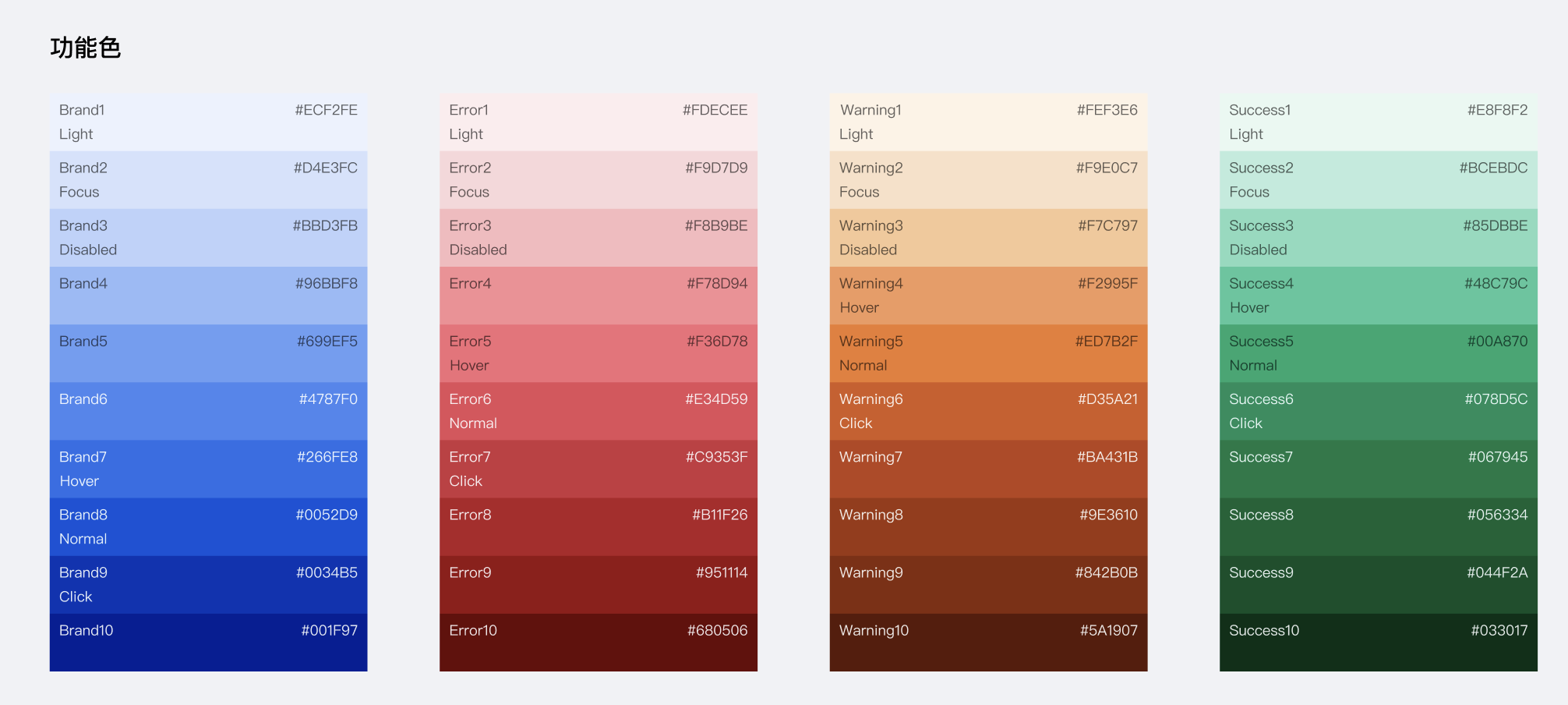
--wd-color-brand: var(--wd-color-brand-8); // 色彩-品牌-可操作
--wd-color-brand-light: var(--wd-color-brand-1); // 浅色的
--wd-color-brand-dark: var(--wd-color-brand-9); // 深色的
--wd-color-brand-hover: var(--wd-color-brand-7); // hover态
--wd-color-brand-focus: var(--wd-color-brand-2); // focus态,包括鼠标和键盘
--wd-color-brand-active: var(--wd-color-brand-9); // 点击态
--wd-color-brand-disabled: var(--wd-color-brand-3); // 禁用态
// 警告色扩展
--wd-color-warning: var(--wd-color-warning-5); // 色彩-功能-警告
--wd-color-warning-light: var(--wd-color-warning-1);
--wd-color-warning-dark: var(--wd-color-warning-9);
--wd-color-warning-hover: var(--wd-color-warning-4);
--wd-color-warning-focus: var(--wd-color-warning-2);
--wd-color-warning-active: var(--wd-color-warning-6);
--wd-color-warning-disabled: var(--wd-color-warning-3);
// 失败/错误色扩展
--wd-color-error: var(--wd-color-error-6); // 色彩-功能-失败
--wd-color-error-light: var(--wd-color-error-1);
--wd-color-error-dark: var(--wd-color-error-9);
--wd-color-error-hover: var(--wd-color-error-5);
--wd-color-error-focus: var(--wd-color-error-2);
--wd-color-error-active: var(--wd-color-error-7);
--wd-color-error-disabled: var(--wd-color-error-3);
// 成功色扩展
--wd-color-success: var(--wd-color-success-5); // 色彩-功能-成功
--wd-color-success-light: var(--wd-color-success-1);
--wd-color-success-dark: var(--wd-color-success-9);
--wd-color-success-hover: var(--wd-color-success-4);
--wd-color-success-focus: var(--wd-color-success-2);
--wd-color-success-active: var(--wd-color-success-6);
--wd-color-success-disabled: var(--wd-color-success-3);
// 遮罩
--wd-bg-mask: rgba(var(--wd-black-rgb), 80%);
--wd-bg-mask-inverse: rgba(var(--wd-white-rgb), 60%);
// 文本颜色
--wd-color-text-default: var(--wd-font-gray-1); // 色彩-文字-主要
--wd-color-text-secondary: var(--wd-font-gray-2); // 色彩-文字-次要
--wd-color-text-placeholder: var(--wd-font-gray-3); // 色彩-文字-占位符/说明
--wd-color-text-disabled: var(--wd-font-gray-4); // 色彩-文字-禁用
--wd-color-text-inverse: var(--wd-white); // 色彩-文字-反色
--wd-color-text-brand: var(--wd-color-brand-6); // 色彩-文字-品牌
--wd-color-text-link: var(--wd-color-brand); // 色彩-文字-链接
--wd-color-text-link-hover: var(--wd-color-brand-hover); // 色彩-文字-链接
--wd-color-text-link-active: var(--wd-color-brand-active); // 色彩-文字-链接
--wd-color-text-link-focus: var(--wd-color-brand-focus); // 色彩-文字-链接
--wd-color-text-link-disabled: var(
--wd-color-brand-disabled
); // 色彩-文字-链接
--wd-color-text-tooltips: var(--wd-white);
--wd-color-text-success: var(--wd-color-success-6);
--wd-color-text-error: var(--wd-color-error-6);
--wd-color-text-warning: var(--wd-color-warning-6);
// 分割线
--wd-color-border-separator: var(--wd-color-gray-2);
// 边框
--wd-color-border-default: var(--wd-color-gray-3);
--wd-color-border-hover: var(--wd-color-gray-4);
--wd-color-border-disabled: var(--wd-color-gray-3);
}